RSS Feed

Posts Tagged ‘bookbinding’

  1. Bookbinder of the Month: Derek Hood

    April 14, 2013 by Erin Fletcher

    phaedoofplato-derekhood


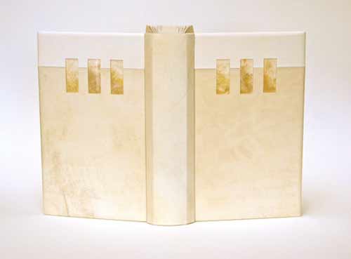
    Published by Golden Cockerel Press in 1930 in an edition of 500, this copy of The Phaedo of Plato is number 392. Written by Plato and translated into English by Benjamen Jowett, this edition also includes ornaments and initial letters by Eric Gill.

    In 2012, Derek Hood bound this copy for the Flow Gallery Exhibition. The binding is covered in light-blue goatskin with inlays of goatskin and alum-tawed calfskin. The outlines are recess onlayed with strips of grey goatskin. The book has Japanese Kozo paper doublures, which are leather jointed. The top-edge is hand gilt with the other two sides left deckled. Titling with Gill Sans hand letters are used in gold on the spine. The binding is housed in a cloth chemise and contrasting slipcase.

    The front cover shows a central abstract figure representing Socrates. The fractured image contains elements of his impending poisoning and transition from this world to the next. The muted palette and use of a wooden sphere are used to echo Socrates’ philosophical obsession with natural order. 


  2. Bookbinder of the Month: Derek Hood

    April 7, 2013 by Erin Fletcher

    revolutioninmind-derekhood

    Revolution in Mind and Practice written by Robert Owen and was published by Effingham Wilson of London in 1849. Derek Hood created this fine binding as a commission for Lord Tom Sawyer as part of an exhibition of 12 books to celebrate 200 years of Socialism. A private viewing of the books was held at the House of Lords.

    Covered in multiple inlays over sculpted boards. The design follows a fluid path based around the letter ‘S’ which represents the word Society and Owen’s revolutionary view of what it could become. The circular movement around the central hole – the minds eye – simulates the flow of his cognitive thought process.


  3. April // Book Artist of the Month: Laura Davidson

    April 2, 2013 by Erin Fletcher

    fortpointtunnelbook-lauradavidson

    Fort Point-Boston is part of an ongoing series of tunnel books from artist Laura Davidson completed in 2011. The point of view shows the harbor walk from the Gillette building to the Boston Harbor, passing by bridges and buildings along the Fort Point Channel. Each copy is numbered and signed. Laura’s tunnel books are available through her website or at the Made in Fort Point store.

    I’ve been working in the Fort Point neighborhood of Boston for almost a year now and I’ve already seen changes in the landscape around me. Laura has been in Fort Point for 30 years. After realizing that we are practically neighbors, Laura so graciously invited me to visit her studio. Laura pulled piece after piece out of her display cabinet, allowing me to handle each one. We discussed details of her work from the handmade hinges to the paper mosaics to the various nibs Laura uses to create her drawings. After surveying Laura’s work one can clearly see how her environment both in and out of the studio acts as inspiration. Laura has created several works showcasing her point of view of a neighborhood to which she calls home.

    fortpointflorafauna-lauradavidsonflorafaunadetail-lauradavidson

    Fort Point Flora and Fauna is an offset printed accordion book from 2003. One side showcases full color drawings of the various animal and plant-life in the Fort Point area that Laura has observed. The reverse side is sepia toned text giving explanation to the images. I first saw this lovely little book at the FPAC Gallery and it opened my eyes to the idea of nature thriving in the urban environment of Fort Point. Now as I walk around the neighborhood I find myself being greeted by signs of life. Most recently a wild turkey, but I image that was quite unusual.

    fortpointilluminated-lauradavidsonilluminateddetail-lauradavidson

    In 2006, Laura created Fort Point Illuminated, a miniature book filled with images of her neighborhood. Each image is painted with ink and wash and illuminated with gold leaf. The covers are sterling silver with copper and brass elements and is bound with a sterling silver necklace chain. This book is in the Collection of the Boston Athenaeum.

    It was a real treat to meet Laura and get a glimpse of her studio life. An organized and inspirational workshop is conducive to creating successful pieces of art. On one side of Laura’s studio is a completely magnetized wall, where Laura displays old tintype portraits, pieces of ephemera, fragments of her current work and photographs of her family. A magnetized wall is quite appealing and something I may implement in my studio. 

    I want to thank Laura again for inviting me into her studio and sharing stories of her work and life with me.

    Read the interview after the jump and come back each Monday in the month of April for more of Laura’s work.

    read more >


  4. April // Bookbinder of the Month: Derek Hood

    April 1, 2013 by Erin Fletcher

    dumasanddecoster-derekhood

    Dumas/de Coster is a beautiful collection of photographs of bookbindings from 1935-1980. It was published in a limited edition of 100 in Paris for the Librarie Auguste Blaizot in 1981. The catalogue is printed on tinted Romana paper, with 14 color and 19 black and white photographs, signed by both artists.

    Commissioned by a collector, Derek Hood bound this book as a laced-in boards binding sewn on pleister tapes. (I’m not familiar with this term, but Derek describes them as the French type that you can then fray and lace into the boards after sewing.) The individual pages were guarded before sewing. The spine was covered in three separate parts and the boards were attached using the leather over boards technique (also referred to as a Bradel binding), once completed. The top edge is hand gilt in 24kt leaf and the headbands sewn with silk thread.

    dumasdoublure-derekhood

    The endpapers are leather jointed with leather doublures, which are decorated with onlays and gold tooling in a similar manner as the cover design. The book is housed in a quarter leather chemise and a leather entry slipcase. 

    I always look forward to the moment when my inbox receives material for the next interview. As I opened the folder containing images of Derek Hood’s more recent bindings I was struck by the image of this binding. I’m greatly inspired by Derek’s work and was so pleased he agreed to be interviewed on my blog.

    The design of this binding is incredibly complex. The linear and triangular forms along with the range of colors offers intrigue and depth. Derek shares his inspiration and process behind the design.
    The design was abstracted from a pencil landscape drawing by Germaine de Coster. Initially, the whole image was traced in simplistic linear form, outlining the buildings, mountains and sunrays, so that every pencil stroke was essentially accounted for. Areas of interest were then honed and focused on until the main triangular form was realized. The finished piece has only an essence of the original drawing, but it is intended to convey the same idea of sunlight and shadow bouncing off multiple planes whilst crossing a vast landscape.

    In 2006, Derek was elected a Licentiate member of the Designer Bookbinders and assigned Paul Delrue and Lori Sauer as mentors. Derek never formally visited either of them during his licentiateship, but discussed the topics of art and books regularly on the telephone. “I like them and their work a lot. It was nice to have two strong, but totally different perspectives on life within the realms of Designer Bookbinders.” Derek now holds the position of a Fellow in the Designer Bookbinders.

    Read the interview after the jump and come back each Sunday in the month of April for more of Derek’s work.

    read more >


  5. Bookbinder of the Month: Lori Sauer

    March 31, 2013 by Erin Fletcher

    topiary-lorisauer

    Topiary by Cecil Stewart is about the art of clipping and sculpting foliage to maintain a clearly defined shape, like a geometric design or animal. In 1936, Topiary was published by Golden Cockerel Press in a limited letterpress edition on handmade paper with whimsical illustrations by Peter Baker Mill.

    topiary illustration

    In 2011, Lori Sauer completed a binding of Topiary in the dos rapporté structure. The binding is covered in reverse vellum dyed with leather dye. The spine is made up of 3 pieces covered in lizard skin and reverse goat. The boards have inlays of wire wrapped in silk and the spine has colured wire coils placed in cutout holes. The doublures and flyleaves are Japanese paper; the flyleaves have cutouts and ink decoration.

    The design is based around the layout of the text and the colours used in the illustrations.

    topiarydetail-lorisauer


  6. Swell Things No. 3

    March 31, 2013 by Erin Fletcher

    stno3a

    1. Incredible Wooden Marble Machines (and videos) from a Swiss designer and artist // Paul Grundbacher
    2. These highly structured and detail sculptures are constructed from paper. Unbelievable! Designed by Irving Harper
    3. Creatively sculpted ceramic vessels and plates // Shawn Spangler
    4. David Meowie
    5. Masterfully illustrated paper designs and portraits // Eiko Ojala

    stno3b

    6. Silkscreen printed Masks Cushion in Neon Coral // Hazel Stark
    7. Miniature Dream House slipcase for an accordion artist book // Jacquie Duruisseau
    8. I recently had an enthralling conversation about gender roles with the talented artist Katrina Majkut whose current work focuses on traditional wedding festivities.
    9. Stone Eye is a collection of poetry from Kentucky’s former poet laureate, Richard Taylor. Two editions were printed by Gray Zeitz of Larkspur Press with wood engravings by Canadian artist Wesley Bates. Thirty-one copies were bound by Guild members for a 2002 Midwest Chapter of the Guild of Bookworkers exhibit. The exhibition can still be seen online at Northwestern University.
    10. The psychedelic collage work of Serpentfire available at Society6.

    stno3c

    11. Need a laugh? Head over to the Irony Lab for some quirky and unusual sentiments // Tim McCool
    12. A recent Etsy obsession – Black Leather & Blue Triangles Pouch // Blackbird and The Owl 
    13. Swiss photographers Taylor Onorato and Nico Krebs cleverly extend the lines and angles of buildings with the careful placement of wooden beams.
    14. Jason and I have been obsessed with shipwrecks lately. These detailed ceramic pieces from Jon Gariepy caught my eye and drew me in.
    15. I love the odd nature of Laura Carlin’s ceramic work.


  7. Bookbinder of the Month: Lori Sauer

    March 24, 2013 by Erin Fletcher

    glassroom-lorisauer

    The Glass Room by Simon Mawer is a novel about a Jewish family and the house they built in Czechoslovakia prior to WWII. The house is based on the Villa Tugendhat, designed by the architect Mies van der Rohe in Brno in the late 1920s. The building was inscribed on the National List of Cultural Heritage in 1969 and after renovations is open to the public. The story in the novel details the plight of the family as they are forced to leave the country and the subsequent uses their house was put to.

    In 2009, Lori Sauer bound The Glass Room for the Man Booker Prize. The binding is a dos rapporté structure and is covered in two shades of vellum. The Perspex (also known as Plexiglass) inlays have dyed Tyvek underneath to simulate onyx. Lori had wanted to use real onyx as it was a major feature in the house, but the cost of having it thinly sliced for inlays was too high. The onyx wall is located in the living room of the house and is partially translucent, changing its appearance with the evening sun. The doublures are dyed Tyvek made to look similar to veins in onyx.

    The house and its design dominate the novel. It is a very modern building with large rooms and lots of glass. Built when art deco was at its peak, Lori chose to design a binding around the motifs and in the spirit of the architecture.


  8. My Hand // Etsy Shop Launch

    March 18, 2013 by Erin Fletcher

    etsyopening

    I’m so proud and excited to announce the opening of my shop on Etsy! In my practice I get to work on a lot of interesting projects under the guide of my clients. The items on Etsy sprang into life during the brief moments of freedom between client work, giving way to personal, limitless flashes of expression. I began with a collection of Lokta papers in a broad range of colors, which inspired the hand-dyed thread on the Coptics and paste papers used for the flatback journals and jotters. 

    Check out my previous post on paste papers. My most favorite pattern is the plum scallops over mint!

    smflatback_purplescallops smflatback_sagebricks

    I’m also a fan of the linear Coptic journals (available in earth tones and blue tones). Inspiration for this design came during my first year at North Bennet Street School from a poster that was hung in front of my bench. The minimalistic design is fresh and enhanced by the soft, muted tones of the Hahnemuhle Ingres. 

    linearearth

    Check out the Herringbone Bindery shop and leave a comment about your favorite product. Thanks in advance!! 


  9. Bookbinder of the Month: Lori Sauer

    March 17, 2013 by Erin Fletcher

    brothergiles-lorisauer

    This book was bound in 2009 by Lori Sauer as a modified sewn-board binding with a wooden spine. The boards are covered in natural vellum and the spine is attached with threads and vellum strips that are laced into the boards. I find the unusual pattern of the vellum to be quite alluring; it adds a great amount of depth and texture. The doublures are Japanese paper with suede flyleaves. The doublures are embroidered with silk in a crosshatch motif, inspired by the method used in the illustrations.

    brother giles illustrations

    The Life and Chapters of Sundry Goodly, Sayings of the Teachings of Brother Giles was printed by the City of Birmingham School of Printing in 1941 with illustrations by Neil Leitch MacCuaig. The book is comprised of wise words and sayings by a companion of St Francis, Brother Giles. 


  10. Bookbinder of the Month: Lori Sauer

    March 10, 2013 by Erin Fletcher

    water-lorisauer

    The first Designer Bookbinders International Competition was organized in conjunction with the Bodleian Library in 2009. Each binder involved submitted a binding of the set book Water, which is a collection of poems and illustrations based on the theme of water. The set book was published by Incline Press in a limited, letterpress edition.

    In 2008, Lori Sauer bound a copy of Water as a stub binding covered in three stages: the spine attached first with the covers stuck on afterwards. The binding is covered in white vellum and the surfaces are decorated with impressions of circles that sit on a graphite grid. The rear board has pairs of circles and the front has single, larger circles. Onlaid colored circles run down the length of the front board. The spine has a pattern of plus symbols. The doublures are Fabriano Roma.

    Lori describes the text as being filled with a myriad of styles of illustrations and poems from different writers, adding to its broad theme. The circles of her design are simply the symbols for the chemical composition of water, two hydrogen atoms plus one oxygen. The onlaid colored circles on the front cover were added a couple of years after completing the binding as Lori felt a focus was needed to the design. I certainly think the addition of the circles offers a focal point to the viewer, then you slowly begin to realize the complex pattern of lines and circles underneath. 


  • My name is Erin Fletcher, owner and bookbinder of Herringbone Bindery in Boston. Flash of the Hand is a space where I share my process and inspirations.
    The StudioNewsletterInstagramEmail me
  • Archives