RSS Feed

Posts Tagged ‘bookbinding’

  1. My Hand…The Enormous Crocodile

    November 19, 2012 by Erin Fletcher

    Only 3 weeks remain to view or purchase my bindings on Buy Some Damn Art.

    I had never read The Enormous Crocodile when I was a child, therefore, I experienced this devilish tale as a young adult. The Enormous Crocodile lives in the jungle and is a rather sinister character. When meeting other jungle creatures, he boasts about his clever plans to snatch up children in order to eat them. All of the creatures are horrified by this idea and foil his plans along the way. The Elephant has quite enough of this crocodile’s antics and decides to put an end to it. Grabbing the Enormous Crocodile by the tail, the Elephant swings him around with such speed, he is projected far into the atmosphere until he hits the sun and is ‘sizzled up like a sausage’.

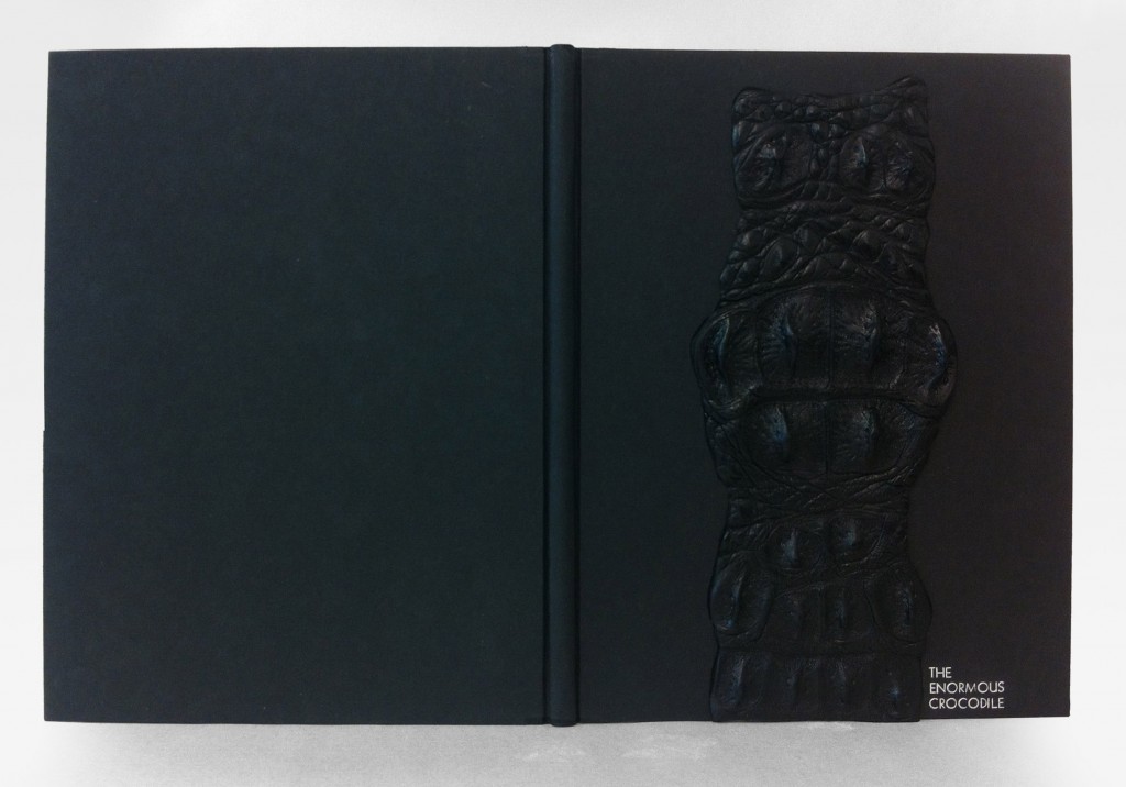
    Quite an ending, one that surprised me as a reader. Very few Roald Dahl books contain color, but The Enormous Crocodile is filled with vibrant greens and yellows. When considering the cover design I didn’t want to compete with such a colorful palette plus I couldn’t get the image of a sizzled crocodile out of my mind. This led to the decision of doing a monochromatic binding in black. 

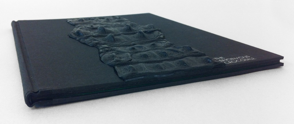
    The book is bound as a millimeter binding with black Pergamena goatskin running along the headcaps and joint. The rest is covered in black Hahnemuhle Ingres. A recess was built into the front board before covering as a well for the crocodile skin. Due to the bumpy texture of the crocodile skin, paring was impossible, but also unnecessary.  Once the skin was glued up and placed in the well, layers of foam were sandwiched between the cover and press boards, this kept the skin flat while drying. The title was stamped in a sans serif typeface with silver foil before gluing down the crocodile skin.

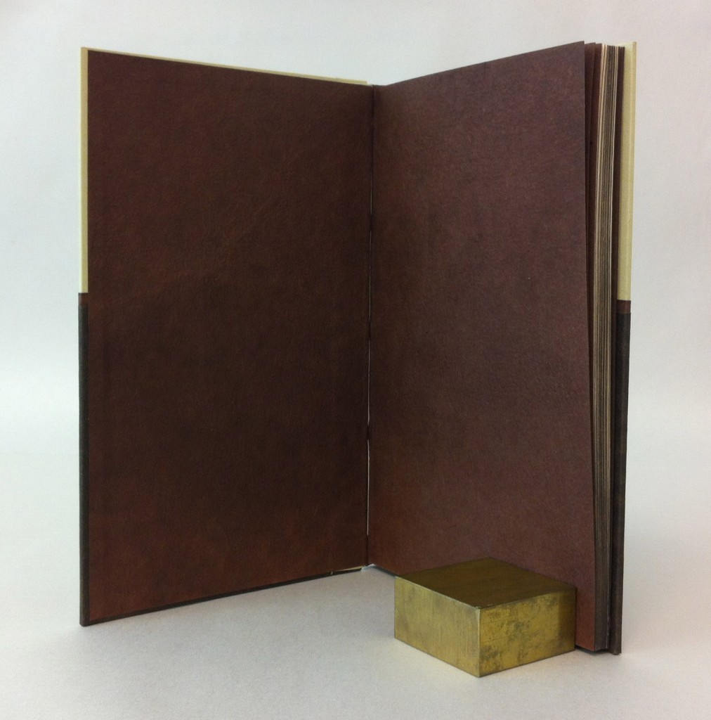
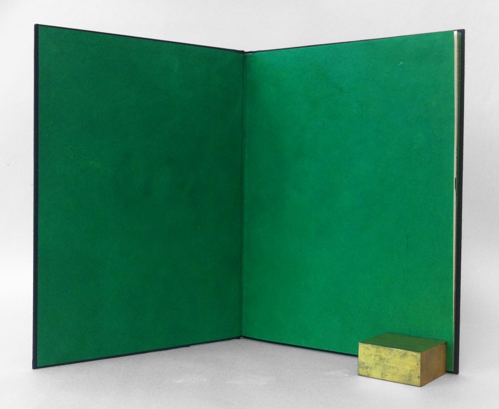
    Continuing with a monochromatic look, the edges were painted black. Using a combination of fluid acrylic, airbrush medium and wheat starch paste I was able to apply a thin yet opaque layer of pigment. When you open the front cover, a rush of brilliant green floods your vision. The endpapers were constructed with emerald green Lokta paper.

    The book is housed in a black clamshell box. The trays are covered and lined with black Hahnemuhle Ingres with Volara foam cushioning the front cover. The case is covered in black Iris bookcloth and kept closed with black satin ribbon.
  2. Bookbinder of the Month: Edgar Mansfield

    November 18, 2012 by Erin Fletcher

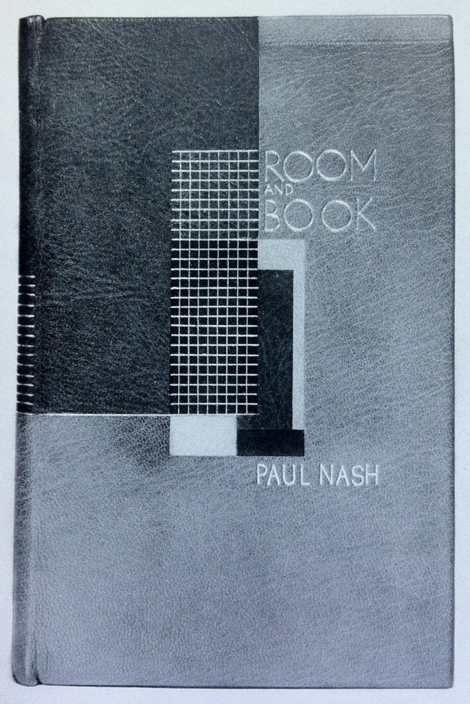
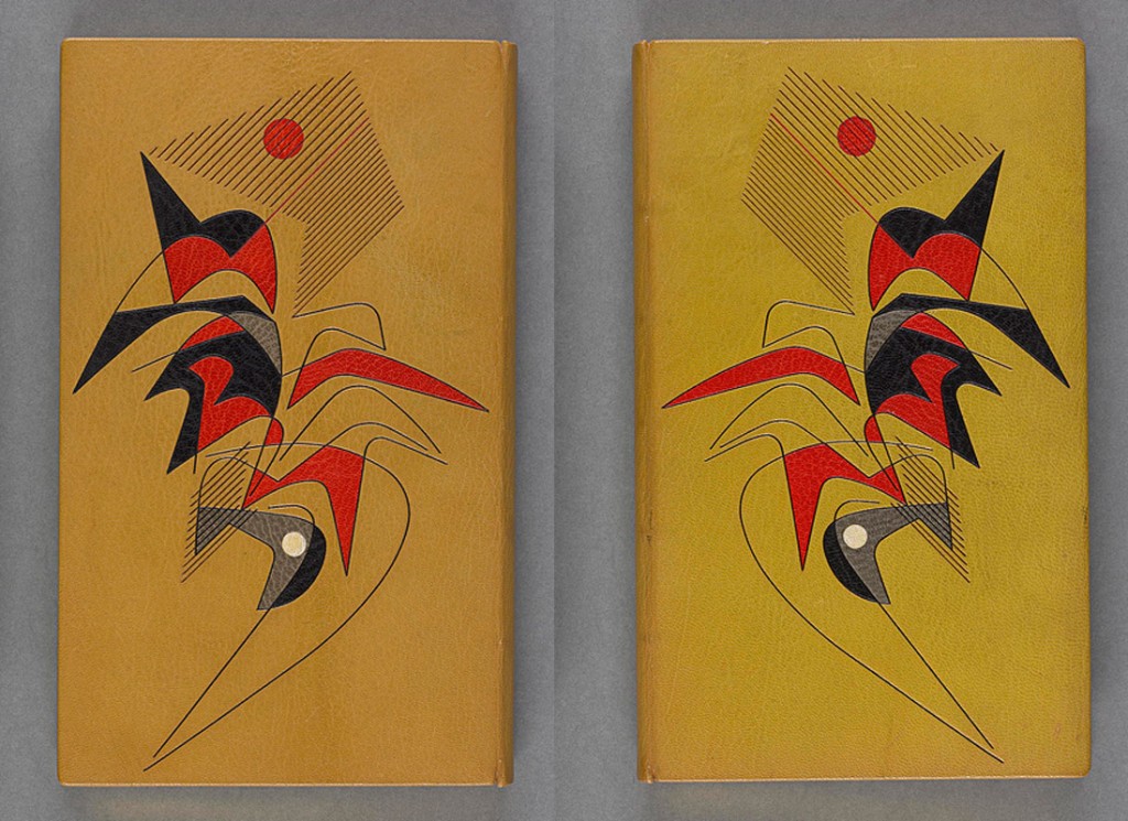
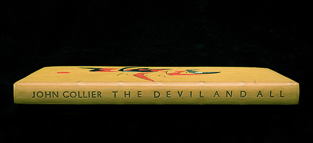
    This is an earlier binding from Edgar Mansfield, before he really developed his expressionist style. Room and Book by Paul Nash was published by Soncino Press in 1932 and was bound by Mansfield in 1941. Covered in yellow ochre and red brown morocco with inlays in natural, red, browns and black. All tooling in gold. 

    I particularly love this binding because of its rigidly angular and balanced design; a nice transition from the popular Art Deco bindings and to the surrealist and expressionist designs he’s best known for. 


  3. My Hand…The BFG

    November 12, 2012 by Erin Fletcher

    Just 4 weeks remain at Buy Some Damn Art.

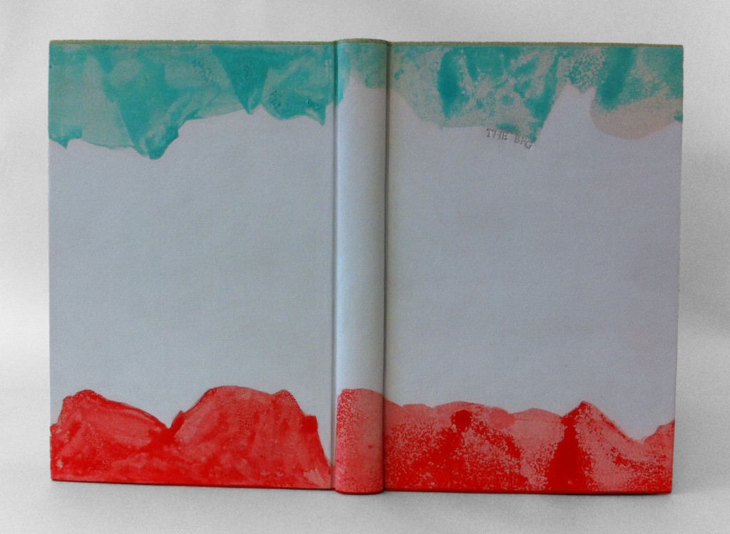
    As I reread The BFG by Roald Dahl, it quickly became clear that I wanted to illustrate the dreams and nightmares captured by the Big Friendly Giant. The reader joins little Sophie in her journey to Giant Country, where we learn about the nasty giants, snozzcumbers and the BFG’s vocation as a dream catcher. Each dream and nightmare is collected into a jar where they remain until released into children’s rooms at night. Sophie describes dreams as being small oblong pale sea-green jellyfish, soft and shimmering, while nightmares thrash around as scarlet blobs of gas and bubbles of jelly. 

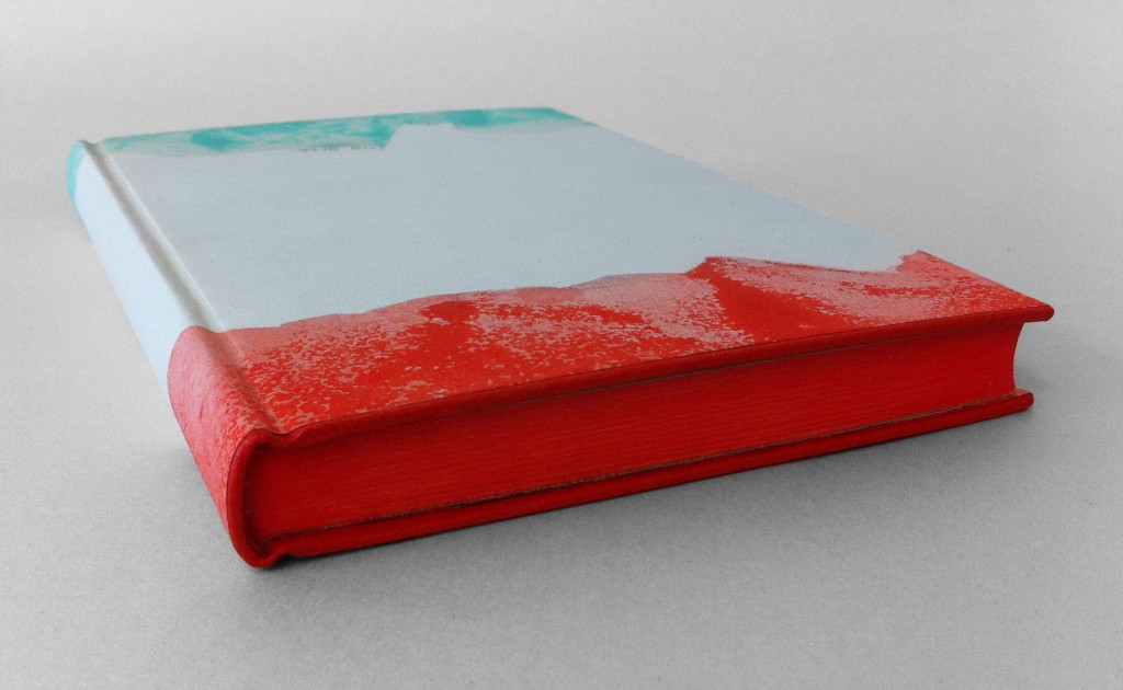
    I made the decision to bind The BFG as a millimeter binding in the Rubow style so the design could run the full length of the book uninterrupted. Using Sophie’s description as a guide for the color palette, I created a paste paper to reflect each illusion. Each area of color is a mixture of gouache, sugar and vinegar applied with a scrap piece of binder’s board. As the paint mixture dries the partially dissolved sugar crystals burst leaving a textural and dimensional effect. 

    Each color continues along the board edge and the edge decoration visually saturating each side in a single color. The tail board edge and headband are covered with scarlet goatskin from Harmatan, while the head board edge and headband are covered with buffalo from Remy Carriat in amadine (light sea-green). Each edge is painted with acrylic paint mixed with airbrush medium, water and wheat starch paste. The head edge is a sea-green blue, foredge is a light grey and the tail edge is scarlet red.

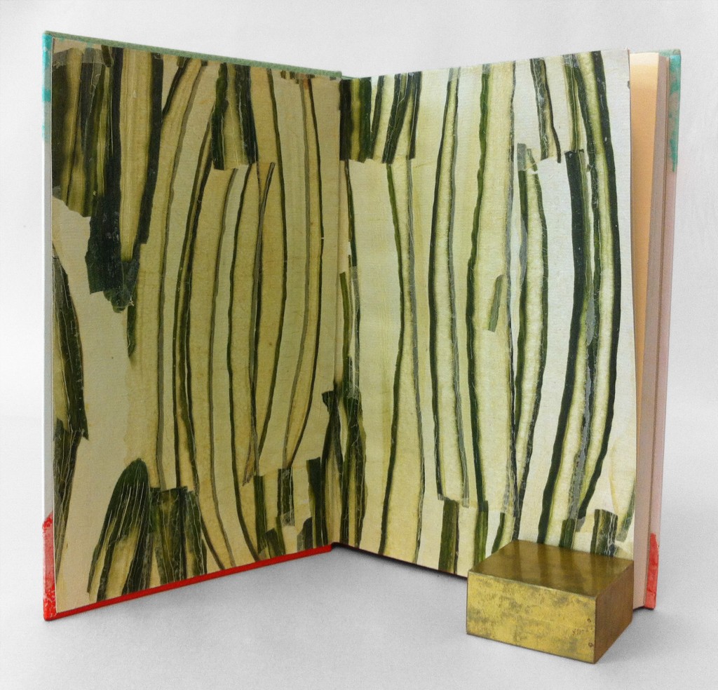
    The endpapers were so fun to make. I’ve worked with vegetable papyrus in the past and felt compelled to use the cucumber since the BFG eats only one thing: snozzcumbers. I acquired the cucumber papyrus from Hiromi Paper which are handmade by an artist in Germany. Using a thin paste wash I broke up the papyrus and collaged the pieces together on top of light gray Hahnemuhle Ingres. 

    The book is housed in a clamshell box, the trays are covered with light gray Hahnemuhle Ingres and lined with smoke Ingres. The case is covered with silver Canapetta and light gray Ingres in a quarter style covering.


  4. Bookbinder of the Month: Edgar Mansfield

    November 11, 2012 by Erin Fletcher

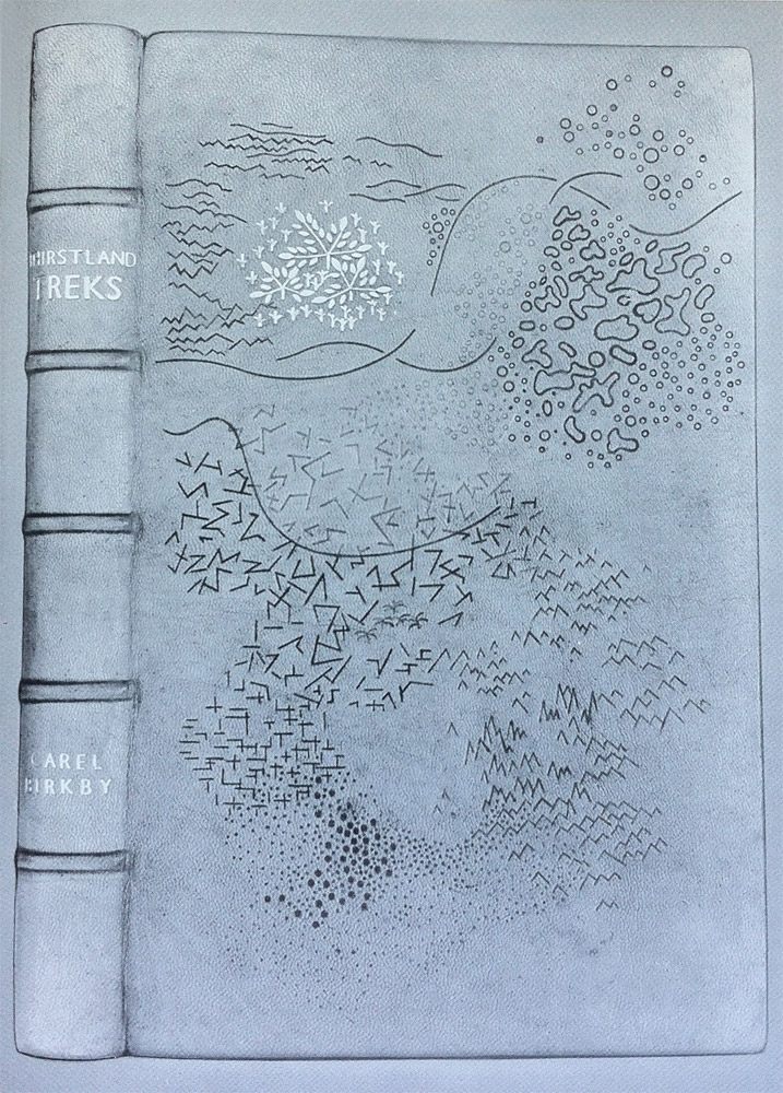
    I wish this image were in color, it’s a really striking design; the marks are almost sketch-like appearing at random to build a dimensional landscape. Thirstland Treks by Carel Birkby was printed by Faber and Faber in 1936 and this copy was bound by Edgar Mansfield in 1948. Covered in a native dyed yellow-brown morocco skin with slight creasing in the grain. The tooling is a combination of light and dark blind with a small amount of gold on the cover and spine.

    This is the first experiment with using the grain as an active and expressive element in the design.

    Reference: Modern Design in Bookbinding: The Work of Edgar Mansfield, pg. 27


  5. My Hand…James and the Giant Peach

    November 5, 2012 by Erin Fletcher

    Five weeks remain for my exhibition on Buy Some Damn Art. There’s still time to add to your library!

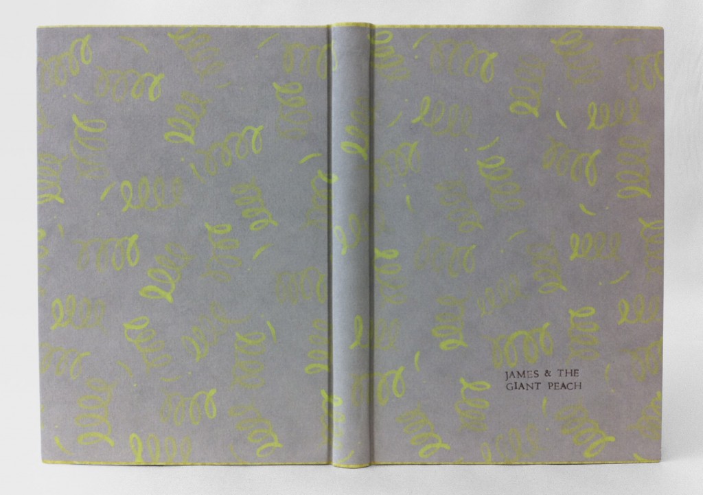
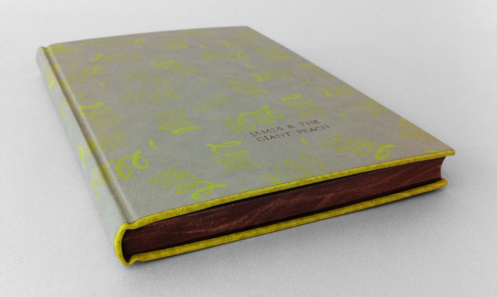
    Initially for this binding of Roald Dahl’s James and the Giant Peach I had intended on covering it in a peachy-colored pig suede to represent the Giant Peach itself. However, dressing the book up like a peach felt too dry, too safe. The story of James and the Giant Peach is loaded with magic from the overgrown peach to the singing insects, which only became possible through the power of those little, luminescent crocodile tongues. Using smoke Hahnemuhle Ingres, I created a simple paste paper representing the little green things, scattering them about randomly. The acrylic paint was mixed with wheat starch paste and watered down significantly, this allowed for the graduation of intensity with each corkscrew shape.

    I choose to execute this design as a Rubow Millimeter binding. This is one of my favorite structures to work with, mainly because the covering material (most commonly paste paper) can lay across the entire book uninterrupted. The head and tail edge of the boards are lined with buffalo skin in Anis (chartreuse green), which matched perfectly to the green tone on the paste paper.

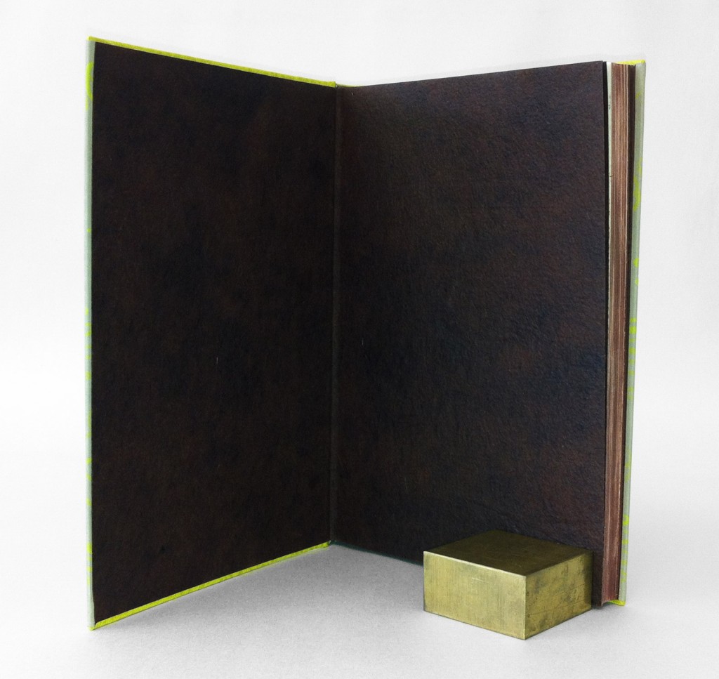
    The edges of the book were painted with an fluid acrylic/paste mixture to match the red walnut Cave Paper endpapers. After application and once the pigment was dry, I used sandpaper to scuff up the edges a bit giving it a distressed look. The headbands are hand sewn around a single core (bead on foredge) in alternating dark brown and reddish brown. The title was hand stamped through brown foil. The book is housed in a clamshell box. The trays are covered in smoke Hahnemuhle Ingres and lined with lime Moriki; the case is covered in a brown Canapetta bookcloth.

    James and the Giant Peach is for sale at the price of $400.


  6. Bookbinder of the Month: Edgar Mansfield

    November 4, 2012 by Erin Fletcher

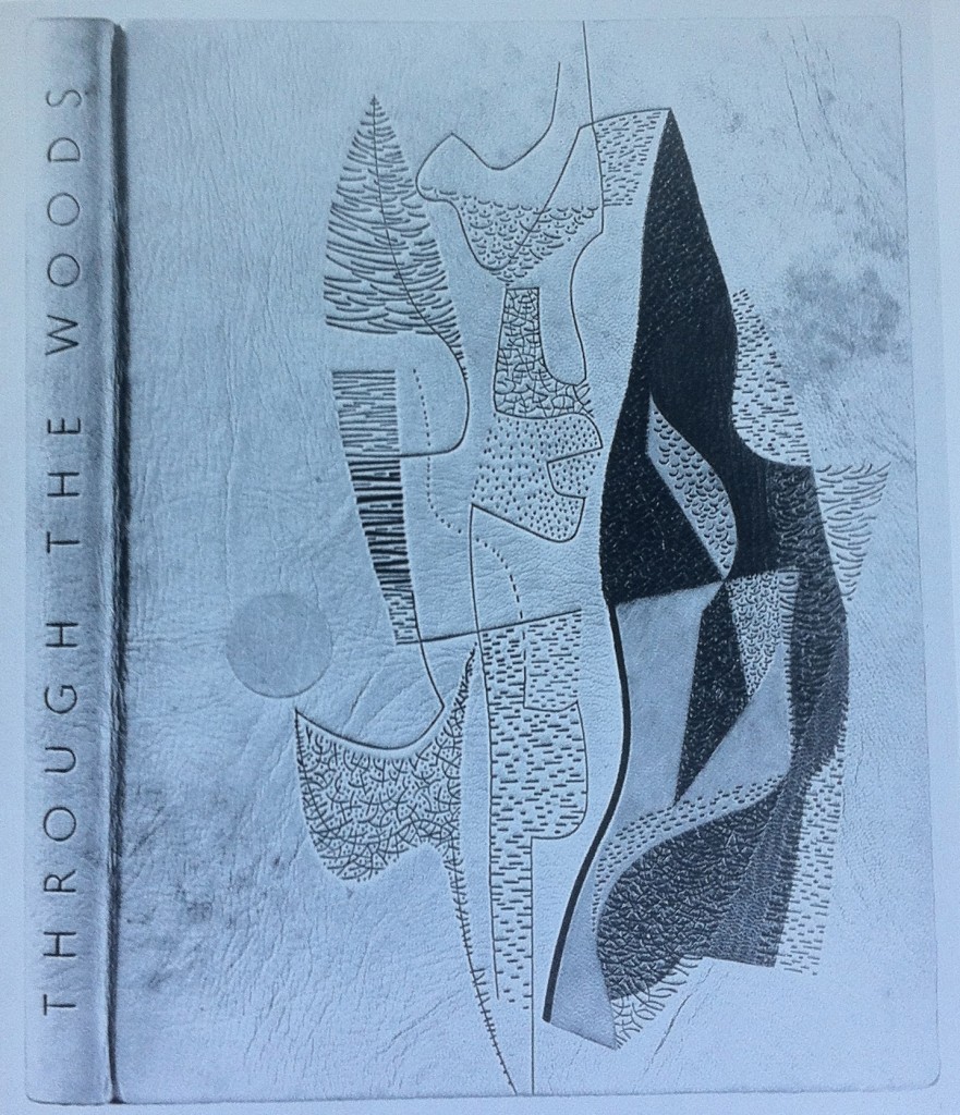
    Throughout Edgar Mansfield’s career as a bookbinder, he bound several copies of Victor Gollancz’s Through the Woods. Twelve of them are represented in The Work of Edgar Mansfield. The binding in the first image was bound in 1958; covered in a native tanned natural morocco with brown markings (both natural and added by Mansfield). The grain creases were induced during covering. All tooling is blind, with inlays of rust-red, greens and chrome yellow.

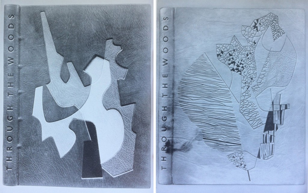
    left side: Bound in 1959 in a native dyed red morocco. The inlaid design spans over four levels built into the cover; inlay leather of chrome yellow, warm black, stone, neutralised green, natural and lemon yellow. All tooling in blind.

    right side: Bound in 1959 in a native tanned natural morocco with natural markings. The grain was creased during covering. All tooling in blind; the solid areas are built up with a short pallet to produce tonal and textural variations.

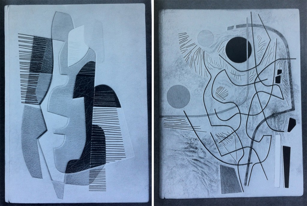
    left side: Bound in 1960 in a native tanned natural morocco. Inlaid design spans over three levels built into the cover; inlay leather of white, yellows, orange, browns and greens. Tooling in green and blind.

    right side: Bound in 1960 in a native tanned natural morocco with creases added to the grain while covering. Brown staining was added to the areas of the leather built up. Recessed inlays in yellow, red, white, black, grey and green. Tooling in light and dark blind.


  7. November // Bookbinder of the Month: Edgar Mansfield

    November 3, 2012 by Erin Fletcher

    Edgar Mansfield was born in London in 1907. Four years later his parents took him to New Zealand where he spent the next 23 years of his life before returning to England. 

    Starting in 1948, Mansfield began teaching at the London School of Printing, where in regards to bookbinding was a advocate for expressive design inspired by the spirit of the book as opposed to decorative pattern making. Mansfield developed as a binder outside of traditional training, his approach was first as an artist and then a craftsman. However, his execution was impeccable; he excelled in inlays and onlays, shaped his own finishing tools, and developed a technique to heighten the texture of leather during cover. Fellow binder Trevor Jones wrote the following after Mansfield’s death in 1996:

    The nature of the surface of a Mansfield binding and its tactile quality is most important, as befits the work of a sculptor. His preference was always for unpolished and unpressed goatskin enlivened with surface markings and blemishes, especially the native tanned and dyed skins once obtainable from Nigeria that displayed variations of tone and colour, if necessary with his own added ink markings. He often heightened the grain texture on the leather of his bindings by rolling the damp skin on itself before pasting, and later brushing towards the spine with the palm of his hand across the surface of the leather in the act of covering the book….

    read more >


  8. My Hand…Exhibition on Buy Some Damn Art

    October 30, 2012 by Erin Fletcher

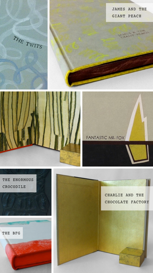
    Check out the six Roald Dahl titles I rebound for Buy Some Damn Art. At the beginning of each week I will feature a post on the creative process behind each binding. Check out this week’s post on Fantastic Mr. Fox.


  9. My Hand…Fantastic Mr. Fox

    October 29, 2012 by Erin Fletcher

    Starting tomorrow at Buy Some Damn Art, six of my books will be featured and on sale for six weeks. Follow my blog during that time to see a post on the making of each title.  

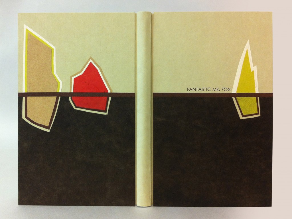
    I’ve been greatly inspired by Art Deco bindings and wanted to incorporate that style into this binding of Fantastic Mr. Fox by Roald Dahl. As a child I read this story over and over, imagining blueprints of the underground tunnels created by those devious foxes. In the spirit of Art Deco design I simplified these underground channels, wrapping them around three colorful, geometric farmhouses. 

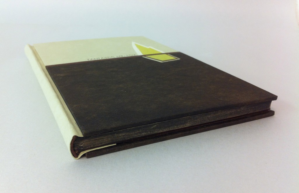
    The binding is a variation on a German case structure by Peter Verheyen where the boards are covered separately from the book. The spine and boards were covered with earth Hahnmühle Ingres. To make the farmhouses I layered various handmade and commercially made papers which include Moriki, Hahnmühle Ingres, Cave Paper and Lokta. There is a line of red walnut Cave Paper running the width of each board representing the ground and dividing up the levels of the farmhouses; the walnut Cave Paper is the dirt far below the top soil, highlighting the tunnels around each farmhouse. The title was stamped in a sans serif typeface with brown foil.

    The headbands are wrapped red walnut Cave Paper around cord. The edges were painted with an acrylic/paste wash, once dry the edges were carefully brushed with sandpaper to give a more textural look. The end papers are red walnut Cave Paper. I loved using Cave Paper for this binding for a few reasons: the handmade quality, use of natural dyes and the textural characteristics seemed most suitable to represent the living, moist dirt deep underground. The book is housed in a clamshell box. The trays are covered in lime Moriki and lined with rose Hahnmühle Ingres and the case is covered with brown Canapetta. 


  10. Bookbinder of the Month: Rose Adler

    October 28, 2012 by Erin Fletcher

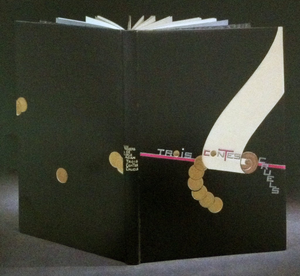
    Bound in full black calf is this 1927 edition of Auguste de Villiers de L’Isle-Adam’s Trois contes cruels with illustrations by Jean-Emile Laboureur.  Rose Adler created the design for the binding in 1929, which was then executed by Emmanuel Lecarpentier. The scroll design is created with ivory and beige calf onlays with a purple calf line onlay running behind and roundels are tooled in solid gilt. Title is tooled in aluminum, inlays of purple calf and gilt tooling, author’s name and title tooled in gilt on the spine. Doublures in beige calf with a pattern of black and purple calf at the bottom where Rose Adler’s signature can be found. Endleaves of alternating purple and aluminum watered silk; second endleaves of glazed aluminum paper. 

    The design is representative of the geometric focus of the first period of the Art Deco era. The design is quite striking, the roundels and descending title create a perfect balance along either side of the scroll.  

    Check out Art Deco Bookbindings: The Work of Pierre Legrain and Rose Adler for more of Rose Adler’s work.  


  • My name is Erin Fletcher, owner and bookbinder of Herringbone Bindery in Boston. Flash of the Hand is a space where I share my process and inspirations.
    The StudioNewsletterInstagramEmail me
  • Archives