RSS Feed

Posts Tagged ‘buy some damn art’

  1. Artist: Lydia Hardwick

    July 3, 2014 by Erin Fletcher

    LydiaHardwick5

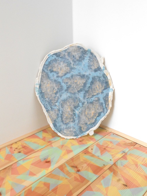
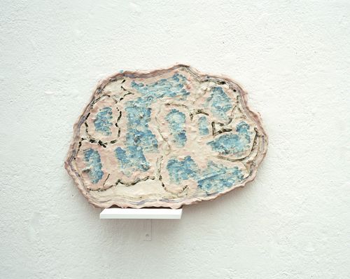
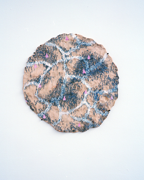
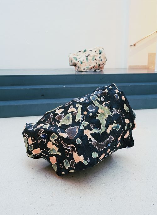
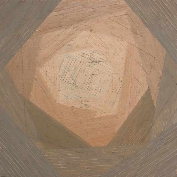
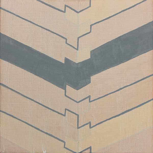
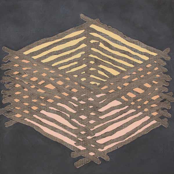
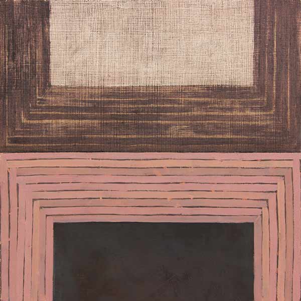
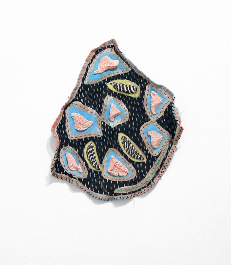
    Lydia Hardwick is a ceramic artist sculpting objects that look very little like ceramic (which is my favorite type of ceramic work). She studied at the Royal College of London and has completed two residencies in Scotland and Germany. The former leading to a show later this year at the An Tobar Gallery.

    As another artist I discovered through Buy Some Damn Art, I wanted to feature her on my blog because her pieces inspire me to make some wild lacunose onlays. Her color choices are brilliant and the abstract shapes she creates are captivating in their organic and sometimes sickly qualities.

    LydiaHardwick3 LydiaHardwick2 LydiaHardwick4 LydiaHardwick1


  2. Artist: Megan Herwig

    July 1, 2014 by Erin Fletcher

    MeganHerwig1

    Megan Herwig is a graduate of the Montserrat College of Art, in addition to receiving a Master’s in Fine Art from the School of the Museum Fine Arts in Boston. I recently came upon her work on Buy Some Damn Art. Her magnificent buildings are made from various materials layered on top of screen prints. She uses paper, tape and fabric to build these architectural wonders.

    MeganHerwig3 MeganHerwig4 MeganHerwig2


  3. Swell Things No. 7

    August 31, 2013 by Erin Fletcher

    stno7a

    1. The work of outsider artist Charles August Albert Dellschau was discovered in the mid-1960s by a junk dealer in Houston, whom acquired 12 notebooks discarded after a house fire. Dellschau worked as a butcher and became a self-taught artist after retiring in 1899. His work began with 3 books entitled Recollections describing a secret organization called the Sonora Aero Club. The pages are filled with highly detailed and colorful watercolor-collaged pieces that include newspaper clippings. Dellschau’s work is quite fascinating and worth some further reading.
    2. I’m just in love with the work of ceramicist, Amy Louise Worrall. She is currently featured as a Young Artist on Buy Some Damn Art. Her work is sold out! Darn!
    3. Fascination with maps began at an early age for Jerry Gretzinger. Since 1963, Jerry has been chipping away at the same map that scales to over 2400 individual 8×10 sheets. 
    4. Sandwich Book is a wonderfully creative and deliciously realistic book mimicking the layers of a sandwich from graphic designer Pawel Piotrowski
    5. The University of Iowa’s library just unveiled the smallest book of their collection. This micro-miniature bible measures at 0.138 inches square and 0.04 inches thick. The book was originally sold with its companion at the World’s Fair in New York in 1965.

    stno7b

    6. Touching Strangers is a unique project from photographer Richard Renaldi, where he asks strangers to physically embrace one another for a portrait. A recent kickstarter project received substantial funding for an upcoming photo book of the series.
    7. These watercolor portraits from artist Oriol Angrill Jordà are quite breathtaking, blending together a range of textures and colors so effortlessly.
    8. Drawn the Road Again is a blog run by artist Chandler O’Leary. She is quite the traveler both in America and Europe, she often frequents the back-road looking for sites few have seen. She documents these excursions with beautifully painted watercolor-scapes and includes wonderful handwritten captions.
    9. Photographer I-Hsuen Chang embraces the restrictions of a bound book that many photographers face. In his latest work, In Between, he uses the gutter of the binding to hide the focal point of the image.
    10. Portraits of Boston is just a delightful and honest site, documenting the wide range of people who call Boston their home. As a fellow Bostonian of 3 years, it’s wonderful to get a glimpse at those whom I quietly interact with everyday walking the streets and riding the trains.


  4. Artist: Sarah Burwash

    April 24, 2013 by Erin Fletcher

    full-sarahburwash

    The illustration work of Sarah Burwash makes me so happy. Her drawings are so delicately executed, displaying a bundle of whimsy and beauty. Her ceramic work is equally intriguing and was recently featured on Buy Some Damn Art

    drawntolight-sarahburwash frostywindow-sarahburwash tendertemper-sarahburwash homage-sarahburwash clusterscactus-sarahburwash


  5. Artist: Amanda Brazier

    March 14, 2013 by Erin Fletcher

    quiet-amandabrazier

    The recent artist featured on Buy Some Damn Art is painter Amanda Brazier. She has sold 4 out of 6 pieces already, which comes as no surprise because Amanda’s work is brilliant and beautiful. She respectfully grinds her own paints using earth pigments from her home in Chattanooga, Tennessee and locations in North Carolina. Amanda collects red, yellow, brown and sometimes purple pigments from the earth, creating a warm and welcoming color palette. Check out her interview at Buy Some Damn Art. 

    hogan-amandabrazier notch-amandabrazier shelter-amandabrazier divided-amandabrazier


  6. My Hand…Charlie and the Chocolate Factory

    December 3, 2012 by Erin Fletcher

    This is the last week to view my work on Buy Some Damn Art!!

    The sixth and final book in my Roald Dahl series is Charlie and the Chocolate Factory, which may be his most well-loved story inspiring several adaptations such as the 1971 film with Gene Wilder (that we all love), the 2005 Tim Burton version (that we all might not love), various live theatrical performances plus one theme park ride. As I read through this book again, I found myself scribbling note after note from the abundance of imagination and imagery sprouting from the text. I needed to settle on an idea and I knew that I wanted to incorporate Art Deco elements into the design. And so the inspiring words are those that make up the detailed description of Willy Wonka’s appearance: black top hat, tail coat of plum-colored velvet, pants were bottle green, gloves were pearly gray, and a gold topped walking cane.

    Working within the limitations of my chosen color palette I created a stacked design of shapes according to their position on the body. The cane became the center point of the design and the binding and so I chose to use Peter Verheyen’s variation on the German case binding, which is the same structure used for Fantastic Mr. Fox, so that I could cover the spine separately from the boards. The spine is covered in black Hahnemuhle Ingres with Ferro gold as the tip. The headbands are wrapped with paper corresponding to the black Ingres or Ferro gold. The boards were initially covered in smoke Hahnemuhle Ingres before adding the paper onlays one at a time. Carefully measuring to make sure the design would remain square and that both boards would successfully mirror each other. I used various papers for the design because my main goal was to match the distinctive color palette. All of the black elements are Hahnemuhle Ingres; I choose purple Lokta, lime Cave Paper and Echizen ribbon Japanese paper for the other elements. 

    The edges were painted with a mixture of light gray acrylic paint, water, wheat starch paste and airbrush medium. This mixture creates a fluid pigment that can be applied as an even, thin coat, which prevents the paint from flaking. The made endpapers could only be gold as a homage to the golden ticket.

    The book is housed in a clamshell box, the trays are covered with smoke Hahnemuhle Ingres and lined with light gray Ingres. The case is covered in full black Iris bookcloth.


  7. My Hand…The Twits

    November 26, 2012 by Erin Fletcher

    Only 2 weeks left in my exhibition at Buy Some Damn Art

    I found the pranks between the terrible couple in The Twits to be wicked yet entertaining, which is why I read the book so much as a kid. One particularly gruesome trick that inspired the design for this binding was the worm spaghetti that Mrs. Twit served Mr. Twit. This devious couple live in a cement windowless house complete with a rotting garden, caged monkeys and a big dead tree where Mr. Twit captures birds for pie. The couple get what they deserve in the end as the monkeys and birds play their own clever trick on them, turning their home upside down.

    I bound The Twits in the millimeter Rubow style with white buffalo skin lining the head edge and flanelle buffalo skin lining the tail edge. The color of the leather wrapped headbands correspond to leather edge. The paste paper was a simple design of free forming squiggles painted on with a long bristled brush. The initial layer was a mixture of titanium white acrylic, water and wheat starch paste. For the next two layers I added a bit of bone black and cerulean blue acrylic to create a blue gray ending with a match for the flanelle buffalo. The title was stamped with Centaur handle letters in carbon.

    The edges were painted with a light gray acrylic mixture.  The book opens to reveal smoke Hahnemuhle Ingres paste downs with light gray Hahnemuhle fly leaves before reaching the text block. I wanted to keep the book to be as gray and drab as possible, representing the sad existence of the Twits inside their cement home.

    The book is housed in a clamshell box. The trays are covered in smoke Hahnemuhle Ingres and lined in light gray Ingres. The case is covered quarter-style with black Iris bookcloth and smoke Hahnemuhle Ingres.


  8. My Hand…The Enormous Crocodile

    November 19, 2012 by Erin Fletcher

    Only 3 weeks remain to view or purchase my bindings on Buy Some Damn Art.

    I had never read The Enormous Crocodile when I was a child, therefore, I experienced this devilish tale as a young adult. The Enormous Crocodile lives in the jungle and is a rather sinister character. When meeting other jungle creatures, he boasts about his clever plans to snatch up children in order to eat them. All of the creatures are horrified by this idea and foil his plans along the way. The Elephant has quite enough of this crocodile’s antics and decides to put an end to it. Grabbing the Enormous Crocodile by the tail, the Elephant swings him around with such speed, he is projected far into the atmosphere until he hits the sun and is ‘sizzled up like a sausage’.

    Quite an ending, one that surprised me as a reader. Very few Roald Dahl books contain color, but The Enormous Crocodile is filled with vibrant greens and yellows. When considering the cover design I didn’t want to compete with such a colorful palette plus I couldn’t get the image of a sizzled crocodile out of my mind. This led to the decision of doing a monochromatic binding in black. 

    The book is bound as a millimeter binding with black Pergamena goatskin running along the headcaps and joint. The rest is covered in black Hahnemuhle Ingres. A recess was built into the front board before covering as a well for the crocodile skin. Due to the bumpy texture of the crocodile skin, paring was impossible, but also unnecessary.  Once the skin was glued up and placed in the well, layers of foam were sandwiched between the cover and press boards, this kept the skin flat while drying. The title was stamped in a sans serif typeface with silver foil before gluing down the crocodile skin.

    Continuing with a monochromatic look, the edges were painted black. Using a combination of fluid acrylic, airbrush medium and wheat starch paste I was able to apply a thin yet opaque layer of pigment. When you open the front cover, a rush of brilliant green floods your vision. The endpapers were constructed with emerald green Lokta paper.

    The book is housed in a black clamshell box. The trays are covered and lined with black Hahnemuhle Ingres with Volara foam cushioning the front cover. The case is covered in black Iris bookcloth and kept closed with black satin ribbon.


  9. My Hand…The BFG

    November 12, 2012 by Erin Fletcher

    Just 4 weeks remain at Buy Some Damn Art.

    As I reread The BFG by Roald Dahl, it quickly became clear that I wanted to illustrate the dreams and nightmares captured by the Big Friendly Giant. The reader joins little Sophie in her journey to Giant Country, where we learn about the nasty giants, snozzcumbers and the BFG’s vocation as a dream catcher. Each dream and nightmare is collected into a jar where they remain until released into children’s rooms at night. Sophie describes dreams as being small oblong pale sea-green jellyfish, soft and shimmering, while nightmares thrash around as scarlet blobs of gas and bubbles of jelly. 

    I made the decision to bind The BFG as a millimeter binding in the Rubow style so the design could run the full length of the book uninterrupted. Using Sophie’s description as a guide for the color palette, I created a paste paper to reflect each illusion. Each area of color is a mixture of gouache, sugar and vinegar applied with a scrap piece of binder’s board. As the paint mixture dries the partially dissolved sugar crystals burst leaving a textural and dimensional effect. 

    Each color continues along the board edge and the edge decoration visually saturating each side in a single color. The tail board edge and headband are covered with scarlet goatskin from Harmatan, while the head board edge and headband are covered with buffalo from Remy Carriat in amadine (light sea-green). Each edge is painted with acrylic paint mixed with airbrush medium, water and wheat starch paste. The head edge is a sea-green blue, foredge is a light grey and the tail edge is scarlet red.

    The endpapers were so fun to make. I’ve worked with vegetable papyrus in the past and felt compelled to use the cucumber since the BFG eats only one thing: snozzcumbers. I acquired the cucumber papyrus from Hiromi Paper which are handmade by an artist in Germany. Using a thin paste wash I broke up the papyrus and collaged the pieces together on top of light gray Hahnemuhle Ingres. 

    The book is housed in a clamshell box, the trays are covered with light gray Hahnemuhle Ingres and lined with smoke Ingres. The case is covered with silver Canapetta and light gray Ingres in a quarter style covering.


  10. My Hand…James and the Giant Peach

    November 5, 2012 by Erin Fletcher

    Five weeks remain for my exhibition on Buy Some Damn Art. There’s still time to add to your library!

    Initially for this binding of Roald Dahl’s James and the Giant Peach I had intended on covering it in a peachy-colored pig suede to represent the Giant Peach itself. However, dressing the book up like a peach felt too dry, too safe. The story of James and the Giant Peach is loaded with magic from the overgrown peach to the singing insects, which only became possible through the power of those little, luminescent crocodile tongues. Using smoke Hahnemuhle Ingres, I created a simple paste paper representing the little green things, scattering them about randomly. The acrylic paint was mixed with wheat starch paste and watered down significantly, this allowed for the graduation of intensity with each corkscrew shape.

    I choose to execute this design as a Rubow Millimeter binding. This is one of my favorite structures to work with, mainly because the covering material (most commonly paste paper) can lay across the entire book uninterrupted. The head and tail edge of the boards are lined with buffalo skin in Anis (chartreuse green), which matched perfectly to the green tone on the paste paper.

    The edges of the book were painted with an fluid acrylic/paste mixture to match the red walnut Cave Paper endpapers. After application and once the pigment was dry, I used sandpaper to scuff up the edges a bit giving it a distressed look. The headbands are hand sewn around a single core (bead on foredge) in alternating dark brown and reddish brown. The title was hand stamped through brown foil. The book is housed in a clamshell box. The trays are covered in smoke Hahnemuhle Ingres and lined with lime Moriki; the case is covered in a brown Canapetta bookcloth.

    James and the Giant Peach is for sale at the price of $400.


  • My name is Erin Fletcher, owner and bookbinder of Herringbone Bindery in Boston. Flash of the Hand is a space where I share my process and inspirations.
    The StudioNewsletterInstagramEmail me
  • Archives