RSS Feed

Posts Tagged ‘herringbone bindery’

  1. Announcing Online Workshops!

    June 29, 2020 by Erin Fletcher

    I am very excited to announce that Herringbone Bindery will be offering Online Workshops beginning in August.

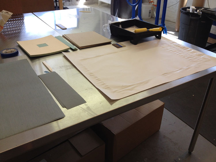
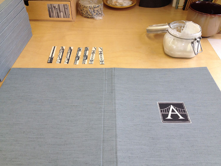
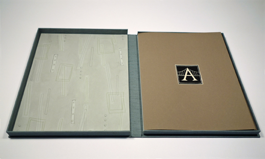
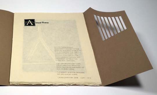
    Teaching bookbinding is one of my favorite aspects of my job as a binder and I can’t wait to reconnect with students. Each of the following workshops are designed for students at all skill levels and require very few tools and virtually no equipment (minus a punching cradle). Each workshop includes a kit of quality materials that are prepped by me and will aid you in creating beautiful bindings.

    Secret Belgian Binding – Three Ways
    4 Sessions // August 4 – 13 (Tuesday and Thursday evenings)
    6:00 – 8:30pm (EST)

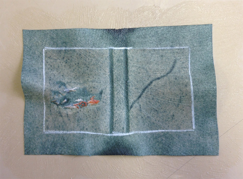
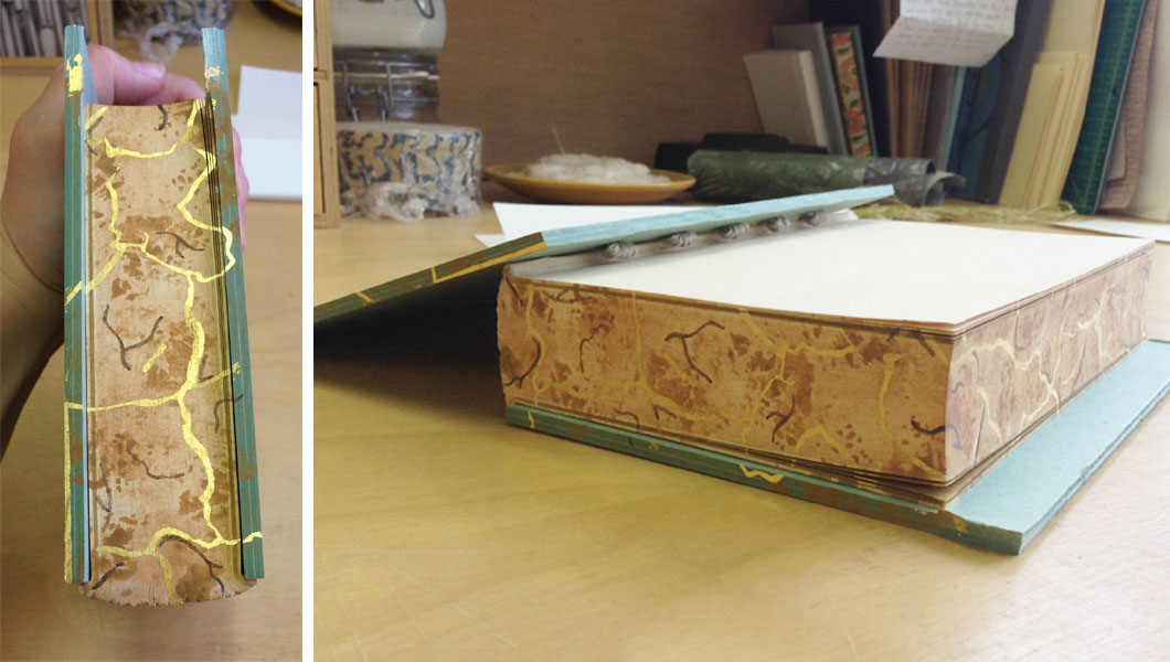
    This workshop will explore the Secret Belgian structure and ways to modify it. The binding is simple and easy to construct for any skill level. The binding opens flat and is perfect for thinner text blocks.

    During this workshop students will use techniques developed by Anne Goy to alter the traditional appearance of the structure through additional weaving and Tyvek.

    This workshop will be live instruction through Zoom. Open to students at any skill level, but please contact me if you have questions determining if this workshop is right for you.

    In order to receive material kits on time, please sign-up by July 24th. Register here.


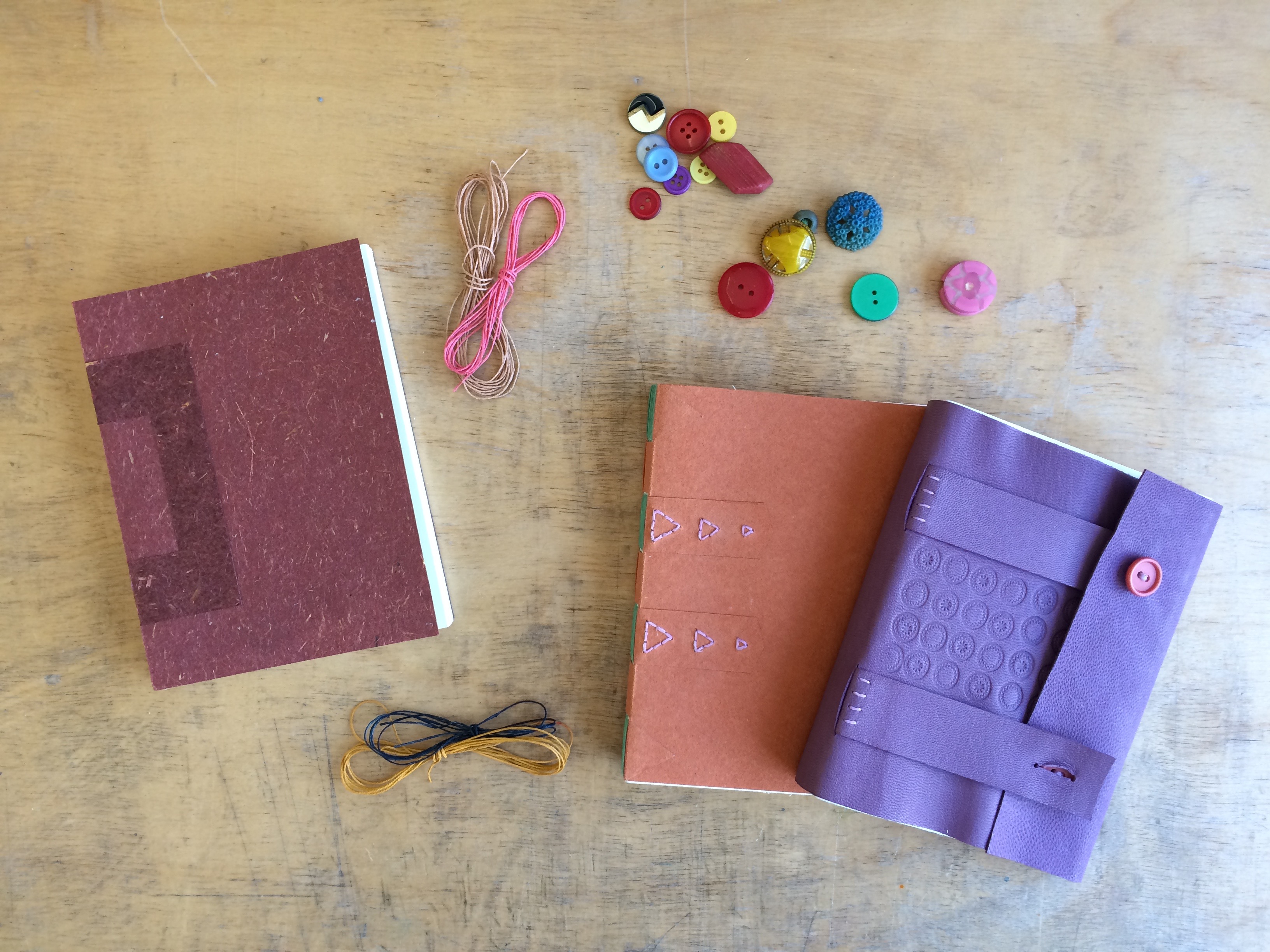
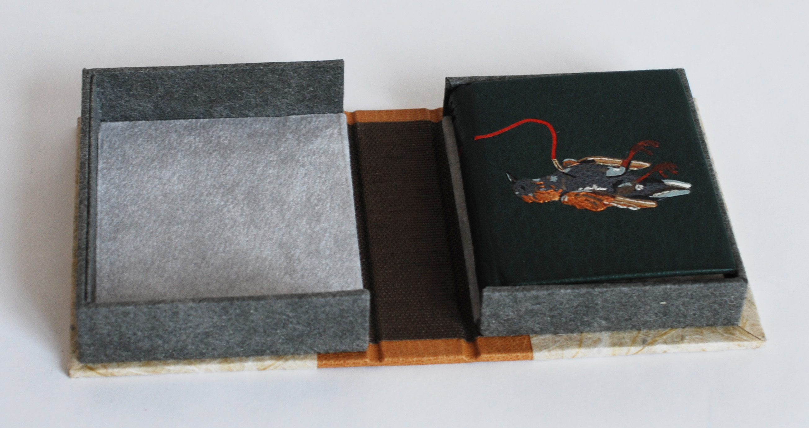
    Cross Structure Binding
    4 Sessions // August 18 – 27 (Tuesday and Thursday evenings)
    6:00 – 8:30pm (EST)

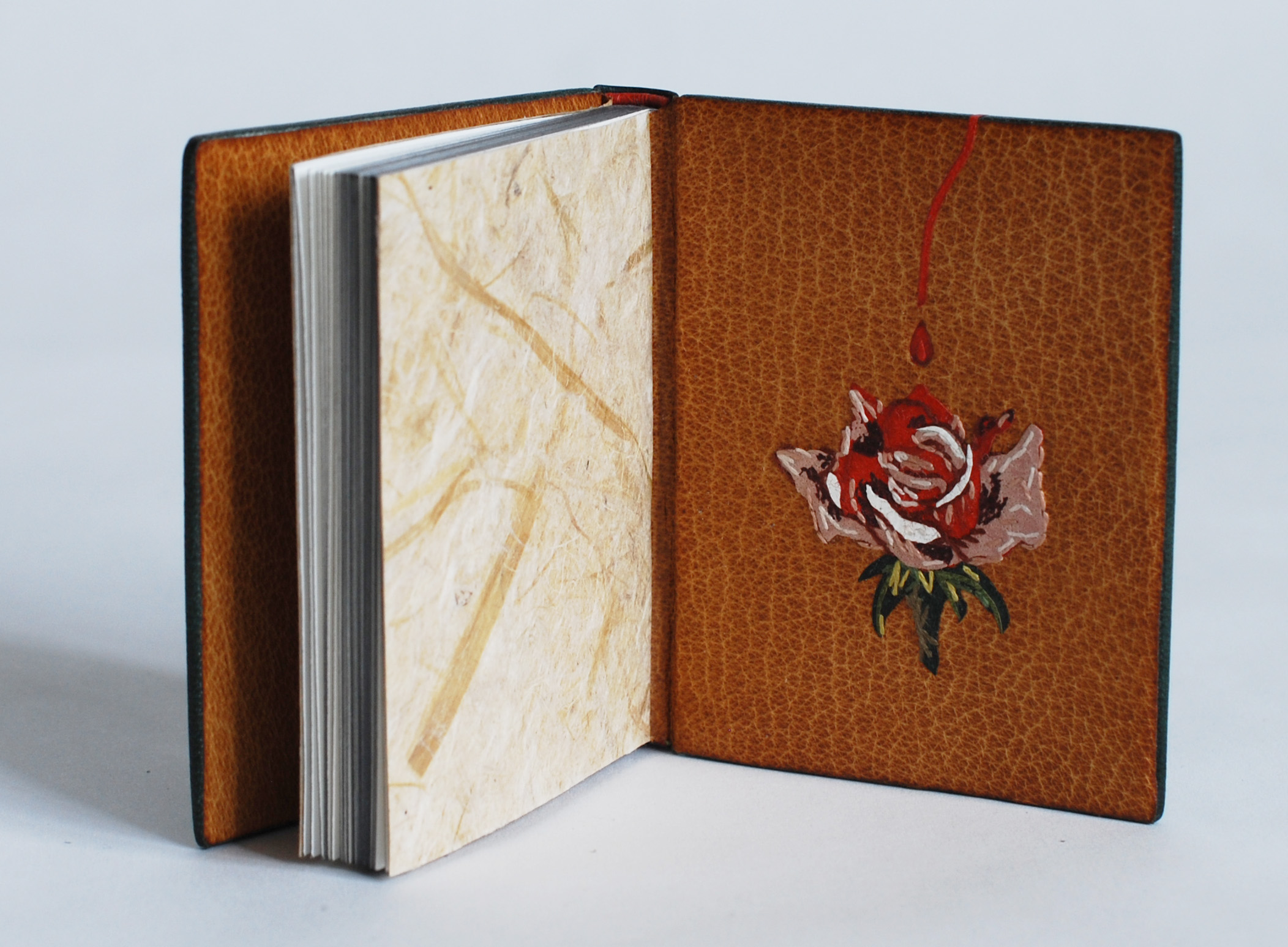
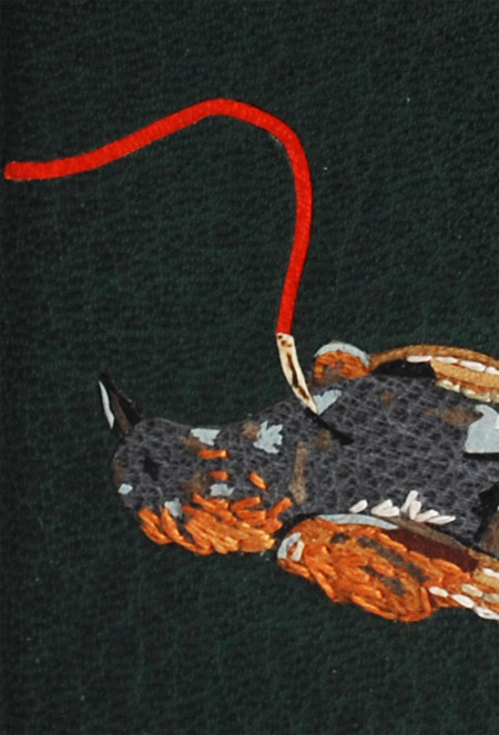
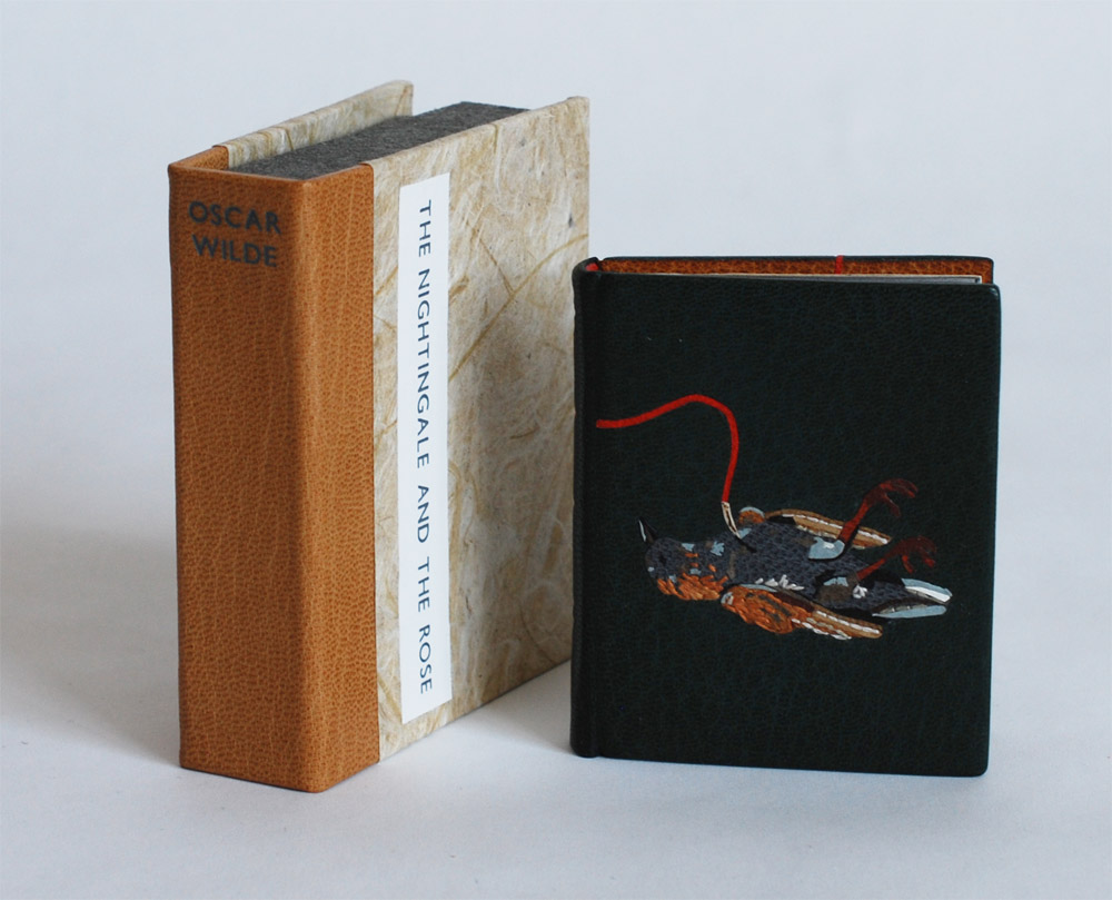
    The Cross Structure binding is a non-adhesive binding that offers much freedom to the text block. This 20th century design is greatly inspired by the Long Stitch bindings of the medieval era. It is suitable in conservation or new bindings, such as travel journals or decorative bindings. The structure is uniquely constructed by interlocking the front and back cover at the spine.

    In this workshop, students will create 4 variations of the Cross Structure binding working with both handmade paper and leather to create their models.

    This workshop will be live instruction through Zoom. Open to students at any skill level, but please contact me if you have questions determining if this workshop is right for you.

    In order to receive material kits on time, please sign-up by August 7th. Register here


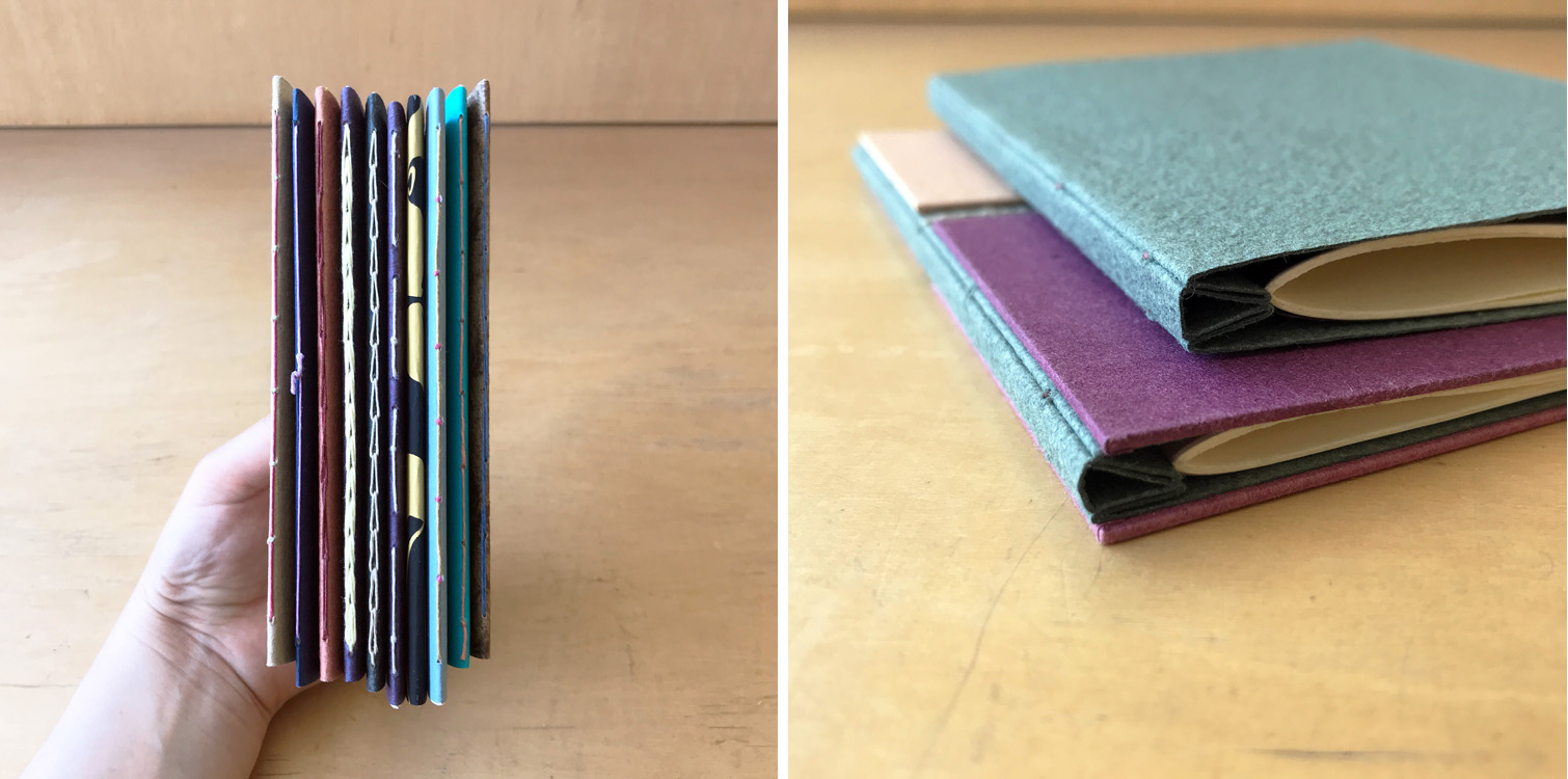
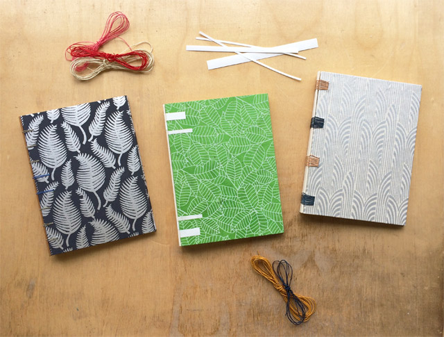
    Variations on Single Signature Bindings
    4 Sessions // September 8 – 17 (Tuesday and Thursday evenings)
    6:00 – 8:30pm (EST)

    Books come in all shapes and sizes. Some may span only a few pages, while others become a thick tome. In this workshop, we’ll explore the former as we create a multitude of models with both soft and hardcovers.

    Students will begin this workshop by making a series of simple softcover pamphlets using a variety of sewing patterns before moving on to hardcover structures. All of these structures allow the book to lay flat and are perfect for chapbooks, presentation pamphlets or short stories.

    This workshop will be live instruction through Zoom. Open to students at any skill level, but please contact me if you have questions determining if this workshop is right for you.

    In order to receive material kits on time, please sign-up by August 28th. Register here.


  2. My Hand // The Nightingale and the Rose

    February 16, 2016 by Erin Fletcher

    Nightingale1-ErinFletcher

    This binding was featured very briefly on the blog last year in my review of the North Bennet Street School’s 2015 Student and Alumni Show. After the show, I sent it off to England for the Society of Bookbinder’s International Competition. Just last week, I was finally reunited with this macabre little binding. Its presence on my bench reminded me that this binding needed a proper post documenting the steps involved in its creation.

    NightingaleAndTheRose1-ErinFletcher

    This edition of Oscar Wilde’s The Nightingale and the Rose was printed by Rebecca Press in 1985 and includes wood engravings by Alan James Robinson of Cheloniidae Press. My design for both the nightingale and the rose are drawn straight from Robinson’s engravings. The text block was sewn on two flattened cords and rounded and backed in a job backer. Which was a bit excessive for such a tiny binding, but offered me a bit a humor. In lieu of a backing hammer, I used the flat, rounded side of my bone folder to achieve the rounded shape of the spine.

    NightingaleAndTheRose2-ErinFletcher

    Once the forwarding on the book was complete, I could focus on the design. I photocopied the image of the nightingale and rose from the text; enlarging them to the desired size. These photocopies became my guide for drawing out each shape of the bird and flower. Beginning with the bird, the first onlays attached to the base leather were a silhouette of the body, the beak and feet. In order to get some depth and texture to the bird’s feet, before cutting out the two shapes I laid feathered onlays of maroon goatskin over thinned out terracotta goatskin.

    NightingaleAndTheRose3-ErinFletcher

    Although I would normally use PVA to place my onlays onto the leather, I chose to use paste because I was worried about staining the tiny pieces of leather when applying the PVA. After the the onlays went down, I pressed the skin between acrylic boards. Then I back-pared the leather. In the image below you can see the shape of the onlays on the reverse side of the leather (the change in color appears because more flesh is being pared from the areas with onlays, this creates a smooth transition from onlay to base leather on the surface.)

    NightingaleAndTheRose6-ErinFletcher

    After paring the leather, I was free to begin with the embroidery. When I embarked on this task, I had very loose plans and approached it in a very free form way. I would build up the image with embroidery and then switch to adding feathered onlays, then more embroidery until I felt satisfied with the look of the bird. You can see this progression below (please forgive the poor photography and variation in color).

    NightingaleAndTheRose7-ErinFletcherNightingaleAndTheRose8-ErinFletcher

    With the design of the bird fully assembled and embroidered, I prepped for covering. After pasting out the leather, I laid down any stray tails from the embroidery beside a stitch to hide its appearance from the front. Then I progressed with the covering, formed the endcaps, wrapped the turn-ins around the cover boards and pleated the corners. After setting the boards, I put the book to rest between a small scrap of felt in my small wooden press.

    NightingaleAndTheRose9-ErinFletcher NightingaleAndTheRose10-ErinFletcher

    Once the book had dried, I carefully opened each cover and began the steps to prep the inside for the leather doublures. The back doublure was embellished with a multi-onlay and embroidered rose. The steps involved in creating the rose mimic those used to create the bird. The tricky part here happened while back-paring. It was impossible to pare to the desire thickness for doublures without slicing through the rose onlay. So the rose is not a true back-pared onlay, it actually sits on the surface of the leather. I was worried this extra thickness might impact the neighboring flyleaf or the way the book closed, but neither became an issue.

    Nightingale2-ErinFletcher

    The Nightingale and the Rose is a tale about a nightingale who chooses to give her life so that a young man may find love. By piercing her breast into the thorn of a rose, her blood stains a white rose red. This part of the story is illustrated with a tiny wood veneer inlaid “thorn”. The red goatskin Ascona onlay runs from the top of the thorn across the spine (at the “I” in Wilde) and to the rose on the back doublure.

    NightingaleAndTheRose12-ErinFletcher

    The book is housed in a miniature quarter leather clamshell box. I used the same tan goatskin on the spine of the box which was used on the doublures. The rest of the case is covered in a paper I made using cotton and leek skins, also used for the flyleaves in the binding. The author name is stamped in matte grey foil on the spine and the title is stamped on a Mohawk label that sits in a recessed well. The trays are covered in granite colored Cave Paper.

    NightingaleAndTheRose13-ErinFletcherNightingaleAndTheRose14-ErinFletcher

    The trays are lined with a light grey Silsuede fabric. I prefer using a faux suede to line boxes for embroidered books and veneer bindings, I think it offers a bit more cushion and less chance of wear on the binding.

    I’m really proud of this little binding. My embroidered work is definitely evolving and I like the direction it took with The Nightingale and the Rose. I have a few fine bindings lined up to complete this year and I look forward to sharing their designs and techniques with you.


  3. Giveaway – Flash of the Hand Turns 3!!!

    July 11, 2015 by Erin Fletcher

    anniversay2015Flash of the Hand turns 3 today!!! I’m so grateful to my readership (that’s all of you). Your comments (both on and offline) are joyful surprises that affirm the work that I put into every post. To date I’ve conducted over 25 interviews with many wonderful bookbinders and book artist, I’ve shared my work from the bindery and just launched a newsletter! This year has been crazy busy and I’m glad to have brought you in on the journey. To celebrate I’m offering the following giveaway.

    smflatback_sagebricks

    In order to enter and win the book shown above I need you to do one of the following tasks (and then let me know about it in the comment section of this post):
    sign up for my monthly newsletter
    OR
    subscribe to the blog

    It’s that simple. If you’re already signed up for one (or both :)), then just say so in the comment section. Giveaway ends on July 31st (12:00am EST). The winner will be announced via email, so don’t forget to include it when you submit.

    Looking forward to another year of posts! Thanks everyone!


  4. Sign Up for the Monthly Newsletter

    March 9, 2015 by Erin Fletcher

    newsletter-preview


    I’m excited to announce the launch of the Herringbone Bindery newsletter. Sign up to receive an email once a month and stay informed on all the thrilling events going on. Stuff like:
    – projects from the bindery
    – upcoming posts and interviews on Flash of the Hand
    – highlights from my Etsy shop
    – workshop opportunities
    – other newsworthy tidbits

    You can subscribe to the newsletter by signing up below.


  5. My Hand // A Desert Inspired Edge for Dune

    November 6, 2014 by Erin Fletcher

    I am currently working on a first edition copy of Dune by Frank Herbert for two reasons: 1) I plan to submit it to a bookbinding competition with the hopes that it will travel around the country and 2) there is a towering stack of books from the Dune series on my husband’s bookcase and he deserves a finely bound copy of his favorite (he exhaustively quotes from) book.

    At the beginning of the design phase, I consulted with my husband for inspiration and to make sure I was capturing the spirit of this iconic science fiction novel with precision (I may have subconsciously derived some inspiration from both Lynch’s visual masterpiece and Jodorowsky’s sadly unfinished film). After finalizing my design, I began working on the binding. First step was to remove it from its trade binding and mend the signatures. After the book was re-sewn, then rounded and backed, I ploughed the edges in preparation for the edge decoration.

    DuneEdgeDecoration-ErinFletcher

    At this point in the process, I’ve already completed the decoration on the fore edge and will go through the steps to decorate the tail edge in this post. As always, I decorate the edges in the following order: fore edge, tail edge, head edge. The book is placed between two wooden finishing boards that are angled at the top in order to apply more pressure to the book’s edge.

    Before I can apply any decoration, I need to scrap and sand the edge until it has a smooth feeling and an almost sheen-like finish. I scrap the edge first with a curved scraper, then I sand the edge beginning with a course grit sandpaper and work the edge with a finer and finer grit to get that nice luster finish.

    DuneEdgeDecoration2-ErinFletcher

    The sanding phase can be an arduous task in the decoration process, but quite necessary to a successful edge. I usually sand the edge smooth, then apply my base layer of pigment, allow it to dry, then sand the edge smooth again. After the second phase of sanding, I’m ready to apply the final base layer of pigment. For the edge on Dune, I wanted to achieve the look of a cracked, dry desert ground by combining gouache and gold leaf.

    The mixture of gouache also included water and paste. I paint the mixture onto the edge, then use a sponge to thin down the color. I allow the first layer to dry a bit before applying more pigment with a sponge which offers a mottled and textured effect to the edge.

    As this layer is drying, I draw out the imagery to represent the cracks of the dry ground on some Frisket film. The cracks are going to be gilt onto the edge, the Frisket film is used to mask out the areas I don’t want to be gilt. Frisket is a great material to work with because it has a low tack and will not disturb the gouache layer underneath.

    DuneEdgeDecoration3-ErinFletcher

    In the image above you can see the mottled gouache layer through the clear Frisket film (which is also hanging over the edge of the spine). The exposed areas will be covered by gold leaf.

    in the next step, I apply a PVA wash as the size (adhesive) for the gold leaf. At first the PVA wash absorbs quickly into the edge, but eventually the PVA wash will sit on top the edge. At this point, the gold leaf can be laid down. The PVA wash acts almost like a vacuum as it sucks the gold leaf to the edge.

    Before the PVA wash is completely dry underneath, the leaf needs to be set; this can be done by carefully applying downward pressure with a piece of flannel wrapped around the squishy part of my thumb. A second layer of gold leaf is laid down using the same steps, this creates a more vibrant and fuller look to the gilding.

    DuneEdgeDecoration4-ErinFletcher

    Once the PVA wash is completely dry, I burnish the edge and remove the Frisket film. This initial burnishing of the edge is done through a protective layer of silicone release paper. After some time, when I know the edge is dry and the decoration is secure, I burnish the edge once more (this time the agate burnisher is in direct contact with the edge).

    For the final step of the decoration process, I add some accents of dark brown gouache (this mixture also included water and paste). The darker pigment is added simply with a brush in the desired areas. When I am satisfied with the decoration and the last bit of gouache is dry, I burnish the edge on last time.

    After removing the book from the press, I whack the edge against the edge of the table. This cracks open the text block, separating the pages. This step can be a bit nerve-racking, at this point any poorly attached layer can crack or flack off. Luckily my edges came out beautifully!

    DuneEdgeDecoration5-ErinFletcher

    Now on to the headbands, but not before I cap up (wrap up with a thin paper) the text block. After spending three days creating such a complex decorative edge, I want to make sure it stays safe from any scrapes or scuffs.


  6. Fort Point Arts Community Open Studios // October 17 – 19

    October 14, 2014 by Erin Fletcher

    FPAC-OpenStudios

    Come by the historic waterfront neighborhood of Fort Point for the 35th FPAC Open Studios. Stroll through the many warehouses that are home to painters, sculptors, ceramicists, jewelers, performance artists, printmakers, book artists, photographers and more. Herringbone Bindery will be participating along with Colin Urbina of Third Year Studio at 369 Congress Street on the 6th floor.

    I’ll be around to show off some of my work both completed and in progress. I will also have a selection of items for sale, all of which can be found in my Etsy shop.

    Ours is just one of the 14 buildings in the Fort Point neighborhood, as well as galleries and pop-up exhibit venues. All buildings are in easy walking distance of each other. However, there will be a free shuttle to help you get around the neighborhood.

    The event is free to the public with free parking available! You can’t beat that. For more details and directions check out the Fort Point Arts Community website.


  7. My Hand // Boxes for Laura Davidson

    September 19, 2014 by Erin Fletcher

    LauraDavidsonBoxes6-ErinFletcher

    Photo courtesy of Laura Davidson

    A while back, I had the chance to interview the artist Laura Davidson as a part of my Book Artist of the Month series. Since then, Laura and I have stayed in contact with each other, which has given me the opportunity to view some of her works in their various stages. Most recently Laura completed a set of prints illustrating various bridges across the country. These six bridges were chosen due to their close proximity to the many spaces Laura views as home. The act of crossing these bridges, Laura is filled with the anticipation of almost being home, therefore, the set of prints are aptly titled Almost Home.

    AlmostHome2-LauraDavidson

    Photo courtesy of Laura Davidson

    AlmostHome3-LauraDavidson

    Photo courtesy of Laura Davidson

    Laura presented me with the opportunity to build an edition of boxes to house the prints from her Almost Home series. I was quite elated. I’ve really enjoyed Laura’s work and was excited to be working with her. Laura knew she wanted a clamshell box, something sleek and clean. I’m came by her studio and we discussed material options and how the prints would fit in the box.

    After everything was settled and the materials were ordered, I began working on the small edition of 8 clamshell boxes. Clamshell boxes are pretty straight forward, but with Laura’s boxes I would be adding a few custom elements. First, the base of the interior tray would include some padding. The prints themselves had no discernible thickness, but Laura wanted the box to be at least ½” thick.  So the outward appearance of the box was the right height for Laura and the interior height of the tray was right for the prints.

    Once the binders board was cut and the trays were assembled, it was time to cover them. Laura chose silver Canapetta cloth for its durability and textural qualities. The color also complimented the prints and the industrial feel of bridges. To streamline the process I used a small paint roller and paint tray filled with PVA.

    LauraDavidsonBoxes7-ErinFletcherLauraDavidsonBoxes2-ErinFletcher

    The second custom element came as the material used on the lining of the trays. Laura provided me with 8 sheets of hand-drawn decorative paper. Using a combination of ink and markers, Laura’s custom lining paper pulled imagery from the prints and grabbed colors from the boxes and brown wrapper. Below is an image of one of the finished boxes showcasing the lining.

    LauraDavidsonBoxes9-ErinFletcher

    Finally, it was time to make the cases, which were also covered in silver Canapetta cloth. Before covering, however, I had to create a label well on the front cover board and the spine piece. Each of these wells would be filled with a printed label that Laura had provided me. I also used a paint roller to streamline the process of making the cases.

    LauraDavidsonBoxes3-ErinFletcherLauraDavidsonBoxes4-ErinFletcher

    The hand-printed label on the front cover is an ‘A’ both acting as the support beams of the bridge and the first letter to the title of the series. The label on the spine came from extra prints from the series. Laura artistically cut down the print to isolate some compelling and inciting imagery.

    It was quite a joy to create these boxes and to work for an artist as talented as Laura!

    LauraDavidsonBoxes5-ErinFletcher

    Photo courtesy of Laura Davidson

    LauraDavidsonBoxes8-ErinFletcher

    Photo courtesy of Laura Davidson


  8. Free Shipping at Herringbone Bindery Etsy – Celebrate National Read a Book Day

    September 5, 2014 by Erin Fletcher

    readabook-sept6blog14

    Just in time for the school year, grab yourself a new journal or notepad. Celebrate the book this weekend for National Read a Book Day at my Herringbone Bindery Etsy shop and receive free shipping on all orders of $10 or more. Just enter code: READABOOK10 at checkout. Have a wonderful and book-worthy weekend.


  9. My Hand // Recreating the Stepped Roofs of Bermuda on a Book

    August 25, 2014 by Erin Fletcher

    Bermuda3-ErinFletcher

    A client of mine presented me with a copy of Residence in Bermuda, a promotional text published by Bermuda Trade Development Board in an edition of 2,000 copies. This particular book was copy 591 and bound as a quarter cloth binding with a simple stamped label. My client wanted the book to be rebound in a more artistic binding, extracting colors and inspiration from one of the many photographs printed in the text.

    In search of inspiration I began to page through the book when I came across one image of a watercolor painting of an iconic Bermuda home. The imagery became my direction for the exterior of the binding; the exterior walls of the house were painted a sherbet pink, which popped against the white stepped roof. The vibrancy and brushstrokes of the surrounding landscape became my inspiration for the label on the spine.

    Bermuda5-ErinFletcher

    Since the binding needed to be completed in a fairly short time period and I wanted to work the boards separately, I chose to use a variant of the Bradel structure. Peter Verheyen published an article and tutorial titled Der Gebrochene Rücken: a variation of the German case binding, which was my guide throughout its construction.

    But before any binding could take place, the book had to be removed from its original case. The spine was cleaned by removing the lining and adhesive. The pages showed sign of age with some scuff marks here and there, which called for a bit of surface cleaning. The exterior folio was guarded with tissue to stabilize the paper in preparation for sewing. The original endpapers were quite beautiful and richly printed. However, they were not salvageable for the new binding, but I’ll come back to that later. So I created some new endpapers using three sheets of Canford paper in blush, plum and forest (all colors derived from my inspiration source).

    With the forwarding complete, I attached a piece of pared buffalo skin in the same sherbet pink of the house to the spine. The benefit of this particular binding allows the binder to use a specific material on the spine and another for the boards, so the cover is completed in three parts. This German-style of binding is very similar to the French simplified binding.

    While the book lay to rest, I started working on the boards (which in my opinion are what make this binding superb). In order to best represent the iconic stepped roofs of Bermuda architecture, I decided to create stepped boards. Once I had the final size of my boards, I went to work figuring out the proper dimensions of each layer. I made a single template of each layer which I used to draw out their placement on the boards. Each layer was attached with PVA and pressed. Finally, I glue out a piece of white Hahnemuhle Ingres (which was pre-dampened with a sponge), laid it over the board and put it in the press with some foam which helped sculpt the paper around each layer or step.

    Before attaching the boards, I placed the two labels on the spine which curved down around the shoulder and onto the flange which connects the boards to the binding. Using two separate leathers with matching metallic foil, I stamped the word RESIDENCE and BERMUDA in Gill Sans using a Kwikprint. The leather was then pared away to offer a rough silhouette of a brushstroke. The word IN was hand-tooled directly on the spine in palladium.

    Bermuda4-ErinFletcher

    A large book with white covers needs a box or it will never appear in such pristine condition again. The clamshell box was simply made with a cloth spine sided up with paper. The spine of the box includes a long paper label stamped in metallic pink with the title. The decorative paper label is a strip of the original endpaper. The trays are lined with a frame of Volara foam for the book to rest on, preventing it from teetering side to side.

    Bermuda-ErinFletcher Bermuda2-ErinFletcher

    My client was thrilled with the book’s transformation. He plans to present it as a wedding gift to the Governor of Bermuda’s daughter. I hope she is equally thrilled with my interpretation of her rich and colorful surroundings.


  10. Giveaway – Flash of the Hand Turns 2!!

    July 11, 2014 by Erin Fletcher

    foth-anniversary

    Flash of the Hand turns 2 today! Working on this blog has brought me close to so many wonderful and talented bookbinders and artists. The comments and compliments I receive have been so thoughtful and encouraging. To show my appreciation to all of you wonderful supporters, I’m giving away 2 mini notebooks to 2 lucky winners.

    giveaway-FotH

    To be eligible to enter, all you need to do is comment on this post saying you did the following:
    – Like Herringbone Bindery on Facebook
    – Write a comment on any post in the blog (make sure to include the link to the post you commented on)
    Subscribe to the blog

    Giveaway ends on July 18th (12:00am EST). Winners will be contacted via email, so don’t forget to include your email address.

    Thanks everyone! I’m looking forward to the next year of blogging.


  • My name is Erin Fletcher, owner and bookbinder of Herringbone Bindery in Boston. Flash of the Hand is a space where I share my process and inspirations.
    The StudioNewsletterInstagramEmail me
  • Archives