RSS Feed

Posts Tagged ‘interview’

  1. Bookbinder of the Month: Eduardo Giménez Burgos // Post Four

    January 20, 2019 by Erin Fletcher

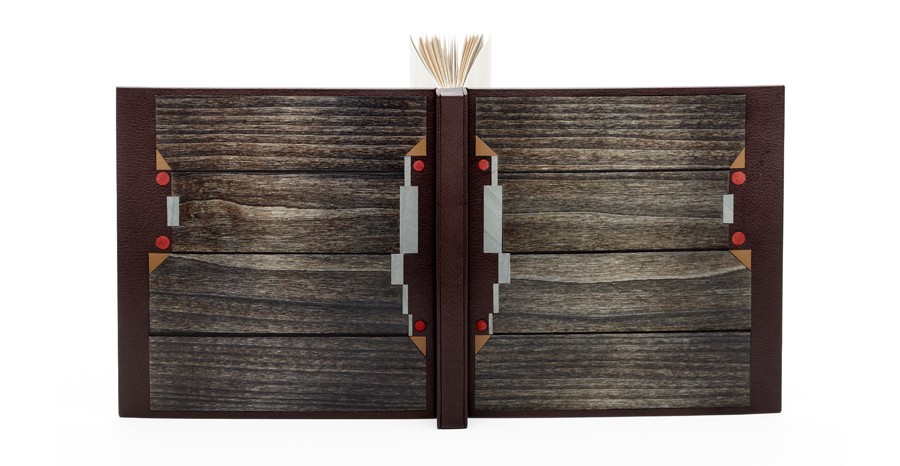
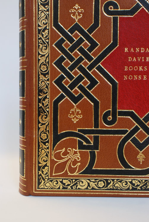
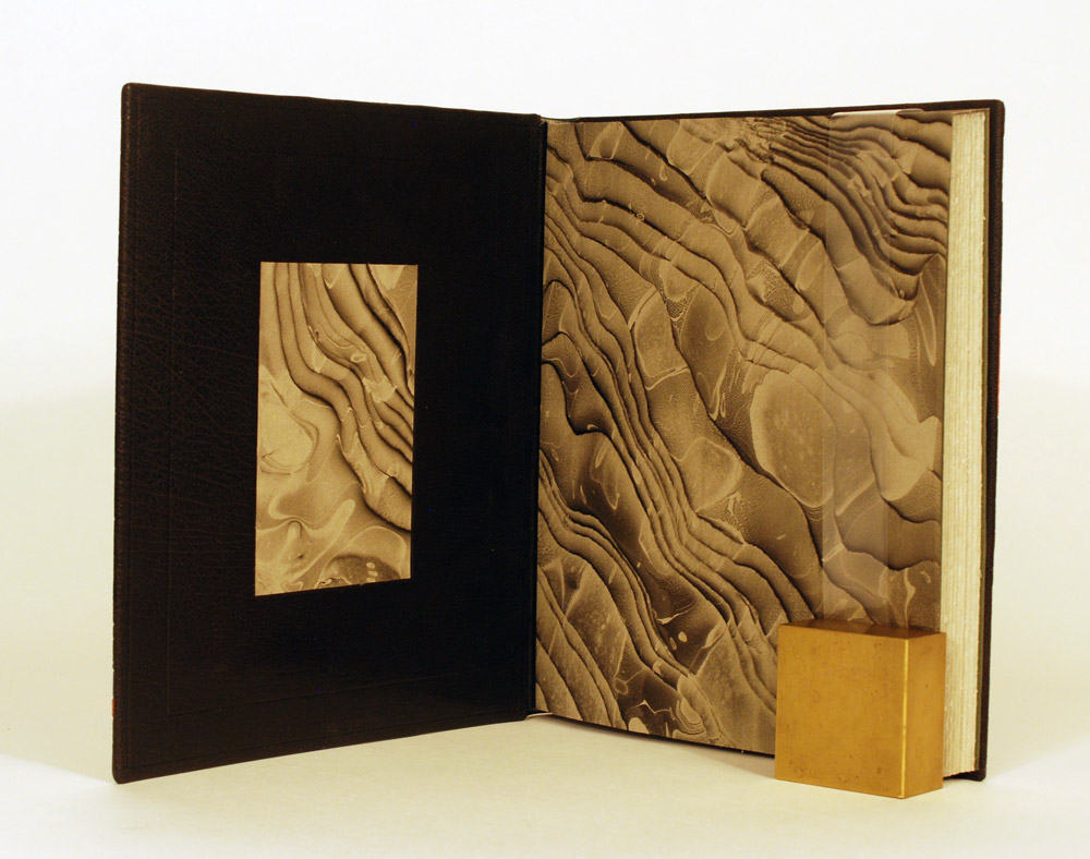
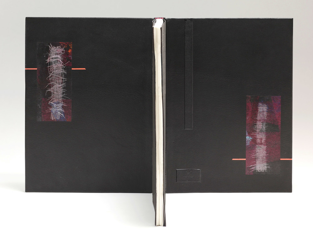
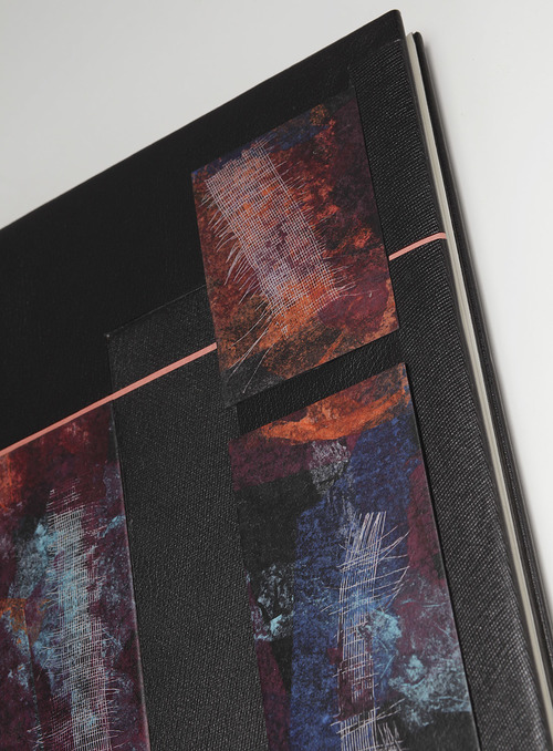
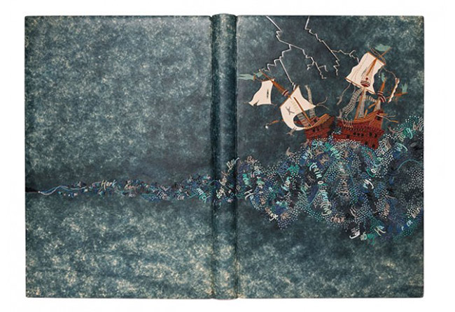
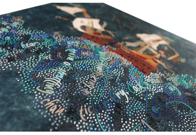
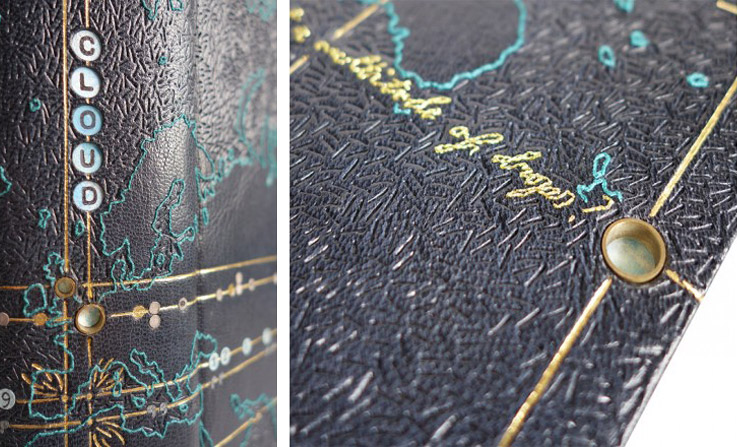
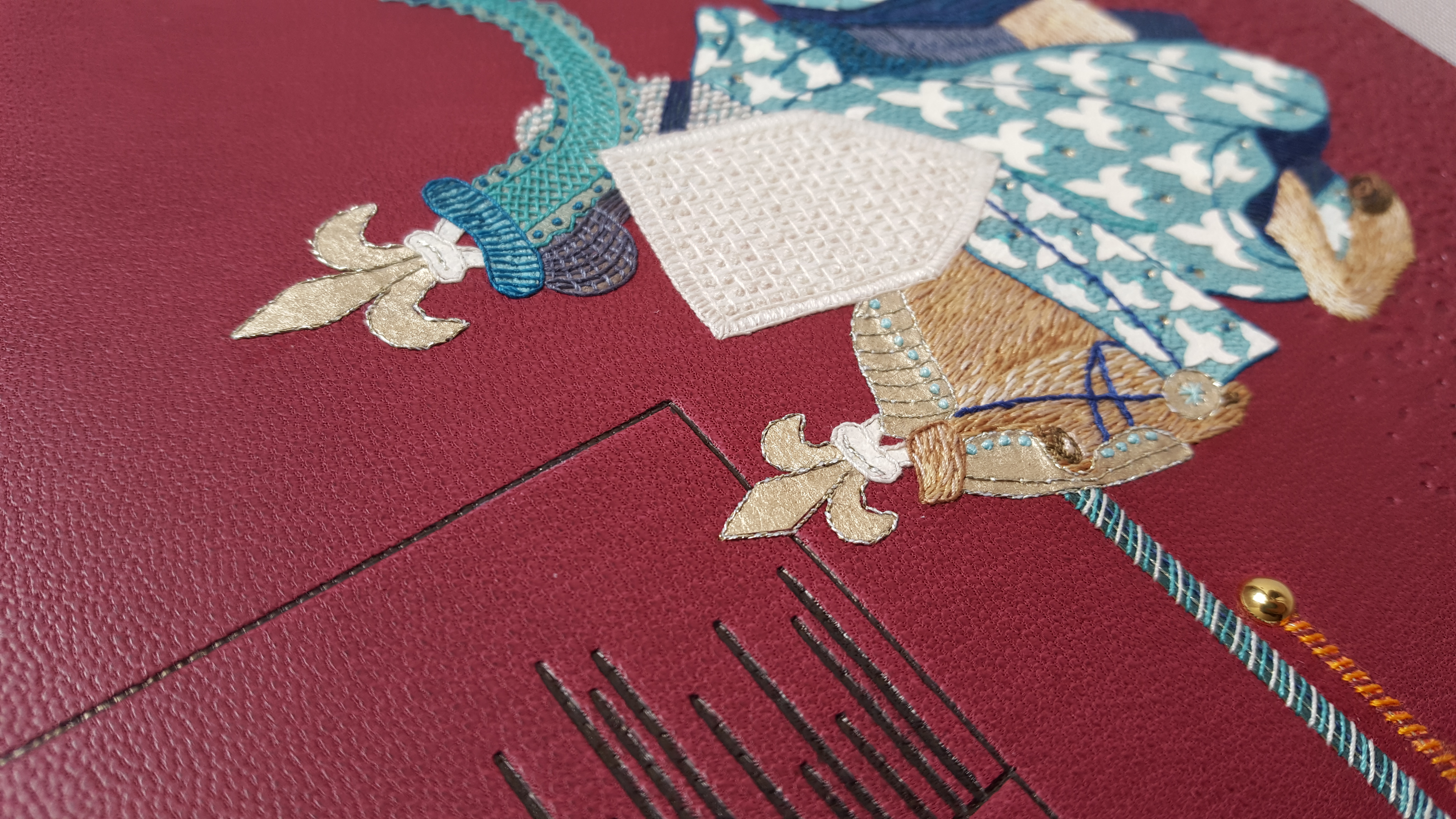
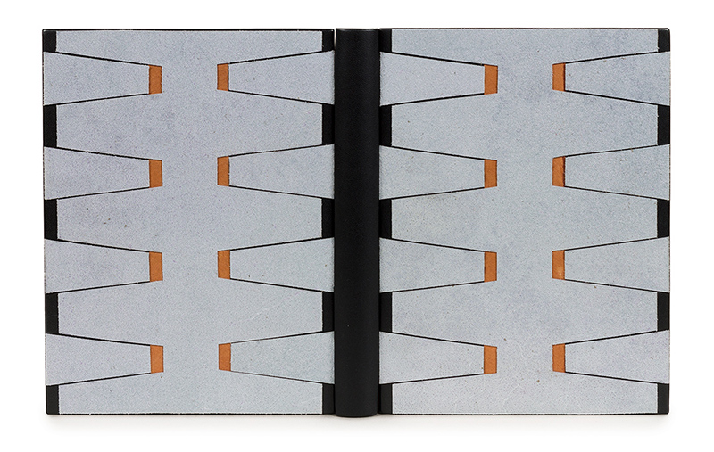
    Eduardo Giménez entered his binding of L’oeuvre de Pierre Lecuire: La Nuit into the Society of Bookbinders 2015 International Competition. It is bound in the Dorfner-style in black calfskin with pale blue suede onlays and orange paper inlays. Black and orange Nepalese paper are used for the doublures and flyleaves. Eduardo’s binding won the Harmatan Leather Award for Forwarding in the Case Binding Category.

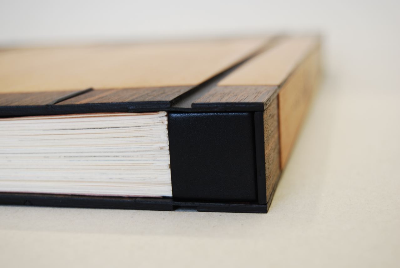
    You studied in Belguim with Edgard Claes and in this binding you employ the Dorfner structure. The description in the Society of Bookbinders catalog refers to this as a Dorfner-style case binding. I’ve had the opportunity to learn this structure as well and would love to know how you modified the structure into a case rather than attaching the boards to the sewing supports?
    Indeed, in this binding I used the Dorfner style, a leather version of the model developed by Edgard Claes for his polycarbonate bindings. In this binding, as it is usual, the black-stained parchment ribbons are glued to the recto of the covers, although they are barely visible as they are hidden by the suede onlays at the level of the spine. I think the confusion is in the definition of the term ‘case binding’. For us, case binding has a broader meaning and defines the bindings whose covers are just covered independently to join the body of the book afterwards.


  2. Bookbinder of the Month: Eduardo Giménez Burgos // Post Two

    January 6, 2019 by Erin Fletcher

    This is a binding of Los cachorros by Mario Vargas Llosa bound by Eduardo Giménez in the Oriental binding using dark brown shagreen leather. The design includes inlays of dyed wood veneers and brown calfskin, with red suede onlaid dots. Eduardo used grey Fabriano Roma paper for the endleaves.

    You often incorporate wood veneer into your designs. What draws you to use this material?
    I discovered very soon that wood and leather were working very well together. Wood veneers offer a big warmth to the covers. Each wood is different, has different grain and textures, and allows dyeing, polishing and the application of waxes or varnish, which adds a very pleasant visual and olfactory component as a whole with the skin. Nevertheless, wood is a living material and it is difficult to work with.

    You used the new Oriental binding structure for Los cachorros. This is not a structure that I am familiar with and have only seen a few other binders use. Can you talk about the structure and why it was a suitable choice for Los cachorros.
    The Oriental style binding is actually a Western version of the classical Chinese and Japanese binding. It uses hard covers and leather, contrary to its counterparts, but the form and its aesthetics are somehow preserved. I have always considered this form very beautiful. It is also a conservation binding, since the signatures are sewn on guards and they are not rounded with the hammer, neither are touched by the glue. In addition the book can be opened flat.

    side view of Don Quijote Samurai bound in the Oriental-style binding

    I think that I would not be able to give an explanation to your question of why it is a suitable choice for this book particularly. I always try that the binding is pleasant to look at. We might possibly think that an Oriental binding must only be good for an Oriental book. But, if we have adapted the structure and the materials in the Western world: why shouldn´t we also use it for a Western book?

    Eduardo bound this copy of Pablo Neruda’s Una casa en la arena with a striking design where black calfskin meets black Morocco goatskin at the center of the front cover. The central design is a collage of perfectly fitted pieces of dyed wood veneer onlaid between the two skins. This binding was awarded the Best Creative Binding for the International Bookbinding Competition of the National Library of Scotland in 2011.

    Upon first glance, the central design on Una casa en la arena acted as a distraction from the two distinct leathers. But I really love the use of both calf and goatskin on the covers. When working with wood veneer, are you treating them as inlays or onlays? I notice that on Una casa en la arena (left), the veneer sits proud of the cover, where as on Mozart (right), the veneer appears flush to the cover.
    The use of two skins of the same colour and of different texture to get a good effect was the result of experimentation. The design rests on both covers over a central axis divided by the two skins that are placed at the same level. The book by Neruda contains a few beautiful photos of his house in Isla Negra (Chile). In them it is possible to see his collection of ship wooden figureheads with their straight bearing and their rich adornments. My work with small irregular pieces of dyed wood veneer, placed in the shape of a puzzle, was trying to produce that effect.

    I work interchangeably with both options, inlays and onlays. In Mozart, I played with different levels in the mosaics, and I believe they gave a more dynamic aspect to the composition. In Una casa, I treated the wood veneer proud of the cover to form a more stylized, more linear figure. The pieces were there, on my table, I only had to give them an order. I often try to find an appropriate way of composing my materials placing instinct before reason.


  3. Bookbinder of the Month: Eduardo Giménez Burgos // Interview

    January 1, 2019 by Erin Fletcher

    Eduardo Giménez participated in the 2009 Designer Bookbinders International Competition, where binders were asked to bind a copy of A Selection of Poems on the Theme of Water. Eduardo’s binding is covered in black buffalo skin with painted acrylic silicone drops inset into the boards. Using blue leather onlays to create the title, which runs down the spine from head to tail with small red leather onlay dots separating the letters. The doublures are also black buffalo skin paired with red suede fly leaves.

    Eduardo’s binding was among other works selected as prizewinners.

    I remember being in my second year at North Bennet Street School and seeing the catalog for this exhibit. Your binding stood out as a favorite and even influenced my design for Flatland: A Romance of Many Dimensions. I would love to have you walk through the construction of the cover. How did you incorporate the painted silicone drops into the cover?
    Water was one of my first International Competitions. I worked on this book with great dedication, and the result was very positive. Feeling satisfied is not very common when I finish a book. But I did with this one and is one of my favorites. Although you might find it difficult to believe, the idea of the design comes from the image of a movie: that of HAL’s brain room, from Stanley Kubrick’s 2001: A Space Odyssey, where the core processor is stored. It is a magic place with its monitors of geometric forms and illuminated grids. My binding uses a set of colours inside a precise geometry. The transparent silicone drops are painted with acrylics on its base and inset one by one in the cover previously hollowed out with a leather hole punch by means of a paper template. When the book closes and is observed sideways from the spine, the colour disappears and transparent drops of water emerge, held on the vertical surface of the covers.

    The books of poetry are full of images that offer a bigger freedom of design for the bookbinder. Perhaps this binding is a little daring. I am really happy to know that you have liked it. Some people have told me that this is my best work, but surprisingly, I have to say that it is one of my few books that I have not sold yet…

    – – –

    With this interview, the lens is focused on Spain, with binder Eduardo Giménez. As I mentioned above I first came across his work in the DB catalog Bound for Success, since that moment his work has been on display in several other international exhibitions that have made their way to America. Eduardo’s work is sleek from his designs to use of multiple textures. Throughout the interview we discuss bookbinding in Spain and the techniques Eduardo likes to employ in his work. And since this interview is coming out on January 1st, I want to wish Eduardo a very Happy Birthday!

    Check out the interview after the jump for more about Eduardo’s training and creative process. Come back each Sunday during the month of January for more on Eduardo’s work. You can subscribe to the blog to receive email reminders, so you never miss post.

    read more >


  4. North Bennet Street School // Student & Alumni Exhibit 2018 – The Set Book

    May 8, 2018 by Erin Fletcher

    It’s that time of year again, when the next group of future bookbinders and book conservators will leave their cosy benches at North Bennet Street School and enter the next stage of their journey. And I’m happy to be back with another round of interviews with the graduating class on their set books, which will be on display during the Student & Alumni Exhibit along with work from students and alum of the other seven programs at NBSS. This year the Student & Alumni Exhibit will be on display at two locations: from May 7 – 23 at Two International Place and from June 4 – 30 at North Bennet Street School (both located in Boston). Check out the website here for more details and opening hours.

    This first post will focus on the Set Book bound be each of the seven graduating students. My next post will highlight some of my favorite alumni pieces from the show. Each student was given a copy of the same book (referred to as the set book) and asked to create a full leather design binding. The set book for this year is Randall Davies and his Books of Nonsense published by Incline Press in 2014. This edition compiles both Davies’ original Lyttel Book of Nonsense published in 1912 and Cayme Press’ production of A Little More Nonsense into one volume. Each page contains a woodcut illustration along with a charmingly inaccurate limerick written by Davies.

    The text block is printed on Wookey Hole mould-made paper which has a beautiful pale grey hue. The introduction was machine set in Garamond and the limericks were hand set in Italic. The 15th – 16th century woodcut illustrations are reproduced from Davie’s books and printed from line blocks. According to the introduction by historian Dr. Paul W. Nash, the original woodblocks were collected by Davies from London-based printers and bookbinders. During the interviews, I spoke with each binder about the inspiration behind their designs and how their chose to execute their concept.

    I was blown away by the range of styles brought forth by the students and the level of craft. Many of the designs were quite tricky to execute and certainly caused some challenges along the way, but their efforts certainly paid off.

    Rachel Jackson

    The word nonsense is the most vital part of the title and had the most influence over many of the student’s designs. In Rachel Jackson’s design, she flips the idea of nonsense to find structure. In reducing the word down to its consonants, she could focus on the orderly process of printmaking. Each letter is composed of a different material to represent each step in the printing process. The woodblock used to carve the illustrations is represented by an inset piece of bleached oak veneer. Next in line is a paper onlay followed by a hand marbled letter s, which is marbled with suminigashi ink on the suede side to represent the ink of the printing press.

    The final n is a piece of indigo Cave Paper coated with graphite inset into the board to represent lead type. The printed result is depicted in the final s. Instead of an onlay, Rachel cut out a window in the shape of an s to expose a printed page below and to invite the viewer into the book. What you see is a piece of tissue printed on both sides showing a specimen of the typeface used in the text block. The entire design sits upon a base of navy blue goatskin.

    The French double-core endbands were hand sewn in alternating bands of navy, dark grey and light grey. The head edge is gauffered in the most unique way, Rachel used this portion of the binding to place the majority of the title using Edinburgh handle letters agains the bare pages.

    In simplifying her design, Rachel creates curiosity which is only heightened by the cut-out window. Chaos and structure commingle beautifully within the five thoughtfully placed letterforms. Each hinting to something specific, but when read to together complete both the title of the book and the technique of crafting the content within the book.

    Upon graduation, Rachel will be focusing on her building her own business. You can check out more of Rachel’s binding work in addition to her calligraphy here.

    Sarah Kim

    Sarah Kim used her love of typography to help grapple with the chaos and to bring a sort of order to this senseless content. Her binding is covered in a medium blue goatskin with onlays in light blue and fair goatskin. By layering the fair goat over the light blue, Sarah creates a dimensional effect to the text. Each layer also receives its own special treatment. The gold tooled fair goat onlays contain a blind tooled line running through the center of the letter. The light blue onlays are blind tooled and are textured with blind tooled lines running at an angle. These subtle additions really added more depth and balance to the design.

    Sarah created the “of” through gouges and line palettes and sandwiched the word between two ornate tools. To anchor the design of the front cover, Sarah incorporates a commonly used design motif: the ribbon banner. A light blue tooled onlay, the banner contains the name of the author and is also complimented by two ornate tools.

    The French double-core endbands are hand sewn with strands of light blue and grey. The endbands sit over a gilt and gauffered edge. I think it was really smart for Sarah to add little touches of decoration with hand tools. In addition to the gauffered edge, the spine is also minimally tooled to help balance the overall design of the binding. When Sarah opened her binding to show me the inside, I was pleasantly surprised by the boldly patterned chiyogami paper. At once you leave the stillness of the cover to only be put on alarm before entering the text of the book.

    Sarah sought to convey her concept through the use of typography; to have the viewer read beyond the words and understand that it was communicating much more than the title of the book. When paired with the decorative paper on the inside, her concept really delivers. Her design was skillfully executed and beautifully laid out. You can follow Sarah on instagram and stay apprised of her work.

    Allie Rosenthal

    Many of the students reflected that Randall Davies’ limericks were loosely inspired by the woodcut illustrations they were meant to reflect. But every once in a while, Davies’ would incorporate a flaw from the illustration into the composition. For example, interpreting a crack as a bullet whizzing through the drawing. Allie Rosenthal found her inspiration in this and chose to incorporate the flaws and rough edges of the terra-cotta goatskin into her design. This abstract, landscape-esque design is formed by presenting the flaws in a leather skin. Putting a spotlight on the irregular coloration, tears, toggle marks from stretching the skins and flattening folds in the skin. The individual pieces were attached as back-pared onlays and laid down over hefty boards.

    The title is hand-tooled in moon gold and playfully wraps along the edge of an onlay. Allie chose the modern typeface Gill Sans for the title. Other elements of Allie’s binding include French double-core endbands hand sewn in stripes of maroon, grey and brown. The head edge is rough edge sprinkled with lemon and moon gold over a ground of Armenian boule. Prior to decorating the edge, Allie mixed up the signatures. So the final result was even more chaotic in appearance than a traditional sprinkled edge.

    The interior is covered in matching edge-to-edge doublures with gold tooling that perfectly mimics the erratic lines and tears created by the onlays on the cover. The style of tooling emulates the technique employed by Tracey Rowledge and Ivor Robinson where the impressions are laid with a stepped effect. The paste papers were created by fellow classmate, Liz McHugh. The texture of the paper compliments the terra-cotta beautifully.

    Following graduation, Allie will be starting her Von Clemm Fellowship at the Boston Athenaeum followed by the Driscoll Family Fellowship. Her fellowship will span over 15 months.

    Ned Schultz

    As mentioned in the introduction, Davies collected woodcuts dating back to the 15th and 16th century. To pay homage to this period in history, Ned Schultz created a spectacular reflection of a 16th century English-style binding. Working with a historical color palette, Ned chose a medium brown goatskin for his binding. The outer frame and knot work are achieved with several black gold tooled onlays. I imagine getting the size of the gouges just right, particularly in those small, tight turns was tricky, but Ned achieved the look flawlessly. The center is adorned with a red tooled onlay and features the title on the front cover. The spine is tooled to mark the placement of bands with black tooled onlays in the spaces between.

    Additional floral hand tools and a large fleur-di-lis were used as accents to the knot work. On the outer black frame, Ned used a decorative roll to nearly cover the entire space in gold. This perfectly symmetrical design glimmering in gold is so attractive to the eye and recreating work from this time period is quite impressive for someone so new to finishing.

    Opening to the interior of the book, the viewer can only be delighted by the patterned paper of gold diamonds against a bright red background. Ned coated the paper with vermillion before painstakingly applying each diamond (twice) through the application of heat. The endpapers work so beautifully with Ned’s cover design and harken to the Dutch Gilt papers of the 16th century.

    I am so impressed with Ned’s binding and can not express it enough. I look forward to seeing the next historical binding reproduction that comes out of his studio. Ned plans to pursue a career in conservation, but also hopes to further hone his skills in finishing.

    Jon Simeon

    Jon Simeon took the theme of chaos to heart with this binding; taking his inspiration from how Davies disregarded the illustration when writing each limerick. Jon took elements from the illustration on the title page and cropped and layered his concept into a surreal design. The base layer is dark green oasis with back-pared olive green goatskin onlays and tooled onlays in black and pink goatskin.

    Trying to decipher his actions, I asked Jon to break down his process step by step. After adhering all of the onlays, blind tooling came next. Using an ascona tool, Jon wanted to highlight the carved lines from the woodcut illustrations and did so first with the blind tooled lines and then with the gold tooled waves and swirls. The pink and black onlays are outlined and giving dimension with blind tooled lines. I love how Jon seemingly reversed a traditional image, burying the major elements behind the background.

    The title is tooled along the spine amidst a blank canvas. This break in the design was thoughtfully placed to relieve the eye. This same idea continues onto the inside of the binding. Black goatskin doublures are paired with a hand marbled paper in a moire pattern. I love how this paper evokes the movement from the front cover. Other elements of Jon’s binding include hand sewn French double-core endbands in alternating bands of green, pink and olive green. The head edge is gilt with moon gold over a graphite ground and sprinkled with palladium.

    This binding experience has really driven Jon to further focus on finishing after graduation. I can’t wait to see what Jon creates next. You can follow Jon on instagram so you don’t miss any of the amazing work he is bound to make in the future (pun intended).

    Rebecca Fisher Staley

    Rebecca Fisher Staley found the connection between the limericks and woodcut illustrations to be awkward and chaotic. To find some sense in this book of nonsense, Rebecca created an elaborately structured design for her binding. Taking inspiration from the anapestic meter, which dictates the syllabic makeup and stress pattern of a limerick, Rebecca constructed two unique grids. Each designed to represent the two opposing centuries found within the book: woodcut illustrations from the 15th-16th century and limericks from the 20th century.

    Rebecca chose a fair goatskin for the base of her design, which developed a slight pink hue over the course of the binding process. This change in the skin blends so beautifully with the rest of her chosen color palette. The grid on the front cover is sleek and modern and holds a series of small square tooled onlays in pepper red, crimson and teal. The strategic placement of color depicts the stress pattern of a limerick in addition to containing each letter of the title.

    The grid on the back board is more representative of an old English 15th century pattern. To set up this grid, Rebecca was guided by the syllable count of a limerick. The tooled crimson onlay in the center is sprinkled with moon gold to represent the chaos Rebecca found in the book and by being placed in the center of the board, the onlay physically pushes the lines of the grid closer together to create spaces of varying size. The small red dots placed just outside the inner frame are hand painted in tooled impressions. Both grids are connected across the spine in an asymmetric layout harkening back to the loose connection between woodcuts and limericks.

    The interior is covered in matching edge-to-edge doublures with a sunken panel of cherry veneer which is framed by crimson leather onlays. The hand sewn endbands are traditional French double-core wrapped with stripes of white, off-white and red.  The head edge is sprinkled directly on the gray paper in moon gold. The sheer amount of planning and reworking that was put into this design is astounding. Rebecca’s design is so striking, her color choices are spot on and I can’t wait to see what she makes next.

    Rebecca will be working to complete two commissioned artist book editions over the summer before moving back to the Los Angeles area where she plans to open a design studio with two colleagues.

    Frances Wentworth

    With Frances Wentworth’s design, she playfully arranges the title in such a way that cuts the word nonsense into two words. When the book is closed the title reads as Books of Sense. The viewer is only revealed of the true title after peering to the backside. This whimsical layout takes direct cues from the layout of the book, where the woodcut illustration sits above the italicized limerick. To create the look of a woodcut block, Frances first crafted the letterforms in 20pt. museum board pieces on a 10pt. museum board base then covered it in a medium brown goatskin. The letterforms on the front cover are rigid and angular while the typography on the back cover is more wild and playful. These are direct responses to the sharpness of the illustrations and whimsy of the limericks.

    The “blocks” are inset into the boards and framed with separate pieces of 10pt. museum board covered in the same medium brown goatskin. I love that Frances chose to emulate the woodcut block instead of the illustration. Viewing part of the text in reverse just adds to the humor and quirkiness of the design.

    The remaining portion of the title is done in back-pared onlays in various colors of goatskin. All of the design is backed by a medium grey goatskin. Frances added a French double-core endband in stripes of blue and red silk against a graphite edge on the head. Frances chose a 19th/20th century reproduction printed endpaper with blue grey Bugra endpapers.

    Although design binding isn’t what Frances sought out to do at NBSS, her concept really worked with the book. It is compelling, thoughtfully executed and sparks a bit of humor. Frances plans to pursue a career in conservation after graduation.

    That brings us to the end of the interview. I have to say again how impressed I am with the finished bindings. Everyone’s personalities and interests really shine through in their designs. Best of luck to everyone in the Class of 2018!

    SaveSave

    SaveSave

    SaveSaveSaveSave


  5. Catching up with Coleen Curry // No. 2

    January 7, 2018 by Erin Fletcher

    LOOM was published by Nawakum Press in collaboration with printmaker Richard Wagener and poet Alan Loney. After Richard began to explore the structure of a loom and the process of weaving, he approached Alan with three finished engravings. Alan was asked to respond in the form of a poem that would equally explore the beauty between connection and disconnection found in both woven work and life.

    Coleen Curry bound this copy of LOOM in 2015 in a black goatskin with inlaid pieces of manipulated leather. The interior is covered in distressed edge-to-edge leather doublures that include two additional inlaid panels of the same manipulated leather.

    The main decorative element on this binding captures the essence of Richard Wagener’s prints beautifully. Can you discuss your technique for creating these amazing distressed leather onlays?
    It was love at first sight when I laid my eyes on LOOM at the 2014 Fine Press Fair in NYC. Richard’s pristine end block maple prints are stunning and Alan Loney’s poem gently flows. I purchased a set in sheets and sat on the project for some time awaiting that design inspiration.

    Later that year, while experimenting with suede splits, I rather unsuccessfully attempted to emboss mull into the split – it stuck and I couldn’t remove it. My ahha moment, it was beautiful! This was perfect for LOOM!

    I made the colorful panels on one large piece of red by layering vivid colored papers, pressing and sanding. I then took sections of mull and carefully removed strands both vertically and horizontally until I had the shapes I desired. These were then pressed into the suede and additional layers of paper added. More sanding and pressing until I had the desired effect.

    To create the design, I cut and arranged the pieces to flow across the book, taking care to ensure the mull pieces flowed harmoniously. I embossed large sections of distorted mull into dampened black leather for a few background onlays and inlays to add texture and continuity. All the panel pieces with the exception of one, are inlaid at various levels: recessed, even, and raised. I inlaid two even panels on the edge to edge leather doublures as well. The pink leather incisions were added to weave the components together.

    The layouts of your designs have a rather organic flow to them, yet LOOM feels more hard-lined and controlled. Was your decision swayed by the nature of the materials or the subject matter of the book?
    I hadn’t thought about the book content being so controlled. The poem is very much about weaving, earth, spirituality, and movement. The typesetting although controlled and consistent, has breaks mid line for a pause and those breaks add to a weave or flow. Richard’s prints begin with a very simple weave and build into ever more complex weaves. Nawakum Press made a 15 minute video on the making of the edition that I find inspiring.

    My binding of LOOM is one of my favorite bindings and it was a hard one to let go. That said, I have another 2 sets in sheets, one of which I am working on these days.


  6. Catching up with Coleen Curry // No. 1

    January 1, 2018 by Erin Fletcher

    The first time I interviewed Coleen Curry was back in 2013. I am continuously inspired by Coleen’s work. She skillfully brings layers of color and texture to her work in new and interesting ways. So let’s start off the year feeling inspired to challenge and improve upon our own work with this updated interview with Coleen. We are starting off with Coleen’s binding of Of Woodland Pools, Spring-holes & Ditches.

    Of Woodland Pools, Spring-holes & Ditches was design and printed by Michael Russem of Kat Ran Press and includes 28 engravings by Abigail Rorer of Lone Oak Press. The prints are accompanied by selected entries from Henry David Thoreau’s journals from the months of March, April and May. These passages elegantly describe the early springtime landscape in New England. The woodland pools, spring-holes and ditches were all terms Thoreau used to describe the breeding grounds of wildlife as the fauna awoke from the winter season.

    Coleen’s binding is covered in a hand-dyed goatskin with edge-to-edge leather doublures. The design includes inlays of cat-tails and green calfskin with additional onlays of bronzy calfskin. The author and printer’s last name were hand-tooled in golf leaf. The leather doublures are distressed and paired with a leather split flyleaf. Coleen bound this copy for the Designer Bookbinders InsideOUT Exhibition in 2014.

    When I saw this binding for the first time, I felt that you had created a style that was uniquely yours. The most striking element of this binding is the hand-dyed leather. The dark veins flow across the book like water making the pieces of inlaid cat-tails and leather almost appear to float on the surface. Can you talk about the dying process for the leather and why you choose to have the accented pieces both sunken on the board and jutting outward?
    I would walk my dogs in a coastal woodland area by my home that has ponds and pools as described by Thoreau. With my tall wellingtons protecting me from the water, I would spend a few hours at various times of the day and peer down into the pools observing the multiple layers of life and plants teeming within. This murky layering was the inspiration for my design. I am deeply attracted to texture and color, and during my design process, I spend a lot of time choosing materials and found objects, mixing and matching, in an attempt to try to visually create the emotions I experience while reading a text and enjoying the art. I find stuff, constantly experiment, and keep everything. I want my designs to introduce the text by appealing to all 5 senses. This binding captured that essence and perhaps that is why you feel it is my own style.

    Working with undyed ‘fair’ goatskin, I applied several paste resists using liquid acrylics, a technique called ‘Craquele’. Thick layers of wheat paste are applied directly to the leather, allowed to dry, and then ‘cracked’ intentionally. The acrylic is then applied and is absorbed in the paste cracks; the paste is then removed. Several resists in various colors were applied to achieve depth and layers I desired. Hewits’ aniline dyes were applied to create the ruddy brown color, along with various embossing and debossing with inks.

    The leather became my water, and now I needed to create movement. First, I gold tooled dotted lines to create the glints of light that appear when sunlight hits water at certain angles. I used a special roulette, that I designed and Pascal Alivon crafted, of uneven dots that roll out crooked. Next, I added a few bright green inlays and onlays for the color of new plant life in the spring. I collected cat-tails from the ponds and dried them. After many experimentations with finishes to seal and protect the cat-tail, I settled on layers of black bison wax – a fine wood finishing wax that has an aroma of wood. To create the feeling of floating layers of intertwined cat-tail leaves, I created two inlay pieces off the book and these needed to be a variety of thicknesses to accommodate effective layering. At this point I had what Suzanne Moore and Don Glaister call ‘the eleventh hour blues’, this is when I experience the ‘my design sucks, it needs something else, it is ruined…”. And yes, this happens with almost every binding I create. At this point, I sift through all my materials and usually find that ‘one thing’ to add. For Pools it was some bronzy calf. I placed thin strips over the cat-tail leaves and inlaid only the tips so the mid portion has air.

    I’m also curious about the treatment of Thoreau and Rorer, their names appear in a sort of V-shape on the spine. It’s quite an unusual layout, does this reference the text in some way?
    The title is quite long ‘Of Woodland Pools, Spring-holes and Ditches’ – I toyed with a variety of shortened versions and settled on ‘Woodland Pools Spring-holes Ditches’ tooled in gold each on its own line meandering line on the front upper right in tiny type.

    I decided to highlight both the prominent author and artist on the spine. I enjoy incorporating letters as part of the design to add interest and intrigue. The ‘O’ in each name lines up with the cat-tails on both front and back covers and the gold letters add that glint on water and adds some continuity between the front and back covers.


  7. Catching Up With Hannah Brown // No. 4

    April 23, 2017 by Erin Fletcher

    Last year, Hannah Brown created this impeccable binding of Shakespeare’s The Tempest. Bound in full leather, Hannah first dyed the fair calf in a mottled effect, which provides the perfect stormy backdrop. The rest of the design is comprised of a variety of colored onlays, silk embroidery and blind, carbon and gold tooling.

    The endpapers have a similar mottled effect as the leather cover. Yet Hannah achieved this decoration by placing the paper over  textured surface before rolling on gold letterpress ink. The book is housed in an oak box and frosted acrylic lid.
    This might be one of the most ambitious designs you’ve created thus far. First, I’d love to know how you kept track of all those little onlays as you were working.
    I worked word by word and made sure there was no draft to blow the pieces away once they had been cut out! The key to ease of cutting was to regularly change my scalpel blade. As the words got smaller and smaller they became too tricky to pierce from leather so I embroidered them instead which gave me more control.

    Many of your bindings are done in goatskin, but The Tempest is bound in a hand-dyed calfskin. Did you find the calf to be more susceptible to scuffs during the embroidery process?
    Yes, this was my first time working with calf. I bought this skin as fair calf and it was dyed in a stippled pattern which I thought might help mask any possible scuffs that would occur during the embroidery process. I always make sample boards ahead of working on a binding so I was able to test whether this was going to be an issue ahead of working on the actual covering leather. Fortunately I had no issues with scuffing of the leather and since then have gone on to bind another binding in fair calf with even less margin for error!

    I will definitely use more calf in the future as I felt the smooth nature of the surface lent itself well to being embroidered. It was tough to back-pare and work ahead of applying the embroidery but I was very pleased with the end result.


  8. Catching Up With Hannah Brown // No. 3

    April 16, 2017 by Erin Fletcher

    Hannah Brown covered this binding of David Mitchell‘s Cloud Atlas in dark blue goatskin. An embroidered outline of a world map expands across the entire binding. To create contrast between land formations and water, Hannah blinded in a short line tool in a dense sporadic pattern.

    The longitude and latitude lines are gold-tooled and cross at six points across the map. These points are marked with brass tubing, which are inset into the boards, giving the viewer a peek of the endpapers. As you open the cover, the same longitude and latitude lines appear in gold. The background is decorated with watercolor altered by salt crystals, then painted with acrylic. The book is housed in a Rosewood box with a frosted acrylic lid patterned in the same fashion as the book.

    Lately, I’ve been thinking about the many ways a book can be exhibited. If displayed fully open, the viewer has an opportunity to collect more information on the binder’s concept. However, when parts of the book are hidden from view, how does that change the viewer’s perception of the binder’s work? When I look through your portfolio it is common to see a detailed cover paired with a custom interior that plays off your design. While working on the design are you conscious of how the different planes of the binding work as individual sides and as a whole?
    Absolutely, I love the fact that there are so many dimensions to a book, with new aspects of the design revealing themselves as you open it up – it gives a lot of scope for illustrating the content. There are so many skills required to make a successful binding, it is a three dimensional object and therefore needs to be planned and executed as such. However with that I feel you need to be a master of so many trades, especially using the variety of materials that I do on one binding paired with it’s box; a designer, a printmaker, a draughtsman, a carpenter, a juggler…the list goes on!

    I always try and make my endpapers marry in some way with the book design, whether they are just a similar colour palette or perhaps directly inspired by an illustration within the cover design, I feel it is important there is some connection between them. On a number of my previous bindings I have incorporated holes cut through the boards in the cover design so part of the endpapers can be seen. This is the case with Cloud Atlas to some degree with different diameter brass rods inset into the boards through which you can see the painted cloud endpapers. Another example of this on a larger scale was on a binding I did of, William Blake’s Watercolour Designs for the Poems of Thomas Gray where a cat was illustrated on the endpapers and also, Randall Davies and His Books of Nonsense with hexagonal viewing holes.

    In terms of the actual displaying of bindings, without mirrors or walk around cabinets it is very difficult to show all aspects of the book as a whole. When I worked as mount-maker at the V&A Museum I used to make a lot of book cradles for displaying open bindings in exhibitions. I always found it incredible that the cradles had to be made not just specific to the book, but to the actual page of the book that was to be open. They were rarely able to be reused again due to the fact that the profile of the book would change if opened on a different page.

    For Cloud Atlas in particular, how does the interior design speak to the cover?
    The design of this binding I found to be very challenging as there are so many stories and themes running through the book. The novel consists of six interconnected stories, however the main characters do not directly interact with one another but their lives are infinitely connected and affected by the actions of the others. The first five stories are broken into two parts – each being interrupted or halted at a pivotal moment. After the sixth story, which is completed in one central section, the other five stories are closed, in reverse chronological order, and each ends with the main character reading or observing the chronologically previous work in the chain. The main characters are also linked in spirit through the reoccurring image of a comet-shaped birthmark which are also depicted at crossing points on the cover.

    The cover design is based on a map of the world, the points marked by the crossing of the longitude and latitude lines are placed where each of the six stories within the book are set. Each longitude line on the cover design has an additional design element running along it to tie in with the theme of the stories as follows (from top to bottom); a train track (the character travels by train between London and Hull), stylised musical notes (the character is a composer who writes “Cloud Atlas Sextet”), typewriter letters (the character is a 1970’s journalist), troughs and peaks (the character travels across seas and over mountains), quote marks in a futuristic font (the story is based in the far future) and finally the embroidered words of the very last quote of the entire book to tie it all together, “Yet what is any ocean but a multitude of drops?”.

    As well as being able to “spy” the clouds on the endpapers through the brass rods inset into the cover, I chose to also run the longitude and latitude lines through onto the endpapers and doublures and also show quotes from each of the stories on them. The atlas of clouds in the sky ties all the stories together therefore was a key part of my design choice.


  9. Catching Up With Hannah Brown // No. 2

    April 9, 2017 by Erin Fletcher

    Randall Davies and His Books of Nonsense is bound in yellow goatskin with a hexagonal honeycomb pattern. Hannah Brown used a variety of techniques to adorn the honeycomb, which include embroidery, gold, carbon and blind tooling, leather onlays and inlays, impressions and cut-outs through the boards. There are sixteen embroidered bees made from onlaid leather and Japanese tissue. Five gold-plated brass pieces are drilled and inserted through the boards. The lino-printed and embroidered endpapers share the same honeycomb pattern.

    The embroidered bees are quite captivating on this binding. What I particularly love about them is your use of Japanese tissue. I’ve not considered using paper as an onlay for embroidery. Did you find that the paper reacted differently to the embroidery? Have you used paper under embroidery on other bindings?
    This was the first binding on which I used Japanese tissue as an onlay. My main concern before doing it was that the glue would show through and/or appear patchy on the surface. I did some tests and I managed to avoid this by wetting the tissue slightly during application in order to draw the adhesive through the paper evenly. When it dried the appearance was as I had hoped – it gave me the colour and delicate texture I wanted for the wings.

    The paper was less forgiving than a leather onlay for the embroidery as it was more apparent if I pricked a hole in the wrong place! By applying the stitches the way I did to the wings the thread is protecting the paper as I it would be more susceptible to getting damaged if it were on the book without this surround.

    I have used Japanese paper since for onlays but not in the same way. I have used it as a backing for gold leaf, adhering the gold leaf to it in and cutting out shapes order to create gold onlays. I have been using this for my most recent binding commission, The Noble Knight Paris and Fair Vienne, as it is a good way of getting around not having the right shape of finishing tool for all of the gold elements I want to include on the binding.


  10. Catching Up With Hannah Brown // No. 1

    April 2, 2017 by Erin Fletcher

    The first interview on the blog was conducted back in February 2013 with the very talented Hannah Brown. Over the past four years, her work has really matured in both design and technique. So over the course of April, I’ll be catching up with Hannah by featuring work made over the past four years. Let’s start with one of my favorites, bound in 2014 is Hannah’s copy of Truman Capote’s Breakfast at Tiffany’s.

    Bound in dark blue goatskin with a variety of leather onlays in grey, black, brown, green, blue, cream and orange. The design is then amplified through the use of machine and hand embroidery, as well as areas that are sanded and painted with acrylics. Texture has been added to the binding through the use of blind and gold tooling. Hannah received the Mansfield Medal for Best Book in Competition in the 2014 Designer Bookbinders Annual Competition.

    The design on the binding for Breakfast at Tiffany’s combines a range of techniques that include machine and hand embroidery, painting, onlay work and tooling. I would love for you to speak about working through such a complex design. Are you planning each stitch and every painted element beforehand or are you working in a spontaneous way?
    For every binding I do I make a sample board of a small section of the design. I have done this since my very first binding and now have a extensive physical archive of all my books to date. I started making these sample boards for a few reasons, mainly it was to test out colours, but given I now have quite a collection they are an invaluable aid for teaching purposes and for showing to clients.

    The sample board tends to be the spontaneous part of my working process as I use it to test out colours and stitches ahead of working on the binding itself. I certainly don’t plan every stitch but do try and work methodically through the design when it comes to the embroidery work, executing the outlines first before filling in the gaps with more intricate embroidery.

    With Breakfast at Tiffany’s I worked through the same method as with all of my bindings. The onlays had to be applied first so the leather could be back-pared ahead of the embroidery. The next step was brushing on the paints and the whole thing was then brought to life with the needlework by adding the outlines, adding tonal colours and securing down the onlays with stitches. I have different tracing paper templates for each stage of the process to ensure everything gets put in the correct place. The last thing is the tooling as of course this is done once the leather is on the book.

    I am not a huge fan of drawing people so for this particular binding I thought a good way around this was by just depicting the legs. Because this book was for the Designer Bookbinders Annual Competition I was working to a tight deadline therefore I incorporated a lot of machine embroidery for the outlines of the legs first (for speed) and then hand-whipped these stitches afterwards. I was very happy with this method for this particular binding as I was able to put the cover design together more speedily.


  • My name is Erin Fletcher, owner and bookbinder of Herringbone Bindery in Boston. Flash of the Hand is a space where I share my process and inspirations.
    The StudioNewsletterInstagramEmail me
  • Archives