RSS Feed

Posts Tagged ‘tracey rowledge’

  1. My Trip to Codex

    February 26, 2017 by Erin Fletcher

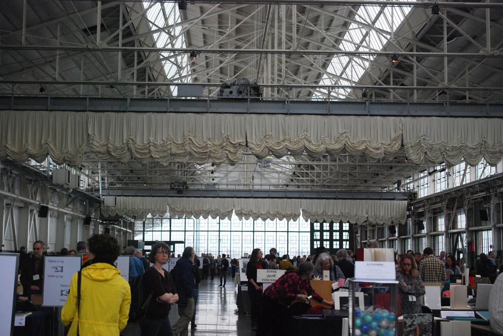
    At the beginning of February, I flew to San Francisco to attend the Codex Book Fair for the first time. The Codex Foundation was formed in 2005 by fine press printer, Peter Rutledge Koch and paper conservator, Susan Filter. Since 2007, the Codex Book Fair and Symposium has run biennially, growing from 120 exhibitors in its first year to 220 in 2017. The venue has also been upgraded to the Craneway Pavilion (once known as the Ford Assembly Plant) to accommodate this ever growing event. The Symposium runs in conjunction with the fair and features keynote speakers within the field of artist books.

    The fair itself runs for four days, unfortunately I only had a chance to be there for the final two days. Needless to say, there was so much to see and so many people to chat with that I was unable to make it all the way through. If you are planning to attend in the future, give yourself four full days. You’re going to need it.

    This year, Codex hosted exhibitors from 26 different countries, who were there to showcase their artist books and fine press editions. In addition, various institutions that offer courses and programs in bookbinding and book arts were displaying work from current students and alumni. A handful of vendors could be spotted amongst the tables selling beautiful handmade papers and tools, plus leather and other binding materials.

    I had a really great time and would recommend making the trip if you are at all interested in bookbinding, book arts and printmaking. It will certainly open your eyes up to the vast levels of skill and creativity amongst our field. Below are some of the highlights from my visit to Codex.

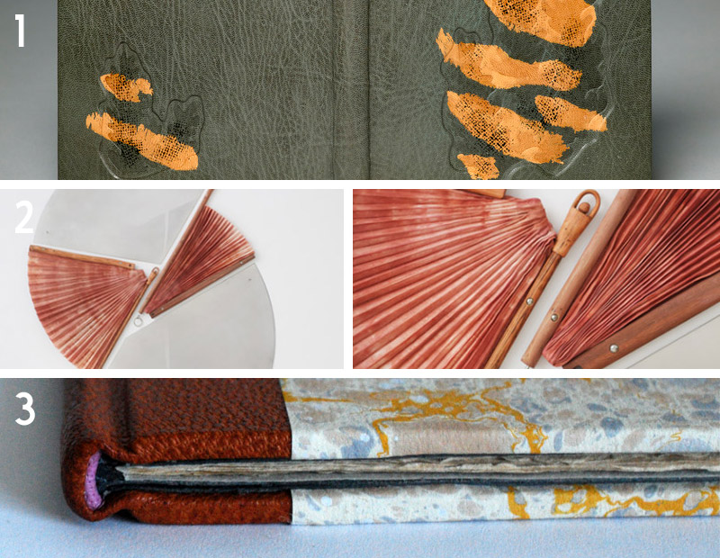
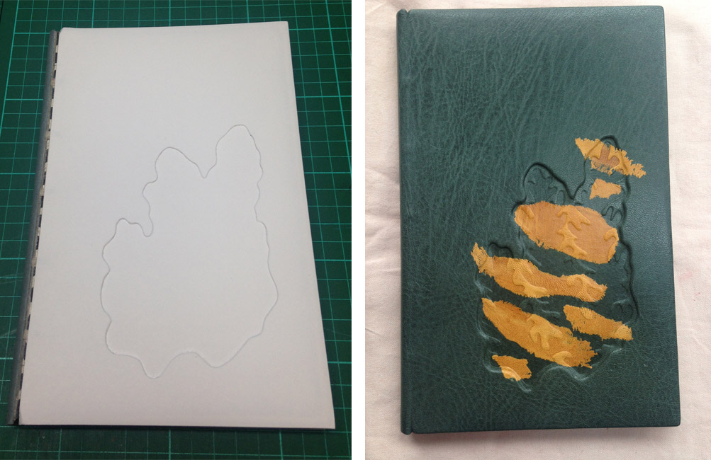
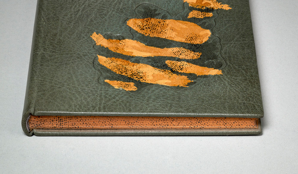
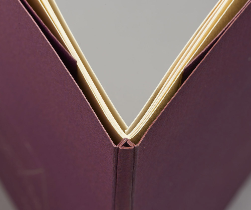
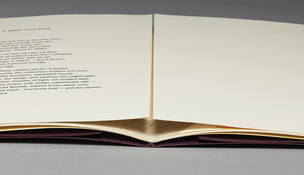
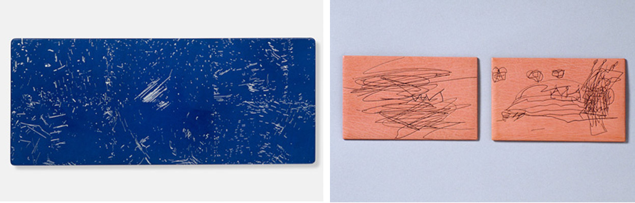
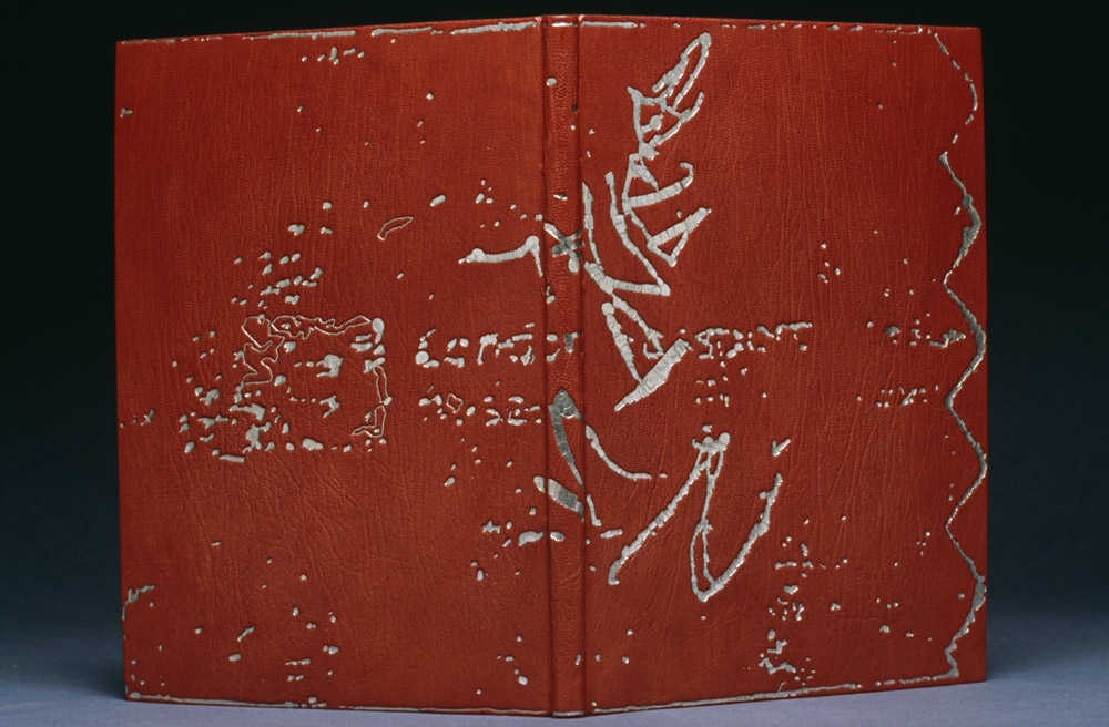
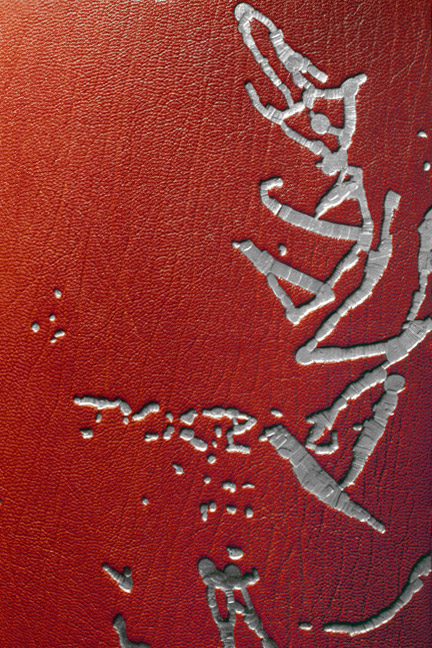
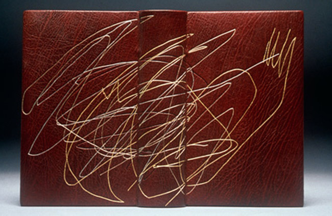
    One of the first things to catch my eye were three bindings by Jonathan Tremblay. His work is so flawless and it was great to get the chance to handle these bindings and chat with Jonathan about his work. The best part of the raised inlay shown on the binding above, is that Jonathan hand-painted the exposed suede edges in a grain-like pattern so that it would blend in seamlessly. A truly amazing detail. Jonathan’s work was on display at A. Piroir Studio-Gallery, a fine press based out of Montréal.

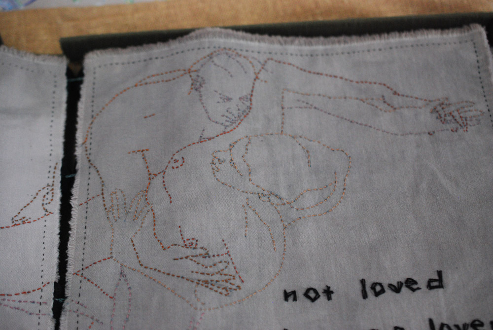
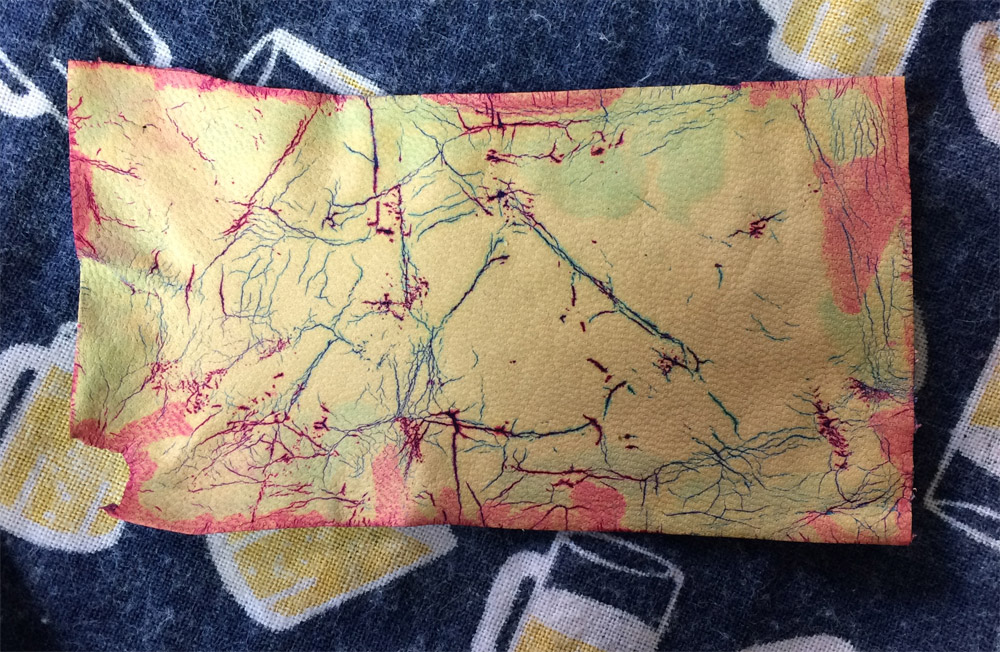
    This lovely cloth book bound around brown thorns and embroidered with erotic images was constructed by Lois Morrison. Her work Leah, interprets an excerpt from the Old Testament. Lois’ illustrations are so expressive, her initial sketch in light blue pencil is still visible under the stitches (a detail that I just loved).

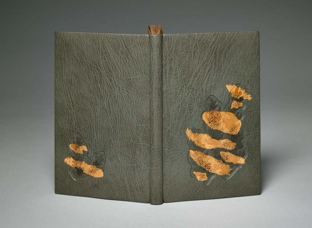
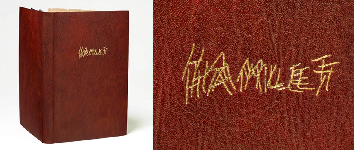
    Coleen Curry discussed a recent binding she completed for Nawakum Press. Her work is so textural and this piece was no exception. Combining a Pergamena grey goatskin with onlays of shark and sanded alligator skin. Really beautiful work.

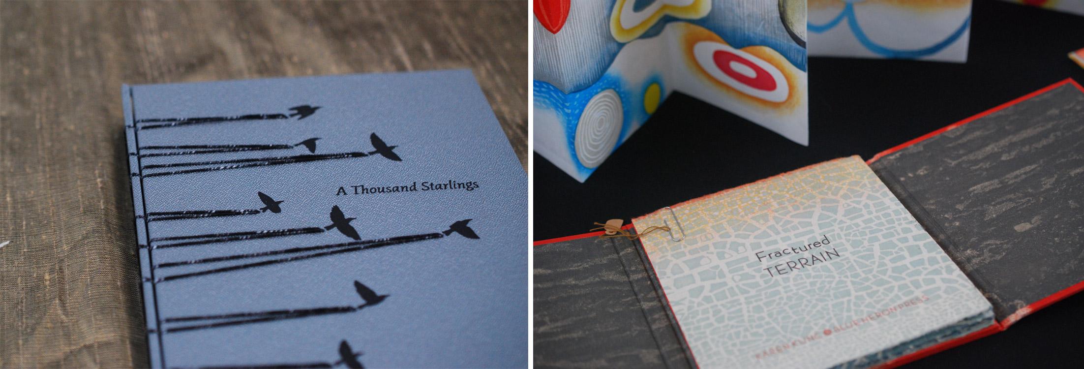
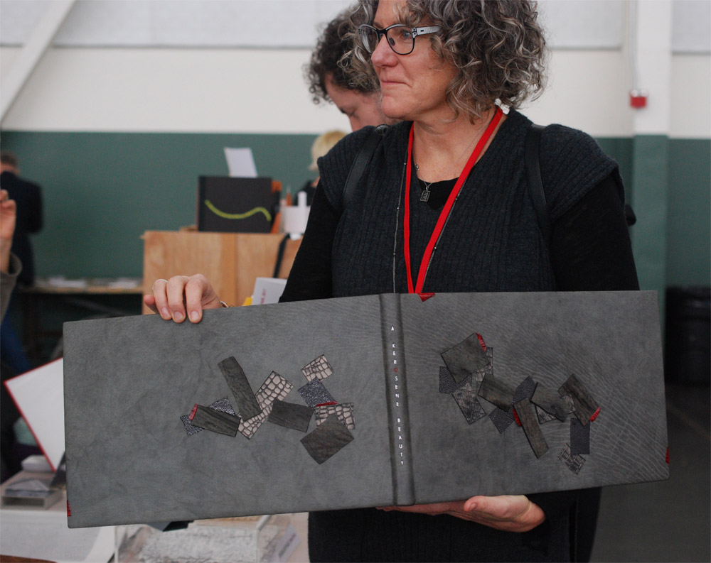
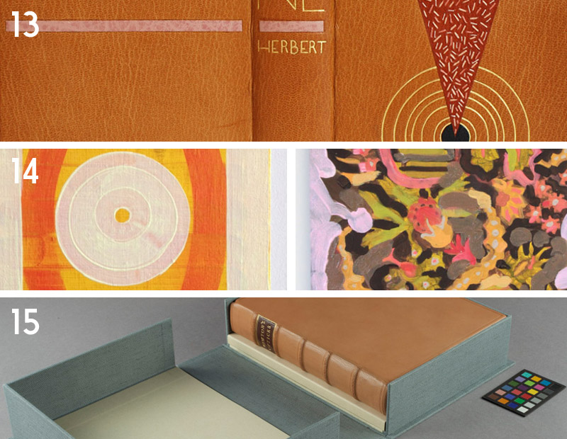
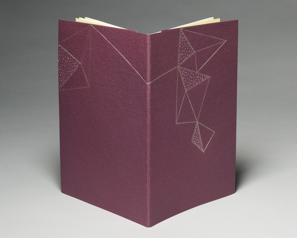
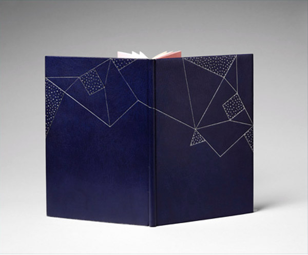
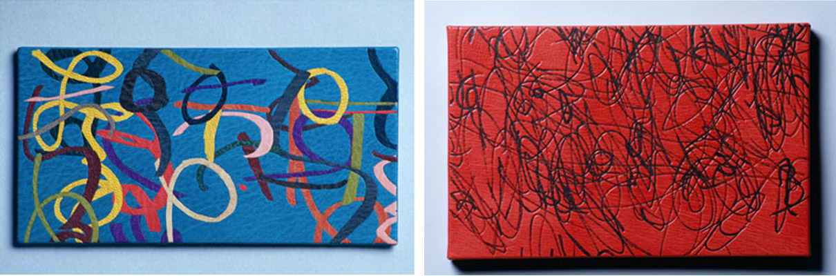
    The book on the left is by Rhiannon Alpers and is such a creative and lovely way of utilizing the structure of the Secret Belgian binding. She was a delight to chat with and see her work in person. The work on the right is by the phenomenal printer and book artist Karen Kunc. Karen is from my home state of Nebraska, where she runs Constellation Studios. It was great to catch some insight on how this art form is being received in the midwest, particularly in an area that lacks exposure to book arts.

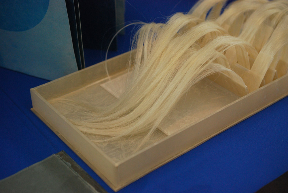
    Vellicate by Karen Hardy includes human hair and this amazing translucent clamshell box. She went through the book arts and printmaking MFA Program at The University of the Arts in Philadelphia and is currently living in Asheville, North Carolina.

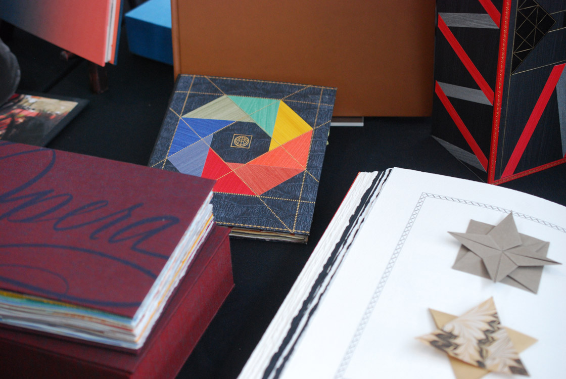
    A small selection from Vamp & Tramp Booksellers.

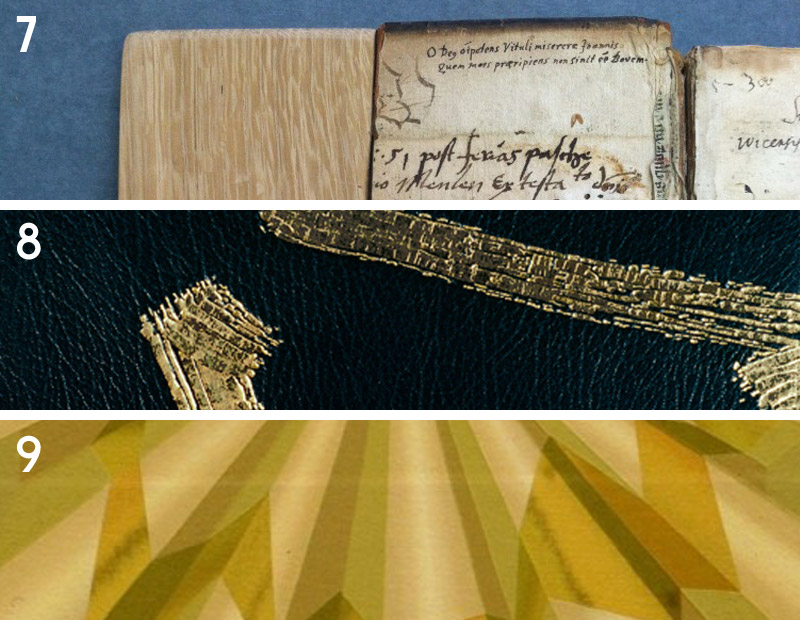
    This binding by Sol Rébora was one of many delightful finds at her table. It was so wonderful to meet Sol in person since interviewing her for the blog back in 2014. The delicate precision of her work is inspiring and Sol was kind enough to speak about the many details of her work.

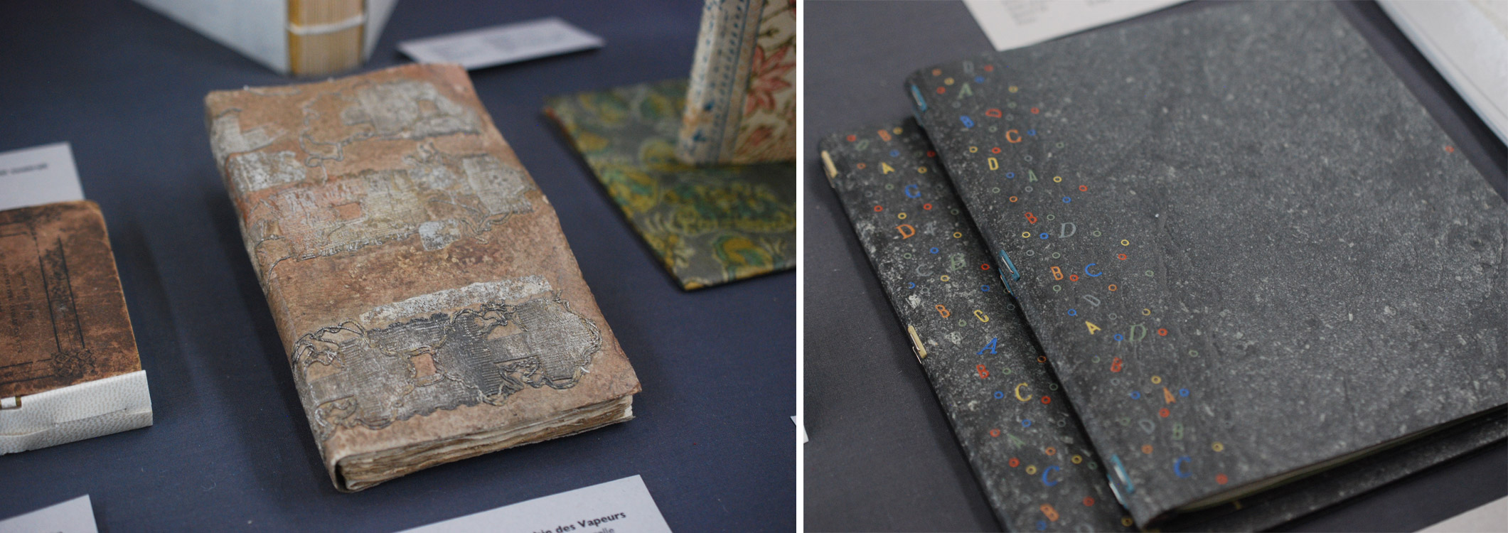
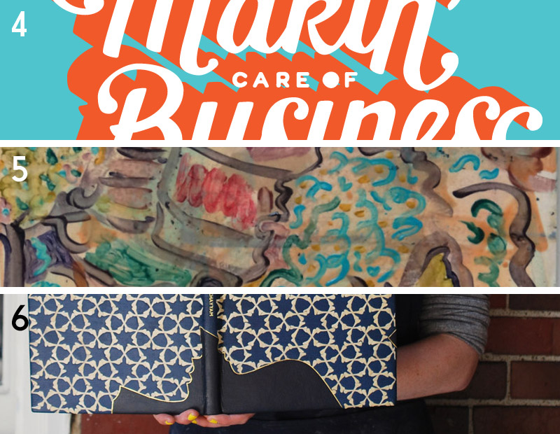
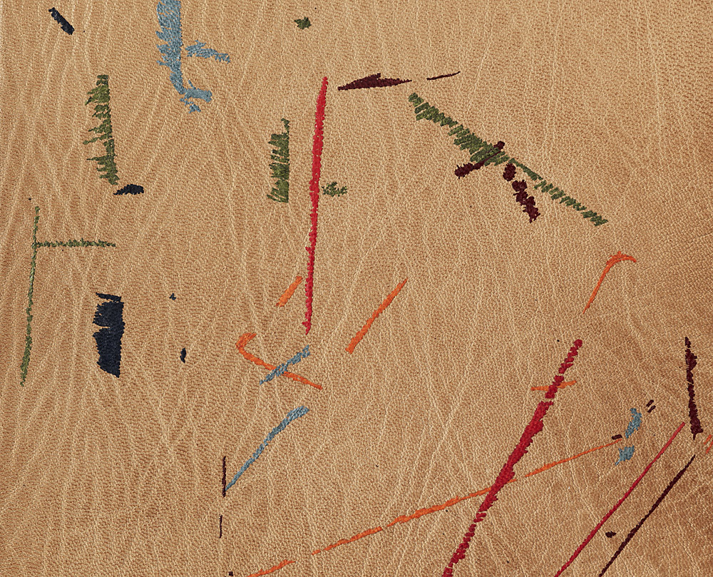
    Towards the end of the final day, I made a quick stop at Tomorrow’s Past to say hello to Tracey Rowledge and Kathy Abbott. Above are two fine examples from their table. The two bindings on the right are stone veneer staple bindings bound by Sün Evrard.

    Well that’s just a small sample of the things I saw during my trip to Codex. As I mentioned before, it’s definitely worth making the trip. You’ll leave feeling inspired and emboldened to make work, plus you might walk away with an armful of goodies.


  2. Studying in London with Mark and Tracey

    January 8, 2017 by Erin Fletcher

    At the beginning of November, I spent two and a half weeks living under the gloomy, grey skies of London. But having lived in Boston for the past six years, I felt quite at home with the overcast days and long train rides. After getting settled in my flat just outside of Tufnell Park, I spent my first day wandering around the Victoria and Albert Museum. An exhibit on Medieval English embroidery occupied most of my time during the visit. The exhibit surveyed religious garments and coverings dating from the 13th – 15th centuries. The quality of the stitchwort was breathtakingly beautiful and in such immaculate condition for their age.

    right: Panel depicting the Tree of Jesse (1310-20)

    right: The Clare Chasuble (1272-94)

    After my jaunt at the V&A (plus a quick bite at the cafe), I wandered around Soho, popping into a few shops before ending up at Mother Mash for dinner (so delicious and highly recommended). But let me get to the real reason why you are reading this post.

    DAY ONE
    The next day I traveled from my flat in Tufnell Park to Barnes for the first of nine days with Mark Cockram. I arrived promptly at 10:00 in the morning, not a minute too early or too late (as were the rules). On the first day, we focused on paring with a Schärffix (which I did standing up, a bit unusual for me) and using a French paring knife. All of the pared leather was used to create “swiss rolls”, which is a term used by Mark to describe this technique but has also been described by Philip Smith as “maril”. Mark also shared reverse cellulose printing with me, which is the process of transferring a printed image onto leather.

    DAY TWO
    On the second day, I continued to play with my creations from the previous day. I took the shavings from the swiss rolls and created an assemblage. I took my printed leather and pared it down in preparation for board attachment using Mark’s method of edge paring. The day’s final demonstration centered on laying down leather corners using a nifty tool called a tensai. The tensai is shown in the image below on the right and is used to mark the leather before trimming. Its name translates from the Japanese word for genius. And I certainly felt quite like one with this technique for finishing off corners.

    DAY THREE
    Today was the beginning of leather dying, starting with the craquelle technique (see more in Day Four). While waiting for the thick layer of paste to dry before the dye could be applied, I began working on a technique that was unnamed at the beginning of the demonstration but was eventually dubbed “dicated surface” (this name was randomly chosen from the dictionary by Mark, but is in fact the second half of a hyphenated word). This technique is implemented by creating multiple layers of leather. These layers are then manipulated in a variety of ways to alter the aesthetic and texture of the surface. After feeling satisfied with its look, I distorted the plaquette further by cutting it down into square tiles.

    By Mark’s encouragement, I continued to play with the aesthetic of the tiles by using embroidery floss to enhance the texture more. I took three of the embroidered tiles and pasted them to a piece of fair goatskin. After back-paring by hand, I continued to tinker with the design by adding additional embroidery around the tiles. I continued to work on this piece throughout my time at Mark’s studio (below is the piece in progress, I have yet to finish it).

    DAY FOUR & FIVE & SIX
    Over the next few days, the focus was primarily on dye techniques with free time to collage multiple techniques onto one plaquette. I was able to finish my craquelle sample piece, which dried on Mark’s lovely tea towel patterned with steins.

    The next sample piece I created was unevenly dabbed with orange leather dye before being pressed with a leaf. The impression created by the leaf was then highlighted with gold leaf and palladium at the midrib (main vein). In the area around the leaf, Mark had me test out Sunago, the Japanese term used to describe sprinkling with leaf.

    I continued to manipulate the plaquette by employing different types of black line work using carbon paper, acrylic paint, ink and foils. The tool also changed depending on the look I wanted; I used a variety of pens, small brushes, PVA, brass finishing tools and a heat spatula.

    DAY SEVEN
    Even more dye techniques were demonstrated to me on day seven, at this stage the dye was mostly painted on with cotton swabs, toothpicks and brushes. But the most interesting type of dye application was flottage (simply put: marbling). I played around with different colors and ways of dropping the dye into the bath.

    Below is my personal favorite. One the final days I tooled some of my dyed pieces with brass tools that I made using quick tooling making techniques. You can see the tool in progress in the image below on the left. Mark also had me make a capital letter G, which was quite difficult. If you don’t believe me, then try it yourself.

    DAY EIGHT & NINE:
    The last two days were focused on tooling the various plaquettes I had. I played around with different applications of size and the order of when I made the impressions.

    The final technique we reviewed was Sunago on paper. I continued to play with dyeing and the sunago technique on the piece of leather that I printed on the very first day. Here’s where that experimentation went:

    After a few days off, I got on a bus that took me across London to Tracey Rowledge‘s studio just west of Regent’s Park. I spent two days with Tracey, learning her technique for tooling. A unique style she learned from Ivor Robinson. I chose to learn how to employ this technique on paper rather than leather. Below are some of my favorite examples from the collection of pieces Tracey laid out for me to view.

    DAY ONE
    Working with a simple swirl design, Tracey walked me through her process. We discussed laying out a design, choosing the right tools to build up the design (which may require making custom tools) then transferring the design to the plaquette. We blind tooled the design through a lightweight handmade paper before painting the impressions with glaire. Tracey pushed me to focus on my posture, making sure I approached the plaquette with accurate precision to place the tool in the right impression.

    Below is an image of how the bench was set up to streamline the tooling process (at this point the plaquette has been blind tooled and painted with glaire and my leaf of gold has been cut into very small square pieces). I continued to work on this design the entire day, taking snack and water breaks from time to time.

    DAY TWO
    On my final day, I continued to perfect my posture and technique under Tracey’s guidance. In addition to the initial plaquette, I also brought a variety of handmade papers from home that I began to play around with by testing direct tooling (seeing how the glaire would alter the appearance of the paper) versus blinding first. We also got into carbon tooling (direct versus blinding first).

    Here are the selection of papers I brought from home (and one that Tracey gave me). From left to right in the top row: Wheatstraw (black) from Hook Pottery Paper and paper from Katie MacGregor. From left to right in the bottom row: Indigo Day Cave Paper, Zaansch Bord (redbrown) from De Schoolmeester and Bugra.

    My time in London was unforgettable, Mark and Tracey are incredible tutors. There was such a stark contrast to their styles of instruction, but each were able to push and challenge me in a way that enhanced my understanding of these techniques (some familiar and some new). I am so grateful to Mark’s pushback every time I asked a question, he has instilled within me the drive to experiment more and not to play it safe with my designs. But I am also grateful to Tracey’s controlled and thoughtful way of working, she taught me how to feel the motion of tooling within my entire body and to work in a meditative way. I left feeling beholden to Mark and Tracey, I hope for the opportunity to study with them again in the future.


  3. Best of 2015

    December 31, 2015 by Erin Fletcher

    Wow, this has been a busy, busy year and I can’t believe that 2015 is coming to end. I want to extend my gratitude to the people who have helped contribute to the blog this year:

    Interviews:
    – Kathy Abbott
    – Ben Elbel
    – Tini Miura
    – Tracey Rowledge
    – Natalie Stopka
    Conservation Conversations Contributors:
    – Marianna Brotherton
    – Henry Hébert
    – Becky Koch
    – Athena Moore
    – Jacqueline Scott

    I also want to thank everyone who reads the blog, subscribes to the blog and newsletter and to those who’ve left comments. It has really warmed my heart to see the growth of interest and recognition that the blog has receive over the course of the year.

    At this time I like to reflect on my year. Herringbone Bindery saw a nice shift in workflow this year. As I removed conservation and repair services, I saw more edition work come my way. A few of these projects will be finishing up early in the new year and I plan to write up a post about them. I had another successful year teaching at North Bennet Street School with roughly 85% of my offered workshops running. I also began my second year as a Middle School Book Arts instructor. It’s been so delightful to see the creativity flow from the kids, stay tuned for a new feature on the blog.

    What to expect in the New Year:
    – an updated website: My husband and webmaster has been working on a beautiful new and easy to navigate website. We hope to have it up and running before the end of March.
    – I’ll be working on a fair amount of design bindings in 2016 and will be posting about them along the way
    – another round of interviews

    As I do every year, here is my list of favorite posts from 2015.

    bestof2015a

    1. December // Bookbinder of the Month: Kathy Abbott
    I am really delighted by this interview with Kathy Abbott. She is very methodical about her approach to design binding from selecting the perfect goatskin to applying her decorative techniques. Kathy’s discipline is inspiring and so are her simplistic designs.
    2. Artist: Rachel Foullon
    3. Client Work // Ye Sette of Odd Volumes

    bestof2015b

    4. Makin’ Care of Business Interview
    In July, I was interviewed by Rachel Binx at Makin’ Care of Business. It was a great way to reflect on my successes and how I’ve overcome challenges throughout the years I’ve been in business. I was honored to be apart of this collection of interviews with other talented craftsman and artisans working successfully as entrepreneurs.
    5. Artist: Nicholas Schutzenhofer
    6. North Bennet Street School // Student and Alumni Exhibit 2015 – Part One & Part Two
    I love writing this post every year. It’s a joy to speak with the students about their design bindings; detailing their concepts and techniques, what worked and what didn’t. This year’s exhibit also included a lovely selection of bindings from alumni, which you can read about in Part Two.

    bestof2015c

    7. Conservation Conversations // Making an Old Book Whole Again by Jacqueline Scott
    Jacqueline Scott had a slew of internships this past summer, which offered great material for the Conservation Conversations column on the blog. I particularly enjoyed this treatment of a binding in the collection at the Newberry Library in Chicago.
    8. March // Bookbinder of the Month: Tracey Rowledge
    I am so awed by the art work and bindings from Tracey Rowledge. Her responses to my interview questions were so thoughtful and inspiring. There is no mistake that she is a talented craftsperson with an impeccable ability to meld her artistic capabilities into her bindings.
    9. Artist: Tomma Abts

    bestof2015d

    10. Seventh Triennial Helen Warren DeGolyer Exhibition and Bookbinding Competition 2015
    As a first time participant in the DeGolyer Exhibit and Competition, I found the experience to be quite rewarding (despite the fact that I didn’t actually win anything). It forced me to execute an idea for a design binding in a new and more extensive way. This post goes into detail about my own proposal and the proposal from winner, Priscilla Spitler.
    11. Artist: David Quinn
    12. July // Bookbinder of the Month: Ben Elbel
    An innovator in the field, Ben Elbel has continuously churned out variations on structures and has developed several new styles of binding. I am always looking forward to his next project; to read about the challenges posed by the binding and the elegant solutions he comes up with.

    bestof2015e

    13. My Hand // Dune
    This year I finished my design binding for Dune, that was then accepted into the Guild of Book Workers Traveling Exhibit: Vessel. I am very pleased with the outcome of this binding, particularly with the edge decoration and the successfully gilt concentric circles. No easy task.
    14. Artist: Lily Stockman
    15. Conservation Conversations // The Continuum by Henry Hébert
    Henry Hébert has been writing for the Conservation Conversations post for 2 years now and has continuously delivered interesting and sometime hilarious content. The outcome of Henry’s treatment shared in this post is stunning. The new binding is well executed and is treated with respect to the binding’s historical content.

    Happy New Year!


  4. December // Bookbinder of the Month: Kathy Abbott

    December 1, 2015 by Erin Fletcher

    OnACalmShore-KathyAbbott

    On a Calm Shore is a 1960 edition by Frances Cornford with illustrations by Christopher Cornford. In 2015, Kathy Abbott bound this copy in full grey goatskin with recessed and embossed onlays with relief printing. The edges are decorated and printed to match the design on the covers.

    Can you walk us through the processes used to create the layered design in the recessed areas of the binding?
    This text-block was a very unusual choice for me as it was printed in the 1960’s on modern paper and was heavily illustrated. I am usually drawn to early 20th century, letterpressed printed books from private presses, with no illustrations. When I found this text in a second-hand bookshop, I was delighted: the poems were charming and the illustrations were so vibrant and alive, that I just had to buy it.

    OnACalmShore2-KathyAbbott

    I made this binding for an exhibition in London last year called: Covered. I have responded to the references to the sea in the poetry and to the layered screen-printed illustrations by the author’s son, Christopher Cornford on this binding. I felt that the structure had to be a fine binding over layered pasteboards so that I could sculpt the boards easily, and cover it in beautiful grainy leather, to create different textures.

    OnACalmShore3-KathyAbbott

    Boards before lacing onto the book.

    To create this design, I cut away parts of the boards; laced the boards on and lined the outside with paper to form a solid ground for the leather. I then covered the book with Nigerian goatskin, pushing the leather into the recesses with a very fine-pointed bone folder. I made seaweed-y shapes from millboard (a very laborious job achieved by cutting out the shapes with a scalpel and making bespoke sanding tools to get into the nooks and crannies) and then pressed the millboard pieces really hard into the dampened recessed areas of the covers. I applied the feathered yellow onlays, pressed the millboard shapes in again and then relief printed on top with acrylic ink through scrim, to achieve the texture, which is consistently used within the book’s illustrations.

    OnACalmShore4-KathyAbbott

    left: Boards laced onto book with design cut out | right: Binding covered in goatskin with feathered onlays.

    My response to each book I bind dictates the technique I must employ, often pushing me outside anything I have ever tackled before, and forces me to be on the edge of my practice technically: I always embrace this process.

    What techniques did you employ to carry that pattern onto the edge decoration?
    I coloured the edges with terracotta coloured acrylic ink and then used the same relief printing technique for the texture.

    OnACalmShore5-KathyAbbott

    This interview comes as a suggestion from Haein Song after I interviewed her back in February 2014. Not knowing anything about Kathy or her work, I soon discovered that, though her bindings may appear simplistic, her designs are meticulously planned and thoughtfully executed. In addition to her striking designs, I was pulled in by the gorgeous leathers used to cover her bindings. In the interview, I ask Kathy about her design processes, techniques and her strategy for choosing the perfect skin. She also goes into the concept behind Tomorrow’s Past and the ease of publishing a bookbinding manual.

    Check out the interview after the jump for more about Kathy’s training and her creative process. Come back each Sunday during the month of December for more on Kathy’s work. You can subscribe to the blog to receive email reminders, so you never miss post.

    read more >


  5. Extra Bonus // Bookbinder of the Month: Tracey Rowledge

    March 31, 2015 by Erin Fletcher

    ALittleTreachery1-TraceyRowledge

    To finish off the interview series with Tracey Rowledge, I wanted to present one final binding (or two really). Just last year Tracey bound two copies of A Little Treachery by Libby Houston, one in full leather and one in paper.

    It can seem challenging to push the envelope with a single signature text block. Yet, I think, when one begins to experiment, the creativity flows and the possibilities seem endless. What were your goals for the binding of A Little Treachery and how did you come to settle on this 2-part pamphlet structure?
    I was commissioned to bind this book, having already bound it once as a full leather fine binding. The client liked the first binding but wanted his binding to be paper-covered. This commission gave me the luxury to revisit and develop the image I’d created for the first binding. As always, and as with the first binding I made, I wanted the book to open flat, so I devised this structure.

    ALittleTreacheryLeather-TraceyRowledge

    A Little Treachery by Libby Houston with dry point by Julia Farrer (Circle Press Publications 1990) // Bound in purple/blue goatskin, sewn on a stub, with leather-jointed hand-coloured endpapers, rounded and backed and gold tooled in Palladium.

    Creating a structure bespoke for this book is no different to my creating a structure for an antiquarian book, or for a fine binding that may have alterations in the structure unbeknownst to the viewer. Really I approach all that I do in the same way: I always put the needs of the book first, employing all that I know in order to do the best thing for the book.

    ALittleTreachery2-TraceyRowledge ALittleTreachery3-TraceyRowledge

    My creative input is always there, it’s what gives the object its look, shape and feel. It’s just that in some bindings I may give deference to the age of the text-block and therefore leave room for the book as an artefact to take centre stage, rather than allowing myself to butt in with anything I might feel a pressing need to convey at that moment. Perhaps it’s all about trying to have good manners, about knowing when is the right moment to speak and when is the right moment to listen.


  6. Bookbinder of the Month: Tracey Rowledge

    March 29, 2015 by Erin Fletcher

    LeatherPanels2-TraceyRowledge

    So far in this interview with Tracey Rowledge we’ve looked at her binding work and her works on paper, more specifically the work inspired by markings either found or interpreted. The leather panels presented in this post are a wonderful representation of art created using traditional binding and finishing techniques. The panel above is called 3 Milk and was created in 2000; the panel is covered in black goatskin with gold tooled design. The detail of this panel will awe you and make you think about tooling combinations differently.

    LeatherPanels4-TraceyRowledge

    Many of your leather wall panels are tooled representations from found paper scraps with markings. The gold tooled marks that decorate your fine bindings appear spontaneous. Are you creating these free-form designs in response to the work being bound or do they come from found paper scraps?
    It’s a mixture. Sometimes I found I had the exact response to a book in my ‘found archive’, other times I set about creating images for a book myself, as time went on the latter was more and more the case. Sometimes though a found image was so strong a driving force that I felt I needed to make a piece of work with it that wasn’t a book. In these instances, the materials and decorative techniques I used and the proportions of the wall piece would all be guided by the original scrap of paper I’d found. Really, what I’m describing is that I created a framework for these pieces of work, whereby the decisions were half made by the found material itself.

    LeatherPanels-TraceyRowledge

    LEFT: Where, covered in mid-blue calfskin, gold-tooled, 2003   RIGHT: Diptych, covered in baby pink goatskin with grey goatskin recessed inlays, 2000

    LeatherPanels5-TraceyRowledge

    LEFT: Buff, covered in turquoise goatskin with leather inlays, 2004   RIGHT: Fidget, stretched native red goatskin, tooled in carbon, 2004

    LeatherPanels3-TraceyRowledge

    Cash, gilded gesso panel on wood, 2005


  7. Bonus // Bookbinder of the Month: Tracey Rowledge

    March 26, 2015 by Erin Fletcher

    Vathek1-TraceyRowledge

    To continue with the same theme from the prior post, I wanted to discuss another unique binding from Tracey Rowledge’s portfolio. The binding is of a 1929 edition of Vathek by William Beckford published by the Nonesuch Press. Bound as a fine binding in biscuit colored goatskin and feathered onlays.

    Vathek3-TraceyRowledge

    This binding is unique within your portfolio. The markings are created through feathered leather onlays instead of gold tooling. Onlays are used rather sparingly in your work, can you talk about the reason why your chose to use onlays on Vathek as opposed to a gold tooled design or colored foils?
    This book contains wonderful illustrations by Marion V. Dorn and the binding further explores my wanting to alter the language of a fine binding. The book has a rough-edge gilt top edge, the endpapers are the same colour as the text-block and are hand-coloured with coloured pencil so that when the book is open the endpapers frame the text-block with the same colours the illustrations contain.

    Vathek2-TraceyRowledge

    The leather-joints are red, the same colour as the endbands, this union I felt brought these two elements together, like an elastic band encircling the book. The natural colour of the leather is for me like a grainy blank canvas and the coloured onlays give the impression of the making of a drawing with coloured pencils: you know when you’re drawing and you lean on another piece of paper and the pencil runs off: over the edge. That’s what I wanted to create – a remnants drawing. Gold tooling wasn’t the right medium for the image, also, I didn’t want the image to be made from tooled impressions, I wanted for the image to sit on the surface of the leather. This was the only way the image felt right.


  8. Bookbinder of the Month: Tracey Rowledge

    March 22, 2015 by Erin Fletcher

    TheEssenceOfBeeing-TraceyRowledge

    The prior posts on Tracey Rowledge’s work have focused on her designs mostly inspired by abstract markings. However, there are a few pieces in her portfolio that stand out for their sheer difference in design. The above binding of The Essence of Beeing by Michael Lenehan with illustrations by Alice Brown-Wagner is bound in black goatskin with a gold tooled design.

    The second binding featured in this post is a copy of William Shakespeare’s Hamlet, which was bound by Jen Lindsay in a red native-dyed goatskin with rough-edge gilding. Tracey completed the binding by gold tooling the title in 2012.

    Even though letterforms can be viewed as markings in their own right, I wanted to find out why Tracey veered toward a typographic design for these particular bindings.

    I love your use of typography as the single design element on these two bindings. The texture you create by overlapping a word or building up a letter with several impressions of a single tool is really genius. What draws you to use typography over the abstract markings you often employ in your designs?
    With The Essence of Beeing I was interested in combining my handwriting, the nature of the crosshatched images in the book and the wonderful title, to create an image that was the title – to see how far a fine binding could be simplified in appearance – to see if at first glance it could look like an art book. I don’t know if this makes sense, but to try to explain it another way – I really enjoy the look and feel of a fine binding, but I sometimes wonder if they look to others overly laboured. I was exploring in this work, whether I could remove this element.

    Hamlet-TraceyRowledge

    Hamlet was bound by Jen Lindsay in 2002 and it came to me in 2012 to be lettered. Although there was a ten year gap in between the time Jen completed the binding and I gold tooled the lettering, it was very much a collaborative process. We felt it was really important that the lettering worked with the incredible grain of the native red goatskin Jen had bound the book in. The Hamlet lettering is gold tooled using Jen’s handwriting, it being uppercase and superimposed, creates an image that also evokes something about Hamlet itself.


  9. Bookbinder of the Month: Tracey Rowledge

    March 15, 2015 by Erin Fletcher

    AuggieWrensChristmasStory1997-TraceyRowledge

    This is one of my favorite bindings from Tracey Rowledge; the tooling is brilliantly executed and in such a way that is perplexing. Which is precisely why it was included in the interview. Tracey bound this edition of Auggie Wren’s Christmas Story by Paul Auster in 1997 using native red goatskin.

    I’m really intrigued by the design for the binding of Auggie Wren’s Christmas Story that you created in 1997. I would love to hear about the steps involved in executing the design; from the detailed image of this book, the tooling appears staggered, as if the depth of the impressions varied. Were you using a series of hand-made tools to create the overall design and this effect?
    This was a pivotal binding for me, as this image dictated that I alter my gold tooling technique from using albumen glaire and laying the gold on the book, to using BS Glaire and picking the gold up on the tool (Ivor’s method). The tooling was done using a series of pallets and irregular shape brass finishing tools (which I’d made), that overlapped in order to fill various shapes in the image. This was the first time I’d used Caplain leaf (18 carat), it’s a difficult leaf to work with as it’s quite brittle. It remains a favourite leaf to use as it doesn’t tarnish and has a wonderful melancholic tone.

    This book took about 100 hours to gold tool.

    AuggieWrensChristmasStory1997detail-TraceyRowledge


  10. Bookbinder of the Month: Tracey Rowledge

    March 8, 2015 by Erin Fletcher

    SatyrAgainstMankind-TraceyRowledge

    The two bindings featured in this post are earlier pieces from Tracey Rowledge, but I think they represent her core interests in melding simple marks into complex gold tooled designs. The binding above is an edition of A Satyr Against Mankind by The Earl of Rochester, which was bound in a chestnut brown goatskin in 1999.

    Below is one of two bindings Tracey has completed on Ulysses by James Joyce. This particular one being the earlier binding done in 1996. Also bound in a chestnut brown goatskin; the majority of the design is gold tooled with subtle touches of blind tooled lines.

    Ulysses-TraceyRowledge

    There is a sense of exploration in the design these two bindings. The execution itself is awe inspiring and I set out to discuss Tracey’s technique and process for creating such expressive tooled designs.

    The gold tooled design on these two bindings is reminiscent of Ivor Robinson’s work; the style is very free and uncontrived. Do you execute this form of design directly on the book in a spontaneous manner or are you tracing out the design from a planned drawing?
    Thank you for the compliment of writing that these two bindings are reminiscent of Ivor’s work, for me what we have in common is leather, gold leaf and the drawn line. Ivor’s work is majestic in its rightness, the tooled lines have a tension and a stillness, which in some works causes the image to reverberate. My interest is to capture the energy of mark-making via the non-gestural process of gold tooling, I’m interested in the play between how something looks and how it is made. How can something that was made intuitively with a pen or pencil be transcribed by the painstaking process of gold tooling – and yet it can. To gold tool a gestural image you need to transfer the image onto the cover by blinding it in through a hand-made paper template, then you blind-in direct to ensure the grain is crushed in the impression and is of the correct depth; then you paint two layers of BS Glaire into all the impressions and then you gold tool each impression with up to nine layers of gold (this is done by gold tooling three layers at a time). This means that I will go into each impression up to five times.

    For something to look spontaneous it needs to have been painstakingly planned and meticulously executed – Ivor and I certainly had that in common!

    You have been noted to incorporate several shades of gold in your tooling. What are the qualities to mixing different tones of gold?
    The different golds are my pallet of colours. Using a gold that is more yellow or more grey will alter the balance of the image and will take it away from being what I think of as standard gold tooling. Using Moongold can make an image appear playful and delicate, using Caplain can give an image a solemn feel. It depends on what I’m wanting to convey as to what colour leather or paper I use to cover the book and what type of gold leaf I use.


  • My name is Erin Fletcher, owner and bookbinder of Herringbone Bindery in Boston. Flash of the Hand is a space where I share my process and inspirations.
    The StudioNewsletterInstagramEmail me
  • Archives