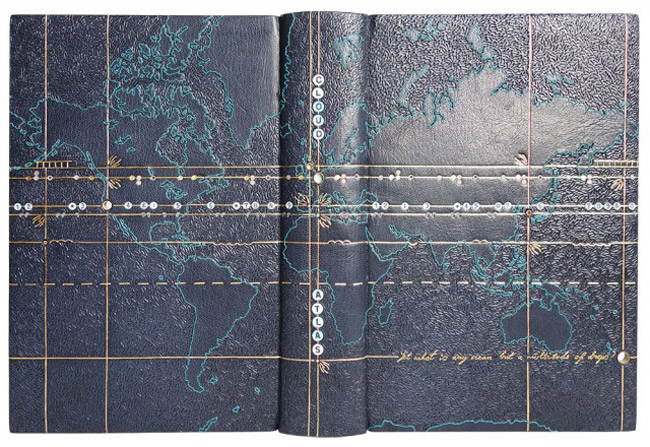
Hannah Brown covered this binding of David Mitchell‘s Cloud Atlas in dark blue goatskin. An embroidered outline of a world map expands across the entire binding. To create contrast between land formations and water, Hannah blinded in a short line tool in a dense sporadic pattern.
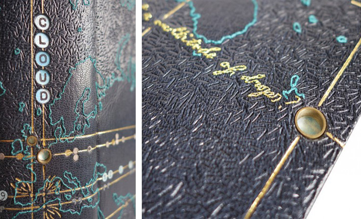
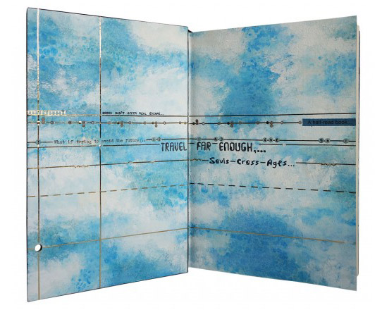
The longitude and latitude lines are gold-tooled and cross at six points across the map. These points are marked with brass tubing, which are inset into the boards, giving the viewer a peek of the endpapers. As you open the cover, the same longitude and latitude lines appear in gold. The background is decorated with watercolor altered by salt crystals, then painted with acrylic. The book is housed in a Rosewood box with a frosted acrylic lid patterned in the same fashion as the book.
Lately, I’ve been thinking about the many ways a book can be exhibited. If displayed fully open, the viewer has an opportunity to collect more information on the binder’s concept. However, when parts of the book are hidden from view, how does that change the viewer’s perception of the binder’s work? When I look through your portfolio it is common to see a detailed cover paired with a custom interior that plays off your design. While working on the design are you conscious of how the different planes of the binding work as individual sides and as a whole?
Absolutely, I love the fact that there are so many dimensions to a book, with new aspects of the design revealing themselves as you open it up – it gives a lot of scope for illustrating the content. There are so many skills required to make a successful binding, it is a three dimensional object and therefore needs to be planned and executed as such. However with that I feel you need to be a master of so many trades, especially using the variety of materials that I do on one binding paired with it’s box; a designer, a printmaker, a draughtsman, a carpenter, a juggler…the list goes on!
I always try and make my endpapers marry in some way with the book design, whether they are just a similar colour palette or perhaps directly inspired by an illustration within the cover design, I feel it is important there is some connection between them. On a number of my previous bindings I have incorporated holes cut through the boards in the cover design so part of the endpapers can be seen. This is the case with Cloud Atlas to some degree with different diameter brass rods inset into the boards through which you can see the painted cloud endpapers. Another example of this on a larger scale was on a binding I did of, William Blake’s Watercolour Designs for the Poems of Thomas Gray where a cat was illustrated on the endpapers and also, Randall Davies and His Books of Nonsense with hexagonal viewing holes.
In terms of the actual displaying of bindings, without mirrors or walk around cabinets it is very difficult to show all aspects of the book as a whole. When I worked as mount-maker at the V&A Museum I used to make a lot of book cradles for displaying open bindings in exhibitions. I always found it incredible that the cradles had to be made not just specific to the book, but to the actual page of the book that was to be open. They were rarely able to be reused again due to the fact that the profile of the book would change if opened on a different page.
For Cloud Atlas in particular, how does the interior design speak to the cover?
The design of this binding I found to be very challenging as there are so many stories and themes running through the book. The novel consists of six interconnected stories, however the main characters do not directly interact with one another but their lives are infinitely connected and affected by the actions of the others. The first five stories are broken into two parts – each being interrupted or halted at a pivotal moment. After the sixth story, which is completed in one central section, the other five stories are closed, in reverse chronological order, and each ends with the main character reading or observing the chronologically previous work in the chain. The main characters are also linked in spirit through the reoccurring image of a comet-shaped birthmark which are also depicted at crossing points on the cover.
The cover design is based on a map of the world, the points marked by the crossing of the longitude and latitude lines are placed where each of the six stories within the book are set. Each longitude line on the cover design has an additional design element running along it to tie in with the theme of the stories as follows (from top to bottom); a train track (the character travels by train between London and Hull), stylised musical notes (the character is a composer who writes “Cloud Atlas Sextet”), typewriter letters (the character is a 1970’s journalist), troughs and peaks (the character travels across seas and over mountains), quote marks in a futuristic font (the story is based in the far future) and finally the embroidered words of the very last quote of the entire book to tie it all together, “Yet what is any ocean but a multitude of drops?”.
As well as being able to “spy” the clouds on the endpapers through the brass rods inset into the cover, I chose to also run the longitude and latitude lines through onto the endpapers and doublures and also show quotes from each of the stories on them. The atlas of clouds in the sky ties all the stories together therefore was a key part of my design choice.
