RSS Feed

Posts Tagged ‘hannah brown’

  1. Catching Up With Hannah Brown // No. 5

    April 30, 2017 by Erin Fletcher

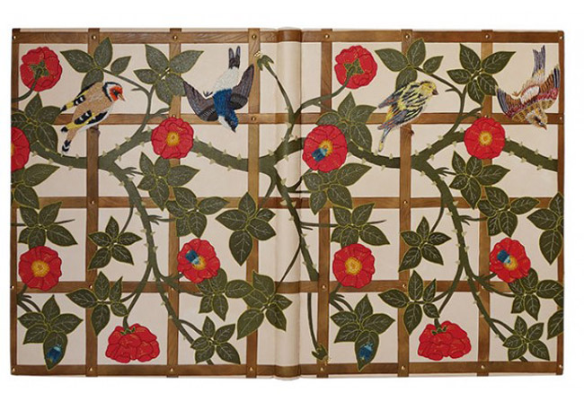
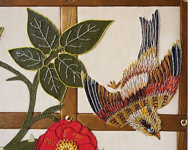
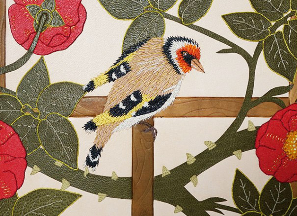
    For the final installment, I asked Hannah Brown about her binding of Love is Enough by William Morris. Just like The Tempest, shown in the previous post, Hannah used fair calf and an array of colored leather onlays. The design includes four beautifully embroidered birds and five beetles. At the points of intersection on the trellis, Hannah has attached twenty-eight gold plated brass pieces. Smaller details in the design have been blind and gold tooled.

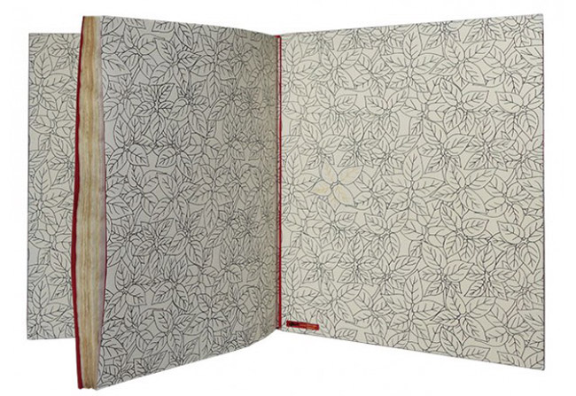
    The cover design is complimented with a patterned endpaper. The book lives in a teak box with a frosted prespex lid, which allows you to view the book.

    I had the chance to see this binding in person, while visiting last year’s Antiquarian Book Fair in NYC. First I want to say that it is absolutely gorgeous and I may have stared at it for an awkward length of time. The embroidery on the birds, is some of the most detailed embroidery I’ve seen on your work. As your work evolves the embroidery is becoming more painterly and reads more traditional in style. For the final question of the month, I’d love for you to talk about how your think you’re previous work has informed the way you build a design today, particularly how you’ve grown from simple machine embroidery to complex and layered hand embroidery.
    Thank you for your comments! It was an absolutely wonderful text block to be commissioned to bind. I am starting to see my embroidery work more like “painting” with thread. Through various social media channels I am now aware of more embroidery artists who are inspiring me to develop my embroidery skills further. I love the way that colour can by built up so subtly with the threads whilst adding a pleasing texture to the surface of the leather on a binding.

    One thing that I am very careful with though is durability, books are made to be used so I have to be very mindful of this when placing my stitches. The difference between utilising embroidery techniques on bindings in comparison to general embroidery on things like wall art is that is has to be designed to be handled. I make sure I tether down my stitches as well as possible to avoid the design catching or being abraded prematurely over time and take extra care when placing stitches over the board joints.

    During my time working at the V&A Museum I had the pleasure of looking at a variety of embroidered bindings from the National Art Library’s collection (the library housed within the museum). It was wonderful to see how the stitching had held out over time, on some better than others due to the amount of handling!

    Machine embroidery has its purposes and is good for producing lines quickly but to me now looks too rigid due to the way it punches the holes in the leather and the regularity of the stitches created. I love the layers than can be built up using hand embroidery as it has far more depth and accuracy to it and following years of practice my fingers are now toughened to it. I have a feeling that binding by binding my work will continue to evolve in this way, especially as my collection of threads grows and grows in size! I have started to teach some classes in embroidery techniques for fine bindings and hope to grow on this and therefore spread my knowledge further in this field.
  2. Catching Up With Hannah Brown // No. 4

    April 23, 2017 by Erin Fletcher

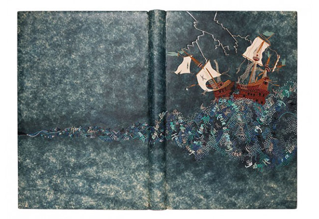
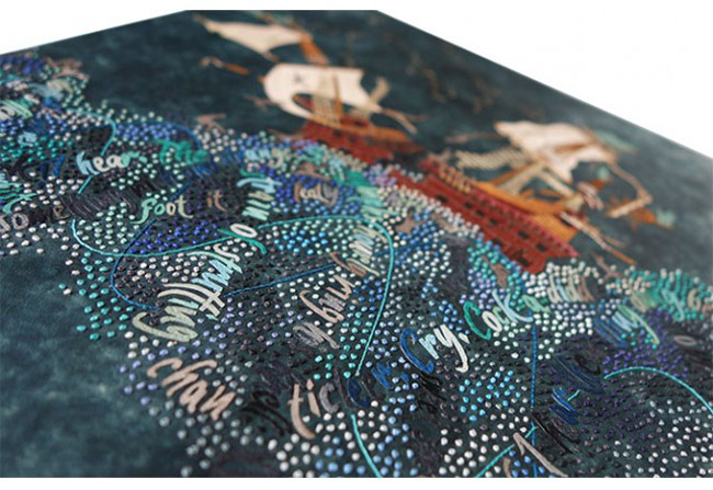
    Last year, Hannah Brown created this impeccable binding of Shakespeare’s The Tempest. Bound in full leather, Hannah first dyed the fair calf in a mottled effect, which provides the perfect stormy backdrop. The rest of the design is comprised of a variety of colored onlays, silk embroidery and blind, carbon and gold tooling.

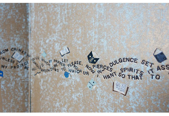
    The endpapers have a similar mottled effect as the leather cover. Yet Hannah achieved this decoration by placing the paper over  textured surface before rolling on gold letterpress ink. The book is housed in an oak box and frosted acrylic lid.
    This might be one of the most ambitious designs you’ve created thus far. First, I’d love to know how you kept track of all those little onlays as you were working.
    I worked word by word and made sure there was no draft to blow the pieces away once they had been cut out! The key to ease of cutting was to regularly change my scalpel blade. As the words got smaller and smaller they became too tricky to pierce from leather so I embroidered them instead which gave me more control.

    Many of your bindings are done in goatskin, but The Tempest is bound in a hand-dyed calfskin. Did you find the calf to be more susceptible to scuffs during the embroidery process?
    Yes, this was my first time working with calf. I bought this skin as fair calf and it was dyed in a stippled pattern which I thought might help mask any possible scuffs that would occur during the embroidery process. I always make sample boards ahead of working on a binding so I was able to test whether this was going to be an issue ahead of working on the actual covering leather. Fortunately I had no issues with scuffing of the leather and since then have gone on to bind another binding in fair calf with even less margin for error!

    I will definitely use more calf in the future as I felt the smooth nature of the surface lent itself well to being embroidered. It was tough to back-pare and work ahead of applying the embroidery but I was very pleased with the end result.


  3. Catching Up With Hannah Brown // No. 3

    April 16, 2017 by Erin Fletcher

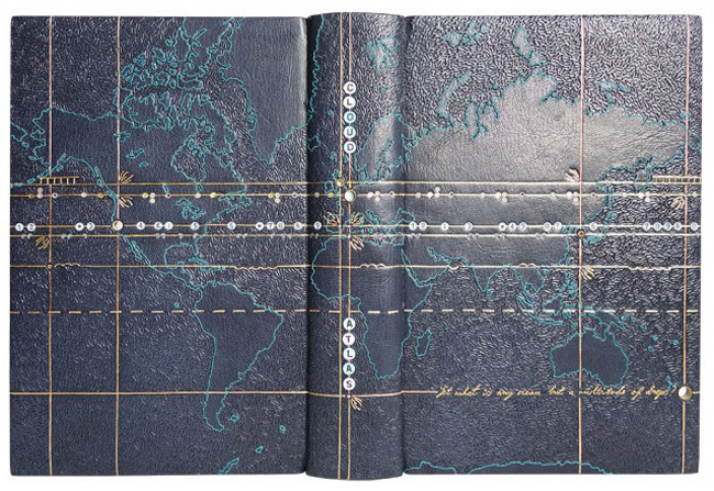
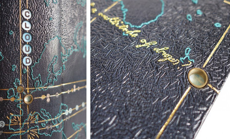
    Hannah Brown covered this binding of David Mitchell‘s Cloud Atlas in dark blue goatskin. An embroidered outline of a world map expands across the entire binding. To create contrast between land formations and water, Hannah blinded in a short line tool in a dense sporadic pattern.

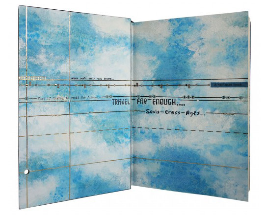
    The longitude and latitude lines are gold-tooled and cross at six points across the map. These points are marked with brass tubing, which are inset into the boards, giving the viewer a peek of the endpapers. As you open the cover, the same longitude and latitude lines appear in gold. The background is decorated with watercolor altered by salt crystals, then painted with acrylic. The book is housed in a Rosewood box with a frosted acrylic lid patterned in the same fashion as the book.

    Lately, I’ve been thinking about the many ways a book can be exhibited. If displayed fully open, the viewer has an opportunity to collect more information on the binder’s concept. However, when parts of the book are hidden from view, how does that change the viewer’s perception of the binder’s work? When I look through your portfolio it is common to see a detailed cover paired with a custom interior that plays off your design. While working on the design are you conscious of how the different planes of the binding work as individual sides and as a whole?
    Absolutely, I love the fact that there are so many dimensions to a book, with new aspects of the design revealing themselves as you open it up – it gives a lot of scope for illustrating the content. There are so many skills required to make a successful binding, it is a three dimensional object and therefore needs to be planned and executed as such. However with that I feel you need to be a master of so many trades, especially using the variety of materials that I do on one binding paired with it’s box; a designer, a printmaker, a draughtsman, a carpenter, a juggler…the list goes on!

    I always try and make my endpapers marry in some way with the book design, whether they are just a similar colour palette or perhaps directly inspired by an illustration within the cover design, I feel it is important there is some connection between them. On a number of my previous bindings I have incorporated holes cut through the boards in the cover design so part of the endpapers can be seen. This is the case with Cloud Atlas to some degree with different diameter brass rods inset into the boards through which you can see the painted cloud endpapers. Another example of this on a larger scale was on a binding I did of, William Blake’s Watercolour Designs for the Poems of Thomas Gray where a cat was illustrated on the endpapers and also, Randall Davies and His Books of Nonsense with hexagonal viewing holes.

    In terms of the actual displaying of bindings, without mirrors or walk around cabinets it is very difficult to show all aspects of the book as a whole. When I worked as mount-maker at the V&A Museum I used to make a lot of book cradles for displaying open bindings in exhibitions. I always found it incredible that the cradles had to be made not just specific to the book, but to the actual page of the book that was to be open. They were rarely able to be reused again due to the fact that the profile of the book would change if opened on a different page.

    For Cloud Atlas in particular, how does the interior design speak to the cover?
    The design of this binding I found to be very challenging as there are so many stories and themes running through the book. The novel consists of six interconnected stories, however the main characters do not directly interact with one another but their lives are infinitely connected and affected by the actions of the others. The first five stories are broken into two parts – each being interrupted or halted at a pivotal moment. After the sixth story, which is completed in one central section, the other five stories are closed, in reverse chronological order, and each ends with the main character reading or observing the chronologically previous work in the chain. The main characters are also linked in spirit through the reoccurring image of a comet-shaped birthmark which are also depicted at crossing points on the cover.

    The cover design is based on a map of the world, the points marked by the crossing of the longitude and latitude lines are placed where each of the six stories within the book are set. Each longitude line on the cover design has an additional design element running along it to tie in with the theme of the stories as follows (from top to bottom); a train track (the character travels by train between London and Hull), stylised musical notes (the character is a composer who writes “Cloud Atlas Sextet”), typewriter letters (the character is a 1970’s journalist), troughs and peaks (the character travels across seas and over mountains), quote marks in a futuristic font (the story is based in the far future) and finally the embroidered words of the very last quote of the entire book to tie it all together, “Yet what is any ocean but a multitude of drops?”.

    As well as being able to “spy” the clouds on the endpapers through the brass rods inset into the cover, I chose to also run the longitude and latitude lines through onto the endpapers and doublures and also show quotes from each of the stories on them. The atlas of clouds in the sky ties all the stories together therefore was a key part of my design choice.


  4. Catching Up With Hannah Brown // No. 2

    April 9, 2017 by Erin Fletcher

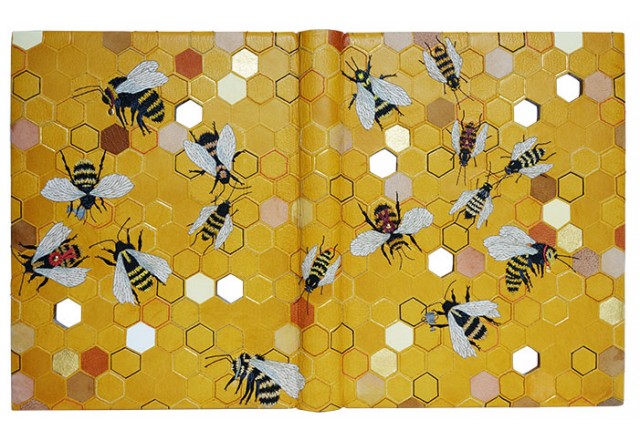
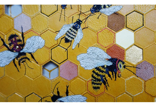
    Randall Davies and His Books of Nonsense is bound in yellow goatskin with a hexagonal honeycomb pattern. Hannah Brown used a variety of techniques to adorn the honeycomb, which include embroidery, gold, carbon and blind tooling, leather onlays and inlays, impressions and cut-outs through the boards. There are sixteen embroidered bees made from onlaid leather and Japanese tissue. Five gold-plated brass pieces are drilled and inserted through the boards. The lino-printed and embroidered endpapers share the same honeycomb pattern.

    The embroidered bees are quite captivating on this binding. What I particularly love about them is your use of Japanese tissue. I’ve not considered using paper as an onlay for embroidery. Did you find that the paper reacted differently to the embroidery? Have you used paper under embroidery on other bindings?
    This was the first binding on which I used Japanese tissue as an onlay. My main concern before doing it was that the glue would show through and/or appear patchy on the surface. I did some tests and I managed to avoid this by wetting the tissue slightly during application in order to draw the adhesive through the paper evenly. When it dried the appearance was as I had hoped – it gave me the colour and delicate texture I wanted for the wings.

    The paper was less forgiving than a leather onlay for the embroidery as it was more apparent if I pricked a hole in the wrong place! By applying the stitches the way I did to the wings the thread is protecting the paper as I it would be more susceptible to getting damaged if it were on the book without this surround.

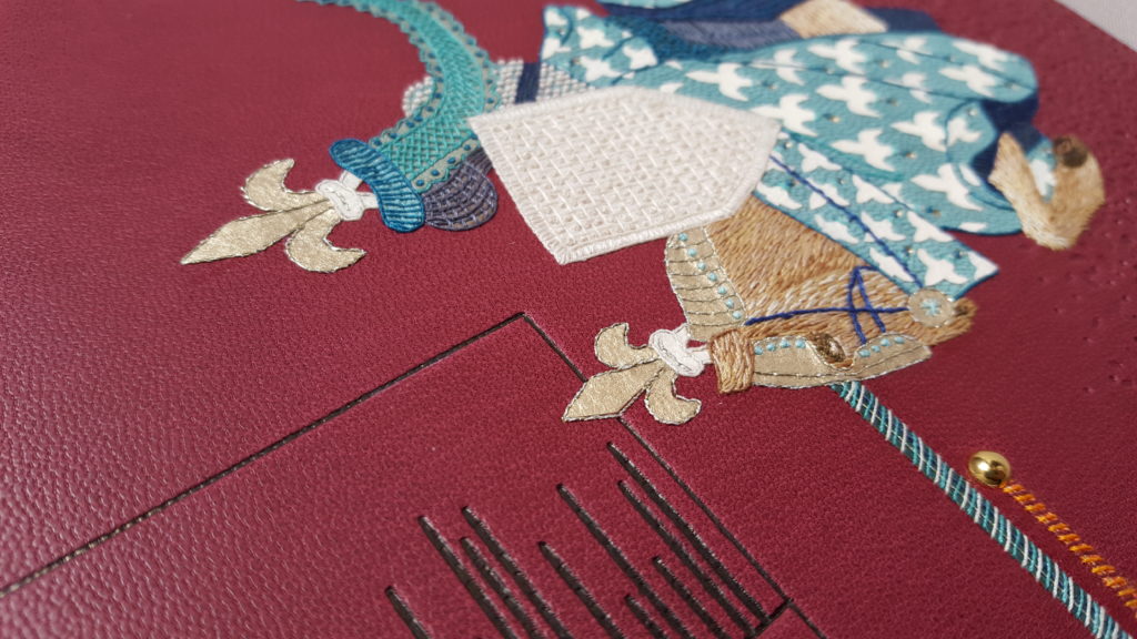
    I have used Japanese paper since for onlays but not in the same way. I have used it as a backing for gold leaf, adhering the gold leaf to it in and cutting out shapes order to create gold onlays. I have been using this for my most recent binding commission, The Noble Knight Paris and Fair Vienne, as it is a good way of getting around not having the right shape of finishing tool for all of the gold elements I want to include on the binding.


  5. Catching Up With Hannah Brown // No. 1

    April 2, 2017 by Erin Fletcher

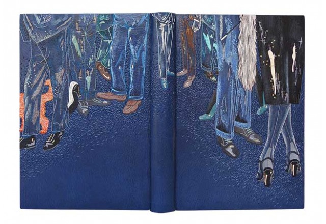
    The first interview on the blog was conducted back in February 2013 with the very talented Hannah Brown. Over the past four years, her work has really matured in both design and technique. So over the course of April, I’ll be catching up with Hannah by featuring work made over the past four years. Let’s start with one of my favorites, bound in 2014 is Hannah’s copy of Truman Capote’s Breakfast at Tiffany’s.

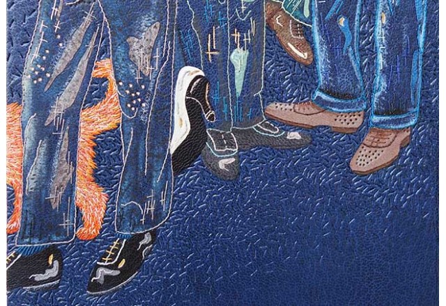
    Bound in dark blue goatskin with a variety of leather onlays in grey, black, brown, green, blue, cream and orange. The design is then amplified through the use of machine and hand embroidery, as well as areas that are sanded and painted with acrylics. Texture has been added to the binding through the use of blind and gold tooling. Hannah received the Mansfield Medal for Best Book in Competition in the 2014 Designer Bookbinders Annual Competition.

    The design on the binding for Breakfast at Tiffany’s combines a range of techniques that include machine and hand embroidery, painting, onlay work and tooling. I would love for you to speak about working through such a complex design. Are you planning each stitch and every painted element beforehand or are you working in a spontaneous way?
    For every binding I do I make a sample board of a small section of the design. I have done this since my very first binding and now have a extensive physical archive of all my books to date. I started making these sample boards for a few reasons, mainly it was to test out colours, but given I now have quite a collection they are an invaluable aid for teaching purposes and for showing to clients.

    The sample board tends to be the spontaneous part of my working process as I use it to test out colours and stitches ahead of working on the binding itself. I certainly don’t plan every stitch but do try and work methodically through the design when it comes to the embroidery work, executing the outlines first before filling in the gaps with more intricate embroidery.

    With Breakfast at Tiffany’s I worked through the same method as with all of my bindings. The onlays had to be applied first so the leather could be back-pared ahead of the embroidery. The next step was brushing on the paints and the whole thing was then brought to life with the needlework by adding the outlines, adding tonal colours and securing down the onlays with stitches. I have different tracing paper templates for each stage of the process to ensure everything gets put in the correct place. The last thing is the tooling as of course this is done once the leather is on the book.

    I am not a huge fan of drawing people so for this particular binding I thought a good way around this was by just depicting the legs. Because this book was for the Designer Bookbinders Annual Competition I was working to a tight deadline therefore I incorporated a lot of machine embroidery for the outlines of the legs first (for speed) and then hand-whipped these stitches afterwards. I was very happy with this method for this particular binding as I was able to put the cover design together more speedily.


  6. February // Bookbinder of the Month: Haein Song

    February 1, 2014 by Erin Fletcher

    MythOfSisyphus-HaeinSong

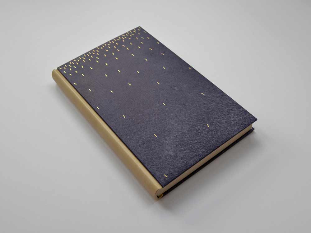
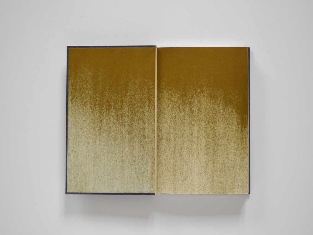
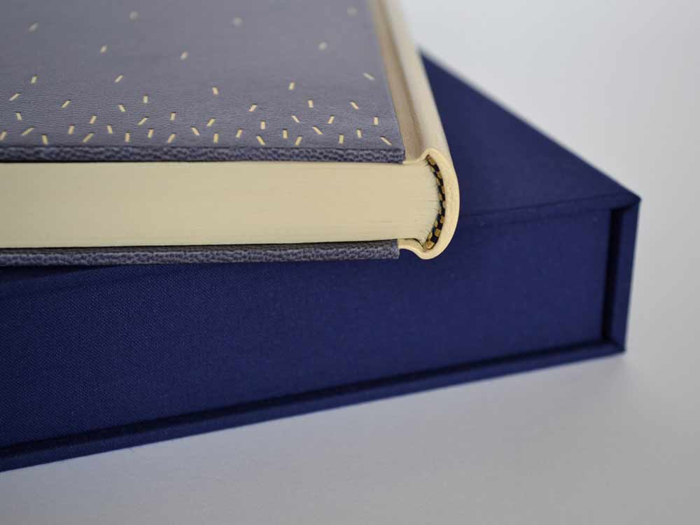
    This beautiful binding of The Myth of Sisyphus and Other Essays by Albert Camus was crafted in 2013 by Haein Song. Bound as a Bradel binding, the spine is covered in a natural goatskin with dark blue vellum covers. The sprinkled dashes on the covers are hand tooled in gold. The spectacular endpapers are hand printed. 

    MythOfSisyphus2-HaeinSongMythOfSisyphus3-HaeinSong

    This binding is absolutely stunning and so flawlessly executed. The covers are a beautiful dark blue vellum. Did you find the material difficult to work with in either the structural or tooling aspect of the binding process? I have a single experience with vellum over boards, but I know that bookbinders approach the board construction differently. May I ask if you prepped the boards for the covers in any particular way for the vellum?
    I heard few notorious rumours about vellum but I don’t think I found it difficult at the time I was working on it. Partly because it was a relatively small bradel binding and there wasn’t headcaps or joints. The spine of the book is covered in natural goatskin. 

    What I found afterwards was that the front and back vellum boards sometimes change their shapes depending on the humidity or temperature of the surrounding. But surprisingly it comes back to the original shape after some time. I was told that it needed a little bit of time to climatise.

    Later I was also told that lining vellum with a very thin paper (archival bible paper or Japanese paper) would reduce this changeable characteristic. 

    Tooling wasn’t particularly hard after practising enough on sample boards but I don’t think I have an ample amount of experience to compare differences in tooling on leather or vellum.

    – – – – – – – – – – –

    I have not yet had the pleasure of meeting Haein or been presented the opportunity of viewing her work in person. However, I’ve had her website bookmarked for a while now, checking back from time to time to ogle her work. As I began preparing a list of people to interview this year Haein’s name popped up as a suggestion from Hannah Brown, whom I interviewed at this time last year. So with Hannah’s endorsement and my growing fondness, I present the following interview with Haein Song. The interview ends with Haein’s elegantly worded philosophy on bookbinding. 

    Come back every Sunday during the month of February for more posts on Haein’s work. You don’t want to miss it, Haein shares some of the creative techniques behind her expressive and artistic bindings. 

    read more >


  7. Bonus // Bookbinder of the Month: Hannah Brown

    February 24, 2013 by Erin Fletcher

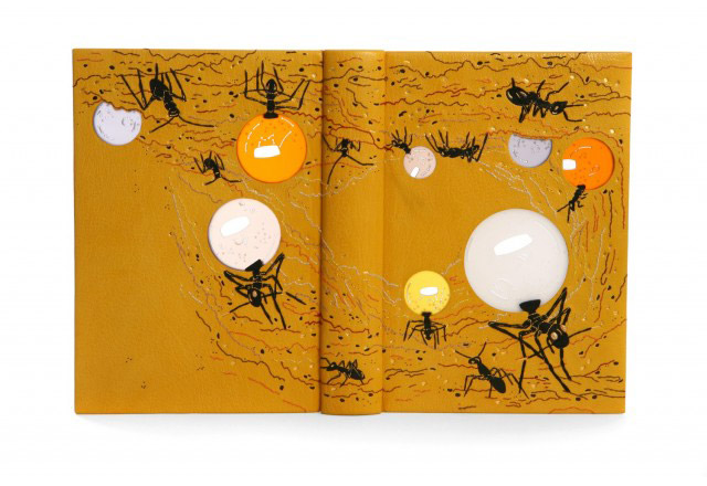
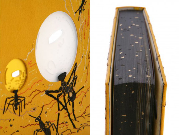
    thesonglines_hannahbrown1The Songlines by Bruce Chatwin with illustrations by Simon Pemberton is a Folio Society edition published in 2010. Hannah Brown bound this copy in 2011 as a full leather binding in yellow goatskin with black back-pared leather onlays. Embroidery is done over the onlays with silk and metallic threads in gold, orange, purple, brown, white, black and rust. Frosted acrylic ‘windows’ were lathe-turned, hand-pierced and drilled then set into the front and back boards. The larger ant’s eyes are gold-plated, hand-shaped and patterned brass pieces, inserted through the book covers. The smaller ant’s eyes are tooled with gold, additional tooling in both carbon and gold using handmade finishing tools. 

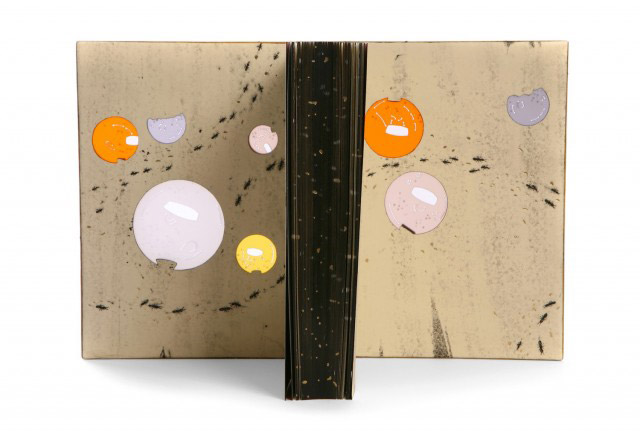
    Edges are painted with acrylic and tooled with carbon and gold foil. Endpapers and doublures are soft-plate off-set printed with a design of walking ants, appearing to move around the acrylic ‘windows’. Both elements are tooled with gold foils.

    thesonglines_hannahbrown2 thesonglines_hannahbrown3

    I’m completely blown away by the design on this book. Can you talk more about your initial concept and how you approached making it a reality?
    The book is a direct account of the author’s travels in Australia. In the book there are references to honey ants, which is what I decided to base my design on. Honey ants (or ‘repletes’, as they are also known) are ants that are gorged with food so that their abdomens swell enormously. Other ants then extract nourishment from them, they function essentially as living larders. They are found deep underground and are valued highly during time of little food and water.

    I was amazed by these insects and wanted to draw attention to the fact that they have peculiarly large abdomens. I had by chance recently ordered some samples of frosted, coloured acrylic and this seemed a perfect material to use to illustrate their bodies. I used a metal working lathe to turn the frosted acrylic into discs, and cut corresponding holes into the boards before insetting the acrylic in. I really liked that fact that the bodies seemed to light up when the covers of the book were opened.  


  8. Bookbinder of the Month: Hannah Brown

    February 24, 2013 by Erin Fletcher

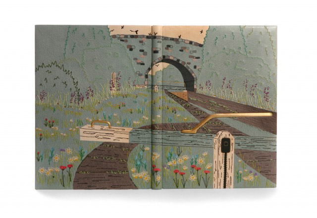
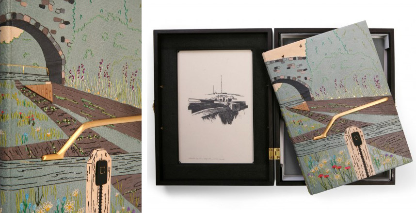
    locksoftheoxfordcanal_hannahbrown1The Locks of the Oxford Canal: A Journey from Oxford to Coventry was published by The Whittington Press in 1984 and includes fifty wood engravings by John Craig. In 2011, Hannah Brown bound a copy for the Designer Bookbinders Annual Competition, receiving the Mansfield Medal for Best Book. The binding is full leather in a turquoise goatskin with various leather onlays and inlays of pink eel skin, turquoise shagreen and yellow, grey and cream goatskin. All embroidery is done over the onlays with colored silk and metallic threads. Two gold-plated, hand-shaped brass pieces were inserted through the covers and recessed into the boards. Tooling in carbon and gold.

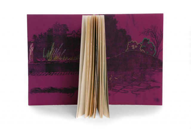
    Doublures have been soft-plate off-set printed to include two images taken from the book and are hand-embroidered and tooled with gold foils. The book is housed in an oak box stained black with suede dyes. The front and back include recessed frosted acrylic panels with cut out sections, brass wire, gold foil tooling and sewn details. 
    locksoftheoxfordcanal_hannahbrown2 locksoftheoxfordcanal_hannahbrown4

    Can you go over the process of embroidering onto leather, when did you first introduce this technique into your fine bindings? How do you decide between machine-sewn to hand-sewn embroidery?
    Ever since my first design binding, ‘The Somme: A Eyewitness History’, I have added sewn detail to the leather. During the first couple of years of making fine bindings, the sewn detail was always done using my sewing machine. This method could however be a little hit and miss with fear of the sewing machine foot leaving marks on the leather.

    The first book that I decided to hand embroider was in 2010, ‘Wildlife in a Southern County’, as I felt the design would appear stronger with hand-sewn outlines. From this point on I have largely chosen to embroider the leather by hand as it gives me more control.

    My most ambitious embroidered binding to date has been on my Shakespeare competition entry, ‘Flowers From Shakespeare’s Garden’, the embroidery alone taking me over one hundred hours to complete. I love the way that it is possible to build up depth of colour and different textures by using a variety of embroidery stitches. I have had no formal embroidery training but have taught myself by experimenting on sample boards.

    I begin by creating a base colour on the covering leather by adding coloured leather onlays. I then back pare these and build up the design by adding silk threads in a variety of colours.


  9. Bookbinder of the Month: Hannah Brown

    February 17, 2013 by Erin Fletcher

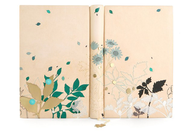
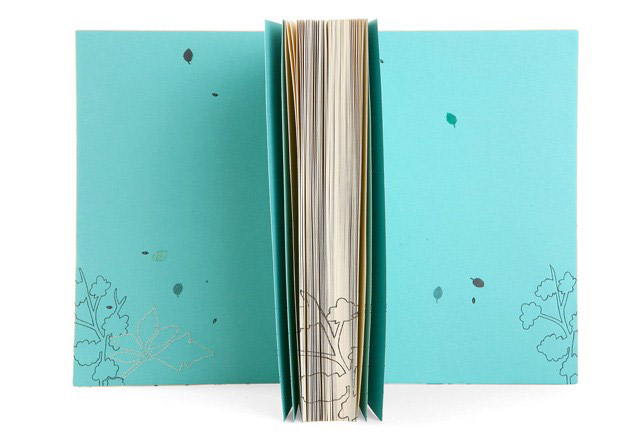
    wordstoliveby_hannahbrown1Words to Live By was bound by Hannah Brown in 2009 in a cream alum-tawed goatskin with various leather onlays in green, black, grey and turquoise. Additional leaf pieces of acid-etched stainless steel are hand-sewn onto covers with metallic thread; leaf outlines are machine-sewn. Various hand-pierced leaves and plant details in brass and silver are scattered throughout the design. Hand-tooling in carbon and Moon gold with hand-made finishing tools. Head edge of text block is painted with turquoise acrylic. 

    wordstoliveby_hannahbrown2


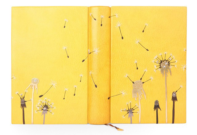
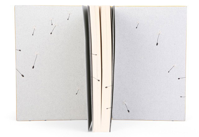
    glimpsesofnature_hannahbrown1In 2009, Hannah Brown bound Glimpses of Nature by Andrew Wilson in a mustard-yellow goatskin with various leather onlays in dark brown, black and grey. Each dandelion seed head was hand-sewn with white and metallic thread. The binding also includes three hand-pierced and drilled brass dandelions. Hand-tooling in carbon and gold with hand-made finishing tools.

    glimpsesofnature_hannahbrown2More dialogue after the jump…

    read more >


  10. Bookbinder of the Month: Hannah Brown

    February 10, 2013 by Erin Fletcher

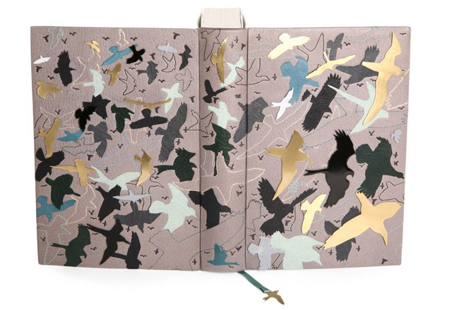
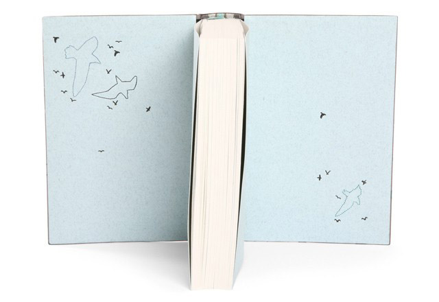
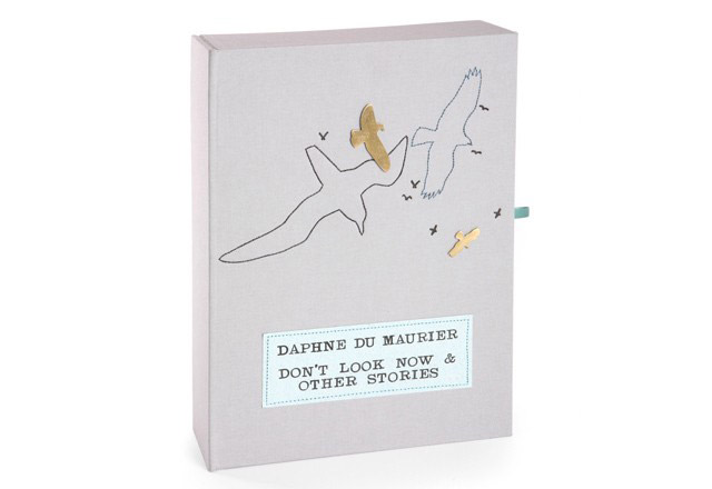
    dontlooknow_hannahbrown1This edition of Daphne Du Maurier’s Don’t Look Now and Other Stories was published by the Folio Society in 2007 and bound by Hannah Brown in 2008 for the Designer Bookbinders Annual Competition, receiving the Mansfield Medal for Best Book. Bound in a dark grey goatskin with miscellaneous leather bird onlays in black, grey, dark green, pale turquoise and dark turquoise. Bird outlines are machine-sewn with twenty-four additional bird silhouettes in hand-pierced brass. Hand-tooled birds in carbon and Moon gold with hand-made finishing tools.

    The book is housed in a drop-back box covered in a pale grey bookcloth highlighted with elements from the binding.

    dontlooknow_hannahbrown2 dontlooknow_hannahbrown3dontlooknow_hannahbrown4

    Metal pieces appear a lot in your binding. How did you start working with this material, do you cut and shape the metal pieces yourself?
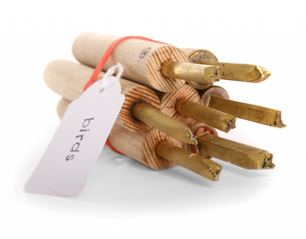
    I began to learn how to work with metal whilst doing my degree course in Brighton. Visually I have always liked the appearance of the pierced metal against leather. I tend to always use brass as the base metal, in my early books I lacquered the metal to prevent tarnishing, however I have now moved on to getting the brass pieces I use gold-plated.

    I do pierce the shapes out myself, I also solder posts on to the reverse of the shapes and attach them to the boards by drilling holes and feeding these posts through. I do not trust glues to withstand the test of time and feel far happier knowing that the metal is physically fixed through the covers. I have also started to experiment with acid etching to create texture on the flat metal surface, and intend to do more with this on future bindings.


  • My name is Erin Fletcher, owner and bookbinder of Herringbone Bindery in Boston. Flash of the Hand is a space where I share my process and inspirations.
    The StudioNewsletterInstagramEmail me
  • Archives