RSS Feed

Posts Tagged ‘artist book’

  1. Book Artist of the Month: Amy Borezo

    May 15, 2016 by Erin Fletcher

    RaisingTheSupineDome1-AmyBorezo

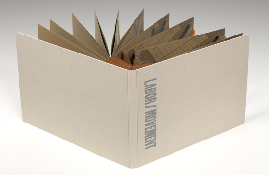
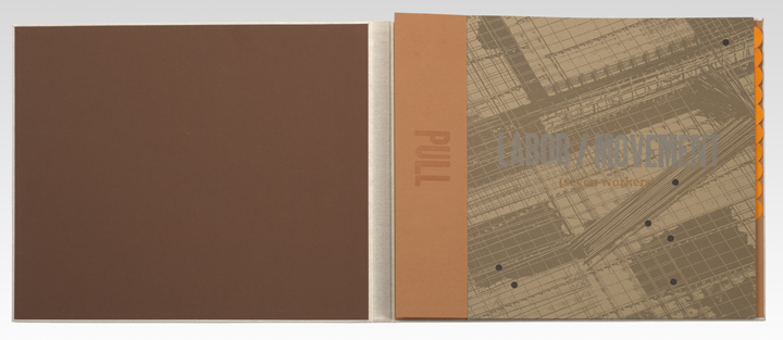
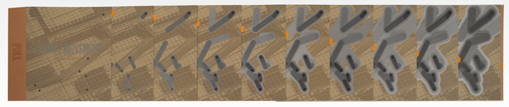
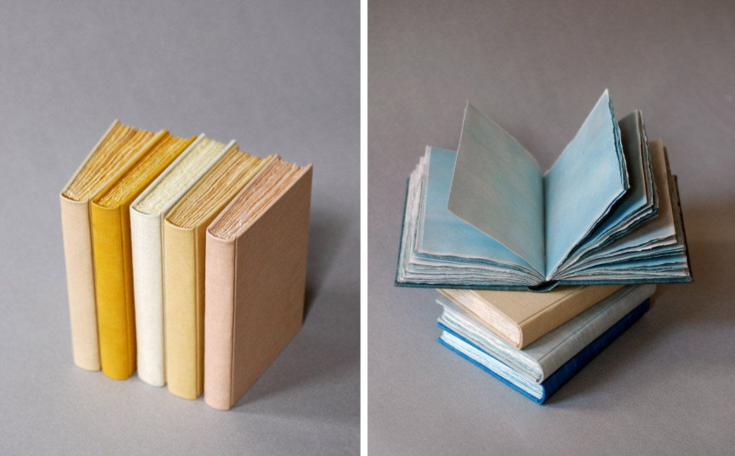
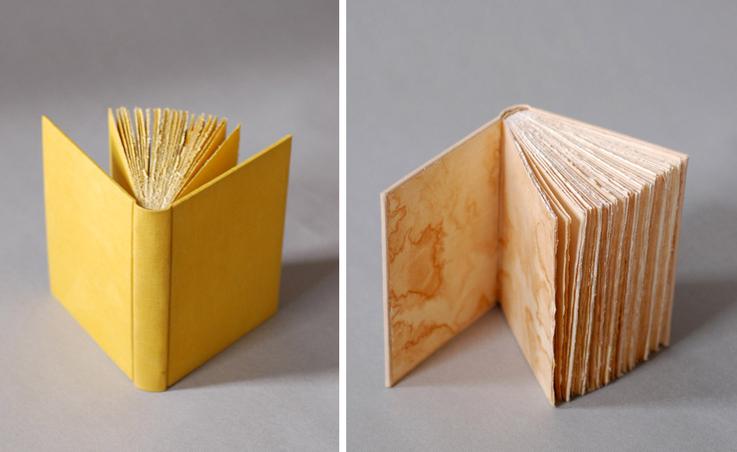
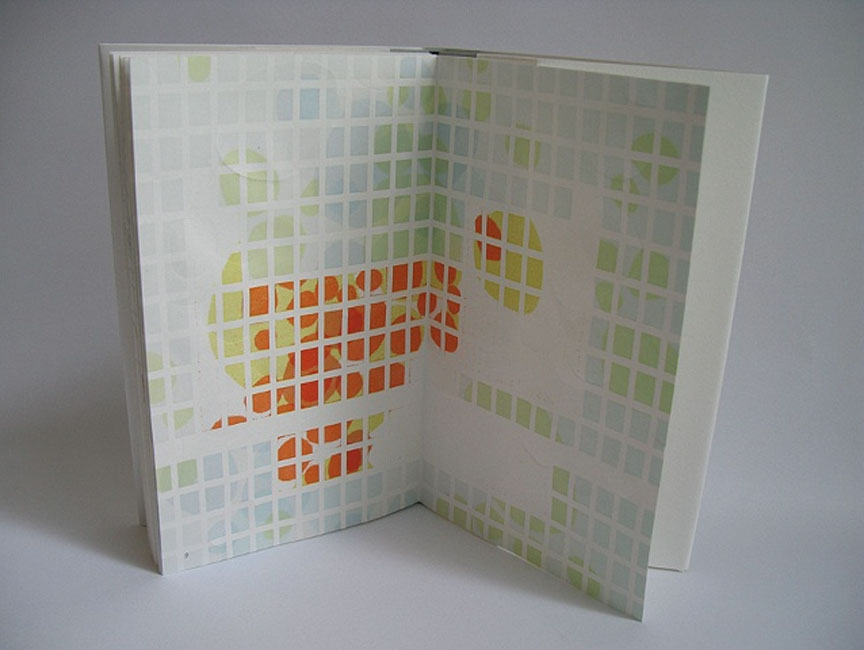
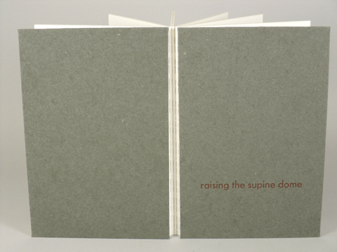
    Amy Borezo completed Raising the Supine Dome in 2010 in an edition of 35 (a few copies are still available). Text and imagery are printed on thick rag paper, Holyoke Fine Paper and then adhered to the both sides of a continuous sheet of Tyvek. Therefore, this accordion binding has double-thick pages with exposed Tyvek hinges. Laser cutting occurred after adhering the pages to the Tyek. Cave Paper is used as the covering materials for the front and back boards.


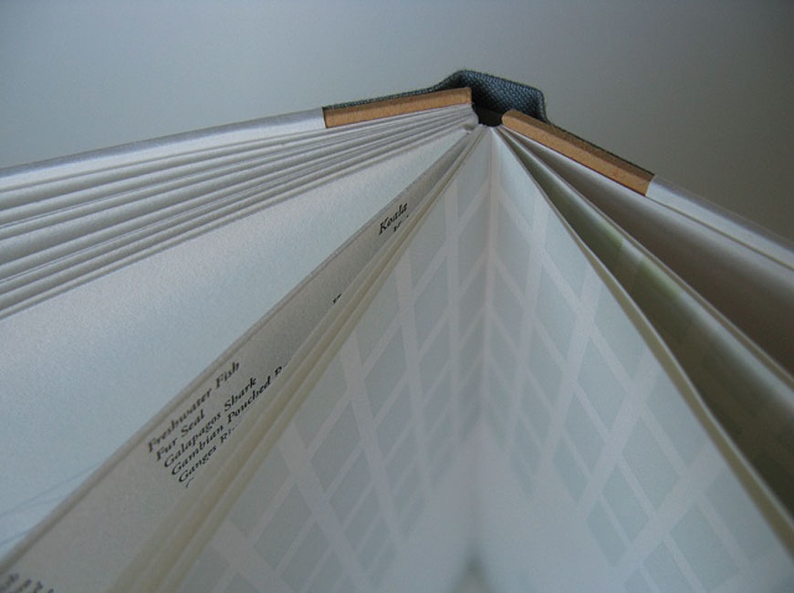
    This binding has such a satisfying weight and heft to it. During my visit to your studio, it was a delight to examine its construction in person. You used Tyvek at the hinge to connect each panel. I wanted to ask about your choice of material for this step and how it has held up over time.
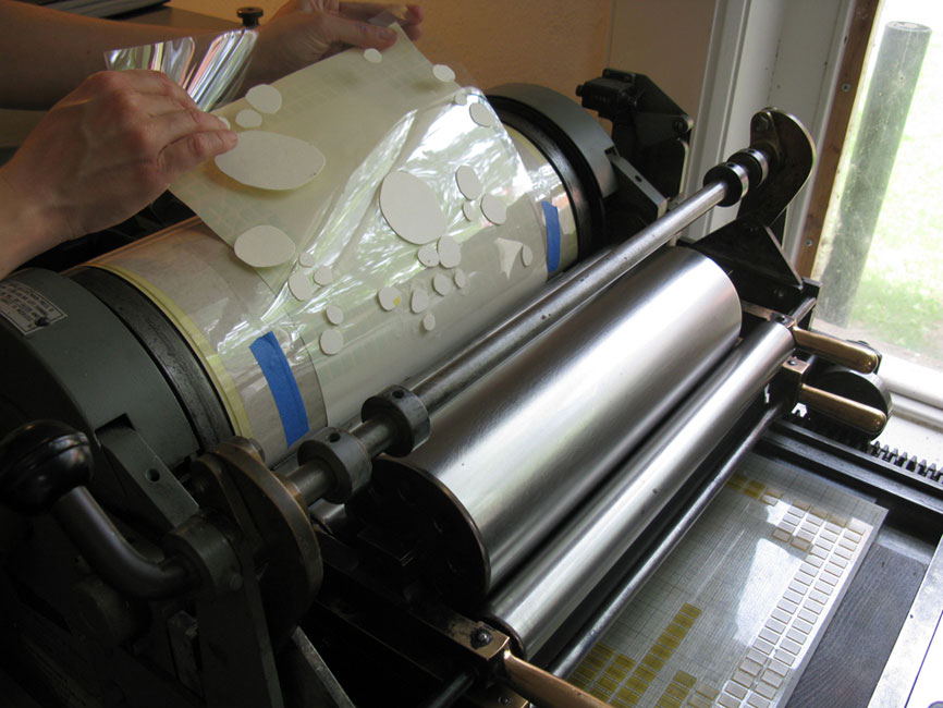
    The Tyvek has held up very well over time. I just saw a copy that has been in a collection that gets heavy use and it’s like new! I like handling it because it feels so indestructible and architectural, in keeping with the concept of the book. I believe I came across Tyvek as a material while working at the Wide Awake Garage. I knew I’d be hinging together pages and I wanted the hinge to be tough. I used a heat sensitive adhesive like Fusion 4000 to adhere the Tyvek to the pages. You do have to experiment with Tyvek as sometimes excessive heat can make the Tyvek warp a bit. But I didn’t have any problems using it.

    RaisingTheSupineDome2-AmyBorezo RaisingTheSupineDome3-AmyBorezo RaisingTheSupineDome4-AmyBorezo

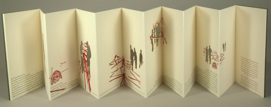
    Buckminster Fuller was a visionary, forward-looking architect. Tyvek has a somewhat futuristic flavor – a paper that doesn’t tear and is made from synthetic material. It was a perfect fit for the project. Because it doesn’t tear, it almost feels like you can arrange the panels of the book into various architectural shapes. Going further, Buckminster Fuller’s geodesic domes are visually all about the lines where two planes meet. The hinge areas become important as reflections of the design of the geodesic dome.


  2. Book Artist of the Month: Amy Borezo

    May 8, 2016 by Erin Fletcher

    LaborMovement1-AmyBorezo

    Labor/Movement (seven workers) was printed and bound by Amy Borezo in 2012 in an edition of 25. Bound on an unsupported concertina binding with folios pamphlet-sewn to the peaks of the concertina. The folios were then sealed along the fore edge. The text is nestled inside a cloth covered case with only the back hinge of the concertina adhered to the back of the case. This constructions allows the reader/viewer to pull out the first flap of the concertina, expanding all of the pleats fully and exposing a portion of each page to be viewed simultaneously (as shown in the image below).

    I want to focus primarily on the structure of this book, which engages the concept of the text in a very subtle and beautiful way. The text and imagery is developed around various forms of movement; the pages themselves can be turned and expanded in various ways that mirror the ideas within the text. How did you develop the structure for this book? Did you work through several models before finalizing the look?
    I made another book many years ago with this structure, which I believe is based on a design by Keith Smith. I love how the book expands in a very physical way. Even the sound that the pages make when they slide on top of each other is very satisfying. This book has to be performed by the reader/viewer, which ties in nicely with the content of the work. It asks the reader/viewer to be aware of her actions and body in space, and this ask is reiterated in the text.

    LaborMovement2-AmyBorezoLaborMovement3-AmyBorezo

    When the book is fully extended, you can see a portion of each page simultaneously to each of the other pages. I feel that this is a very cinematic way of experiencing the book, similar to stop-action animation. The series of images in Labor/Movement show a pattern of movement over time, and when you see a portion of each image overlapping the next, the connection between the images is much more fluid than if you were seeing one whole image and then turning the page to see the next whole image. I don’t think I considered any other structure, but I did make a few dummies to make sure it would function well.

    The structure also allows the book to be read in many different ways. It can also be opened and paged through like a traditional codex. I like to make artwork that is multi-layered in form and content.

    LaborMovement4-AmyBorezo


  3. Book Artist of the Month: Natalie Stopka

    April 27, 2015 by Erin Fletcher

    BotanicalPrintBook-NatalieStopka

    In this final post with Natalie Stopka, we continue the discussion on her techniques that employ natural pigments for dying and image making by looking at her 2012 artist book Botanica.

    This binding consists of a series of eco-prints that are brilliant in both color and detail. Can you discuss the process behind eco-printing?
    Eco printing is the process of making a plant print using only the natural colorants contained within the plant. As opposed to nature printing in which pigment is applied to the surface of natural objects, in eco printing the plants can be smashed, pressed, bundled, soaked, steamed, or even frozen to coax the dye colorants out. There are a variety of techniques and terms to describe them. Hapa zome is the pounding of fresh plants directly onto a fiber substrate, and bundle dyeing involves tightly wrapping plant or other dye materials in fabric before burying or steaming them.

    Botanica2-NatalieStopka

    To create Botanica, I gathered a dozen different dye plants one August day. These included mint, yarrow, dahlia, coreopsis, and goldenrod. Each specimen was folded within alum-mordanted paper, guarded with additional paper, and vigorously smashed with a mallet to break down the plant fibers and transfer the colorants within. I lowered this sandwich, with the plant still inside, briefly into a pot of simmering water. The hot water further drew out the dyes, creating an aura of color around the plant image, and made the print as permanent as possible. I was left with two mirrored images of each plant to create an edition of two books.

    Botanica4-NatalieStopka

    In binding the books I adopted a flat back variation of Richard W. Horton’s light album structure, with each print mounted inside an accordion fold of naturally dyed paper. The paper as well as the silk book cloth and thread on the cover were dyed with a mix of wildflowers.

    Botanica5-NatalieStopka


  4. Book Artist of the Month: Natalie Stopka

    April 20, 2015 by Erin Fletcher

    Specimens1-NatalieStopka

    Up until this post, Natalie Stopka has shared her techniques for natural dyeing, as well as her methods for marbling and suminagashi. In the last two posts for the month, we’ll look at two artist book projects starting with her 2011 book Specimens.

    Can you talk about the concept behind this work and your inspiration for the book’s structure?
    I’m very interested in the notion of fabricated histories, including artifacts of dubious or bogus provenance such as the Voynich Manuscript or Cottingley fairy photographs. In creating Specimens I bound together the textile fragment collection of the (fictional) Dorcas Little, seemingly a phony collection that she had created and catalogued in the mid-1900s. Each textile fragment was hand sewn from vintage materials to look as if the fibers were is some aspect growing or reproducing. Mounted in a petri-shaped window, each piece is visible from both sides.

    Specimens3-NatalieStopkaSpecimens4-NatalieStopka

    I have a love/hate attitude towards album structures, which are very useful for a book such as this, but generally inelegant and tedious to bind. I elected to use a double guarded album binding, which has the institutional appearance I was hoping for, but a somewhat more graceful movement. As if, in order to augment the appearance of authenticity, the collection’s owner had commissioned the housing.

    Specimens2-NatalieStopka


  5. Book Artist of the Month: Natalie Stopka

    April 6, 2015 by Erin Fletcher

    CompleteDye-NatalieStopka

    As a continuation from last week’s post, I extended the conversation on natural dyes with book artist, Natalie Stopka. During her time at the Center for Book Arts as a Van Lier/Stein Scholar, Natalie also completed a collection of case bindings, where each component beautifully represents the subtleties of natural dyes.

    CompleteDye2-NatalieStopka

    The variation between the different materials is subtle and beautiful. I wonder what your inspiration was for this project?
    Besides my enjoyment of the process of foraging and dyeing with plants, I love the sympathy between natural dyes and fibers, as well as the resonance of using historical methods with historical materials. Prior to the discovery of synthetic dye in 1856, all books were decorated with naturally derived dyes, inks, and pigments. That is a lot of artistic heritage that has been largely supplanted in the past 150 years. I wanted to create some books that were all of a piece referencing that period just prior to the advent of synthetics, using a hollow-back structure with linen book cloth, hand sewn headbands, uncut pages folded down from full sheets, and, of course, natural dyes. I ended up binding a dozen books in different colors, partly as an exercise in honing my binding skills, as well as a continuation of my dye experiments.

    Can you walk through your dying process from the creation of the pigments to the dying of the materials? Where did you learn these techniques?
    Beginning with the techniques I learned at the Textile Arts Center, I extended my natural dye experiments into bookbinding. There was some trial and error at first as I selected and mordanted paper samples. Papermakers generally color the pulp with pigment prior to forming sheets, so there is not a lot of information on how to dye paper, or how the dyes and mordants affect it over time. But paper is just cellulose fiber like many fabrics I had experience dyeing, so I jumped in. I decided to use Zerkall Ingres, which is quite absorbent due to its composition, but also has good wet strength. And when folded down it makes a lovely signature size.

    The first step in dyeing is to source or collect plant material. In this case I used plants I foraged in upstate New York including oak leaves, cherry bark, Queen Anne’s lace, apple bark, and yarrow, the only exception being indigo. I chopped and soaked or simmered the plant material to extract the dye, then strained the dye liquor into a big stainless steel vat containing the mordanted paper and other book materials. After about 12 hours in the vat, everything was ready to carefully remove and dry.

    DyeProcess-NatalieStopka

    As with my embroidered botanical illustrations, these books demonstrate the different shades of color (sometimes slight) that result when a single dye is applied to various substrates. The linen cover, silk headbanding thread, Zerkall Ingres pages, and linen binding thread were all dyed in the same vat. The endpapers were made from the uppermost sheet of paper in the bath, which became patterned by the evaporation of the dye. My favorite book was dyed with black cherry bark – I left the dye vat outside overnight, and a light frost left crystal patterns on the endpapers! Initially I expected the papers to take the dye evenly in a uniform shade, but most dyes were absorbed with a good deal of variation, making a richly toned surface.

    CompleteDye3-NatalieStopka


  6. April // Book Artist of the Month: Natalie Stopka

    April 1, 2015 by Erin Fletcher

    Botanical-NatalieStopka

    Natalie Stopka has conducted extensive research and experimentation with natural dyes, which is partly what drew me to interview her on the blog. I’ve long been interested in incorporating natural dyes into my own work. So it’s fair to say that I’m quite inspired by Natalie’s work.

    At the end of your year at the Center for the Book, you presented on a series of natural dye experiments in a pretty brilliant way. What drew you to focus on natural dyes and how did you to come to present your findings through embroidery?
    I became interested in natural dyeing as an antidote to city life. I was initially drawn to the process of foraging and dyeing itself, but the more I studied the history behind the process, the more it became apparent that our culture has devalued and forgotten the vast majority of the dye artistry we once possessed. This artistry is akin to alchemy, because we still do not scientifically understand what functions many colorant compounds perform for the plants that create them, or how many dye processes occur on a chemical level. I was surprised to learn that each part of a plant – its petals, leaves, bark, and roots – create different colors. These colors can be manipulated into a greater range of tones by using a variety of mordants and fibers. I decided to explore the full range of colors accessible in a single plant using these methods.

    I chose three trees I had access to in upstate New York; birch, crab apple, and black cherry. From these I responsibly foraged leaves and bark, and used them to dye alum-mordanted silk, cotton, wool, linen/wool, and silk/wool thread. I then treated the dyed thread with the color modifiers copper sulfate, ferrous sulfate, an acid, and a base. I was left with about 40 samples in a range of colors and textures representing each tree’s dye potential. Some samples had very little color at all, but some were vivid and strongly varied.

    Botanical2-NatalieStopka

    I had known these experiments would become a series of embroidery pieces from the beginning, and I wanted to illustrate the clear distinctions in the dye colorants accessible in different parts of the plant. I adopted the form of the traditional botanical illustration, utilizing the thread dyed with the analogous plant part to illustrate it. That is to say, the leaves are depicted with leaf-dyed threads, and the bark with bark-dyed threads. For the birch tree embroidery, I also differentiated between the inner and outer barks.

    Botanical3-NatalieStopka

    LEFT: birch MIDDLE: black cherry RIGHT: crab apple

    The final element of these pieces is a question pertinent to any bookbinder: time. Not only are natural dyes sensitive to ultraviolet light, but the modifiers I used degrade fibers over time. The ephemeral nature of natural dyes is a sad reality for an artist, but I think it can also be beautiful. These three pieces each have a lifespan, and to measure it I enclosed a sample of each thread used in the embroidery behind the frame. There it will be protected from light, and can be used as a point of comparison over time.

    – – – – – – – – – – –

    I became aware of Natalie Stopka’s work while visiting the Center for the Book in New York, which in happenstance was exhibiting the piece above. Since then I’ve continued to keep an eye on her portfolio, especially the work she does with natural dyes and marbling. Natalie’s work encompasses not only the prior mediums mentioned, but she also dabbles in book arts as well.

    Check out the interview after the jump, then come back each Monday during the month of April for additional posts on Natalie’s work. Need a reminder? Subscribe to the blog.

    read more >


  7. Book Artist of the Month: Sarah Bryant

    December 29, 2014 by Erin Fletcher

    Shift-SarahBryant

    Sarah Bryant is apart of the five-person collaborative group Shift-Lab, which she discusses more in-depth below. The image above shows the full spread of their first collaborative project, Shift, which was created in 2014 in an edition of 20. Each of the five artists created a small letterpress printed book that reflects a shift in perspective as well as a matching print. Both the books and prints were displayed at the San Francisco Center for the Book in 2014.

    The books are housed together in a custom drop-spine box shown third from the left with a printed title label.

    ShiftBaldwin-SarahBryant

    detail of Katie Baldwin’s book

    ShiftTreacy-SarahBryant

    left: detail of Tricia Treacy’s book | right: detail of Denise Bookwalter’s book

    ShiftChadwick-SarahBryant

    detail of Macy Chadwick’s book

    Can you discuss the collaborative group Shift-Lab. Who are its members and what type of projects do you work on together?
    Shift-lab is made up of myself, Katie Baldwin, Denise Bookwalter, Macy Chadwick and Tricia Treacy. We started as a group in the summer of 2013 and since then we’ve produced a book project (Shift) for an exhibition at the San Francisco Center for Book Arts, staged a pair of printing events (I had to be a remote participant, unfortunately,) and met for a week in North Carolina to print a project together. We will be exhibiting together at the Codex Book Fair in February, and are working on plans to meet for a skill share/book project next summer. You can find us all at shift-lab.org.

    Shift is a set of five books all with the same theme. Each of us created an edition of 20 books of the same dimensions. These five books are housed together in an enclosure. The books vary in content, Katie’s is an exploration into the different diggings of the Erie Canal. Tricia was interested in the shift key on a keyboard. I was having trouble sleeping while I was working on this project, and so my book evolved into a body shifting and moving in bed.

    ShiftInPosition-SarahBryant

    For your book Shift in Position, how did you monitor your sleeping behavior and then transfer the imagery into a print?
    I was spending a good portion of each night around this time rolling and repositioning myself in the hopes of getting to sleep. I didn’t monitor this activity, exactly, but took dozens of photographs of myself as I repeated the familiar movements I was doing each night. These photos were taken against a white background. I traced the shifting line of my body over and over again and layered these lines, creating the basic imagery for the book. The “book” is actually a series of panels that can be rearranged. Some of the imagery locks in together, some doesn’t. Text related to shift and change printed on the top and bottom of each panels always locks in to make some kind of sense. I wanted the process of rearranging the panels to be reminiscent of the kind of non-restful process dreaming that I was slipping in and out of at night.

    ShiftInPosition2-SarahBryant ShiftInPosition3-SarahBryant


  8. Book Artist of the Month: Sarah Bryant

    December 22, 2014 by Erin Fletcher

    Simulations-SarahBryant

    I really enjoyed this week’s response by Sarah Bryant on her inspiration and creative process behind Simulations on a Two-dimensional Grid. You can read about it below, but first the specs. Simulations was created in 2013 in an edition of ten. Zerkall paper is used for the pages and have been manipulated with letterpress printing, hand-drawn imagery, wax and folding. The loose pages are bound up in a waxed paper wrapper also decorated with hand-drawn imagery.

    Simulations2-SarahBryant Simulations3-SarahBryant

    Two sources of inspiration are behind this artist book: Barb Tetenbaum’s Aritst Book Idealation Deck and David Allen’s 2011 dissertation. Can you talk about how these two pieces came together as a guide for the concept of this artist book?
    So in late 2012, Barb Tetenbaum invited me to participate in a show using a set of cards that she and Julie Chen had developed over several years called “The Artist Book Ideation Deck.” The deck has categories for structure, paper, layout, technique, text, image, color, and description. It also has “adjective” cards. Barb and Julie drew random hands from this deck for all of the artists who would be making a book for the show. My hand went as follows:

    Imagery: none
    Structure: unbound/boxed
    Text: collaborate with writer/poet/other
    Layout: across folds
    Color: favorite
    Technical: hand drawn, painted/collaged, etc.
    Paper: pre-treated, crumpled, painted, pasted, etc.
    Describe: narrative
    Adjectives: personal, scientific, ordinary, complicated, colorful

    Dave Allen and I had been talking at this point about collaborating on a book, (this was just before his visit to the UK and the beginning of our Figure Study project,) so I turned to him for some text. He sent me a few excerpts from his PhD thesis for the University of Michigan and I selected this one: Simulations on a two-dimensional grid reveal that if the conditions are met to destabilize the spatially homogenous equilibrium then individual patches cycle out of phase with their neighbors. At any particular time the grid has a checkerboard-like structure (Figure 2.1), and through time individual patches exhibit a two-cycle.

    We worked together to pair it down to the following: Simulations on a two-dimensional grid reveal that if conditions are met to destabilize the equilibrium, individuals cycle out of phase with their neighbors. This felt more like a universal text, open-ended enough to invite us in and call for different interpretations.

    Once the text was selected, it was time to work with it and knead it into a book using the external prompts that came from the Ideation Deck. I used a series of folds, expanding from sheet to sheet, to disturb a grid made up of holes and lines. I loved this project, it forced me to do some new things that I surely wouldn’t have attempted without a set of instructions. Waxing the pages, for example. Also the loose sheet format that I have adopted for two subsequent projects.

    Several people have pointed out that my book is not strictly following the guidelines set by the deck. It does have imagery, for example, even if that imagery is minimal. And of course this is true. But the deck is meant to generate ideas, and so I considered the cards as prompts rather than unbreakable rules. You can still get the decks, by the way. I use mine all the time in classes or just to get my mind moving.

    – – – – – – – – – – –

    Setting limitations for a project can bring unique challenges and even heighten creativity. I was so thrilled to learn about Tetenbaum and Chen’s Idealation Deck. I may need to get my own copy and begin exploring artist books again.

    If you’d like to read a more in-depth description of Simulations, check out Heather Doyle-Maier’s review on the Abecedarian Gallery Blog, where she describes the tactile qualities of the book.


  9. Book Artist of the Month: Sarah Bryant

    December 15, 2014 by Erin Fletcher

    AlMutanabbiStreet-SarahBryant

    For the traveling exhibit Al-Mutanabbi Street Starts Here, Sarah Bryant crafted Al-Mutanabbi Street to memorialize those who lost there lives to a car bomb on March 5, 2007. Bound between two boards is an entangled ribbon of red paper letterpress printed with an incomplete list of names. This altered accordion lays open in a custom box; the colophon is print on the base of the box hidden under the book’s cover.

    AlMutanabbiStreet2-SarahBryant AlMutanabbiStreet3-SarahBryant

    The text of this artist book rests in a position of entanglement and chaos, but in fact the lines of paper can be separated rather easily. The names printed on the underside represent a portion of those who lost their lives. I’ve seen a variety of books from this show and really love the simplicity of your piece, which is also largely impactful. It presents itself like a memorial; can you talk about your concept for this artist book?

    I wasn’t sure how to approach this book. I had no personal connection to the bombing or to the affected community, or, frankly, to any tragedy of this scale. I was concerned that in an attempt to honor the dead and the community to which they belonged, I might make a bumbling and insensitive book. So I tried to keep it simple and avoid pretending an understanding that I could not have.

    I printed the names of the dead in Arabic and English, each name lining up with it’s counterpart on the two sides of the strips of paper, and housed them in a structure that I hoped conveyed a sense of violence and loss. I wanted the names to be legible, but fragile, and in a position of distress. The box is vaguely coffin-like. I am glad to hear your reaction to the book, thank you.

    AlMutanabbiStreet4-SarahBryant


  10. Book Artist of the Month: Sarah Bryant

    December 8, 2014 by Erin Fletcher

    Biography-SarahBryant

    In 2010, Sarah Bryant completed Biography, which explores of the alternative roles played by the chemical elements found in the human body. Each element is represented as a specific colored rectangle, which are used in various diagrams throughout the book. As you progress through the book the diagrams become less clear and are interrupted with blind stamped organic shapes. Biography won the 2011 Minnesota Center for Book Arts Prize in addition to receiving the Award for Artistic Excellence at the Pyramid Atlantic Book Arts Fair in late 2010.

    Printed in an edition of 75 using letterpress techniques from polymer plates on Zerkall Book, Biography was bound as a hardcover drum leaf enclosed in a clamshell box. Numbers one through ten are bound as a deluxe edition (pictured above), which include additional prints from the book, as well as a ghost print creating during the printing process. The deluxe edition comes in a larger clamshell box designed to house both the book and set of prints.

    Biography4-SarahBryant Biography3-SarahBryant Biography5-SarahBryant

    In The Bonefolder article Evolution of an Artist’s Book, you mention that Biography took 2 years to complete. The inspiration led to extensive research and preparation before embarking on months of printing. Is this an average amount of time needed to complete a project?
    Most of my big books take about two years. Dave and I first conceived of Figure Study in January of 2013 and I have set a release date to coincide with the Codex Book Fair and Symposium in February of 2015. I started working on Fond when I was at Wells College in early 2011 and released it in the fall of 2012. Two years seems to be my average these days. But in the background there are other things emerging. While the larger projects are proceeding at their slow pace, I am working on quicker, smaller things. A book I printed with Shift-lab, a collaboration between myself, Katie Baldwin, Denise Bookwalter, and Tricia Treacy took me about six months in 2013. Simulations on a Two-Dimensional Grid, a book I created for the Ideation by Chance show at the Seager Gray Gallery in Mill Valley, California, took me a few months. Those books were done in smaller editions and in response to external collaborations and deadlines.

    Since I’m not a printmaker, the printing process behind You are part of something larger than yourself is puzzling to me. Can you walk me through the printing steps for this particular print?

    Biography2-SarahBryant

    Aha! Yes I can. And, in fact, if you really want to know more about it, a lecture I gave at Wells college several years ago contains a detailed description of that process, with photos! Thanks to Peter Verheyen, you can find it on youtube here:

    My description begins at 29:09 and ends about three minutes later.

    That spread and one other in the book toward the end, (described in the above video,) are pressure printed against a polymer plate of the periodic table grid. I inked the press in two colors (for a color shift) and printed the first run, then cleaned the press and inked it again in the reverse and so on so that there are many layers and colors at play. The blob-shaped forms are generated by paper cutouts that I have attached to the impression cylinder of the press. So the printed imagery is coming from the combination of the traditional, inked relief surface (the grid in the bed of the press) and the uneven pressure created by the paper shapes on the cylinder.

    BiographyProcess-SarahBryant


  • My name is Erin Fletcher, owner and bookbinder of Herringbone Bindery in Boston. Flash of the Hand is a space where I share my process and inspirations.
    The StudioNewsletterInstagramEmail me
  • Archives