RSS Feed

Posts Tagged ‘design binding’

  1. Wild/LIFE Exhibit at American Bookbinders Museum

    June 4, 2021 by Erin Fletcher

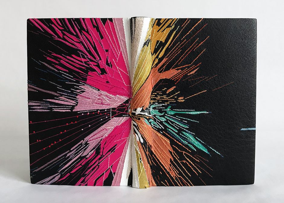
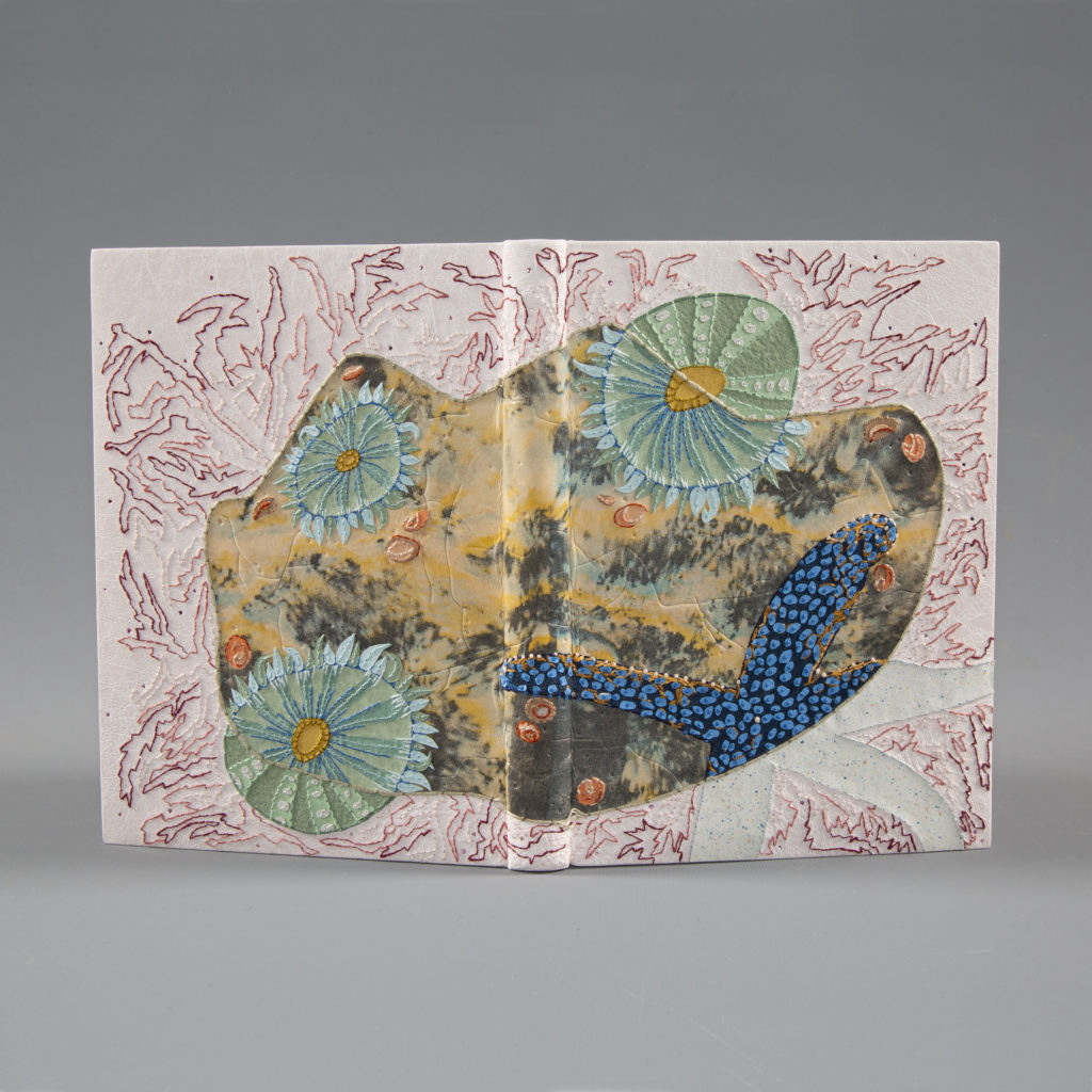
    My binding of At Low Water by Rebecca Chamlee is now on view at the American Bookbinders Museum in San Francisco as part of the Guild of Book Workers Traveling Exhibit Wild/LIFE. The work in on view from June 2 – August 7, 2021.

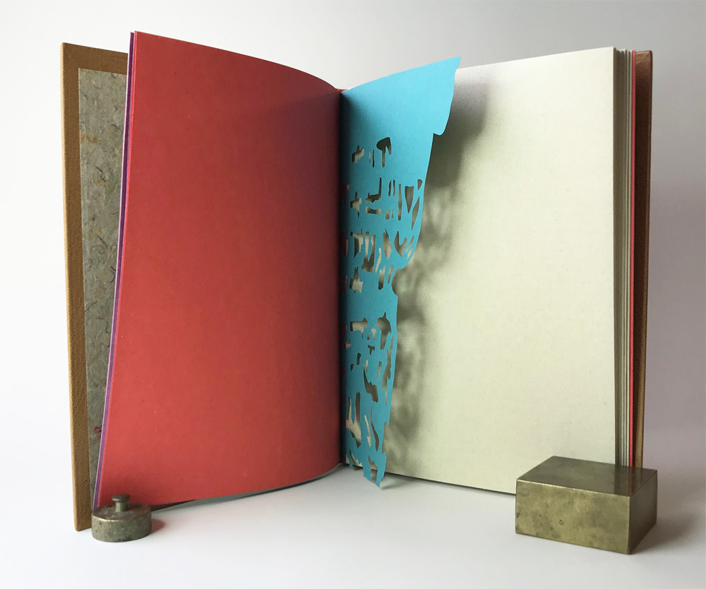
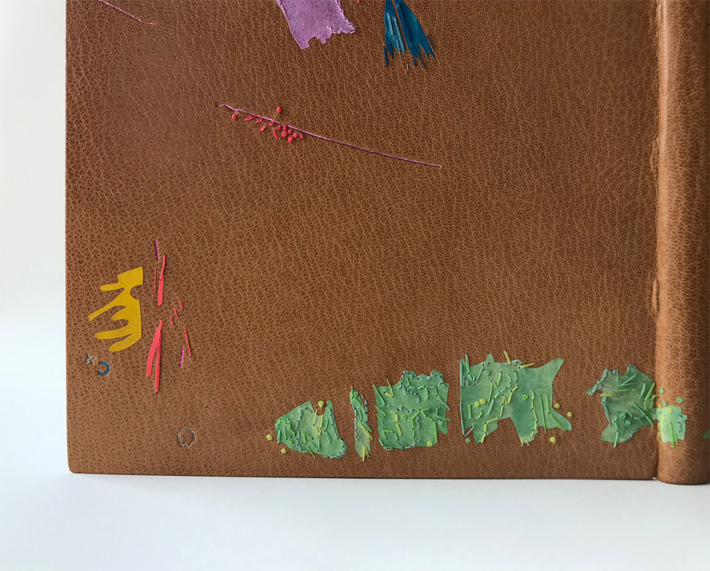
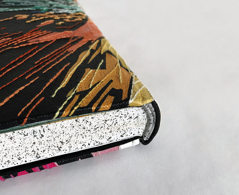
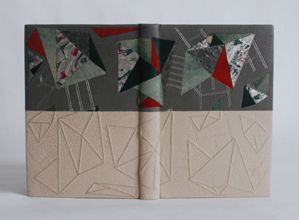
    The beach provides a microcosm that has the power to capture and reel you in for a closer look. For the design on Rebecca Chamlee’s book, I wanted to play on the transformation that occurs when removing specimens from the beach. There is a certain brilliance and beauty displayed beneath the water, yet once removed these same specimens dry out and become something entirely new.

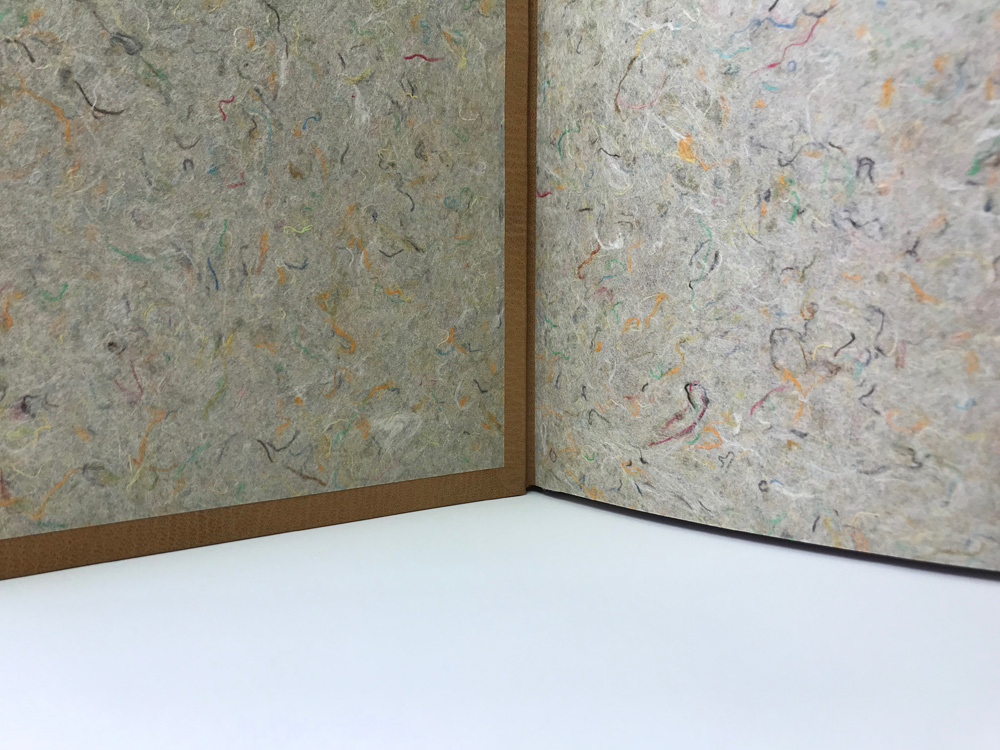
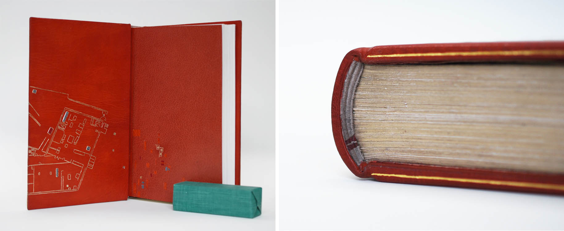
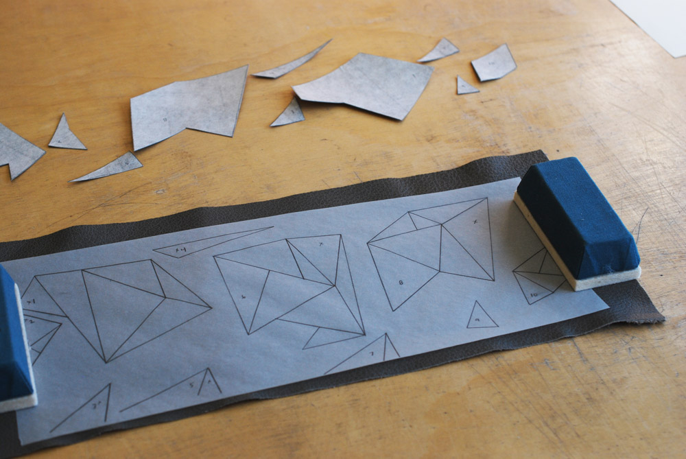
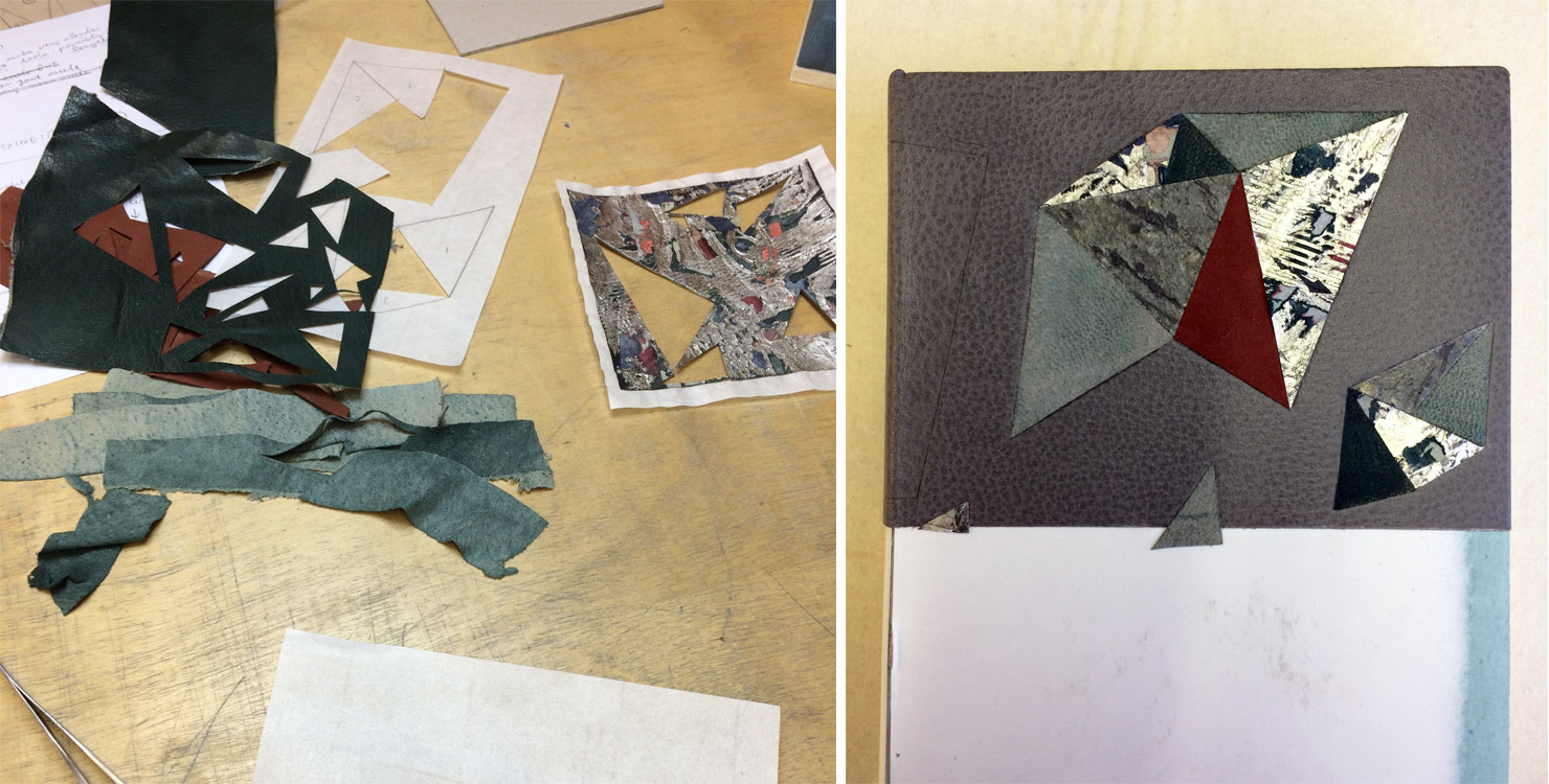
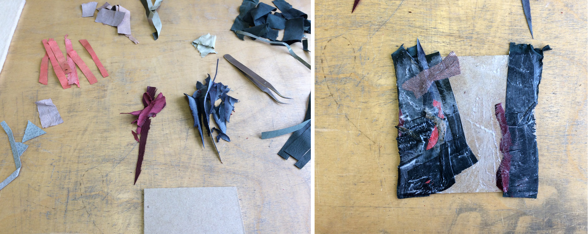
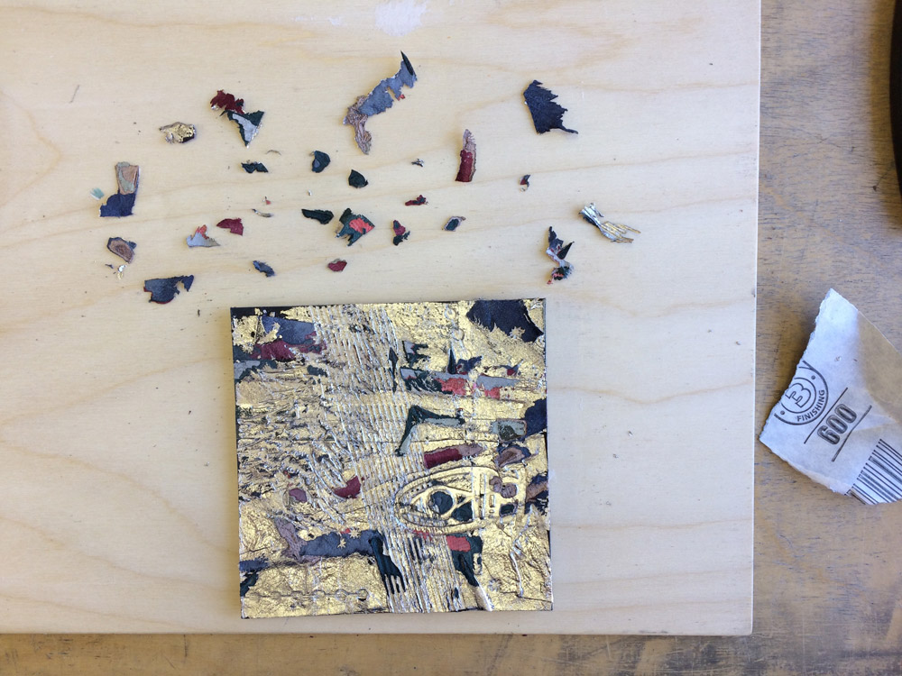
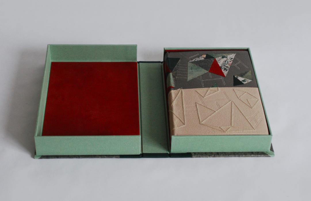
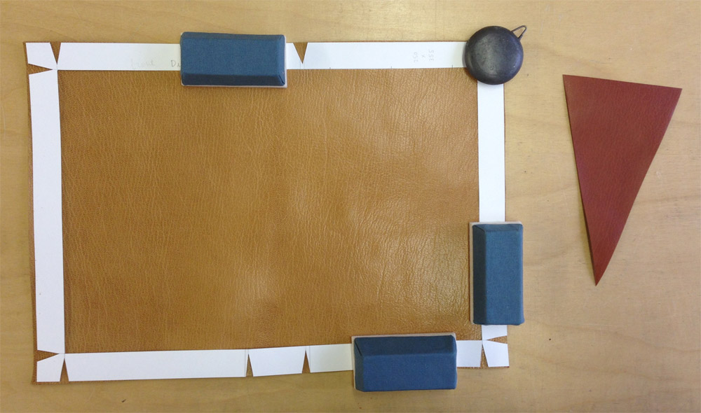
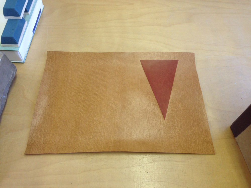
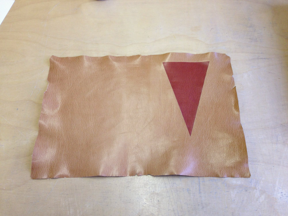
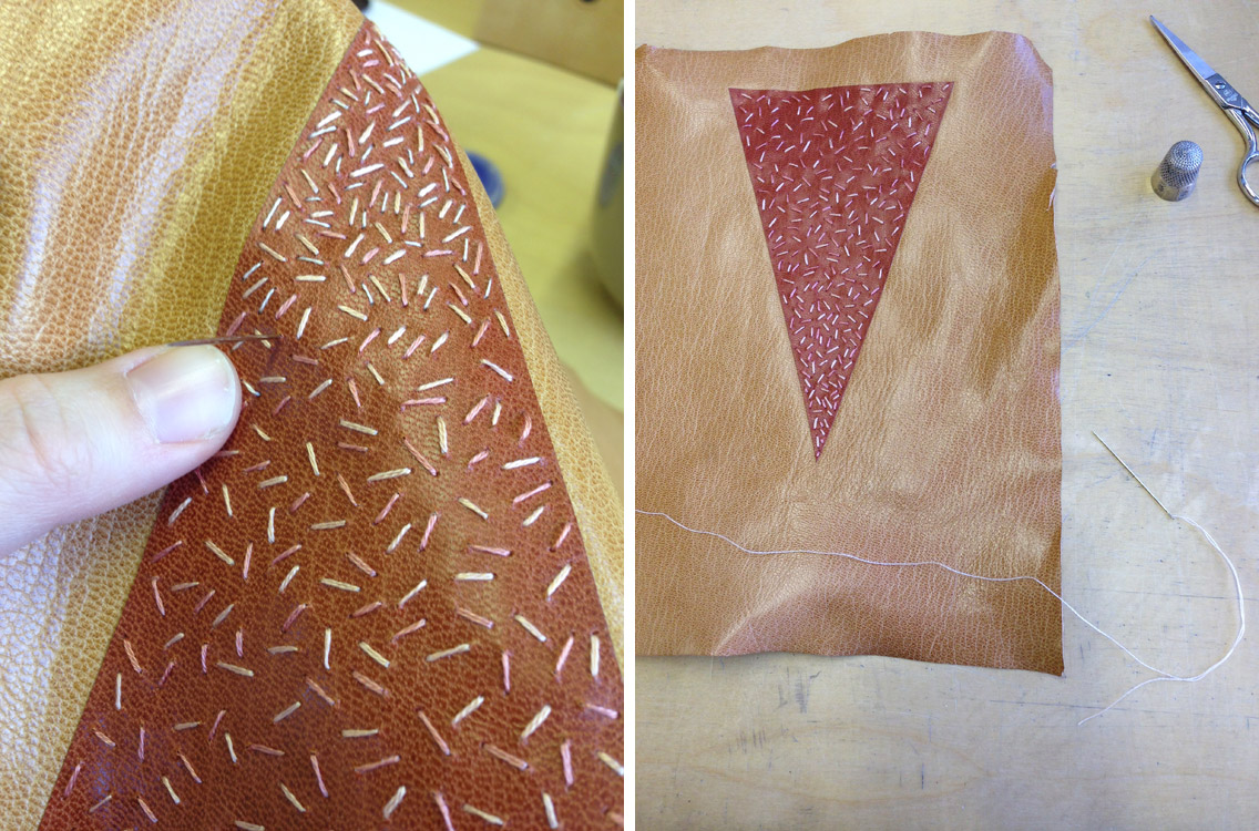
    The binding is bound in pale pink buffalo skin with back-pared onlays in printed calfskin, navy blue buffalo skin and various handmade papers. Laser-cut paper sequins tacked on with embroidery floss embellish the starfish. Additional details for the anemones and coral are hand embroidered with various colors of cotton floss. The printed onlay is outlined in a couched line of sage green cotton floss and blind tooled to create texture. Metallic pink dots are tooled around the coral.

    If you are in the San Francisco area, I hope you get the chance to see this incredible exhibit of bindings, artist books and broadsides.


  2. My Hand // Happy Abstract

    April 29, 2020 by Erin Fletcher

    Being lost in a state of creativity and production is a splendid place to be as an artist. William Blake, the Romantic poet, painter and printmaker, referred to this as ‘happy abstract’. This concept was highlighted in a letter written by Blake to one of his patrons in 1801, where Blake expressed his apology for the delay and that something more interesting had come along.

    This letter became the content of the set book for the second OPEN • SET exhibition sponsored by the American Academy of Bookbinding. This triennial event features finely crafted design bindings from all over the world. Binders were invited to submit their work into either category: the Open Category allowed the binder to choose their own text block and the Set Category gave each binder the same text block.

    Happy Abstract was printed by the immensely talented Russell Maret. A printmaker whose work is coveted by many and hard to obtain by many bookbinders to bind. Maret split up the letter to a single line per page descending from the head to the tail. Since this layout left a large margin around the printed text, binders were invited to add decoration to the inside of the book as well. A very exciting prospect to design throughout the entirety of the book.

    PAGES
    For the design on both the pages and the binding for Happy Abstract, I wanted to create something that was inspired by the beauty of unintentional marks and shadows. The inspiration for the shadows came during visits to museums and art galleries, where I captured the shadows cast by various works of art. These complex shadows add to the aura and beauty of the work, but are also captivating on their own.

    I wanted to recreate these shadows on the pages of the book. To do this I cut stencils with black paper to act as masks during the sun-bleaching process. Some of the stencils were cut down further after a certain period of time to offer the gradation seen in the image above. I taped the pages to windows at my studio and my home for a length of about 3-4 weeks. My studio gets more direct sunlight and offered a richer ‘shadow’ from the sun-bleaching.

    The stencils were placed on only one side of the folio, the chosen side was mixed up throughout the text block. This gave a disjointed display of shadows and a spread could range from no shadows, one shadow, or two different shadows. You can see views inside the book by clicking here.

    The endsheet closest to the text block was cut to mimic one of the stencils used for sun-bleaching. The cut endsheets cast a shadow on to the first and last page of the text block, giving the reader a similar experience to what first inspired me.

    BINDING
    I came to find the inspiration for the binding from my middle school students. My colleague Colin Urbina and I teach a Book Arts Middle School program through the North Bennet Street School in Boston. We teach a variety of artist book structures in addition to having them create their own content. They use all manner of instruments to do this: watercolor, crayon, colored pencils, markers, ink, charcoal and pastels. Each bench is set up with a piece of binder’s board to protect the surface from their flurry of creativity. The consequence of this creates a collection of abstract and unintentional marks.

    I pulled various shapes and marks from these boards to create a new arrangement for the binding. These shapes were then translated as back-pared onlays using a mix of handmade paper and hand-dyed calfskin. To capture the spirit of the watercolor markings, I layered the dyes with a paint brush (seen on green, grey and blue onlays) to make it look mottled.

    The markings would be built up in three layers using the following techniques: onlays, embroidery and tooling. Some elements would stand alone, but I was really interested in how these techniques would interact with each other. The embroidery is done mostly in a random way, with varying lengths and thicknesses to the stitches. I also used back-stitch and French knot, two common stitches in my work.

    With the embroidery finished I moved forward with covering and the third layer of the design: tooling. I used a random selection of tools from my collection (including some handle letters) to build up the design further. Impressions were done over the onlays and right along side the embroidery. I used a variety of pigmented matte and metallic foils in similar tones to the onlay pieces. I love this small addition of color and shimmer that the tooled impressions brought to the overall design.

    I used a very special handmade paper for the fly leaf and paste down. Papermaker and activist Mary Hark made a trip to Ghana to aid in the building of a papermaking studio. With an abundance of kozo growing as an invasive species, the community was able to harvest this plant to benefit their environment and build their business. This Ghanian kozo handmade paper has thread inclusions collected from a nearby textile factory. The circumstances, color palette and use of thread felt like a perfect pairing to the text and design of the binding.

    To see the entire catalog of bindings in the OPEN • SET exhibit click here. Even though the exhibit will be traveling across the country, it may be challenging to see it in person for a while. The Grolier Club in New York City, which served as the opening venue, posted images from the exhibit here.


  3. My Hand // 2001: A Space Odyssey Part Two

    June 13, 2019 by Erin Fletcher

    In my previous post, I went through the various enclosures crafted to hold my binding of 2001: A Space Odyssey and how they represented different parts of the Clarke’s text and Kubrick’s film. This post will focus on the binding itself, the inspiration and the process.

    Sitting inside the clamshell box is a binding decorated with a burst of color that plays homage to one of the most iconic scenes from Kubrick’s film. It is at this point, that the protagonist Dave flees the now inhospitable spaceship that was intended to carry him and his crew safely to Saturn. To recreate these star streaks, I bound the book in black buffalo skin with a range of back-pared onlays in goatskin, suede and handmade kozo paper. Additional embellishment is created through hand embroidery. Many times I create a template for my embroidery work. For this design I worked more spontaneously.

    Each stitched line was first marked out by scoring with a thin bone folder against a ruler in the desired spot. Then I pre-punch holes along this line in preparation for the embroidery. You can see my progression below as I was building up the design with both the onlays and the embroidery.

    This slideshow requires JavaScript.

    Tucked in between the section of pink onlays is a segment from Verdi’s Requiem Mass (Dies Irae) which is achieved with couching the embroidery floss and French knots for the notes. After narrowly escaping Hal’s attempt to kill him, Dave dismantled the computer and spent time in the ship contemplating his next move. He played a range of music to combat the silence. Verdi was blasted across the ship at the height of his loneliness and despair.

    Dave finally flees the empty ship and enters the final stages of his evolution. This is communicated by the interior side of the boards, flyleaves, edge decoration and endpapers. In his escape pod, Dave enters a space with gaping black shafts filled with squares, triangles and polygons before emerging into a white space peppered with a myriad of tiny black specks overhead.

    Dave ends this portion of his journey in a room where the objects seem familiar but at closer inspection deemed poor replicas. Dave calls out how two paintings hung on the walls are quite blurry yet recognizable. These two paintings are Van Gogh’s Bridge of Arles and Wyeth’s Christina’s World. I altered and cropped these paintings for the endpapers to be the final visual representation of the book before getting to the actual text.

    And that’s my rendition of this iconic science fiction story. You can see more images of the binding and boxes at my website.


  4. North Bennet Street School // Student & Alumni Exhibit 2019 – The Set Book

    May 9, 2019 by Erin Fletcher

    I am thrilled once again to be writing up this post after interviewing the graduating class from the North Bennet Street School’s Bookbinding Department. To catch up those who are new to the blog, every year I interview the second year students about their design bindings which go on display in the annual Student & Alumni Exhibit. And it’s my favorite time of year, I love sitting down one-on-one with each of the students to chat about their experience crafting a design binding and how their individual backgrounds tie into their work. That latter half was ever more present with this year’s set book: Rewarding Work: A History of Boston’s North Bennet Street School by Christine Compston, Stephen Senge and Walter McDonald.

    In this comprehensive examination of the School’s history, Rewarding Work, outlines the school’s impact within the local community and how it has evolved over the years to expand that community without compromising its initial mission “to bring about meaningful lives and livelihoods for its students, who come from across the country and around the world.” You can read a more about Rewarding Work at the school’s shop page, where you can purchase a copy for yourself.

    During the interviews, I discussed with each binder how their personal history with the school may have impacted their design choices. Every binding felt perfectly unique to the student who created it, which speaks volumes to their ability to reflect upon their two years and explore it in a visually creative way. If you happen to be in the Boston area, please check out the Student & Alumni Exhibit, which will be on display at the North Bennet Street School from May 1st through June 29th. The exhibit is free and open to the public, you can find out more information on the website.

    Séphora Bergiste

    The North Bennet Street Industrial School (the original name of the school) was established as an institution to better the lives of newly arrived immigrants through training programs to develop hand skills. Séphora Bergiste really latched onto this part of the school’s history. Séphora is also an immigrant having grown up in Haiti before moving to Rhode Island at age nine. Already her design decisions felt very personal, even before she talks about her art practice outside of bookbinding and its connection to dealing with and measuring time. The design mimics the face of a clock with the numbers replaced by symbols that represent the eight departments at NBSS.

    Séphora chose a color palette which represents the school’s unofficial colors: navy blue and golden yellow. The binding is covered in a beautifully hand-dyed goatskin. Séphora applied the spirit dyes using a wet on wet method in two ways: diluting the dye with an initial layer of alcohol and by continually saturating the same areas with dye. This application of dye created a dynamic and textured effect on the leather.

    The symbols are created through either tooling or surface gilding using florentine gold leaf. Séphora represents the Bookbinding department twice through the backing hammer on the back cover and the threaded needle on the spine. Below are the symbols for the Jewelry, Violin and Locksmithing Departments. The title fits within the needle/clock hand on the spine; Séphora used Gill Sans handle letters tooled in florentine gold leaf for the title.

    Séphora used a handmade Japanese paper that she purchased during a trip to Japan for the paste down and flyleaves. The paper has a subtle striped pattern in olive green and gold. She used the same dyed leather for the hinges, so there is a lovely pop of color between the two paper pieces. The elaborately hand-sewn French double core endbands include alternating bands of green, yellow, light blue and white threads.

    I love that Séphora chose to dye her own skin; that she took a chance to make her binding unique. The mottled effect she was able to achieve creates a beautiful contrast to the precision of the gold tooling. And I love that it is subtle, only in a well lit room can you see the true brilliance of the leather dyeing. I interviewed Séphora in a dimly lit room and it wasn’t until I photographed the binding could I truly see the variation in color. It was a lovely surprise.

    You can follow Séphora on Instagram: @somedays.bindery or check out more of her work at her website. Séphora will continue in her position working on an extensive housing project at the W. Van Alan Clark, Jr. Library at the School for Museum of Fine Arts at Tufts University after graduation.

    Rachel Campbell

    Reading through Rewarding Work, its apparent that the accord between NBSS and the North End neighborhood allowed both to flourish. Inspired by this idea and the surrounding architecture, Rachel Campbell gleaned elements from the neighborhood to build her design. Brick and concrete are common building materials throughout the neighborhood. The brick, in particular, felt so unique to Rachel as it presents itself more than in the architecture from her home state of Oregon. Her regular visits to St. Leonard’s Church also began to inspire aspects of her design, specifically the columns and stained glass windows. This draw to building structures and decor comes from a background in interior design.

    Rachel knew that she wanted to use a frame for the basic layout of the design. After sharing several iterations with me, I saw how she worked through her design and pared it down to it’s final stage. The shape of the columns changed from a classic Corinthian style, the detailed window design was reduced to simple line work and the overall design was reworked to be symmetrically balanced from fore edge to fore edge.

    The binding is covered in a grass green goatskin with over a 100 onlays used for the bricks and columns. The bricks are carbon tooled onlays in three shades of red goatskin: terracotta, crimson and maroon. Rachel carefully planned the arrangement of bricks to feel naturally random. The columns are also carbon tooled onlays; the grey goatskin is subtly marbled with black ink to resemble concrete. The windows are tooled in dukaten leaf. The title is laid out beautifully down the spine with hand tools to mimic an Art Deco typeface.

    A hand marbled paper made by Rachel is used for the paste down and flyleaf and has a color palette that perfectly pairs with the design on the cover. The marbling is irregular, but controlled within a linear frame which works well with the brick layout. Rachel also cleverly wrapped the bricks around the fore edge and over the marbled paper paste down. This is such a unique treatment and something I haven’t seen before. The text block edges are sprinkled with a brick red acrylic. The endbands are hand sewn around a single core in alternating bands of bright red and brick red.

    It is evident that Rachel put in so much thought and consideration into the design and execution of her binding. It’s clear to me that she worked very methodically and with precision as she laid in each of the onlays. Her carbon and gold tooling is so clean and so exact.

    In the recent NBSS exhibit, Bound Together, Rachel was awarded 2nd place for her binding of Emma by Jane Austen. She is incredibly talented and I can’t wait to see what binding she makes next. You can find more of Rachel’s work at her website here.

    Yi Bin Liang

    During the 2006 graduation ceremony, speaker Barry Moser, is quoted saying the following:

    The most important advice I can give you all–and forgive me if this seems glib–is to work. Work. Work. Work. Everyday. At the same time every day, for as long as you can take it. Work. Work. Work.

    You can’t depend on talent. Talent is as common as house dust…So remember that nothing is as valuable to solid craftsmanship as is the habit of work, and work has to become a habit. Has to become something that you cannot NOT do. It has to become bone within you.

    This quote really resonated with Yi Bin Liang as a self-proclaimed workaholic, who set out to create an ambitious design binding for her copy of the set book. Featured on the front cover is the school’s logo: a lantern. However, in Yi Bin’s design it is re-imagined as a lighthouse. The school’s strong focus in traditional crafts and hand skills became a guiding light to Yi Bin after graduating from the Rhode Island School of Design. Like many of her fellow classmates, Yi Bin incorporated her own experience into her design, highlighting her transition from art school to trade school.

    Yi Bin used various shades of blue goatskin onlays for the waves and alum-tawed goatskin for the crests. The lantern is constructed with turquoise and black goatskin onlays. All of the onlays are tooled with a combination of moon gold and double gold. Behind the lantern is a sunburst of gold, all set to a backdrop of medium grey goatskin. The title is hand tooled down the spine in Gill Sans.

    As we discussed her process and design, she revealed that she worked almost spontaneously on the book. Although she worked initially from a planned design, some elements were added later on to build up the design providing depth and balance

    The light blue goatskin leather Yi Bin chose to use on her binding is notoriously known to fade over time. And since Yi Bin is quite resourceful, she collected various scraps from the communal bin which gave her a range of light blue tones. In choosing her materials discreetly, some piece came with tears, which Yi Bin decided to keep as an element of her design.

    The edge decoration beautifully mimics the handmade paper used for the paste down and flyleaf. To recreate this look, Yi Bin brushed on a dark blue goauche before laying on squares of leaf and then sprinkling small pieces of leaf. The endbands are hand-sewn in alternating bands of teal, blue and silver. I really enjoy Yi Bin’s design, it’s bright and boisterous. It really carries several emotions throughout the design, which I think, perfectly reflects anyone’s experience at NBSS.

    You can find more of Yi Bin’s work at her website or follow her on Instagram: @liang.yi.bin

    Greta Llanes

    Part of the history laid out in Rewarding Work is a timeline of the various programs offered at the school. Discussing trends and the politics on what the school should be teaching, highlighting the decisions to drop some programs and introduce others. In Greta Llanes design, she sought to capture the cultural influence of North Bennet Street School to the North End neighborhood and her own experience at the school over the past two years. These two main factors are represented as a core of energy centrally located on the spine of the binding. The veins of the marbling flow out from this point like a burst of energy.

    I really enjoyed my discussion with Greta, it became quite apparent that her design was driven from a thoughtful examination of her time at North Bennet and the surrounding community. Although her design may read as simplistic, Greta experimented greatly to achieve such a seamless design. The main component of her design is the marbling, which resembles 17th century Spanish-style marbling. Greta used acrylic pigments to marble on a blackberry goatskin.

    The color purple was very important for Greta’s design. It was her way of connecting with the color’s interesting history of discovery; that revelations can be discovered through mistakes and error. In many ways the binding embodies Greta and her experiences both leading up to and during her time at NBSS. To fully connect her design on the binding, she added gold leaf through surface gilding and by painting on shell gold to bridge the veins of the marbling to the central core on the spine. The title is tooled in moon gold down the spine using Edinburgh typeface.

    Greta created a “marbled” effect for her edge decoration. After applying a layer of graphite, she put down different varieties of gold leaf and wrinkled them to create a vein-like effect. She continued to build up the edge in this way; the added graphite toned down the gold in the previous layer creating depth and levels of vibrancy. All edge are tooled with a single line in dukaten gold leaf. The hand-sewn French double core endbands have alternating bands of blue, light blue and two shades of grey. The marbled paste down and flyleaf are from Chena River Marblers. A really nice detail, are the marbled leather hinges which match the marbling on the cover. This creates a continuous flow from the paste down to the flyleaf.

    I really love Greta’s binding. The colors are sumptuous, the design is elegant. After speaking with Greta and being able to connect the design with her personal history makes it even more electrifying. I can’t wait to see what she does next.

    In June, Greta will be at Harvard’s Francis L. Loeb Library for a 1-month internship before teaching week-long classes on decorative paper techniques at a summer camp for kids of all ages. She’ll be rounding out the summer with the Lisa Von Clemm fellowship at the Boston Athenaeum for the following 6-months. Check out more of Greta’s work on her website here.

    Liz McHugh

    As America’s first trade school, North Bennet Street Industrial School focused on training programs for immigrants in the North End neighborhood in the late 19th century. This connection to the North End resonated with Liz McHugh as she began to plan out her design. Being the oldest neighborhood in Boston, the North End has a unique old-world architectural feel. Liz walked around the windy, narrow streets capturing photographs of various buildings that caught her eye, which she then compiled into an imaginary landscape with the help of Illustrator.

    Liz used a selection of goatskin onlays to highlight each individual building ranging from royal blue, grass green, blackberry, terracotta, maroon and turquoise. Each onlay is tooled with moon gold using a range of hand tools. It is undeniable that the most captivating structure is her depiction of the Old North Church. Easily recognizable to anyone familiar with the North End. Yet even if you can’t place it, your eyes are immediately pulled to its unique silhouette and bold color. The Old North Church is located near NBSS’s original location and has continued to serve as the venue for the school’s annual graduation ceremony.

    Liz also added subtle details through the use of blind tooling, choosing more traditional finishing tools to represent the finer architectural details without adding too much decadence. I love this element of her design. It elevates her design, creating more depth and interest. The maroon goatskin title piece is treated in the same manner as the buildings with a frame of gold and blind tooling. The edges are splattered in blue, purple and gold acrylic paint, which is paired with French double-core endbands in alternating bands of blue, purple and a pinkish red.

    As I opened the book, I found myself pleasantly surprised by the brightly patterned marbled paper which is used for the paste down and flyleaf. Marbled by Liz, the paper pulls colors from the cover making it an easy transition as you move from outside to inside. I also love the energy of the paper, I think it resonates with the spirit of the school and its continued success building a vibrant community.

    The color palette and playful perspective of the buildings really speaks to the intensity of the neighborhood. Liz manages to balance the colors of the landscape, while creating a central focus. She knew where to add subtle details and when to retract. I think her binding has a lovely illustrative feel and really encapsulates the feel and look of the North End.

    Liz plans to move back to her hometown of Philadelphia to start her career in field of bookbinding. You can follow her next move on Instagram: @exmchugh

    Jennifer Pellecchia

    The colorful design binding that Jennifer Pellecchia is holding was not her original design, far from it. Taking her initial inspiration from a section in the book on lap joints, Jennifer’s plan was to mimic a dovetail joint with a grey chagreen goatskin laid over a hand-dyed skin which was decorated to resemble the floor around her bench. However, the chagreen skin proved to be too difficult to work with in the paring machine. Hitting an impasse, Jennifer had to decide whether she would push forward or scrap her entire idea. She decided on the latter and I think she ended up with a spectacular binding that showcases both her skills and personality.

    Honoring the her time at NBSS, Jennifer chose to incorporate a variety of techniques she learned during her second year. This includes her unique application of leather dye, which is a technique she learned from guest instructor Nicky Oliver. The fair goatskin is dyed with spirit dyes applied with cotton balls and pom-pom applicators. Dye was also dripped through a pipette and sprayed with an atomizer. The division of color follows the blind tooled design, which resembles the paneling on the ceiling in Windgate (an area of the school that was built during the renovations to connect two existing buildings). The blind tooling pulled out a variety of shades from the various colors of dye, making the overall effect more dynamic.

    The leather was pressed with lead shot and salt, which created small irregular divets in the leather. This is quite subtle, but effective at creating depth and an interesting texture. The panel rivets are done with itty, bitty tooled onlays in complimentary colors. The gold is applied with leaf and foil in specific areas. Jennifer chose to use foil for the solid dots, since it was challenging to differentiate between the tooled dots and the impressions created by the lead shot. The title is hand tooled down the spine in Gill Sans in the same gold leaf as the design.

    The endbands are hand-sewn around a single parchment core in alternating bands of dark grey, pink, tan and off-white. Jennifer embellished the handmade Bhutanese paper used for the paste down and flyleaf by stamping the paper with dye soaked bubble wrap. The dye permeated into the paper in a spontaneous way, creating soft splotches of color. Jen was quite innovative in her solution to add a pop of flair to the interior side of her binding and I really love the results.

    I commended Jennifer on her perseverance as she struggled with her initial idea, she really tried to make the best out of a difficult material. But, in the end that battle forced her to reshape her concept and design. She created one of my favorite bindings of the bunch. I’m drawn to the wonderfully saturated colors, the playfulness of her design and the ingenuity of material use (lead shot, salt and bubble wrap). Looking forward to her next design binding.

    After graduation, Jennifer will continue in her position as Preservation Assistant at MIT working on their music collection. Follow Jennifer on Instagram: @jenn1cakes.

    Clair Emma Smith

    When I spoke with Clair Emma Smith about her binding, I was intrigued not only by the gorgeous geometric pattern, but also by her design process. It was very indicative to the way binder, Annette Friedrich works to create her designs. Clair Emma worked within a set of parameters as she drew various linear designs on graph paper; penciling in lines as her mood saw fit. After building up a collection of illustrations, Clair Emma pulled elements from multiple designs in order to create what would become the final template for her binding. Her binding has a very Art Nouveau feeling and in a strange route to compliment her binding, I mentioned that it reminded me of an elegantly decorated elevator. I beam with delight at a an exceptional design in an elevator.

    This year, the second year students really experimented with a variety of leather dyes through workshops with guest instructors Nicky Oliver and James Reid-Cunningham. Roda dyes, which are metal-based dyes, were introduced to the students through the lens of conservation. Clair Emma wanted to see how these dyes could be used for creative, artistic purposes.

    By blending pink and yellow dyes with cotton balls, the pigments merged to create rich orange tones. These diamond shaped tooled onlays evoke jewels set in the leather. Clair Emma used a navy blue goatskin for the base leather with the geometric design tooled in dukaten gold leaf. The title is beautifully balanced into the design on the spine in Edinburgh handle letters.

    I was pleasantly surprised when I opened Clair Emma’s binding to discover a vibrant and ornately patterned paper used for the paste down and flyleaf. This bold and lavish paper broke from the rigor of the cover design. Clair Emma noted how this paper created a nostalgic connection to her home town and felt like the perfect paper to incorporate into the binding. The French double core endbands are hand sewn with alternating bands of navy blue, gold and maroon silk threads.

    Although Clair Emma’s design may appear as a simple geometric pattern, I want to point out the precision it takes to lay out tooled lines in a straight and even fashion. Her design is beautifully balanced across the entire cover. I love her choice of color, the brilliant orange onlay leather dances against the navy blue forcing the eye to move around the cover. Her design choices are on point and they surprisingly bring me to my love of elevator interiors.

    Matthew Lawler Zimmerman

    As I’ve mentioned already, Rewarding Work is about the history of NBSS and its impact on the community in the North End. Because the text is so site specific, Matthew Lawler Zimmerman wanted to emphasize this in his design. The school recently underwent a massive change when it moved from the original location on North Bennet Street to it’s new home on North Street. Matthew chose to capture this transitional point in the school’s history by recreating the blueprints of the original location and the new location with traditional decorative techniques.

    Influenced by the brick buildings in the North End, Matthew chose to execute his design on a gorgeous vintage oxblood goatskin. A portion of the school’s original location is tooled on the back cover in dukaten gold leaf, while the new building adorns the front cover and bends around the doublure on the inside. The new building is tooled in moon gold, which is softer and less yellow than the dukaten gold leaf. I particularly love the slight overlap of the two blueprints at the spine.

    In order to engage more of the school, Matthew incorporated a variety of materials as both tooled onlays and inlays to represent all eight programs currently offered at NBSS. These include various wood veneers, such as bird’s eye maple, cedar, aspen and walnut, metals, ebony, elk bone and hand-dyed leather.

    Matthew chose the ambitious route of adding leather doublures and leather flyleaves to his design binding, using the same oxblood goatskin for the doublures and a terracotta goatskin for the flyleaves. There is a subtle difference in tone, with the terracotta being slightly darker, and has a more even grain pattern. This transition from light to dark is so seamless, especially since the design on the doublure floats onto the flyleaf into an abstract pattern. The head edge is rough edge gilt with moon gold and the board edges are tooled with a single line in dukaten gold leaf. The French double core endbands are hand sewn with grey and two bands of maroon thread.

    The students graciously allow me to handle their bindings so that I can survey every detail and lend them a critical eye. Matthew’s execution of his binding is exceptional. Crafting a full leather binding, with leather doublures and flyleaves is quite a challenge and Matthew rose to the occasion. The leather doublures in particular are flawless, which can be quite a task. I think he is quite observant and has a keen eye for detail, which really shone through in his binding. There will certainly be more design bindings in Matthew’s future and I look forward to it.

    Matthew plans to merge his printmaking background his newly honed bookbinding skills by crafting editions of work from the printed page to the custom binding. However, he also plans to pursue a career by working with other printers and binders. You can check out more of Matthew’s work at his website.

    – – –

    Thanks again to the 2019 graduating class and Jeff Altepeter, Head of Bookbinding Department. It was such a joy to get to know you all a little bit more and speak candidly about your work. I can’t wait to see how you all take your skills and apply them to our community. I wish you all the best.

    If you want more interviews from past classes check out the list here.


  5. My Hand // 2001: A Space Odyssey Part One

    April 22, 2019 by Erin Fletcher

    If you ask a binder what book they would love to bind, I’m sure they would have a list of titles at the ready. I’ve had 2001: A Space Odyssey by Arthur C. Clarke on my list for sometime now. After working on the binding on and off for over a year, I can finally check it off my list.

    I was first enchanted by this story not by reading the science fiction novel by Clarke, but through the film by Stanley Kubrick. It’s one of my favorite films and I see it on the big screen any chance I can. It wasn’t until after I read Clarke’s telling of 2001, that I began to investigate the unusual collaboration that produced both the film and the novel. Kubrick and Clarke wrote the story together, yet parts of the story don’t appear in the film and vice versa. Each respective storyteller put their own unique spin on the tale.

    The film actually debuted before the novel, which makes me feel better about not reading the book before watching the movie. In fact, I think the novel enriches the film, expanding on the story in a way that could not be visualized in the film.

    When I embarked on binding a copy of 2001, I had all of this history in the back of my mind. I read the novel again, this time through the lens of a designer, pulling out segments and phrases I found inspirational. Unconsciously, I was also visualizing imagery from the film; scenes that were so impactful and had influence on my design. I could not separate the two when working on the design.

    One other hurdle I came upon, was the sheer volume of inspiration from the novel and film. There were too many significant moments; which do I highlight? So, I came to the conclusion that I needed to create a design that would represent each major moment of the story.

    In this multi-part post, I will describe each aspect of the piece, going into detail about the inspiration for the design and how I chose to execute it through various materials and techniques.

    Let’s start with the outermost enclosure: the storage box. The entire collection of enclosures and binding are housed in a standard full cloth clamshell box. I don’t really view this box as part of the overall concept, it merely serves the purpose of storing the contents safely. However, this is the only piece where the title appears as a label on the spine. The title is embroidered in a futuristic font on handmade paper from Hook Pottery Paper.

    Sitting inside the storage box is a paper wrapper, which is meant to represent Part I: Primeval Night. The story begins at the dawn of humankind, witnessing the moment that our primitive ancestors develop tools to be used for killing animals for consumption, but soon this same tool becomes a weapon against an enemy tribe as it is used to murder the leader of a neighboring group. The 4-flap wrapper is made from yellow ochre St. Armand paper, which is a nod to the vast desert setting for this incident. A coyote foot bone aids in opening the wrapper and is an obvious cue to this significant part of the story.

    Unfolding the wrapper reveals the interior clamshell box, which includes the elusive monolith. A symbol that appears throughout the novel. This transition from wrapper to clamshell is referencing two moments: the monolith first appears to the primitive humans at the precise moment described above and then not seen again for centuries until it is unearthed on the moon. So the action of unfolding the paper wrapper to reveal the monolith underneath speaks to these two moments in the story and moves into Part II: TMA-1 and Part III: Between Planets.

    The monolith onlay is constructed according to the 1:4:9 ratio described in the book. I used black calf skin wrapped around 20pt. museum board. After attaching the leather, I pressed the piece with mylar to create a shiny surface on the leather. Depth is created through the simple addition of three blind tooled lines at the left side and bottom edge.

    The monolith is surrounded by a frame of handmade moon paper from Hook Pottery Paper and paper from Moth Designs with a scribble design.

    The case is covered with black buffalo skin and the same moon paper is used to cover the trays. The purple paper, which I used for the label on the storage box lines the interior of the box.

    That covers all of the enclosures for the binding. In my next post I will go into detail about the concept and construction of the binding and how I worked in the remaining portion of the story.


  6. My Hand // Invisible Cities

    March 13, 2018 by Erin Fletcher


    I was introduced to the work of Italo Calvino through his 1972 novel Invisible Cities. I became infatuated with his writing style and imagination. The tales within Invisible Cities project so much imagery and color and emotion. And so I set forth to create a binding worthy of Calvino’s descriptive tales of fantastical cityscapes; the binding was completed in 2017.

    Bound as a traditional French-style fine binding, the book is covered in two separate pieces of buffalo skin which meet along the center horizon. The top half is busy and heavy; the collaged materials depict abstract images of buildings with gilt “scaffolding”. The abstract building structures were achieved through various onlays of suede, goatskin, stone veneer and palladium lacunose. The stone veneer and palladium lacunose were too textured and too stiff to back-pare, so to achieve the look I wanted I attached stand-in onlays in the full shape of the collaged structures before paring.

    Once pared down, the top half was attached to the book and the stand-in onlays were removed to make way for the final onlay pieces. In order to cut each onlay to the correct size, I used additional pieces of tissue drawn with the same shapes used for the back-paring. The final onlay pieces were cut out through the tissue to ensure their exactness.

    The palladium lacunose is a technique I learned during a workshop with Mark Cockram. An assemblage of goatskin and suede scraps was surface gilt with palladium. Additional texture was created through stamping, tooling, sanding and paring.

    With all of the onlays placed in the top portion, I was ready to work on the bottom half. My first step was to trim both halves at a bevel to create a seamless connection at the center of the book. The design was marked in the leather and sewn with a cotton floss in a matching light grey color. Some shapes span across both halves of leather, so it was vital to have the embroidery line up with the onlay pieces.

    The final aspect of the design to put in place was the “scaffolding”. After making my own thin line brass tools, the top half was tooled in palladium, while the bottom half was left blind.

    Despite finding the entire book inspirational, one particular city drew me in deeper than the rest. Within chapter seven under the group “the dead” Eusapia speaks of an underground city where the dead attempt to mimic the living or vice versa. These opposing forces of truth and falsehood are represented by the two opposing panels. The lower portion of the design is meant to poorly mimic the top portion. This was achieved by removing the color, texture and glisten of the upper panel.

    This theme of polarity and symmetry continues onto the edge of the book and the leather doublures. The entire edge was initially covered in graphite, then palladium was applied to just the head edge and half of the fore edge. The palladium was left looking distressed to compliment the broken palladium on the lacunose onlays.

    As you open to the interior side of the covers, more imagery is unearthed leading you back into the richness of the text. Pulling from Calvino’s references to building structures and the solar system, the front doublure depicts the orbits in our solar system with inlays representing the planets. The bottom half shows the constellation for Cancer. The stars are embroidered in a matching cotton floss with connecting lines tooled in blind.

    The back is similarly styled with a palladium tooled dome and the constellation for Pisces. The fly leaf is a metallic cork paper. The book is housed in a quarter leather clamshell box. The spine of the box hints at the design of the binding with three small inlays collaged together. The rest of the box case is covered in stone veneer. The trays are covered in handmade Katie MacGregor paper and lined in the same faux suede used on the binding.

    This binding was apart of the Student and Alumni Show at North Bennet Street School before going on display for the Society of Bookbinders International Competition 2017 in Keele, England. You can read more about my concept and see even more images here.


  7. My Hand // Covering Dune

    February 10, 2015 by Erin Fletcher

    CoveringDune1-ErinFletcher

    As I have mentioned on a prior post, my inspiration for the binding of Dune came from several sources: my husband (super fan) plus Lynch and Jodorowsky’s cinematic interpretations. Once I put pencil to paper, I drew from the geometric shapes and simple forms of the French Art Deco design bindings of the 1920s/30s.

    After creating a plaquette of the final design, I outlined the steps of execution for the covering and design work. The isosceles triangle onlay was to be embroidered, which meant it needed to be attached before any paring. The triangle onlay was pared to be incredibly thin from a terracotta Harmatan goatskin then glued down to the base tan Harmatan goatskin using PVA. It’s crucial to use PVA, since the steps for covering requires moisture which could lift the onlay if paste were used.

    In the image above, I’ve laid down a paper template (this paper template is the exact dimensions of the book, it includes the turn-ins and width of the joint). It also has the markings showing me where to glue the terra-cotta triangle onlay. Once the triangle was in place, I sandwich the leather between two acrylic boards and put it in the press to dry.

    CoveringDune2-ErinFletcher

    At this point, the leather is ready to be pared. The paring went through several stages. I began by paring the whole piece of leather using a Schärf-fix, this process turned the triangle onlay into a back-pared onlay. Next I pared the edges down in preparation to use a spokeshave to cushion pare the rest.

    CoveringDune5-ErinFletcher

    Once the skin was perfectly pared, I got straight to the embroidery of the triangle onlay. I used three different shades of pink in varying thread thickness to sew lines in a random manner (being more densely applied near the point of the triangle).

    CoveringDune6-ErinFletcher

    With the embroidery complete and the leather pared, I continued with the final steps of the plan: covering the book. I’m going to keep you in suspense to see the full design once the binding is complete! Stay tuned!


  8. Bookbinder of the Month: Sol Rébora

    November 16, 2014 by Erin Fletcher

    FaustoA-SolRebora

    In this post on Sol Rébora, I am presenting two of her bindings of the text Fausto. Just as was the case with the two bindings she completed on Alice in Wonderland, Sol found inspiration in the individual editions, thus creating two independent and unique design bindings. Fausto was written by Argentinian poet Estanislao del Campo is 1866; the story describes a laborer that goes to see Charles Gounod’s opera Faust and believes the events to really be happening.

    The binding above is bound in full black goatskin. The circular design includes strips of goatskin and calf, offering a nice variety of textures. The title is tooled in gold along the spine.

    The binding below is bound in full calfskin with detail along the front cover fore edge in the signature style we’ve seen on some of Sol’s other bindings. On this binding, the goatskin and calf onlays sit on five tooled levels. The title is tooled in gold along the spine. FaustoB-SolRebora

    These two bindings of Faust0 are quite different. Can you talk about the concepts behind each binding and what made you design them differently?
    After the explanation of the process I use to make a design binding, probably there are not too much to say about.

    Those are totally different editions, different clients, different years, and different prices, which is another very important point that I didn’t mention before, and it is a big condition of course.

    Most of the tooling on your bindings seem reserved to the titles or is done blind. Is there a reason for excluding this technique from your bindings?
    Well, maybe I don’t use traditional tooling on my designs, besides the titles, but it just depend on the designs, if I feel it needs it, I used traditional tooling to make gold lines it as I did on Milongas, Borges.

    I think I just use what I need when I need.

    I mostly like to work with a metal or brass folder, a very thin tool which helps me to make the finishing work on the inlay and the onlay. I do not love the strong lines around the inlays and my feeling is that it makes the composition looks stronger.

    FaustoAB-SolRebora

    Click image to enlarge.


  • My name is Erin Fletcher, owner and bookbinder of Herringbone Bindery in Boston. Flash of the Hand is a space where I share my process and inspirations.
    The StudioNewsletterInstagramEmail me
  • Archives