At the beginning of the school year in Fall 2020, I had the honor of ushering in a new group of students. I was invited to teach the incoming class for about a month and a half. And over the past two years, I’ve enjoyed getting to see their journey and show them a couple of other techniques here and there. In the past, I would be at school at least once a week, but the time I get to spend at North Bennet has continued to be limited due to COVID. So when I stopped in to interview the students, I had very little knowledge about the outcome of their set books. It was a real treat to be thoroughly surprised. And I will add, completely impressed with their ambition and tenacity.
This year’s set book is The Illustrated Man by Ray Bradbury. This collection of short stories was originally published in 1951, but the students bound a recent edition from the Folio Society. The collection of unrelated stories share some reoccurring themes such as technology, space and human psychology, but the main thread that ties them all together is the “The Illustrated Man”. An unnamed man, covered in tattoos, acts as the narrator. As the tattoos become animated each of the individual short stories are revealed.
Each of the student’s bindings will be on display in the 2022 Exhibition: Making Matters at North Bennet Street School through August 26. The exhibit offers a behind-the-scenes look at how work is created throughout the different departments at North Bennet. Each binding is displayed alongside some of the experiments, materials and tools used to create them. Check out the NBSS website for information on the best time to visit.
I hope that each of the students feels pride and satisfaction when they look at their binding. It takes an incredible amount of skill, patience and passion to get to the that final stage of the binding. I wish them all the best post-graduation as they find their path within this field.
Lucy Dunphy Barsness
Lucy (she/her) and I share an affinity for embroidery and throughout the past two years, we’ve discussed technique and new ways of incorporating embroidery into bookbinding. About halfway into her first year, we discovered that we had actually met years earlier while attending a course at Rare Book School. What a small world! So needless to say, I was not surprised that Lucy used embroidery on her binding, but I was certainly sparked by her ambition in recreating a fanfare-style design through stitching. Being introduced to this 16th century form of decoration during the course at RBS, this heavily decorative and intricate layout of compartments, coils and foliage stuck with Lucy over the years.
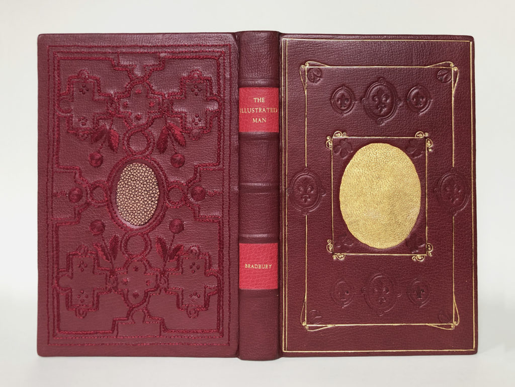
While each cover is unique, similar design elements that hint towards the fanfare-style link them together. Lucy covered her binding in a maroon goatskin and embellished the back cover with garnet silk thread. The blind tooling on the front cover relates directly to fanfare, while the gold tooled borders give off Parisian vibes, pinpointing her inspiration to both time and place.
A central motif, typically a heraldic crest, placed within the complex layout is found on most historical fanfare bindings. With a drive to play with different techniques and materials, Lucy decided to work with stingray. Due to the hardened cartilage that makes up their skin, stingray is a notoriously difficult material to pare and manipulate. But Lucy took it a step further and decided to surface gilt the skin, which you can see proudly placed on the front cover. The surface gilt stingray has a brilliance that draws you in to reveal the subtlety of the skin’s texture.
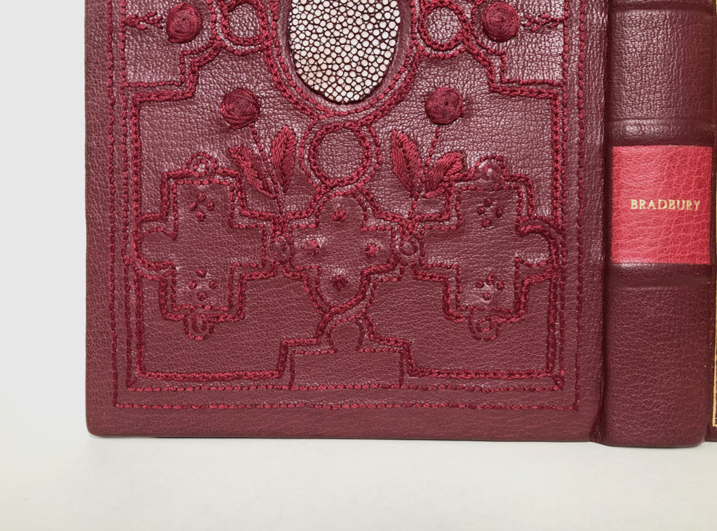
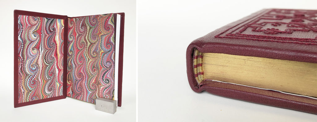
Although the fanfare-style was historically executed in gold, Lucy’s embroidered version is no less opulent and sophisticated. Using garnet silk, she embellished the back cover with six different embroidery stitches to create variation in line thickness and ample texture. The position of the stitches catches the light, creating depth and space around a natural white inlay of stingray. The spine is segmented into compartments with false bands. Two stamped labels on brick red goatskin showcase the title and author. The limited color palette on the exterior is met with an explosion of color as the book is opened to reveal a traditional marbled paper. The head edge is gilt over a layer of Armenian red boule. The gold and red striped double-core endbands blend perfectly with the rest of the design.
I always end the interview by asking the students about their experience creating a design binding and whether or not they plan to make more in the future. I was particularly interested in Lucy’s answer as I can see the potential of where her work with embroidery can go and also how it may surprise me! Thankfully, Lucy enjoyed the challenges that this binding presented and looks forward to exploring the possibilities future bindings could bring. Soon after graduation Lucy will be relocating to Raleigh, North Carolina to start as a conservation technician for the State Archives of North Carolina.
Alexa Garvin
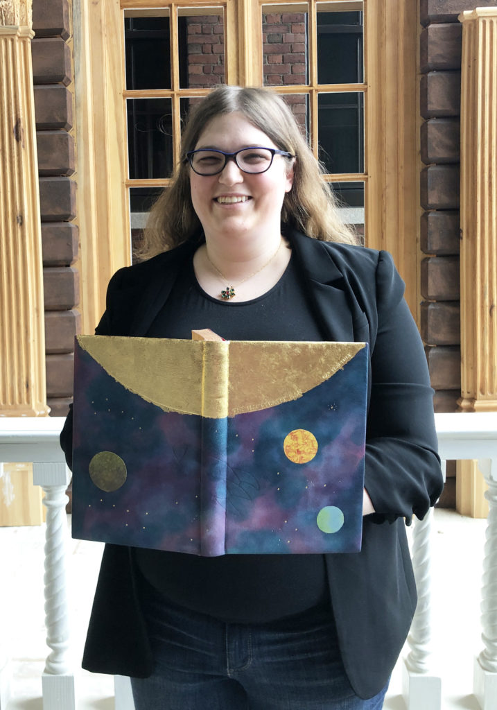
When Alexa (she/her) told me she wanted to incorporate as many of the techniques she had learned throughout the year onto her binding as she could, I was instantly transported back 10 years when I was designing my own set book. I think it’s highly ambitious and risky to incorporate lots of technique into a design. However, when Alexa pulled out her binding to show me, I was so blown away with the brilliance of the surface gilt sun against the softness of the hand-dyed leather. I had gotten a few peaks into Alexa’s design and her dye experiments prior, but I was just so impressed with the final look of the binding.
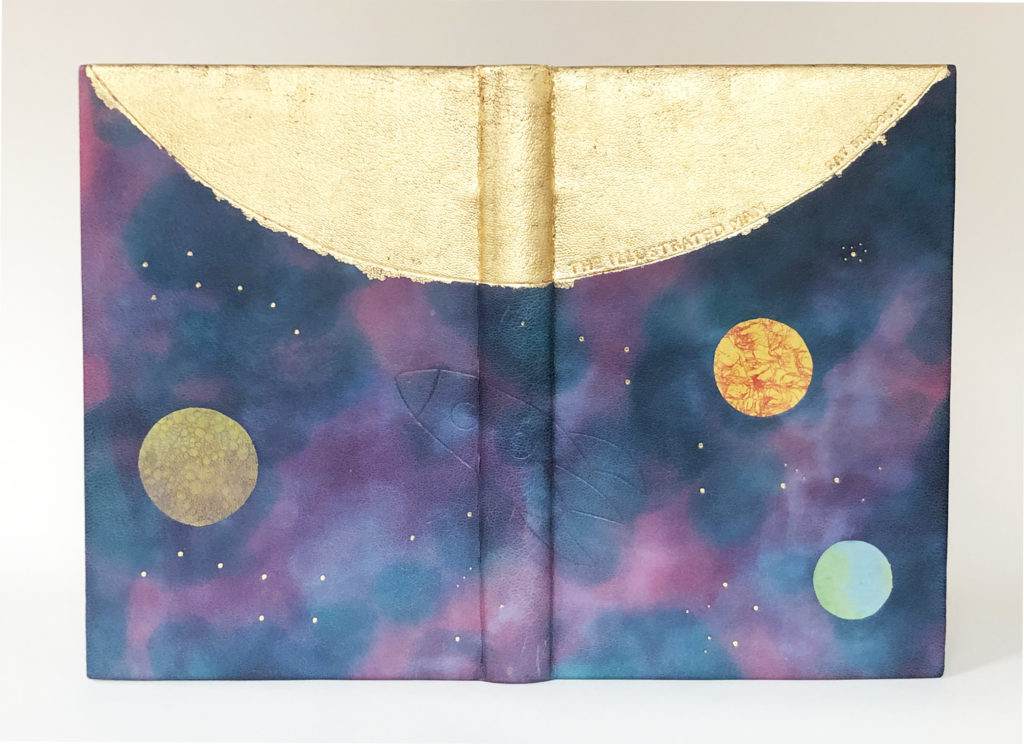
Before winter break last year, I taught a quick workshop for the entire bookbinding department on the leather dyeing techniques I had previously learned from Nicky Oliver and Coleen Curry. Using a blending technique, Alexa was able to seamlessly fuse aniline and spirit dyes together to create a nebulous atmosphere on fair goatskin. Alexa took her inspiration from The Rocket Man (which doesn’t appear in this edition, but is included in other editions of The Illustrated Man) and how it related to the myth of Icarus. The blind tooled rocket quietly moves through space on a course set for the sun.
The almost invisible rocket is sandwiched between three back-pared onlays of Earth, Venus and Mercury. Each of the planets have been uniquely dyed to capture the essence of that world. The iconic blue dot is created with a layer of blue spirit dye dabbed with yellow to create green land forms. Alexa used the craquelle technique to create Venus, putting a layer of chili pepper alcohol ink over yellow spirit dye. Mercury also includes a base of yellow spirit dye, but is finished with a layer of bubbles made from a purple/blue mixture.
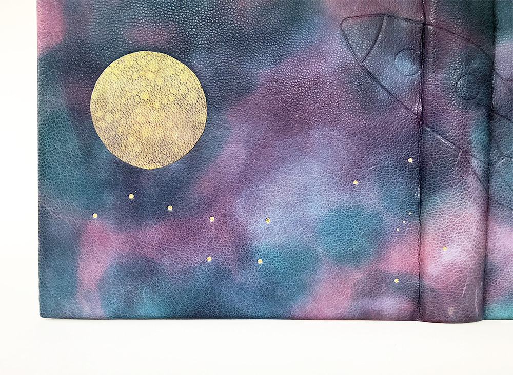
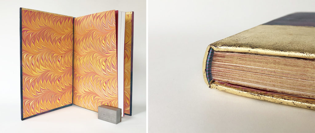
The negative space is filled with various constellations that have been gold tooled with large and small dots. Each constellation is easily recognizable, but Alexa specifically included the Pleiades star cluster to give a nod to the fact that she attended one of the Seven Sisters colleges prior to coming to North Bennet. The title and author’s name are hidden inside the surface gilt sun, following the curve of the sun from spine to the fore edge. The surface gilding continues around the turn-in and aligns with the fore edges of the text block. The exterior of the binding feels mostly cold with the use of purples and blues, but once the book is open a blast of yellows and oranges envelope you. The head edge is gilt in the rough in gold over a layer of Armenian red boule. Alexa jumbled up the folios and the sections to create a true random edge. The single core endbands are sewn with purple and blue/green silk giving the eye a break from the swarming gold.
Since I had the chance to speak with Alexa during the process, I can clearly see her determination in executing her design to perfection. She persevered through a series of dye experiments to find the right plan for her binding. The overall look of her binding is clean and crisp. The concept speaks volumes through her clever use of technique and the right balance of loud and quiet elements.
You can discover more of Alexa’s work here and follow her on Instagram.
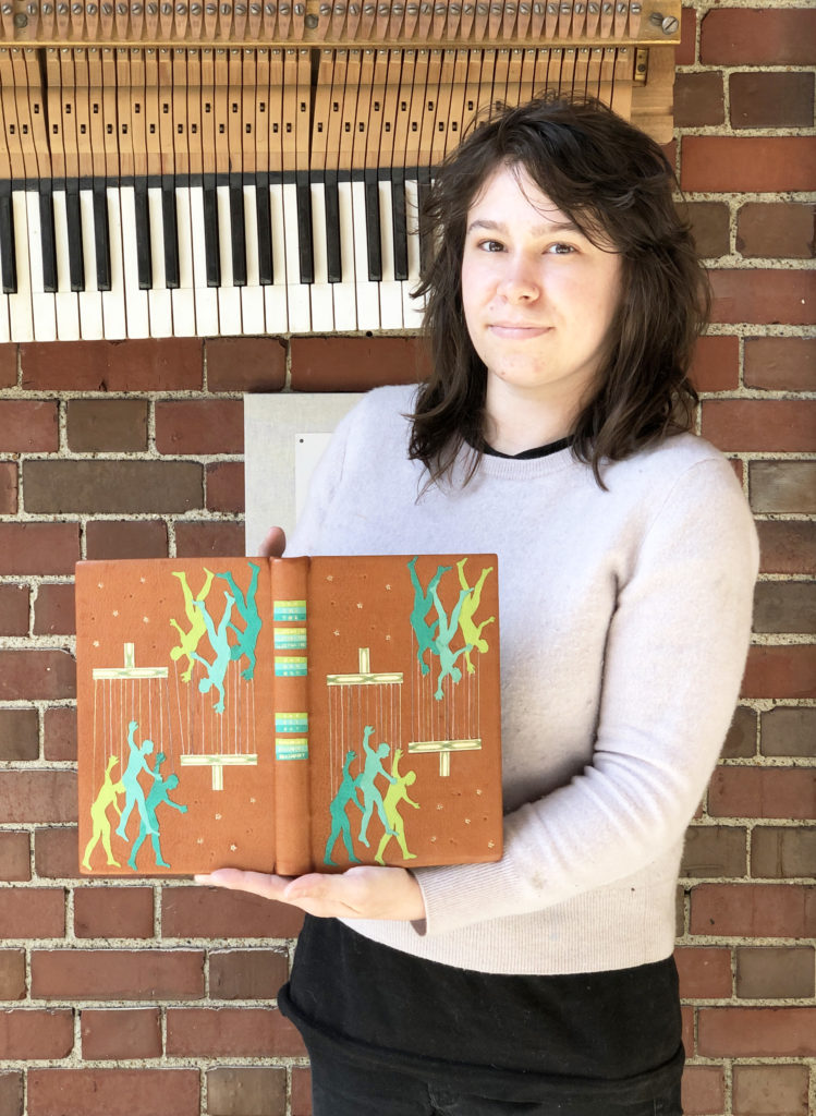
Chloe Goff
Chloe (she/her) has set her binding apart from the rest by shifting away from the prominent theme of space. As a fan of Bradbury’s novels, Chloe was equally engaged by this series of short stories and their captivating imagery. In the short story, Marionettes, Inc. a company by the same name offers customers identical avatars as a means of disengaging with the people around them and to separate from any emotional responsibilities. Using this story as her main inspiration, Chloe wanted to build a design that spoke to the cold, bleak reality brought on by this revolutionary tech.
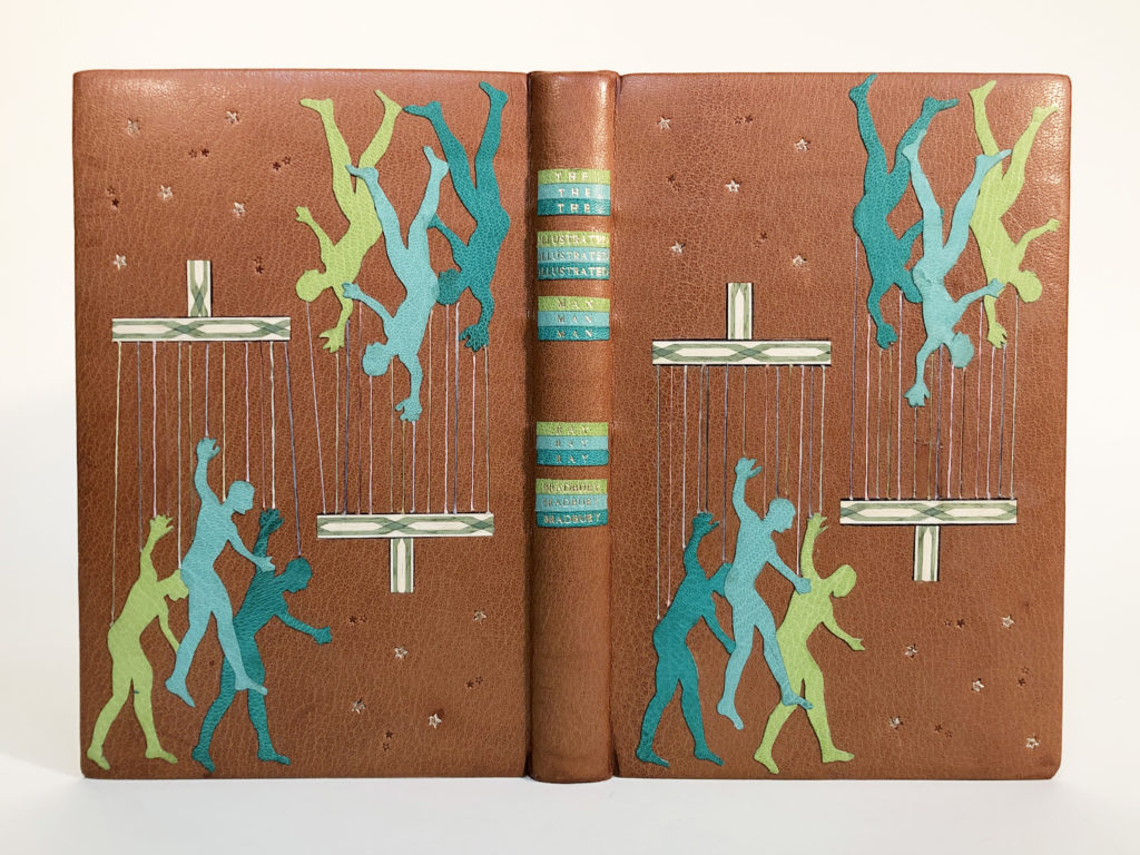
Each grouping of marionettes is comprised of overlapping onlays in light green, mint blue and forest green goatskin on a backdrop of medium brown goatskin. Chloe’s choice of simple shapes and complimentary color palette creates a striking design that has the ability to draw you in from across the room. The faceless figure is relatively the same from puppet to puppet and even though the onlays are stationery, the positioning of the body and the slight asymmetry in the placement of color creates a feel of movement on the binding.
The remaining elements that make up the marionettes are quite delicate materials. Yet Chloe, fearlessly cut into the binding in order to inlay both the decorative wood veneer for the handles and the cotton threads for the strings. Her decision to include these additional materials is so smart, they each lend additional texture that contrasts beautifully against the leather.
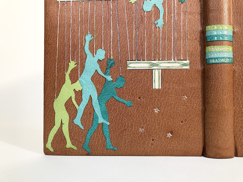
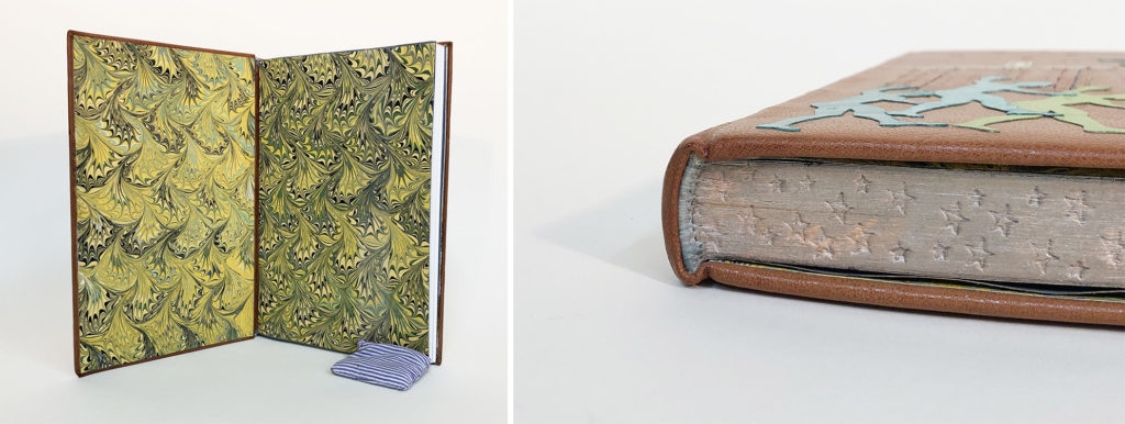
The negative space around the marionettes is filled with blind and gold-tooled stars in different sizes, giving a small nod to the theme of space relevant to many of the other short stories. I know that it can be challenging to incorporate a title onto a design binding and most of the time I leave this part off of my bindings. I love Chloe’s unique spin on integrating this element into her binding. Continuing with repetition, each color used for the marionettes was stamped with the title and author. Reading each word three times creates a level of disorientation and connects to the overall design. The interior is flooded with colors complimentary to the exterior with the use of a marbled paper made by Chloe. The head edge has been decorated with moon gold and gauffered with the same star tools found on the covers. The hand-sewn endbands blend beautifully into the edge decoration with the use of light grey cotton thread.
Chloe’s design is comprised of just a few elements, but each is deliberate and connects to the themes presented within Marionettes, Inc. The difficulty of creating a design binding and the challenges of trying out new techniques resonated with everyone, including Chloe. She spoke to enjoying the evolution of the design process and how creating this binding has informed her mindset for any future bindings. Can’t wait to see the next design binding Chloe makes!
Martyna Gryko
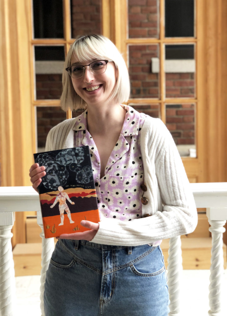
Back in 2020, while teaching the students how to make paste papers, I was instantly captivated by Martyna’s (she/her) design aesthetic and skill as a painter. I couldn’t wait to see how her creative past would influence her binding work. And as she shared her work with me over the last two years, I began to see how she thoughtfully incorporated her training as an artist into her design choices no matter how small. Her work displayed real intention and dedication to both the visual and structural aspects of bookbinding. Her approach to the set book project was no different. With the main influence coming from the narrator, Martyna also pulled in concepts from The Veldt and The Visitor in addition to a vintage 1950’s color palette. Her intention was to design a Mars-like landscape that would speak volumes to isolation and loneliness.
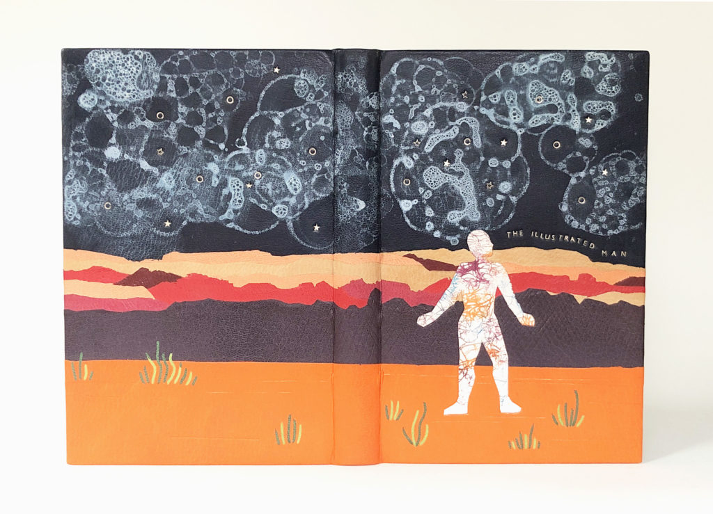
Every decorative element of Martyna’s binding was added after the binding was covered in a navy blue goatskin. This style of working instantly connected to Martyna’s process as a painter. I commended her for being so brave in this style of execution, but noted that a design binder needs to find the path that is most comfortable for them to really steer them towards success. Working from the top of the horizon, Martyna created a Mars-like landscape by layering various goatskin feathered onlays in desert tones. Some of these onlay pieces have been blind tooled to create additional texture and depth. Tufts of grass were added as onlays using different shades of green goatskin.
The Illustrated Man stands alone in this desolate scene and becomes the focal point of the design. To convey the tattoos that cover the narrator’s body, Martyna employed the craquelle technique and used the same color palette as the landscape, but with splashes of teal over a piece of fair goatskin. With its tooled edges and matching color palette, the Illustrated Man is elegantly integrated into the landscape.
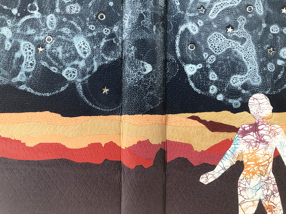
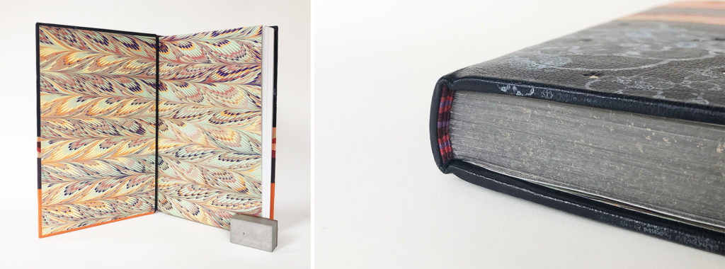
The ethereal and other-worldly night sky was created through a leather dyeing technique that involves blowing bubbles. This technique can be tricky to apply to a skin that is commercially dyed as the pigment doesn’t always stick. After trying several different mixtures, Martyna found two variations that worked to create this milky haze looming above the desert landscape. Sprinkled amongst the blue vapor, Martyna has tooled stars and circles with moon gold. The title dances along the horizon, also tooled in moon gold. When the book is opened, a familiar color palette is presented with a feathered marbled paper made by Martyna. It perfectly flows with the design of the cover and is seamlessly split at the leather hinge as to not break the pattern. The head edge has been given a graphite base sprinkled with moon gold. The tri-colored striped sewn endbands bring together colors from the landscape and marbled paper.
Working directly on the binding offered Martyna a certain level of freedom, giving her the chance to edit in real time and to place each element intuitively. The overall finish and look of the binding feels so naturally connected to Martyna’s process as both a binder and an artist. I truly can’t wait to see how her work will evolve through bookbinding and artist books. In the fall, Martyna will be joining the conservation lab at the Boston Athenaeum as the new Von Clemm Fellow.
Follow Martyna on Instagram to stay updated with her work!
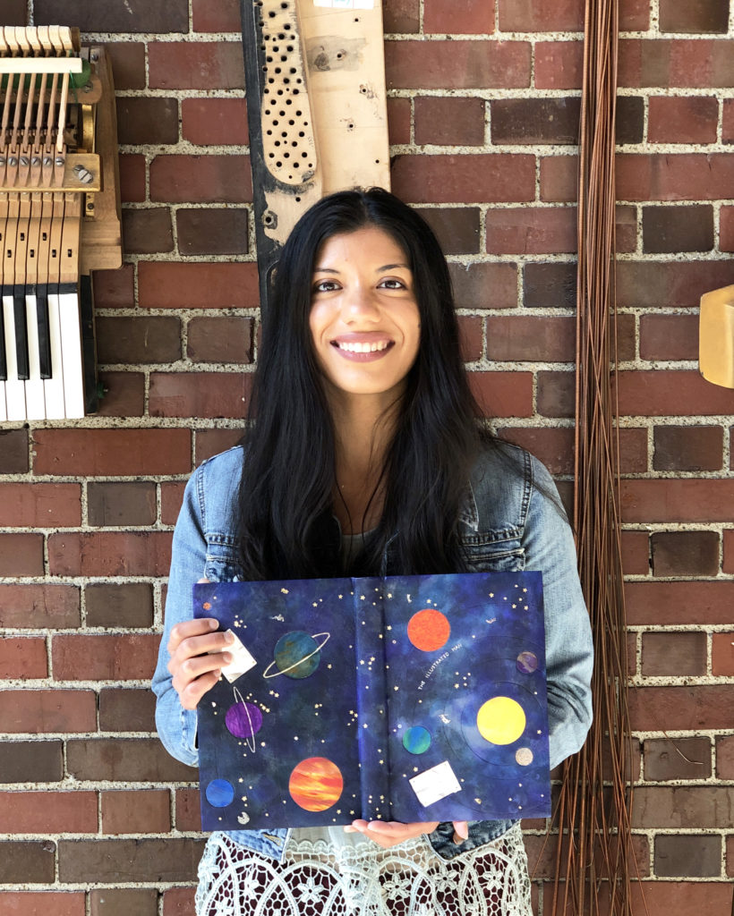
Ariana Rutledge
The Illustrated Man is filled with science fiction short stories, which Ariana (she/her) admitted isn’t her favorite genre to read. However, she was hooked to the psychological connection of the individual stories and grasped to the fact that each story was meaningful and profound. Like many of her fellow classmates, she leaned into the themes of space, disaster, loneliness and death.
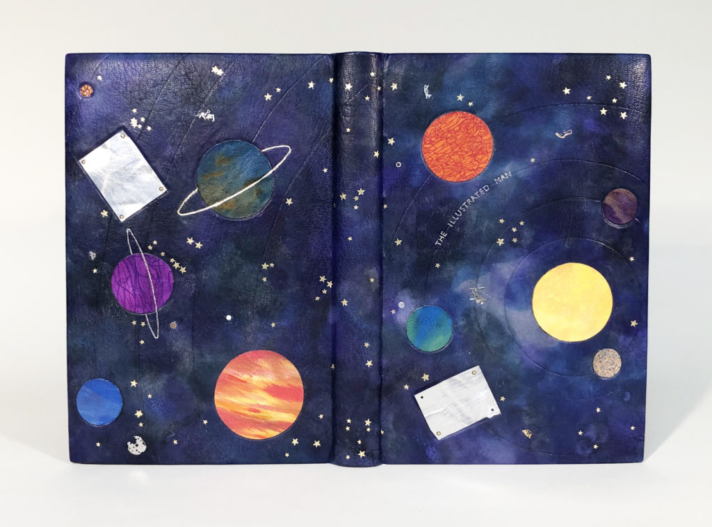
Blending leather dyes together can be difficult to control, yet Ariana managed to expertly lay down pigment onto fair goatskin to flow in such an exquisite manner that undeniably captures the feeling of outer space. With the addition of white acrylic bubbles, Ariana was able to create a perfect balance of light and dark tones. Ariana also managed to pack an entire solar system complete with gold-tooled stars into her design with sunken onlays for each planet. To control the placement of each planet and its blind-tooled orbit, Ariana initially cut wells in the board prior to covering. The unique make-up of each planet gave Ariana a chance to really play with leather dyes further:
Sun // yellow dye with a layer of red bubbles
Mercury // sprinkled with various colors
Venus // blend of purple and yellow dye
Earth // blend of green and blue dye (plus a neighboring parchment Moon)
Mars // craquelle (cracked over a textured wall) red dye over orange
Jupiter // red, yellow and orange dye streaked on with a pipette
Saturn // blend of blue and orange dye with a gold-tooled ring
Uranus // craquelle (cracked over a stack of chairs) purple dye over purple with a palladium-tooled ring
Neptune // blend of blue, purple and green dye
Pluto // craquelle (cracked over cement wall) purple dye over orange
Since Pluto was classified as a planet when The Illustrated Man was published, Ariana felt it was appropriate to include the dwarf planet in her design. Each planet was given individual consideration and I was particularly impressed by the beautiful rendition of Jupiter with its Great Red Spot.
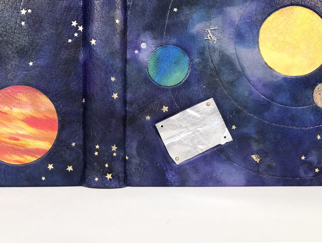
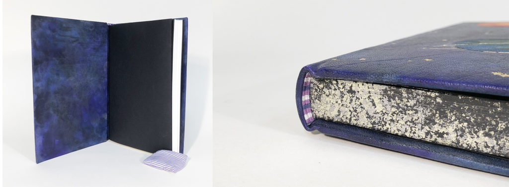
To signify death and disaster, Ariana incorporated pieces of tin and watch parts to represent shrapnel floating through space. The irregular shapes of the watch parts contrast beautifully with the symmetry of the planets and stars. The large tin pieces are placed in sunken panels and attached to the covers with brass rivets. Ariana manipulated each piece through bending and scratching, giving the tin a more authentic feel. The title is seamlessly worked into the design by being tooled along Earth’s orbit in palladium. Ariana further showcases her incredible skill by adding an edge-to-edge leather doublure on the inside. The head edge celebrates the design of the binding with a base of black pigment sprinkled with both gold and palladium. Using the same color palette from the binding, Ariana created a tri-color striped double-core endband in navy blue, purple and white.
It was apparent by the way that Ariana spoke to me about her binding, that she thoroughly enjoyed the process of making it and is quite pleased with the outcome. Complex and layered designs often require extensive forethought and planning, Ariana proved to be incredibly thoughtful in her approach throughout the construction and design phase of the binding. I’m on the edge of my seat to see what she comes up with in her next design binding. After graduation, Ariana will be spending her summer in Pennsylvania interning at the Haverford College conservation lab.
Follow Ariana on Instagram
– – –
Thanks to the 2022 graduating class for sitting for these interviews and thanks to Jeff Altepeter, Head of Bookbinding Department, for inviting me once again. I look forward to this moment every year and I really enjoyed speaking to everyone about their incredible design bindings. I can’t wait to see where each of these lovely people land in the future and how they explore this style of binding further.
If you find yourself in the Boston area this summer, stop by North Bennet Street School to see each of these bindings in person in the 2022 Exhibition: Making Matters.
If you want more interviews from past classes check out the list here.

Thank you for sharing these amazing books. The graduates’ skill and imagination are inspiring.
Wonderful to see the different interpretations! I particularly like Chloe’s use of colors and repeats on the spine.