RSS Feed

‘book artist of the month’ Category

  1. April // Book Artist of the Month: Natalie Stopka

    April 1, 2015 by Erin Fletcher

    Botanical-NatalieStopka

    Natalie Stopka has conducted extensive research and experimentation with natural dyes, which is partly what drew me to interview her on the blog. I’ve long been interested in incorporating natural dyes into my own work. So it’s fair to say that I’m quite inspired by Natalie’s work.

    At the end of your year at the Center for the Book, you presented on a series of natural dye experiments in a pretty brilliant way. What drew you to focus on natural dyes and how did you to come to present your findings through embroidery?
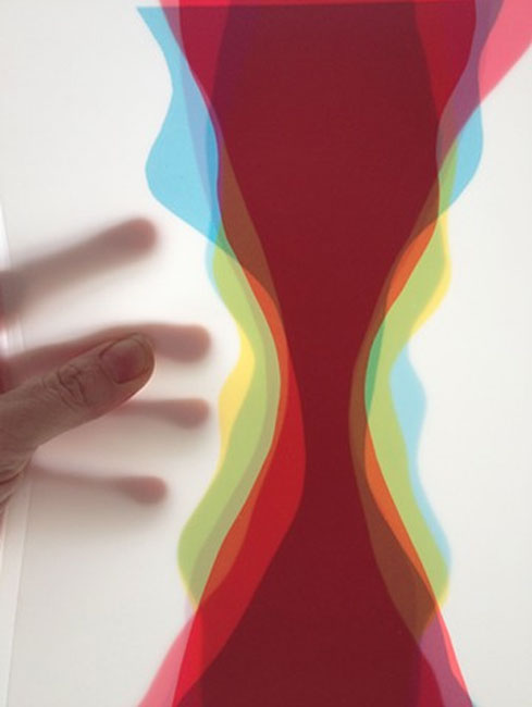
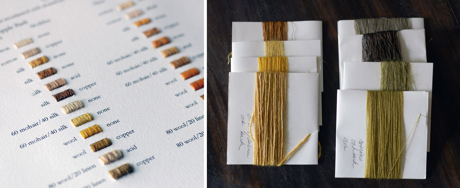
    I became interested in natural dyeing as an antidote to city life. I was initially drawn to the process of foraging and dyeing itself, but the more I studied the history behind the process, the more it became apparent that our culture has devalued and forgotten the vast majority of the dye artistry we once possessed. This artistry is akin to alchemy, because we still do not scientifically understand what functions many colorant compounds perform for the plants that create them, or how many dye processes occur on a chemical level. I was surprised to learn that each part of a plant – its petals, leaves, bark, and roots – create different colors. These colors can be manipulated into a greater range of tones by using a variety of mordants and fibers. I decided to explore the full range of colors accessible in a single plant using these methods.

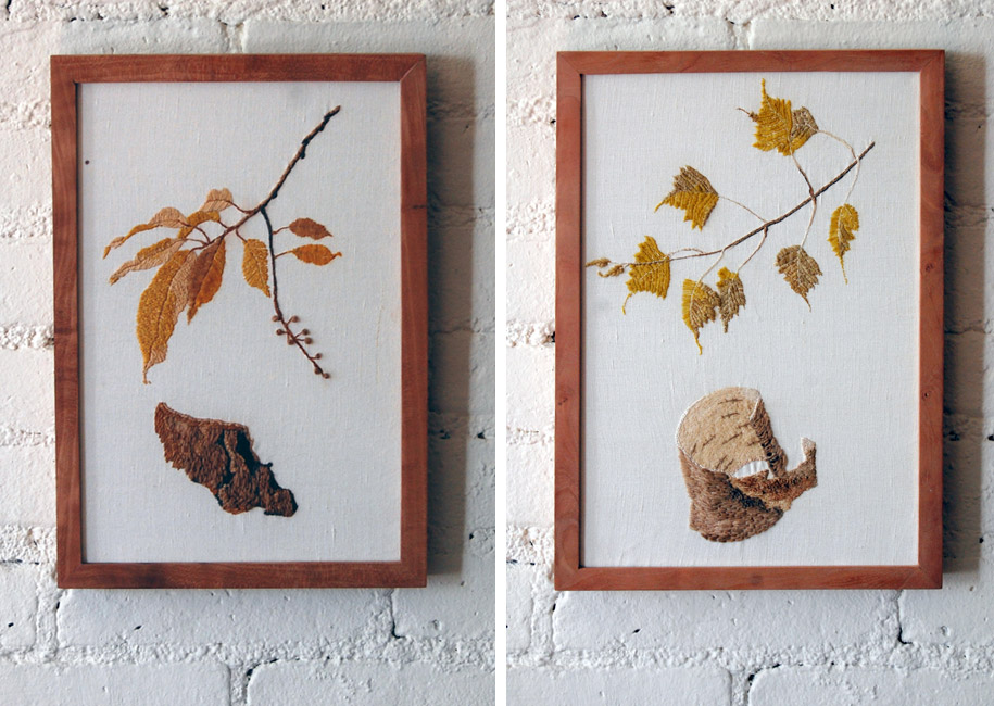
    I chose three trees I had access to in upstate New York; birch, crab apple, and black cherry. From these I responsibly foraged leaves and bark, and used them to dye alum-mordanted silk, cotton, wool, linen/wool, and silk/wool thread. I then treated the dyed thread with the color modifiers copper sulfate, ferrous sulfate, an acid, and a base. I was left with about 40 samples in a range of colors and textures representing each tree’s dye potential. Some samples had very little color at all, but some were vivid and strongly varied.

    Botanical2-NatalieStopka

    I had known these experiments would become a series of embroidery pieces from the beginning, and I wanted to illustrate the clear distinctions in the dye colorants accessible in different parts of the plant. I adopted the form of the traditional botanical illustration, utilizing the thread dyed with the analogous plant part to illustrate it. That is to say, the leaves are depicted with leaf-dyed threads, and the bark with bark-dyed threads. For the birch tree embroidery, I also differentiated between the inner and outer barks.

    Botanical3-NatalieStopka

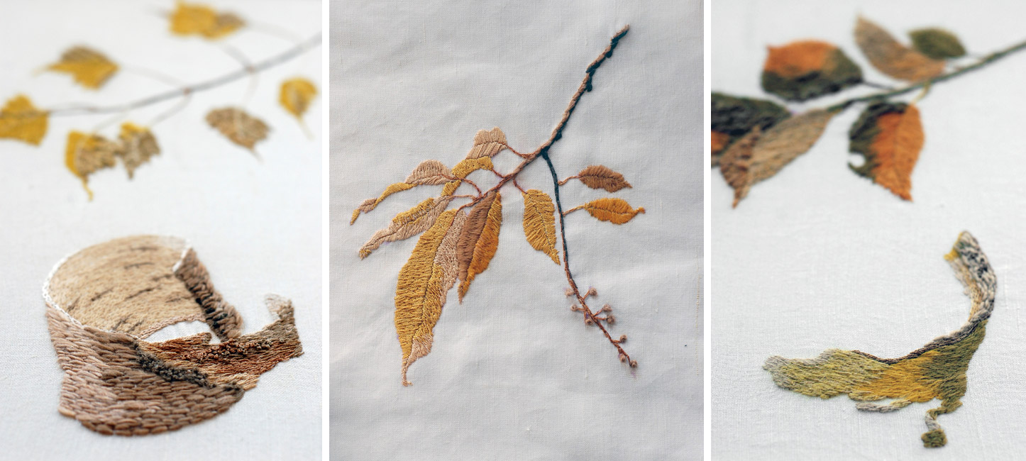
    LEFT: birch MIDDLE: black cherry RIGHT: crab apple

    The final element of these pieces is a question pertinent to any bookbinder: time. Not only are natural dyes sensitive to ultraviolet light, but the modifiers I used degrade fibers over time. The ephemeral nature of natural dyes is a sad reality for an artist, but I think it can also be beautiful. These three pieces each have a lifespan, and to measure it I enclosed a sample of each thread used in the embroidery behind the frame. There it will be protected from light, and can be used as a point of comparison over time.

    – – – – – – – – – – –

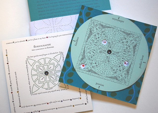
    I became aware of Natalie Stopka’s work while visiting the Center for the Book in New York, which in happenstance was exhibiting the piece above. Since then I’ve continued to keep an eye on her portfolio, especially the work she does with natural dyes and marbling. Natalie’s work encompasses not only the prior mediums mentioned, but she also dabbles in book arts as well.

    Check out the interview after the jump, then come back each Monday during the month of April for additional posts on Natalie’s work. Need a reminder? Subscribe to the blog.

    read more >


  2. Book Artist of the Month: Sarah Bryant

    December 29, 2014 by Erin Fletcher

    Shift-SarahBryant

    Sarah Bryant is apart of the five-person collaborative group Shift-Lab, which she discusses more in-depth below. The image above shows the full spread of their first collaborative project, Shift, which was created in 2014 in an edition of 20. Each of the five artists created a small letterpress printed book that reflects a shift in perspective as well as a matching print. Both the books and prints were displayed at the San Francisco Center for the Book in 2014.

    The books are housed together in a custom drop-spine box shown third from the left with a printed title label.

    ShiftBaldwin-SarahBryant

    detail of Katie Baldwin’s book

    ShiftTreacy-SarahBryant

    left: detail of Tricia Treacy’s book | right: detail of Denise Bookwalter’s book

    ShiftChadwick-SarahBryant

    detail of Macy Chadwick’s book

    Can you discuss the collaborative group Shift-Lab. Who are its members and what type of projects do you work on together?
    Shift-lab is made up of myself, Katie Baldwin, Denise Bookwalter, Macy Chadwick and Tricia Treacy. We started as a group in the summer of 2013 and since then we’ve produced a book project (Shift) for an exhibition at the San Francisco Center for Book Arts, staged a pair of printing events (I had to be a remote participant, unfortunately,) and met for a week in North Carolina to print a project together. We will be exhibiting together at the Codex Book Fair in February, and are working on plans to meet for a skill share/book project next summer. You can find us all at shift-lab.org.

    Shift is a set of five books all with the same theme. Each of us created an edition of 20 books of the same dimensions. These five books are housed together in an enclosure. The books vary in content, Katie’s is an exploration into the different diggings of the Erie Canal. Tricia was interested in the shift key on a keyboard. I was having trouble sleeping while I was working on this project, and so my book evolved into a body shifting and moving in bed.

    ShiftInPosition-SarahBryant

    For your book Shift in Position, how did you monitor your sleeping behavior and then transfer the imagery into a print?
    I was spending a good portion of each night around this time rolling and repositioning myself in the hopes of getting to sleep. I didn’t monitor this activity, exactly, but took dozens of photographs of myself as I repeated the familiar movements I was doing each night. These photos were taken against a white background. I traced the shifting line of my body over and over again and layered these lines, creating the basic imagery for the book. The “book” is actually a series of panels that can be rearranged. Some of the imagery locks in together, some doesn’t. Text related to shift and change printed on the top and bottom of each panels always locks in to make some kind of sense. I wanted the process of rearranging the panels to be reminiscent of the kind of non-restful process dreaming that I was slipping in and out of at night.

    ShiftInPosition2-SarahBryant ShiftInPosition3-SarahBryant


  3. Book Artist of the Month: Sarah Bryant

    December 22, 2014 by Erin Fletcher

    Simulations-SarahBryant

    I really enjoyed this week’s response by Sarah Bryant on her inspiration and creative process behind Simulations on a Two-dimensional Grid. You can read about it below, but first the specs. Simulations was created in 2013 in an edition of ten. Zerkall paper is used for the pages and have been manipulated with letterpress printing, hand-drawn imagery, wax and folding. The loose pages are bound up in a waxed paper wrapper also decorated with hand-drawn imagery.

    Simulations2-SarahBryant Simulations3-SarahBryant

    Two sources of inspiration are behind this artist book: Barb Tetenbaum’s Aritst Book Idealation Deck and David Allen’s 2011 dissertation. Can you talk about how these two pieces came together as a guide for the concept of this artist book?
    So in late 2012, Barb Tetenbaum invited me to participate in a show using a set of cards that she and Julie Chen had developed over several years called “The Artist Book Ideation Deck.” The deck has categories for structure, paper, layout, technique, text, image, color, and description. It also has “adjective” cards. Barb and Julie drew random hands from this deck for all of the artists who would be making a book for the show. My hand went as follows:

    Imagery: none
    Structure: unbound/boxed
    Text: collaborate with writer/poet/other
    Layout: across folds
    Color: favorite
    Technical: hand drawn, painted/collaged, etc.
    Paper: pre-treated, crumpled, painted, pasted, etc.
    Describe: narrative
    Adjectives: personal, scientific, ordinary, complicated, colorful

    Dave Allen and I had been talking at this point about collaborating on a book, (this was just before his visit to the UK and the beginning of our Figure Study project,) so I turned to him for some text. He sent me a few excerpts from his PhD thesis for the University of Michigan and I selected this one: Simulations on a two-dimensional grid reveal that if the conditions are met to destabilize the spatially homogenous equilibrium then individual patches cycle out of phase with their neighbors. At any particular time the grid has a checkerboard-like structure (Figure 2.1), and through time individual patches exhibit a two-cycle.

    We worked together to pair it down to the following: Simulations on a two-dimensional grid reveal that if conditions are met to destabilize the equilibrium, individuals cycle out of phase with their neighbors. This felt more like a universal text, open-ended enough to invite us in and call for different interpretations.

    Once the text was selected, it was time to work with it and knead it into a book using the external prompts that came from the Ideation Deck. I used a series of folds, expanding from sheet to sheet, to disturb a grid made up of holes and lines. I loved this project, it forced me to do some new things that I surely wouldn’t have attempted without a set of instructions. Waxing the pages, for example. Also the loose sheet format that I have adopted for two subsequent projects.

    Several people have pointed out that my book is not strictly following the guidelines set by the deck. It does have imagery, for example, even if that imagery is minimal. And of course this is true. But the deck is meant to generate ideas, and so I considered the cards as prompts rather than unbreakable rules. You can still get the decks, by the way. I use mine all the time in classes or just to get my mind moving.

    – – – – – – – – – – –

    Setting limitations for a project can bring unique challenges and even heighten creativity. I was so thrilled to learn about Tetenbaum and Chen’s Idealation Deck. I may need to get my own copy and begin exploring artist books again.

    If you’d like to read a more in-depth description of Simulations, check out Heather Doyle-Maier’s review on the Abecedarian Gallery Blog, where she describes the tactile qualities of the book.


  4. Book Artist of the Month: Sarah Bryant

    December 15, 2014 by Erin Fletcher

    AlMutanabbiStreet-SarahBryant

    For the traveling exhibit Al-Mutanabbi Street Starts Here, Sarah Bryant crafted Al-Mutanabbi Street to memorialize those who lost there lives to a car bomb on March 5, 2007. Bound between two boards is an entangled ribbon of red paper letterpress printed with an incomplete list of names. This altered accordion lays open in a custom box; the colophon is print on the base of the box hidden under the book’s cover.

    AlMutanabbiStreet2-SarahBryant AlMutanabbiStreet3-SarahBryant

    The text of this artist book rests in a position of entanglement and chaos, but in fact the lines of paper can be separated rather easily. The names printed on the underside represent a portion of those who lost their lives. I’ve seen a variety of books from this show and really love the simplicity of your piece, which is also largely impactful. It presents itself like a memorial; can you talk about your concept for this artist book?

    I wasn’t sure how to approach this book. I had no personal connection to the bombing or to the affected community, or, frankly, to any tragedy of this scale. I was concerned that in an attempt to honor the dead and the community to which they belonged, I might make a bumbling and insensitive book. So I tried to keep it simple and avoid pretending an understanding that I could not have.

    I printed the names of the dead in Arabic and English, each name lining up with it’s counterpart on the two sides of the strips of paper, and housed them in a structure that I hoped conveyed a sense of violence and loss. I wanted the names to be legible, but fragile, and in a position of distress. The box is vaguely coffin-like. I am glad to hear your reaction to the book, thank you.

    AlMutanabbiStreet4-SarahBryant


  5. Book Artist of the Month: Sarah Bryant

    December 8, 2014 by Erin Fletcher

    Biography-SarahBryant

    In 2010, Sarah Bryant completed Biography, which explores of the alternative roles played by the chemical elements found in the human body. Each element is represented as a specific colored rectangle, which are used in various diagrams throughout the book. As you progress through the book the diagrams become less clear and are interrupted with blind stamped organic shapes. Biography won the 2011 Minnesota Center for Book Arts Prize in addition to receiving the Award for Artistic Excellence at the Pyramid Atlantic Book Arts Fair in late 2010.

    Printed in an edition of 75 using letterpress techniques from polymer plates on Zerkall Book, Biography was bound as a hardcover drum leaf enclosed in a clamshell box. Numbers one through ten are bound as a deluxe edition (pictured above), which include additional prints from the book, as well as a ghost print creating during the printing process. The deluxe edition comes in a larger clamshell box designed to house both the book and set of prints.

    Biography4-SarahBryant Biography3-SarahBryant Biography5-SarahBryant

    In The Bonefolder article Evolution of an Artist’s Book, you mention that Biography took 2 years to complete. The inspiration led to extensive research and preparation before embarking on months of printing. Is this an average amount of time needed to complete a project?
    Most of my big books take about two years. Dave and I first conceived of Figure Study in January of 2013 and I have set a release date to coincide with the Codex Book Fair and Symposium in February of 2015. I started working on Fond when I was at Wells College in early 2011 and released it in the fall of 2012. Two years seems to be my average these days. But in the background there are other things emerging. While the larger projects are proceeding at their slow pace, I am working on quicker, smaller things. A book I printed with Shift-lab, a collaboration between myself, Katie Baldwin, Denise Bookwalter, and Tricia Treacy took me about six months in 2013. Simulations on a Two-Dimensional Grid, a book I created for the Ideation by Chance show at the Seager Gray Gallery in Mill Valley, California, took me a few months. Those books were done in smaller editions and in response to external collaborations and deadlines.

    Since I’m not a printmaker, the printing process behind You are part of something larger than yourself is puzzling to me. Can you walk me through the printing steps for this particular print?

    Biography2-SarahBryant

    Aha! Yes I can. And, in fact, if you really want to know more about it, a lecture I gave at Wells college several years ago contains a detailed description of that process, with photos! Thanks to Peter Verheyen, you can find it on youtube here:

    My description begins at 29:09 and ends about three minutes later.

    That spread and one other in the book toward the end, (described in the above video,) are pressure printed against a polymer plate of the periodic table grid. I inked the press in two colors (for a color shift) and printed the first run, then cleaned the press and inked it again in the reverse and so on so that there are many layers and colors at play. The blob-shaped forms are generated by paper cutouts that I have attached to the impression cylinder of the press. So the printed imagery is coming from the combination of the traditional, inked relief surface (the grid in the bed of the press) and the uneven pressure created by the paper shapes on the cylinder.

    BiographyProcess-SarahBryant


  6. December // Book Artist of the Month: Sarah Bryant

    December 2, 2014 by Erin Fletcher

    FigureStudy-SarahBryant

    As a work still in progress, Figure Study is a creative collaborative project between book artist and printer Sarah Bryant (Big Jump Press) and her biology professor cousin, Dave Allen. In the interview below, I’ve asked Sarah a series of questions about this project because its production is partially possible due to a successful Kickstarter fund. And of, course due to the brilliance of the design and content of the project.

    Figure Study is a book about population data. Housed in a custom box is a series of population diagrams printed on drafting film. The translucency of the drafting film allows one to arrange the prints in unique combinations creating new sets of data and artistic forms.

    FigureStudy2-SarahBryant

    Figure Study has an interactive element. How do you see the owner of this work connecting with the population diagrams?
    I hope that the process of comparing the shapes will be a truly addictive one. I find it that way. Of course, the owner of the book will be able to look at the figures in a purely analytical way if they wish, layering a sheet of drafting film printed with a figure onto a grid and using the index to determine which regions are represented. But additionally the layering yields beautiful forms and stark contrasts that appeal to both the analytical parts of our brains and our more basic appetite for creating and experimenting.

    It is interesting to me that over the last two years or so I have made three “books” that are essentially composed of loose sheets that can be rearranged. I didn’t set out to do it this way, but somewhere in the back of my mind I have been interested in the viewer reshuffling and recombining the content. I think this book is the natural conclusion of that impulse because the reshuffling of the data is so essential to the core of the book. Comparing, revealing differences and similarities, investigating.

    – – – – – – – – – – –

    I’m really excited to present this interview with Sarah Bryant. I continue to enjoy the work she produces and was pushed to conduct this interview from as a suggestion given by Michelle Ray, who I interviewed last year. Sarah is creating really interesting artist books in beautifully designed and bound formats. I recently made a pledge toward Sarah and Dave’s successful Kickstarter fund and am anxiously awaiting my reward. I see Kickstarter as a potential avenue for other book artists to fund their ambitious projects and a goal of this interview was to discuss the entire process with Sarah.

    Check out the interview after the jump for more about Sarah, her background and creative process. Come back each Monday during the month of December for more about Sarah’s work.

    read more >


  7. Book Artist of the Month: Roni Gross

    May 26, 2014 by Erin Fletcher

    TheNightHunter3-RoniGross

    The Night of the Hunter is another collaborative artist book between Roni Gross, Peter Schell and Nancy Campbell.

    The text comes directly from a poem by Nancy Campbell of the same title, which was based on her residency on a remote island off the coast of Greenland during the winter of 2010. Roni reinterprets the text as a visual pattern of drawn colored lines repeating as the language repeats creating a unique landscape housed within a palm leaf structure. The poem is written as a pantoum, where lines repeat in specific patterns.

    TheNightHunter5-RoniGross TheNightHunter6-RoniGross

    The book is paired with an interactive board game constructed from salvaged wood and game pieces made from found materials that have been shaped by Peter Schell. On Nancy’s blog, she explains these material elements of the artist book “are a perfect physical expression of the austere Arctic environment that I had tried to capture in the poem.

    TheNightHunter2-RoniGross

    The objects stored inside the rawhide pouch are meant to be placed in the depressions on the board. Can you describe the interaction between the reader, these objects and the story itself?
    This work is an example of our interest in having the viewer participate in the telling of the story by feeling the objects – stone, bone and metal – and then placing them on the game board. There are not a lot of raw materials in Greenland, and so the materials are found or repurposed. The wood of the covers is driftwood, the cordage is made from dogbane – a natural fiber, and the game board was found wood. By holding these object, materials that the night hunter might encounter, you are entering his realm. Your freedom to place the pieces as you wish involves you in the unfolding of the poem.


  8. Book Artist of the Month: Roni Gross

    May 19, 2014 by Erin Fletcher

    AnniversaryCommission-RoniGross

    Roni Gross crafted this celebratory gift for a couple’s 50th anniversary. The piece is housed in a birch plywood box distressed with milk paint and includes the stenciled word ‘TULIP’ in red. The text printed on the inside of the lid is a poem by Frank O’Hara called Having a Coke with You. 

    AnniversaryCommission2-RoniGross

    This is such a beautiful commissioned piece for a couple’s 50th anniversary. Can you talk about the relationship between the elements: poem, wooden typographic map and the book necklace?
    The couple are collectors of art glass, and are more visual than literary. The wife enjoys collecting wacky jewelry and so I thought that a book necklace would make sense for them. I am motivated by language however, and I told the daughter that I needed some text to start working from. The poem, by Frank O’Hara, is a avery New York poem, and we thought that a sculptural topographical map of a place in Riverdale would be an interesting reference for people that have lived their whole lives in NYC. The waterway provides the trough for the necklace to reside.

    AnniversaryCommission3-RoniGross

    – – – – – – – – – – –

    The text which makes up the poem by Frank O’Hara (see the poem in it’s entirety below) was printed, cut and sewn as a coptic structure along with monoprints. The wooden covers of the coptic book necklace have also been treated with milk paint.

    Having a Coke with You by Frank O’Hara

    is even more fun than going to San Sebastian, Irún, Hendaye, Biarritz, Bayonne
    or being sick to my stomach on the Travesera de Gracia in Barcelona
    partly because in your orange shirt you look like a better happier St. Sebastian
    partly because of my love for you, partly because of your love for yoghurt
    partly because of the fluorescent orange tulips around the birches
    partly because of the secrecy our smiles take on before people and statuary
    it is hard to believe when I’m with you that there can be anything as still
    as solemn as unpleasantly definitive as statuary when right in front of it
    in the warm New York 4 o’clock light we are drifting back and forth
    between each other like a tree breathing through its spectacles

    and the portrait show seems to have no faces in it at all, just paint
    you suddenly wonder why in the world anyone ever did them

    I look
    at you and I would rather look at you than all the portraits in the world
    except possibly for the Polish Rider occasionally and anyway it’s in the Frick
    which thank heavens you haven’t gone to yet so we can go together the first time
    and the fact that you move so beautifully more or less takes care of Futurism
    just as at home I never think of the Nude Descending a Staircase or
    at a rehearsal a single drawing of Leonardo or Michelangelo that used to wow me
    and what good does all the research of the Impressionists do them
    when they never got the right person to stand near the tree when the sun sank
    or for that matter Marino Marini when he didn’t pick the rider as carefully
    as the horse

    it seems they were all cheated of some marvelous experience
    which is not going to go wasted on me which is why I am telling you about it


  9. Book Artist of the Month: Roni Gross

    May 12, 2014 by Erin Fletcher

    SayingsOfTheBlind3-RoniGross

    Sayings of the Blind is an artist book by Roni Gross that includes the poem of the same name (see below) from the prolific William Stafford. The book unfolds to reveal a hand-drawn and letterpress printed topographical map, which interprets the world of the blind.

    Bound in 2010 in an edition of 50, Sayings of the Blind is part of the Stafford Collection, a curated collection organized by the 23 Sandy Gallery. The Stafford Collection includes any work that incorporate the poetry of William Stafford and/or Kim Stafford. 

    SAYINGS OF THE BLIND — William Stafford
    Feeling is believing.
    Mountains don’t exist. But their slopes do.
    Little people have low voices.
    All things, even the rocks, make a little noise.
    The silence back of all sound is called “the sky.”
    There’s a big stranger in town called the sun.
    He doesn’t speak to us but puts out a hand.
    Night opens a door into a cellar–
    you can smell it coming.
    On Sundays everyone stands farther apart.
    Velvet feels black.
    Meeting cement is never easy.
    What do they mean when they say night is gloomy?
    Edison didn’t invent much.
    Names have a flavor.

    SayingsOfTheBlind-RoniGrossSayingsOfTheBlind2-RoniGross

    The poem by William Stafford is plotted across the topographical map in such an ingenious way. What is the correlation between the map graphic and the text from the poem?
    After many mockups, most more complicated than the final book, I realized that the topographical map is referring to the landscape of the blind. It is a different landscape than seeing people are aware of, and by placing the text within it, we are taking you into that world.

    SayingsOfTheBlind4-RoniGross

    The texture of Suminagashi wonderfully reflects the shapes of a topographic map, was this your intention?
    I did realize that the Suminagashi was a nice parallel to the lines of the map without revealing too much from the beginning. I commissioned the paper from Yukari Hayashida, who teaches a class in Suminagashi at CBA (The Center for Book Arts).


  10. Book Artist of the Month: Roni Gross

    May 5, 2014 by Erin Fletcher

    ZitounaPress-RoniGross

    I See You Everywhere – 2003

    Roni Gross has successfully continued her project Zitouna over the course of 25 years. Twice a year, she creates a limited edition book or broadside which expands on the cultural ideas which emanate from Valentines Day and Halloween. The projects have explored a wide variety of themes from folklore and superstition to wordplay and mythology. 

    As a project that began in 1989, what was your initial inspiration for this ongoing work?
    The Zitouna pieces started as limited edition book-like objects made in honor of Valentines Day and Halloween each year. I chose those holidays because they are secular and thus inclusive. It began by an investigation of the origins of the traditions cross culturally, and then deepened over time to consider the seasons in which they occur – times of death and rebirth. 

    How do you find inspiration as you continue year by year?
    I have found this a very fruitful project that has led me to investigate alchemy, concepts about skeletal understanding throughout the ages, mythology and superstitions, to name a few topics. The deadline is a motivator and I have not yet felt that I am reaching the end of the possible topics for exploration.

    ZitounaPress4-RoniGross

    If Luvin’ You Is Wrong – 2008

    ZitounaPress5-RoniGross

    Alchemy – 2008

    ZitounaPress2-RoniGross

    A Very Valentine – 2010

    ZitounaPress3-RoniGross

    Lover’s Knot – 2009


  • My name is Erin Fletcher, owner and bookbinder of Herringbone Bindery in Boston. Flash of the Hand is a space where I share my process and inspirations.
    The StudioNewsletterInstagramEmail me
  • Archives