RSS Feed

‘bookbinding’ Category

  1. August // Bookbinder of the Month: Annette Friedrich

    August 1, 2013 by Erin Fletcher

    thetempest1-annettefriedrich

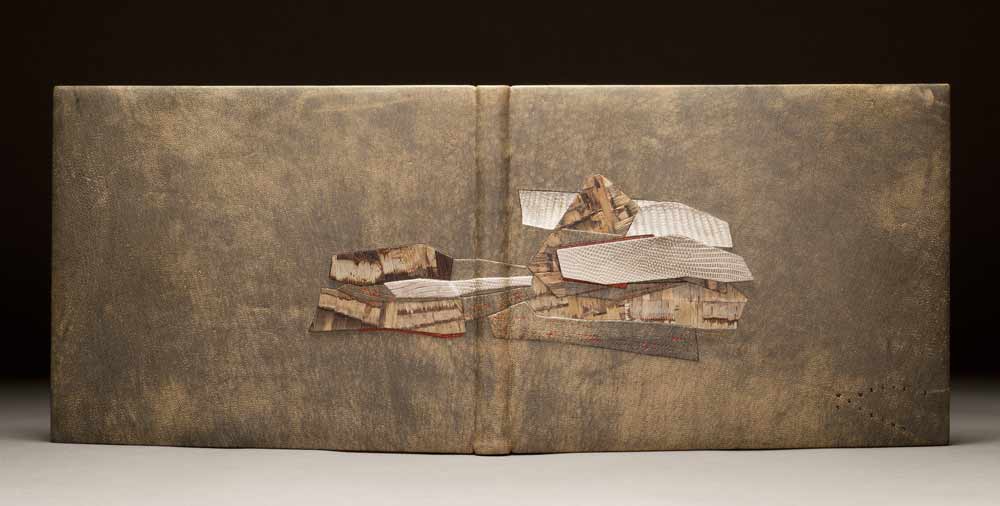
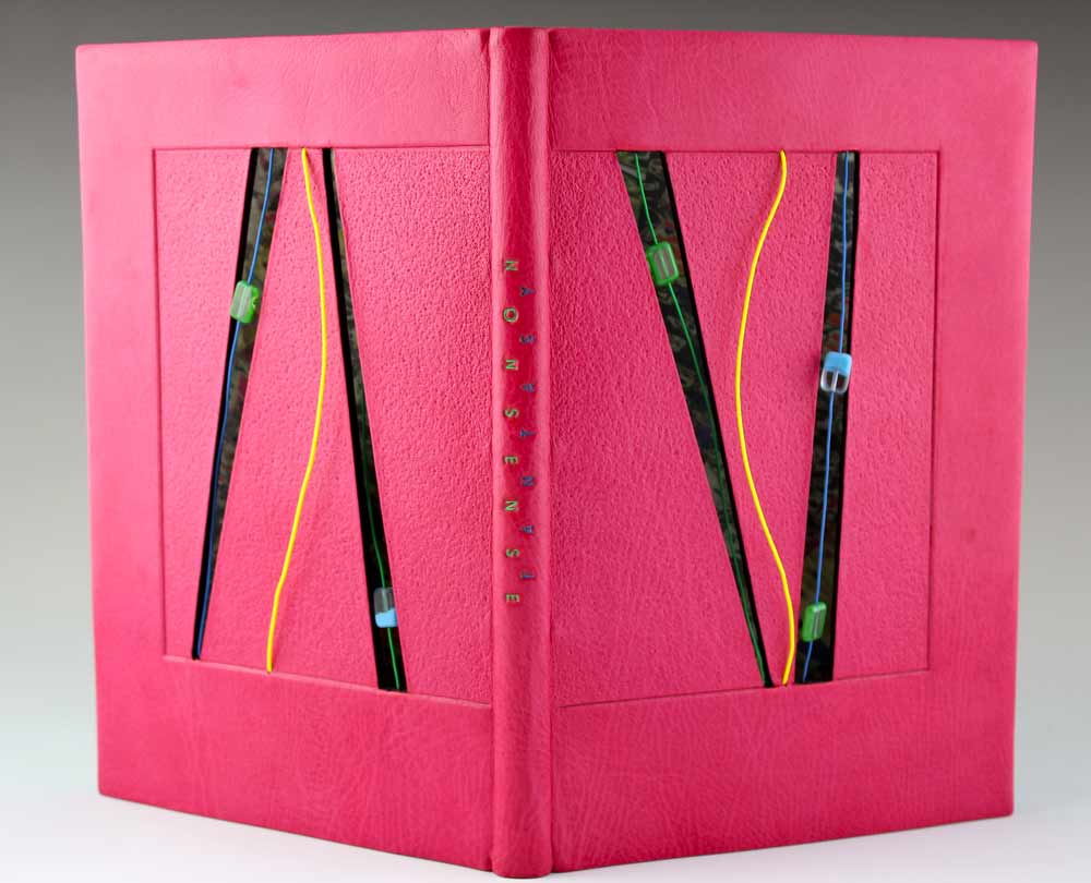
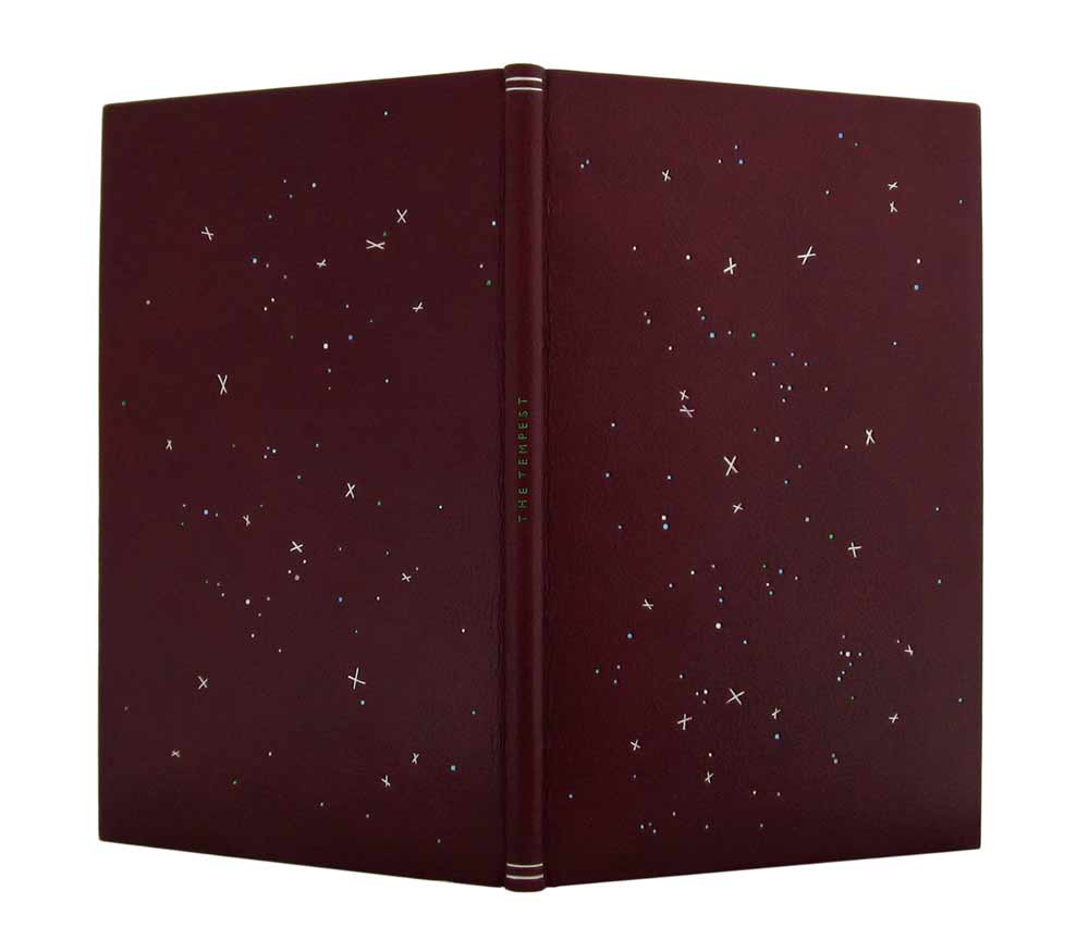
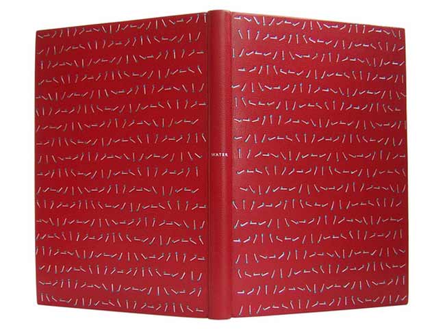
    This edition of The Tempest by William Shakespeare from The Nonesuch Press, was bound by Annette Friedrich in 2012. Bound as a full leather fine binding in red-brown goatskin. Decorative tooling on the covers in white, grey, two shades of blue, metallic green and silver. The title is tooled along the center of the spine in metallic green with matte silver lines at the head and tail.

    thetempest3-annettefriedrich
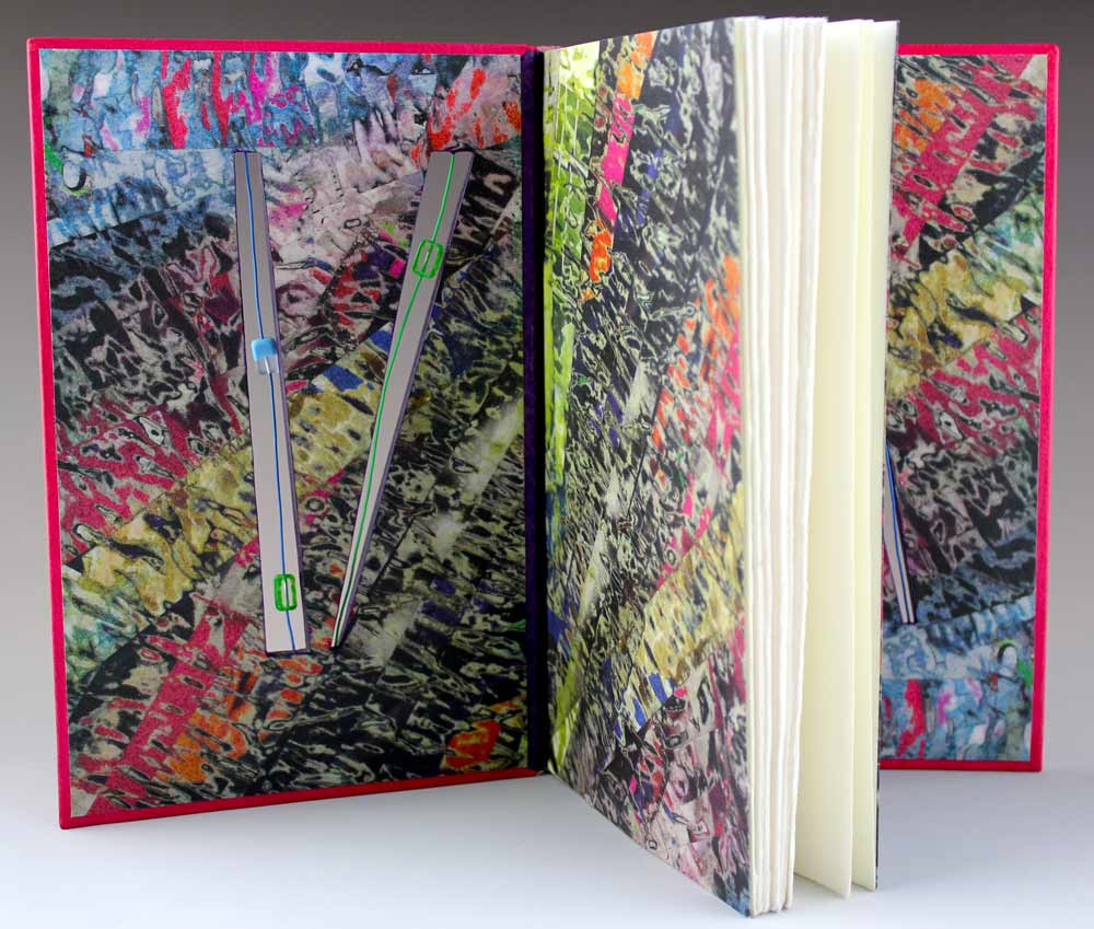
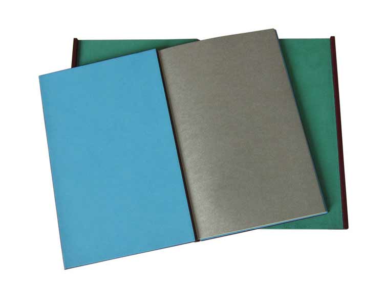
On the inside, the paper bord-a-bord doublures are bright blue, matching leather joints and fly leaf in silver. All papers used are hand dyed.

    thetempest4-annettefriedrich

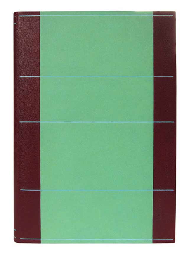
    The binding is housed in a green chemise and slipcase. The chemise is decorated with linear tooling across the sides in two shades of blue. The author’s name is tooled in metallic green in the center the spine of the chemise along with tooled lines in matte silver and blue at the head and tail.

    I first stumbled upon Annette’s work through the Autumn 2012 Newsletter of Designer Bookbinders. The cover offers a detailed image of Annette’s binding Water bound in 2008.

    water-annettefriedrich

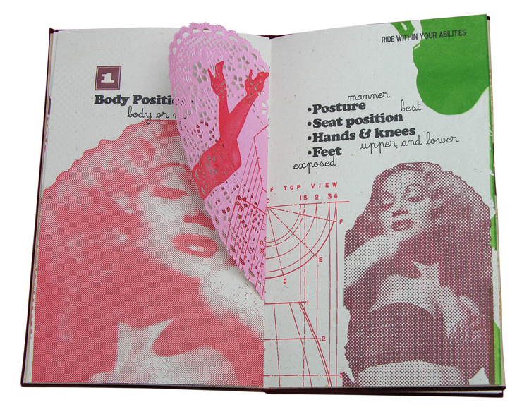
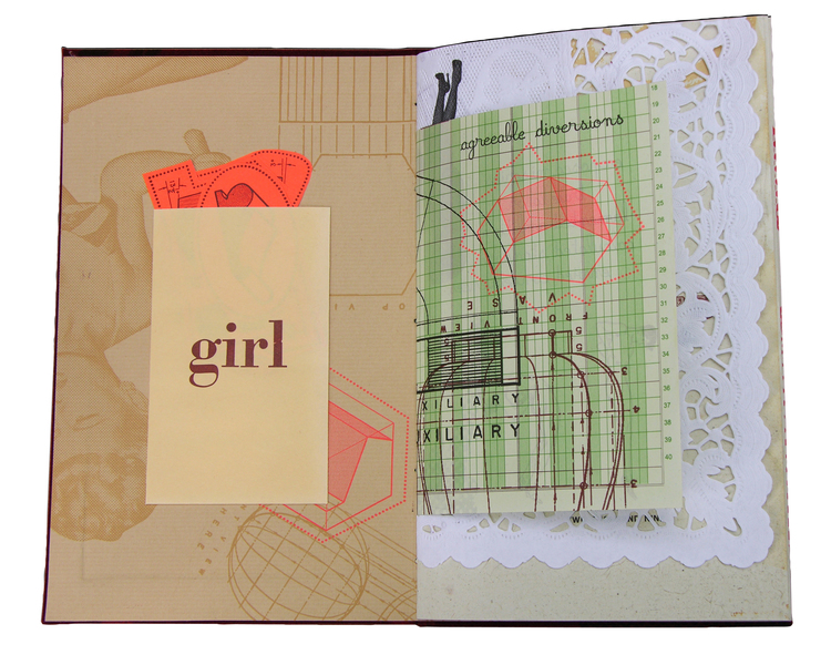
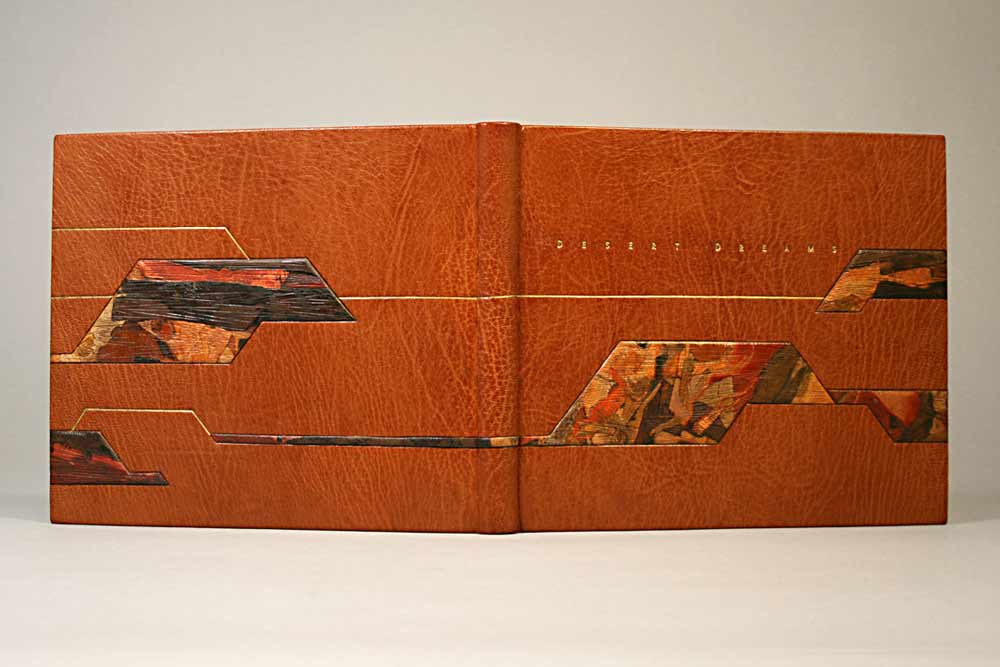
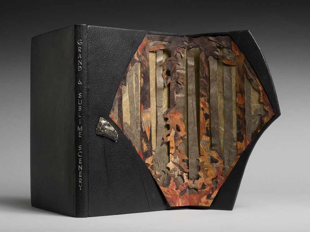
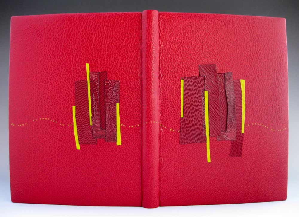
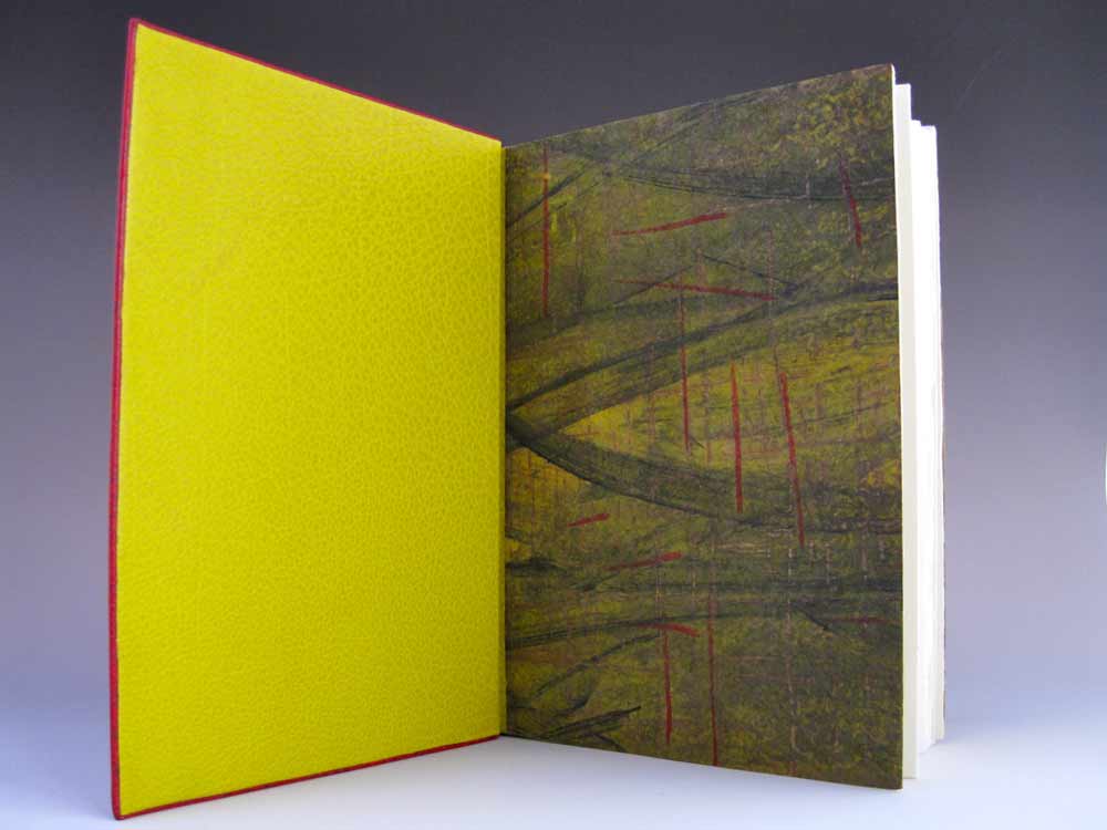
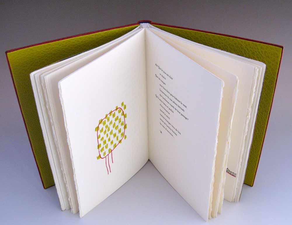
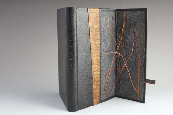
    The fine binding work of Annette Friedrich is delightful! Her portfolio matures with every new binding as she skillfully depicts the essence of each story with delicate and artistic flair. Read the interview after the jump and come back each Sunday in the month of August for more posts on the work of Annette Friedrich.

    read more >


  2. Client Work: Single Section Full Leather Binding // Part One

    July 30, 2013 by Erin Fletcher

    STORY OF THE TEXT: For his 50th birthday, my client, commissioned two pieces of music to be played during his celebration in Kenya. Each piece is inspired by two distinct features of Kenya, the Talek river and the nyatitis, an eight-stringed lyre instrument. As a commemoration of this event, he approached me to bind the sheet music into a full leather binding.

    ABOUT THE BINDING: The sheet music came to me as 17 individual loose sheets. At the same time, the most recent The New Bookbinder (Volume 32) from the Designer Bookbinders appeared at our bindery. The journal contains an excellent and detailed article by Ingela Dierick titled Single Section Bradel Binding.

    Using this article as a guide, I decided to guard the scores as a single signature. A single sheet of light green/gray Hahnemühle ingres was used to divide the two compositions. A single folio of the same ingres and a folio of pool blue handmade paper from Katie MacGregor was wrapped around the single signature to act as endpapers. 

    musicalscorebinding1-erinfletcher

    Once the signature was ready, I prepared a stub out of the same pool blue handmade paper to the thickness of the signature. The signature was pamphlet sewn to the stub, the layers of the stub were glued together using PVA and then put under weight until the next day. After trimming the text block and stub to size, I was ready to attach my final endpaper. A single sheet of waste paper was tipped onto the stub at the height of my shoulder. The waste sheet is then folded back and the endpaper is tipped onto the same position. The waste paper is then wrapped back around the fold of the endpaper. This creates a zig-zag and leaves a pocket for the false shoulder. This final endpaper will also act as the paste down and is a handmade paste paper designed by Deena Schnitman

    musicalscorebinding3-erinfletcher

    A false shoulder made from cord of appropriate thickness is tipped into the pocket between the waste paper that is tipped to the stub and where it wraps around the endpaper. The book is then placed into a press or job backer and the stub is rounded to create the shape of the spine and the shoulder. This is done with a bone folder and some force. From here I added the leather wrapped headbands and six layers of spine linings, which extend beyond the head and tail. Once the spine is dry, it is then sanded down smooth.  

    musicalscorebinding4-erinfletcher

    At this point, I attached a bonnet to the spine. The bonnet included a spine stiffener and was then slit to allow for the leather turn-in at the headcaps. Boards were laminated from 1.5 mm millboard and 20 pt. and attached to the waste sheet. The waste sheet was then torn off and smoothed down. Lastly, the boards were sanded to have a subtle chamfered shape. 

    musicalscorebinding5-erinfletcher


  3. Book Artist of the Month: Ellen Knudson

    July 29, 2013 by Erin Fletcher

    subjectverbobject1-ellenknudson

    Subject/Verb/Object grew from frustration and anger towards art criticism and other academic writings, which largely incorporates language to control its audience and exclude outsiders. In 2012, Ellen Knudson of Crooked Letter Press created this word game, with no beginning, no end and no way to win. The turning, fitting and order of words can cause clarification or confusion. Using simplistic language forces the reader to attempt a visual organization of the things we cannot put in order: our desires. 

    subjectverbobject2-ellenknudson

    subjectverbobject3-ellenknudson

    The volvelle is made of three layers bound with a metal brad and measures at 12″ in diameter. The book was letterpress printed in an edition of 85 on a Vandercook Universal I from a combination of handset metal type and photopolymer plates. Murillo paper was used to created the volvelle, interior sleeve and belly band which is held together with a set of metal grommets; the exterior sleeve is covered in Iris coffee bookcloth. 

    This artist book can be purchased from 23 Sandy Gallery


  4. Bookbinder of the Month: Coleen Curry

    July 28, 2013 by Erin Fletcher

    tamalpaiswalking-coleencurry

    Every three years, the Guild of Book Workers offers a national traveling exhibition based on a general theme. In June 2012, Horizon, the most recent GBW exhibition began it’s journey across the nation starting at the University of Kentucky. The exhibition is currently on it’s way to the University of Denver for display from August 1st – October 31st. You can check out the rest of the schedule here

    Every day, Coleen Curry runs the trails of Mt. Tamalpais. This landscape is her backyard, her horizon; she can catch a glimpse of the mountain from her bindery windows. The text of Mt. Tamalpais echoes Coleen’s feelings about the mountain-scape and therefore, she chose to represent this horizon through texture.

    Bound as a French-style fine binding, sewn on cords with laced-in boards. Covered in full goatskin leather that has been sanded, distressed and dyed with matching edge to edge doublures. The slopes of Mt. Tamalpais are represented with collaged horsetails, that Coleen collected from the watershed, dried and pressed. To celebrate the fog that wraps around the ridges and the California poppies and Indian paintbrush which smatter the slopes, Coleen painted and blind tooled lizard inlays and onlays.

    When I toured this exhibition at the Utah Museum of Fine Arts, I was in awe of Coleen’s binding. Because her work is so textural, her bindings appear even more vibrant and animated in person. 

    tamalpaiswalkingdetail-coleencurry


  5. Book Artist of the Month: Ellen Knudson

    July 22, 2013 by Erin Fletcher

    wildgirlsredux1-ellenknudson

    In 2009, Ellen Knudson revisited her work How to Become One of the Original Wild Girls, a book that was designed and printed in 1997 in the new piece Wild Girl Redux: An Operator’s Manual.

    wildgirls1-ellenknudson

    How to Become One of the Original Wild Girls

    The original work includes a playful list of imaginary “rules” that “should” be followed to achieve a Wild Girl status. The rules are light in nature, but the deep-rooted sexist issues are easily recognizable. 

    wildgirls2-ellenknudson

    How to Become One of the Original Wild Girls – page detail

    In Wild Girls Redux, Ellen reexamines these issues, combining motorcycle road and driving rules as text (adapted from the Missouri Department of Revenue Motorcycle Operator Manual) along with images of pin-up girls and industrial schematic illustrations. All parts of the book were letterpress printed on Indian Sunn Hemp Contemporary with photo-polymer plates. Bound as an accordion portfolio cover with two single signature pamphlets sewn in. In addition to the printed pages are pieces of ephemera, which include pink heart paper doilies, white doily placemats, and green office ledger papers. The cover is flocked paper in maroon. Each books comes with a set of stickers, which are kept inside a yellow office mailing envelope decorated with a wrap-around belly band. The intent of the Operator’s Manual is tongue-in-cheek and provides the ordinary, mechanical, and absurd rules of how to operate women.

    wildgirlsredux3-ellenknudson wildgirlsredux4-ellenknudson wildgirlsredux2-ellenknudson

    Created in an edition of 100, each signed by the artist. Wild Girls Redux: An Operator’s Manual was the winner of the 2009 Florida Artist’s Book Prize for The Bienes Museum of the Modern Book and The Florida Center for the Book.


  6. Bookbinder of the Month: Coleen Curry

    July 21, 2013 by Erin Fletcher

    fantasynonsense-coleencurry

    In 2012, the Rocky Mountain Chapter of the Guild of Book Workers put on a juried set-book exhibition which was held in conjunction with the Standards of Excellence conference at the J. Willard Marriott Library at the University of Utah in Salt Lake City. The set-book, Fantasy and Nonsense, is a collection of poems from 19th century American poet James Whitcomb Riley with peculiar wood engravings by Berrot Hubrecht. The text was letterpress printed on handmade paper in an edition of 230 from Tryst Press.

    The first prize went to Coleen Curry’s traditional French-style fine binding covered in a custom-dye pink Harmatan goatskin. Sewn on 4 cords with laced-in boards. The front and back cover cutouts have embedded electrical wires strung with floating glass beads. The decorative endpapers are made by Coleen; a collage made by laminating magazine strips, then sanding and painting the surface. The finished collage was then scanned and inkjet printed onto arches text wove. The bold color palette is a reflection of the whimsical nature of the poems and illustrations.

    fantasynonsense2-coleencurry


  7. Bookbinder of the Month: Coleen Curry

    July 14, 2013 by Erin Fletcher

    desertdreams-coleencurry

    West of the Plains was a juried exhibition put on by the Rocky Mountain Chapter of the Guild of Book Workers between 2008-09. Coleen Curry submitted two fine bindings to this exhibition, Desert Dreams by Lawrence G. Van Velzer with illustrations by Peggy Gotthold and Grand and Sublime Scenery by W.W. Elliot. 

    In 2008, Desert Dreams was bound as a traditional French-style fine binding, sewn on 5 cords with laced-in boards. Bound in Harmatan goatskin with matching doublures and suede fly leaves. Lacunose-style sanded leather raised onlays decorate the covers. Blind and gold leaf tooling, title is hand tooled with golf leaf. The head edge is gilded. The binding is housed in a clamshell box lined with ultra suede and covered in ‘Duo’ cloth using magnets for closure. A colored agate slice decorates the box cover. 

    Coleen was inspired by the vast mesa in Utah. While she drives to Telluride from California, she often travels through an area of Utah called the Paradox Valley. The colors on the binding are that very mesa. Coleen is excited about the lacunose technique because it so easily creates a feeling of landscape and motion. 

    Laura Wait acted as an exhibit juror and wrote quite the review of Coleen’s work: “Californian Coleen Curry’s binding “Desert Dreams”, is perhaps the finest example of traditional French binding in the show, with leather doublures, suede flyleaves and raised onlays. It also opens well!”


  8. Book Artist of the Month: Ellen Knudson

    July 8, 2013 by Erin Fletcher

    howtolove2-ellenknudson

    In 2004, Ellen Knudson printed and bound How to Love Someone Forever in an edition of 50 books and 50 broadsides. This collection of poems are written by Kevin Knudson (Ellen’s husband) and herself for one another and for their son. As Ellen explains it: We are always working on how to love each other, Kevin, Gus, and I, so this is a hint of the grand gooey mess that is us.

    howtolove1-ellenknudson howtolove4-ellenknudson

    Illustrations throughout the book are done by Ellen to represent weeds as a reflection of the tangle of relationships, lovely and difficult as they are. The illustrations are line drawings and letterpress printed from photopolymer plates. The book is about the every day of relationships and finding beauty in them when they can be taken for granted and so easily go unnoticed, much like weeds.

    The poems were handset and printed in Gould Old Style 394 and Caslon metal type. Pages were letterpress printed on dampened Hahnemuhle Bugra paper in mint and marble gray. The book is double-pamphlet sewn and bound as a built-in groove case binding. The paste paper covers are handmade on mint Bugra. All printing was done by Ellen at her studio, Crooked Letter Press, in Starkville, Mississippi on the (as Ellen puts it) badass Vandercook Universal 1 proofing press. 

    howtolove3-ellenknudson

    The poem Valentine Sestina written by Kevin is printed on the only fold-out found in the book and  is also available as a separate broadside. The poem is a sestina, which is a 39-line poem consisting of six stanzas of six lines each followed by a three lined stanza.


  9. Bookbinder of the Month: Coleen Curry

    July 7, 2013 by Erin Fletcher

    grandandsublimescenery-coleencurry

    W.W. Elliot’s Grand and Sublime Scenery was bound by Coleen Curry in 2008 as a French-style fine binding, sewn on cords with lace-in boards. Covered in black Morocco goatskin with matching edge to edge doublures; cover has an embedded Colorado agate. The head edge is decorated with graphite and title is hand-tooled in palladium. 

    The book is about the grandeur of the Sierra Nevada, which inspired Coleen to create a structure that would excite awe and showcase the timeless expanse of the landscape. The front cover panel is held in place by magnets and opens three-quarters outward to reveal elements of rock and giant redwood trees. The interior panel is designed with a layer of blind tooled lacunose (sanded leather) and two layers of Japanese paper.

    In 2009, Coleen’s binding was selected for the Guild of Book Workers traveling juried exhibition Marking Time. The exhibition traveled throughout the country until March 2011.


  10. July // Bookbinder of the Month: Coleen Curry

    July 1, 2013 by Erin Fletcher

    lacouleurduvent-coleencurry

    Coleen Curry was amongst the talented bookbinders who participated in the ARA-Canada exhibit La Couleur du Vent, an international design binding exhibition starting in Paris before traveling to Quebec in September 2013 and then Montreal in November 2013. La Couleur du Vent is a collection of poems by Gilles Vigneault, illustrated and designed by Nastassja Imiolek under the artistic direction of Cécile Côté. If it sounds familiar, I posted about this exhibition during last month’s interview with Sonya Sheats

    Coleen bound this copy of La Couleur du Vent as a ‘Montage sur onglets’ style so the prints would not get lost in the gutter. The term ‘Montage sur onglets’ refers to the signatures being sewn on stubs to release them from the confines of the gutter and offering a less restricted opening. Sewn on cords with laced-in boards, the book is bound in red water buffalo with chartreuse water buffalo edge to edge doublures. Exotic leather inlays of varying depths decorate the front and back covers. Title tooled with gold foil. The flyleaves are decorated papers made by Coleen. 

    A brief explanation about the design from Coleen:
    The colors match the prints in the book.  I took some of the shapes from the prints and altered them to create a feeling of blowing in the wind and to create movement.

    lacouleurduvent2-coleencurry lacouleurduvent3-coleencurry

    Coleen’s work has been on my radar ever since I came across her binding of Toni Morrison’s A Mercy at the Chicago Public Library’s exhibition One Book, Many Interpretations in 2011. I attended the opening reception not only because I love design bindings, but to see my own binding of Arthur Miller’s The Crucible. This was the first time I had a binding on exhibit and I was quite honored to be on display with so many other talented binders.

    A Mercy by Toni Morrison bound by Coleen Curry

    A Mercy by Toni Morrison bound by Coleen Curry

    Coleen’s work masterfully mixes traditional leathers with some non-traditional textures such as exotic leathers, agate, and horsetail (to name a few). But I am more attracted to Coleen’s brilliant use of color; either by adding pops of color, subtle hints or just out-right all-over bold color palettes. 

    Read the interview after the jump and come back each Sunday in the month of July to view more gems from Coleen’s portfolio.

    read more >


  • My name is Erin Fletcher, owner and bookbinder of Herringbone Bindery in Boston. Flash of the Hand is a space where I share my process and inspirations.
    The StudioNewsletterInstagramEmail me
  • Archives