RSS Feed
  1. North Bennet Street School // The Set Book Interviews – Class of 2025

    May 15, 2025 by Erin Fletcher

    In February, I traveled to Boston to teach a workshop at the North Bennet Street School. Since moving to Austin, I’ve only been traveling back to teach during the summer. A happy coincidence during my winter visit was that I got the chance to speak with most of the second year students about their set books. They were in the process of forwarding their text blocks and finalizing their designs. It has been a few years since I’ve been able to have these preliminary conversations and it was such a joy to learn about their ambitions and talk through any challenges presented by their designs. I couldn’t wait to conduct these interviews to see how their final bindings turned out.

    The set book for this year’s graduating class was The Poetical Vagaries of a Knight of the Folding-Stick, of Paste-Castle. Note: you will find several variations of this title on the student’s bindings. Many bookbinders may be familiar with the poem The Binder’s Curse, which was part of a collection of poetry written by John Bradford. First published in 1815, this series of bookbinding-related poems were written by a journeyman bookbinder based in New York City. Many students commented about the delight in being a bookbinder binding a book about bookbinding as one of their final projects in the bookbinding program. This particular book has a really interesting history that is explored deeply in Jeff Peachey’s article “The Binder’s Curse”: John Bradford and Early Nineteenth-Century American Bookbinding found in Suave Mechanicals: Essays on the History of Bookbinding, Volume VIII.

    The students bound a facsimile printed in 1993 by Sandlin’s Books & Bindery, which replicates the original layout and punctuation as best as possible. The publishers noted that a portion of the original writing was omitted “due to its indiscernible ramblings which distracted from the delightful poetry about bookbinding.” This section is titled The History of the Garret, Translated from the Hierglyphics of the Society. By a Member of the order of the Blue-string, which is a satire about secret societies. The absurdity of such clubs is laid out through stream of conscientiousness and with little editing from the author. However, some of the students chose to indicate this omitted section from the 90s publication by including a portion of blank black or off-white pages to the back of their text block.

    The topics of Bradford’s poetry speak to the working conditions and livelihoods for bookbinders in the early nineteenth-century. Using wordplay and quirky humor, Bradford mentions ownership over tools, striking against long workdays, the daily workflow of a bindery, workplace politics and monetary hardships. Peachey goes into greater detail of the poems and fleshes them out further with additional historical references.

    Featured on several of the student’s bindings is the Knight of the Folding-Stick either in the form of text or as a decorative element. Bradford’s focus on tools goes beyond possession and complaints, but speaks to the embodiment of our tools as craftspeople. They are an extension of ourselves and our work. The knight is a human-like figure literally built from tools found in a bindery. Peachey discusses a few ways this imagery could be interpreted in his article, but many of the students spoke about the knight as a figure fighting for the bookbinder.

    All of the bindings will be on display as part of the 2025 exhibition Meaningful Work at NBSS in Boston until July 3rd. The greater theme of the show highlights how the work created by students and alumni have transformed their lives, communities and values. I hope you enjoy the following interviews conducted with the 2025 Bookbinding graduates. We spoke about much more during the interviews and I wish I could have included it all. I recommend reaching out to congratulate and welcome these wonderful folks into our community!
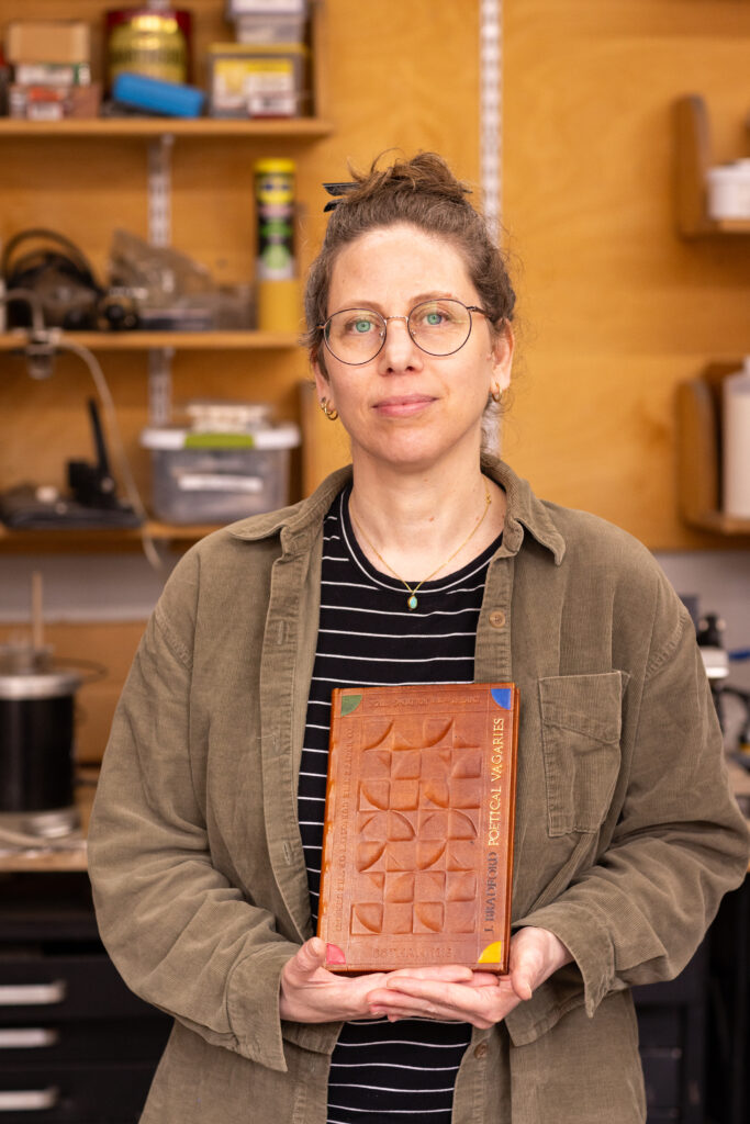
    Yaara Buksbaum
    The painful political and social commentaries concealed within the poems are peppered with some slight absurdities. It was this whimsy that gave Yaara permission to be playful in her own design as she attempted to capture the spirit of Bradford’s words. Her initial designs leaned into the layout of political pamphlets and posters of the nineteenth-century. However, after finding little visual inspiration, she moved into the twentieth-century where mid-century modern designs captured her attention. Yaara expressed her love of hand-cutting and knew she wanted to create a design that would lean heavily into this technique. She wanted to explore this artistic style of bookbinding through a technique that would bring her joy while also challenging herself pragmatically.
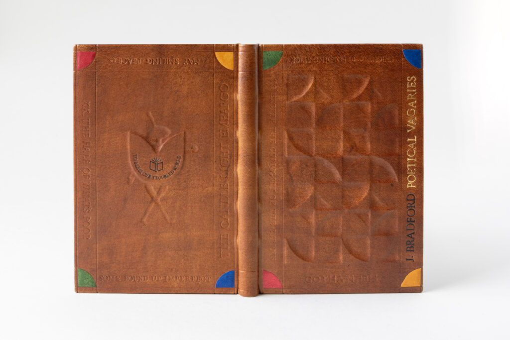
    Yaara chose to dye all of the leather for her binding, this includes the base leather, onlays and hinges. When applying the brown Roda dye, the leather absorbed the liquid irregularly which created an interesting mottled effect. Prior to covering, the boards were built up in various layers of 10pt. and 20pt. board to create deep recesses, mid-points and raised areas of the designs on both the front and back covers. Although Yaara pared her leather on the thinner side, created several tests and worked diligently to push the material into these shapes, it ultimately created a softer appearance than she intended.

    Tooled onlays of saturated colors anchor the design onto the covers and help define the outer blind tooled frame. On the front cover, Yaara hand-tooled the main title with gold leaf and the author’s name in carbon inside this frame. Her choice to use carbon was to place the author’s name in the dark as he did not sign the work within. The remaining blind tooled text on the front cover notes Gotham as the place of publication, acknowledges the Knight of the Folding-Stick and snippets from the poems. The latter is continued on the back cover with more lines from the poems, which are all meant to demonstrate the author’s humor and social messages. The infamous Knight of the Folding-Stick is recessed on the back cover behind a raised shield. Yaara carbon tooled the phrase To Bless Our Troubled World onto the shield along with an open book. This phrase in particular really resonated with Yaara as she continues to deal with the challenges of leaving Israel before war broke out.
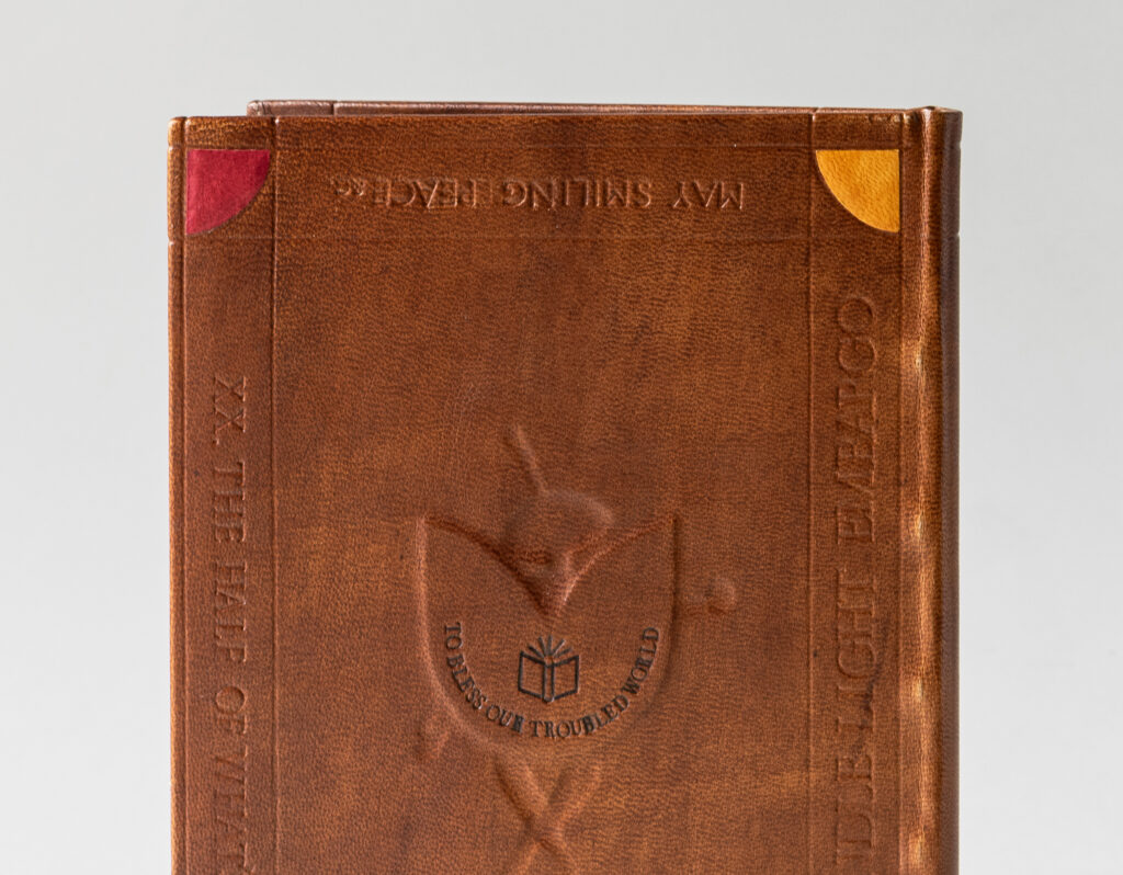
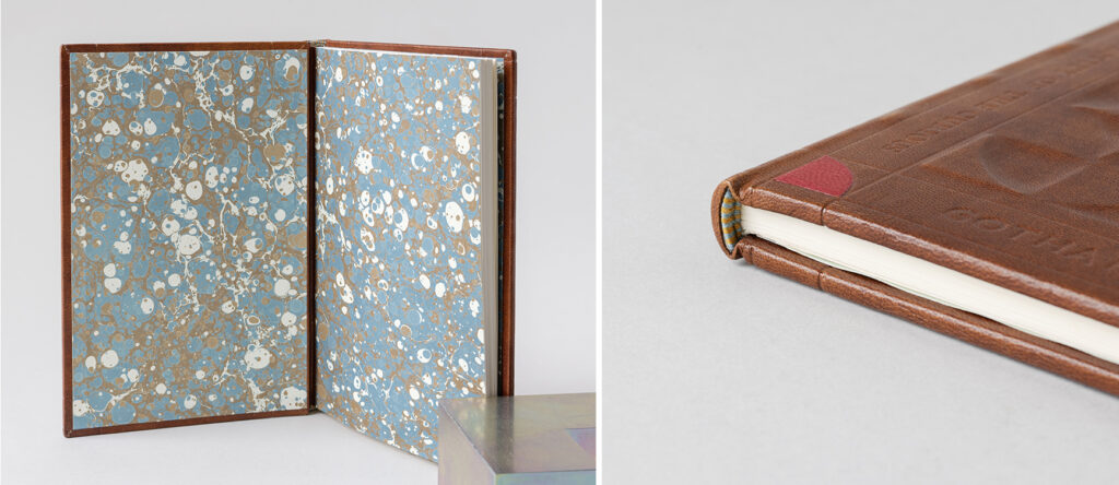
    The blind tooled frames on the cover extend onto the spine at the head and tail while also wrapping around the board edges before landing on the turn-ins. The endbands were sewn around a rectangular core with bands of yellow and light blue. Yaara used a marbled paper made by alumni Abra Mueller for the paste downs and fly leaves. While the students do make their own marbled paper throughout the year, Yaara selected one of Abra’s papers for its complimentary color scheme to her binding.
    Yaara has a background in social work and sociology, which she did up until the pandemic. As many of us felt burnt out during that time period, Yaara chose to pivot into a new field and gained an archival studies diploma. During a field trip to a conservation lab in Jerusalem, she immediately felt inspired and at home in the space. The conservators suggested that she study abroad as there were no opportunities in Israel. This started Yaara on a windy path to considering West Dean before ultimately landing at North Bennet Street School, a place she only discovered during a trip to visit family in Boston. However, upon finding the school, she felt that same sense of place. After graduation, Yaara will be at the Boston Athenaeum for a year-long Fellowship in Book Conservation provided by the Von Clemm and Driscoll Family.
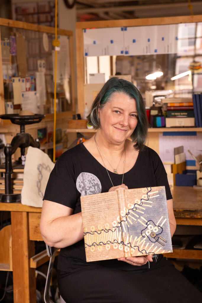

    Sandra Haynes
    Aliens Read My Diary
    @aliensreadmydiary

    Prior to reading the set book, Sandra read the aforementioned article by Peachey and latched onto an illustration of a sewing key. Within the pages of her diary, Sandra played around by stamping the shape of a sewing key into various patterns. One pattern in particular reminded Sandra of a strand of DNA, or the master key of life. Sandra noted that she was once an aspiring biologist and often comes back to DNA in her work. Bradford’s affinity for wordplay gave Sandra license to make her own connection between the history of bookbinding and genetic coding. This is demonstrated by using a sewing key to illustrate a strand of DNA. As keys within these strands are loosened and wound up over time future generations are affected in how the code is expressed in our bodies (or how prior generations of bookbinding innovation inform how contemporary binders work).
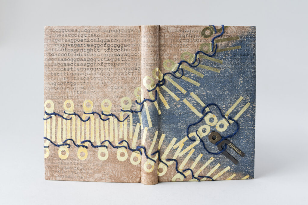
    Sandra’s design is incredibly layered with various techniques. The DNA sequence is the initial layer which is a photo transfer covered with a light wash of pale brown leather dye. Using the craquelle technique, Sandra laid brown and blue leather dye over thick and thin paste to achieve two distinct textures and areas of the design. The keys were surface gilt on the leather with one isolated as an inlaid piece of brass. Although Sandra’s tests found that the rabbit skin size worked best for the surfacing gilding, the reality of working on her actual binding turned out differently. Sandra had to apply separate layers of PVA size and rabbit skin size in order to achieve successful surface gilding for the sewing keys.

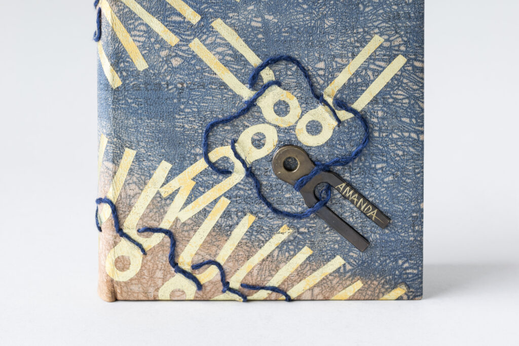
    The inlaid brass has the name Amanda etched into one of the ends. Bradford writes about the control he has over his tools, not allowing any of his colleagues to use them. Another poem titled Technical Description of Somebody speaks about a woman’s beauty and the name Amanda appears within the stanzas. Could she have been a colleague of Bradford’s? Would she have been equally controlling over her tools? The life and experiences of women in binderies were often not documented, as is the case with Bradford’s poems. Sandra wanted to nod to this omission by singling out this individual sewing key. The four interlocking keys on the front cover represent both a coat of arms and a transcription that is turning to unfold the strand of DNA. The blue yarn was stitched through the leather after covering. Sandra achieved this by punching a hole into the leather and then carefully slipping a needle underneath.
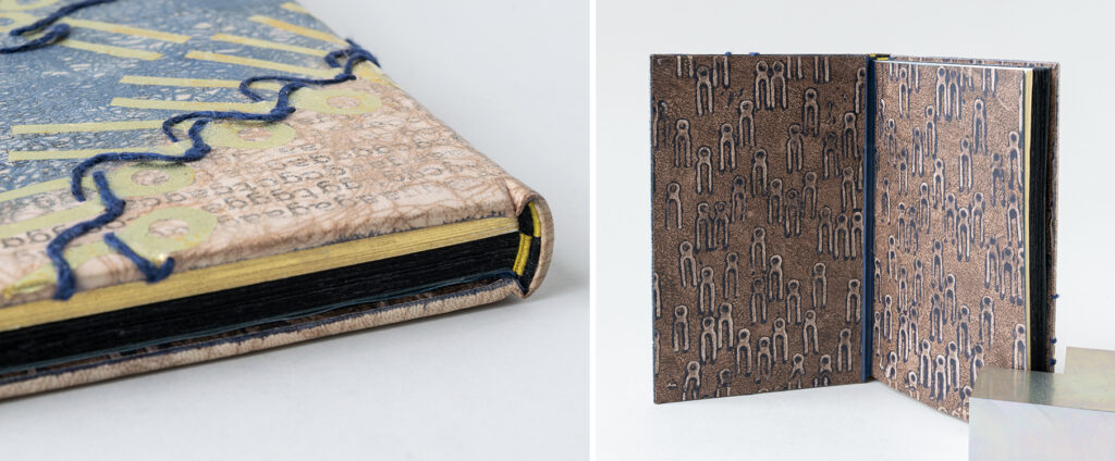
    Sandra’s passion for preserving personal stories meant the exclusion of The History of the Garret was unacceptable. Therefore, she created extra signatures made of black paper to represent this omission. This distinction is clearly seen along the edges of the text, which the pages of the set book rough edge gilt. The French double-core endbands play with this separation by alternating gold and black threads in a cleverly woven design. Another one of Sandra’s initial sewing key patterns made its way onto the custom papers used for the paste downs and fly leaves. Sandra created a textured brown background then stamped the sewing key with a heavy application of dark blue paint that had pooled at the edges. This created a thick silhouette of blue around the sewing keys. The use of walnut browns and indigo blues were intentionally chosen to reference the 1812 embargo on fabrics, which led to more neutral tones being used for fashion at this time, particularly for women’s work wear.
    After graduation, Sandra is looking forward to connecting with members of her community and finding ways of sharing her knowledge to folks interested in bookbinding and making artist books. She wants to focus on binding styles that are great for writing or drawing inside and plans to explore these structures further. Her lifelong practice of maintaining a diary has led her to find the American Diary Project. As a recently appointed board member, Sandra will be surveying the current collection to help determine what treatments might be necessary and how she can offer her skills to this ambitious project.
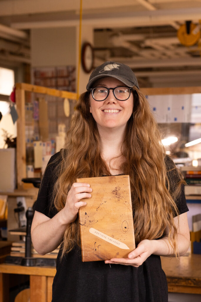

    Laura Kraegel
    Every student in the Bookbinding Program at NBSS gets their own bench and as the year progresses it becomes a reflection of who they are as a maker. Some thrive in a chaotic, messy space, while others might find peace in a clean, minimal space. Each bench showcases years of history through its markings and pigmented spots along with the student’s signatures who claimed it during the year. Laura wanted to celebrate the work bench and its ability to accrue messes through the bustle of the school year in her design. Our tools are also incredibly personal, becoming an extension of our own hands. This can often make it difficult to lend them to others as noted by Bradford in the poem A Proclamation. Laura sketched out a range of tools for her design initially, but in the end only her absolute favorites made the cut for the final binding.
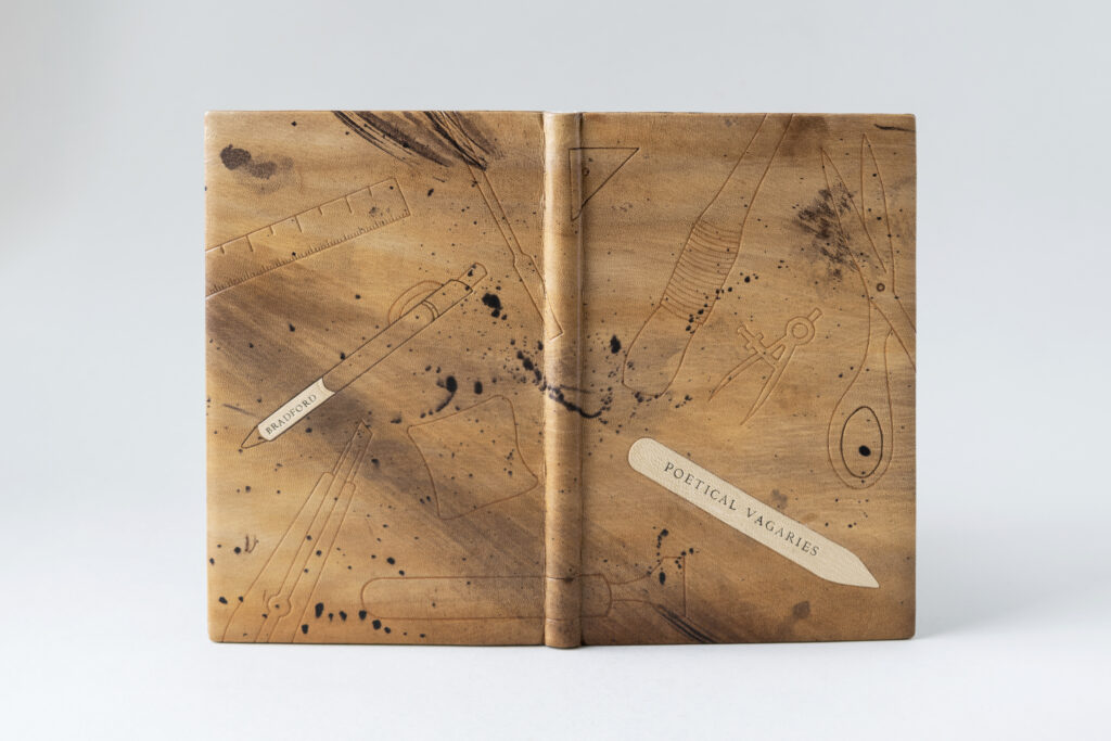
    Laura transformed an undyed goatskin to reflect all those beautiful imperfections of her bench. Working with a selection of brown Roda dyes, she used a range of applicators in order to achieve various textures. This included sponges, rags and stiff bristle brushes. From the beginning, Laura had intended to use leather dyeing and tooling in her design. Her goal for the former was to use this technique more creatively rather than technically as required for conservation. And indeed, Laura found dyeing to be rather freeing while creating an abstracted interpretation of the bench.

    To find a balance between hand-sketched and minimalist design for the tools, Laura streamlined the lines needed to define each tool while also peppering in subtle irregularities. In addition, the scale of each tool is augmented to be either smaller or larger than its real-life counterpart. While two of the tools were non-negotiable in their placement, the location became mostly informed by the look of the dyed leather. Laura felt that the bone folder was most appropriate for the title as a nod to the Knight of the Folding-Stick and since the line palette is her favorite tool, it also needed to be featured on the front cover. After testing a variety of options to further define the tooled impressions, Laura landed on painting the outlines with two tones of brown dye rather than blind, gold or carbon tooling. The painted dye also created a softer look to the design, which ultimately felt more harmonious than a crisp tooled outline.
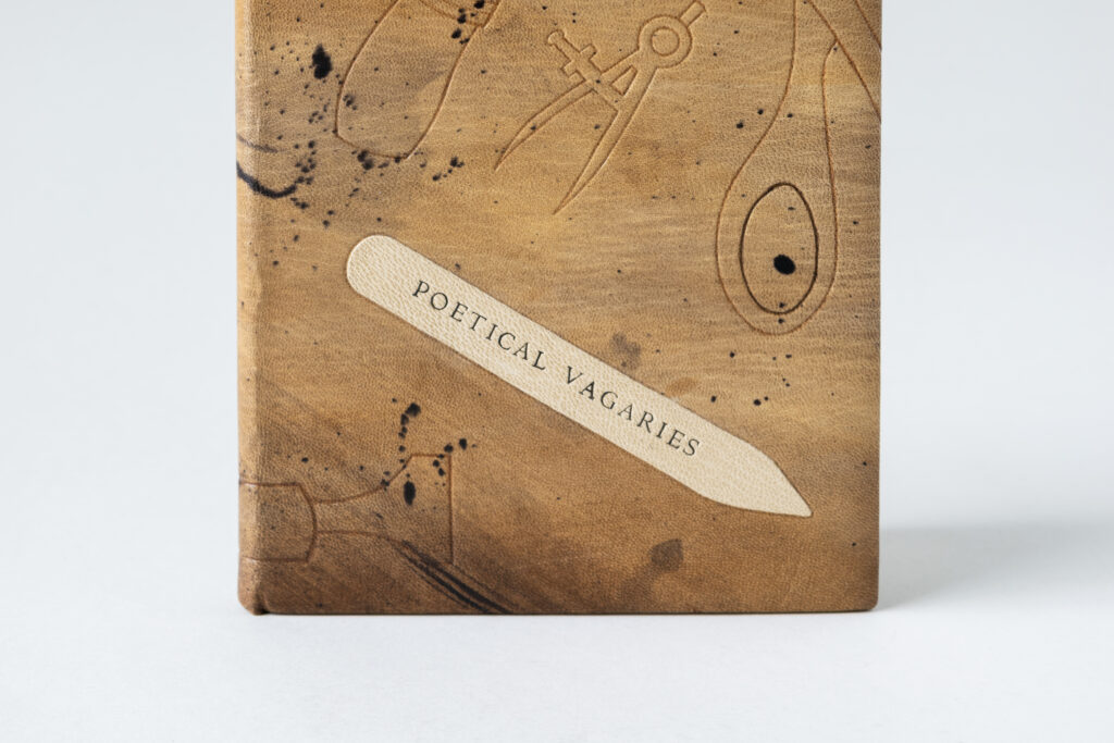
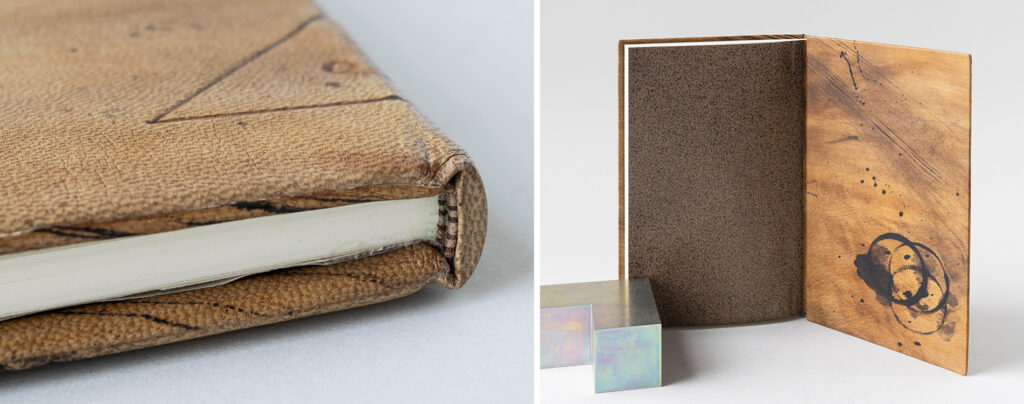
    As mentioned above, the bone folder was used for titling on the front cover and the pen barrel on the back cover showcases the author’s name. Both were hand-tooled using handle letters in carbon over a lightly hand-dyed goatskin onlay. The endbands are sewn over a rectangular core in three shades of brown. Although Laura’s first instinct was to sprinkle the head edge, she backed away from that choice in order to create a moment of pause before opening the binding. The edge-to-edge doublures are dyed with the same energy as the covers and each were given one feature. The front doublure is adorned with a tooled illustration of Laura’s favorite pair of tweezers, while the back doublure highlights Laura’s tea habit in the bindery. She used the very Christmas mug that she drinks tea from everyday to achieve the cup rings on the back doublure. The speckled flyleaves are a decorative paper from Dirk Lange Handmarmorpapier, which matches Laura’s binding perfectly.
    Laura found bookbinding during her undergraduate studies, but didn’t pursue it further until much later on when she heard about NBSS through a WBUR radio piece. After taking a few Community Education classes, she decided to enter into the full-time program. During the past two years, Laura has embraced every new experience with excitement. She’s built on her training by interning at Haverford College over the summer and taking courses on the history of bookbinding at Rare Book School along with a course on the history of book structures taught by Julia Miller at the University of Michigan. With all of these experiences under her belt, Laura is looking forward to planning her next move.
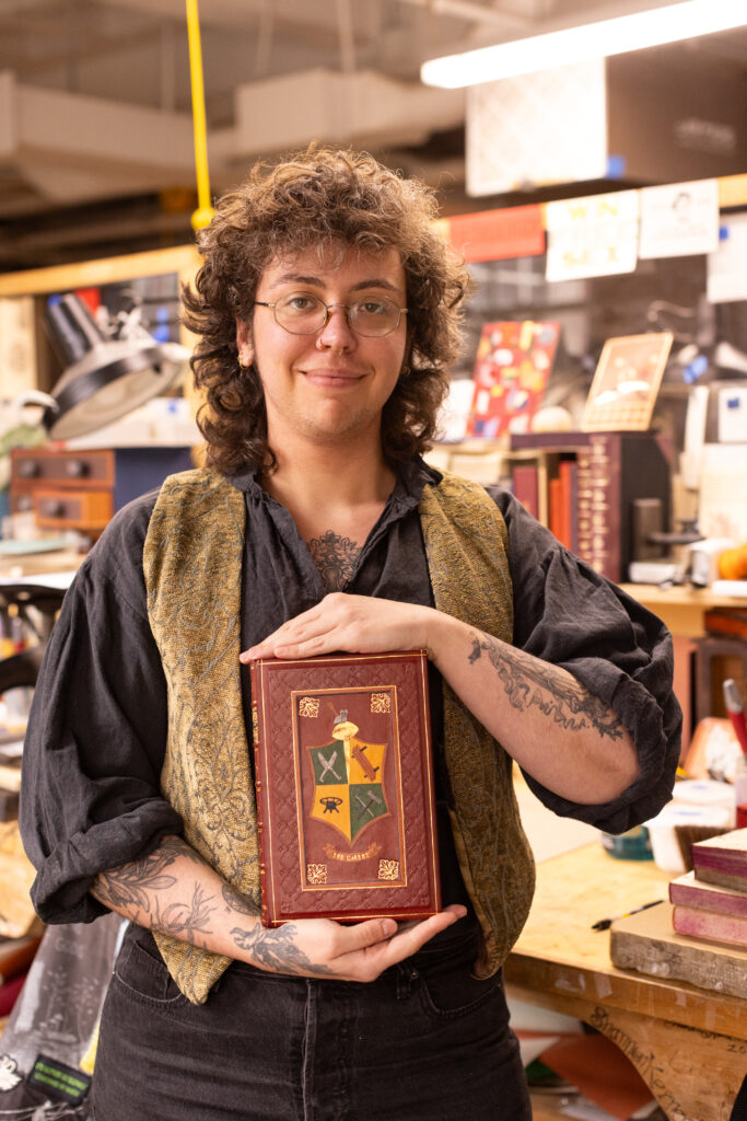

    Ash Nunez
    Ashen Briar Bindery
    @ashenbriarbindery

    Ash found inspiration from armorial bindings found in England and Italy during the nineteenth-century along with Bradford’s satirical commentary on secret societies. Both of these influences connected their personal maximalist aesthetics and interests in heraldry. Rather than recreating the exact appearance of an ornate armorial binding, Ash’s goal was to elevate this look through a contemporary lens while also making a direct connection to the text block. Although the illustration of the Knight of the Folding-Stick is a part of the omitted text, it does appear at the beginning of Peachey’s article. This gave Ash a great source of inspiration to build the details of the shield for the front cover of their binding.
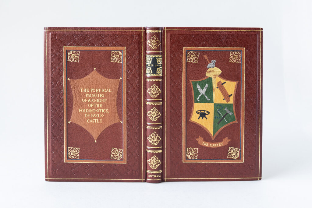
    The binding is covered in a cherry goatskin, however the decorative panels in the center of each board are actually sunken inlays. An extra layer of board was laminated to the covers and you can catch a glimpse of a shadow at the board edges in the photograph below. The front cover panel is masterfully layered using techniques that Ash learned during a workshop with Coleen Curry on inlays and onlays. The green and yellow goatskin blocks that make up the background of the shield (along with the surface gilt elements) were butt together first, then trimmed to the final shape. After being framed with a piece of light brown goatskin, the entire shield was inlaid into a piece of cherry goatskin. At this point the individual tools were added. Onlays in light grey, brown, dark grey and black were used to create the brush, owl, shears, lying press, finishing stove and hammer. The needle was tooled with palladium along with a small dot to indicate the hinge of the shears. The thread is an ascona onlay with blue leather to represent the Order of the Blue-string. Further details on the tools are blind tooled while the owl’s features are smoke tooled.

    The panel on the back cover is constructed slightly differently. The shape on the back matches the shield, but it is also meant to mimic a piece of stretched leather with the clips represented by a small decorative arrow tooled in gold. This piece is an onlay that has been hand-tooled with the full title. The decorative sunken panels are surrounded by a frame of blue leather and a tooled light brown onlay. The central panels are further framed with a blind tooled pattern meant to mimic a design that could be achieved by using a brass wheel, but it is actually made up of three separate finishing tools. A single tooled gold line is the final frame on the covers.
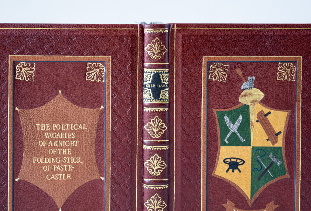
    The aesthetics of armorial bindings are continued on the heavily tooled spine where Ash added false raised bands on the hollow to create the different compartments. Each band is tooled along the edges with two different finishing tools. The lettering piece features the words Keep Dark as a nod to the phrase Keep dark, Can’t tell which is found at the top of the illustration and is nineteenth-century slang for keeping quiet. The lettering piece is also heavily tooled with corner motifs matching the boldness of the larger decorative tool used in the corners of the panels and remaining spine compartments. The word Gotham is tooled in the tail compartment, which is the place of publication (New York City) of the original 1815 edition.

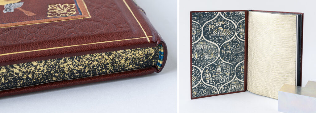
    The endbands are sewn over a rectangular core with bands of yellow, blue and green thread. The head edge has been painted black to mask the addition of blank black pages. The edge was then sprinkled with gold leaf and a few flecks of palladium. The paste downs and flyleaves come from a collection of decorative papers that were donated by Todd Pattison. Both patterns matched the aesthetic of Ash’s binding perfectly. The paste downs include hand-stamped scenes in indigo, while the flyleaves are printed with gold in a pattern similar to dragon scales.
    Prior to coming to NBSS, Ash was already a small business owner and as they progressed through the program they began incorporating more of their binding work and services into their established business. Through binding, Ash has found acceptance as an artist and has found this craft to be the perfect outlet for their creative energy. This energy will hopefully translate into more fine bindings, more marbling and more collaborations with other artists. The latter being very important for Ash as they really enjoy connecting with authors in particular, to craft a unique binding of their work.

    Stephanie Sieverding
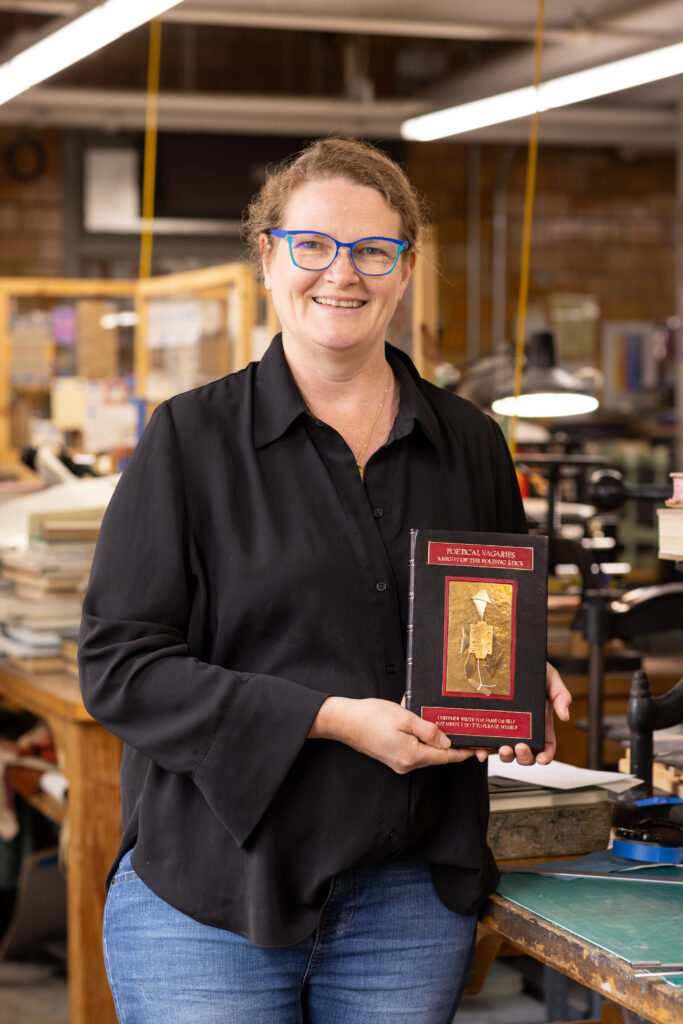
    Stephanie’s two designs are split by the spine of the book which is minimally gold tooled to outline the false raised bands. The front cover takes influence from the illustration of the Knight of the Folding-Stick while the back cover pulls imagery from the poem The Binder’s Curse. This poem lists off the myriad of calamities that could occur in the bindery or during the binding process. In her binding, Stephanie embraced these curses and illustrated them across the back cover, however, she does offer a small triumph with the decoration on the back cover doublure.
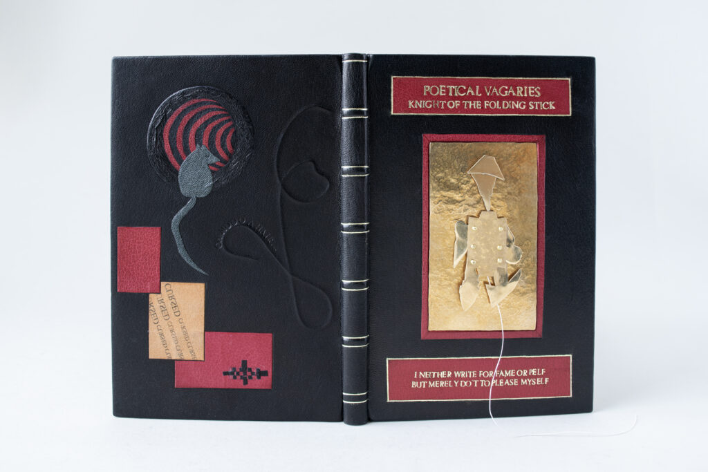
    Stephanie crafted her binding using a simple color palette of black, red, tan and yellow metals. However, she employed a wide range of techniques across the binding. Beginning with the back cover, Stephanie has recreated some of the curses using a range of onlay techniques and carbon tooling. The top right hand corner features a tunnel with a mouse at the entrance. The black and red stripes butt against each other to create the illusion of depth through the board. A wrinkled onlay surrounds the entrance where a light grey mouse awaits. This small scene depicts the first line of curses listed in the poem: “May rats and mice devour your paste, Your paper and your leather,”. Other elements that Stephanie highlights from the list of curses include a hair left under the leather, using patches to hide errors, newsprint transferring onto leather and unintentionally overlapping elements.

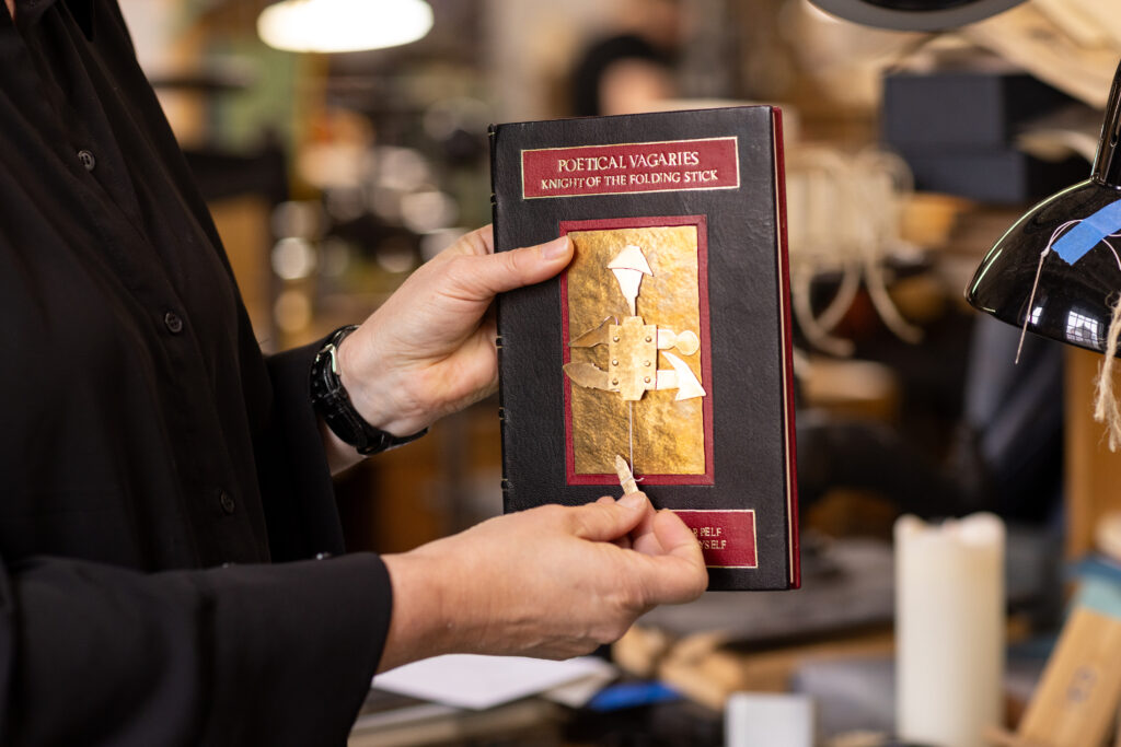
    After seeing the illustration of the knight, Stephanie said that she felt compelled to create an animated version of the knight out of brass. This material being something her father worked with a lot gave her confidence to engage with it to craft the knight. The backplate was hammered to create texture, while other pieces were sanded and polished. The head and helmet were sealed to prevent tarnishing. After assembling several knights of different sizes to test the pulling mechanism, Stephanie finally landed on a solution that would allow for easy pulling action of the string. The rivets were hammered to the body plate and are part of the mechanics. The title at the top of the cover and quote at the bottom were hand-tooled and gilt on a tooled red goatskin onlay. The quote “I neither write for fame or Pelf, But merely do’t to please myself.” comes from the title page of the text and was selected by Stephanie as she felt it perfectly captured the author’s sense of humor.
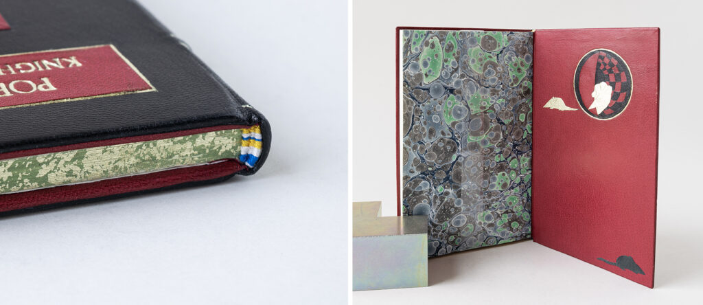
    The French double-core endbands are sewn with bands of yellow, white and blue and sit atop a sprinkled edge over green pigment. Upon opening the back cover, you find the mice have made their way through the tunnel and transformed into golden rodents. These onlays were surface gilt by Stephanie to represent wins over those pesky curses. The fly leaves were marbled by Stephanie using watercolor paints and the pops of green and blue are a nice reprieve from the covers while also connecting with the edge decoration and endbands.
    Stephanie began her journey into bookbinding as a hobbyist before finding Community Education courses at NBSS. Once her daughter was a bit older, she decided to enter the full-time program. After graduation, Stephanie will be setting up a private practice in a studio space at home. She found so many aspects of the program to be interesting and plans to offer a range of services while also developing a product line. The long process of crafting a fine binding also really appealed to Stephanie and she is already working on her next binding.
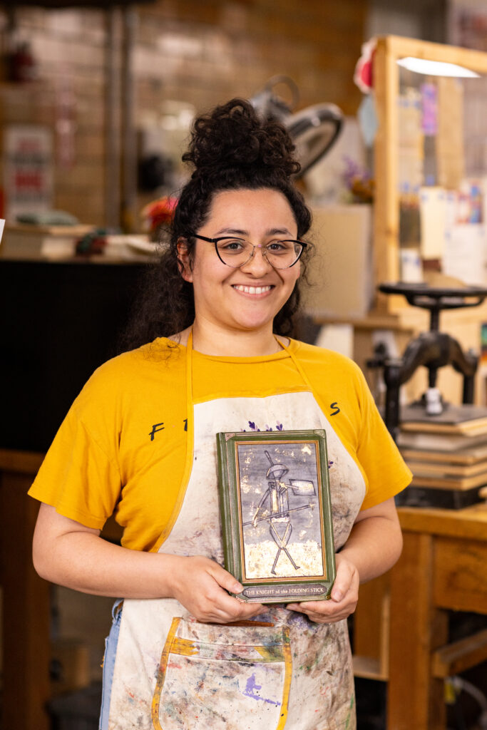

    Suehade Soto
    @suehade_inc

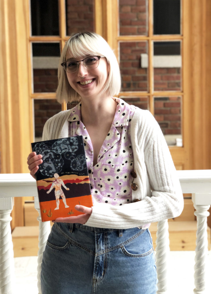
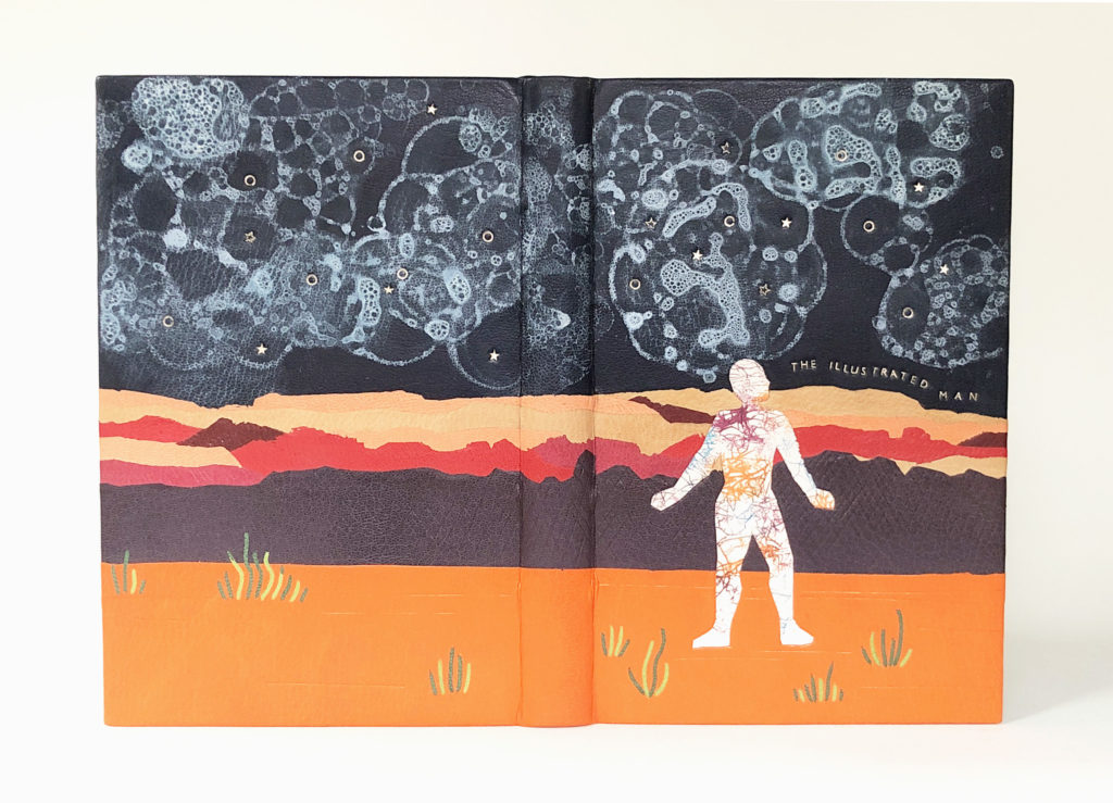
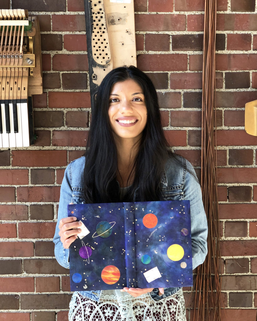
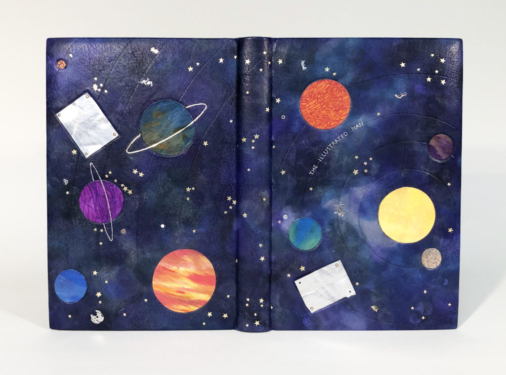
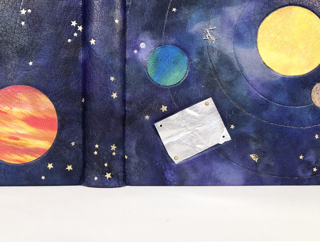
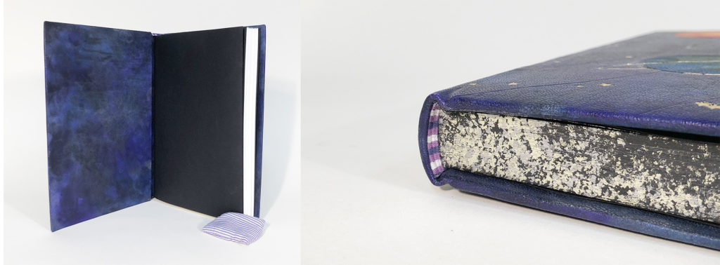
    In Suehade’s design we get to see the knight as it appears in the original illustration set atop a stark, desolate backdrop. His hat is a paste bowl with a brush “feather”. His body is formed with a backing hammer, plough, tenon saw and gold cushion. His legs are press shears and his arms are comprised of a polishing iron and fillet. He holds a press board as a shield and wields a press pin like a spear. One tool that is missing is the actual folding stick, which we refer to today as a folder and is typically made from bone, wood or horn. The bone folder is mentioned by Bradford as being one of the most basic tools for a bookbinder, in fact it was the first professional tool I ever bought and one that I still cherish to this day. Peachey notes this omission of the folding stick as being an ironic injustice as the rest of the knight’s body is made solely from bookbinding tools and equipment. Suehade chose to incorporate a literal bone folder in her design and gave it a pocket, so it can be unsheathed at any moment.
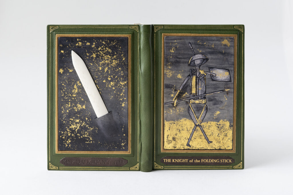
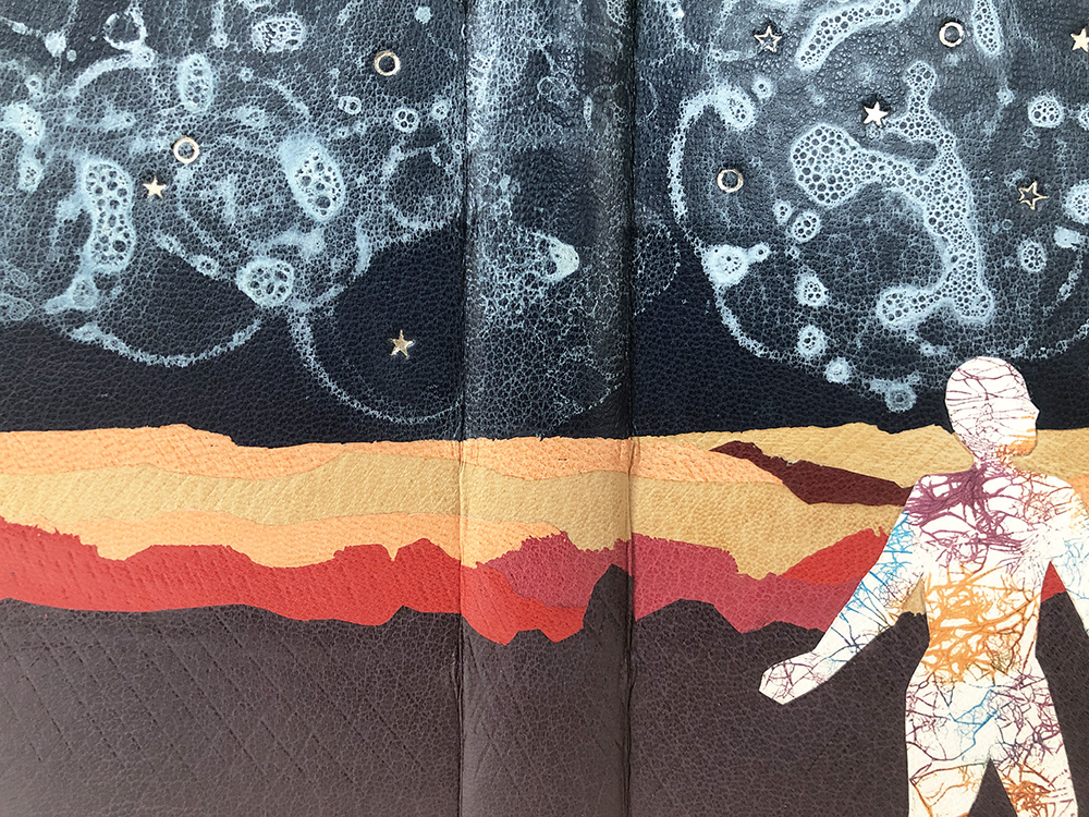
    After building up the boards with an extra layer to accommodate the decorative panels, Suehade covered her binding in green goatskin. While all the decorative elements were dyed with the same batch of diluted black dye, Suehade worked with a range of undyed skins with different undertones to achieve a variety of results. The background on the front cover panel was first dyed to create a streaky effect, then the bottom portion was textured before being surface gilt to depict the ground. The knight is so skillfully dyed by Suehade; through her technique she was able to create dimension and similar markings to the engraved illustration. This single tooled onlay was then hand-painted with dye to create the bold black outlines. Any metal tool that makes up the knight’s body was given a surface gilt highlight.

    Both panels were given sprinkled backgrounds using gold leaf. The panel on the back cover has a more solid background to make the bone folder really pop from its surroundings. Suehade created a slight well for the bone folder, which serves to keep it anchored to the binding. After covering a slit was carefully cut into the leather and a pocket was formed to hold the bone folder just like in an apron or tool belt. It was important for Suehade to make the bone folder accessible, to give the tool action and purpose. The two plaques at the bottom of each panel were also hand-dyed, with the front cover piece featuring a condensed version of the title stamped in gold and the back cover piece featuring the phrase Keep dark, Can’t tell stamped in blind.
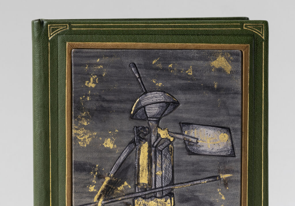
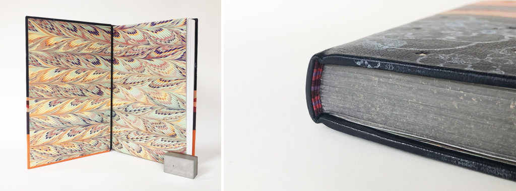
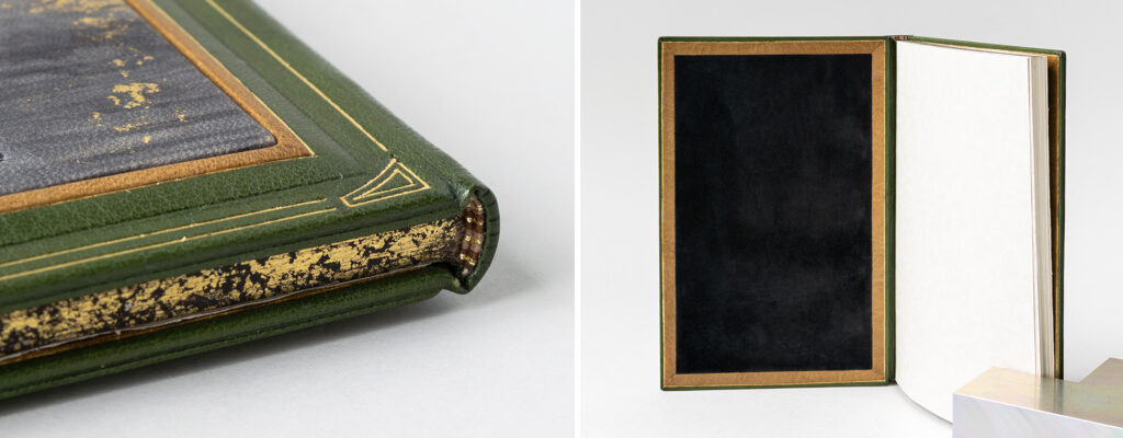
    Each panel is framed first by a tan goatskin tooled onlay then a blind tooled line which accentuates the cushioned board underneath. A final gilt border with corner motifs creates structure to the overall design. The rectangular endbands are sewn with light brown, maroon, dark brown and metallic gold threads. The head edge was given a wash of dark brown pigment before being sprinkled with gold leaf. The interior side of each board compliments the exterior with a sunken panel of black pig suede framed by a light brown onlay. This is paired with a textured opalescent paper for the fly leaves.
    While studying for her BFA in Oregon, Suehade took a course on illuminated manuscripts. Even though her focus was on sculpture and installation, this blip into the world of bookbinding was enough to create intrigue. During a bout of traveling and being exposed to a variety of art and bindings, Suehade redirected her focus to find a school to study bookbinding. NBSS offered her a foundation in techniques while building on the hand skills she developed during her BFA studies. Suehade plans to continue with her education by taking a course later this year at the American Academy of Bookbinding. She hopes to find opportunities within various institutions to better understand the field of bookbinding and conservation and what it has to offer.
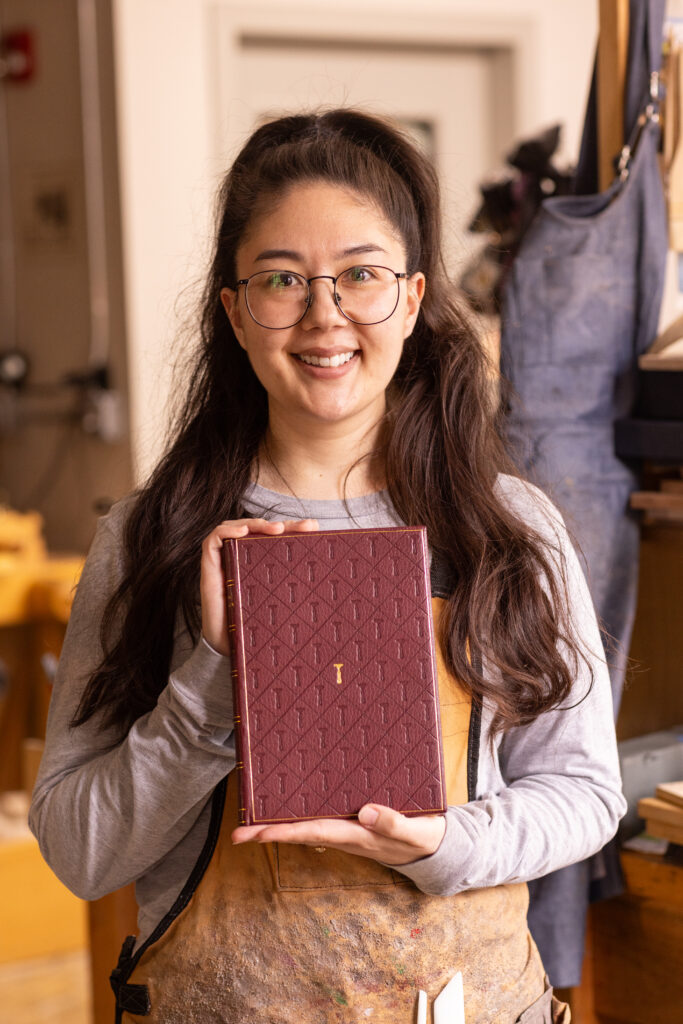

    Annie Ujifusa
    @annieuji

    When I spoke with Annie back in February, she had many ideas bouncing around. Her love of maritime and naval history suggested she should focus on the many poems related to the War of 1812. Her love of maps pulled her in the direction of using the poem The World’s a huge Bindery as inspiration. Before we spoke in April, I was the most excited to see where she landed with her design and I love that her focus went straight to a single tool: the line palette. As I’ve mentioned before, Bradford writes about the bindery and his tools and the ownership over tools. So it felt only fitting for Annie to create a binding-centric design for a collection of poetry on bookbinding that both utilized and featured her favorite tool.

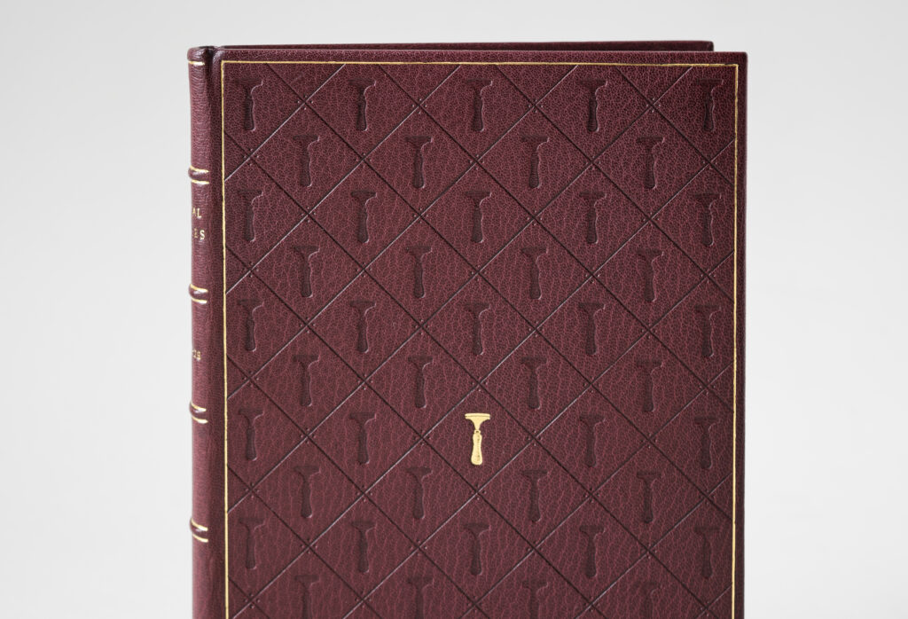
    When I asked Annie how she came to attend NBSS, she talked about stumbling upon a tutorial on a Byzantine binding where she witnessed the steps of how a binding could be crafted from start to finish. This was her aha moment. One step in particular that intrigued her the most (and the one that she looked forward to learning the most) was gold tooling. So when it came time to learn this incredibly difficult technique in her second year, she was so worried that she would hate it or it would be beyond her abilities. Although her first attempt at titling was by her account horrific, overall she was able to pick up the process quickly and feels lucky to have connected so seamlessly to the intricate nature of tooling. So, Annie stripped away the more complex and modern designs for a sophisticated, classic look that could celebrate her favorite tool. Bound in a maroon goatskin, the geometric design of the cover lives within a single gold tooled frame. The blind tooled diaper pattern is filled with a line palette in a semé pattern with dots at each corner of intersecting lines.

    Initially planning to gold tool the entire design, Annie did the center first and decided that it was perfect. The tooling template was simply flipped from the front cover in order to tool the same pattern on the backside, the only change being that the line palette would be flipped upside down. Speaking of being upside down, Annie had the unfortunate discovery that when adding the spine piece with the false bands onto the leather while covering, she had done so upside down. A mistake only discovered after covering was complete. And while it was difficult news to share, I commended Annie on persevering and finding a way to pivot. While the title is tooled right-side up, she chose to flip the author’s name. Without even knowing about Annie’s error, this decision felt intentional and fitting for the text.
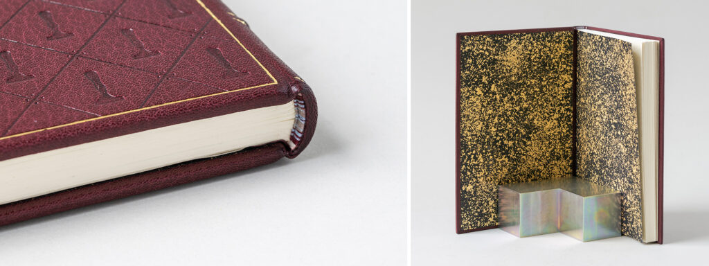
    Annie worked with fellow binder and tool maker, Brien Beidler to have an illustration of hers transformed into a finishing tool. Brien was able to suggest ways of augmenting her illustration to make it a more successful impression. This resulted in some shading on the handle and the separate line that runs across the top of the tool. The endbands are sewn in a symmetrical pattern around a rectangular core with burgundy, baby blue and beige grey threads. This was Annie’s subtle nod to her love of maritime history and Bradford’s patriotic tone towards the War of 1812. These colors are muted versions of the red, white and blue that adorn our nation’s flag. Annie made the decorative papers for the paste downs and fly leaves by sprinkling gold leaf over black paper with the use of gum arabic.
    Over the past 2 years, Annie has felt affirmed in her choice to attend NBSS. She has really enjoyed learning about conservation and engaging with historical materials and bindings. And she is just enamored by gold tooling. Over the summer she interned at the Boston Public Library’s Rare Book Room for 10 weeks and starting soon after graduation she will head back to the BPL as their newly hired Conservation Technician.

    – – –

    Thanks to each of the students in this year’s graduating class for chatting with me back in February and then chatting with me again over Zoom in April. And a big thanks to Jeff Altepeter, Head of the Bookbinding Department, for allowing me to steal away his students yet again. I always look forward to this moment every year and I can’t wait to see these bindings in person later this summer. I wish each of these students the best of luck as they embark into the field after graduation.

    If you want more interviews from past classes check out the list here.

  2. North Bennet Street School // The Set Book Interviews – Class of 2024

    May 7, 2024 by Erin Fletcher

    Since moving to Austin, I miss out on establishing relationships with the students at North Bennet Street School (NBSS) as they navigate through their two years in the program. Therefore, these annual set book interviews have now become even more valuable to me. Speaking with each of the graduating students on their approach to the set book project gave me a glimpse into their personalities and creative influences. We also spoke about how they found their way to North Bennet to attend the Bookbinding program and where they see themselves after graduation.

    The students were presented with John Steinbeck’s Of Mice and Men this year. This American classic is simultaneously taught in most high schools while also becoming one of the most challenged books of the 21st century according to the American Library Association due to its vulgar language, racism and sexism. I found that many of the students who read this novella in high school chose not to revisit it in preparation for this project. However, many of the students could agree that Steinbeck is a great writer and found his language about the landscape of California to be the most inspiring. This particular edition from the Folio Society presented a unique challenge with it being printed on heavyweight paper. In order to create a more flexible binding, several of the students explored ways of incorporating stubs into their final binding. The text block also included a set of prints which were either incorporated into their binding or given separate housing or left out entirely.

    The student’s bindings are on display in the 2024 Exhibition: Then & Now at North Bennet Street School through August 10th. To celebrate the 10 years since moving the school into its new expansive building at the entrance of the North End, this exhibit explores the personal evolution of the students and alumni by showcasing their work before and after their time at North Bennet.

    As always, the students presented such thoughtful consideration to their designs, choice of materials and techniques used. The students had fresh ideas to their approach to design and it was invigorating to discuss their experiments, successes and challenges. I hope you enjoy reading these interviews and please visit the exhibition to see these wonderful bindings in person. A big thanks to Jo Sittenfeld for photographing the students with their bindings and to NBSS for photographing the bindings! If you want to learn even more and see some behind-the-scenes images, check out this article: The Journey of a Set Book.


    Fox Allen
    Fox Allen Bindery
    @foxallenbindery
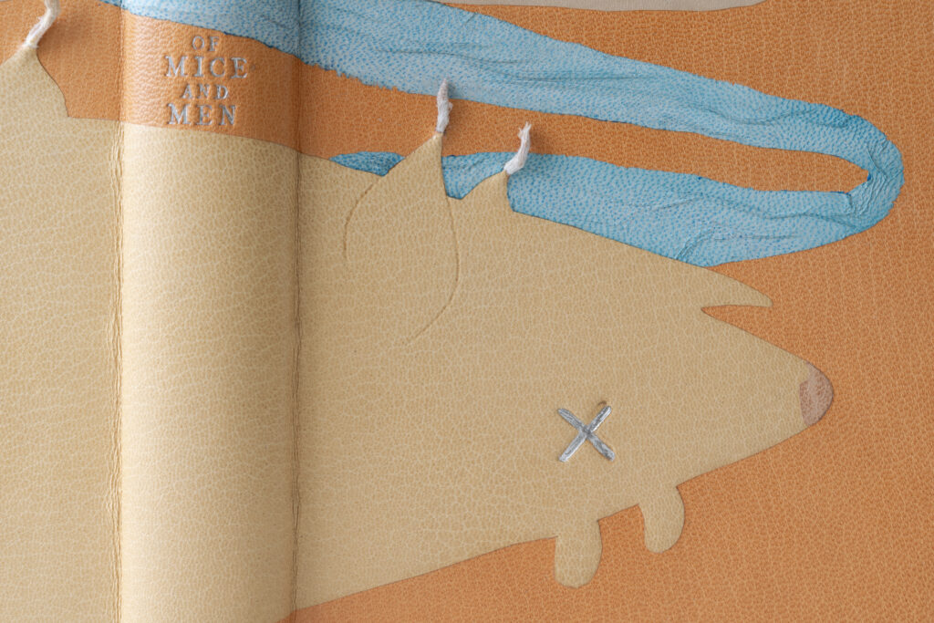
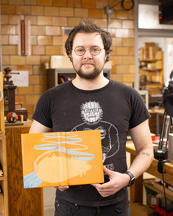
    The design on Fox’s binding was spurred by his emotional connection to the text and Steinbeck’s use of color as a descriptor. The design you see below started out as a simple doodle as Fox began to play around with ideas. The dead mouse is the reader’s introduction to Lennie, a character who struggles with social cues and independence. He often strokes the soft fur of animals to help calm his nerves. However, unconscious of his own strength Lennie ends up killing each of these creatures that provide him with comfort. A habit that begins with mice and escalates throughout the book until he kills a woman.

    Like many of Fox’s classmates, he too was inspired by Steinbeck’s use of color and selected a color palette based on the text. The body of the mouse is a cushioned onlay cut from a beige goatskin with an undyed calfskin onlay for the tail and pinkish goatskin for the nose. The tail zigzags up towards the head edge intertwined with a blue goatskin onlay attached with the suede side up and wrinkled to show the flow of water. All elements are set on a background of tan goatskin. In lieu of an eye, Fox uses that iconic letter X indicating death. Using a handmade finishing tool, the eye is tooled in palladium. The tool’s irregular surface mimics the look of a pen scribbled deep into paper.

    The most surprising element of this binding are the feet protruding from the cover. Fox collaborated with a taxidermist friend to get these little feet from feeder mice. The feet are attached in a similar fashion as an ascona onlay. A small opening is cut and the feet are fed under the leather and secured with PVA, Fox affectionately called these “skin caves”. The title is tooled between the belly of the mouse and the river in palladium.

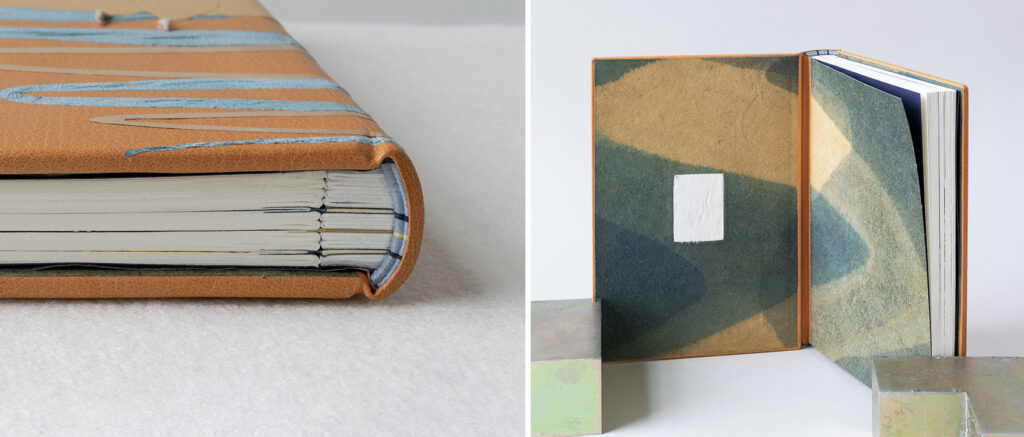
    Fox and I spoke at length about his many experiments with stubs before landing on the perfect construction for this particular text block. The stubs are laminated sheets of yupo paper, which is used commonly for watercolor due to its non-porous surface. The yupo paper was laminated together with heat-set tissue. The separate illustrations were added to the text block with their own unique stub constructed using museum board sandwiched by leather. This style of stub made it near impossible to round and back in the traditional way. So Fox created shoulders with a small rectangular stub encased in a thin layer of yupo and shaped the spine with a micro-plane. Since the yupo cut so easily with the plane, Fox had to be very careful when shaping the spine, so as not to lose the shoulders or create an irregular round. The spine was lined in the traditional manner, with a hollow for the final layer to create a soft base for tooling the title later on.

    The endbands are sewn through a laminate of paper and sized muslin around a rectangular core, as it was not possible to sew through the yupo stubs. Using silk threads in powder blue, navy and yellow, the design on the endbands matches the division of materials used for the stubs. The paste downs and fly leaves are Cave Paper dyed with that familiar swoosh of indigo and pomegranate rind. Inlaid on the inside of the front cover is a patch of mouse fur (also supplied by Fox’s taxidermist friend). This creates a moment for the reader to sympathize with Lennie or perhaps invites the reader to embrace the same calming technique as they read through this tragedy.

    Fox seemed almost destined to attend the full-time program at North Bennet. He began making books when he was 15 with his friend who ultimately became the taxidermist mentioned above. This became a full circle moment for Fox and he wants to continue exploring unconventional materials in future work. Fox had the opportunity to intern with Chena River Marblers to conduct research and experiments on the tiger’s eye pattern. Ultimately landing on a formula to make this challenging pattern easier to create and more accurate to historical examples. Fox also had the opportunity to learn under the great Daniel Kelm. With all this experience and two years at North Bennet under his belt, Fox has a goal of finding a full-time job in the field while also maintaining a studio space where he can continue to experiment and make creative work.


    Louise Capizzo
    It was great to reconnect with Louise during this interview. She attended of few workshops that I had taught at North Bennet prior to entering into the full-time program. Making books for the first time in my class, she felt her whole body light up! A feeling that many book people can recognize. As we discussed the text and how it inspired her design, it became apparent that her design was also restricted by her long daily commute from Maine. In order to complete the binding on time and work in her skill-set, Louise felt that simple was better. After reading Of Mice and Men, Louise found similarities to the injustices faced by many marginalized and working class people of today to the story of Lennie and George. Both men had a dream to live a simple life on a their own farmland, but without the support of society they would never see this dream come true.

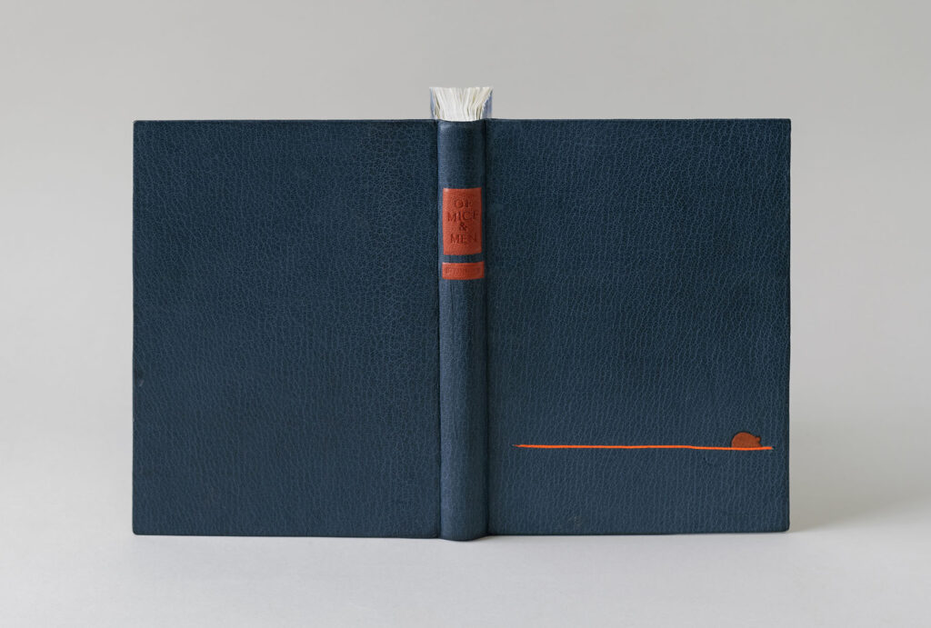
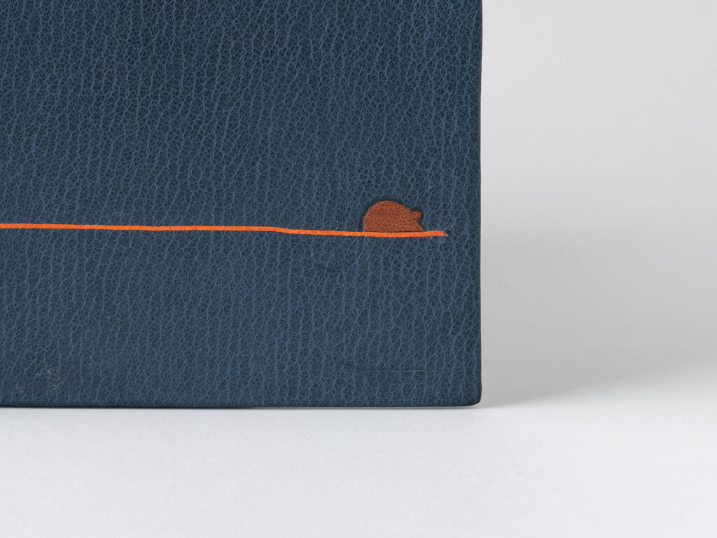
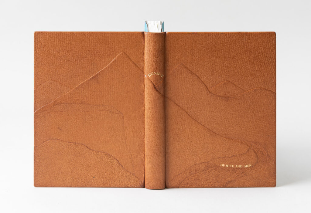
    Working with such a simple design, it was important for Louise to choose a leather with a pronounced grain to cover the entire binding. A road is depicted on the front cover using an ascona onlay in a vibrant orange leather. The color is meant to evoke the heat of this era and the hardships of working outdoors. A terra cotta goatskin tooled onlay is placed on top of the road in the shape of a mouse, with its blind tooled tail sweeping below the road. Louise added the mouse to represent two things: there is the obvious connection to the mice both loved and unintentionally killed by Lennie early on in the story. The second connects back to the theme of injustice. Mice and rats are often seen as pests, creatures that are ignored until they become a nuisance to society. Unfortunately, this sentiment has also been applied to people experiencing homelessness, immigrants, marginalized communities and in regards to the book, itinerant workers. Rather than creating policies to provide safety and assistance they are often just swept away from the public’s eye.

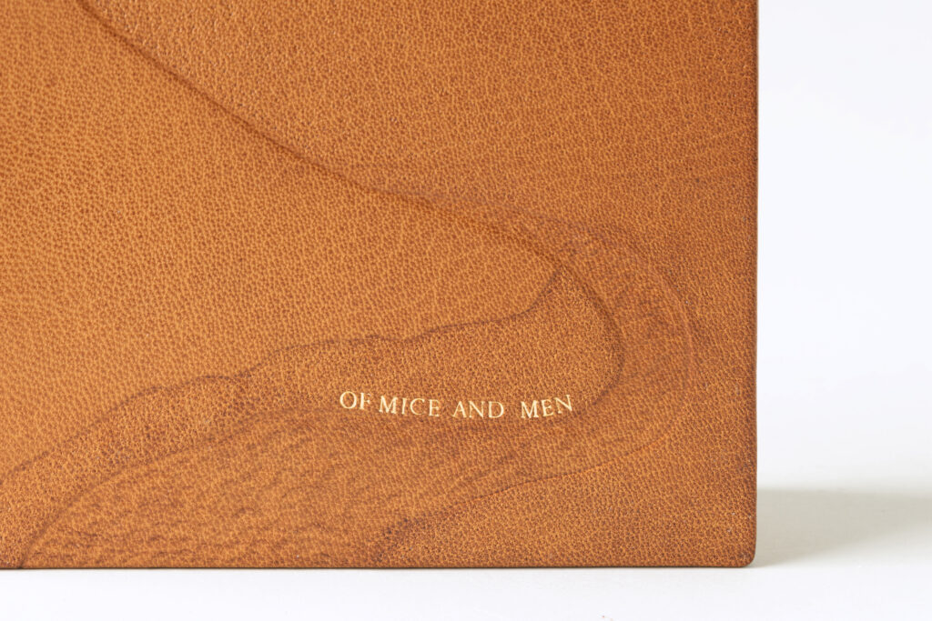
    Of Mice and Men and Steinbeck are tooled on separate labels cut from the same terra cotta leather as the mouse. The text is blind tooled and intentionally staggered to once again shine a light on our imperfect society.

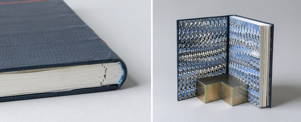
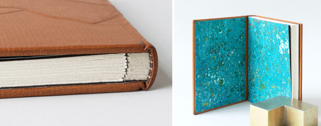
    Since the landscape is so crucial to the plot, Louise felt it necessary to represent it somewhere in her design. And as someone who has spent the majority of her life in Maine, Louise wanted to capture the contrast of the west coast sky in her design. The single-core hand-sewn endbands are stitched with bands of light blue and sky blue using silk threads to evoke the sky of Salinas. Upon opening the binding, you are flooded with bright blues marbled with black and white pigments to pair with the endbands. Louise made these marbled papers during a workshop with Chena River Marblers that took place earlier in the year.

    During our conversation about her journey to becoming a full-time student at North Bennet, it became quite clear how impactful those Community Education classes were to Louise back in 2018. She always loved to craft and build things with her hands. Her love of books led her to get a masters degree from Simmons University in 1999 and work as a librarian before retiring to attend North Bennet. After graduation she plans to open a small bindery in order to service public libraries in rural areas of Maine, who are in desperate need of conservation services.


    Elizabeth Grab
    Rambling Rambler Press
    @ramblingrambler
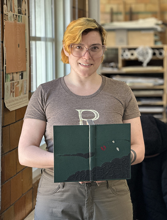
    Even though Steinbeck is considered an American classic, Of Mice and Men is brimming with racism and sexism. Elizabeth used the latter within her design to put a spotlight on Lennie’s final victim. The character in question was never given a name and is simply referred to as Curley’s wife. In a New York Times article, Steinbeck explained that she is “not a person, but a symbol. She has no function, but to be a foil – and a danger to Lennie.” Her ambitions of becoming a star on the silver screen are vanquished and she is cursed to live a meaningless life with an abusive husband.

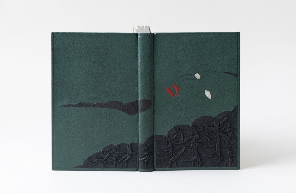
    Curley’s wife falls victim to Lennie’s strength when she allows him to stroke her hair. When she becomes frightened, Lennie in turn becomes alarmed and inadvertently kills her. To highlight this part of the story, Elizabeth created a tactile experience on her binding by using a puckered leather technique inspired by the work of Tini Miura and Anthony Cains. The black goatskin is wrinkled and folded within a tooled outline and manipulated by hand in such a way to resemble the flow of hair. This part of the design was very challenging, as the black onlay leather had to start off slightly larger and fit into an abstract shape. The final results create texture and shadows and you see the effect of layering and overlapping at the edges.

    Elizabeth pulled from Steinbeck’s colorful descriptions of both the landscape and Curley’s wife to help choose the palette of her binding. The verdant green goatskin that the binding is covered in represents the river basin of Salinas Valley. Her face and neckline are tooled in blind, allowing her to fade into the green leather. A crimson red goatskin that closely matches a particular lipstick shade from that era was chosen as the tooled onlays for the lips (as red was used continuously by Steinbeck to describe Curley’s wife.) The ghostly look in the eyes comes from using leather with a faint blue tint. The title is tooled in palladium in her eyes to represent the pupil and iris. Of is tooled in the eye in the background with Mice & Men tooled in the foreground. For Elizabeth, it was important to minimize the story by tooling the title in the character’s eyes and to omit Steinbeck’s name from the design entirely. The title is so subtle it allows her presence to be in the forefront of the design. In addition she is set within a frame on the binding, as if we are peering into this scene and witnessing this atrocity.

    The hand-sewn endbands in cream and red linen continue the color scheme from the cover. The graphite edge showcases all that glitters is not gold to play on the character’s tarnished dream of becoming an actress. The over-marbled paper (or party paper) used for the paste downs and fly leaves were created by Elizabeth using acrylic paint to develop a real pop of color and to give a nod to a material contemporary to the setting of the book. From my discussion with Elizabeth, it became apparent that her choice of colors and materials were really rooted in the time period of the story.

    Elizabeth found book arts while studying at Wellesley College in the mid 2010s, where she studied under Katherine Ruffin, Director of the Book Studies Program. Katherine offered her students a full spectrum view of the letterpress and book arts possibilities by granting access to the Special Collections and Conservation Lab. Elizabeth then obtained a Library Science degree from the University of North Carolina in 2019, where she was also a fellow for the Learning from Artists Archives program. This fellowship allowed her to work with artists and art repositories to aid in developing their archives. During the pandemic she worked at an interior design studio in New York to build up her skills with leather. For her, the next logical step was to attend the full-time program at North Bennet where she could both gain skills in addressing preservation issues with works on paper with artists and lean into design binding. After running her small business Rambling Rambler Press and assisting in the foundation of a few nonprofits, she is ready to work full-time at an institution to dive deeper into conservation.


    Jacqueline “Jacky” Martin
    Battle Axe Bindery
    I have to admit that I have never read Of Mice and Men, but after speaking to the students I was told again and again about the immense care given to describing the landscape even over the main characters, George and Lennie. Jacky mentioned in particular that there is a starkness and simplicity to the way Steinbeck writes; that his writing is without flourishes. Relying only on texture to convey the majesty of the Salinas Valley, Jacky evokes the same strategies found within Steinbeck’s writing.

    Jacky has prior experience working with tooling techniques traditionally used in saddlery, which is best achieved on calf skin. However, being restricted to using goatskin for her set book, Jacky looked to images of cuir-ciselé as well to find inspiration. This 15th century technique involved outlining the design with a pointed tool when the leather is damp. Areas of the design can be textured by stamping a succession of dots into the leather or by embossing from the backside of the leather. To create the landscape, Jacky added three layers of 10pt. museum board to the covers and 2 layers of thinly pared leather to the hollow on the spine. Then the binding was covered in a medium brown goatskin.

    After covering, the leather was dampened again and pressed with various grits of coarse sandpaper to create subtle texture in specific areas of the landscape. To create movement in the river that cuts through the valley, Jacky pressed the tip of a bone folder into dampened leather and gently pushed it forward. The title is tooled along a curve at the river’s edge using red gold leaf, while Steinbeck hovers above the mountains on the spine.

    Jacky chose the route of incorporating stubs into her binding. She landed on a laminate of Gutenberg and muslin for the stub, which made it easy to shape into a rounded spine. The hand-sewn endbands are a single-core wrapped in three different shades of brown silk. The marbled papers are a splash of blues and greens, acting as a nice reprieve from the monotone cover.

    Jacky spoke about her joy in creating this binding, how her training provided the necessary confidence to create success. Leaving the engineering department for literature, Jacky eventually found herself interning at the preservation lab at MIT. Afterwards, Jacky received a degree in Library Sciences at Simmons University. During this time, she had the opportunity to attend a summer course on basic conservation, which happened to be hosted at North Bennet Street School. The rest is history. After graduation Jacky hopes to stay in the New England area and work full-time in conservation.


    Spike Minogue
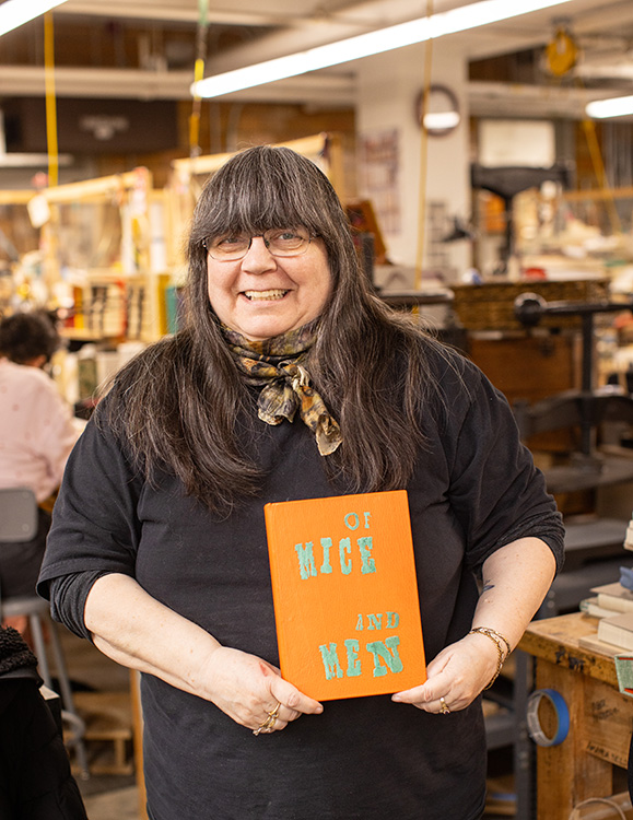
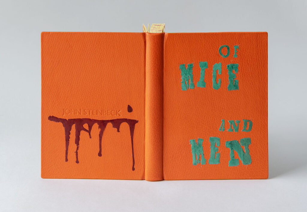
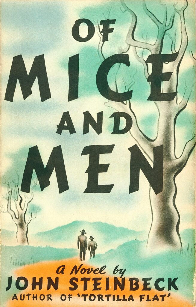
    While searching for inspiration across several iterations of the novella, Spike stumbled upon the cover design for the first edition of Of Mice and Men from 1937 (pictured above). With a background in offset printing and design, the oversized and stylized typeface really stood out to Spike. To tie her design to this new edition from the Folio Society, Spike recreated the typeface from the title page with feathered onlays.

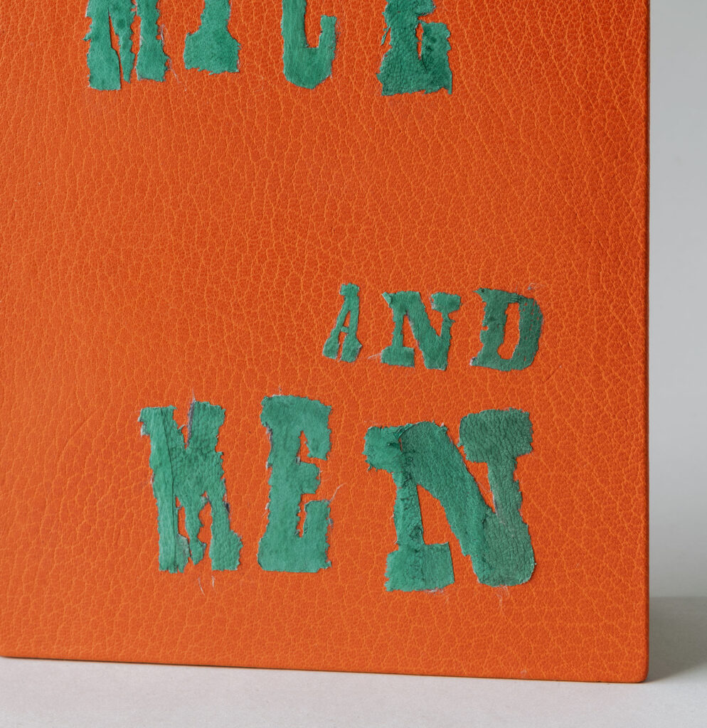
    Also inspired by the bold and bright colors from the original cover design, Spike covered her binding in a vibrant orange goatskin. Teal goatskin was pared incredibly thin to be used to construct the letters for the title. A layer of Japanese tissue was attached to the goatskin to aid in cutting down the individual letters. After removing the tissue, the paste left a film to the leather and dulled the color. To combat this, Spike added two layers of shellac to bring back that vibrant teal color. Some of the larger letters are pieced together from different parts of the leather creating texture through the varied grain and saturation of pigment. The edges were finished with a paring knife to create a rough, feathered look.

    Spike bravely placed her finished binding under the Kwikprint in order to blind stamp the author’s name onto the back cover. To highlight the darkness of the story, the dripping blood underlining Steinbeck’s name represents the escalation of deaths and murders. This onlay is also comprised of several smaller pieces of feathered onlays in crimson goatskin.

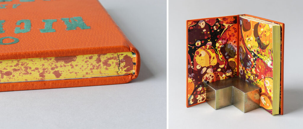
    During an online workshop with Karen Hanmer, Spike learned a unique sewing technique for endbands devised by Jen Lindsay. The bead on this single-core endband is sewn over 3 strands of thread to give the effect of a double-core. For Spike’s endbands she incorporated orange, yellow, black and green linen. All three edges (including the stubs) have been painted with a yellow acrylic wash, with the head edge splattered with red to continue the blood stain motif. Spike experimented with different materials before landing on Arches text wove for the stubs. The layers of each stub are laminated together. Although Arches is a softer paper, Spike found this was the easiest material to shape at the spine.

    The paste downs and fly leaves are over-marbled paste papers or party papers, which were made by Sandy (a first year student) during a workshop earlier in the year with Chena River Marblers. I wasn’t familiar with the term party paper and Spike was the second student to use it. She noted that it refers to a paper that is marbled twice: one layer having large circles of pigment and the other layer having smaller, tighter circles. The marbled paper used in Spike’s binding incorporates those bright, bold colors from the cover and endbands.

    For nearly 30 years Spike worked in the commercial printing industry which led to her teaching the pre-press side of printing in the Graphic Design program at Algonquin College in Ottawa, ON. In 2012, Spike became involved with the Canadian Bookbinders and Book Arts Guild (CBBAG) after reading an article about rebinding books. She took many workshops with Betsy Palmer Eldridge, Dan Mezza and Karen Hanmer before advancing to teach many of the core classes and serving on the local CBBAG Committee for several years. Through her connections at CBBAG she found out about North Bennet. Spike chose to come to the program in order to challenge herself and really hone her skills. After graduation, Spike will be welcomed back to her home in Canada by her husband and dog. She will be teaching a course this fall at Carleton University in Ottawa and hopes to continue teaching for CBBAG.


    India Patel
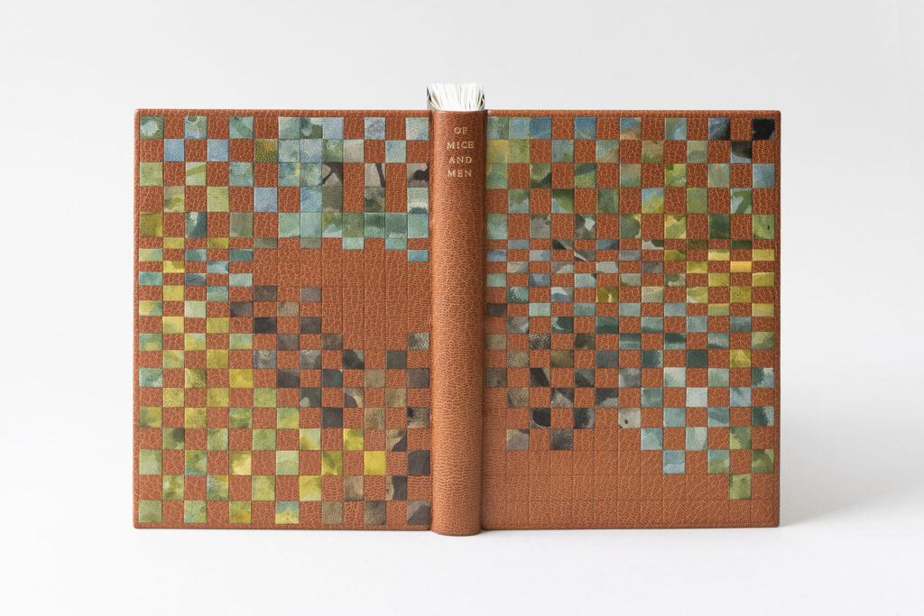
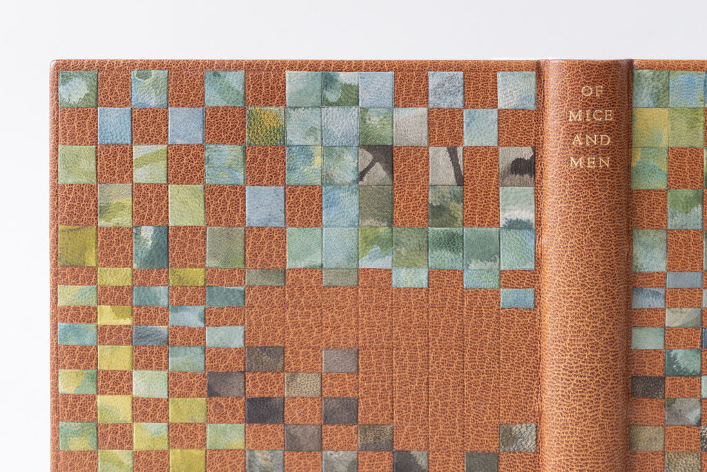
    It was such a joy to discuss India’s path of discovery and contemplation to get to the final binding you see below. After rereading the text with an intent for design, India considered imagery inspired by Steinbeck’s colorful descriptions of the California landscape, the various animals and the farmlands. Textures, softness and structure also came into play, from the gestural marks of the illustrations to Steinbeck’s structured narration which is often disrupted by its own devices.

    Using imagery of the Salinas Valley, India sought to create an abstract landscape dissolving while also being pulled apart into pieces arranged on a structured grid. After learning leather dyeing techniques with the intent to color match for the purposes of conservation from James Reid-Cunningham during a workshop, India set out to use these skills in a more painterly way. Working on small pieces of fair goatskin, India played with Roda dyes through different ways of applying and diluting the pigments to create a variation of scale and texture.

    Once the book was covered with a medium brown goatskin, India blind tooled an irregular grid across the front and back cover. Instead of tooling a regimented and uniform grid, India highlights the abstract nature of the design by tooling perfect squares that collapse into thin rectangles before expanding back into squares. Even though India plotted a look for the landscape, she was ultimately under the control of the individual dyed pieces. In order to create an effective blurry landscape, she had to constantly arrange, rotate, flip and rearrange pieces before adhering them in place. The title is tooled across the spine in gold and is centered in relation to the onlays in order to create balance.

    Like many of her classmates, India also chose to sew her text block on stubs. However, her choice of using a colored paper stands out from the rest. The stubs were cut and folded into a “V” shape using a light brown handmade paper from the Morgan Conservatory. The endbands are a single-core sewn with a thick silk in a similar grey to the stubs. This choice of neutral tones for the stubs and endbands is a lovely choice that adds intrigue, but doesn’t distract from the beauty of the cover. The interior is covered with a meditative paste paper simply made by sweeping two shades of brown over a sheet of dark blue Hahnemuhle Ingres. I say simply because India has become a master of paste papers during her time at North Bennet.

    Initially interested in becoming a librarian, India spoke to many in the field, but while considering graduate school she worked for a private press doing bookbinding and repair as well as making paste papers. Coincidentally, her time there coincided with Ariana Rutledge’s internship. Ariana graduated from the Bookbinding program in 2022 and is the current TA. Hearing about Ariana’s experience and learning more about the program certainly became a factor once North Bennet became a contender for her next step. After graduation, India will be interning at the Northeast Document Conservation Center, which will be followed by an position at the Boston Athenaeum in the fall provided by the Von Clemm and Driscoll Family Fellowship in Book Conservation.


    Jennifer Pyburn
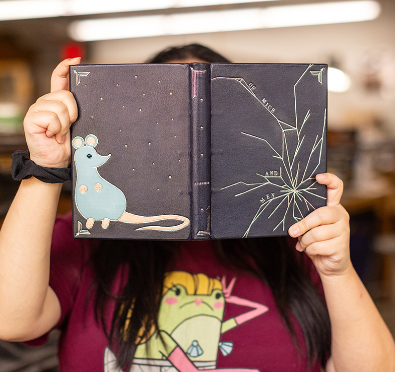
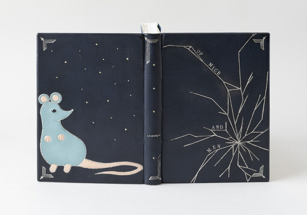
    Reading Of Mice and Men in high school was enough for Jennifer and she chose not to read it again for this project. However, one part of the book that stuck with her was a scene where an aging and sickly dog had to be put down. Though this scene was troubling to Jennifer, it is meant to foreshadow the death of Lennie at the end of the book. After it is discovered that Lennie murders Curley’s wife, George kills Lennie with a gun. The design on the front cover conveys this gunshot through the use of tooling to create a shattered effect. In a way I think it may also represent Jennifer’s disdain for the book.

    Using palladium on the front cover, Jennifer noted that she had a rough outline of the shattered design, but chose to freehand some areas directly on the cover to create the right balance. The title is also tooled in palladium and anchored to different segments of the cracked cover. The binding is covered in a navy blue goatskin to both set her binding apart from her fellow classmates and to allow the palladium to pop. Each plane of the book is framed with corner ornaments uniquely formed by combining three separate finishing tools.

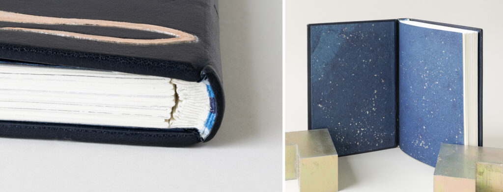
    The back cover design is hinted at from the spine with the appearance of gold and palladium stars. The stars continue onto the back cover along with tooled dots. This nighttime scene evokes a dream-like atmosphere and nods at the desire of owning land that is so central to the drive of the two main characters. From the start, Jennifer wanted to include a mouse in her design and chose to place it on the back so that it wasn’t the focal point. This stylized mouse was created with tooled onlays in light blue and undyed goatskin. Before placing the light blue onlay, Jennifer adhered a small bead for the mouse’s eye. Then with the light blue onlay in place a small slit was cut into the leather and shaped around the bead to create eyelids.

    Although sewing her book on stubs was noted as her least favorite part, Jennifer understood their importance and was determined to have her binding function properly. The stubs are constructed in a “V” fold using Arches wove, with the layers of each stub laminated together. The endbands are a traditional double-core French style sewn with pale blue, sky blue and navy blue. Using an indigo paper laced with mica flakes from Cave Paper, Jennifer extends that dreamy night sky to the interior of the binding for the paste downs and fly leaves.

    Jennifer always enjoyed working with her hands, but never enjoyed traditional schooling. As a child she found folding origami and making books from scrap paper to be quite fulfilling. This made her a perfect candidate for North Bennet, as she was also seeking teachers that were passionate educators. So after ruling out college and taking a long gap year after high school due to the pandemic, Jennifer could justify the short commute from her parent’s home in Medford to attend the Bookbinding program. She loves making new bindings over repair work, but is still considering all avenues post graduation.


    Emily Stanley
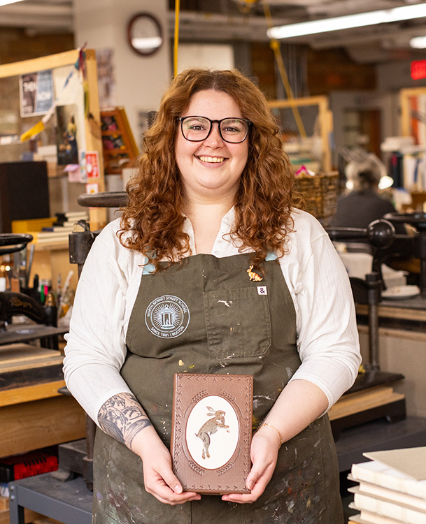
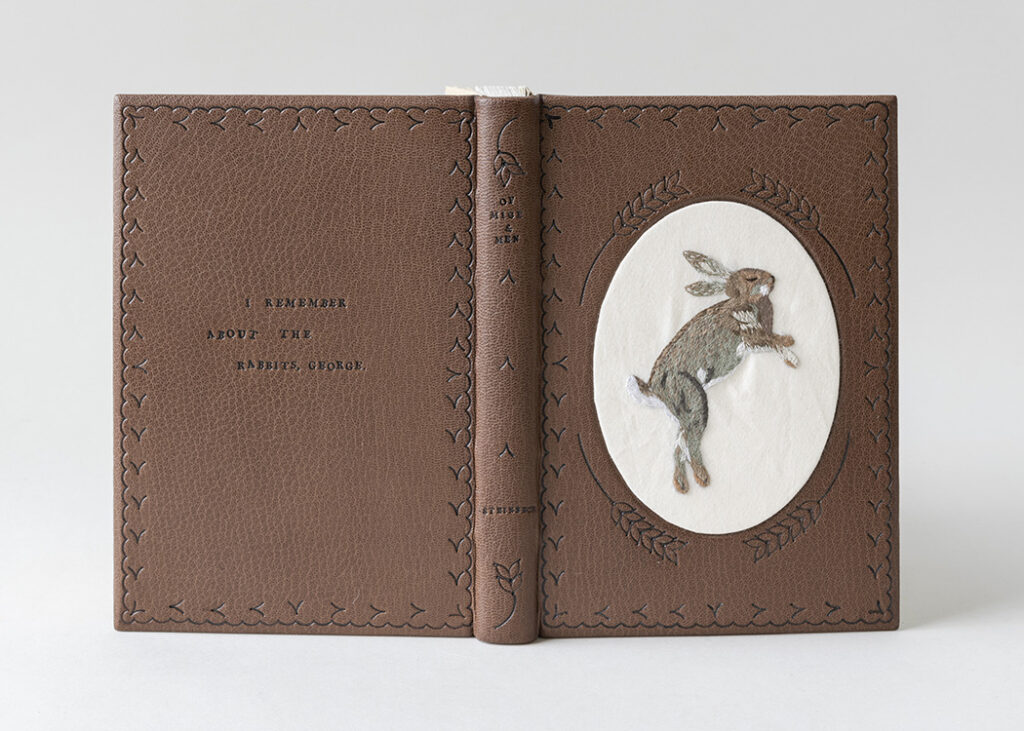
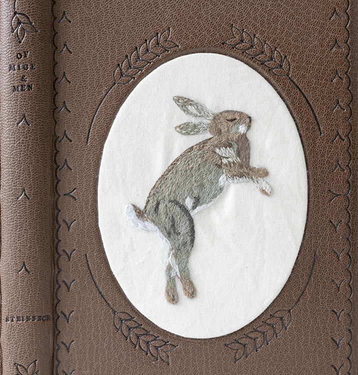
    Struck by the trauma of Lennie’s interaction with animals throughout the book, Emily sought out a soothing medium for her binding. Emily began stitching during the pandemic to keep herself occupied and found a real pleasure in creating animals through embroidery. Even though Lennie never kills a rabbit in the story, Emily uses the image of a rabbit to represent the death of Lennie’s dream of owning a farm. His aspiration is used as a metaphor for the American dream and both are vanquished at the end of the book with Lennie’s death. Emily wanted her design to evoke folk art rooted in earth tones and simple materials that would be accessible to ordinary women in the early 1900s.

    Before covering the binding in a brown goatskin, the front cover board had to be built up in layers to create the oval well. The top-most layer of matboard was cut by a framer at a bevel and the offcut was used as the support for the embroidered muslin. The rabbit is stitched using DMC cotton floss in a range of browns, greys and whites. The single-ply stitches are delicate and intricately placed to create movement in the rabbit’s fur. Once the embroidery was complete Emily wrapped the fabric around the offcut and stitched the turn-ins with a running stitch to hold the fabric taut before securing with a layer of Arches. The entire piece was then inlaid into the binding with PVA.

    I appreciated that Emily seemed to embody a character in order to render a design made with care and precise imperfections. The organic quality of the carbon-tooling is a result of Emily’s tool choices. The scallop border framing each board is tooled using two different gouges, while the strands of barley are a result of a single tool modified by Emily and repeated either six times (front cover) or two times (spine). The swooping “V” shape is meant to evoke an embroidered stitch and reminds me of elements pulled from a stitched sampler. The title and author are tooled on the spine in a slight staggered effect along with a quote pulled from the book , which has been tooled on the back cover. With the layout of the quote, Emily showcases that she is once again making calculated decision to making perfection imperfectly.

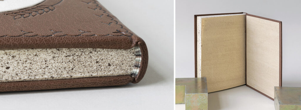
    The sprinkled edge and tinted decorative paper used on the inside were a way to place the binding in the early 1900s, to make it feel intentionally old. All three edges have been heavily sprinkled using a raw umber acrylic paint. The impressive double-core French endbands are sewn with the same cotton floss from the embroidery work. To create the aged look for the paste downs and fly leaves, Emily used a more diluted raw umber sponged onto Gutenberg to slightly tint the cream paper.

    As an aside, Emily shared the diploma case she made during her first year for her classmate Kaylee, who graduated last year (as is tradition). At some point, Emily cared for Kaylee’s tarantula and so decided to stitch Adelaide onto the custom diploma folder. Emily also shared experiments she has conducted working embroidery onto cloth bindings as well. Prior to attending North Bennet, Emily was studying Library Science at Indiana University. She found herself working in the E. Lingle Craig Preservation Lab, first with film and then with books. Unfortunately, this experience was cut short due to the pandemic. However, Elise Calvi, Head of Preservation suggested Emily look into North Bennet. After graduation, Emily will be heading back to Indiana to be an Advanced Conservation Assistant where she will be focusing on both book and paper conservation.

    – – –

    Thanks to each of the students in this year’s graduating class for hanging out with me for an hour over Zoom and to Jeff Altepeter, Head of the Bookbinding Department, for once again letting me steal away his students. I still look forward to this moment every year and I can’t wait to see these bindings in person. I wish each of these students the best of luck as they embark into the field after graduation.

    If you want more interviews from past classes check out the list here.

  3. North Bennet Street School // The Set Book Interviews – Class of 2023

    June 1, 2023 by Erin Fletcher

    Part of my move to Austin meant that I would not be able to conduct the annual set book interviews in person anymore. This year, I lost the ability to handle the bindings in person, to really see the incredible details of the work added with care and intention by each of the students. But the interviews, which were conducted through Zoom, were still the highlight of my week. It was such a joy to speak with each of these budding bookbinders. Their energy and excitement reminded me of how special North Bennet is as a place. We spoke about their futures, the dread over their two-year journey coming to an end, the collective pressure of creating their bindings and of, course the bindings themselves.

    This year’s set book was La Vita Nuova by Dante Alighieri. Originally published towards the end of the 13th century, this collection of prose and verse is an expression of courtly love that reflects the love a man has for a woman he’s never spoken to. Viewing this story through a 21st century lens, the students all had very interesting reactions towards the protagonist’s perpetual desire and lack of action. A few students created designs that outright repelled against the text, while others chose to highlight the work by expressing the torment and passion depicted in the text with either a contemporary or historical flair. You will also find several references to the number three and nine as they were significant within the text.

    Each of the student’s bindings will be on display in the 2023 Exhibition: Continual Craft at North Bennet Street School through August 12th. The exhibit includes work from several departments at North Bennet and highlights the careful considerations that go in to crafting an object that is long-lasting due to the intentional selection of technique and materials.

    Year after year, the students continually astound me with their thoughtfulness to design, material and technique. Whether they have the desire to continue with this style of binding or not, each student put considerable care into their work and they should each feel immensely proud of themselves. I wish them all the very best as they leave the comfort of their North Bennet benches and start their own unique journeys in the field of bookbinding and conservation. A big thanks to Jenn Pellecchia for taking photographs of the students and their work!

    Nicoline Meyer
    she/her
    Silver Ocean Studios

    Setting aside the story within La Vita Nuova, Nicoline was captivated by the scaffolding of Dante’s writing style and his attempt at writing poetry that would be accessible to everyone. This draw is in part due to Nicoline’s background with pre-Renaissance history, but her time spent abroad in Italy also created a pull to incorporate a sense of place into her design. From the start, Nicoline surveyed historical bindings from the 13th century for inspiration. Finding it difficult to fully reinterpret these historical bindings, Nicoline moved forward in history and decided to take some cues from 18th century fine bindings as well.

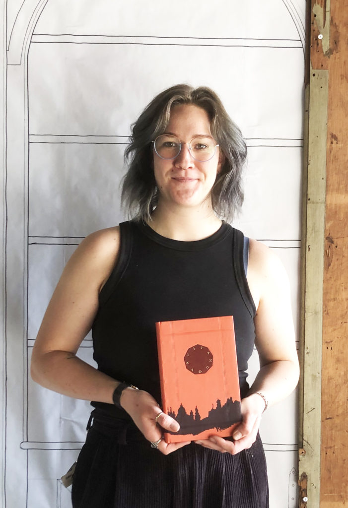
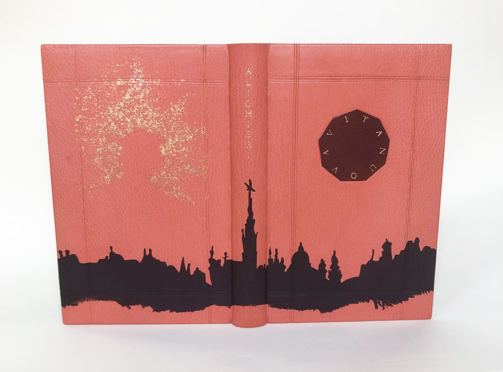
    Using a color palette harmonious to the illustrations in the text, Nicoline covered her binding in pink goatskin. With a subtle nod to both medieval and 18th century bindings, the suggestion of a panel design is created through a frame of three blind tooled lines. The idea of including bosses in some way crossed her mind, but Nicoline shifted to adding a central medallion on the front cover instead. While this cherry red goatskin onlay evokes the silhouette of a stained glass window, the real significance lies in its number of sides: nine. By simplifying the title to Vita Nuova, these nine letters could be perfectly arranged to one letter per side and tooled in 23kt gold.

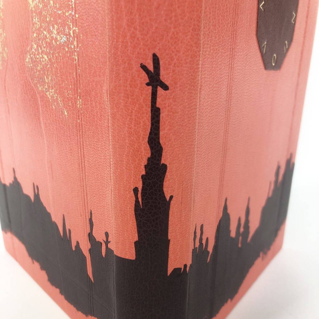
    Pulling the skyline of Florence from the text, this element identifies a location for the viewer and magnifies the significance of the city to Dante and his work. At the time of publication, it was more common to write in Latin. However, Dante chose to use a Florentine dialect, which caused a shift that would help modernize the Italian language as other influential writers followed in his footsteps. Nicoline used a blackberry goatskin back-pared onlay to illustrate the city with the bottom edge feathered off.


    A silhouette of Beatrice is pressed into the back cover surrounded by a halo of sprinkled 23kt gold and palladium. As with the other design elements, this imagery of Beatrice is conveying two ideas. Beatrice perishes in the story and the impression we have of her is hollow as it has been crafted by Dante’s blind infatuation rather than told by Beatrice herself. Extending the color palette further, Nicoline embellished the head edge with a dark red acrylic base sprinkled with red gold and palladium. The French double-core endbands include stripes of bronze, light pink, hot pink and purple. The interior is lined with an Italian vein marbled paper made by Nicoline.


    Over the course of our conversation, it became quite clear that Nicoline did not land on her ideas quickly, but only after long and careful consideration. I appreciate that within her sophisticated design, Nicoline employed a range of techniques. The three main elements of her design identify key aspects of her concept while working in harmony to create a cohesive composition. Enjoying the process that required precision and exacting technique, Nicoline hopes to continue working in this style. Her interests also lie in edition work and her plan is set up her own studio after graduation.


    Kaylee Moen
    she/her

    While appreciating the significance of Dante’s work, Kaylee couldn’t help but consider how his projection of Beatrice has both immortalized and erased her at the same time. Putting herself in Beatrice’s position, Kaylee expressed that she would love to travel back in time and take control of the narrative by destroying any mention of her life. Kaylee decided to let her aversion towards La Vita Nuova guide her in the designing process. In the end, she created a binding that appears to be smashed into pieces.

    Burnt umber French Chagreen is used to cover the binding and also acts as the frame around the shattered glass. Kaylee built up the boards into three levels to accentuate the frame along with blind tooling the edges. The shattered glass is comprised of crimson and scarlet goatskin with the cracks tooled in palladium. The title and author are placed right along the edges of the cracks and tooled in gold.

    The shattered effect radiates from a ‘hole’ placed at the tail of the spine. Rather than breaking up the design at the spine, this portion of the binding was given the same panel treatment. Kaylee crafted the binding as a tightback so that the spine could be given the same number of layers as the cover boards. To create the ‘hole’ in the design, Kaylee simply cut a hole in the onlay leather to expose the burnt umber below.

    The edges of the text block are painted with diluted acrylic ink to match the burnt umber leather, giving it the appearance of being a solid object. The leather wrapped endbands match the red used for the onlays. Kaylee choose to stay true to the simplicity of the illustrations for the palette of her binding.

    While the design was driven by emotion, Kaylee also wanted to set herself up for success and choose techniques that would both compliment her design along with simplifying the process. As we spoke candidly about her reactions to the text, I greatly appreciated the route she took with her design. While I think it’s important to create a striking design, it doesn’t necessary have to paint the text in a positive light. After graduation, Kaylee will be moving back home and begin building up her portfolio while she seeks a position in repair and conservation.


    Abra Mueller
    she/they
    @by_the_bookish

    The route towards inspiration can sometimes start with the desire to work with specific techniques. This was the case when Abra, a very technique-driven individual, began to think about her design. Reading and re-reading through La Vita Nuova, Abra considered how she might explore tooled onlays and eggshell panels in her design. With an overwhelming sense of exhaustion caused by Dante’s obsession with Beatrice and his search for salvation through her virtue, it only seemed fitting that Abra create a design with nearly 200 individual pieces of leather.

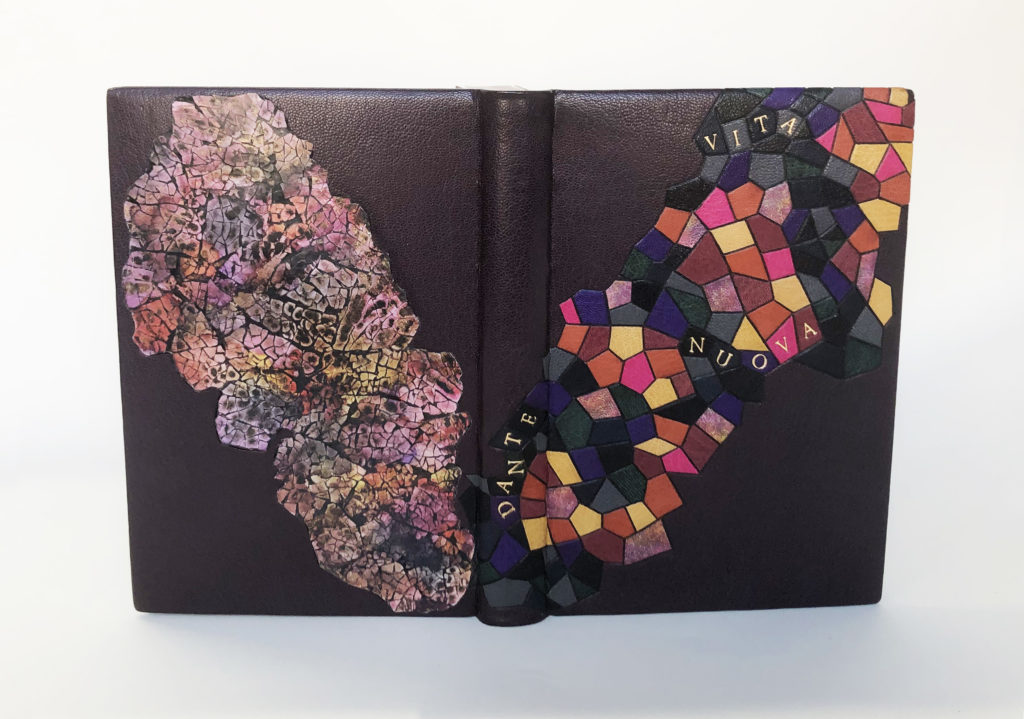
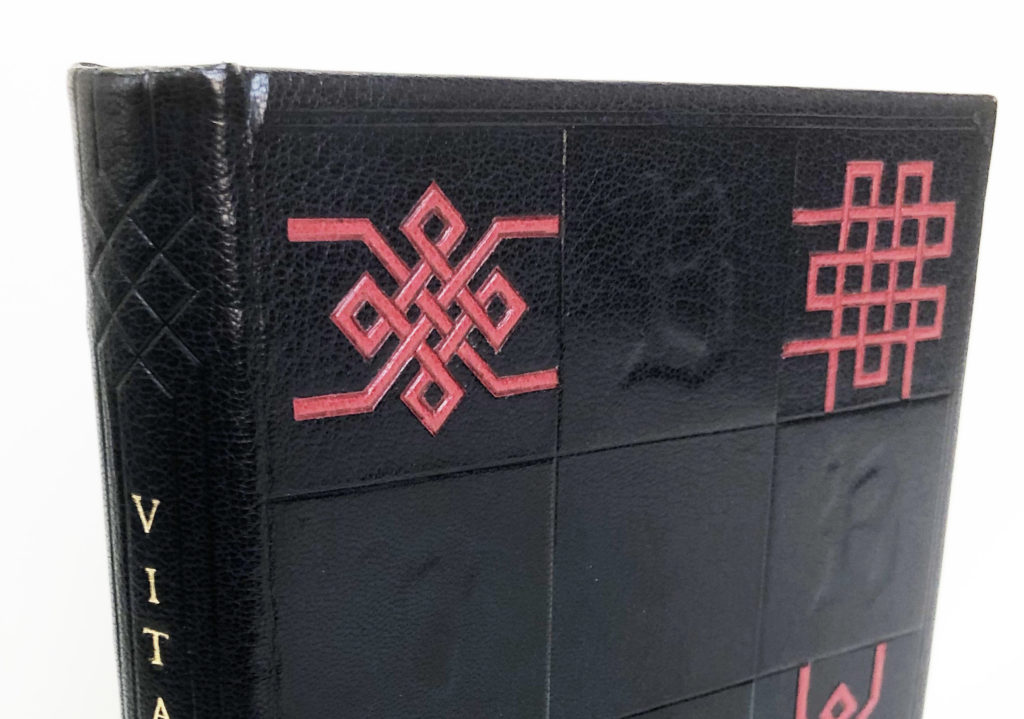
    The mosaic design of the front cover is indicative of a stained glass window so characteristically found adorning medieval churches, putting the viewer in a time and place. The design, which sits on a backdrop of blackberry goatskin, is comprised of several onlays cut from various scraps of goatskin leather with carbon-tooled edges. After much trial and error, the title has been perfectly placed within this design using individual handle letters and red gold leaf. Abra searched for the right balance within the onlays large enough to hold each letter. The author’s first name is given the same treatment as it rises up the spine of the binding.

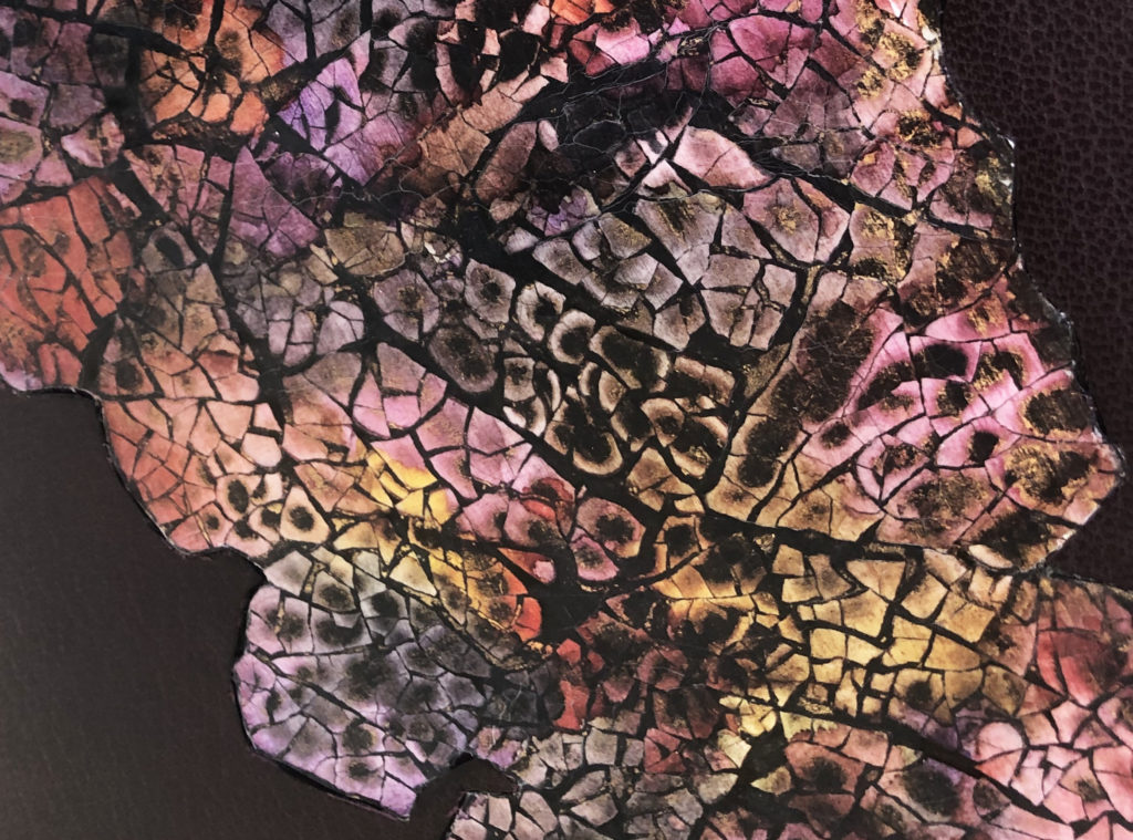
    With the use of an eggshell panel, Abra shows us the stained glass window not in its pristine state, but something that is shattered and crumbling. The panel was created by first crushing, then layering and sanding turkey eggs. The pigment was added through blending alcohol inks and isopropyl alcohol to create a hazy, cloudy effect that mirrors the way the colors are arranged on the front cover. A bit of shimmer comes from flecks of gold paint dotted throughout the panel.

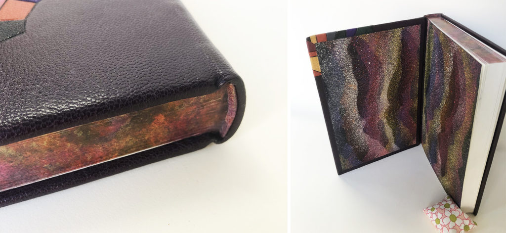
    The central theme of deterioration continues onto the other decorative surfaces of the binding. Using the same range of colors, Abra dabbed acrylic paint onto the head edge and included moments of gold paint. The flat vellum-core endbands are wrapped with the same dyed leather used as part of the mosaic on the front cover. Further driven by a desire to play with technique and finding inspiration in the work of Roger Green, Abra created these fantastic decorative papers for the interior of the binding. Using a mask that resembles the silhouette of the eggshell panel, pigment was sprinkled onto the paper using a toothbrush. The placement of the mask was played with to create layers of both color and texture.


    Right from the start Abra declared that she wasn’t an artist and leaned into her strengths of more left-brain thinking. Yet after our conversation and her thoughtful approach to design, I think she can reconsider this outlook. She spoke so fearlessly about approaching each technique and expressed how freeing this binding process was for her, an unexpected surprise that she hopes to recapture with the next fine binding. While she waits to hear back from applications submitted to various institutions, Abra is seeking to land a conservation position after graduation.


    Rachel Payne
    she/her
    Saga Bookbinding
    @saga_bookbinding

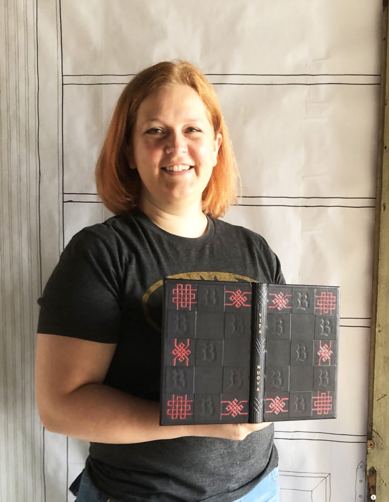
    One route to designing a cover for a binding is to overlap your own interests with the text. Finding threads between two distinct sources can offer unique results. Rachel began with her love of Gothic architecture and stained glass. Using medieval architecture as a starting point, Rachel found herself steeped in historical bindings and eventually came upon the collection of Thomas Mahieu, a 16th century collector who took a special interest in decorative bindings. Taking some visual cues from these bindings, Rachel also decided to incorporate another interest of hers: Celtic knots. The intricate knots thread a connection to Dante’s tangled obsession for Beatrice.


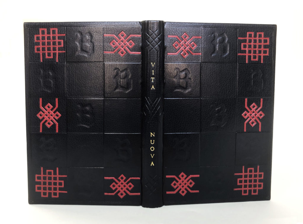
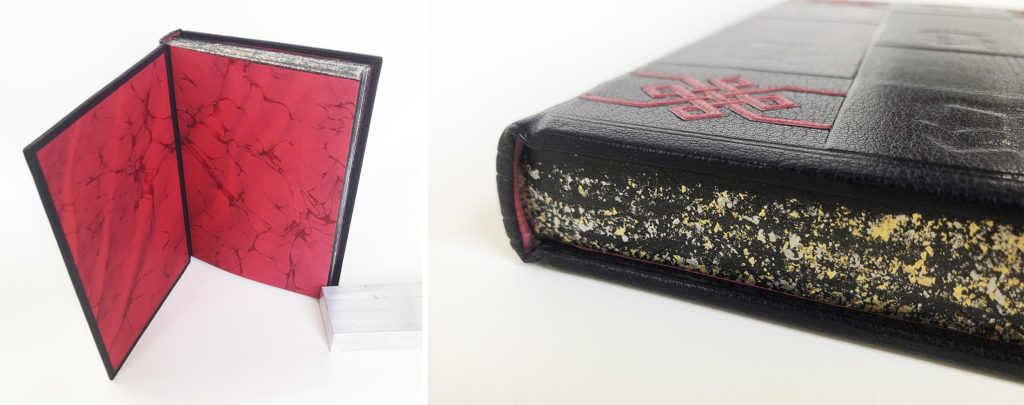
    Draping her binding in a simple color palette of dark navy blue and scarlet red, Rachel can put the emphasis on the texture of her boards. While surveying older bindings, one aspect that Rachel found herself drawn to over and over again was dimension. To create the geometric boards, panels of 10pt. museum board were cut to size with the letter ‘B’ cut from the center in a stylized Blackletter script. Once affixed to the boards, these panels create both raised and debossed areas of the board that are further defined through blind tooling. The entire design is framed with a blind tooled double line and a flourish in each corner.

    To create the delicate and intricate knots from scarlet goatskin, Rachel employed a Silhouette machine to insure each angle would be cut with precision. This was only after several experiments to find the correct way to support her materials and the right depth for the blade. The complexity of the knots is beautifully mimicked on the spine in blind tooled lines that frame the gold tooled title. This effect on the spine is perfectly executed, creating a balance to the design. The tooled lines extend onto the endcaps and bring your eye to the extra details Rachel has added to the text block edge.

    An interlacing design informed by the patterning on the spine is gauffered on the head and tail edges. The gauffering sits on top a layer of lamp black ink embellished with palladium and 23kt. gold sprinkling. The leather wrapped endbands are the same scarlet goatskin used for the knots on the covers. Adorning the inside are these incredible marbled papers made by Rachel. She used two tones of red and navy blue for an Italian vein pattern. While pulling the paper, Rachel worked the sheet back and forth to create a Spanish wave effect.


    I couldn’t help but exclaim out loud at the drama of the endpapers. I wasn’t expecting such a bold, rich color to be lining the inside. I particularly love the contrast between the organic flow of the marbled paper against the static quality of the outside. Rachel found a way to express both herself and the text in her design; a harmonious outcome not always so easily achieved. After graduation, Rachel will be moving back to the Twin Cities in Minnesota where she plans to set-up a studio space and start her own bindery business that will take commissions focusing on conservation and unique bindings.


    Sara Pines
    he/she/they
    @sosnastudios

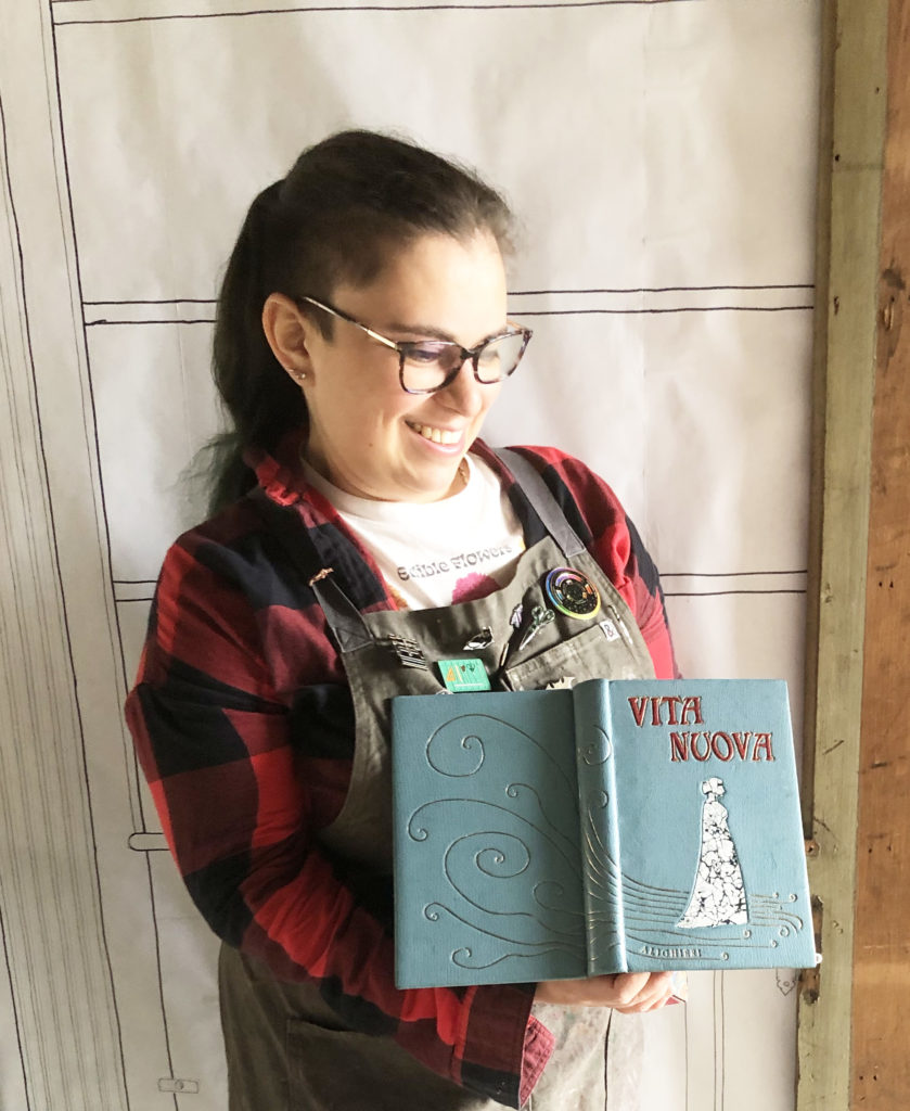
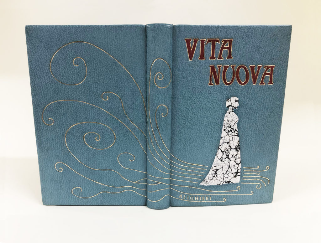
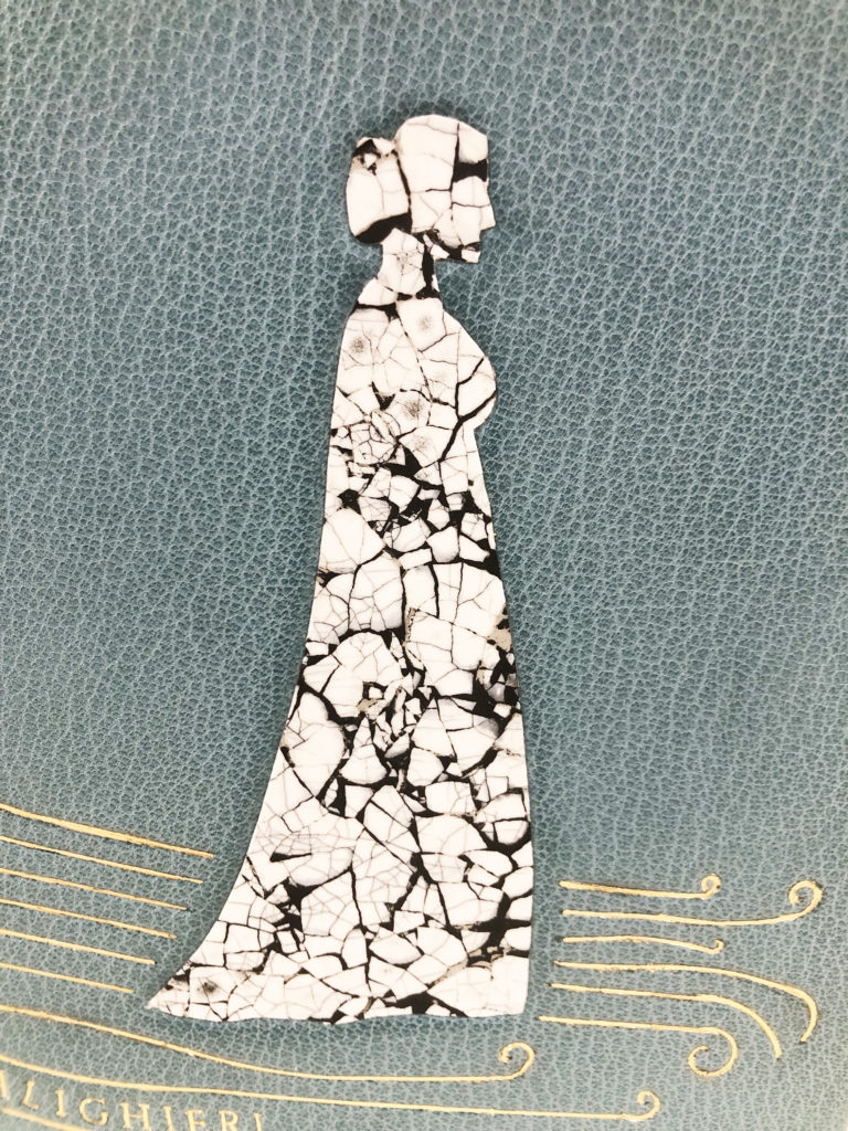
    Sara set up a few parameters when tackling what the design of their binding would look like. First, they really wanted to capture the spirit of Art Nouveau in the design. Second, they wanted the design to incorporate an eggshell panel and tooled lines constructed with gouges. Sara initially felt uninspired by the structure of La Vita Nuova and the melodrama presented by Dante’s archaic version of love. However, it was Dante’s lack of action that propelled the design forward and lead Sara to create a simple silhouette of Beatrice walking on a road that begins to disappear.


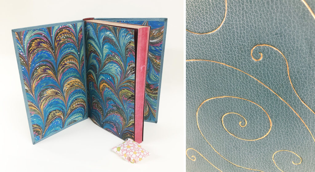
    Sara’s use of peacock blue goatskin sets her binding apart from the darker palettes seen on the other bindings. It’s also the perfect choice, as it creates a heavenly, ethereal backdrop for the design. The whimsical lines that make up the road in which Beatrice is walking upon were creating by carefully charting the different gouges required to illustrate each wave and curl. Modifying the free form lines of their original design through the confinements of the tools was a task that became both challenging and rewarding for Sara. Each of the nine lines starts and finishes with a tight curl, creating the sense of movement and that at any moment they will evaporate into nothing. The author’s name is gilt between the bottom two lines.

    Working with a classic Art Nouveau typeface for the title, Sara further connects to their initial inspiration. To create the gold tooled edges around the vibrant crimson red goatskin onlays, Sara once again faced the need to modify the curvatures of the letters to best fit the shapes of the gouges.


    Selecting duck eggs for their thicker shells (and because they would make a delicious omelet later), Sara created the eggshell panel inlay that would be used to represent Beatrice. The space between the cracks is filled with black acrylic paint, creating a stark contrast to the white of the eggshell. Sara was attracted to this technique and how it would highlight the perception of Beatrice presented by Dante. The purity of the white eggshell along with the translucency of the material creates this angelic version of Beatrice, yet the cracked effect works to represent her misrepresented identity.


    With the book still closed, the remaining details are colored red. The endbands are wrapped in the same crimson goatskin and the edges are painted with red acrylic paint. The head edge was further embellished with gold leaf. Once you open the book, you are greeted with an explosion of color from the marbled paper flyleaves. Sara greatly challenged themselves with each aspect of their design and was able to achieve a cohesive depiction of the text. Given the freedom to design a binding and work with techniques in a creative way really resonated with Sara and they hope to continue working in this style in the future. However, their main focus is in conservation and after graduation, Sara will be on the search for a position in the field.


    EJ Youcha
    they/them
    @pashariko_bookbinding

    As a student, working with leather is initially used to create historical models and for rebacks, so EJ delighted in the opportunity to finally use leather in a creative way. As we discussed the inspiration behind their design, EJ acknowledged that the style of writing used by Dante is not typically what they find themselves reading. However, they found a way to connect to the passionate love felt by Dante towards Beatrice and the underlying dreariness of his reality. Each element in the design is making multiple connections to both the text and EJ’s concept, some that were intentional from the beginning and some that arose as we discussed their binding further.

    That dreary reality that I mentioned above is expressed through a bed frame splintering amongst dancing flames. The carbon tooled onlays in medium brown goatskin representing the bed frame act as a stand-in for both love and a crumbling infrastructure. Dante’s love is more of an obsession over Beatrice and their love story is one sided. His delusions begin to deteriorate with the realization that his one true love will die someday. However, this does not push Dante to act, instead he chooses to withdraw from society.

    The entire scene is set against a dark navy blue goatskin with the fire created through back pared onlays in red, orange and yellow goatskin. The onlays are purposefully misaligned to create the illusion of movement, as if we are viewing this scene of destruction as it is happening. In truth, the story is about unrequited love or a dangerous love as described by EJ. The perplexing title is carbon tooled onto the bed frame. What does a new life mean in the context of Dante’s story. EJ has established the bed frame as both love and infrastructure, but could it also represent new life? EJ is simultaneously creating a visual representation of the text while also encouraging the idea that perhaps La Vita Nuova is a cautionary tale and one that promotes the idea that when things fall apart a new phase of life can begin.

    While the design originally included more splinters, EJ landed on a total of nine to create a design that is more visually impactful through its simplicity and to give a nod towards the importance of the number nine. The flames are also comprised of three groupings of three colors each. The vibrancy of the flames is cooled by the blue marbled interior. EJ made this marbled paper specifically for their binding to represent the hot interior of a flame. The head edge is rough edge gilt and the endbands are hand-sewn with colors pulled from the overall design.


    EJ was the first student I interviewed and they really set the stage for me. It was a joy to speak with them about the entire process, what excited them and what created stress. In the end, I think EJ crafted a design that speaks volumes in its simplicity. For now, EJ plans to stay in the Boston area and is searching for a studio space to share with a fellow classmate. They are interested in both bookbinding and conservation and has goals of bringing both into their practice. And perhaps another fine binding or two is in their future!


    Mimi Zycherman
    she/her
    @zycherwoman

    The fear of rejection is so powerful, it compelled Dante to never reveal his true feelings to Beatrice. With her design, Mimi sought to visualize the turmoil a person may experience from internalizing something so potent for a great length of time. Like many of her other classmates, Mimi was determined to work with certain techniques to achieve her design. This included leather dyeing, embroidery and doublures. As someone who uses embroidery often in my own work, Mimi sought out my expertise to find the right style of sewing to create the bold thick lines seen in her design. I greatly enjoyed working with Mimi on this task, as it encouraged me to consider adding these new stitches to my own work.


    The binding is covered with hand-dyed goatskin using a technique that blends spirit dyes and diluted alcohol. Rather than applying the dye directly to the leather, Mimi placed the dye onto a plexiglass board and then spread the dye by spraying diluted alcohol. The leather was then placed grain side down and dabbed to absorb the dye. To achieve a more layered effect with the black, the skin was placed lightly, lifted and then placed again to absorb more dye. The main inspiration for this effect came from Helen Frankenthaler’s Causeway and Mimi’s style of working greatly reflects Frankenthaler’s unique technique dubbed “soak stain”.

    The central medallions are onlays of stitched muslin. The messiness of the thread scraps highlight the turbulence experienced from keeping something hidden and trapped inside. The threads are secured through machine stitching and a layer of paste wash. Closing in around these nine-sided medallions are thick stitched lines of heavy chain stitch in black embroidery floss. The heavy chain stitch is dense and sits prominently on the surface of the leather. The texture created with the embroidery acts as an invitation to handle the binding. This result was part of Mimi’s drive to use embroidery in the first place. Something that I can greatly appreciate and desperately wanted to do. The gold-tooled title is framed by overlapping lines running across the spine from both directions.

    While dyeing the leather for the cover, Mimi dyed a second skin to use for the doublures. The same blend of color and tumult continues onto the interior, but is arrested by the black on black suminagashi flyleaves. Working within a simple color palette, the endbands are black leather with three sewn bands of color in yellow, orange and pink. The head edge is a peachy acrylic base with sprinkled moon gold.


    Even though her passion lies with conservation, Mimi found freedom in being creative during the process of crafting this binding in addition to putting decorative techniques she had learned throughout the year to good use. I greatly encouraged Mimi to continue in this style of working. Through thoughtfulness to design and technique, she was able to craft a really beautiful binding. After graduation, Mimi will get the chance to pursue conservation further at the Boston Athenaeum as the Von Clemm Fellow. This position will last an entire year starting in September.


  4. Winter/Spring 2023 Workshops

    December 12, 2022 by Erin Fletcher

    The blog is going to experience a makeover in early 2023. To get regular updates on upcoming workshops, please sign-up for the newsletter


    FEBRUARY
    Dos Rapporté Binding
    2 Sessions // February 11 & 12 (Sat & Sun mornings)
    9:00am – 11:30am (CST)
    SOLD OUT – Wait List

    Dos Rapporté is an elegant binding created by Ben Elbel around 2005. Rapporté loosely translates from French as something that comes back together. To create this unique structure, the covers and spine are covered separately and brought together to finalize the binding. This binding is an elegant solution for a book that can open flat based on the unique folding technique for the spine piece. In this workshop students will create a model of the Dos Rapporté using bookcloth and decorative paper.

    Embroidered Leather
    6 Sessions // February 15, 22, March 1/2, 8, 15, 22 (Wednesday evenings)
    5:00 – 7:00pm (CST)
    Register by February 3rd

    Historical examples of embroidered bindings typically date back from the close of the 14th to the mid-17th century and were primarily done on silk, satin, velvet or canvas. These highly decorative bindings grew out of the tradition of textile bindings that became popular in England during the 14th and 15th centuries. The embroiderers working on these bindings included both professional (predominately male artisans) and amateur needle-workers (typically women in their homes).

    Within the past few decades contemporary bookbinders and book artists have been incorporating embroidery and other sewing techniques into their work. For many of these artists, it was an easy transition to bring the two mediums together. The range of materials and methods has certainly expanded beyond the historical examples. Using thread over traditional binding techniques allows the artist to express their vision in an unique way and introduces a different tactile experience to the binding. Embroidered threads can be used to draw in the abstract or add highlights and shadows to an illustrative design. The threads can be kept neat or left to tangle.

    In this workshop, students will work from start to finish on their own embroidered leather binding over the course of several sessions. Students will be asked to prep their own text block and leather for a full leather case binding, however a kit of materials is available for purchase. Students will be introduced to a few hand-embroidery stitches and the best techniques for sewing into leather, cloth and paper. We will also discuss ways to transfer the design onto the material, how to incorporate onlays and how to prepare the finished embroidered piece for covering.

    This workshop will include live instruction through Zoom, which will be recorded and available to participants for a limited period of time. This workshop will not cover the foundations of working with leather, therefore students must have some prior knowledge of leather work. However, the embroidery techniques taught in this workshop can be applied to other materials such as cloth or paper. Please contact me if you have questions determining if this workshop is right for you.


    APRIL
    Tue-Mouche Binding
    2 Sessions // April 15 & 16 (Sat & Sun mornings)
    9:00am – 11:30am (CST)
    Register by April 4th – 4 SPOTS LEFT

    Translated to “flypaper”, the Tue-Mouche was developed by Ben Elbel as a variation to the Dos Rapporté structure (another one of his innovations). The Tue-Mouche is an easy and economical form of bookbinding. The covers are constructed entirely from heavyweight paper, layered to create rigidity and strength, while the flexible spine allows the binding to open without constraints. In this workshop students will learn how to create the Tue-Mouche structure from start to finish.

    Box Series
    4 Sessions // April 18, 20, 25, 27 (Tues & Thurs evenings)
    5:00pm – 7:30pm (CST)
    Register by April 6th

    Boxes come in all shapes and sizes. In this workshop, we’ll look at just three examples: French-Tray with Drop Spine, Clamshell and Japanese Box Case. Students will learn how to assemble these three styles of boxes while also discussing the ways to measure for custom box-making. This workshop will give you the foundational skills to build and modify your own boxes. It will also explore different ways of creating closures for boxes.


  5. New Year – New Workshops // 2023 Winter/Spring Workshops

    November 15, 2022 by Erin Fletcher


    FEBRUARY
    Dos Rapporté Binding
    2 Sessions // February 11 & 12 (Sat & Sun mornings)
    9:00am – 11:30am (CST)
    Register by January 31st

    Dos Rapporté is an elegant binding created by Ben Elbel around 2005. Rapporté loosely translates from French as something that comes back together. To create this unique structure, the covers and spine are covered separately and brought together to finalize the binding. This binding is an elegant solution for a book that can open flat based on the unique folding technique for the spine piece. In this workshop students will create a model of the Dos Rapporté using bookcloth and decorative paper.


    Embroidered Leather
    6 Sessions // February 15, 22, March 1/2, 8, 15, 22 (Wednesday evenings)
    5:00 – 7:00pm (CST)
    Register by February 3rd

    Historical examples of embroidered bindings typically date back from the close of the 14th to the mid-17th century and were primarily done on silk, satin, velvet or canvas. These highly decorative bindings grew out of the tradition of textile bindings that became popular in England during the 14th and 15th centuries. The embroiderers working on these bindings included both professional (predominately male artisans) and amateur needle-workers (typically women in their homes).

    Within the past few decades contemporary bookbinders and book artists have been incorporating embroidery and other sewing techniques into their work. For many of these artists, it was an easy transition to bring the two mediums together. The range of materials and methods has certainly expanded beyond the historical examples. Using thread over traditional binding techniques allows the artist to express their vision in an unique way and introduces a different tactile experience to the binding. Embroidered threads can be used to draw in the abstract or add highlights and shadows to an illustrative design. The threads can be kept neat or left to tangle.

    In this workshop, students will work from start to finish on their own embroidered leather binding over the course of several sessions. Students will be asked to prep their own text block and leather for a full leather case binding, however a kit of materials is available for purchase. Students will be introduced to a few hand-embroidery stitches and the best techniques for sewing into leather, cloth and paper. We will also discuss ways to transfer the design onto the material, how to incorporate onlays and how to prepare the finished embroidered piece for covering.

    This workshop will include live instruction through Zoom, which will be recorded and available to participants for a limited period of time. This workshop will not cover the foundations of working with leather, therefore students must have some prior knowledge of leather work. However, the embroidery techniques taught in this workshop can be applied to other materials such as cloth or paper. Please contact me if you have questions determining if this workshop is right for you.


    APRIL
    Tue-Mouche Binding
    2 Sessions // April 15 & 16 (Sat & Sun mornings)
    9:00am – 11:30am (CST)
    Register by April 4th

    Translated to “flypaper”, the Tue-Mouche was developed by Ben Elbel as a variation to the Dos Rapporté structure (another one of his innovations). The Tue-Mouche is an easy and economical form of bookbinding. The covers are constructed entirely from heavyweight paper, layered to create rigidity and strength, while the flexible spine allows the binding to open without constraints. In this workshop students will learn how to create the Tue-Mouche structure from start to finish.


    Box Series
    4 Sessions // April 18, 20, 25, 27 (Tues & Thurs evenings)
    5:00pm – 7:30pm (CST)
    Register by April 6th

    Boxes come in all shapes and sizes. In this workshop, we’ll look at just three examples: French-Tray with Drop Spine, Clamshell and Japanese Box Case. Students will learn how to assemble these three styles of boxes while also discussing the ways to measure for custom box-making. This workshop will give you the foundational skills to build and modify your own boxes. It will also explore different ways of creating closures for boxes.


  6. Fall & Winter Workshops – Live from the new Austin Studio!

    September 19, 2022 by Erin Fletcher

    NOVEMBER
    Cross Structure Binding
    4 Sessions // November 1, 3, 8 & 10 (Tues & Thurs evenings)
    6:00pm – 8:30pm (EST)
    Hosted by Maine Media Workshops + College

    The Cross Structure binding is a non-adhesive binding that offers much freedom to the text block. This 20th century design created by Carmencho Arregui is greatly inspired by the Long Stitch bindings of the medieval era. It is suitable in conservation or new bindings, such as travel journals or decorative bindings. The structure is uniquely constructed by interlocking the front and back cover at the spine.

    Secret Belgian Binding
    2 Sessions // November 12 & 13 (Sat & Sun)
    10:00am – 1:00pm (EST)
    Hosted by Maine Media Workshops + College

    The Secret Belgian binding is a popular structure, used primarily for artist books. This style of binding is simple and easy to construct; it opens flat and is perfect for thinner text blocks. Students will learn 2 different finishing techniques for the Secret Belgian.

    Telescoping Box
    3 Sessions // November 15, 17, & 22 (Tues & Thurs evenings)
    5:00pm – 7:00pm (CST)
    Sign-up by November 3 to receive your material kit! – 4 SPOTS LEFT

    In contrast to the clamshell box, this style of enclosure has a completely separate lid that slides off the base. In this workshop, students will construct an inner tray set within a frame for the object to rest. A ribbon will be added for easy retrieval of the object. Students will be able to customize the inner tray to fit an object from their own library.

    DECEMBER
    Tue-Mouche Binding
    2 Sessions // December 3 & 4 (Sat & Sun mornings)
    9:00am – 11:30pm (CST)
    SOLD OUT – Join the wait list!

    Translated to “flypaper”, the Tue-Mouche was developed by Ben Elbel as a variation to the Dos Rapporté structure (another one of his innovations). The Tue-Mouche is an easy and economical form of bookbinding. The covers are constructed entirely from heavyweight paper, layered to create rigidity and strength, while the flexible spine allows the binding to open without constraints. In this workshop students will learn how to create the Tue-Mouche structure from start to finish.


  7. Summer Workshops – For Those Hot Summer Days

    June 14, 2022 by Erin Fletcher

    JULY/AUGUST
    Secret Belgian Binding
    4 Sessions // July 9 – 17 (Saturday – Sunday)
    10:00am – 12:30pm (EST)
    Sign-up by June 28 to receive your material kit! – 4 SPOTS LEFT

    The Secret Belgian binding, also known as Criss Cross binding, was developed by Anne Goy in the mid-1980s and is influenced by traditional Japanese binding styles. The binding is simple and easy to construct; it opens flat and is perfect for thinner text blocks. Students will construct 3 variations of this structure, including a style which uses Tyvek as the binding agent.

    Focus on Clamshell
    4 Sessions // July 26 – August 4 (Tues and Thurs evenings)
    6:00 – 8:30pm (EST)
    Sign-up by July 14 to receive you material kit!

    As a bonus, I’ll select two students and make my demo boxes for a binding in their personal library!

    A clamshell box is a common and elegant way to house and protect a binding. In this workshop students will learn how to measure and cut down materials to make two custom clamshell boxes to house books from their own library. The first box will be covered in full cloth, while the second box will have a leather spine with suede lining the inside. Each box will be finished with a printed label.


  8. North Bennet Street School // The Set Book Interviews – Class of 2022

    May 13, 2022 by Erin Fletcher

    At the beginning of the school year in Fall 2020, I had the honor of ushering in a new group of students. I was invited to teach the incoming class for about a month and a half. And over the past two years, I’ve enjoyed getting to see their journey and show them a couple of other techniques here and there. In the past, I would be at school at least once a week, but the time I get to spend at North Bennet has continued to be limited due to COVID. So when I stopped in to interview the students, I had very little knowledge about the outcome of their set books. It was a real treat to be thoroughly surprised. And I will add, completely impressed with their ambition and tenacity.

    This year’s set book is The Illustrated Man by Ray Bradbury. This collection of short stories was originally published in 1951, but the students bound a recent edition from the Folio Society. The collection of unrelated stories share some reoccurring themes such as technology, space and human psychology, but the main thread that ties them all together is the “The Illustrated Man”. An unnamed man, covered in tattoos, acts as the narrator. As the tattoos become animated each of the individual short stories are revealed.

    Each of the student’s bindings will be on display in the 2022 Exhibition: Making Matters at North Bennet Street School through August 26. The exhibit offers a behind-the-scenes look at how work is created throughout the different departments at North Bennet. Each binding is displayed alongside some of the experiments, materials and tools used to create them. Check out the NBSS website for information on the best time to visit.

    I hope that each of the students feels pride and satisfaction when they look at their binding. It takes an incredible amount of skill, patience and passion to get to the that final stage of the binding. I wish them all the best post-graduation as they find their path within this field.

    Lucy Dunphy Barsness

    Lucy (she/her) and I share an affinity for embroidery and throughout the past two years, we’ve discussed technique and new ways of incorporating embroidery into bookbinding. About halfway into her first year, we discovered that we had actually met years earlier while attending a course at Rare Book School. What a small world! So needless to say, I was not surprised that Lucy used embroidery on her binding, but I was certainly sparked by her ambition in recreating a fanfare-style design through stitching. Being introduced to this 16th century form of decoration during the course at RBS, this heavily decorative and intricate layout of compartments, coils and foliage stuck with Lucy over the years.

    While each cover is unique, similar design elements that hint towards the fanfare-style link them together. Lucy covered her binding in a maroon goatskin and embellished the back cover with garnet silk thread. The blind tooling on the front cover relates directly to fanfare, while the gold tooled borders give off Parisian vibes, pinpointing her inspiration to both time and place.

    A central motif, typically a heraldic crest, placed within the complex layout is found on most historical fanfare bindings. With a drive to play with different techniques and materials, Lucy decided to work with stingray. Due to the hardened cartilage that makes up their skin, stingray is a notoriously difficult material to pare and manipulate. But Lucy took it a step further and decided to surface gilt the skin, which you can see proudly placed on the front cover. The surface gilt stingray has a brilliance that draws you in to reveal the subtlety of the skin’s texture.

    Although the fanfare-style was historically executed in gold, Lucy’s embroidered version is no less opulent and sophisticated. Using garnet silk, she embellished the back cover with six different embroidery stitches to create variation in line thickness and ample texture. The position of the stitches catches the light, creating depth and space around a natural white inlay of stingray. The spine is segmented into compartments with false bands. Two stamped labels on brick red goatskin showcase the title and author. The limited color palette on the exterior is met with an explosion of color as the book is opened to reveal a traditional marbled paper. The head edge is gilt over a layer of Armenian red boule. The gold and red striped double-core endbands blend perfectly with the rest of the design.

    I always end the interview by asking the students about their experience creating a design binding and whether or not they plan to make more in the future. I was particularly interested in Lucy’s answer as I can see the potential of where her work with embroidery can go and also how it may surprise me! Thankfully, Lucy enjoyed the challenges that this binding presented and looks forward to exploring the possibilities future bindings could bring. Soon after graduation Lucy will be relocating to Raleigh, North Carolina to start as a conservation technician for the State Archives of North Carolina.


    Alexa Garvin

    When Alexa (she/her) told me she wanted to incorporate as many of the techniques she had learned throughout the year onto her binding as she could, I was instantly transported back 10 years when I was designing my own set book. I think it’s highly ambitious and risky to incorporate lots of technique into a design. However, when Alexa pulled out her binding to show me, I was so blown away with the brilliance of the surface gilt sun against the softness of the hand-dyed leather. I had gotten a few peaks into Alexa’s design and her dye experiments prior, but I was just so impressed with the final look of the binding.

    Before winter break last year, I taught a quick workshop for the entire bookbinding department on the leather dyeing techniques I had previously learned from Nicky Oliver and Coleen Curry. Using a blending technique, Alexa was able to seamlessly fuse aniline and spirit dyes together to create a nebulous atmosphere on fair goatskin. Alexa took her inspiration from The Rocket Man (which doesn’t appear in this edition, but is included in other editions of The Illustrated Man) and how it related to the myth of Icarus. The blind tooled rocket quietly moves through space on a course set for the sun.

    The almost invisible rocket is sandwiched between three back-pared onlays of Earth, Venus and Mercury. Each of the planets have been uniquely dyed to capture the essence of that world. The iconic blue dot is created with a layer of blue spirit dye dabbed with yellow to create green land forms. Alexa used the craquelle technique to create Venus, putting a layer of chili pepper alcohol ink over yellow spirit dye. Mercury also includes a base of yellow spirit dye, but is finished with a layer of bubbles made from a purple/blue mixture.

    The negative space is filled with various constellations that have been gold tooled with large and small dots. Each constellation is easily recognizable, but Alexa specifically included the Pleiades star cluster to give a nod to the fact that she attended one of the Seven Sisters colleges prior to coming to North Bennet. The title and author’s name are hidden inside the surface gilt sun, following the curve of the sun from spine to the fore edge. The surface gilding continues around the turn-in and aligns with the fore edges of the text block. The exterior of the binding feels mostly cold with the use of purples and blues, but once the book is open a blast of yellows and oranges envelope you. The head edge is gilt in the rough in gold over a layer of Armenian red boule. Alexa jumbled up the folios and the sections to create a true random edge. The single core endbands are sewn with purple and blue/green silk giving the eye a break from the swarming gold.

    Since I had the chance to speak with Alexa during the process, I can clearly see her determination in executing her design to perfection. She persevered through a series of dye experiments to find the right plan for her binding. The overall look of her binding is clean and crisp. The concept speaks volumes through her clever use of technique and the right balance of loud and quiet elements.

    You can discover more of Alexa’s work here and follow her on Instagram.


    Chloe Goff

    Chloe (she/her) has set her binding apart from the rest by shifting away from the prominent theme of space. As a fan of Bradbury’s novels, Chloe was equally engaged by this series of short stories and their captivating imagery. In the short story, Marionettes, Inc. a company by the same name offers customers identical avatars as a means of disengaging with the people around them and to separate from any emotional responsibilities. Using this story as her main inspiration, Chloe wanted to build a design that spoke to the cold, bleak reality brought on by this revolutionary tech.

    Each grouping of marionettes is comprised of overlapping onlays in light green, mint blue and forest green goatskin on a backdrop of medium brown goatskin. Chloe’s choice of simple shapes and complimentary color palette creates a striking design that has the ability to draw you in from across the room. The faceless figure is relatively the same from puppet to puppet and even though the onlays are stationery, the positioning of the body and the slight asymmetry in the placement of color creates a feel of movement on the binding.

    The remaining elements that make up the marionettes are quite delicate materials. Yet Chloe, fearlessly cut into the binding in order to inlay both the decorative wood veneer for the handles and the cotton threads for the strings. Her decision to include these additional materials is so smart, they each lend additional texture that contrasts beautifully against the leather.

    The negative space around the marionettes is filled with blind and gold-tooled stars in different sizes, giving a small nod to the theme of space relevant to many of the other short stories. I know that it can be challenging to incorporate a title onto a design binding and most of the time I leave this part off of my bindings. I love Chloe’s unique spin on integrating this element into her binding. Continuing with repetition, each color used for the marionettes was stamped with the title and author. Reading each word three times creates a level of disorientation and connects to the overall design. The interior is flooded with colors complimentary to the exterior with the use of a marbled paper made by Chloe. The head edge has been decorated with moon gold and gauffered with the same star tools found on the covers. The hand-sewn endbands blend beautifully into the edge decoration with the use of light grey cotton thread.

    Chloe’s design is comprised of just a few elements, but each is deliberate and connects to the themes presented within Marionettes, Inc. The difficulty of creating a design binding and the challenges of trying out new techniques resonated with everyone, including Chloe. She spoke to enjoying the evolution of the design process and how creating this binding has informed her mindset for any future bindings. Can’t wait to see the next design binding Chloe makes!


    Martyna Gryko

    Back in 2020, while teaching the students how to make paste papers, I was instantly captivated by Martyna’s (she/her) design aesthetic and skill as a painter. I couldn’t wait to see how her creative past would influence her binding work. And as she shared her work with me over the last two years, I began to see how she thoughtfully incorporated her training as an artist into her design choices no matter how small. Her work displayed real intention and dedication to both the visual and structural aspects of bookbinding. Her approach to the set book project was no different. With the main influence coming from the narrator, Martyna also pulled in concepts from The Veldt and The Visitor in addition to a vintage 1950’s color palette. Her intention was to design a Mars-like landscape that would speak volumes to isolation and loneliness.

    Every decorative element of Martyna’s binding was added after the binding was covered in a navy blue goatskin. This style of working instantly connected to Martyna’s process as a painter. I commended her for being so brave in this style of execution, but noted that a design binder needs to find the path that is most comfortable for them to really steer them towards success. Working from the top of the horizon, Martyna created a Mars-like landscape by layering various goatskin feathered onlays in desert tones. Some of these onlay pieces have been blind tooled to create additional texture and depth. Tufts of grass were added as onlays using different shades of green goatskin.

    The Illustrated Man stands alone in this desolate scene and becomes the focal point of the design. To convey the tattoos that cover the narrator’s body, Martyna employed the craquelle technique and used the same color palette as the landscape, but with splashes of teal over a piece of fair goatskin. With its tooled edges and matching color palette, the Illustrated Man is elegantly integrated into the landscape.

    The ethereal and other-worldly night sky was created through a leather dyeing technique that involves blowing bubbles. This technique can be tricky to apply to a skin that is commercially dyed as the pigment doesn’t always stick. After trying several different mixtures, Martyna found two variations that worked to create this milky haze looming above the desert landscape. Sprinkled amongst the blue vapor, Martyna has tooled stars and circles with moon gold. The title dances along the horizon, also tooled in moon gold. When the book is opened, a familiar color palette is presented with a feathered marbled paper made by Martyna. It perfectly flows with the design of the cover and is seamlessly split at the leather hinge as to not break the pattern. The head edge has been given a graphite base sprinkled with moon gold. The tri-colored striped sewn endbands bring together colors from the landscape and marbled paper.

    Working directly on the binding offered Martyna a certain level of freedom, giving her the chance to edit in real time and to place each element intuitively. The overall finish and look of the binding feels so naturally connected to Martyna’s process as both a binder and an artist. I truly can’t wait to see how her work will evolve through bookbinding and artist books. In the fall, Martyna will be joining the conservation lab at the Boston Athenaeum as the new Von Clemm Fellow.

    Follow Martyna on Instagram to stay updated with her work!


    Ariana Rutledge

    The Illustrated Man is filled with science fiction short stories, which Ariana (she/her) admitted isn’t her favorite genre to read. However, she was hooked to the psychological connection of the individual stories and grasped to the fact that each story was meaningful and profound. Like many of her fellow classmates, she leaned into the themes of space, disaster, loneliness and death.

    Blending leather dyes together can be difficult to control, yet Ariana managed to expertly lay down pigment onto fair goatskin to flow in such an exquisite manner that undeniably captures the feeling of outer space. With the addition of white acrylic bubbles, Ariana was able to create a perfect balance of light and dark tones. Ariana also managed to pack an entire solar system complete with gold-tooled stars into her design with sunken onlays for each planet. To control the placement of each planet and its blind-tooled orbit, Ariana initially cut wells in the board prior to covering. The unique make-up of each planet gave Ariana a chance to really play with leather dyes further:

    Sun // yellow dye with a layer of red bubbles
    Mercury // sprinkled with various colors
    Venus // blend of purple and yellow dye
    Earth // blend of green and blue dye (plus a neighboring parchment Moon)
    Mars // craquelle (cracked over a textured wall) red dye over orange
    Jupiter // red, yellow and orange dye streaked on with a pipette
    Saturn // blend of blue and orange dye with a gold-tooled ring
    Uranus // craquelle (cracked over a stack of chairs) purple dye over purple with a palladium-tooled ring
    Neptune // blend of blue, purple and green dye
    Pluto // craquelle (cracked over cement wall) purple dye over orange

    Since Pluto was classified as a planet when The Illustrated Man was published, Ariana felt it was appropriate to include the dwarf planet in her design. Each planet was given individual consideration and I was particularly impressed by the beautiful rendition of Jupiter with its Great Red Spot.

    To signify death and disaster, Ariana incorporated pieces of tin and watch parts to represent shrapnel floating through space. The irregular shapes of the watch parts contrast beautifully with the symmetry of the planets and stars. The large tin pieces are placed in sunken panels and attached to the covers with brass rivets. Ariana manipulated each piece through bending and scratching, giving the tin a more authentic feel. The title is seamlessly worked into the design by being tooled along Earth’s orbit in palladium. Ariana further showcases her incredible skill by adding an edge-to-edge leather doublure on the inside. The head edge celebrates the design of the binding with a base of black pigment sprinkled with both gold and palladium. Using the same color palette from the binding, Ariana created a tri-color striped double-core endband in navy blue, purple and white.

    It was apparent by the way that Ariana spoke to me about her binding, that she thoroughly enjoyed the process of making it and is quite pleased with the outcome. Complex and layered designs often require extensive forethought and planning, Ariana proved to be incredibly thoughtful in her approach throughout the construction and design phase of the binding. I’m on the edge of my seat to see what she comes up with in her next design binding. After graduation, Ariana will be spending her summer in Pennsylvania interning at the Haverford College conservation lab.

    Follow Ariana on Instagram

    – – –

    Thanks to the 2022 graduating class for sitting for these interviews and thanks to Jeff Altepeter, Head of Bookbinding Department, for inviting me once again. I look forward to this moment every year and I really enjoyed speaking to everyone about their incredible design bindings. I can’t wait to see where each of these lovely people land in the future and how they explore this style of binding further.

    If you find yourself in the Boston area this summer, stop by North Bennet Street School to see each of these bindings in person in the 2022 Exhibition: Making Matters.

    If you want more interviews from past classes check out the list here.
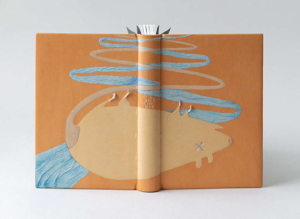

  9. Sign-Up for a Summer Workshop!

    May 10, 2022 by Erin Fletcher

    MAY/JUNE


    Modern Nag Hammadi
    3 Sessions // May 31 – June 7 (Tuesday and Thursday evenings)
    6:00 – 8:30pm (EST)
    Sign up by May 19 to receive your material kit! – Only 1 Spot Left!

    In this workshop, we will explore how some of the earliest known codices may have been constructed. The best-known examples were discovered in a jar near the Egyptian village of Nag Hammadi in 1945. These mostly intact bindings date back to the 3rd or 4th century, but fragments of similar bindings date back further to the 2nd century.

    These single signature bindings are held in their leather covers with the use of knotted leather tackets. The bindings also include ties at the head, tail and fore edge to keep the binding secure. During this workshop we will be using contemporary materials to build two models of these ancient binding structures.
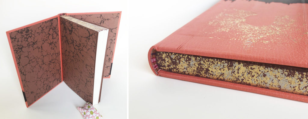
    Artists’ Books with Guest Instructor Keri Miki-Lani Schroeder
    6 Sessions // June 8 – July 13 (Wednesday evenings)
    6:00 – 8:00pm (EST)
    Online through North Bennet Street School

    Register here

    Learn to create your very own artist’s book, a versatile medium for creative expression. This class will offer different folding and binding techniques, creative ways to fill pages with content, and time to develop and share ideas with your classmates. Students are required to complete the pre-recorded session on folding pages prior to the first live session on June 8. During the live sessions, students will work alongside the instructor to build structures for their folded pages.

    Box Series
    4 Sessions // June 14 – 23 (Tuesday and Thursday evenings)
    6:00 – 8:30pm (EST)
    Sign-up by June 2 to receive your material kit!

    Boxes come in all shapes and sizes. In this workshop, we’ll look at just three examples: French-Tray with Drop Spine, Clamshell and Japanese Box Case. Students will learn how to assemble these three styles of boxes while also discussing the ways to measure for custom box-making. This workshop will give you the foundational skills to build and modify your own boxes and different ways of creating closures for boxes.
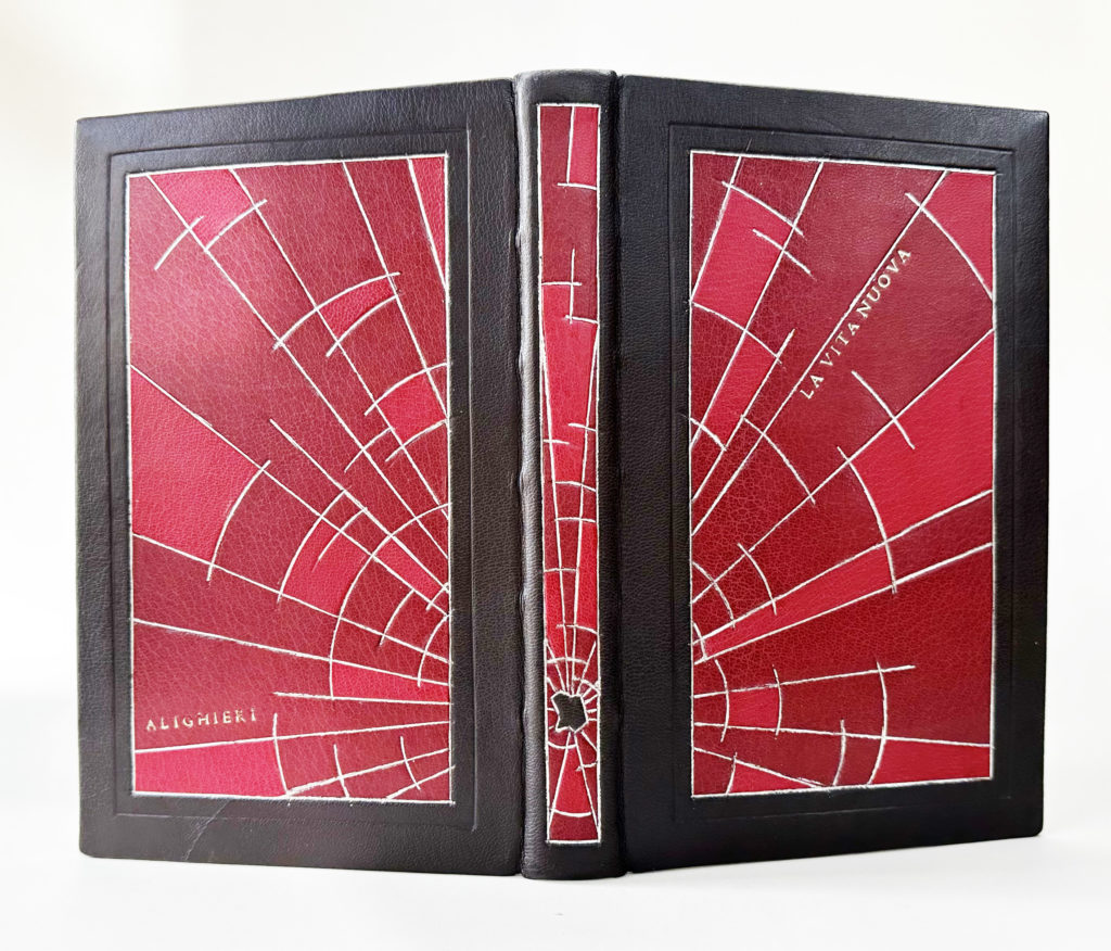
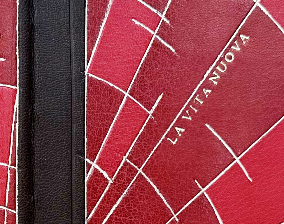

    JULY/AUGUST


    Secret Belgian Binding
    4 Sessions // July 9 – 17 (Saturday – Sunday)
    10:00am – 12:30pm (EST)
    Sign-up by June 28 to receive your material kit!

    The Secret Belgian binding, also known as Criss Cross binding, was developed by Anne Goy in the mid-1980s and is influenced by traditional Japanese binding styles. The binding is simple and easy to construct; it opens flat and is perfect for thinner text blocks. Students will construct 3 variations of this structure, including a style which uses Tyvek as the binding agent.

    Japanese Box Making
    1 Session // July 23 (Saturday)
    8:30am – 4:30pm
    North Bennet Street School, Boston

    Register hereOnly 1 Spot Left!

    In this workshop, students will learn techniques used to create a traditional Japanese box; an assembly that varies from the more common clamshell box used in Western cultures. During the class students will construct a four-walled box with lid, which will be covered in an elegant Japanese book cloth and held together with bone clasps.

    Focus on Clamshell
    4 Sessions // July 26 – August 4 (Tues and Thurs evenings)
    6:00 – 8:30pm (EST)
    Sign-up by July 14 to receive you material kit!

    A clamshell box is a common and elegant way to house and protect a binding. In this workshop students will learn how to measure and cut down materials to make two custom clamshell boxes to house books from their own library. The first box will be covered in full cloth, while the second box will have a leather spine with suede lining the inside. Each box will be finished with a printed label.

    Fundamentals of Bookbinding I
    5 Sessions // August 8 – 12 (Monday – Friday)
    8:30am – 4:30pm
    North Bennet Street School, Boston

    Register here

    Students will learn the foundations of bookbinding by combining hands-on exercises and discussion. The class starts by exploring non-adhesive structures: soft cover pamphlet, Coptic, historical longstitch, and link stitch. The class ends with a look at case bindings, with the creation of two hardcover flatback bindings. Students also learn different structural elements, sewing variations, covering and cutting techniques using various materials, tools and equipment. Throughout the course, discussions will cover terminology, paper grain and folding, selecting proper materials and tools, and adhesives and their properties.


  10. Upcoming Workshops // Summer 2022

    April 12, 2022 by Erin Fletcher

    May/June
    Modern Nag Hammadi
    3 Sessions // May 31 – June 7 (Tuesday and Thursday evenings)
    6:00 – 8:30pm (EST)
    Sign up by May 19 to receive your material kit!

    In this workshop, we will explore how some of the earliest known codices may have been constructed. The best-known examples were discovered in a jar near the Egyptian village of Nag Hammadi in 1945. These mostly intact bindings date back to the 3rd or 4th century, but fragments of similar bindings date back further to the 2nd century.

    These single signature bindings are held in their leather covers with the use of knotted leather tackets. The bindings also include ties at the head, tail and fore edge to keep the binding secure. During this workshop we will be using contemporary materials to build two models of these ancient binding structures.

    Box Series
    4 Sessions // June 14 – 23 (Tuesday and Thursday evenings)
    6:00 – 8:30pm (EST)
    Sign-up by June 2 to receive your material kit!

    Boxes come in all shapes and sizes. In this workshop, we’ll look at just three examples: French-Tray with Drop Spine, Clamshell and Japanese Box Case. Students will learn how to assemble these three styles of boxes while also discussing the ways to measure for custom box-making. This workshop will give you the foundational skills to build and modify your own boxes and different ways of creating closures for boxes.


    July/August
    Secret Belgian Binding
    4 Sessions // July 9 – 17 (Saturday – Sunday)
    10:00am – 12:30pm (EST)
    Sign-up by June 28 to receive your material kit!

    The Secret Belgian binding, also known as Criss Cross binding, was developed by Anne Goy in the mid-1980s and is influenced by traditional Japanese binding styles. The binding is simple and easy to construct; it opens flat and is perfect for thinner text blocks. Students will construct 3 variations of this structure, including a style which uses Tyvek as the binding agent.

    Focus on Clamshell
    4 Sessions // July 26 – August 4 (Tues and Thurs evenings)
    6:00 – 8:30pm (EST)
    Sign-up by July 14 to receive you material kit!

    A clamshell box is a common and elegant way to house and protect a binding. In this workshop students will learn how to measure and cut down materials to make two custom clamshell boxes to house books from their own library. The first box will be covered in full cloth, while the second box will have a leather spine with suede lining the inside. Each box will be finished with a printed label.


  • My name is Erin Fletcher, owner and bookbinder of Herringbone Bindery in Boston. Flash of the Hand is a space where I share my process and inspirations.
    The StudioNewsletterInstagramEmail me
  • Archives