RSS Feed

Posts Tagged ‘colin urbina’

  1. Tutorial // Petal Fold Book

    July 12, 2020 by Erin Fletcher

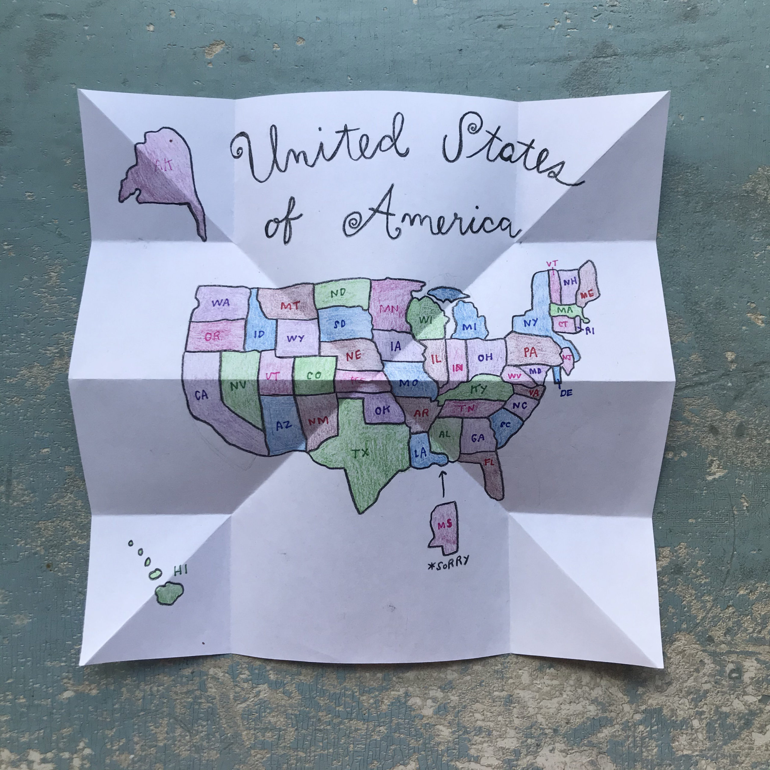
    In this video for North Bennet Street School, my co-host Colin Urbina shows me how to make a Petal Fold Book using simple folding techniques similar to the Turkish Map Fold. Even though this video is geared towards kids, this technique is great for any age group. You can find more online content created for NBSS here.

    If you are looking for even more instructional content, I have a growing list of tutorials and I also teach live workshops in-person and online. Check out my list of Upcoming Workshops.

    SUPPLIES:
    – 5 square pieces of paper, plain or decorative (any size, but should be the same size)
    – Glue Stick
    – Bone Folder (optional)
    – Coloring and decorating supplies (markers, colored pencils, or crayons)

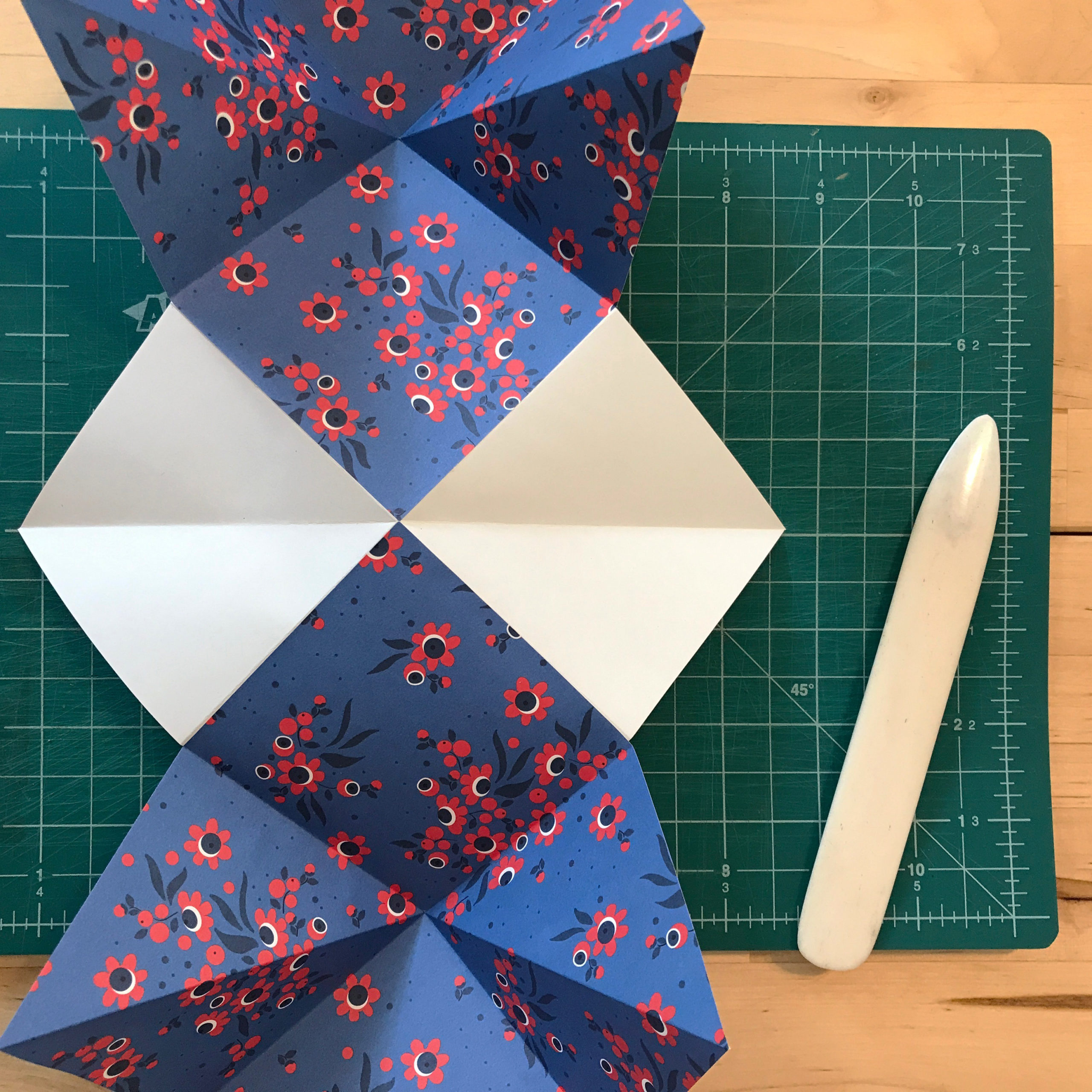
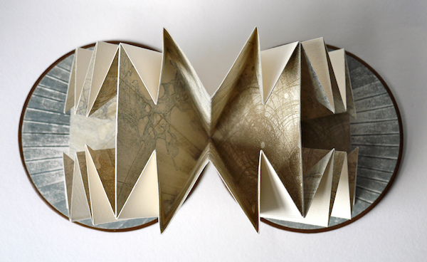
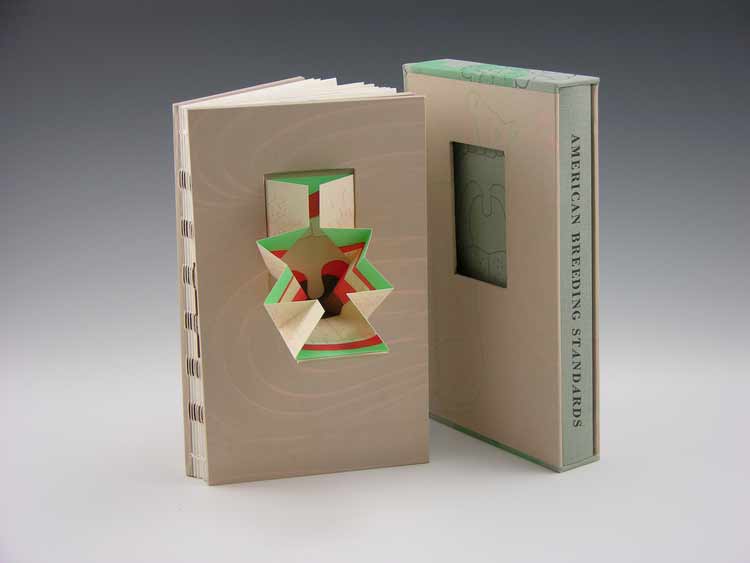
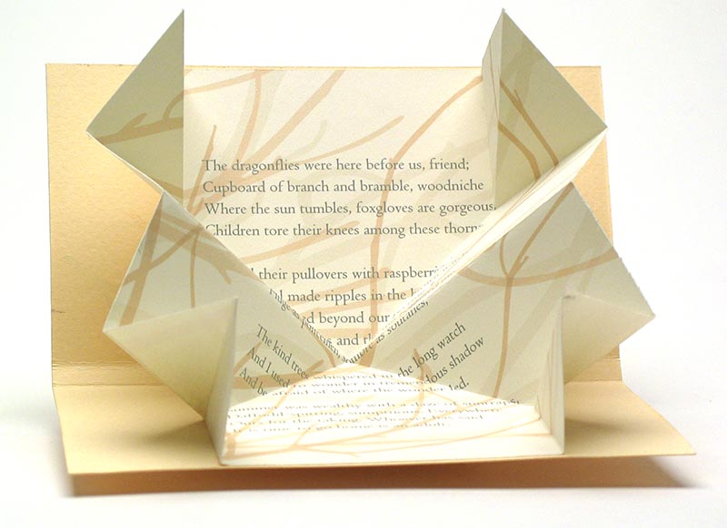
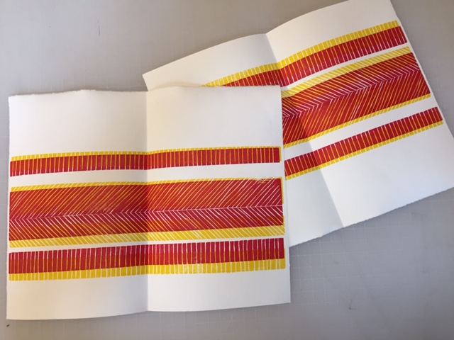
    The Petal Fold is a simplified version of a fold used in origami by the same name. By reducing the number of folds from the origami technique, it can be used to create pages that can easily condense into an artist book.


  2. Tutorial // Turkish Map Fold

    June 8, 2020 by Erin Fletcher

    In this video for North Bennet Street School, I show my co-host Colin Urbina how to fold a square sheet of paper using the Turkish Map Fold technique. Even though this video is geared towards kids, this technique is great for any age group. You can find more online content created for NBSS here.

    If you are looking for even more instructional content, I have a growing list of tutorials and I also teach live workshops in-person and online. Check out my list of Upcoming Workshops.

    SUPPLIES:
    – 1 square piece of paper (any size)
    – Coloring and decorating supplies (markers, colored pencils, or crayons)

    Unfortunately, I don’t know the origins of this folding technique. But you can find examples of this fold being used in booklets with maps and many artists use this technique in their artist books. See examples below:

    Cartography I | Louisa Boyd

    American Breeding Standards | Ellen Knudson


  3. Tutorial // Make a Book from a Single Sheet of Paper

    May 3, 2020 by Erin Fletcher

    In this video for North Bennet Street School, I follow along as Colin Urbina shares how to fold a single sheet of paper into a folded book with 8 pages. Even though this video is geared towards kids, this technique is great for any age group. You can find more online content created for NBSS here.

    If you are looking for even more instructional content, I have a growing list of tutorials and I also teach live workshops in-person and online. Check out my list of Upcoming Workshops.

    SUPPLIES:
    – One 8.5×11″ sheet of paper
    – Scissors
    – Pencil
    – Coloring and decorating supplies (markers, colored pencils, or crayons)

    This style of folding is rooted in traditional book layouts and printing, where a single printed sheet could be folded into eight equal sections and then cut at the head edge to create a gathering of 16 pages. This process is described with the Latin word octavo, which means “in eighth” or “for the eighth time”. The final pages of the book would represent one eighth of the original sheet of paper (or roughly the size of the original sheet if the pages were trimmed down after folding).

    If you are looking for some great content for this type of structure, go to Quarantine Public Library. This free repository of finished works can be printed for free and assembled using the tutorial above. Katie Garth and Tracy Honn dreamed up this project in the early days of quarantine and by the generosity of the artists they collaborated with is making this library free for everyone. Any donations generated by this project will be given to EveryoneOn, a non-profit organization that connects low income families to computers and affordable internet. When the internet is our most important means of connection right, this organization is very important and necessary.


  4. International Edible Book Day!

    April 1, 2020 by Erin Fletcher

    International Edible Book Day is celebrated on April 1st. April Fools may seem like the perfect day to create literary inspired desserts and dishes, but in fact Edible Book Day celebrates the birthday of French gastronome Jean-Anthelme Brillat-Savarin (1755 – 1826). Famous for his book Physiologie du goût, Brillat-Savarin and his colleague Grimod de La Reynière are known as the creators of the gastronomic essay genre.

    This unusual holiday was the brainchild of book artists Judith A. Hoffberg and Béatrice Coron, who cooked up this idea in 1999 during Thanksgiving. Edible Book day was first celebrated in 2000. This yearly event takes place around the world and invites bibliophiles, book artists, binders and food lovers to combine literature with food in creative and humorous ways.

    In this video for North Bennet Street School, Colin Urbina and I offer two options for creating an edible book inspired by bookbinding techniques. Using tortillas for pages and jelly and peanut butter for glue, Colin recreates an edible version of a Drum-leaf binding.

    I was greatly inspired by Tiffany Eng’s post on the West Dean Arts & Conservation blog. I’ve been wanting to make her version of a Japanese Stab binding for a long time. Unfortunately, my twizzler thread was not long enough to create the proper sewing. My edible book has leaves of lettuce, ham and salami with swiss cheese endpapers and mayonnaise doublures. The Cambridge panel tooling was done with yellow mustard. Our books were bound, documented and then consumed.

    Even though this video is geared towards kids, this technique is great for any age group. You can find more online content created for NBSS here. If you are looking for even more instructional content, I have a growing list of tutorials and I also teach live workshops in-person and online. Check out my list of Upcoming Workshops.

    Happy International Edible Book Day!


  5. North Bennet Street School // Student & Alumni Exhibit 2017 – Alumni Work

    May 18, 2017 by Erin Fletcher

    In the second portion of my post on the Student and Alumni Exhibit at North Bennet Street School, I want to highlight some of the pieces showcasing the talents of our alumni. If you missed the post where I interviewed the graduating class on their set book, check it out here.

    I’ll start with my own bindings. This year I chose to submit two recently completed bindings. The first is a miniature binding of Bobbie Sweeney’s Rookwood printed by Mosaic Press in 1983. The text chronicles the Rookwood Pottery studio founded in 1880 by Maria Longworth Nichols who fell in love with the Arts & Crafts movement. She and her employees pioneered a variety of different pottery styles and glazes over the course of Rookwood’s existence.

    Bound in a Dorfner-style binding, the boards are covered with stone veneer with onlays of wood veneer and handmade paper. The interior side of the board is also covered in stone veneer facing a suede fly leaf. The edges have been sprinkled with purple gouache. The box is covered in dark grey buffalo skin with a back-pared onlay of light grey buffalo skin in one variation of the Rookwood insignia.

    The second binding I chose to submit was completed just last month after working on it for over a year. This fine binding of Italo Calvino’s Invisible Cities is bound in two buffalo skins, with dark grey on top and light grey on the bottom. The top is adorned with a series of onlays in green goatskin (show in both leather and suede), ruby Novasuede, stone veneer and multilayered palladium gilt pieces. The bottom half is embroidered in a matching thread in such a way that partially mimics the top portion. All of the lines on the top are palladium tooled and the bottom are blind. I was greatly inspired by all of the imagery in Calvino’s abstract telling of a conservation between Kublai Khan and Marco Polo. I will be posting on this binding further, there is so much to reveal about the edge decoration and doublures.

    Colin Urbina, BB’11
    Next up is another lovely miniature, this one was bound by Colin Urbina.

    Colin’s binding of Shaman is covered in a medium brown goatskin and adorned with onlays of stone veneer. Illustrations gleaned from the text are stamped in red foil. The head edge is sprinkled with red acrylic paint. The title is stamped in the same red foil along the spine of the book.  The box for this miniature book is quite large because it holds the book, a paper folder of loose prints and a map (displayed open). The spine of the box is covered in a tan goatskin stamped in blind with the same icons from the book.

    Samuel Feinstein, BB’12
    As always, Samuel Feinstein impresses with his incredible tooling abilities. His binding of Dante Gabriel Rossetti’s Ballads and Sonnets is covered in a bright blue goatskin and intricate gold tooling. His work is always teetering on the line of classic design and modernism.

    Gabby Cooksey, BB’14
    The Book of Penumbra comes from the very talented Gabby Cooksey. Her work is always fresh and interesting and splendidly weird. The cover stands out in a unique way against the rest of the bindings and so does the technique. Gabby arranged the illustrations from the book in a chaotic way before debossing them into the black goatskin. Contrast is created through the application of varnish on the raised areas. The text block was also illustrated and printed by Gabby, you can read more about the work here.

    Becky Koch, BB’12
    My dear friend Becky Koch submitted this delightful little binding of The Farm by Wendell Berry. I love the array of colors she used to capture such a bucolic landscape.

    The sun is beaming over the country side, literally beaming with Becky’s use surfacing gilding in gold leaf. Oh, I love that little patch of blue. Brilliantly place amongst a sea of mainly reds and browns. The title has been hand-tooled with carbon.

    Fionnuala Gerrity, BB’ 11
    Last up is Trinity is a small, but not quite miniature, laced vellum binding containing hand calligraphed pages from Maryanne Grebenstein. The transparent vellum reveals Fionnuala’s painting underneath.


  6. New England Chapter Print Exchange

    April 5, 2017 by Erin Fletcher

    I recently participated in a print exchange with a few fellow members of the New England Chapter of the Guild of Book Workers. Our instructions were to create a print edition using any medium we desired around the optional theme of Spring. The prints were then sent through the mail to each other. So in the end I made 11 prints (plus a few extras) and received 11 different prints from everyone else.

    Erin Fletcher

    The print I created was part collaboration with my husband. He drew an image that I had turned into a metal die, which was heated and pressed into paper. I chose two papers handmade by Katie MacGregor, orange and a sort of dull algae green. Once the impression was made, I then drew several marks with colored pencils. The dots are hand-stitched french knots.

    It was fun to send these out into the world, but it was more fun to receive so much interesting mail over the course of a week. Here are the rest of prints from the exchange:

    Katherine Beaty

    Carol Blinn

    Penelope Hall | Cypripedium acaule

    Martha Kearsley

    Kate Levy | Spring Garlic

    Anne McLain | March Hare

    Melanie Mowinski

    Emily Patchin | Ostara

    Colin Urbina

    Linnea Vegh | Swag


  7. Exquisite Corpse Collaboration

    July 10, 2016 by Erin Fletcher

    ExquisiteCorpse
    As Program Chair for the New England Chapter of the Guild of Book Workers, I had the pleasure of organizing a project brought to me by one of our members. Jonathan Romain, a recent graduate of the North Bennet Street School Bookbinding Program, brought forth the idea of a collaborative project between the students at NBSS and the NEGBW. I loved this idea and so with the help of instructor Jeffrey Altepeter, we put this plan in motion.

    An Exquisite Corpse is a method of illustration invented by Surrealists in the early 1910s, where each collaborator adds to a composition in sequence usually without seeing the prior portion. Upon reveal this rule to hide the previous sequences offers up an abstract and amusing portrait. Each student created a plaquette covered in neutral leather (we used Harmatan Terracotta and Brown goatskin) and also completed the “head” portion of the figure. The plaquette’s were about 18in x 6in; allowing each participant to cover a 6in square portion of the board.

    The project spanned over 3 months as each participant received and worked on their portion over the course of a month. At the end of May, the finished pieces were on display as part of NBSS’s Student & Alumni Show, an annual exhibit that showcases work from current students and alumni from the various programs.

    I had the pleasure of receiving the finished pieces and bringing them back to the students. We gathered around one another as each student revealed the unique and strange characters that developed over the course of the project. Each piece is displayed below with a brief description from each collaborator remarking on their concept and use of materials.

    Jeffrey Altepeter – Samuel Feinstein – Lang Ingalls

    JeffSamuelLang-Corpse
    Jeffrey Altepeter
    The robot head was inspired by my son’s fascination with mechanical and technological design and construction. It is made up of traditional leather decoration techniques—leather onlays, tooled with gold leaf, foil and carbon.


    Samuel Feinstein
    Chicago, IL

    Gold and blind tooling.


    Lang Ingalls
    Crested Butte, CO

    I opted for humor in my approach to the Exquisite Corpse. The design concept was to depict bird legs: the initial tests were for tooling in the positive; it became clear that the negative space would be more interesting. I used four sizes of “dots” in gold foil to produce the background behind the legs. Repetition and rhythm became the focal point.

    Emily Patchin – Barbara Adams Hebard – Athena Moore

    EmilyBarbaraAthena-Corpse Emily Patchin
    This head was created as an onlay piece. The main portion was cut out of navy blue goat skin, pared thin. The sections for the eye, ear, and ghosts were all cut out, and their edges beveled on the flesh-side. Light blue leather for the eye and ear were glued to the back before pasting to the base leather. The ghosts were cut out from parchment; their faces backed with thinly pared gold leather, and painted with watercolor before being glued in place. The outline of the original drawing was then blind tooled over the leather. The intention behind the design was to look at intense personal struggles (depression, intrusive thoughts, insomnia) through a lens of whimsy and humor.

    Barbara Adams Hebard
    Melrose, MA

    Melrose, MAWhite alum-tawed goatskin onlay with blind tooled details, inspired by the shape of an Early Cycladic marble female torso (2800-2300 BC, Keros-Syros Culture). Flanking the torso are shapes commonly found incised on Early Cycladic pottery, a spiral and a two-headed ax, executed in surface gilding.


    Athena Moore
    Somerville, MA

    My materials were leather and hand-cast paper (made by the artist). The concept was a bit literal, since I had the last portion and was finishing the body with the legs, but I was inspired by a particular set of medical prints from Yale’s collection.

    Jonathan Romain – Erin Fletcher – James Reid-Cunningham

    JonathanErinJamesJonathan Romain
    a shapeless face, 18 karat gold, palladium, and ascona onlay


    Erin Fletcher
    Boston, MA

    I wanted to created something really playful with my portion of the plaquette. When I saw no indication of where to begin, I chose to create a headless girl with comically long arms. The girl’s dress is a series of blind tooled onlays in pink and purple goatskin and white buffalo. Her skin is gold tooled. And the blood spurting from her headless stump is painted with red acrylic.


    James Reid-Cunningham
    Cambridge, MA

    The design is largely non-representational, with a vague suggestion of legs. Otherwise, there is no concept. Tooled in gold and metallic foil, with inset lines of white box calf.

    Mary Grace Whalen – Eric Alstrom – Penelope Hall

    MaryGraceEricPenelope-CorpseMary Grace Whalen
    Blue Pageboy, a leather tool-edged onlay made of goatskin is inspired by the Russian pioneer of geometric abstraction, Kazimir Malevich’s costume design and his Yellow Man painting. Blue Pageboy gives off a theatrical and mysterious vibe. Who is s/he? Only the body will tell!


    Eric Alstrom
    Okemos, MI

    After many ideas, I kept coming back to the idea of ancient Egypt and their exquisite corpses.  My design is based on various historic paintings, but did not copy any single on in particular. The design is made from various colors of goat painted with acrylics and blind tooled


    Penelope Hall
    Kingfield, ME

    Inlay consisting of glazed earthenware, scraps of Thai papers, and wheat paste. Colored with watercolor. Additional adhesives used are E-6000, and Jade 403 PVA. Finish coat on the inlay is SC 6000 acrylic polymer and wax emulsion.

    Nicole Campana – Jan Baker – Colin Urbina

    NicoleJanColin-Corpse

    Nicole Campana
    This design was inspired by nothing more than a common theme in much of my art: day and night. I’m drawn to the color palette each time presents and the way in which our perceptions of those colors change as the light does. The techniques utilized are predominantly onlays and gold tooling, however a variation of the lacunose technique and an Ascona tool were used for the hair.


    Jan Baker
    Providence, RI

    what i lost this year:
    – my ovaries
    – my fallopian tubes
    – my uterus
    – all of my hair
    – and my brother


    Colin Urbina
    Boston, MA

    When I’m sketching, I often come back to the roots of a plant. For this project I decided to attempt the same type of free flowing, loose, many-from-one nature of these sketches with traditional gouges. Using five or six tools I built up the legs of this plaquette, and then added acrylic paint into them that gets darker as the roots go lower. The dirt is represented by grain manipulation with sandpaper, changing the surface of the leather and giving it a different look and feel.

    Peggy Boston – John Nove – Shannon Kerner

    PeggyJohnShannon-Corpse

    Peggy Boston
    My inspiration for this project came from a group of mustachioed, high-collared, quirky members of the Viennese Secessionist art movement. This movement was part of the golden age of illustration and graphic design in Vienna and Germany from 1897 to 1918. Their main influences were derived from William Morris and the English Arts and Crafts movement which sought to bridge the applied and fine arts. The Secessionists favored hand-made object opposing machine techniques. Hand tooling and acrylic paint.


    John Nove
    South Deerfield, MA

    The initial description of the project attributed the Exquisite Corpse to the Surrealists. My concept was of a Magritte-ian gentleman – fine suit, hands crossed in the standard coffin pose holding the usual flower  — but then with an amphibian’s green gnarly ‘hands’. Carbon tooling and goatskin onlays.


    Shannon Kerner
    Easthampton MA

    The vivid colors on the chubby tum were used to inspire whimsy, as well as the funny shape of the legs, which took inspiration from the cartoon Invader Zim, a silly plot animation focusing on an alien sent to Earth and meant to blend in. Stars: gold and palladium mixed together is a challenging medium to tool as they are different weights, but the outcome is very rewarding and attractive. Leather onlays, gold and palladium tooling.

    Todd Davis – Jason Patrician – Jacqueline Scott

    ToddJasonJackie

    Todd Davis
    The design of this head is inspired by the sugar skulls used as part of the Mexican celebration of Dia de los Muertos (day of the dead). On that day, these skulls, made of sugar, are part of an altar made to honor and celebrate dead ancestors, particularly children. Blind tooled outline filled with raised, ascona, and back-pared onlays. It is finished with blind and lemon gold tooling, and surface gilded teeth.


    Jason Patrician
    New London, CT

    I wanted to stay true to the surrealist exercise of the exquisite corpse by combining the distorted human figure and nature. For my design I chose the octopus, the master of disguise, which doubles as the female torso. Leather onlays (Harmatan and Pergamena), vellum inlay (Pergamena) with walnut ink wash and Prismacolor marker detail, blind tooling throughout.


    Jacqueline Scott
    Somerville, MA

    Materials: goatskin leather, gold leaf
    Concept: I wanted my plaquette section to be whimsical and colorful and wanted to utilize the feathered onlay technique. Something about chicken legs appealed to me, so I ran with that, though I think they ended up looking more like reptile legs with funny leg warmers.

  8. North Bennet Street School // Student & Alumni Exhibit 2015 – Part Two

    May 28, 2015 by Erin Fletcher

    In addition to the set books I wrote about in Part One of this post, the Student and Alumni Exhibit at North Bennet Street School includes a selection of bindings produced by current students and alumni of the full-time program. In this post, I’ll be highlighting some of my favorites.

    I’ll start with my own bindings. This year I submitted two miniature bindings, which I’ve completed within the last 8 months. The book on the left is Goose Eggs & Other Fowl Expressions bound in the Dorfner-style with wood veneer boards. I wrote about the process a few months ago, you can check that out here.

    The second binding is The Nightingale and the Rose by Oscar Wilde. The book is bound as a traditional French-style fine binding. The nightingale on the front board is created using various back-pared onlays, feathered onlays and embroidery. For those of you who know the story, there is also a small wood veneer inlay that represents the rose’s thorn. The binding includes tan goatskin doublures. The back doublure showcases the rose and was created in the same manner as the nightingale.

    ErinFletcher-NBSSExhibit

    Next up is Jacqueline Scott’s embroidered binding of Hans Christian Andersen’s The Wild Swans. Jacqueline is apart of the 2015 graduating class and I featured her set book in the first post. Her work is so stellar and I had the delightful opportunity to see this book as it took a journey to became this very gorgeous binding.

    The embroidery is so delicately handled and the feather embroidered on the spine of the box adds just the perfect amount of intrigue. The swan’s wings extend beyond the fore edge and are covered on the backside with matching green goatskin leather. I can’t wait to see how Jacqueline continues to explore embroidery in her work.

    JaquelineScott-NBSSExhibit

    The rest of the images were taken after the exhibit was fully installed, so please pardon any glares, shadows or my reflection. I would also like to note that I had intended to include the work of Rebecca Koch and Anne McLain, but it was rather difficult to capture an accurate photograph of their bindings due to reflection and glare issues. So sorry you two but I would like to say that loved your bindings!

    The following binding was recently bound by my charming bindery mate Colin Urbina, 2011. In his binding of Twenty Thousand Leagues Under the Sea by Jules Verne, he created an abstract underwater scene with several tooled leather onlays and inlays of pearl. Other portions of the design are texturized with an open circle tool and by pressing sandpaper into the wet leather. The title and author are blind tooled on the spine.

    The head edge is painted in a vibrant purple with brushstrokes that cross over one another. Colin put in matching edge-to-edge doublures and added a frame of ascending “bubbles” using the same open circle tool.

    ColinUrbina-NBSSExhibit

    GabrielleCooksey-NBSSExhibit

    Monsters and Beasts is the work of the incredibly talented Gabrielle Cooksey, 2014. Unfortunately, I don’t know much about this piece. But I believe that everything from the illustrations to the printing were all done by Gabrielle. It’s absolutely beautiful work!

    KaitlinBarber-NBSSExhibit

    Kaitlin Barber is the master of miniatures (and there always seems to be one in every class). In this adorable and wildly impressive collection of bindings, Kaitlin has miniaturized a selection of historical bindings she learned over the course of her time at North Bennet Street School. She’ll be apart of the 2015 graduating class and I wrote more about her work in the first post.

    Continuing on with the topic of historical structures, the students were treated to a week long workshop in the spring with Dr. Georgios Boudalis. Using his extensive understanding of Byzantine culture, he taught the students none other than a traditional 12th century Byzantine structure. Todd Davis, 2016, included his binding in the exhibit. The bindings are quite massive and required a lot of detailed work, such as board shaping, primary and secondary headbands, braided straps and clasps. After all that blood, sweat and tears, the class bound some really lovely models.

    ToddDavis-NBSSExhibit

    The next binding on my list of favorites was done by another studio mate of mine, Lauren Schott, 2013. Bound in the Dorfner-style (same as Goose Eggs) with wood veneer boards and a leather spine. Lauren’s design on this binding of Walt Whitman’s Song of the Broad-Axe is so elegant.

    Lauren and I are both a big fan of incorporating shapes and symmetry into our designs. The front and back board are gold tooled onto the wood veneer; the tooling sits in the veneer so that at certain angles becomes almost invisible.

    LaurenSchott-NBSSExhibit

    And to round out the favorites is this stunning binding from Johanna Smick Weizenecker, 2010. This binding of Chairmaker’s Notebook is a quarter leather goatskin binding with semi-hidden corners. The design on the front and back cover continues onto the spine as an onlay. The title and author are hand titled using black and copper foils.

    JohannaSmickWeizenecker-NBSSExhibit

    So that concludes this year’s Student and Alumni exhibit at the North Bennet Street School. I hope you enjoyed this overview and I want to thank all of you who were able came out to see the show in person!


  9. Trip to the 2015 New York Antiquarian Book Fair

    April 21, 2015 by Erin Fletcher

    On April 10th, I took the train down to New York City for the annual Antiquarian Book Fair and shadow show put on by the Fine Press Book Association. I spent the weekend ogling over a delightful selection of fine bindings, artist books and finely pressed editions amongst a sea of rare objects and books. I wanted to highlight a few of the gems that I saw, which there were many.

    BookFair1-ErinFletcher

    My first stop was at the shadow show, where I am afraid I was less of spectator (I only captured two images from this event). My first stop was at the Two Ponds Press table where I had a wonderful conversation with co-found Liv Rockefeller and browsed through some Gehanna Press editions and Gray Parrot bindings.

    Next, I stopped at the table of book artist Sue Higgins Leopard of Leopard Studio Editions, whose work is pictured above. We discussed the concepts behind a few of her pieces on display. After browsing through the selection of large-scale artist books on the Booklyn table, I made a point to chat with David Esslemont on his current projects. My next notable stops were with two highly accomplished and exquisite printers: Russell Maret and Gaylord Schanilec of Midnight Paper Sales. Gaylord was quite gracious with his time and walked me through this latest and most elaborate printed accomplishment, Lac Das Pleurs. It was such a pleasure to examine each print through his eyes as he pointed out subtle details, such as how each scale of one particular fish were drawn individually to capture the unique qualities of nature.

    Before leaving, I stopped by Abby Schoolman’s booth and met bookbinder Christine Giard, whose work was on display. It was such a treat to speak with her not only about her binding training, but discuss the techniques employed in her work. My goal is to get her interviewed on the blog sometime this year (Christine gladly accepted!).

    BookFair2-ErinFletcher

    From the Lux Mentis booth: left: Russell Maret’s Interstices & Intersections | right: a book from Nancy Loeber

    I spent one and a half days exploring the Antiquarian Book Fair, which was held at the Park Avenue Armory. As a former storage space for weaponry and tanks, the room was massive and has been transformed for several types of events and art installations. My first stop was at the Lux Mentis booth run by Ian Kahn. He always has delightfully strange and unique items on display, such as the work of Diane Jacobs and some fellow colleagues of mine Colin Urbina and Gabby Cooksey.

    As I wondered through the aisles, I stumbled upon one embroidered binding after another. If you are regular to the blog, you know my fascination with historical embroidered bindings and creating my own. So it was pure enjoyment to see such a pristine collection of historical embroidered bindings from England and France.

    BookFair3-ErinFletcherBookFair4-ErinFletcher

    The three embroidered bindings shown above range from 17th to 18th century and were found at the  Librairie Camille Sourget booth, a dealer from France. Click on the image to see the detail of the embroidery work.

    BookFair5-ErinFletcher

    Over at the Musinsky Rare Books booth were three really beautiful examples of embroidered French pocket Almanacs. I choose to include my two favorites. The example on the left has a great example of couched ribbon creating a bold border. The example on the right is bound in a luscious pink silk with painted appliqué pieces that build up the central design and dots. These pieces were in such wonderful condition, I don’t think they were carried around too often.

    BookFair6-ErinFletcher

    At the very end of the fair, my eye caught this shelf of embroidered bindings. Unfortunately, in my haste I neglected to note anything about the bindings or the dealer who was exhibiting them.

    In addition to embroidered bindings, I like to search out design bindings and binders whose name or work I recognize. One binder that popped up again and again was Brother Edgard Claes. The two books in the image below seem like they were made on two different planets, yet the bindings are actually very similar. The book on the left was spotted at the Sophie Schneideman Rare Books booth and is an example of one of Claes’ Dorfner bindings. The covers are wood veneer with delicate marquetry and hand painted elements.

    BookFair7-ErinFletcher

    The book on the right was found in the Bromer Booksellers booth. It was one of three bindings by Claes they had on display. This binding of erotica is an example of Claes’ polycarbonate bindings. The color palette is inspired by the original cover which has been included in the text block.

    BookFair8-ErinFletcher

    One binder commonly found at Antiquarian Fairs is Pierre Legrain. The binding above was found at the booth of Dr. A. Flühmann of Switzerland. I took a photograph of this particular binding because it reads so differently from his other highly geometrical designs. The emphasis on typography really grabbed me.

    I truly had a wonderful experience at the book fairs in New York City. I ran into familiar faces and met many wonderful artist, publishers and dealers. I’ll finish off this post with a charming engraved tunnel book discovered at one of the booths.

    BookFair9-ErinFletcher


  10. Guild of Book Workers – Standards of Excellence Seminar // Las Vegas 2014

    October 28, 2014 by Erin Fletcher

    The 2014 Guild of Book Workers Standards of Excellence Seminar was located in Las Vegas at the Excalibur Hotel. My initial experience of the city was enchanting. As my first trip to Las Vegas, the lights and sights were captivating and surreal. The city is constantly bustling with excitement and anticipation. However, these abstractions of Vegas began to weigh on my experience.

    Despite the circumstances, I thoroughly enjoyed myself at the Seminar and within this post I will present an overview of the events. Each Standards of Excellence Seminar includes a tour. The conservation lab at the University of Nevada, Las Vegas invited the attendees to view their facilities and see an overview of their collection, means of repair and exhibits.

    The official start of the Seminar occurred later that day with an opening reception at the University outside the Barrick Museum. We gathered outside in the warm weather to some treats and libations. The museum was open to us as well and featured a selection of contemporary 2-d and 3-d art juxtaposed with an exhibit of baskets from the Southern Paiute and Shoshone of southern Nevada. The reception is a great way to see who is attending and offers an opportunity to rekindle connections. There are a variety of people whom I connect with every year at Standards, which is one reason I love to attend the Seminar.

    Standards1-ErinFletcher

    The first full day of the Seminar included two of the four presentations and ended with a Mix and Mingle event. In addition to those happenings, is the the vendor room. Each year the vendor room is filled with colorful leathers, handmade papers, bindery tools and more. There are many vendors who are staples of the vendor room and many who are new to the crowd. I’m always pleased to chat with the vendors, it’s so wonderful to have a personal relationship with the people who supply our materials. But on to main event: the very first presentation was by Emily Martin.

    Standards2-ErinFletcher

    Emily’s artist book, The Tragedy of Romeo and Juliet, was a Distinguished Winner for the Designer Bookbinders 2013 International Bookbinding Competition and became the subject of her presentation on Carousel Books. This style of binding was first used in the 1930s becoming more popular after WWII. There are two main types of carousel books: 1) floor and wall and 2) window (or starbook). Emily’s presentation was so well executed as she demonstrated how she created a hybrid of the two types for her Shakespeare book. Her instruction was easy to follow as she demonstrated her creative process and the steps for constructing an elaborate carousel book. One other element that I enjoyed from Emily’s presentation was her use of trace monotype as a means of creating illustration.

    The second presentation was on Parchment Over Boards from Peter Geraty. This is a structure that I have learned directly from Peter, while I was a student at North Bennet Street School. So Peter’s presentation was a wonderful refresher to a structure that I am currently working on in my studio. Due to the short-time frame of the presentations, many of the steps had to be rush through, but Peter did a wonderful job of completing the major parts of the binding. It was particularly nice to see how to shape the headcap, which can be quite difficult when working in parchment.

    Standards3-ErinFletcher

    The first full day of the Seminar ended with a Mix and Mingle event, which is an informal way to show off your more recent work to the fellow attendees. A few tables were filled with a variety of book related projects from miniature bindings and finely printed artist books to handmade tools and fine bindings. It’s always delightful to handle books and have the opportunity to speak with the craftsperson about their work. This Mix and Mingle event is quite a new addition to Standards, only happening once before at last year’s Seminar, but I hope it will continue. It’s a wonderful way to engage in creative conversation with fellow bookbinders and conservators.

    Standards4-ErinFletcher Standards5-ErinFletcher

    At the start of the second day of the Seminar was a presentation on Historical Letterlocking by Jana D’ambrogio. I really enjoyed Jana’s presentation because her enthusiasm for the subject of letterlocking was quite infectious. She presented on several letterlocking variations, detailing the folds and locking techniques used in order to secure a letter of importance. And there were quite a lot of variations from using the same material to create the lock, penetrating through all folded layers, pleating, triangular lock, the penguin lock and using wax seals. Every locked letter that Jana demonstrated was based on an actual letter, that had been deeply researched and investigated by Jana herself. She has traveled all over the world viewing various letters to decipher their letterlocking structures. All this research is just the start of a new database of information and a new lexicon on the habits of security during the 15th – 16th century.

    Jana wrapped the audience into her presentation as we were tasked to unlock our own letter. She also demonstrated a quick and easy way to lock a letter into a triangular shape, which can be sent through the mail even today.

    Standards6-ErinFletcher

    To wrap up the day was the final presentation on the Traditional Medieval Girdle Book given by Renate Mesmer. In Germany the girdle book is called Das Beutelbuch and was a symbol of faith or status within society of the 15th century. The texts were either religious or legal. Around 800 girdle books can be found in art, yet only 23 physical examples are known worldwide (most in Germany and only 14 in their original cover). The structure of the book is similar to most 15th century wooden board bindings, there are so many variations to the sewing pattern, sewing support, endpapers and spine linings. Renate demonstrated the construction of the binding before moving on the creation of the girdle and Turk’s head knot.

    Renate also engaged the audience’s participation by attempting to teach us the Turk’s head knot using a bouncy ball and a long, thin piece of leather. It was quite difficult to say the least.

    Throughout Renate’s presentation, the audience was enchanted by spurts of medieval knowledge from Jim Croft, who joined the stage to discuss wood and brass hinges.

    Standards7-ErinFletcher

    The final event of the Seminar is the banquet, this year attendees were invited to dress in medieval garb (which is why Renate is dressed so appropriately during her presentation). And thanks to my classmate, Caitlyn Thompson, many of the NBSS students and alum donned hand-crocheted crowns. During dessert, the Guild’s President Mark Andersson, presented the Laura Young Award to Julia Miller and the Lifetime Achievement award to Sam Ellenport. The former is presented to someone who has served the Guild in an outstanding manner. The latter award was presented to Sam Ellenport for the countless ways he has influenced the field of bookbinding. Many people have been affected by his influence, for example, Sam was instrumental in created the bookbinding program at North Bennet Street School.

    Following the food and awards, is the real excitement of the night: the auction. Scholarship winners parade around the room with the items up for auction and excitement ensues amongst the crowd. I was delighted to participate this year for the first time and walked away with two beautiful pieces of suede that were so gorgeously decorated and altered by Coleen Curry. And thanks to Colin Urbina, I also got a dogtooth burnisher.

    Standards8-ErinFletcher

    My night ended with several goodbyes, some lovely music from Jim Croft and an excellent show and tell from Don Glaister.

    Although, I was eager to leave Vegas, I had a wonderful time at the Seminar. Looking forward to seeing all my book friends and colleagues next year in Nashville.


  • My name is Erin Fletcher, owner and bookbinder of Herringbone Bindery in Boston. Flash of the Hand is a space where I share my process and inspirations.
    The StudioNewsletterInstagramEmail me
  • Archives