RSS Feed

Posts Tagged ‘lori sauer’

  1. Catching Up With Lori Sauer // No. 5

    August 27, 2017 by Erin Fletcher

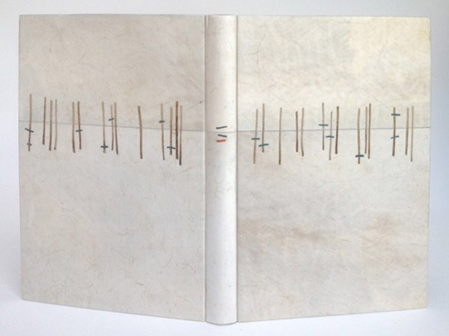
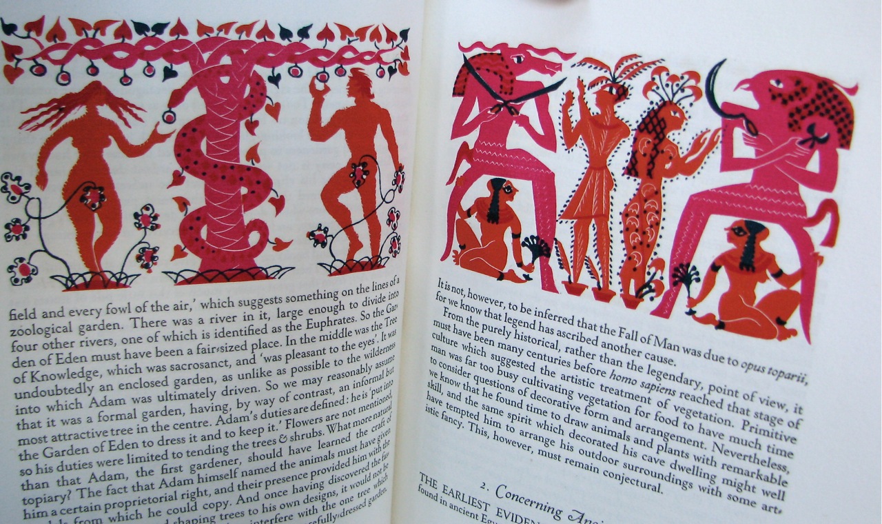
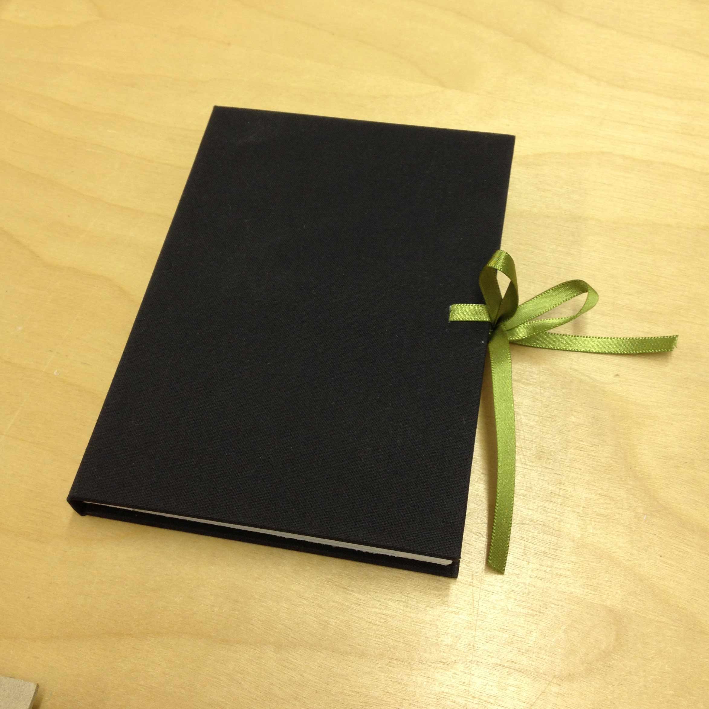
    For the final post, I wanted to highlight one of Lori Sauer’s more recent bindings. Done in 2017, Lori created a binding for Russell Maret’s Linear A to Z. Using an unusual binding style, Lori combine’s vellum and Japanese paper to create a binding that works beautifully with the text’s imagery.

    Russell Maret’s Linear A to Z is a beautifully printed book. And your play on the geometry perfectly harmonizes with the prints in this abecedarian text. Can you talk about the binding structure you used for this binding (particularly the board attachment and how it functions)? Is the vellum limp or over boards?
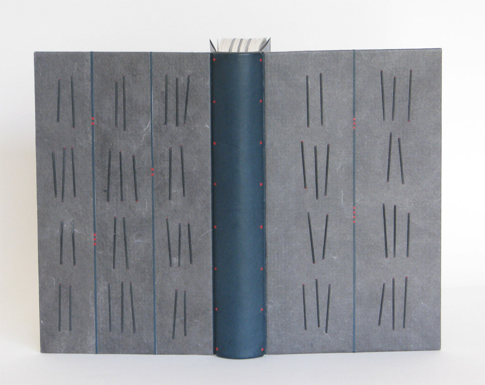
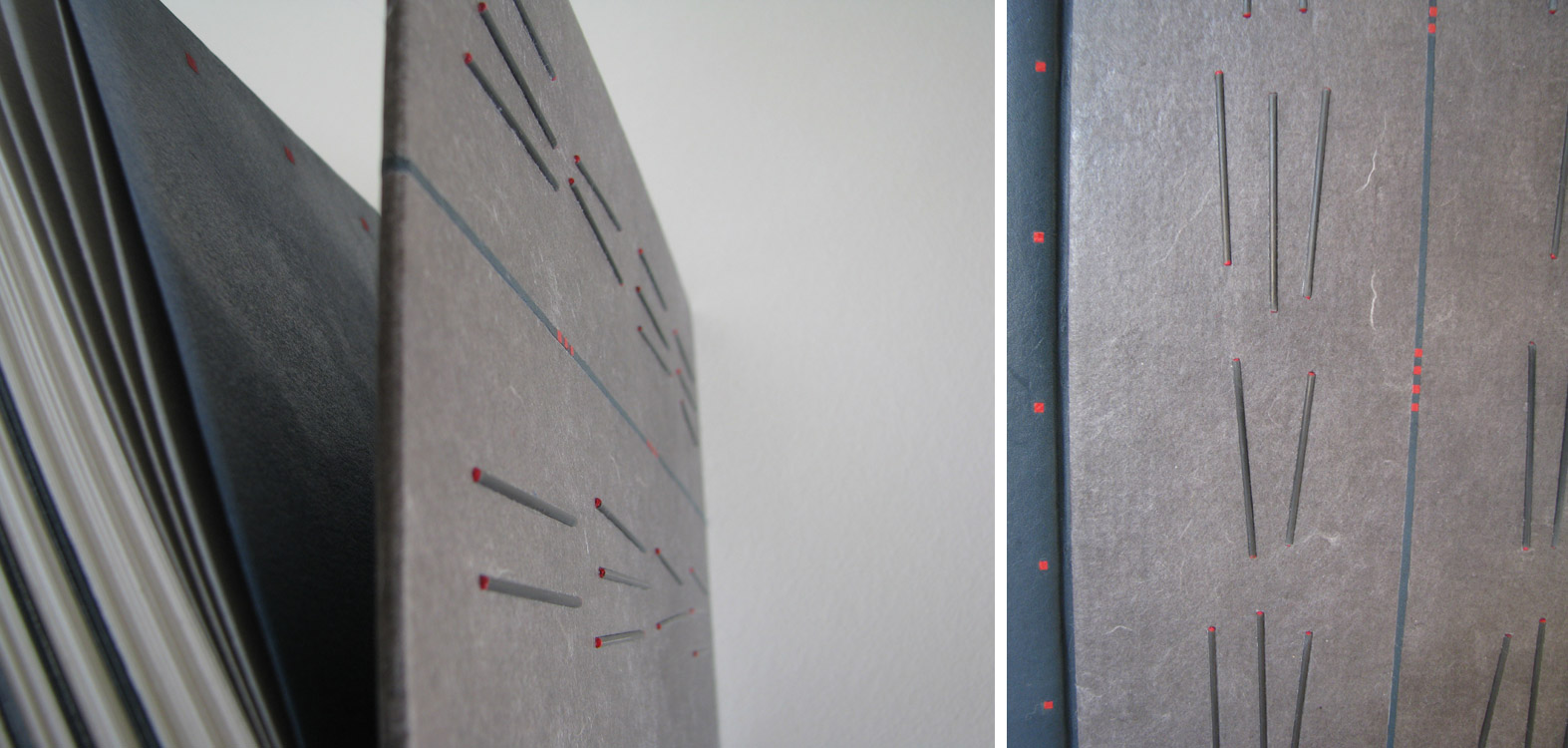
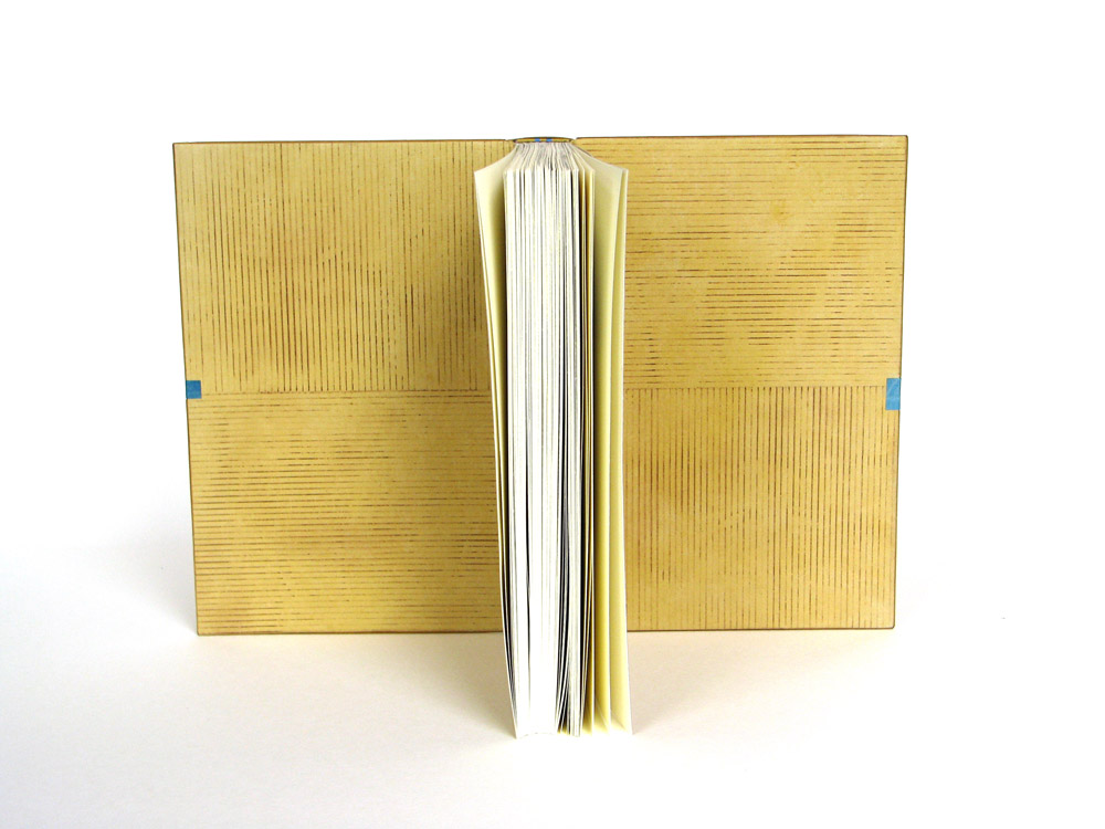
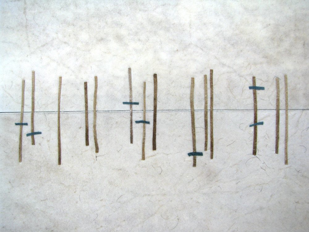
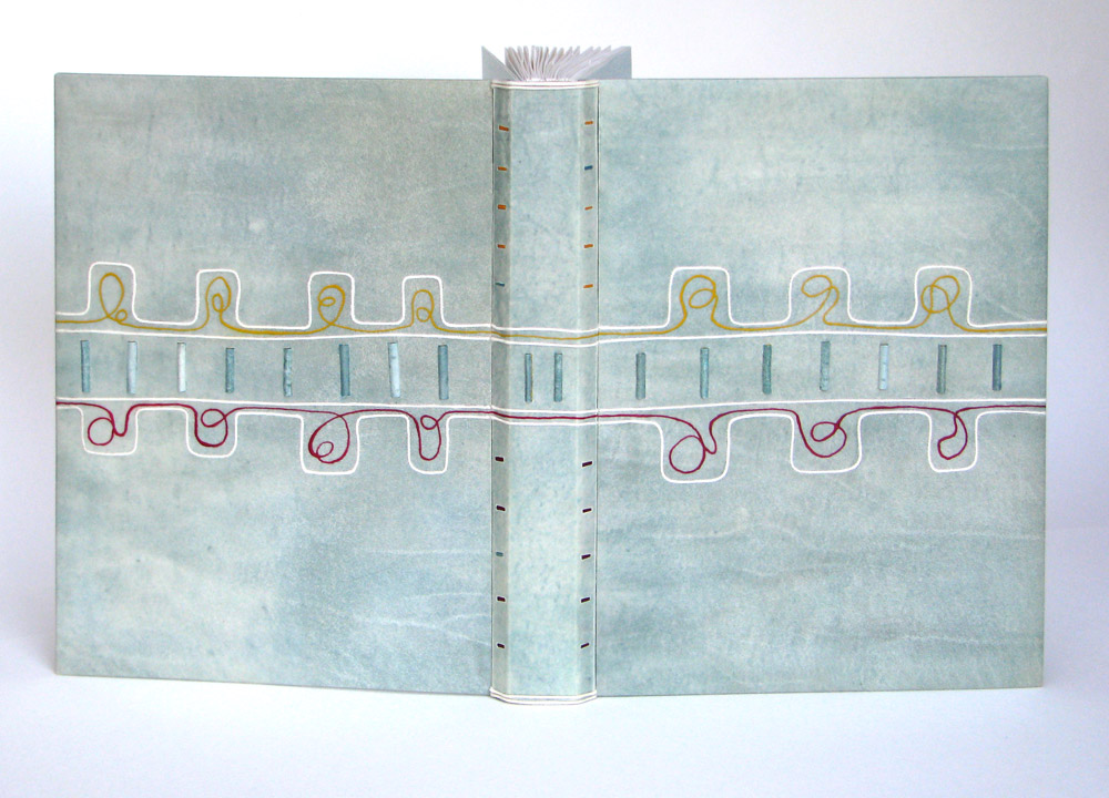
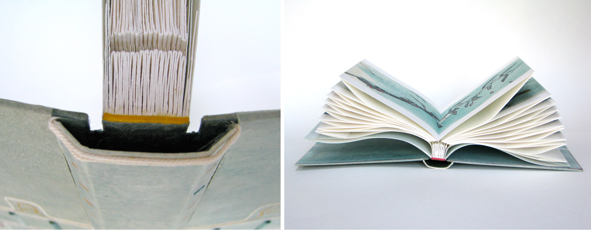
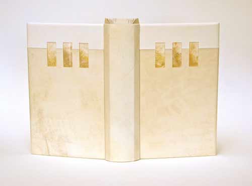
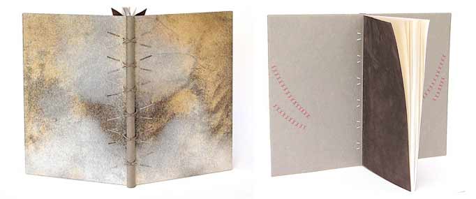
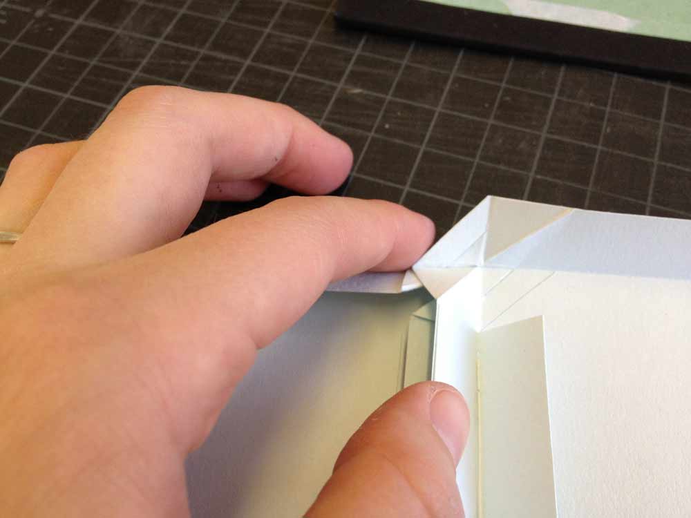
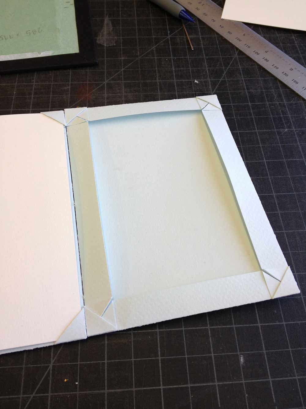
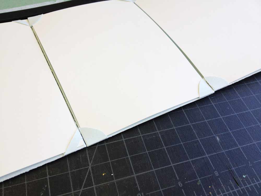
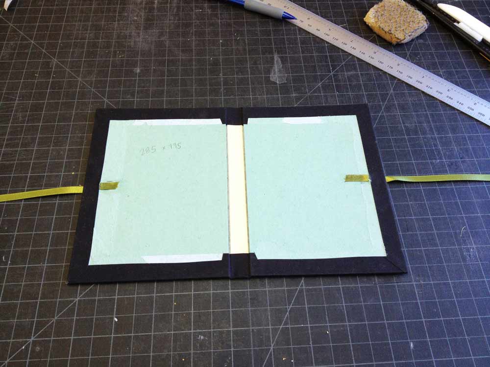
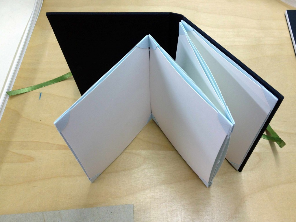
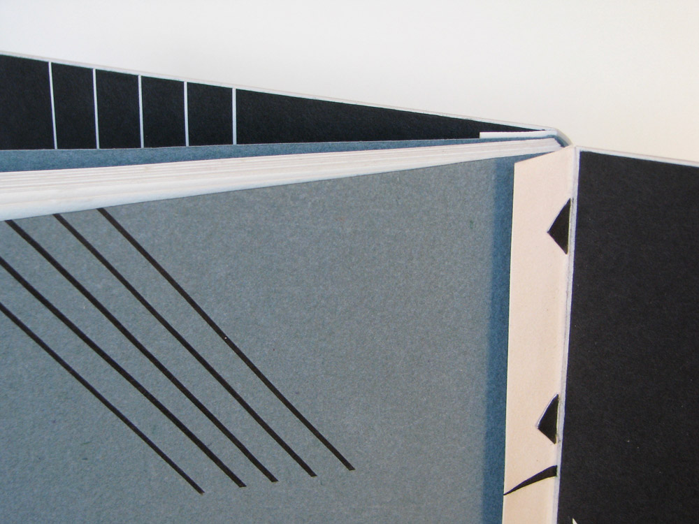
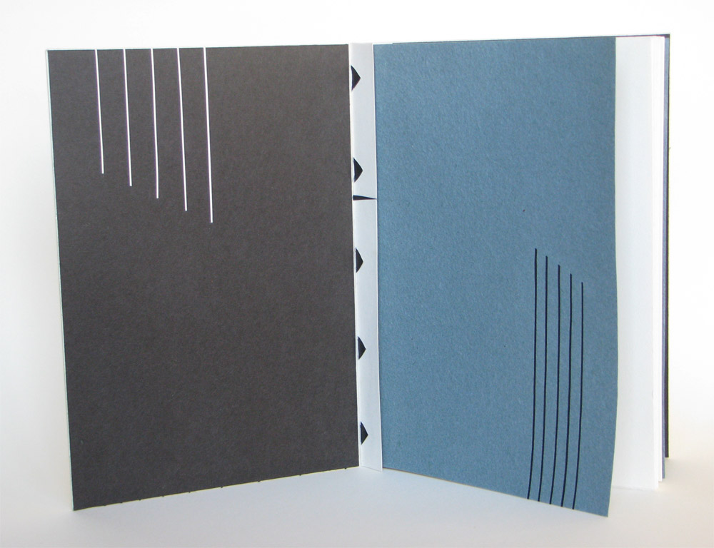
    I don’t know the name of this structure and sadly I can’t remember who showed it to me years ago. I’ll do my best to describe it. The text is sewn on vellum supports that are shaped like a bar with an arrow on each end. They have to be very precisely cut and measured as the bar is the width of the sewn spine plus the thickness of the covering material.

    The three covering pieces, in this case vellum, are cut to size. The spine piece is folded along the joint and the sidepieces are turned-in along the spine edge only. Slits are then cut in to the fold of the spine and folds of the board pieces that correspond to the sewing stations/supports. The ends of the arrows are very carefully fed through the slits. The points of the arrow shape lock the pieces together and on to the text block.

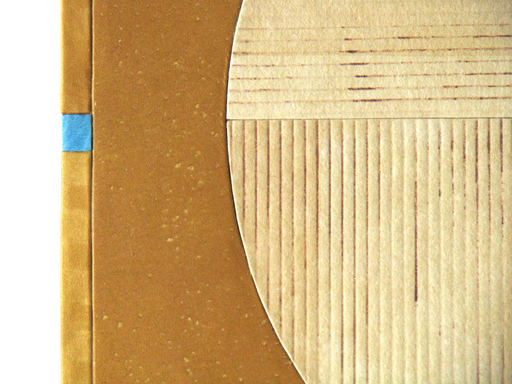
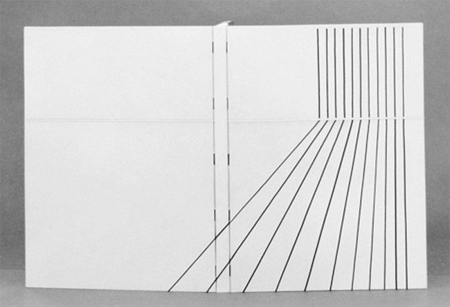
    I then tipped in a thin board to the gutter of the board vellum and drummed the vellum on resulting in a semi rigid cover. The black lines are waxed Japanese paper laid in to embossed lines. The horizontal line is cut in to the board vellum and inlaid with a laminate of vellum and paper.

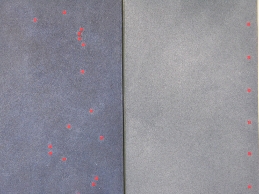
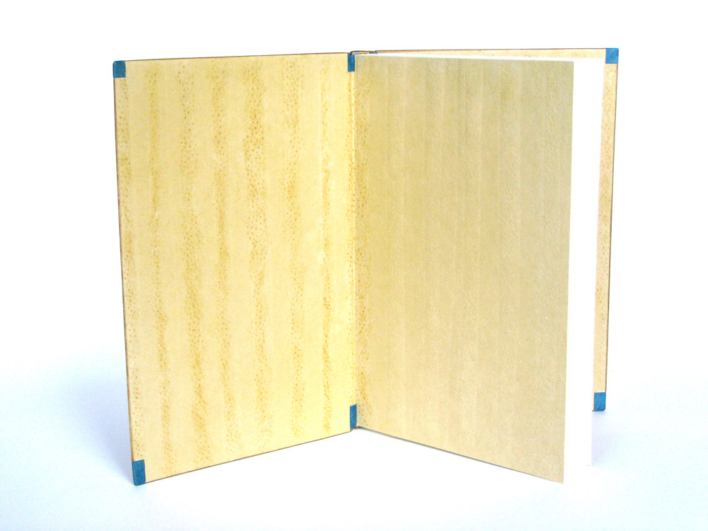
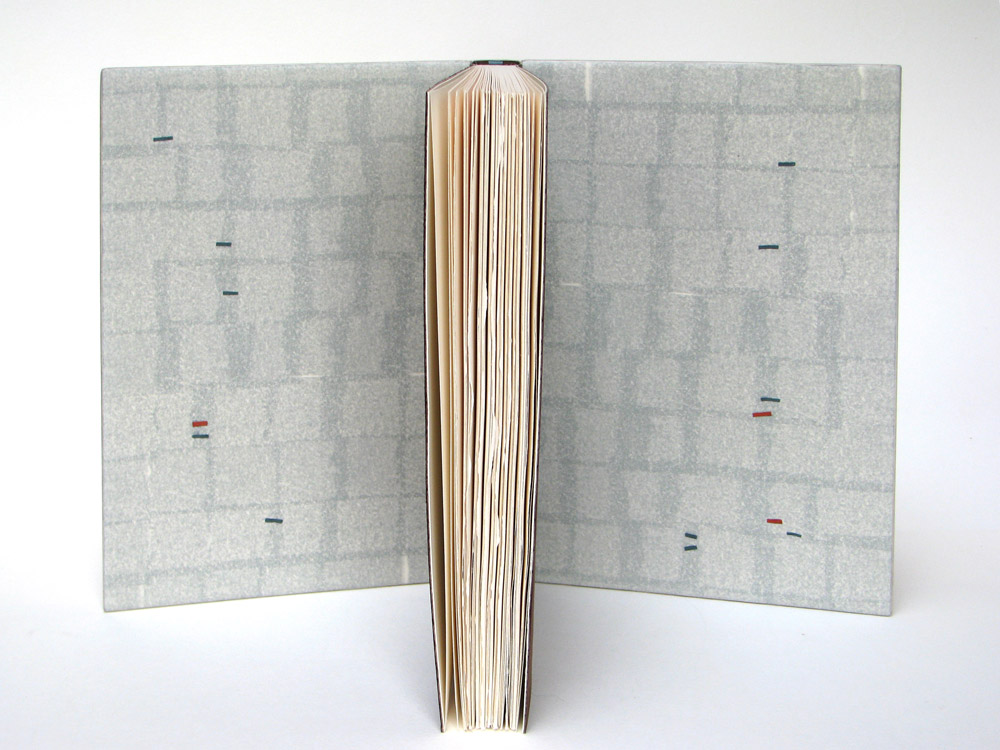
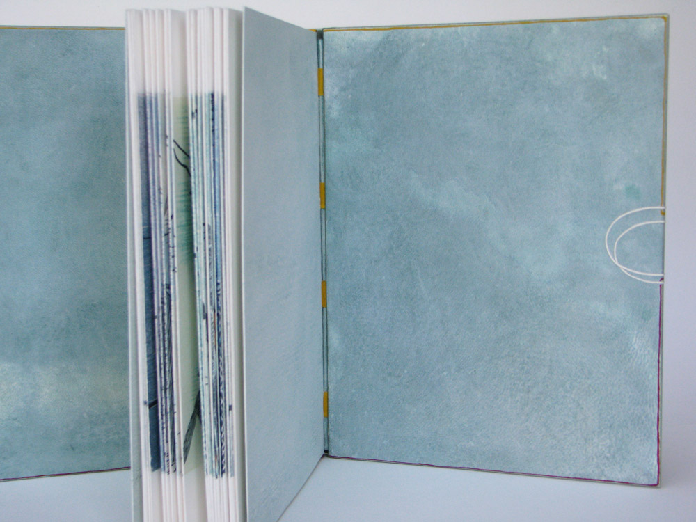
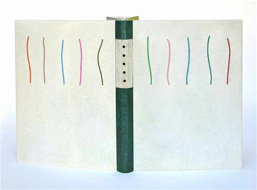
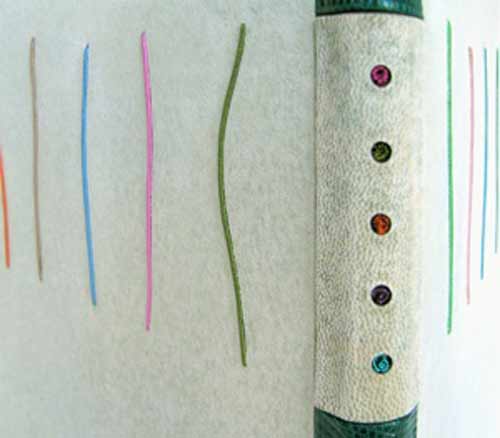
    The doublures and flyleaves have black and white lines that echo the design on the outside.

    This structure can also be done in a single piece. A gusset is then formed between the inner board and text block. I hope I’ve explained this well enough. It’s very hard to describe without drawing some pictures!


  2. Catching Up With Lori Sauer // No. 4

    August 20, 2017 by Erin Fletcher

    In 2016, Lori Sauer was one of six Designer Bookbinder Fellows selected to bind one the six titles shortlisted for the Man Booker Prize. Lori bound Madeleine Thien’s Do Not Say We Have Nothing, which was presented to the author on the night of the award ceremony.

    Your designs are so delicate, but have the power to capture deep emotion. Each element feels meticulously planned and placed in perfect harmony. Can you go through the stages of planning for Do Not Say We Have Nothing, specifically touching on the placement of the small red pieces?
    This is a binding done for the Man Booker Prize shortlist, work that always has a very tight deadline. I loved the novel, an epic tale spanning three generations of two separate families, who lived through a turbulent time of Chinese history in the mid twentieth century (the Cultural Revolution through to Tiananmen Square). There is a book within the book, called The Book of Records that ties the families and generations together. Classical music also plays a big part, in particular The Goldberg Variations, a piece based on repeated patterns and mathematics.

    I usually tend to work in light and pale colours, my penchant for minimalism. This is the first dark binding I’ve done for a long time but I felt it was needed to capture the psychological temper of the period. All of Chinese society at the time wore uniforms – drab, dark colours with only the Red Guard having something bright.

    With all of these elements stewing around in my mind I begin to sketch and when some of them start to work for me I make paper mock-ups – cutting out the right colours and shapes and moving them about – and take photos of the best compositions. I also work on my iPad with a drawing app. (I like Art Rage). I eventually settle on something that makes my fingers want to start work. Sometimes I settle on a design that’s a very long way from my starting point but I’m not unduly bothered that I move off in a sideways direction, as a good design will stand up on its own.

    The final design is my visual solution to a novel about music, the passage of time, families and Chinese writing.

    You’ve asked specifically about the small red dots. The ones on the outside (leather, shown above) were placed for compositional balance and add a necessary shot of colour. The dots on the doublures (paper, shown below) were very randomly applied. I worked instinctively and fairly quickly here and photographed a pattern I liked so I could use it for reference when gluing them down later.


  3. Catching Up With Lori Sauer // No. 3

    August 13, 2017 by Erin Fletcher

    Lori Sauer bound The Moonstone by Wilkie Collins in 2015, just three years after it was published by Arion Press. This limited edition includes illustrations by Stan Washburn. As Lori mentions below, she split the text into two volumes, creating two fine bindings that compliment each other beautifully. Each binding is covered with calfskin and decorative handmade paper.

    Can you talk about your use of materials and how they connect to the text? Which elements are paper and why use paper over another type of material?
    Relating a material to a text is not something that I ever find myself mulling over. In rare cases one might pick wood for a book about wood, etc., but in the majority of cases leather is used, as convention. I’ve moved away from leather and now mainly bind in vellum because it’s so beautiful. Just to break out from my habit I bound this one in calfskin and paper. The calfskin because it has no grain and paper because I’ve always wanted to use it as major material for a design binding. I’ve always had the feeling (perhaps I’m wrong here) that paper is not considered appropriate for serious work. But it has a longer shelf life than leather, is open to a wide range of decorative treatments and I haven’t met a binder yet who isn’t besotted with it.

    The circular shapes are paper and the area around the circles is calfskin. The paper is a heavy weight Griffen Mill, specially made for a commission I did and these are some of the off-cuts. The pieces have been tinted with watercolour to achieve a range of neutral shades. The leather has been sanded over the top of a pimply surface to create texture.

    This is a very long novel with many characters and lots of narrative layers. There were a number of key scenes set on some shifting sands, a metaphor for the quasi-surreal nature of the plot. My colour choice came from this and also why I wanted to use a variety of textures/materials.

    This is a single volume production (Arion Press) but I decided to split it in to two bindings because I find very thick books rather clumsy. It worked out well to divide it because of how Collins had structured the story into two sections. I liked doing a pair of complimentary bindings, as I was able to use more than just one of the many compositions I had played around with.

    Shown below are the two interior views of each volume. 


  4. Catching Up With Lori Sauer // No. 2

    August 6, 2017 by Erin Fletcher

    Lori Sauer bound this Arion Press edition of Robert Louis Stevenson’s The Silverado Squatters in 2014. The book is bound in vellum with decorative elements in Japanese paper.

    I really love your use of materials on this binding. It offers a peaceful and calming interpretation of the Napa Valley landscape portrayed in this classic travel memoir. Can you speak about how you covered the book in vellum? Is the division created by using two separate pieces of vellum or through a decorative application?
    R.L. Stevenson is in the top five of my favourite authors and I’ve bound quite a few of his works. This one from Arion Press has sepia toned photographs from central California as illustrations. Bindings for books with images present a particular set of challenges. I never attempt to reproduce an illustrator’s work in a design but will do my best to capture the tone or mood. With this piece I used both the serene quality of the photos along with Stevenson’s literary style to guide me. Stevenson’s prose reads with such ease and grace, something that is incredibly hard to do. I’m pleased that you’ve picked up on this!

    Each piece of vellum (two on each board) is lined with a slightly different shade of backing paper in order to give a very subtle shift in colouration. The pieces are turned in on their meeting edges so that the line between them is clean and soft.

    The vertical lines are Japanese paper, onlaid in to pressed grooves.

    What technique did you use for the decoration on the doublures?
    I did an iPad ‘painting’ to create the doublures and inkjet printed them on to hand-made paper. (I like this technique very much and need to remember to do it more often). I then applied small pieces of Japanese paper and these were back sanded before I stuck down the doublure. Very subtle marks are made by the onlays on the suede flyleaves.


  5. Catching Up With Lori Sauer // No. 1

    August 1, 2017 by Erin Fletcher

    I first interviewed Lori Sauer for the blog back in March 2013. I thought it might be time to check in and see what new bindings Lori has created over the past four years. Over the month of August, I’ll be featuring five of Lori’s more recent bindings. Let’s begin with a book Lori bound in 2013, a copy of A Line illustrated by Suyeon Kim.

    A Line was published by Incline Press in 2009 and is an illustrative narrative of linocut prints by Suyeon Kim depicting the companionship between a blind fisherman and his dog. Lori bound her copy in the dos rapporté structure with dyed vellum. Lori adds decorative elements with twine and ink.

    I love the playfulness of the cover compared with Suyeon Kim’s linocut prints. How did you manipulate the vellum to achieve a hazy water-like quality?
    I love this book, no text, just a narrative in images. The images veer off in to fantasy, a bit like a Chagall painting, and are full of warmth and charm.

    You asked about the vellum – I dyed it. I buy very clear and clean white skins for this and interesting markings appear with the dye (I use watered down FW acrylic inks). I start with dying the flesh side as it soaks up moisture better. If I need to I’ll wipe some of the ink on the hair side too. The first pieces I coloured for this weren’t exactly right so I did a second set. I ended up using the first set as doublures. I can go through a lot of vellum this way in order to get the right shade but the rejects always get used up eventually.

    Are the red and yellow lines actual threads running across the binding? If so, how are they adhered to the vellum covers?
    The red and yellow lines are also acrylic ink, applied with a nib. The white line is inlaid string.

    I’ll also say that the book is printed as a concertina and folds out to seventeen feet, I think. It was pretty badly folded so I had to fiddle quite a bit to get the edges to line up. I decided that it would be rare or never that someone would open it all the way so I attached guards on the reverse to keep it like a conventional book. I then used a stub for the spine so that the pages would fan open. The physical result ties in well with the playfulness and watery theme of the images.


  6. Bookbinder of the Month: Lori Sauer

    March 31, 2013 by Erin Fletcher

    topiary-lorisauer

    Topiary by Cecil Stewart is about the art of clipping and sculpting foliage to maintain a clearly defined shape, like a geometric design or animal. In 1936, Topiary was published by Golden Cockerel Press in a limited letterpress edition on handmade paper with whimsical illustrations by Peter Baker Mill.

    topiary illustration

    In 2011, Lori Sauer completed a binding of Topiary in the dos rapporté structure. The binding is covered in reverse vellum dyed with leather dye. The spine is made up of 3 pieces covered in lizard skin and reverse goat. The boards have inlays of wire wrapped in silk and the spine has colured wire coils placed in cutout holes. The doublures and flyleaves are Japanese paper; the flyleaves have cutouts and ink decoration.

    The design is based around the layout of the text and the colours used in the illustrations.

    topiarydetail-lorisauer


  7. Bookbinder of the Month: Lori Sauer

    March 24, 2013 by Erin Fletcher

    glassroom-lorisauer

    The Glass Room by Simon Mawer is a novel about a Jewish family and the house they built in Czechoslovakia prior to WWII. The house is based on the Villa Tugendhat, designed by the architect Mies van der Rohe in Brno in the late 1920s. The building was inscribed on the National List of Cultural Heritage in 1969 and after renovations is open to the public. The story in the novel details the plight of the family as they are forced to leave the country and the subsequent uses their house was put to.

    In 2009, Lori Sauer bound The Glass Room for the Man Booker Prize. The binding is a dos rapporté structure and is covered in two shades of vellum. The Perspex (also known as Plexiglass) inlays have dyed Tyvek underneath to simulate onyx. Lori had wanted to use real onyx as it was a major feature in the house, but the cost of having it thinly sliced for inlays was too high. The onyx wall is located in the living room of the house and is partially translucent, changing its appearance with the evening sun. The doublures are dyed Tyvek made to look similar to veins in onyx.

    The house and its design dominate the novel. It is a very modern building with large rooms and lots of glass. Built when art deco was at its peak, Lori chose to design a binding around the motifs and in the spirit of the architecture.


  8. Bookbinder of the Month: Lori Sauer

    March 17, 2013 by Erin Fletcher

    brothergiles-lorisauer

    This book was bound in 2009 by Lori Sauer as a modified sewn-board binding with a wooden spine. The boards are covered in natural vellum and the spine is attached with threads and vellum strips that are laced into the boards. I find the unusual pattern of the vellum to be quite alluring; it adds a great amount of depth and texture. The doublures are Japanese paper with suede flyleaves. The doublures are embroidered with silk in a crosshatch motif, inspired by the method used in the illustrations.

    brother giles illustrations

    The Life and Chapters of Sundry Goodly, Sayings of the Teachings of Brother Giles was printed by the City of Birmingham School of Printing in 1941 with illustrations by Neil Leitch MacCuaig. The book is comprised of wise words and sayings by a companion of St Francis, Brother Giles. 


  9. Bookbinder of the Month: Lori Sauer

    March 10, 2013 by Erin Fletcher

    water-lorisauer

    The first Designer Bookbinders International Competition was organized in conjunction with the Bodleian Library in 2009. Each binder involved submitted a binding of the set book Water, which is a collection of poems and illustrations based on the theme of water. The set book was published by Incline Press in a limited, letterpress edition.

    In 2008, Lori Sauer bound a copy of Water as a stub binding covered in three stages: the spine attached first with the covers stuck on afterwards. The binding is covered in white vellum and the surfaces are decorated with impressions of circles that sit on a graphite grid. The rear board has pairs of circles and the front has single, larger circles. Onlaid colored circles run down the length of the front board. The spine has a pattern of plus symbols. The doublures are Fabriano Roma.

    Lori describes the text as being filled with a myriad of styles of illustrations and poems from different writers, adding to its broad theme. The circles of her design are simply the symbols for the chemical composition of water, two hydrogen atoms plus one oxygen. The onlaid colored circles on the front cover were added a couple of years after completing the binding as Lori felt a focus was needed to the design. I certainly think the addition of the circles offers a focal point to the viewer, then you slowly begin to realize the complex pattern of lines and circles underneath. 


  10. My Hand: Skype Workshop with Benjamin Elbel

    March 4, 2013 by Erin Fletcher

    shrigley2-erinfletcher

    When I was presented with the challenge of binding a book for a set of photography prints that would need to open flat, I sent my former instructor, Jeff Altepeter, an email to help me brainstorm. After discussing a few options, I received another email from Jeff showcasing the upcoming workshops at BINDING re:DEFINED. All of the workshops looked intriguing, but Benjamin Elbel’s Onion Skin Binding and The Shrigley appeared to be suitable solutions for my current project.

    My only problem was being in Boston and wanting to take a workshop in England. I contacted Benjamin through the help of Lori Sauer (who runs BINDING re:DEFINED and will be featured on my blog through the month of March). Benjamin and I decided to experiment and run the workshop through Skype (a recent topic of interest on the Book Arts Listserv).

    The workshop was based on The Shrigley structure and ran for 2.5 hours over 2 Skype sessions. The initial session was half an hour long. During this time I received instruction on creating the folded frames and cutting the corners. Benjamin had a camera set-up directly over his workspace and it was incredibly easy to see what he was doing. Our connection never lagged and the video image stayed clear, making it easy for me to read any measurements or notes that Benjamin jotted down. 

    shrigley7-erinfletchershrigley8-erinfletchershrigley6-erinfletcher

    During our second session, Benjamin walked me through the sewing and a simple hardcover case to house the frames. We did a pamphlet stitch to connect the frames in a concertina style. The case was constructed with two pieces of millboard and a thin, flexible spine piece covered in cloth. Ribbon was inserted into the boards to aid in the closure of the book.

    shrigley4-erinfletcher

    Once the cloth lining was pasted in, the frames could be fixed to the case. Overall, I think the workshop was successful. It was easy for me to follow Benjamin’s instruction. However I had made a mistake while folding my frames, which I didn’t realize until the near end of the workshop. In hindsight, we discussed the importance of reviewing my work before proceeding to the next step. In order to do this with the built-in camera I was using on my laptop, I would have to hover my work in front of the camera and move it around so Benjamin could assess what I had done. 

    shrigley3-erinfletcher

    I think performing workshops through an online interactive video platform such as Skype or Google Hangout could serve as a viable way for bookbinders to connect and spread their teachings further through the community. There are still some kinks that need to be worked out. I know within the Listserv there has been some discussion regarding this topic, but I would love to hear your opinions and whether you’ve been on either end of an interactive video workshop.


  • My name is Erin Fletcher, owner and bookbinder of Herringbone Bindery in Boston. Flash of the Hand is a space where I share my process and inspirations.
    The StudioNewsletterInstagramEmail me
  • Archives