RSS Feed

Posts Tagged ‘tini miura’

  1. Bonus // Bookbinder of the Month: Tini Miura

    October 25, 2015 by Erin Fletcher

    YouCanJudge-TiniMiura

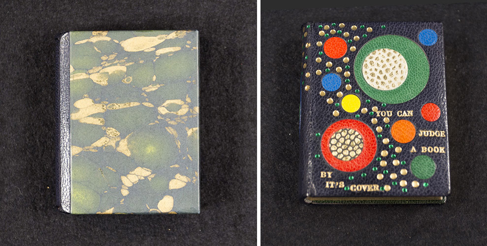
    In a recent competition put on by the Washington University Libraries Special Collections, the public was encouraged to judge books by their covers and cast their vote for favorite binding. Fittingly, the book being bound was Bernard C. Middleton’s You Can Judge a Book By Its Cover, which was published by Mel Kavin and designed by Ward Ritchie in miniature form back in 1995 (which is presumably around the time it was bound as well).

    The first book of this edition was designed and bound by Tini and Einen Miura and printed by Henry Morris. Later on, 32 more binders were invited to create their own unique binding and to celebrate the artistry of the miniature book.

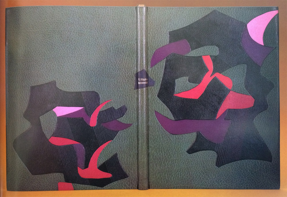
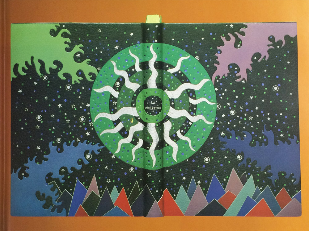
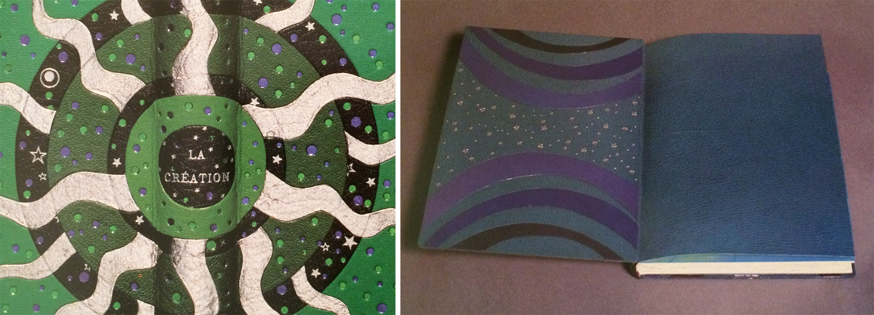
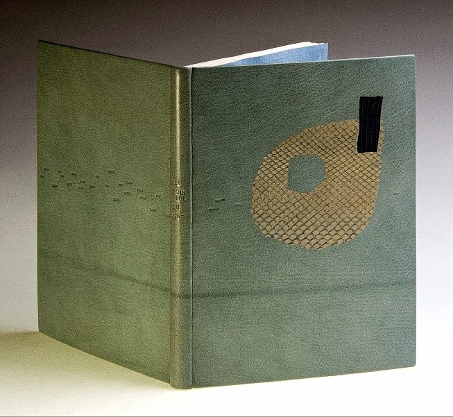
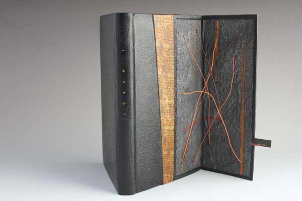
    Tini bound the book in black morocco. She used the onlaid shapes and design to tell a story about the author. The ascending tooled area represents Bernard Middleton’s larger than life character. Running along side this path are circle onlays of various sizes and colors, which show the abundance of information he has shared with the world throughout his professional life.

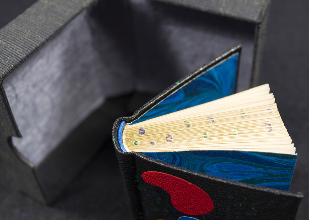
    In the image above, the book is shown on the right with the slipcase pictured on the left. Tini also made a miniature chemise, which would be placed around the book before sliding it into the slipcase.

    YouCanJudge2-TiniMiura

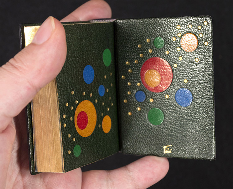
    The edges are gilt and headbands handsewn in colored silk. The doublures, seen above, have multicolored circular onlays and tooling.

    The scale of many of the bindings in your book A Master’s Bibliophile Bindings: Tini Miura 1980 – 1990 are quite large. For the final post in your interview I would like to talk about two miniatures you did for Bernard Middleton’s You Can Judge a Book by Its Cover. What challenges did you come across when scaling down the binding and decorating processes?
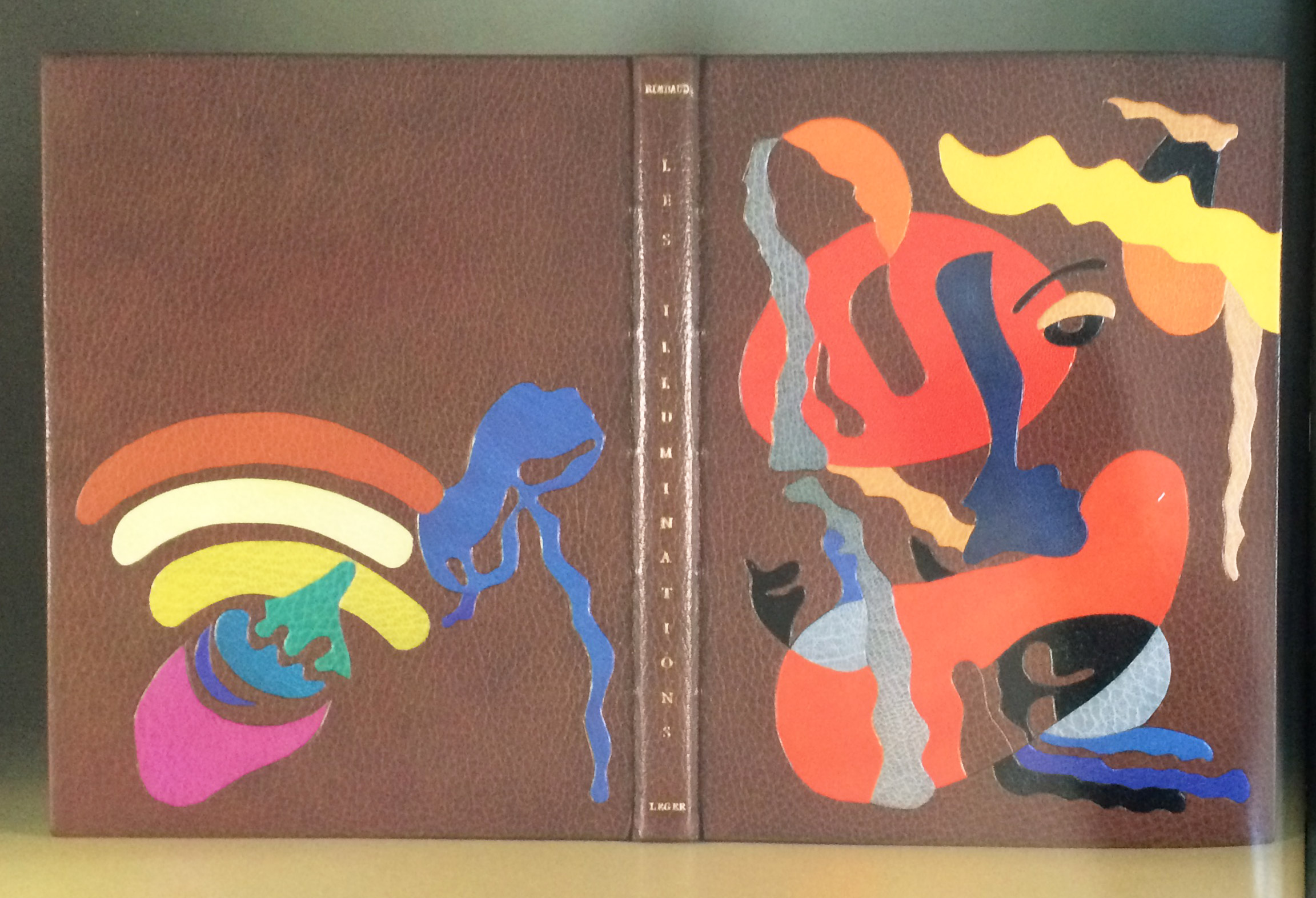
    Usually my books are large, because they are limited edition livre d’artiste. They have signed original images by artists like Picasso, Leger, Roualt, etc. and are extremely expensive.

    I prefer large books that open well and can be enjoyed easily, while lying on a table. Small books have to be held on both sides to keep them open, there is no weight to the text. But I have enjoyed doing some immensely. No change in binding steps for miniatures.

    – – – – – – – – – – –

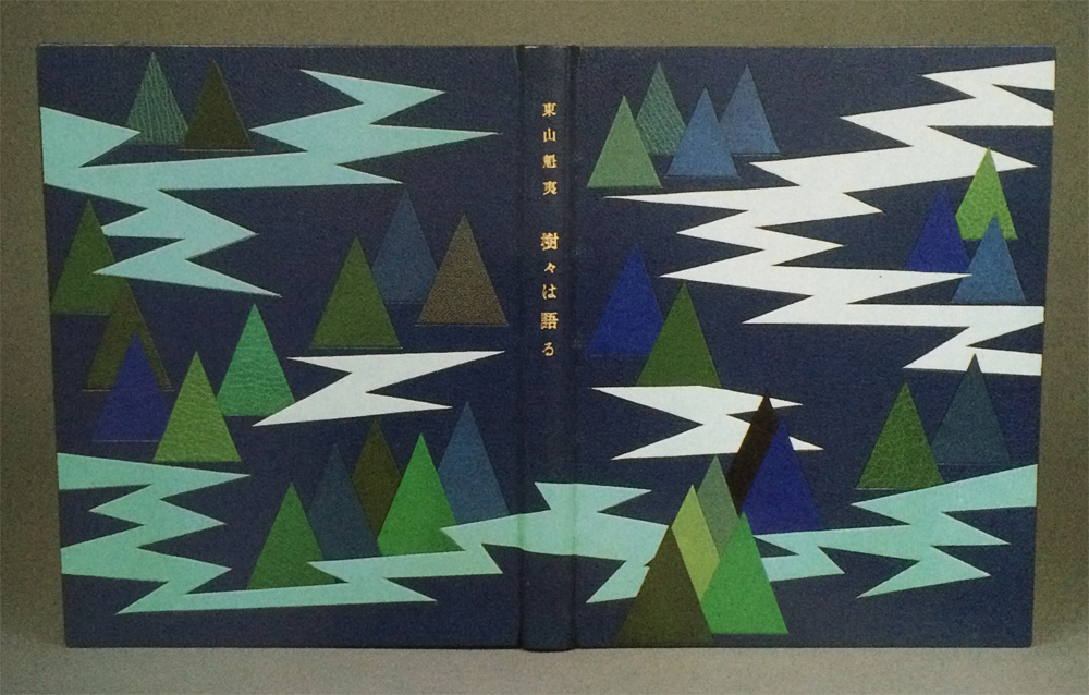
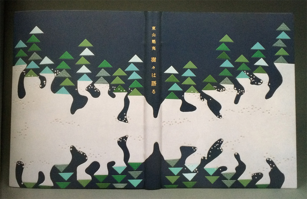
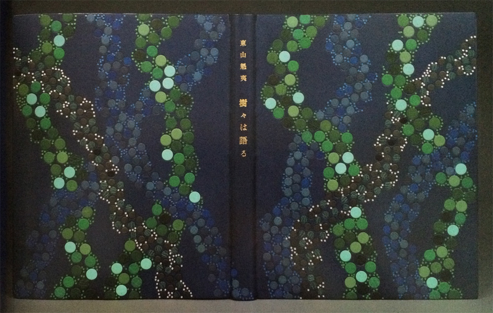
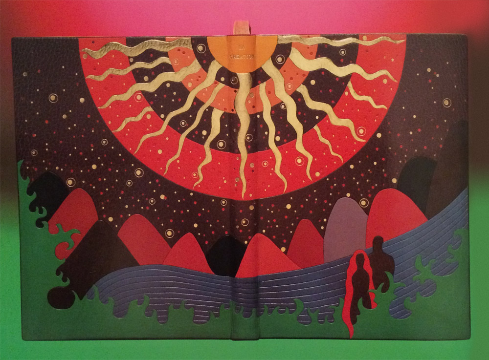
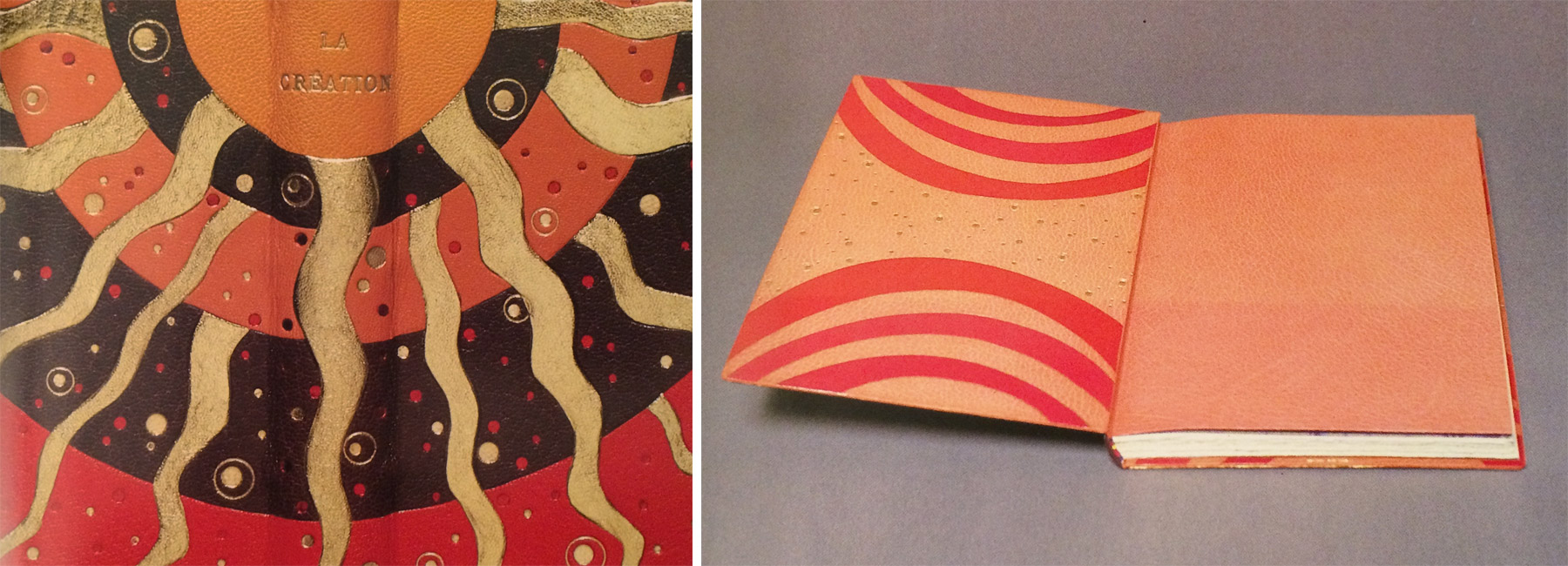
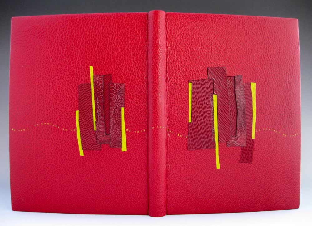
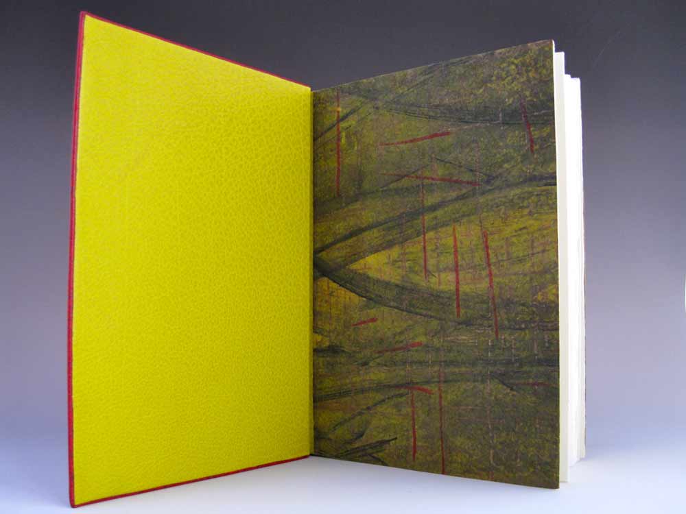
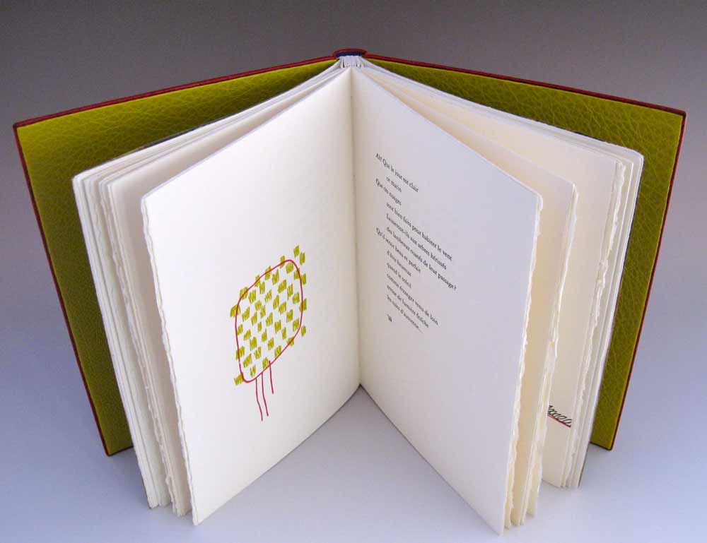
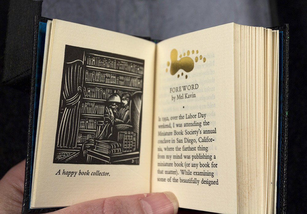
    Tini bound an additional copy of Middleton’s book in black morocco with several colored inlays (inspired by the shape printed at the top of the foreword) and foil tooling.

    YouCanJudge3-TiniMiuraYouCanJudge4-TiniMiura

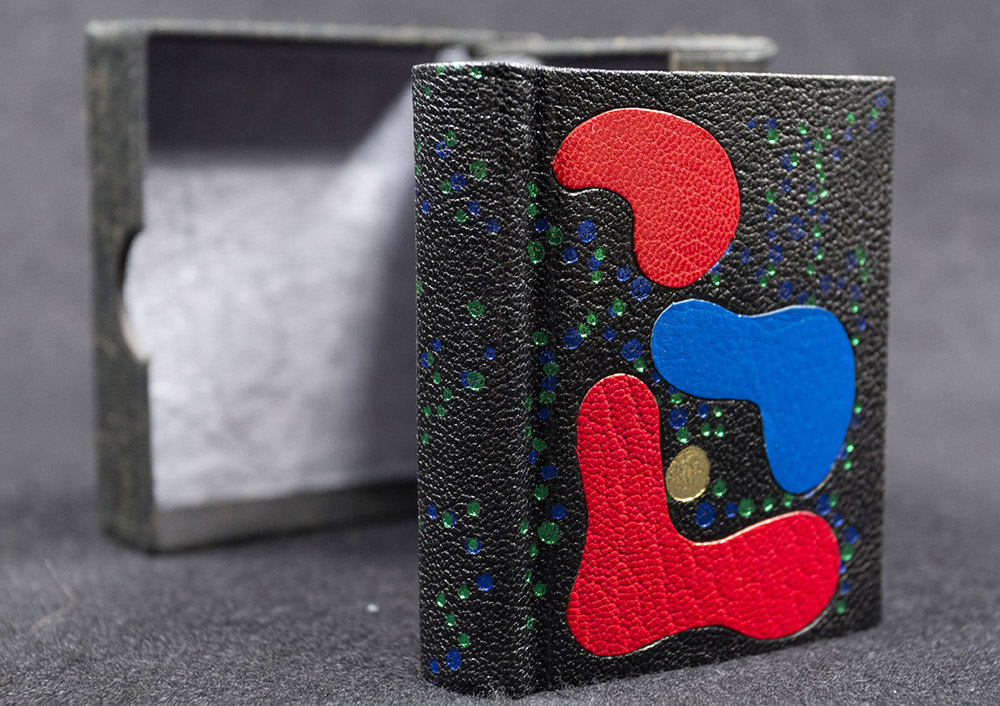
    The edges have been gilt and gauffered with colored polka dots. The endpapers are marbled. The book lives in a small clamshell box.

    YouCanJudge6-TiniMiura


  2. Bookbinder of the Month: Tini Miura

    October 25, 2015 by Erin Fletcher

    Alice-TiniMiura

    Alice’s Adventures in Wonderland is one of those titles that has been bound so many different ways and by so many different binders. In 1983, Tini Miura, added her binding to this list with her brightly colored, kaleidoscopic design for an equally mind-bending story. This particular edition was published by the Pennyroyal Press in 1982.

    Bound in red morocco with several onlays that run the spectrum of color between white and black with tooling in gold and green foil. The doublures are a dark red sheepskin and the edges have been in gilt in the rough.

    I love your interpretation of this book, the design emotes feelings of chaos and helplessness. In many of your designs you incorporate floral elements. What does the flower mean within your designs, specifically for this binding and in general?
    It is a fairytale-like story and the things Alice encounters, like rabbit, teapot, etc. Therefore I chose fantasy flowers to make the whole interpretation happen in a “wonderland”.

    Flowers are a wonder of nature that bring joy – like  beautiful words. They do something to your soul, you feel alive and joyful (colors and music does that to me as well).

    When I do a book and see the design in my head, the design becomes this image which I physically execute. After reading the story, if it is not worldwide known literature, I often understand the design after I read the book. I know that is weird. But I feel it is a present and I don’t ever change or complain – just go with it.

    Another reoccurring design element are the built up areas of tiny tooled shapes, which usually flow across the binding. What can you say about the use of this in your work?
    The small dots or squares are my “Pixie” dust, magic or wonderment in the words or stories.


  3. Bookbinder of the Month: Tini Miura

    October 18, 2015 by Erin Fletcher

    AGlimpseOfThomasTraherne-TiniMiura

    Another one of my favorite bindings from Tini Miura. This edition of A Glimpse of Thomas Traherne includes illustrations by Ann Brunskill and was published in 1978 by The Worlds End Press in London. The design on this binding is like an abstract puzzle compiled of “pieces” that represent parts of Traherne’s poetry to offer a picture of his creativity.

    Bound in 1990 in yellow morocco where each onlay is a single, unique color. The title is stretched across the binding and each letter is created through repetitive tooled dots through brown foil. Tini creatively ties together the title and puzzle by tooling a diamond motif through brown foil strewn in the negative spaces between the onlays.

    This is one of the few examples where the title is transformed into a design element. Can you talk about why for this particular binding, you chose to display the title this way as opposed to using type?
    The colored onlay pieces are freely moving over the surface, like a line of a poem is following the former to make a verse. The overall image represents the several verses that make up the poem.

    If I had used letters, then I would have felt an interruption in the free flow of the onlay “verses”. The “dotted” words of the title are, so to speak a “miniature” image of the flowing line of colored “verses”. Kind of two interpretations of the same idea – making spoken words visible, like the vibrations of energy they are.

  4. Bookbinder of the Month: Tini Miura

    October 11, 2015 by Erin Fletcher

    LesIlluminations-TiniMiura

    I think this binding from Tini Miura of Les Illuminations by Arthur Rimbaud and is one of my favorite bindings in her portfolio. Published in 1949, this edition includes illustrations by Fernand Leger. Bound in 1985, the book is covered in brown morocco and includes a series of colorful onlays. The title and last names of the author and illustrator are gold tooled onto the spine. There are also a few subtle blind tooled lines within the design on the front cover.

    Tini embraced the range of colors from Leger’s illustrations, which reflect the visual impact of Rimbaud’s poetry.

    I also wanted to include Tini’s binding of Miennes by Tristan Tzara in this post because of its visual similarity to her binding of Les Illuminations (in that they are both unique to her typical way of designing).

    Miennes-TiniMiura

    Bound in 1989, this book is covered in grey morocco with onlays in black, purple, red and pink leather. The title and author are gold tooled over an onlay on the spine. Tini’s response to the design in her book (A Master’s Bibliophile Bindings, 1990) is as follows:
    The colors and forms express the state of mind in a devastated society after the First World War, when Dadaism’s leader Tristan Tzara rejected the traditional ideas of formal beauty.

    The designs on these two bindings have very unique looks from your other work. Can you talk about the inspiration behind the designs?
    It is difficult to capture an artist’s images without copying him. I try to find spaces between the shapes of their illustrations to honor them and keep the feeling they invoked me.

    Les Illuminations incorporates a wide spectrum of colored leather. Do you dye your leathers to produce the perfect shades or are you sourcing your leather from different tanneries? Do you use a combination of vegetable and chrome-tanned skins?
    I have a large range of leathers, all bought in Paris. I don’t dye them myself for durability reasons.


  5. Bookbinder of the Month: Tini Miura

    October 4, 2015 by Erin Fletcher

    TreeTalks2

    Trees Talk includes the work of Kaii Higashiyama, a highly respected painter in Japan whose work captures the spirit of the four seasons. The reproductions in this book are a collection of trees paired with poetry reflecting the words spoken by the trees.

    In 1985, Tini Miura bound an impressive 23 editions of Trees Talk in full leather decorative bindings.

    The designs are a mix of geometric patterns to more organic shapes, but the color palette is limited to shades of blue and green with pops of pink and neutrals such as white, gray and black. Was it challenging to reinterpret a set of work 23 different ways? Was the assembly done like an edition or did you work on each binding separately?
    This edition is showing the work of Kaii Higashiyame, the most famous Japanese artist when I arrived. The main colors used for this book’s illustrations by the artist were: blues, greens, white on every page. I followed the feeling of these images by mainly using his color range.

    I bound the book during a 4-month period, from book block preparation until covering and another 5 months for the execution of the design.

    I often hear: oh, I can tell your designs are influenced by Japanese art. My professor in Paris complained that my colors were too sad, I had guests who came to my slide shows leave, shaking their heads: too colorful.

    My color choice always has to do with the content (in my mind ) colors in Scandinavia are mainly: blue, green, white, grey, violet….usually the literary themes there are not the same as in Spain for example. Colors in the North of Europe are different than those in the Mediterranean region, so are the feelings evoked by colors.

    TreeTalks7 TreeTalks1 TreeTalks4 TreeTalks3 TreeTalks6 TreeTalks5


  6. October // Bookbinder of the Month: Tini Miura

    October 1, 2015 by Erin Fletcher

    LaCreationBlue-TiniMiura

    La Création (from the Old Testament) is a two volume set and was bound two ways by Tini Miura in 1983. The book itself was published in Paris in 1928 and includes illustrations by François-Louis Schmied. The first book is bound in dark blue morocco. The explosive design was created by using a large collection of colored onlays and platinum tooling. The central design of concentric circles symbolizes the calmness amongst darkness and chaos. Click on the image below to see a detailed image of the design.

    LaCreationBlue5-TiniMiura

    The doublures are a pale blue morocco with cool-colored onlays and platinum tooling. The fly leaf is one of her recognizable oleaugraphs (more on that in the interview below).

    LaCreationRed-TiniMiura

    The second binding in La Création is equally expressive, but designed in a warmer palette eluding to the birth of life. This binding contains the suite of illustrations by F.L. Schmied in black and white and is bound in a wine colored morocco. An impressive collection of onlays create the pictorial design along with another explosive central design similar to the first binding. Small tooled shapes are speckled across the background and emphasized with gold and red foils.

    LaCreationRed3-TiniMiura

    The doublures are created in a similar fashion to the other binding using pink morocco and onlays in rose. The tooling is completed with gold foil.

    I think it can be tricky to create a cohesive and attractive design when adding multiple layers of color and tooled elements. Your interpretations of La Création are an example of when this design strategy is successful. When you are building designs this complex, where do you begin? Can you walk through your process for laying out your designs in leather?
    I saw the image in my mind and understood this was from the old testament: In the beginning………The word created the vibrations which are spreading throughout our universe.

    1. I begin with the idea sketch, indicate colors, shapes etc.
    2. make a scale to scale drawing, indicate numbers of lines and curves from the set of the gilding tools
    3. transfer this design onto a long fiber Japanese paper
    4. attach this Japanese paper
    5. begin the tracing using my warm tools through the paper
    6. remove the paper, begin deepen the impressions
    7. moisten parts of the leather, using a warm gilding tool “ crushing” the deep leather grain to a solid line by gradually increasing the temperature and pressure. ( to have an uninterrupted gold line all grain has to be “ crushed “ to a level where no hight differences exist.)
    8. onlay: thinly pared leather is wetted, placed over the shape it is meant for, tapped down by using a soft brush as not to tear or stretch the shape, using a warm gilding tool follow the lines, remove the leather, let dry between board, when dry, cut desired shape holding a penknife at an 45 degree angle. Roughen the form on the original leather on the book with dull side of binders knife for a better hold. Paste out the onlay, wet the roughened shape, paste onlay. down. Press under a thin Japanese paper with fingers or flat hand, pick up excess paste, trace outlines, let dry under weight.

    – – – – – – – – – – –

    Tini Miura became a household name during my time at the North Bennet Street School. Our instructor, Jeff Altepeter, was taught by her while at the American Academy of Bookbinding and so her techniques would emerge into demonstrations every once in a while. For the interview this month, I’m going to be mainly focusing on bindings from her book A Master’s Bibliophile Bindings: Tini Miura 1980 – 1990. This book was my first exposure to her work and when I first fell for her expressive and colorful designs. Tini has had a long and prolific career as a binder and teacher, so I hope you enjoy her responses on those experiences.

    Check out the interview after the jump and make sure you come back during the month of October for even more enlightening responses regarding a selection of Tini’s work. You can get email reminders by subscribing to the blog, just click here.

    read more >


  7. March // Bookbinder of the Month: Lang Ingalls

    March 1, 2014 by Erin Fletcher

    LaCouleurDuVent-Lang Ingalls

    At this point I think it’s safe to say that I have found the recent ARA-Canada exhibition La Couleur du Vent to be filled with many beautiful and inspiring bindings. This particular binding was created by Lang Ingalls and is the fourth binding from the exhibition to be featured on the blog (the other three: Sonya Sheats, Coleen Curry and Karen Hanmer).

    So in case you missed those three posts I highly recommend you check them out after reading this one, but first let me summarize the exhibit. This international design binding exhibition was put together by ARA-Canada in partnership with École Estienne in Paris. The exhibition started in 2013 in Paris before traveling to Quebec then Montreal (which ended on February 28th). The show will continue to travel during this year, showing in Trois-Rivières from March to April. La Couleur du Vent is a collection of poems by Gilles Vigneault, illustrated and designed by Nastassja Imiolek under the artistic direction of Cécile Côté.

    Let’s get back to Lang’s binding. The set text is bound in the French technique using sea foam blue goatskin. On the front cover are inlays of python and lizard. A series of irregular shapes are tooled blind and span across the full length of the binding with the title also tooled blind on the spine. What I love most about this binding (besides the superb color choices) is the bold inclusion of the spine. Lang so wonderfully highlights the material and uses the natural elements of the leather to create an even more compelling design.

    This binding is stunning. The design you’ve created really celebrates the natural qualities of the materials. Can you talk about your concept behind the design?
    I bought the python and lizard used for the inlays in Paris years ago, but really love the texture and color of them — I tend to make monochromatic color choices in my books, this one is an example of that.

    – – – – – – – – – – –

    I chose to interview Lang for a few different reasons. Her work has been and continues to display thoughtful experimentation and courage with her materials. Her designs continue to engage and perplex me. She’s also just a wonderful person to be around. Lang is part of a handful of people I look forward to seeing once a year at the Guild of Book Workers Standard of Excellence Conference. Lastly, Lang’s educational experiences have greatly differed from my own. Since graduating from North Bennet Street School and having the opportunity to study with various guest instructors I’ve come to value the importance of creating what Lang describes as a ‘tool box’: gathering techniques on structures and decoration from binders with various talents and backgrounds.

    After the jump is my interview with Lang, it discusses heavily her varied educational experiences. Every Sunday this month I will feature some more of Lang’s bindings, so don’t forget to email subscribe and receive reminders when posts go live. You won’t want to miss out!

    read more >


  8. July // Bookbinder of the Month: Coleen Curry

    July 1, 2013 by Erin Fletcher

    lacouleurduvent-coleencurry

    Coleen Curry was amongst the talented bookbinders who participated in the ARA-Canada exhibit La Couleur du Vent, an international design binding exhibition starting in Paris before traveling to Quebec in September 2013 and then Montreal in November 2013. La Couleur du Vent is a collection of poems by Gilles Vigneault, illustrated and designed by Nastassja Imiolek under the artistic direction of Cécile Côté. If it sounds familiar, I posted about this exhibition during last month’s interview with Sonya Sheats

    Coleen bound this copy of La Couleur du Vent as a ‘Montage sur onglets’ style so the prints would not get lost in the gutter. The term ‘Montage sur onglets’ refers to the signatures being sewn on stubs to release them from the confines of the gutter and offering a less restricted opening. Sewn on cords with laced-in boards, the book is bound in red water buffalo with chartreuse water buffalo edge to edge doublures. Exotic leather inlays of varying depths decorate the front and back covers. Title tooled with gold foil. The flyleaves are decorated papers made by Coleen. 

    A brief explanation about the design from Coleen:
    The colors match the prints in the book.  I took some of the shapes from the prints and altered them to create a feeling of blowing in the wind and to create movement.

    lacouleurduvent2-coleencurry lacouleurduvent3-coleencurry

    Coleen’s work has been on my radar ever since I came across her binding of Toni Morrison’s A Mercy at the Chicago Public Library’s exhibition One Book, Many Interpretations in 2011. I attended the opening reception not only because I love design bindings, but to see my own binding of Arthur Miller’s The Crucible. This was the first time I had a binding on exhibit and I was quite honored to be on display with so many other talented binders.

    A Mercy by Toni Morrison bound by Coleen Curry

    A Mercy by Toni Morrison bound by Coleen Curry

    Coleen’s work masterfully mixes traditional leathers with some non-traditional textures such as exotic leathers, agate, and horsetail (to name a few). But I am more attracted to Coleen’s brilliant use of color; either by adding pops of color, subtle hints or just out-right all-over bold color palettes. 

    Read the interview after the jump and come back each Sunday in the month of July to view more gems from Coleen’s portfolio.

    read more >


  • My name is Erin Fletcher, owner and bookbinder of Herringbone Bindery in Boston. Flash of the Hand is a space where I share my process and inspirations.
    The StudioNewsletterInstagramEmail me
  • Archives