RSS Feed

January, 2014

  1. Book Artist of the Month: Mary Uthuppuru

    January 27, 2014 by Erin Fletcher

    UndefinedLines4-MaryUthuppuru

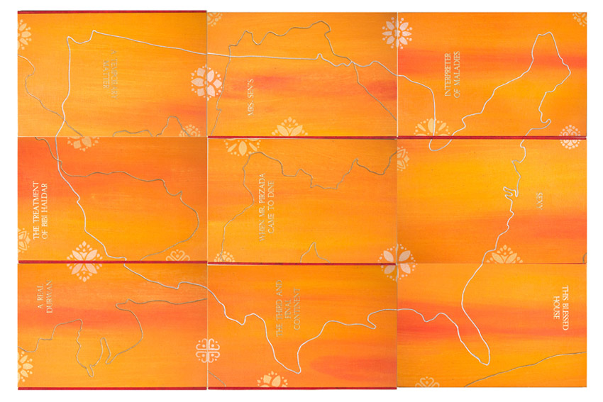
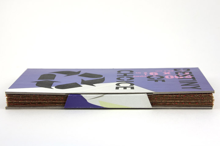
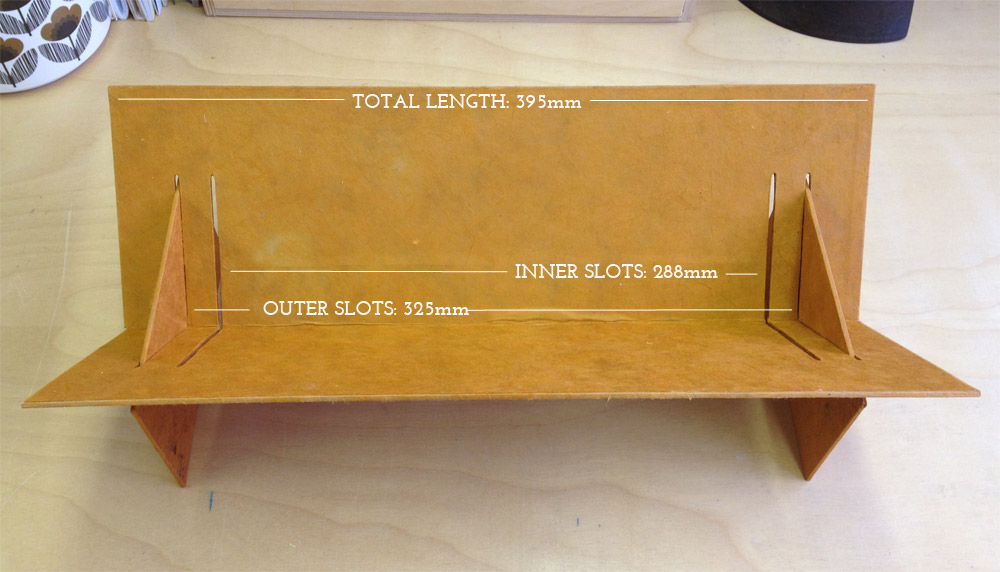
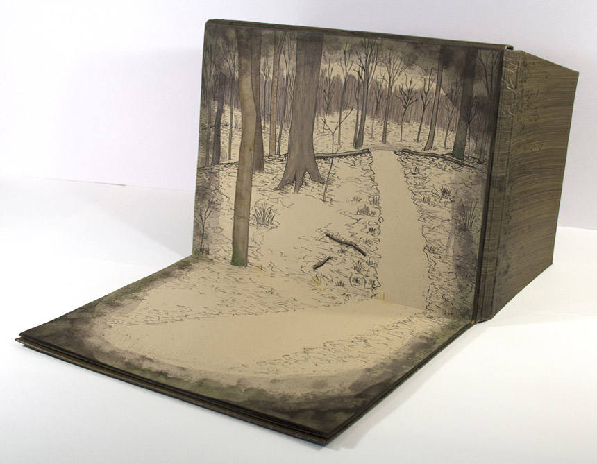
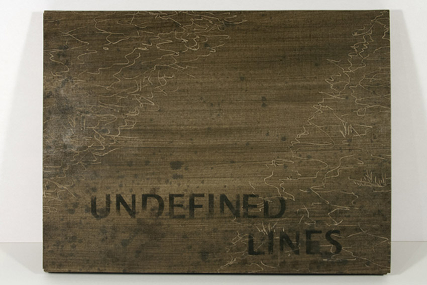
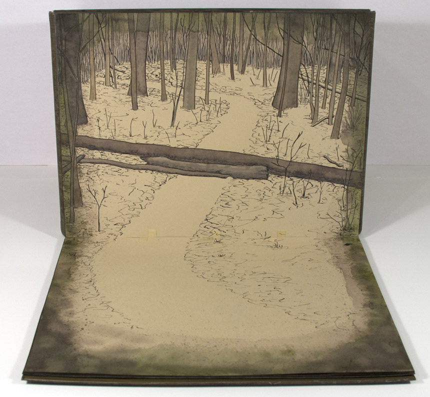
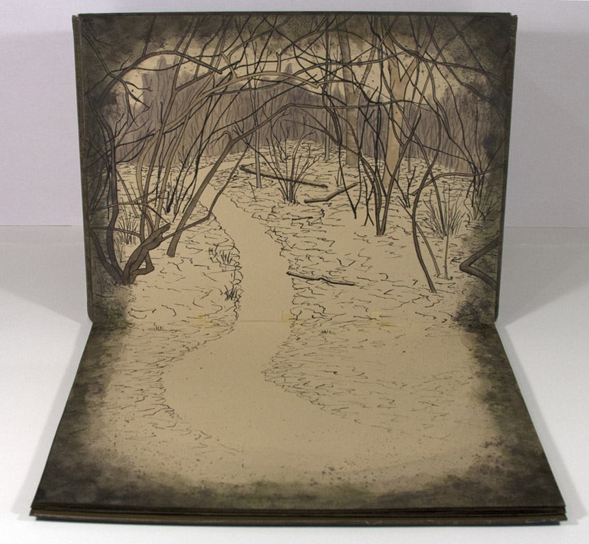
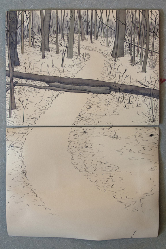
    In 2012, Mary Uthuppuru created Undefined Lines. This unique artist book is designed with a cover that converts into an easel, making the image heavy content read as a guided tour along a trail commonly traveled by Mary. Using ink and watercolors to layout each scene on Rives BFK, the pages have a very soft, nostalgic feeling.

    UndefinedLines2-MaryUthuppuruUndefinedLines3-MaryUthuppuruUndefinedLines-MaryUthuppuru

    Undefined Lines is a really unique structure. The binding acts as an easel to direct the point of view of the imagery. Where did your inspiration come from for this structure?
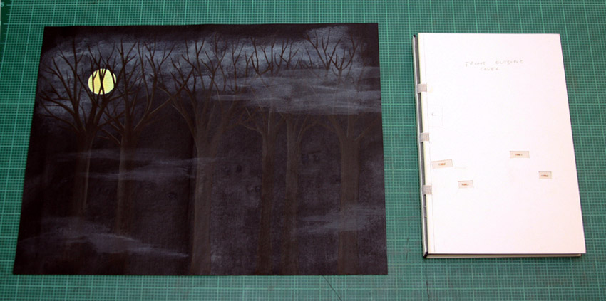
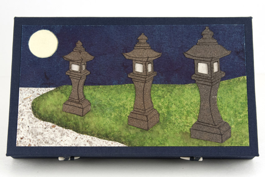
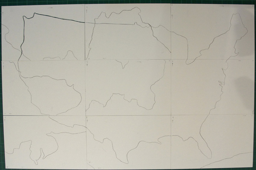
    I chose to depict a hike I take every morning in a forest near my house. It is there that I sort out the agenda for the day, contemplate what might be on my mind or just clear my head. Being a little reserved with letting imagery be the message in my books, I decided that this book would be centered on large ink drawings with watercolors.

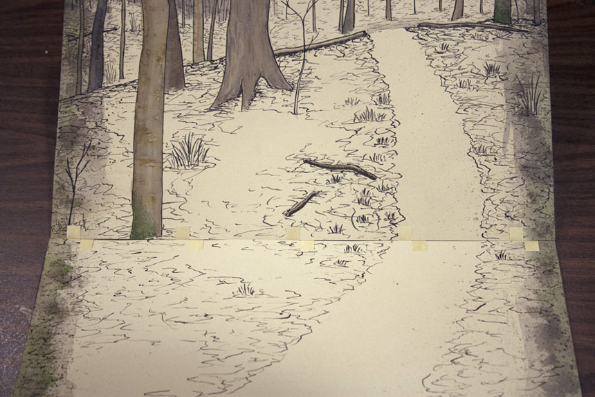
    This structure was a complete response to the content. In an unusual way, unusual to me, I created the pages of the book before considering how it would come together in the binding. As I finished the image panels, it occurred to me that I did two things: I created single sheets that then needed to be bound, and the image format begged for each page to be upright when viewed.

    UndefinedLines-inprocess-MaryUthuppuru

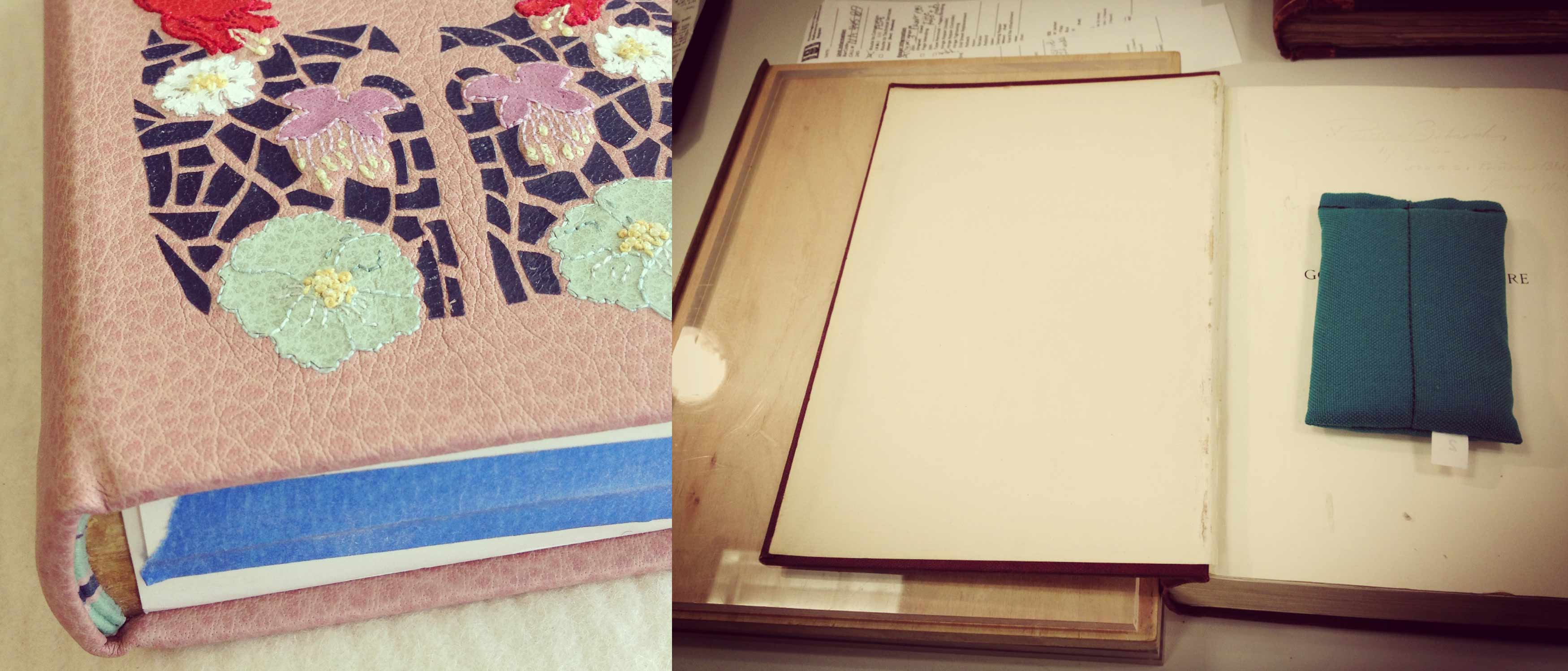
    So I leaved through all of the books about artist books I could find, hoping something would trigger an idea for my unique situation. First, I stumbled upon one of Claire Van Vliet’s bindings and I remembered the quilted books for which I first came to know her. The Lilly Library has a copy of her book Woven and Interlocking Book Structures from the Janus so I paid a visit and found a binding style that worked for my pages. The woven paper allowed me to bind the single sheets in an elegant and mostly hidden way. Another inspiration for the binding came from Susan Skarsgard, from whom I took a class at the Paper and Book Intensive in 2011. She showed us a non-adhesive structure that allowed the spine piece to slide into the cover to allow for the pages to open completely flat, something I found out I needed once I decided on the cover format.

    UndefinedLines-inprocess2-MaryUthuppuru

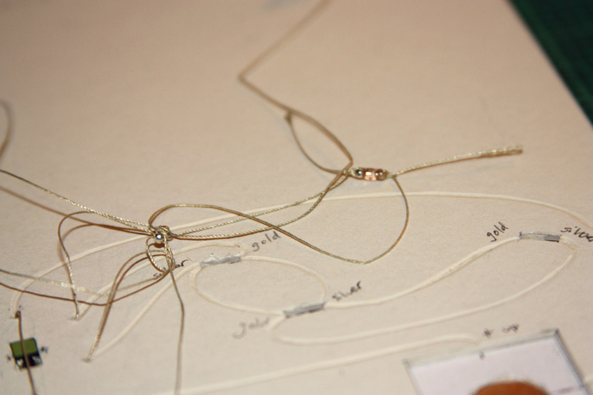
    Woven binding detail.

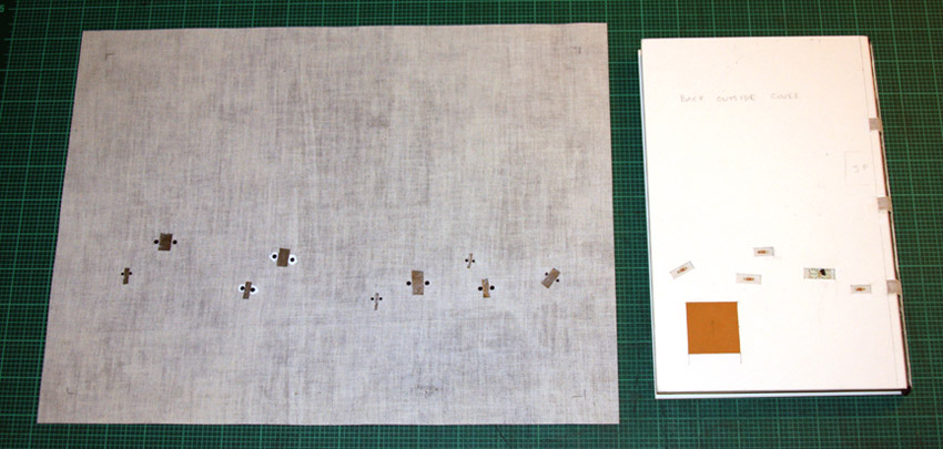
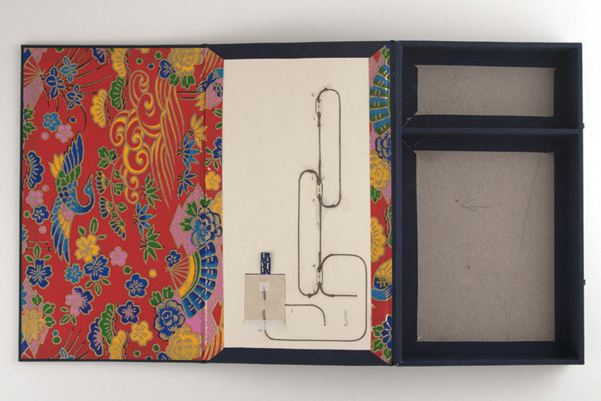
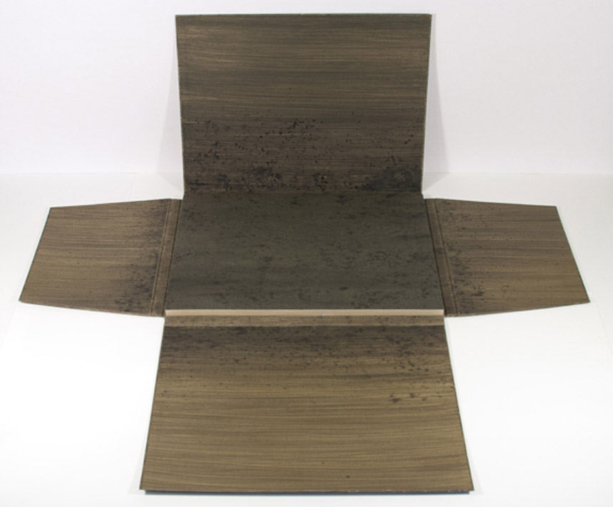
    Next, was to find a way to get the pages upright. I wanted the viewer to have the experience that they were walking through the forest with me. With the images as large as they are, I thought this would be possible especially if I could get the pages to turn towards the viewer. As each page is turned down, the viewer would find themselves in a new scene. I looked for inspiration in objects that are propped up for use that already exist like iPad cases and art easels. I made a few mock ups, but none of those things would work without making the book look clunky. Remembering that the box itself could act as the “easel”, I found the simplest ways possible to prop up the book. Having the box act as the cover in the form of a multi-flap portfolio was a good solution not only can all of the flaps be folded back for my purposes, but it also had a good-for-travel sort of feel. Once all the flaps are closed, it is self-contained.

    UndefinedLines5-MaryUthuppuru

    Last week you discussed your use of painted tissue for the cover of Fantasy & Nonsense. For Undefined Lines, Interpreter of Maladies and other works you’ve used paste cloth. Can you talk about your process for creating paste cloth?
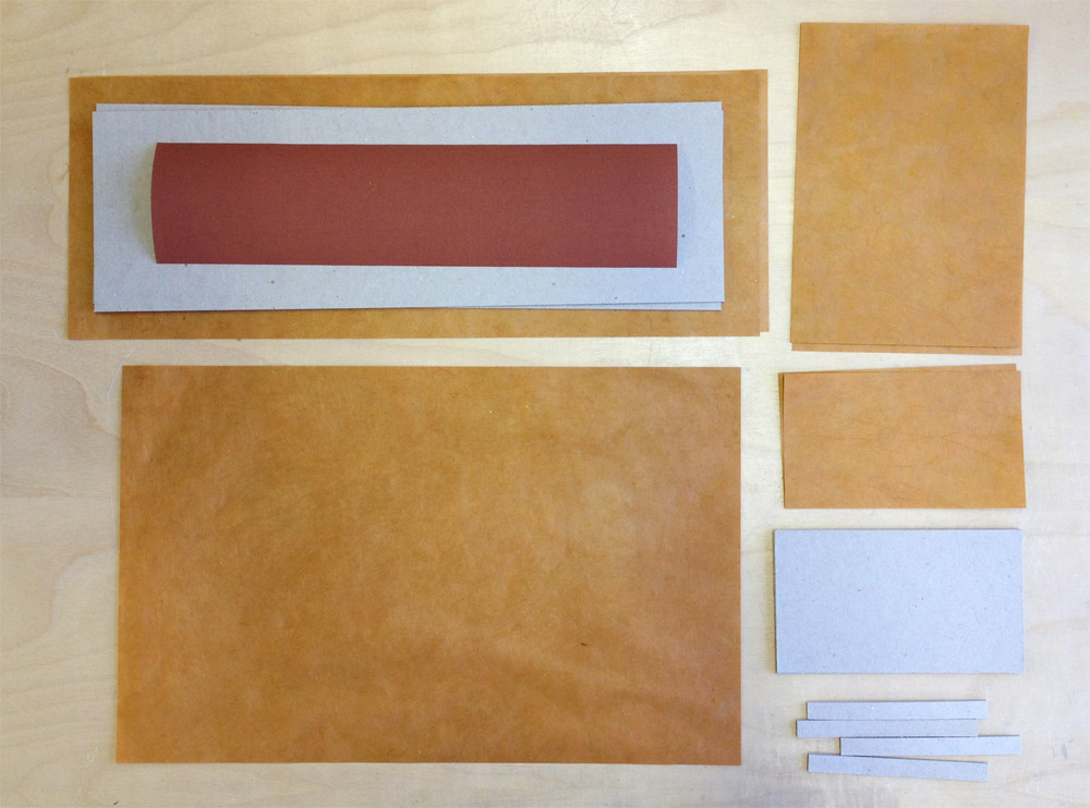
    I first learned about paste cloth at my first Standards in 2008 in Toronto. Martha Cole demonstrated her beautiful technique of creating and using paste cloth for books as well as textile pieces. She even provided everyone with her recipes. I don’t use her recipe but I make a very simple recipe for mine which is just paste cooked as though you are using it for repair work, strained and thinned to the desired consistency, then divide the paste to be mixed with Golden acrylic paints. For the cloth, I use undyed natural cotton or linen…usually cotton since it has a consistent texture and tight weave that provides a nice smooth surface for combing if desired. All of my paste work with paste cloth is done on Mylar taped to a hard surface for drying.

    PasteCloth-MaryUthuppuru

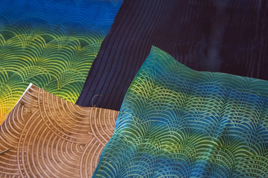
    The cloth is sprayed with water and spread flat on the Mylar. At this stage, I make sure the fabric is laying evenly and the threads are not warped or distorted. The cloth is then pasted out with clear paste until the whole piece is evenly coated. Using your hands or a long ruler, turn the pasted cloth over onto the same piece of Mylar and smooth out gently with your hands getting rid of any air bubbles. At this point, you have to start making design decisions. If you plan on combing or drawing through the paste, then you need to decide if you will allow the color of the cloth to come through, by applying a layer of clear paste first, or if you want to build different colors on top of one another, in which case you just start your painting. If you are merely painting a design with the paste/paint mixture, you are ready to begin. Paste cloth lends itself to building rich designs by layering different colors or patterns on top of one another which is really fun to play with depending on the book’s subject matter.

    – – – – – – – – – – –

    Thanks Mary for a wonderful interview. It was great of you to share some of your techniques and creative processes.

    – – – – – – – – – – –

    UPDATE: Check out this wonderful review on Undefined Lines over at the Abecedarian Gallery Blog. The post includes a great slideshow of each page of the book!


  2. Bookbinding Now // Interview with Henry Hébert

    January 23, 2014 by Erin Fletcher

    bookbindingnowhenry

    In May 2013, Susan Mills interviewed me for her podcast Bookbinding Now. In addition to that interview, Susan offered me the opportunity to suggest someone for a future interview or conduct my own for the podcast.

    Up until this point I had only conducted written interviews on the blog, so I was intrigued to test out my interview skills in a live, one-on-one scenario. I chose to interview my friend and colleague, Henry Hébert. In the interview we chat about his experiences in the field of conservation leading up to attending North Bennet Street School and what he’s done since graduating in 2012. Spoiler: his talents and expert skills have landed him the position of Rare Book Conservator at the University of Illinois at Urbana-Champaign. You can download the episode (no. 69) on iTunes or listen to it here


  3. Book Artist of the Month: Mary Uthuppuru

    January 20, 2014 by Erin Fletcher

    FantasyAndNonsense-MaryUthuppuruIn 2012, the Rocky Mountain Chapter of the Guild of Book Workers held an juried exhibit of design bindings based on a book of James Whitcomb Riley poetry called Fantasy & Nonsense. The text block was beautifully letterpress printed by Tryst Press and includes wonderful and whimsical wood engravings by Berrot Hubrecht. 

    Mary Uthuppuru’s binding of Fantasy & Nonsense is covered in a thin hand-painted tissue, which allows the scattered LED lights embedded in the covers to shine through. These lights glow at alternating intervals and represent the goblin’s “green glass eyes” as described in the poem Nine Little Goblins. The book is housed in a cloth covered clamshell box, which contains a compartment holding three spare batteries. Watch the video below to see the LED lights in action.

    The exhibition was held in conjunction with the 2012 Standards of Excellence conference in Salt Lake City, Utah. At the time the books were on display at the University of Utah’s J. Willard Marriott Library, where Mary’s binding was awarded second place. 

    There are so many creative elements in this binding and so many design questions I have for you. Can you talk about your process for creating the painterly look of the cover?
    While I usually use paste cloth (Mary will discuss her paste cloth technique in next week’s post) when I want total control over cover design for my bindings, this book had unusual needs. Paste cloth, while thin, would not allow me the translucency that I needed for the LED lights. Not only did I need the cover material to allow light through, but I needed it to look like the surrounding material when the light was off. For this reason, I turned to Japanese tissue mounted to cotton. The tissue could be painted exactly how I wanted, and in the areas where the LEDs would be placed, I could thin it even more. This way, when everything was painted, it would blend in, but when the lights were on, it would have the effect I wanted.

    The steps for getting from plans to the final book are as follows: create the cover design on a piece of paper to scale, plan the circuitry and light placement, bind the book, add circuitry, work on the cover material. (You’ll find some in-progress images below: layout of design and circuitry, layout of circuitry on front cover boards and detail of wiring.)

    FantasyAndNonsense_process1-MaryUthuppuruFantasyAndNonsense_process2-MaryUthuppuru FantasyAndNonsense_process3-MaryUthuppuru

    The general design for the cover was painted on the tissue, predominately the midnight blue background and the trees. Next, the dry painted tissue was mounted to the cloth with PVA/Klucel G mixture. Once dry, the material was lined up with the paper design and holes were punched where the eyes in the design were to be. I then toned a thinner tissue to match the surrounding areas and put that in place. Finally, the painted design was completed and attached to the book being careful to line up the eyes over the LEDs.

    FantasyAndNonsense_process5-MaryUthuppuru

    Back of covering material and back cover of binding.FantasyAndNonsense_process6-MaryUthuppuruCovering material and front cover of binding.

    Your use of soft circuitry is very exciting and I’m looking forward to seeing how your work progresses with this technique. When did you first experiment with combining this technology with your bookbinding work? What challenges have you experienced? 
    I first started using the soft circuitry when Leah Buechley came from MIT to Indiana University to give a lecture and workshop about the promotion of these materials. I lucked out because my friend was helping put the workshop together and was able to get me a seat. During the workshop, we each created our own soft circuit using conductive thread, a battery and an LED light. The workshop was given in hopes of putting this technology in the hands of people, specifically educators, who make things and have the potential to distribute these skills to kids, especially girls. During the lecture, Leah explained these goals further and showed some amazing applications of the circuitry.

    After this exposure to the potential uses, I was really interested to try the technology in books too, but I wanted to wait until it actually fit the project at hand. It is easy to be excited about a technique or tool and use it just because you are excited about it. It is especially the case with lights and circuitry. It is my feeling that once you add lights to something, that you are trying to draw attention or add extra glitz. I wanted to be careful to reserve this eye catching element for a purpose, not just an adornment. It was this project that was perfect for the lights.

    The challenge comes when you try to figure out how to hide all the electronic components that, while small, are tricky to keep from distracting from the overall design. I wanted to avoid sacrificing my aesthetic to allow the new components, so it can be tricky. With Fantasy & Nonsense, the biggest challenge was hiding the LEDs under the book cloth and trying to figure out how to wrap the conductive threads around the spine.

    CircuitryBox-MaryUthuppuru

    It also required some additional education on my part since the lights are timed with a microcontroller that had to be programmed. I applied these similar techniques to a box I made and donated to the Guild of Book Workers Standards of Excellence auction. The box has a moon (which is also a button) that when pressed, lights up three lanterns. It was built so that when the lid is lifted, there is a panel that folds out and reveals the circuitry. Also included were supplies for a small project and a tutorial for how to put something like that together. (All of this is available for download on my website.)

    CircuitryBox3-MaryUthuppuru


  4. Introducing a New Column: Conservation Conversations

    January 16, 2014 by Erin Fletcher

    Over the course of the year, you’ll see a collection of posts written by other people. I’ve wrangled up a few of my friends and colleagues whose work is predominately centered around conservation. Under the title Conservation Conversations, each author will present three posts over two months on a topic of their choice.

    In the following post, my friend Anna starts off the series. Anna graduated with me at North Bennet Street School in 2012 and since then she’s landed a position at the Huntington Library in Pasadena. Anna is no stranger to the blog. We collaborated on the Daily Glimpse project together on the first and final months. This was a year long project, where images were exchanged daily at the same random moment. Below is an image from the series showing off my binding work on the left and Anna’s work at the Huntington on the right. 

    day2_meanna

    I hope you really enjoy this series and I encourage the posting of questions and comments. 


  5. Conservation Conversations // Lab Coat Daydreams, Part I

    January 16, 2014 by Anna Shepard

    I feel that I should share a bit of my story and recent background in this first post, in hopes of providing some context for what may follow in the next few weeks.

    There was a running joke our instructor liked to chide us with, during our training at the North Bennet Street School. He teased that, after finishing our program, we could expect to find ourselves in either a “lab” or a “studio.” Being of a more artsy bent, or at least gravitating more towards the image of the artistic bookbinder that I had visualized at the program’s beginning, I never really considered what life in a book and paper conservation lab might actually be like.

    After many slow months of picking up work where I could find it and squeezing in some binding projects on the side, I left Boston and decided to give things a shot in Los Angeles county, where my boyfriend had found steady work as a concert piano tuner & technician. With great luck, after suffering a few more painfully slow (and hot) months, I was hired as a “book & paper conservation technician” at The Huntington Library in Pasadena. I was overjoyed to find work that would allow me to employ the skills I had so recently acquired and in such an incredible setting. While my egoistic inner artist may have wept a few tears at first, I began to see the ways in which I could exercise my artistic license within the context of conservation.

    anna-part1b

    As with almost any job, there are elements of my work that sometimes feel a little wrote or tedious. O the whole though, I feel lucky to say that I engage creative and critical thinking skills with the majority of the projects that come my way. The nature of the work we do in the lab demands true flexibility and a type of problem-solving akin to what I imagine certain engineers might use. For example, while I may not have the weight of producing complex infrastructures in high-density areas looming over me, as I begin any housing project, I am asked to construct something securely and uniquely designed for each rare book or manuscript’s safe-keeping. I am asked to open my eyes to the unusual aspects of a book and give it the treatment it deserves or, as happens in triage situations, do whatever can be done for the time being.

    As conservation staff we are constantly taking into consideration how items have and will continue to age and how we can best aid the longevity of each item so that it may continue to be. Thinking in this way can lead to some pretty heavy pondering – however, if you are as submerged in the art and mechanics of creating something with your hands—directly connecting mind with body, employing experience-based knowledge to your decision making about even the smallest element of a box or binding—you find yourself at the source of budding craftsmanship. And that, after all, is what I fell in love with when this journey began.

    anna-part1a


  6. Book Artist of the Month: Mary Uthuppuru

    January 13, 2014 by Erin Fletcher

    InterpreterOfMaladies5-MaryUthuppuru

    Mary Uthuppuru received ‘Best Binding’ for her work based on Interpreter of Maladies. This award was given at the opening reception for the second edition of One Book, Many Interpretations exhibition at the Chicago Public Library in 2011. A total of ten titles were chosen by the CPL, a handful of bindings were created for each title and the award for ‘Best Binding’ was awarded to one binding for each title. 

    Housed in a beautifully shaped slipcase are nine individual books. Each book is bound in the Bradel binding style with handmade paste cloth. Details explained below are hand stenciled. Titles are stamped in gold. 

    This piece is so complex; you divided Interpreter of Maladies into nine books, which can be arranged two different ways to create either a map of India or the United States. I’ve never read these short stories by Jhumpa Lahiri, what inspiration did you find within the text to execute the binding in this manner? 
    This was my first competition binding and it was a perfect book for me because I have an intimate look into the content of Lahiri’s subject matter. Interpreter of Maladies is a compilation of nine stories featuring Indian people both in India and the United States as they deal with cross cultural issues and in some cases, the westernization of India. While the stories are about a specific culture, Lahiri writes them in such a way that they speak to a more universal experience.

    My husband is the son of an Indian father and a Japanese mother who moved to the United States for college in the 1960s. They moved here at a time when communication and travel is nothing like it is today. Letters were written and silences between phone calls were very long if at all possible. My first memories of visiting them were the numerous maps throughout the house. After a while it became clear that when you move to a new country with your family on the other side of the world, especially at the time that they did, there is comfort in looking at a map and seeing the two places a little closer together. It is this element that helped me tie the content of Interpreter with what became familiar to me.

    Since the stories take place in India and the United States I wanted both maps to be a part of the design. However, I didn’t want to overload the books with too many design features. Having the maps only appear one at a time as simple line drawings inset in the cover was the perfect solution. Additionally, I wanted the ability to create an intense color similar to marigolds, a flower present in various aspects of Indian culture, so I created paste cloth for my cover material. This also allowed me to easily stencil guides for arranging the maps into both configurations without which would make it nearly impossible for the viewer to figure out their order.

    InterpreterOfMaladies-process2-MaryUthuppuru

    Stencils used to create guides to help in arranging maps.

    This shuffling of book covers and rearranging them to create the two countries helped reinforced the difficulty of the themes in the book: life is a challenge, and when you move to a new place or what once was familiar changes, you have to make adjustments…and it can be difficult.

    – – – – – – – – – – –

    Below are images of the map blueprints and how the covers can be arranged to create both the United States and India. 

    InterpreterOfMaladies-process4-MaryUthuppuruInterpreterOfMaladies2-MaryUthuppuruInterpreterOfMaladies6-MaryUthuppuru


  7. Photographer: Andrea Galvani

    January 10, 2014 by Erin Fletcher

    DeathOfAnImage9-AndreaGalvani

    In her series Death of an Image, photographer Andrea Galvani attempts to cross a boundary. Through each image there is a desperate need to cancel something out in order to rebuild it. Objects are cleverly placed within the shot to create a precise perspective, thus cloaking and transforming the subjects. In the image below, the stark black balloons are carefully placed with accurately calculated string lengths to create a visible center point that the dots radiate from. Beyond the conceptual explanation, these images are just stunning. The final image is separate from the collection, but how could I resist an image of cats. 

    DeathOfAnImage12-AndreaGalvani DeathOfAnImage5-AndreaGalvani DeathOfAnImage2-AndreaGalvani DeathOfAnImage4-AndreaGalvani n11-AndreaGalvani


  8. Artist: Tim Wirth

    January 9, 2014 by Erin Fletcher

    GeeWhiz-TimWirth

    Tim Wirth has really streamlined his artistic process. Each painting is created on a square birch canvas that is cut down from a larger plank, leaving no waste. The paintings are framed and the backside includes the date and place where the painting was completed, as well as the title and signature. Many of the painting’s backsides include a painting of their own. 

    I like Tim’s work because it’s humorous, non-sensical at times and colorful. It’s that plain and simple. 

    ThompsonBall_BonnieClyde-TimWirth ChuckBerry_HardWorld-TimWirth HolySmokes_GoodbyeBeGood-TimWirth


  9. Book Artist of the Month: Mary Uthuppuru

    January 6, 2014 by Erin Fletcher

    DestinyOfChoice1-MaryUthuppuru

    Can books save the world? Can artist books raise consciousness, create awareness or change thinking? These were the questions that EcoEditions aimed to answer through a collection of artist books that could raise awareness on the state of our environment. For her submission, Mary Uthuppuru, created Destiny of Choice in a small unique edition of three. Each book is bound in the Ethopian style with a tab closure on the fore edge. The title is hand stenciled on three unique covers sourced from boxes that were headed to the recycling bin.

    DestinyOfChoice4-MaryUthuppuru

    The text block is made from trash entirely sourced from Mary’s house. Which is also the major influence for creating this book. Most of us assume our trash is going straight to a landfill, but we lose sight of the fact that it may not. Mary’s concern with reducing the amount of waste that comes out of her household is an attitude that more people need to obtain.

    The books were sewn with dental floss (which Mary notes was unused for hygienic purposes). The illustrations and text have been inkjet printed onto packaging material. Other bits of trash including plastic bags and plastic netting were scattered throughout the text block.

    DestinyOfChoice3-MaryUthuppuruDestinyOfChoice2-MaryUthuppuru

    This artist book is brilliant; once again you successfully bring together humor and interactive elements. Destiny of Choice was part of EcoEditions, an exhibition at 23Sandy Gallery. Did you create this artist book specifically for the exhibition?
    This book was created for the EcoEditions exhibit. It was also a part of the hoped for quarterly project with Kristin of Space Paste Press. As mentioned earlier, we hoped to create more advanced projects than the one book per month endeavor. At the time, we were both thinking of environmental themes so it sounded like a really good goal, create a book that can also be submitted to an exhibit.

    I was really happy with the way the book turned out. Since I was already thinking of the theme, it was great timing. The theme asks artists to illicit change through the content of their artwork.  When trying to get people to change or realize that what they might be doing is harmful, I don’t think it is best to begin by ordering them around. I don’t listen this way, so I wanted to avoid a book full of preaching. The Choose Your Own Adventure format seemed really appropriate to me because the arrangement is playful, inviting the reader in. As a kid, I used to read choose your own adventure books all the time and I always approached them with a sense of reserve. I was choosing what would happen to the characters in the story, which hit home for me. So I wanted that same feeling to translate through this book.

    A favored story-telling method of mine is to anthropomorphize sometimes unexpected objects. In this case, a plastic bag is the main character of the story and while the reader decides what happens, the bag is doing the action. The reader chooses between recycling and throwing it away then how the bag gets from the garbage can or recycling bin at home to its final destination. Many people have heard about the gyres (islands of garbage) in the middle of the ocean. We all know about landfills. It is a very contemporary concern all over the world, and one that I have on my mind daily.


  10. Tutorial: Collapsible Punching Cradle

    January 3, 2014 by Erin Fletcher

    PunchingTrough1-ErinFletcher

    A punching cradle is a useful tool to have around in one’s bindery. There are a lot of models available for purchase, but it’s quite simple to make one yourself using just a few tools and materials. I have a few in my bindery that range in size, but I find my collapsible punching cradle to be the most useful. Especially when I am traveling to teach workshops.

    The following tutorial will go through the steps to create your own collapsible punching cradle. I’ve including all of my measurements, but the best part about this tool is that you can customize it for your own purposes. This particular cradle will consist of a detachable cradle and 2 leg supports. The cradle will have two different size options, which makes this particular version even more versatile. I discovered this collapsible punching cradle while taking a private workshop with Monique Lallier. She allowed me to take down the measurements and I made my own once I returned to my studio.

    If you are looking for more instructional content, I have a growing list of tutorials and I also teach live workshops in-person and online. Check out my list of Upcoming Workshops.

    MATERIALS: 
    – paper for covering (I used Lokta)
    – binder’s board
    – book cloth
    – PVA
    – methyl cellulose (optional)

    TOOLS: 
    – pencil
    – ruler
    – 90º triangle
    – Japanese screw punch with 3mm bit
    – cutting mat
    – x-acto blade
    – glue brushes in various sizes
    – bone folder
    – scissors

    STEP ONE:
    Determine the length of workable space for your cradle. For example, if you tend to work large, then perhaps you want to make a cradle long enough for paper that is 12″ tall. The cradle I’m making in this tutorial is slightly longer than ones I currently have. The total width of my cradle is 395mm (~15½”), the two outer slots give me a workable area of 325mm (~12½”) and the inter slots give me a workable area of 288mm (~11¼”).

    PunchingCradle2a-ErinFletcher

    Once you’ve decided on your dimensions, grab some binder’s board and cut down 2 pieces the same size for the cradle. The dimensions for the legs and support stubs can really vary depending on the distance you want between the bottom of the cradle and your work surface. The lower the cradle is the more likely that your awl will pierce your work surface if left unprotected. But you can start by using my measurements below and then make your own modifications.

    MY MEASUREMENTS:
    cradle (cut 2 pieces the same size):
    395mm x 125mm

    legs (cut 2 pieces the same size):
    150mmx 88mm

    support stubs (cut 4 pieces the same size):
    110mm x 11mm

    STEP TWO:
    Mark with a pencil where you would like the two slots to be on both cradle pieces. On my cradle the outer slot starts 30mm in from either end. Each slot is 3mm wide and they sit 15mm apart.

    PunchingCradle3a-ErinFletcher

    The height of my slots are 80mm from the bottom edge of the cradle. Using a 90º triangle, draw a line from your mark up to the desired height. Do this on either side and on both cradle pieces.

    PunchingCradle4-ErinFletcher

    Using a Japanese screw punch with a 3mm bit, punch a hole at the top of the slots. Make sure to have a scrap board underneath to protect your work surface. With an x-acto blade, carefully cut out the slots by slowly cutting through each layer. DO NOT try and cut through the entire thickness in one stroke, the blade could kickback and slice your finger. As you cut, angle your blade as perpendicular to the binder’s board as you can, this will make a nice straight cut. Sand the slots smooth.

    PunchingCradle5-ErinFletcher

    read more >


  • My name is Erin Fletcher, owner and bookbinder of Herringbone Bindery in Boston. Flash of the Hand is a space where I share my process and inspirations.
    The StudioNewsletterInstagramEmail me
  • Archives