RSS Feed

Posts Tagged ‘book artist of the month’

  1. January // Book Artist of the Month: Mary Uthuppuru

    January 2, 2014 by Erin Fletcher

    AndThenThereWere8_3-MaryUthuppuru

    In preparation for their 2013 Annual Open House and Silent Auction, the Morgan Conservatory presented participants with two sheets of paper made at the Morgan and asked them to create a piece of art to be auctioned off during the event. Mary Uthuppuru was given one sheet of charcoal grey and the other of bright white.

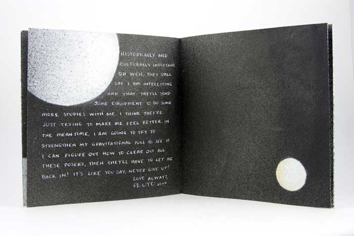
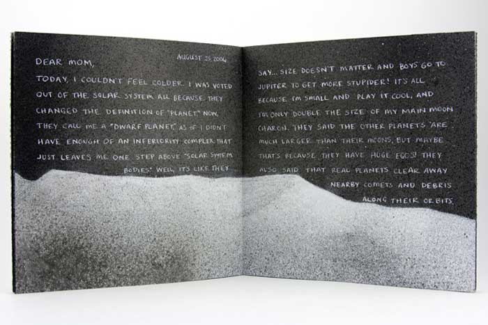
    Mary found inspiration from the recent drop Pluto experienced from its rank as a planet and the heated discussions that followed. As the sole character in this artist book, Mary personifies the now dwarf planet in the form of a letter, where Pluto freely express himself after hearing this news of rejection. You can read more about Mary’s process in her blog post, Poor Pluto

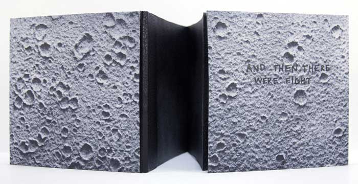
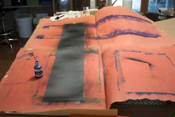
    And Then There Were Eight is bound as an accordion with a removable spine piece, when fully opened the viewer can experience the vast and expanding qualities of outer space. The covers are most appropriately wrapped in beautiful handmade Moon Paper from Hook Pottery Paper. The paper appears to be a 3-dimensional print of the moon, but it is actually smooth (like paper). The interior pages were given an airbrush look by using a mouth atomizer and drawing inks.
    AndThenThereWere8-MaryUthuppuruAndThenThereWere8_4-MaryUthuppuruAndThenThereWere8_2-MaryUthuppuruI really enjoyed reading about your thought process behind this book. Not only did you find inspiration in a literary influence, but also in your own sense of humor. The application of pigment really captures the atmosphere and depth of space. Can you talk about the challenges and benefits to using a mouth atomizer?
    The mouth atomizer was a really fun thing to use. I actually had it for over ten years before I discovered its use during this project. It looks a lot like a compass, but without the pencil. One end goes into whatever liquid you are using (in the case of the Pluto book it was India ink and Winsor & Newton drawing ink) and then you blow on the other tube.

    The benefit in its use is also its challenge. So long as you have the lung capacity, this tool is very simple. Blow in the horizontal tube, and the ink is sprayed from the vertical tube. The difficulty is in style. If you are trying to get consistent coverage, then you have to be consistent with the pressure behind your breath. But it is easy to get used to with a practice piece of paper. Also, beware your work space. Cover anything surrounding the piece you are working on with newsprint or other waste unless you want a speckled work space.

    ThereWere8_Atomizer-MaryUthuppuru

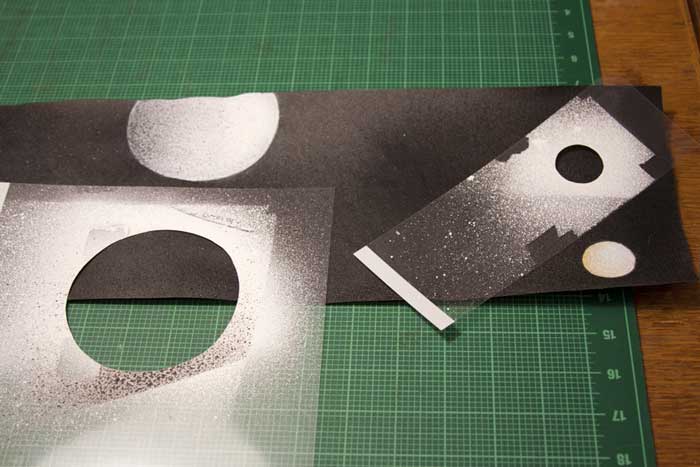
    There is more than one way to use it too. In this book, for example, I cut stencils from transparency sheets to create the planetary bodies. This allowed for a clean, shaded shape that is much faster and reads truer than a traditional stippling stenciled technique. It is also easy to clean by running it under water then drying.

    ThereWere8_Stenciling-MaryUthuppuru

    I first met Mary in Chicago for the One Book, Many Interpretations exhibit at the Chicago Public Library, where both Mary and I had work in the show. I’ll be featuring her binding of Interpreter of Maladies from that show later this month. From the beginning, I noted Mary’s impeccable skill and her exceptional eye for detail, but I can’t forget to mention her infectious personality. Her humor mixed with kindness and generosity makes her a delightful person to engage with and learn from.

    Like myself, Mary, is just beginning her career in the field of bookbinding. Her ambition and creativity are inspiring, as is the interview (after the jump). Mary discusses her love for bookbinding and how she caught “the book bug”. Later in the interview, Mary talks about setting up her own home studio and how being self-employed has its ups and downs. But it’s quite clear to see that Mary tackles her obstacles with smarts and humor. 

    Come back each Monday during the month of January for more on Mary Uthuppuru and her work, which will bounce between bookbinding and book arts.

    read more >


  2. Book Artist of the Month: Susan Collard

    May 27, 2013 by Erin Fletcher

    3x3-susancollard

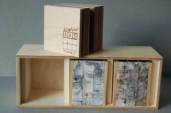
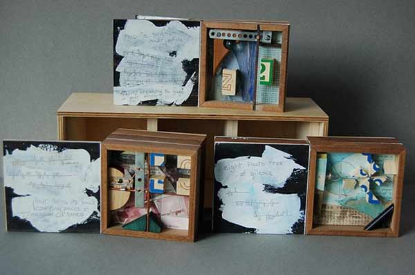
    In 2010, Susan Collard created 3×3 a series of board books made from birch aircraft plywood, maple and walnut bound with Tyvek. Each page spread represents a single number ranging from one to nine. For Susan, numbers have definitive personalities that sprout from their mathematical associations. As Susan developed each numerical character sketch she began with a few poetic words (on the verso) before morphing into a collaged “portrait” (on the recto). 

    3×3 was featured in Quantified Aesthetics, an exhibit held at the Minnesota Center for Book Arts in 2010.

    3x3-susancollard2 3x3-susancollard3 3x3-susancollard4


  3. Book Artist of the Month: Susan Collard

    May 20, 2013 by Erin Fletcher

    smallmuseum-susancollard

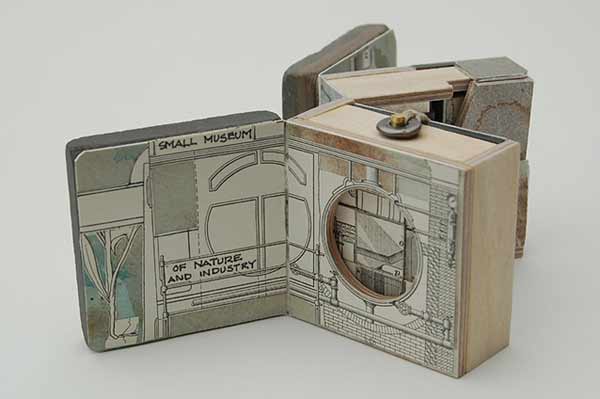
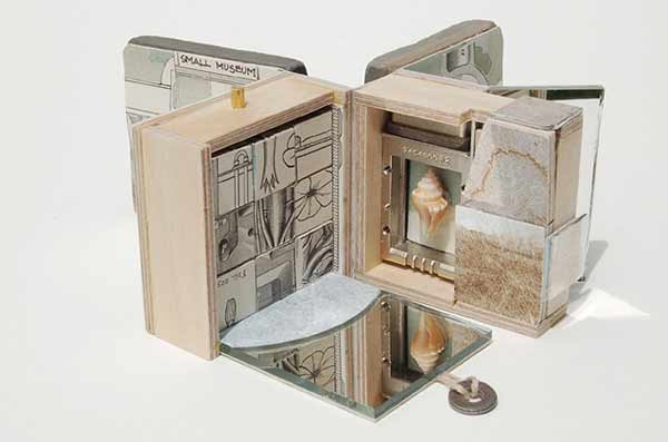
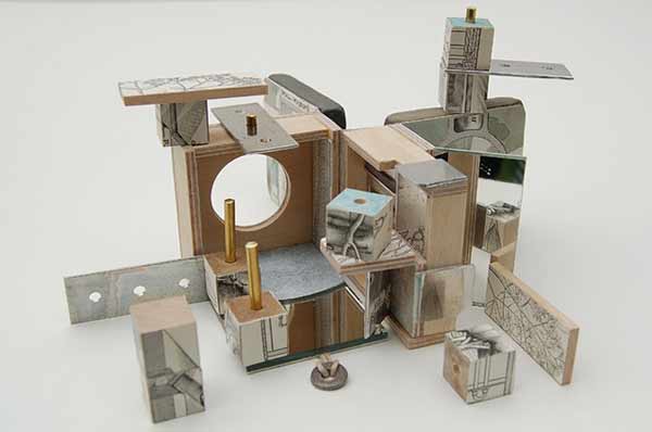
    In 2010, Susan Collard created her smallest book to date with a wide range of materials including birch aircraft plywood, basswood, slate, various metals, mirrors, linen thread and a shell. Small Museum of Nature and Industry is a bit fatter than a perfect cube with dimensions of 2″ x 2″ x 2½”. This tiny structure opens up to a series of compartments to reveal a set of building blocks and concealed brass rods, as well as wooden and aluminum pieces. The unraveling architecture and hidden components of this book are quite surprising.

    Once the materials and title were determined, Susan set out to create a book with the open-ended complexity of a miniature museum. This artist book received a Juror’s Award during the Pop-Up Now! exhibit at the 23 Sandy Gallery

    smallmuseum2-susancollard smallmuseum3-susancollard


  4. Book Artist of the Month: Susan Collard

    May 13, 2013 by Erin Fletcher

    shortcourse-susancollard

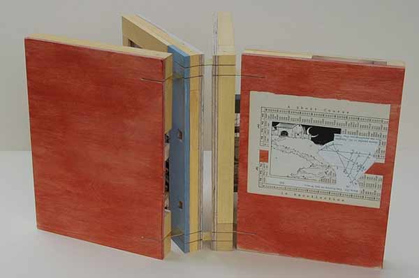
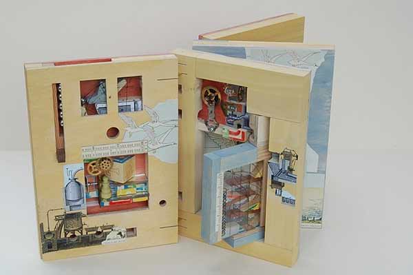
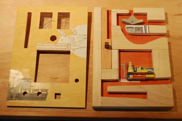
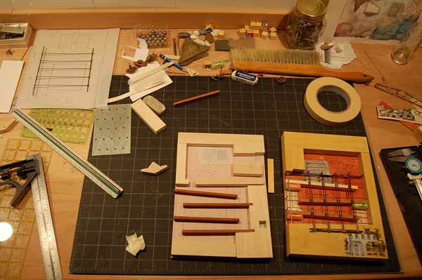
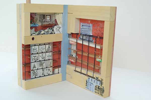
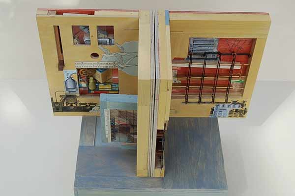
    A Short Course in Recollection was built by Susan Collard in 2009 for the Guild of Book Workers national exhibit Marking Time and through this book I was introduced to Susan’s work. Although the book may appear fairly plain on the outside, the interior pages are an inch thick in order to house a series of ramps and switchbacks. Susan began with her fascination of children’s toys built of ramps and towers. This literal marking of time in a direct, mechanistic, clattering fashion appealed to Susan (as did the technical challenge of interpreting that into a book).

    shortcourse2-susancollard

    At the top left of the first page is a vertical slot where the steel marbles are fed into the course. A blue toggle switched to the left stales the first marble upon its decent. The next marble will knock the toggle to the right and both marbles will move forward into the course on different paths. This toggle trick was inspired by woodworker, Matthias Wendel, who builds complex and ingenious marble machines. Susan approached the design of Short Course just as many artists do, by considering her materials first. In order to reduce any awkward bulkiness to the book, Susan choose steel marbles that are smaller then normal (about 7/16″). The ramps are made from ½” poplar and the face of the pages are aircraft plywood. The pages are bound together with slotted brass hinges. 

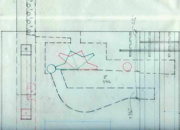
    Susan drafted full-size diagrams of the pages and made a cardboard model to aid in the building of Short Course. This is more planning that usual for Susan and all aesthetic elements came in after the pages started taking shape and the title of the book was chosen. 

    shortcourseprocess3-susancollardshortcourseprocess-susancollard shortcourseprocess2-susancollardshortcourse4-susancollard

    The third and fourth pages are more open, where the steel marbles can navigate more reliably. The marbles that fall to the right of the first toggle switch come down a ramp above the sleeping girl’s head, then hit a second toggle switch at her feet.

    The book can only function in one position, with the pages butted together tightly so the marbles can travel freely between them. There are three distinct courses, regulated by two toggle switches. The mechanism of the book does work, but rather temperamentally and can be viewed as a metaphor for memory. Some marbles will travel the course flawlessly, while others get hung up between pages, jump a guardrail or cause a traffic jam. As Susan so elegantly says “it seems easy to extend the metaphor to include these accidents of blockage and retrieval. Perhaps the book, as is, is a better representation of our own flawed memories than if it worked reliably every time. Which is not to say I wouldn’t fix it in a heartbeat if I had the ability. Probably my favorite thing about this book was integrating more childish elements (the fairy tales, alphabet blocks, even the colors of the milk paint) with the very intricate mechanisms and depictions of machinery—as if to suggest childhood is a serious and convoluted endeavor, or that understanding the world requires great leaps of nonsense and whimsy.” 

    shortcourse3-susancollard


  5. Book Artist of the Month: Susan Collard

    May 6, 2013 by Erin Fletcher

    cameraobscura2-susancollard

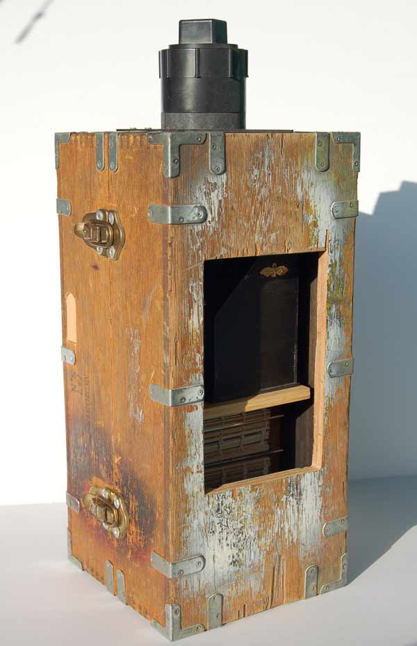
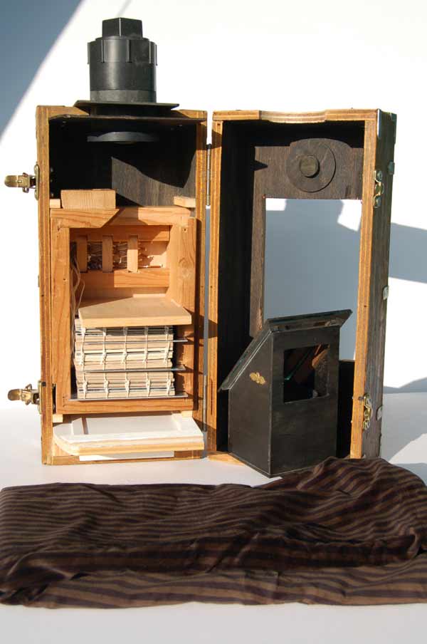
    In 2007, Susan Collard built Camera Obscura, a wooden box fitted with all the components that allows one to view the world around them in a more intimate manner. Once the camera is placed in a sturdy position, the viewer may sit at the viewing window with their head and shoulders covered by the cloth hood. As the image is projected into the viewing window adjustments can be made to focus the lens. Susan recommends positioning the camera towards a scene that is well lit as the experience will be more magical.

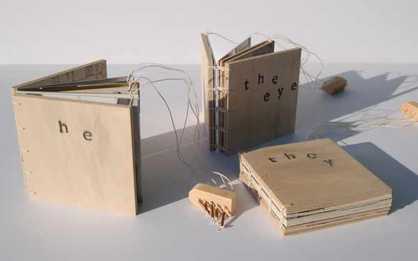
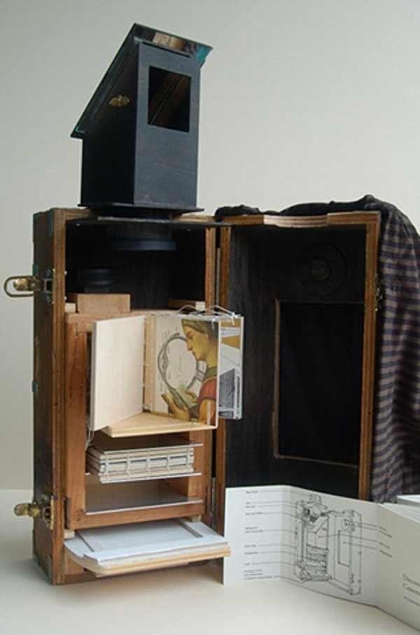
    In addition to its more traditional parts, Susan has included a bookshelf to hold three coptic bound books – he, they and the eye. Each book can be viewed and read inside the chamber with the aid of light from outside the camera. Each book has a set of strings, much like a marionette, that allow the viewer to turn the page without reaching into the chamber. The copper string ends vary in length, which allow the viewer to distinguish them by touch. 

    cameraobscura1-susancollard cameraobscura3-susancollard cameraobscura4-susancollard

    In this last image, we get a glimpse at the interior pages of one of the three coptic books in addition to the detailed set of instructions that come with the piece.


  6. May // Book Artist of the Month: Susan Collard

    May 2, 2013 by Erin Fletcher

    interlinear-susancollard

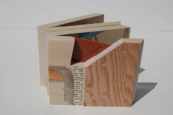
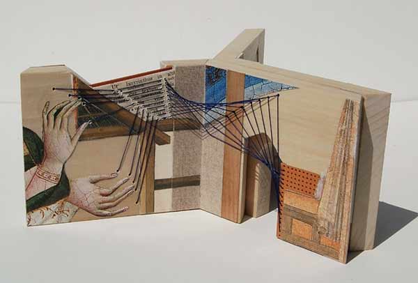
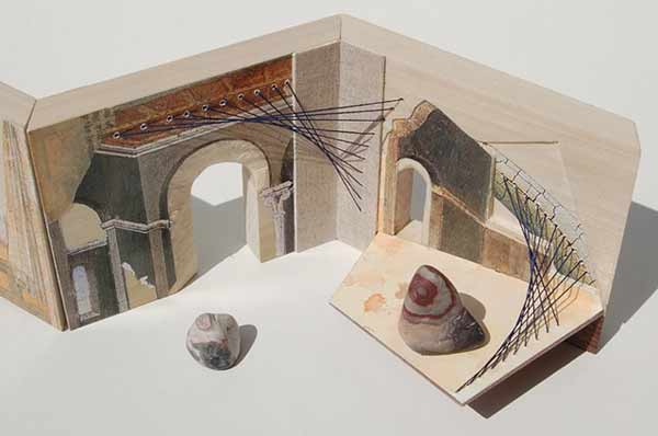
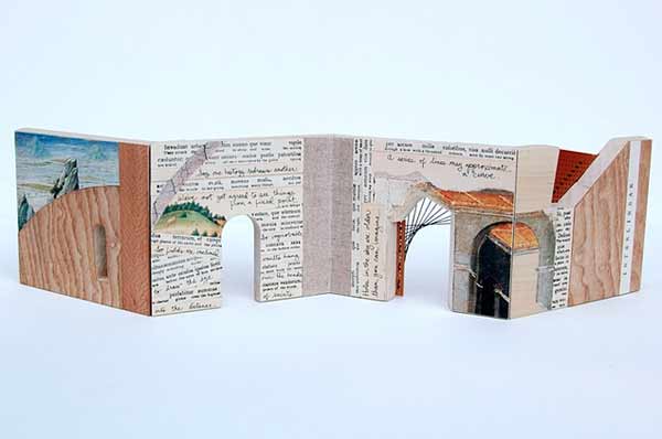
    In 2011, Susan Collard crafted Interlinear, a wooden accordion-like structure collaged with various imagery and texts. I’m particularly attracted to the inclusion of delicate embroidery threads; connecting the illustrations in a playful manner and drawing the viewer’s eye from page to page through doorways and into secret compartments. 
    interlinear2-susancollard interlinear3-susancollard interlinear4-susancollard

    During my first year at North Bennet Street School, the students were invited to aid in the set-up of the Marking Time Exhibition at Dartmouth College. It was here that I first saw and played with Susan’s work. As we gathered around her work, we dropped one of the steel balls to investigate the hidden channels and pathways between each page. 
    Read the interview after the jump. Come back each Monday during the month of May for more posts about Susan’s work, which include in progress photos for A Short Course in Recollection and more detailed images of Camera Obscura

    read more >


  7. Book Artist of the Month: Laura Davidson

    April 29, 2013 by Erin Fletcher

    ebonypencil-lauradavidson

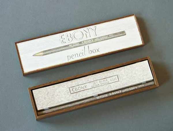
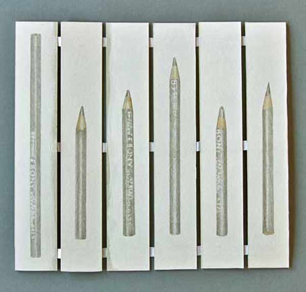
    In 2012, Laura Davidson spent some time drawing her drawing tools. Ebony Pencils is a set of six silverpoint portraits cataloging the remaining pencils from Laura’s youth. These pencils were given to her by her father, who worked as a detailer at Studebaker’s and then the Ford Motor Company. This unique book is housed in a walnut box crafted by Laura’s father. 

    During my visit to her studio, Laura directed me towards her magnetic wall where additional drawings hung. Since Ebony Pencils, Laura has expanded to include more tools for her collection, capturing the detail of each tool. I hope these drawings will soon manifest into another delicately crafted book. 

    ebonypencil2-lauradavidson


  8. Book Artist of the Month: Laura Davidson

    April 22, 2013 by Erin Fletcher

    everynib-lauradavidson

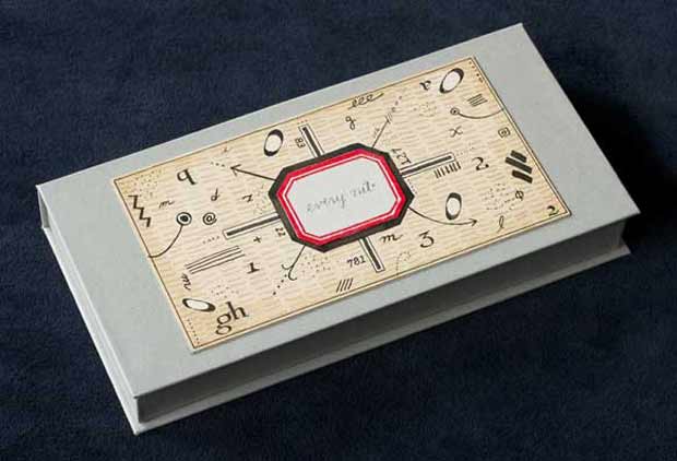
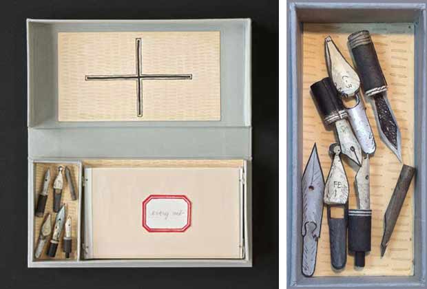
    Not only does Laura Davidson find inspiration in her travels and her neighborhood, but also in the tools scattered throughout her studio. Every Nib is catalog of nibs and pens used in Laura’s work; housed in a clamshell box that opens to reveal a book and seven handmade pen nibs sculpted from painted paper. Every Nib was created in an edition of 18, signed and numbered, in 2012.

    everynib2-lauradavidson

    The book is bound as an accordion, delicately held together with wire and linen. Five pages of the book are block printed with unique images of five different pen nibs with descriptions written in ink. At the bottom of each page is a hand drawn pen in silverpoint. The sixth page includes an artist’s statement from Laura written in a Sheaffer’s fountain pen. A portrait of the 1940s pen is drawn in silverpoint. In the small compartment, each nib replica appears fragile, but are quite sturdy and highly detailed. Laura showed me some of the real nibs, tucked away neatly in little tins or the original Italian packaging. 

    The grey clamshell box was crafted by Marie Oedel. The box includes labels and tray linings hand drawn with pen and ink wash. The box and all its contents are protected inside a fold-over portfolio with an original linocut of a pen nib on the spine. 

    everynib3-lauradavidson


  9. Book Artist of the Month: Laura Davidson

    April 15, 2013 by Erin Fletcher

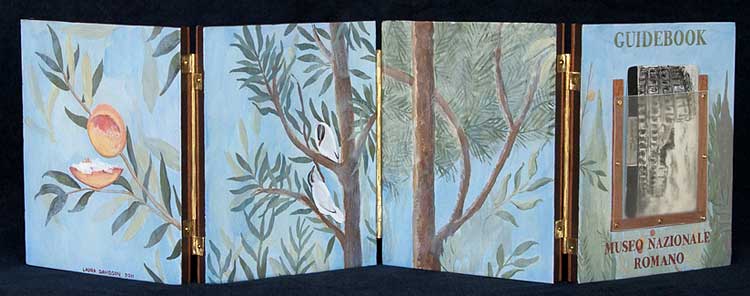
    guidebook1-lauradavidson

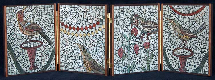
    Guidebook – Museum Nazionale Romano was completed by Laura Davidson in 2011 after an inspirational visit to the museum in Rome. The four wooden pages of this accordion book are connected with handmade brass hinges. The painting on the cover and exterior sides of the book are based on a frescoed room housed in the museum. A transparent vellum holder on the front cover displays a two-sided replica of the museum ticket, which was drawn using ink and wash.

    guidebook1a-lauradavidson

    The interior pages of the book are paper mosaics based upon pieces in the museum’s collection. These paper mosaics are found throughout Laura’s work and are quite beautiful (even more so in person). Each mosaic is created by adding tiny pieces of paper to a line drawing. Each piece is then painted individually by hand. Laura works with a wide color palette as she paints her mosaics, slightly altering the pigment from piece to piece. Some images are also embellished with 22 c. gold leaf.

    guidebook2-lauradavidson

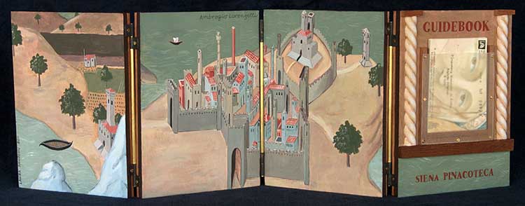
    After visits to the museum in Siena Pinacoteca, Laura becomes inspired to create another guidebook.

    In Laura’s words:
    These books are about specific places that have inspired me – the Siena Pinacoteca is a place I have a very emotional attachment to. There is one floor there that I know the works so well, I can find sketches from many different visits. I can see color influences in my work from there and the deep desire to use gold leaf. 

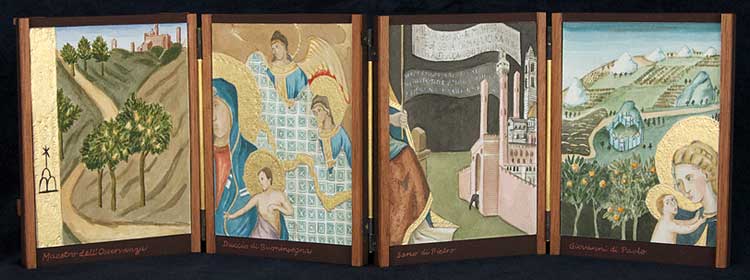
    Guidebook – Siena Pinacoteca was also made in 2011 as a four page accordion book bound using handmade brass hinges. I had the opportunity to handle this book during my visit to Laura’s studio. The movement of the pages were very fluid, which allowed me to navigate easily through the book as both an accordion and codex. The paintings on the exterior side of the wooden pages are based on two works by Ambrogio Lorenzetti. This guidebook also includes a transparent vellum holder set in between two carved columns. The holder displays a two-sided museum ticket, which Laura recreated using ink and wash. I love this detail, the hand-drawn tickets act as souvenirs and create a connection between the artist and the viewer. 

    guidebook2a-lauradavidson

    The interior pages are ink and wash drawings depicting details of paintings within the museum’s collection. The images are embellished with 22 c. gold leaf.


  10. Book Artist of the Month: Laura Davidson

    April 8, 2013 by Erin Fletcher

    9citiescover-lauradavidson

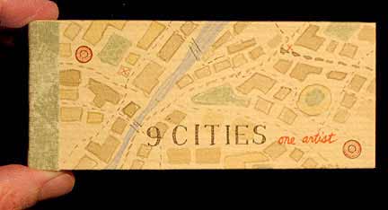
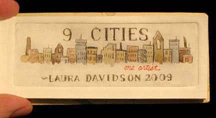
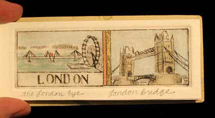
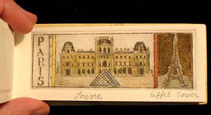
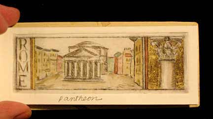
    In 2009, Laura Davidson took inspiration from the cities that she visited and created 9 Cities, One Artist in a small edition of 7. Each hand colored dry point print depicts a monument from each respective city and includes a handwritten caption naming the buildings. The beautiful, muted color palette is a lovely contrast against the vibrant 22 c. gold details. There are 10 prints in total.

    The book is on a smaller, more intimate scale measuring 2″ high by 4½” long. 

    A few words from Laura regarding her work:
    I love to travel and have been so inspired by it. I think it is good to get out of the studio and look at what is out there and what can inspire.

    9cities-lauradavidson 9citieslondon-lauradavidson 9citiesparis-lauradavidson 9citiesrome-lauradavidson


  • My name is Erin Fletcher, owner and bookbinder of Herringbone Bindery in Boston. Flash of the Hand is a space where I share my process and inspirations.
    The StudioNewsletterInstagramEmail me
  • Archives