RSS Feed

Posts Tagged ‘bookbinding’

  1. New Items in the Herringbone Bindery Etsy Shop

    June 11, 2013 by Erin Fletcher

    newetsyitems

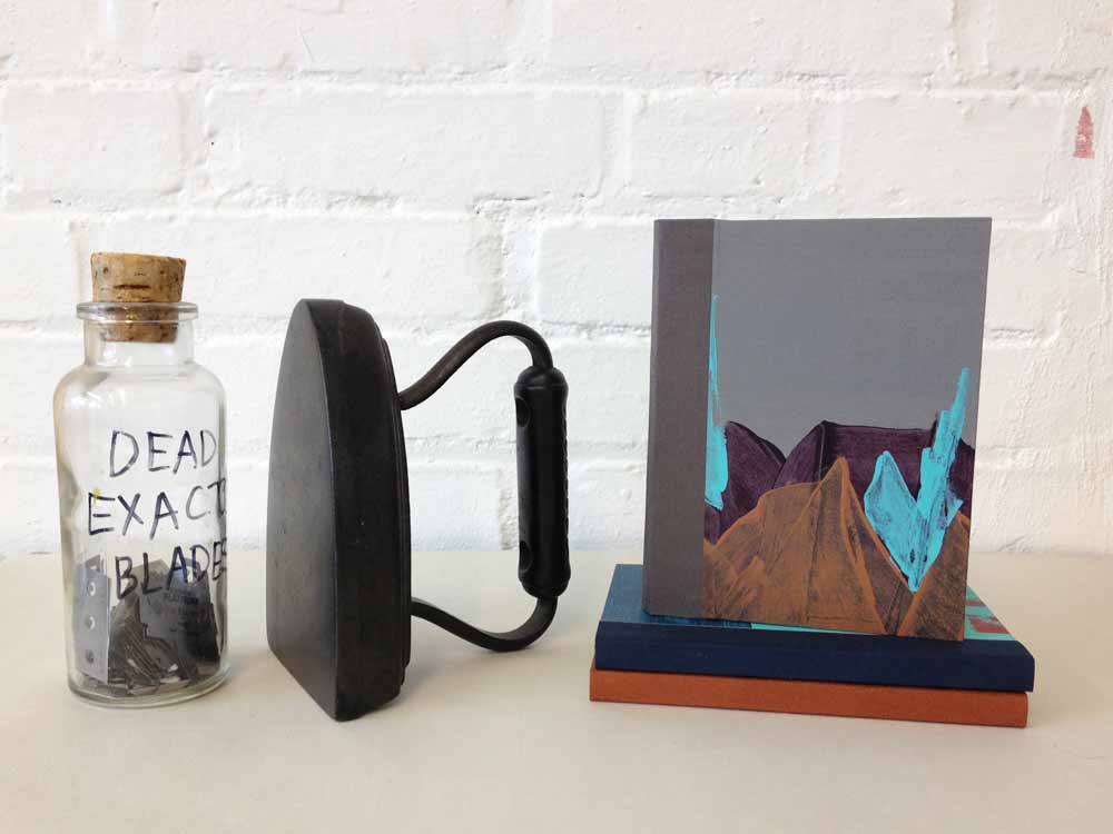
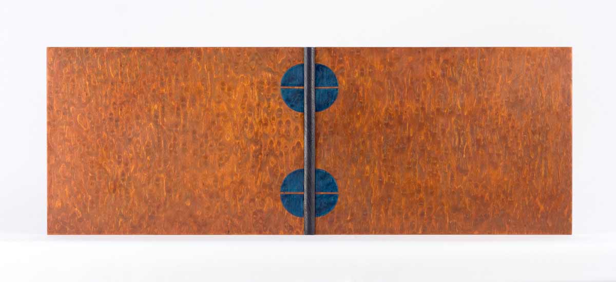
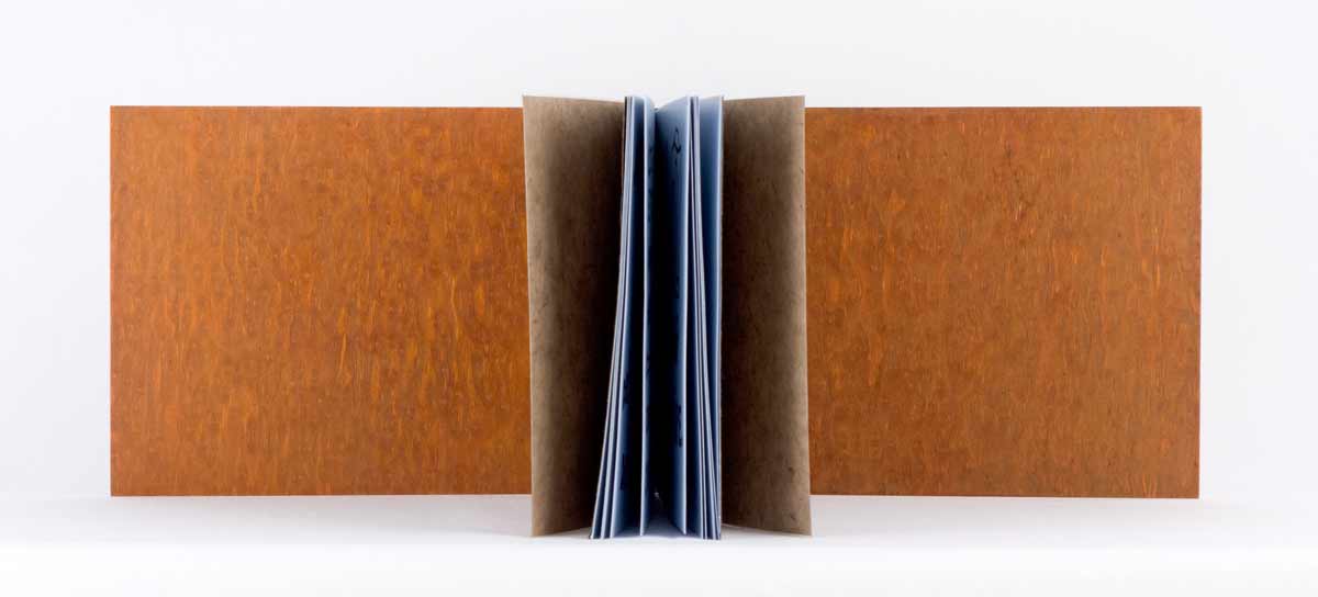
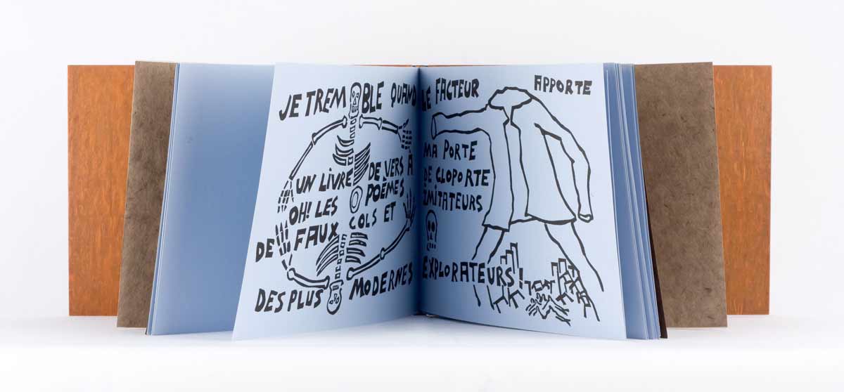
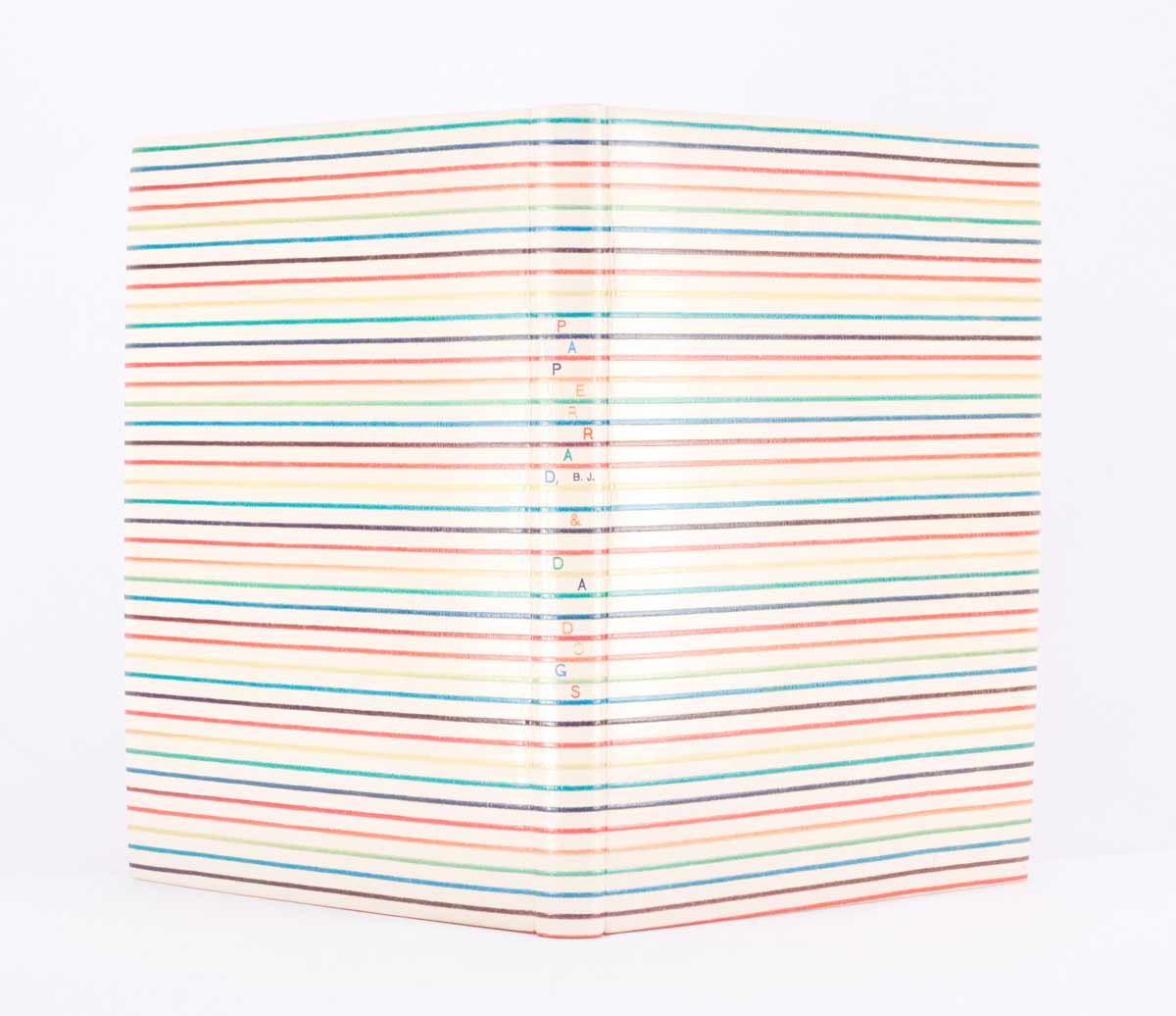
    During a recent workshop, I revisited the Gary Frost sewn-board binding structure. Remembering how much I enjoy that structure I decided to bind a few for my Etsy shop using the same series of paste papers as the previous collection of books. Each sewn-board journal is filled with 48 blank Mohawk pages and accented with book cloth on the spine and board edges near the spine. 

    Check out Herringbone Bindery at Etsy

    sewnboardpurplecheetah
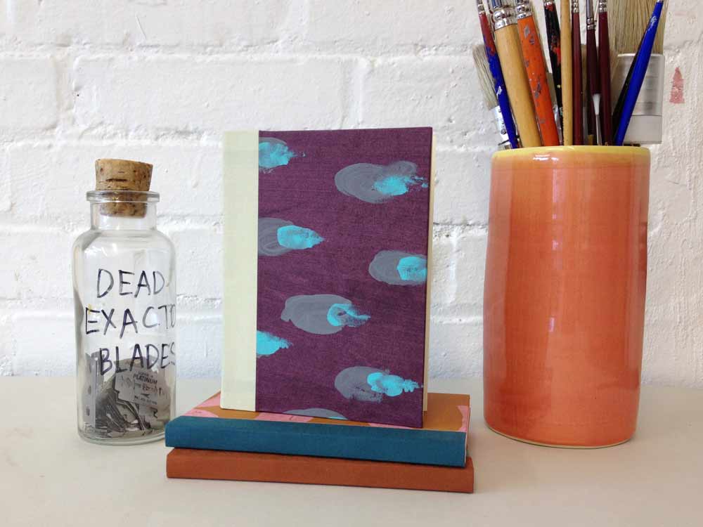
Hand Bound Sewn-board Blank Notebook // Grey Cheetah – $25.00

    sewnboardmountainHandmade Sewn-board Blank Notebook // Mountain – $25.00


  2. Bookbinder of the Month: Sonya Sheats

    June 9, 2013 by Erin Fletcher

    bienaimeraymond-sonyasheats

    Photo by Brandon Constant.

    Bien Aimé Raymond by Max Jacob with illustrations by Jean-Marie Queneau was bound by Sonya Sheats in 2007. This was Sonya’s first open joint binding using MDF and wood veneer. Sonya refers to this binding as an open joint because the covers are attached by the snakeskin and vellum sewing tapes, leaving an open (or empty) joint between the text block and the boards. It is a cased-in binding that is based on a structure that was used by Otto Dorfner in Germany in the early 1900’s.

    The covers are a dyed birch veneer with a dark blue Oasis goatskin spine. The endpapers are brown Silsuede and a brown Nepalese paper.

    bienaimeraymond2-sonyasheats bienaimeraymond3-sonyasheats


  3. Bookbinder of the Month: Sonya Sheats

    June 2, 2013 by Erin Fletcher

    paperradpoly-sonyasheats

    Photo by Brandon Constant.

    Paperrad was an artist collective based in Boston and comprised of Jacob Ciocci, Jessica Ciocci, and Ben Jones (all fantastic friends of Sonya Sheats). Their multimedia projects use “lo-fi” visual aesthetics, bold fluorescent colors, and images from popular culture.

    In 2006, Jacob visited Sonya in France. Paperrad’s first book, BJ and Da Dogs, had just been published and he brought her a couple copies. Sonya had just finished her first apprenticeship with Edgard Claes and was about to return to Belgium to continue her studies. Jacob and Sonya thought it would be a good idea to bind Paperrad’s book, so he designed the cover while in France, and Sonya brought it with her to Belgium.

    This edition had been previously bound after publication, so Sonya dismantled the text block. To hide some wear left on the outer folds of the signatures, Sonya glued strips of fluorescent papers onto the folds. The structure for the binding is referred to as “À Creneaux” with an open spine in polycarbonate assembled in sections and PVC. The signatures were sewn with monofilament and exposed along the spine.

    A comment from Sonya:
    It will forever be a running joke between Edgard and me because he was quite shocked and unsettled by the colors in the Paperrad design. I hung up prints, templates, and color samples around my workspace, and Edgard joked that he had a hard time looking in my direction during that time. It took me about 22 hours to make 7 templates for the color blocks and to airbrush the design [with automotive paint]. 

    paperradpoly2-sonyasheats paperradpoly3-sonyasheats

    The interior of the boards were also airbrushed, one in lime and the other in a soft blue.

    paperradjourdan-sonyasheats

    Bound in 2005 for Paperrad, BJ and Da Dogs is this full embossed leather binding with colored foil tooling for the title. Below is another edition bound as an open joint binding with buffalo skin.

    paperraddiamonds-sonyasheats


  4. June // Bookbinder of the Month: Sonya Sheats

    June 1, 2013 by Erin Fletcher

    lacouleurduvent-sonyasheats

    Photo by Denis Larocque.

    La Couleur du Vent is a collection of poems by Gilles Vigneault, illustrated and designed by Nastassja Imiolek under the artistic direction of Cécile Côté. Sonya Sheats bound this copy for an international design binding exhibition organized by ARA-Canada and the École Estienne in Paris. The exhibition is currently on display in Paris until it travels to Quebec and then to Montreal. The exhibition is also viewable online at ARA-Canada: La Couleur du Vent

    Sonya bound this edition as an open joint sewn with tapes made out of vellum and box calf, spine is tanned calf skin with onlaid bands of muted green and taupe water-snake skin and one band of red calf skin, boards in MDF and walnut burl veneer, and onlays in lace wood and calf skin. The subtle accent on red comes straight from the illustrations in the book.

    While finishing my second year at North Bennet Street School, Sonya was invited to teach my class the simplified binding structure, a technique she learned from Sün Evrard. Initially, I had the pleasure of meeting Sonya during an open studio event in Cambridge. I was able to tour her space and handle many of her bindings. I am very intrigue and captivated by Sonya’s clean design and level of skill. I would like to thank Sonya for taking the time to share her experiences and skills with me through this interview

    Read the interview after the jump and come back each Sunday in the month of June to read more about Sonya’s work. 

    read more >


  5. North Bennet Street School // Student & Alumni Exhibit 2013

    May 30, 2013 by Erin Fletcher

    At the annual Student & Alumni Exhibit for North Bennet Street School, the 2013 graduating Bookbinding class* showcased their design bindings for the set book The Periodic Table by Primo Levi. The text is largely a memoir of the years before and after Levi was transported to Auschwitz. Through a set of chapters titled after elements on the periodic table, Levi recounts his Jewish community in Italy and his life as a student and young chemist; exposing how life’s pleasures can resist and endure in the face of tyranny.

    studentalumni-kevinsheby

    Kevin Sheby bound his edition in black goatskin with hand-dyed goatskin onlays, tooled with palladium. The title and author are also hand tooled in palladium. Edges decorated with graphite and irregularly gilt with palladium. Kevin finished off the inside covers with black goatskin doublures and sunken ebonized veneer panels.

    studentalumni-jeannegoodman

    Jeanne Goodman covered her binding in full navy blue goatskin with sunken hexagon panels on either cover displaying two illustrations from the text. Each illustration is created through the use of several decorative techniques including feathered onlays, tooling in blind and gold and surface gilding in palladium. A tooled double border in gold runs along the outer edges of the covers. All three edges are gilt in gold and the interior is finished with handmade graphite paste papers.

    studentalumni-katrinakiapos

    Bound in full black goatskin, Katrina Kiapos, accented her design binding with a minimalist, geometric design. Three onlays in shades of black and grey mirror each other from the front and back covers. Katrina hand tooled the title and author in palladium. Edges decorated with graphite and sprinkled with palladium. The interior is covered with black goatskin doublures and leather flyleaves.

    studentalumni-betsyroper

    Betsy Roper bound her design binding in full hand-dyed goatskin. The skin was dyed to have a mottled look, creating texture and movement. Various hexagons are placed on the front and back cover, both protruding from and sinking into the boards. Title hand tooled in blind. Edges decorated in a soft brown tone. A marbled paper accents the island paste down and flyleaf.

    studentalumni-averybazemore

    Avery Bazemore created a design to reflect the chapters of the book, emphasizing the section about gold with a surface gilt square onlay on the front cover. The book is bound in full grey goatskin with additional onlays in black goatskin. Title and author were hand tooled in carbon. Head edge decorated before sewing in graphite; Avery again emphasizes the chapter in gold by gilding that particular section of the text. The single line continues onto the headband and headcap. The interior is finished off with leather doublures.

    studentalumni-laurenschott

    Covered in full dark green goatskin, Lauren Schott created a design binding reminiscent of the Art Deco era. Hand tooled gilt lines run the height of the front cover, wrapping around the spine, board edges and back cover leaving the outline of a hexagon. The title and author were also hand tooled in gold. Edges decorated with graphite and sprinkled with gold leaf.

    In addition to student work, a small handful of alumni work was also on display.

    libraryofbabel-colinurbina

    Library of Babel bound by Colin Urbina in full brown goatskin and hand tooled in a repeating hexagon pattern. A single hexagon is gilt on the front cover. Edges decorated with alternating shades of brown and chartreuse green.

    libraryofbabel2-colinurbinawhitman-samfeinstein

    A full leather rounded spine clamshell box from Samuel Feinstein. The front cover has a built-in window to house a printed portrait of Walt Whitman in addition to a gold tooled border along the frame.

    shakespeare-celinelombardi

    The Complete Works of Shakespeare bound by Celine Lombardi in full red goatskin. Titling and cover design hand tooled in gold. Each title on the spine is linked to a tab on the foredge of the text block through a corresponding gilt line.

    alumnicase-erinfletcher

    There are four great pieces on display in this case. On either corner are two of my bindings: Fantastic Mr. Fox and James and the Giant Peach. Last year, Marie Oedel paired up with book artist Laura Davidson (whom I interviewed on my blog in April) to make custom boxes for her book Every Nib. Lastly, is Celine Lombardi’s Murmurations, a small edition printed and bound during her year long fellowship at The Center for Book Arts in New York.

    * Nancy Baker’s set book was taken from the exhibit before I could photograph it for this blog post.


  6. Client Work: Large-scale Coptic with Collaged Paper Covers

    May 14, 2013 by Erin Fletcher

    copticopen-erinfletcher

    Weggefährten is a German word that roughly translates to companions. I was approached by my client, Nadja to create a Coptic binding for a series of letters and collaged pages to present as a gift for her partner’s 40th birthday. Each page was submitted by someone who had made a meaningful connection with her partner during the course of his life. The ‘mountainous’ landscape on the covers was chosen by my client from a previous design I had done. She enjoyed the organic quality of the design and how it mimicked the pathways of life.

    When I originally covered a Coptic in this manner, each section would overlap and turn-in at the tail of book. This created a very bulky edge at the tail of the book that was five layers thick as oppose to only one layer at the head. In order to avoid that excessive bulk, I cut each color section to the sized required. Once I drew out the design I was able to trace the shapes onto the paper, building in for turn-ins and a 2mm overlap. I used various shades of Hahnemuhle Ingres to create the design.

    The Coptic was bound with hand-dyed linen thread to match the shade of Ingres at the six sewing stations.

    copticdetail-erinfletcher

    In addition to Weggefährten, the Coptic was also stamped with the phrase 40 Jahre, which translates to 40 years. The words were individually stamped with brass handle letters to follow the horizon of the pathways. In order to do this irregular stamping on paper, I first trace the line my word will follow onto tracing paper. I place a piece of gold foil onto the cover, then lay down my piece of tracing paper. The hot tool stamps through the tracing paper and the gold foil. I do not remove either layer until the word is complete, this allows me to easily see where to stamp the next letter.

    copticpastedown-erinfletcher

    The color scheme of the book was quite surprising with pops of color and metallics in unusual places. The fold of each signature was highlighted with a bit of magenta Lokta to contrast with the subtle tones of the Ingres. The paste down is a gold metallic paper, which pairs nicely to the pale pink fly leaves.

    copticenvelope-erinfletcher

    In addition to the single pages of letters and collages, was a seven page comic and CD. Using the same pale pink paper as the fly leaf, I included a 4-flap enclosure at the end to house these additional pieces of reverence. The entire book is enclosed inside a magenta 4-flap enclosure for protection.

    It was incredibly enjoyable to work on this project because it was outside my usual flow of work. The client’s reaction was ecstatic as she saw her vision come into being and couldn’t wait to present it to her partner. Check out more Custom Projects at Herringbone Bindery.


  7. Client Work: Clamshell Box for Seven Miniature Shakespeare Books

    May 7, 2013 by Erin Fletcher

    clamshellmini8-erinfletcher

    A client came to me with a set of seven miniature limp-leather Shakespeare bindings in need of a clamshell box. The length of each book was exactly the same, but the width and height varied slightly. As a solution I built individual French trays for each book and assembled them side by side as the A tray for the clamshell box.

    clamshellmini4-erinfletcher

    The French trays were constructed with a single opening at the tail of each book, exposing a piece of satin ribbon. The ribbon was installed for ease in removing each book and to put less stress on the book during this process. When measuring for each French tray, I was less concerned about the width (as I knew they would vary) and the length (as they were all consistent). However, I wanted the French trays to be the same height. Since the books varied from 12mm to 19mm, I adjusted the thickness of the trays by laminating board together so the books would rest at a uniform height.

    Since each French tray would be custom fitted to a specific book, I stamped each title with gold foil on the Hahnemuhle ingres used to line the base of each tray. This would prevent any confusion when replacing the books and to make sure the books rest in their properly fitted tray.

    clamshellmini3-erinfletcher

    The walls were made from millboard and covered with brown Canapetta bookcloth.

    clamshellmini2-erinfletcher clamshellmini`-erinfletcher

    Once all of the French trays were assembled I was able to measure out the materials for the B tray and the case. The B tray was covered with the same brown Canapetta cloth and lined with earth Hahnemuhle ingres. The exterior of the box was covered with a dusty pink buffalo skin and stamped with gold foil the initials of my client’s wife. As this was to be a gift for Christmas.

    clamshellmini6-erinfletcher

    I was very satisfied with the overall construction and feel of the box, as was my client. I enjoyed the challenge that was presented by this project and working with miniatures was a nice change of pace from my regular line-up. You can see more client work on the Services page at Herringbone Bindery.


  8. Swell Things No. 4

    April 30, 2013 by Erin Fletcher

    stno4a

    1. These brilliant and mystifying jellyfish are captured by artist Alexander Semenov, who studied Zoology from Moscow State University and specialized in invertebrate animals.
    2. Indigo: The Color that Changed the World by Catherine Legrand follows her search to reveal the few remaining communities that continue to harvest and produce indigo, tracking history through these contemporary artisans.
    3. I recently watched The Wolf Man from 1941 with my mother. It was quite campy and not the least bit scary, but revealed itself as the black and white film featured in The Sandlot!
    4. The Knife just released a new album after a seven year hiatus! Enough said.
    5. These 19th Century astronomy drawings from the New York Public Library Digital Gallery are just breathtaking and quite modern.

    stno4b

    6. Boys Club is a tumblr that shines light on aspects of our global culture where women have not tread. For example, all incarnations of Dr. Who have been men.
    7. Stunning photographs from Amira Fritz that simply make me happy and perhaps someday Jason will come home with an oversized bouquet!
    8. Persistence of Vision is a recent documentary from Kevin Schreck following the unfinished animated feature from Richard Williams, who you may recognize as the genius behind Who Framed Roger Rabbit?. Kevin’s film is beautiful and heartbreaking as you follow the ups and downs of Williams’ career.
    9. These adorable miniature rounded-back case bindings have been transformed into an itty bitty urban street. Let’s Live Here is bound by Jamie Lynn Schilling
    10. Midway is a film by Chris Jordan capturing the heart wrenching effects of human waste. The Laysan albatross is plagued by the Pacific Garbage Patch. Chicks are ingesting bits of plastic, causing them to starve and die. Chris Jordan dissects the deceased chick, circling their remains around the contents of their stomachs. 


  9. Bookbinder of the Month: Derek Hood

    April 28, 2013 by Erin Fletcher

    ulysses-derekhood

    In 2012, Derek Hood bound a copy of James Joyce’s Ulysses in full dark blue goatskin with onlays and inlays in various leathers. Printed on natural calfskin (and used as onlays) are excerpts from Joyce’s recently released handwritten manuscript of Ulysses. The book was sewn on hemp cords, which were laced into the boards. The book edges are gilt in 24kt leaf, as is the title on the spine. Endpapers are leather jointed, with Japanese Kozo doublures.

    A hand drawn map of Leopold Bloom’s Dublin by Vladimir Nabokov inspired the design. It follows Bloom’s heady journey, starting from Dublin Bay and meandering across the Liffe. The simple map is intertwined with two fractured Greek masks.

    This first edition copy of Ulysses was published by Random House of New York in 1934. 

    ulysses2-derekhood


  10. Bookbinder of the Month: Derek Hood

    April 21, 2013 by Erin Fletcher

    lookslikenothing-derekhood

    Looks Like Nothing The Shadow Through Air was published by Circle Press in 1972 in a limited edition of 175. Letterpress printed in Times Roman on T.H. Saunders mould-made paper, the content is previously unpublished poems written by Larry Eigner between 1960-1969. The edition includes illustrated relief prints by Ronald King. 

    Derek Hood covered the binding in multiple inlaid leathers including suede, calf and snakeskin. The top edge is hand gilt in 24kt gold leaf. Lettering is tooled in white, purple and 24kt leaf. Endpapers are leather jointed with Japanese Kozo paper doublures, which are tooled with purple arcs.

    The cover artwork is a direct response to the poetry of Larry Eigner. The space between the lines, that Eigner creates, say as much to the reader as the words upon them. The circular movement reflects Eigner’s constant referral to the moon, the sun and the interplay of light between the two. The gold dots are used to emulate the keys of Eigner’s 1940s Royal manual typewriter, which he used to type all of his poetry on. The title is lettered around the book to reflect the informal style in which Eigner laid out his poetry on the page.


  • My name is Erin Fletcher, owner and bookbinder of Herringbone Bindery in Boston. Flash of the Hand is a space where I share my process and inspirations.
    The StudioNewsletterInstagramEmail me
  • Archives