RSS Feed

Posts Tagged ‘leather binding’

  1. My Hand // Into This World

    October 18, 2016 by Erin Fletcher

    IntoThisWorld8-ErinFletcher

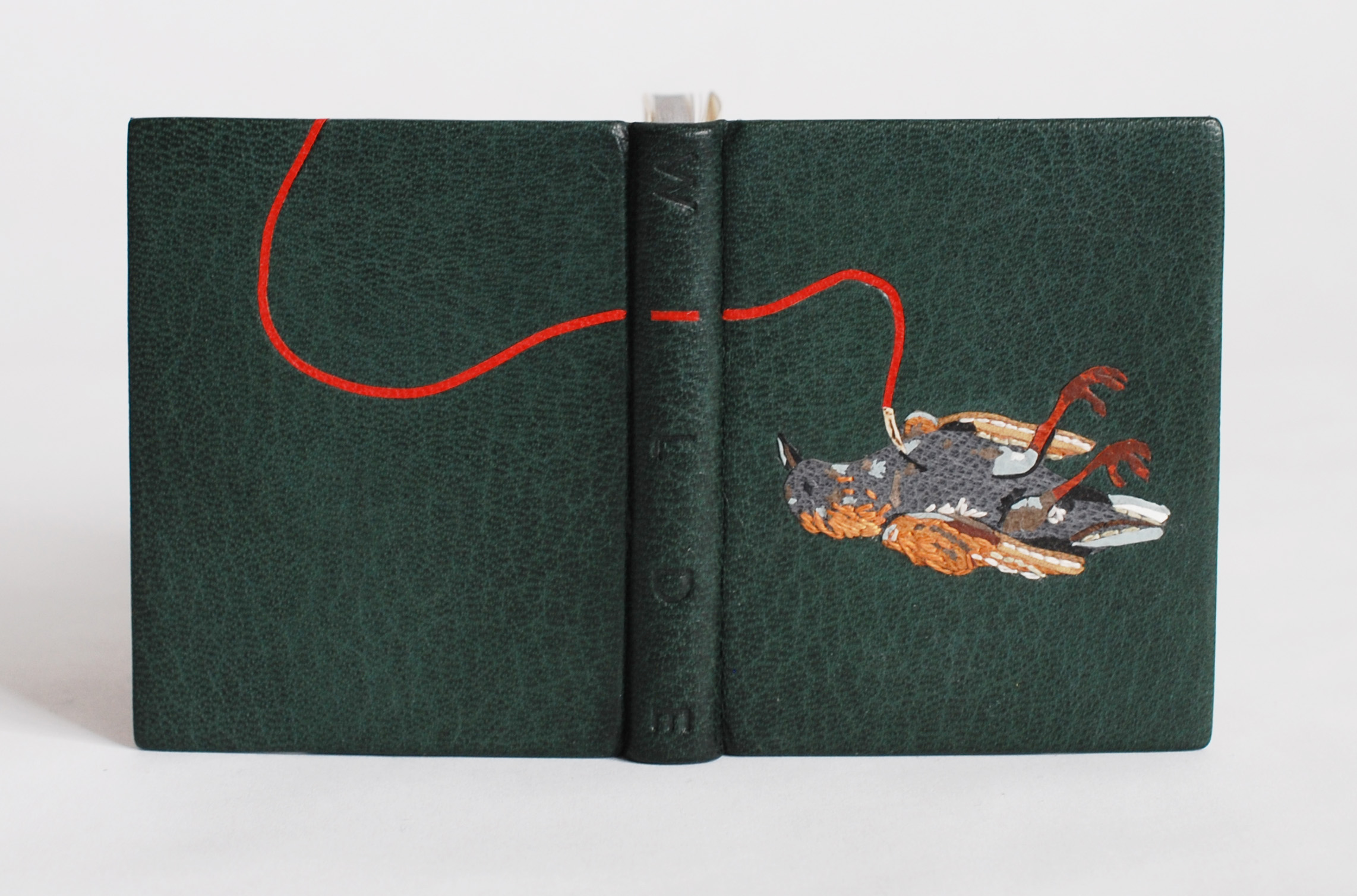
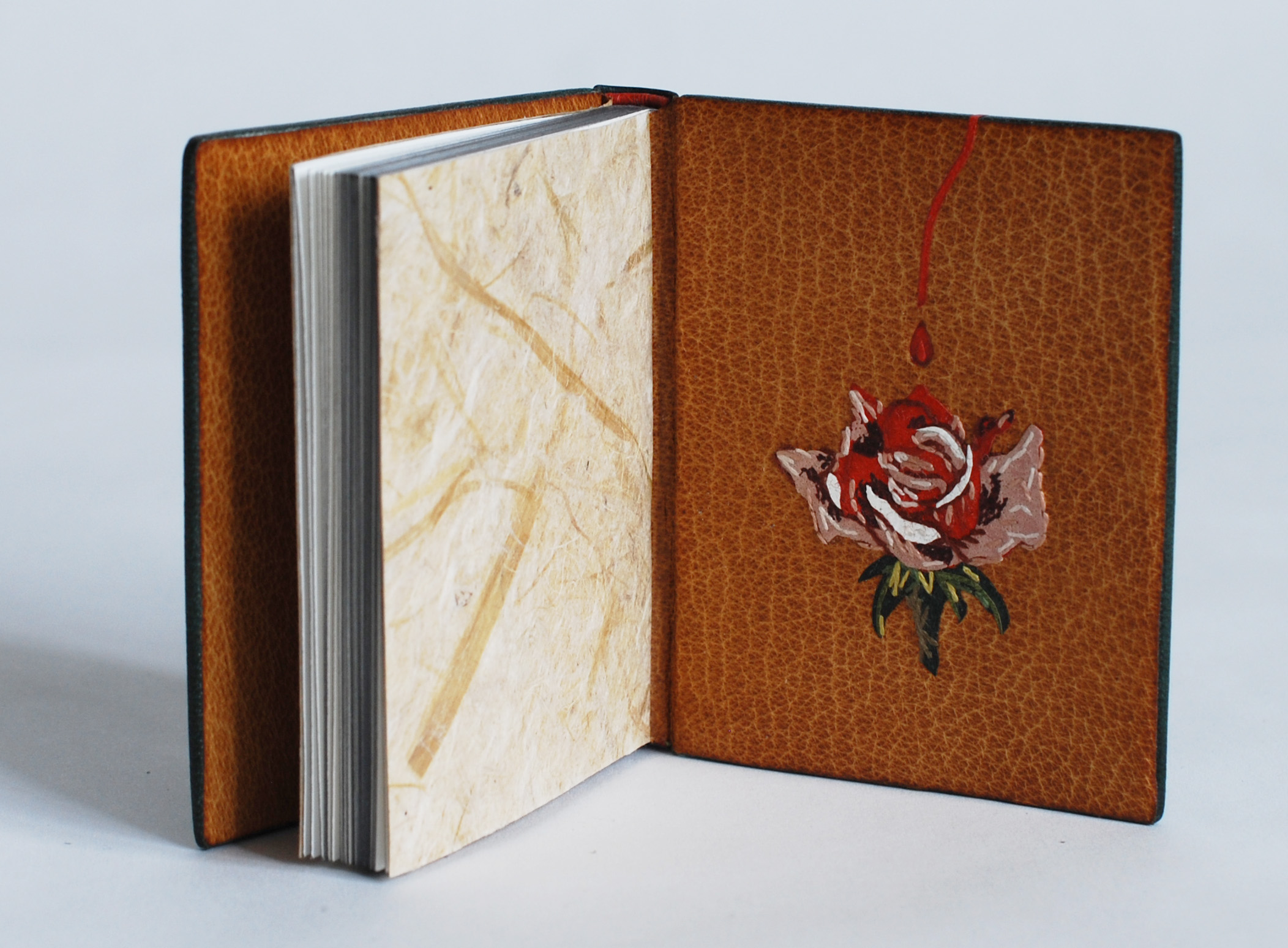
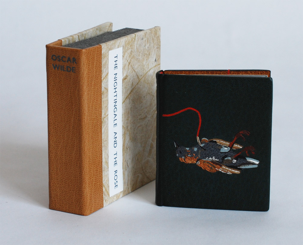
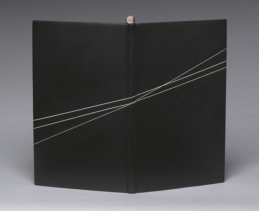
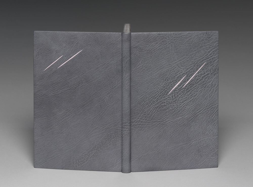
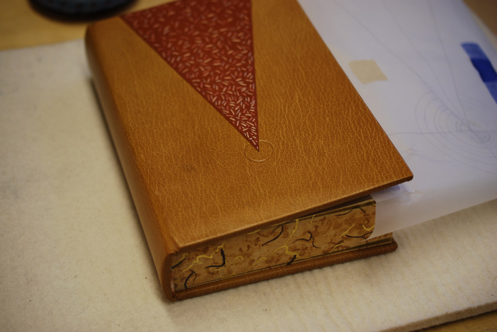
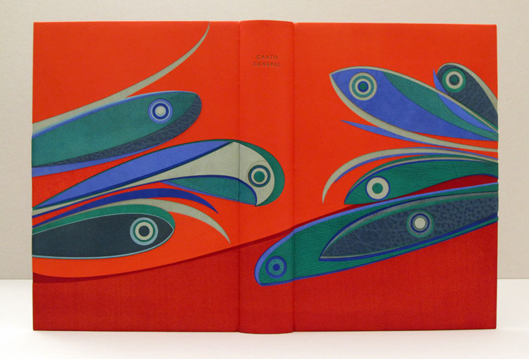
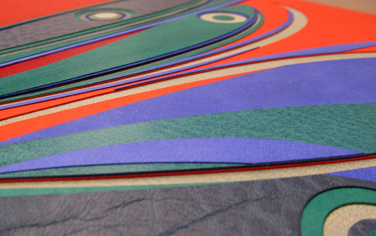
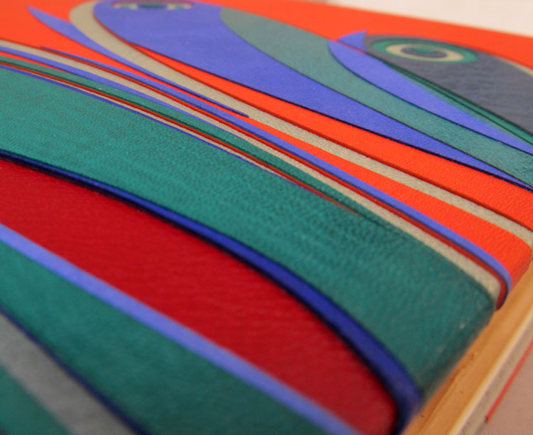
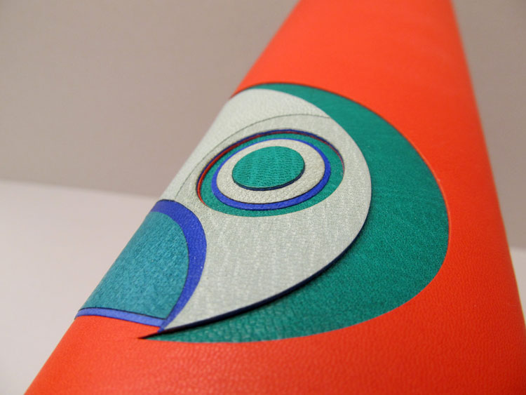
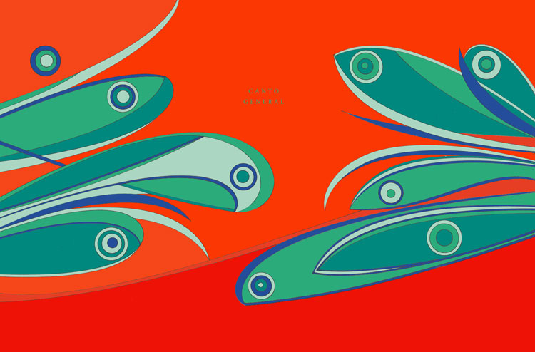
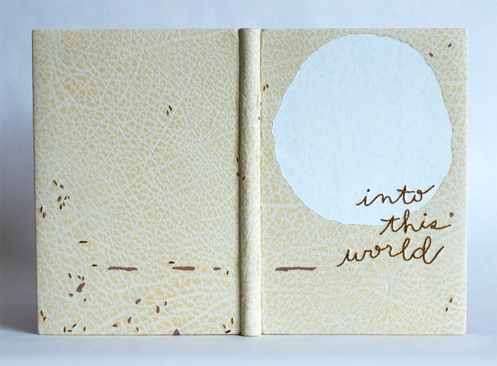
    I recently completed a French-style fine binding around Natalie Goldberg’s Into This World. The letterpress printed text is paired with woodblock prints both carved and printed by Clare Dunne and hand-tinted by Sialia Rieke. The texture of the prints were my inspiration for the design for the binding. By combining the natural texture of the buffalo skin with embroidery and leather onlays, I hoped to capture the pops and cracks between the layers of color.

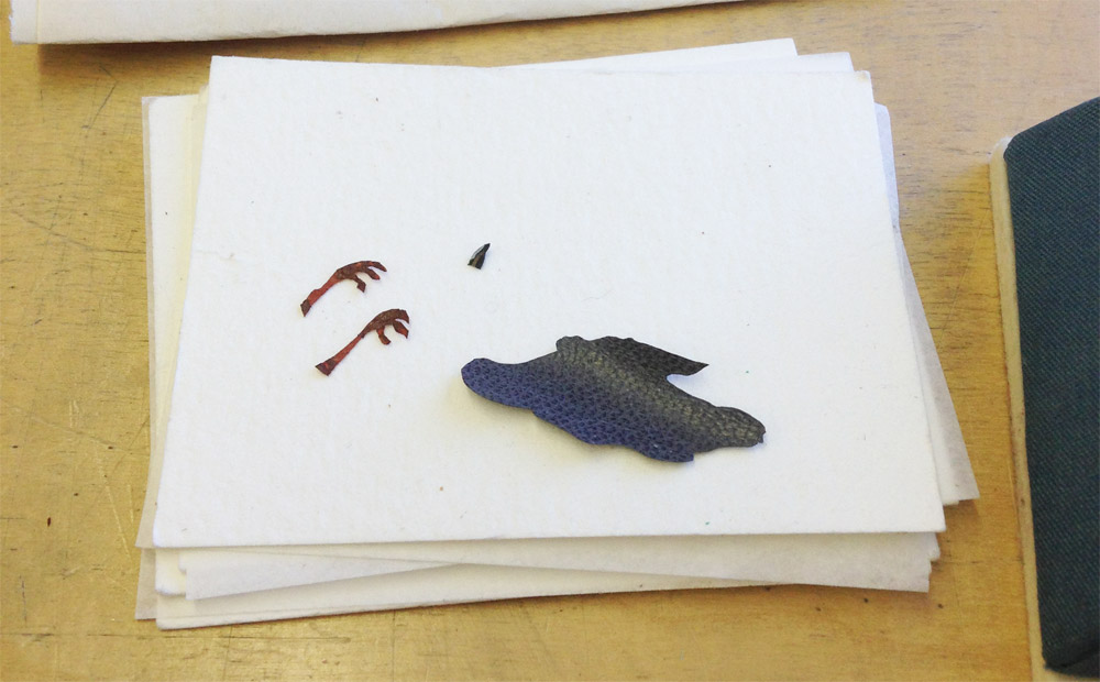
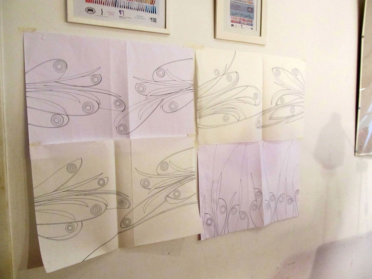
    With this plan in mind, I used a single print as my inspiration to lay out the design. For the embroidered elements of the design, I chose to play with the technique in two new ways: an embroidered title and embroidered paper doublures.

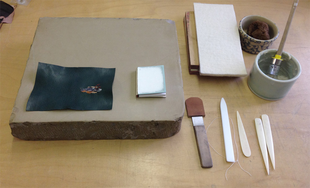
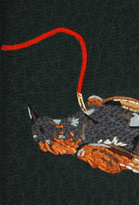
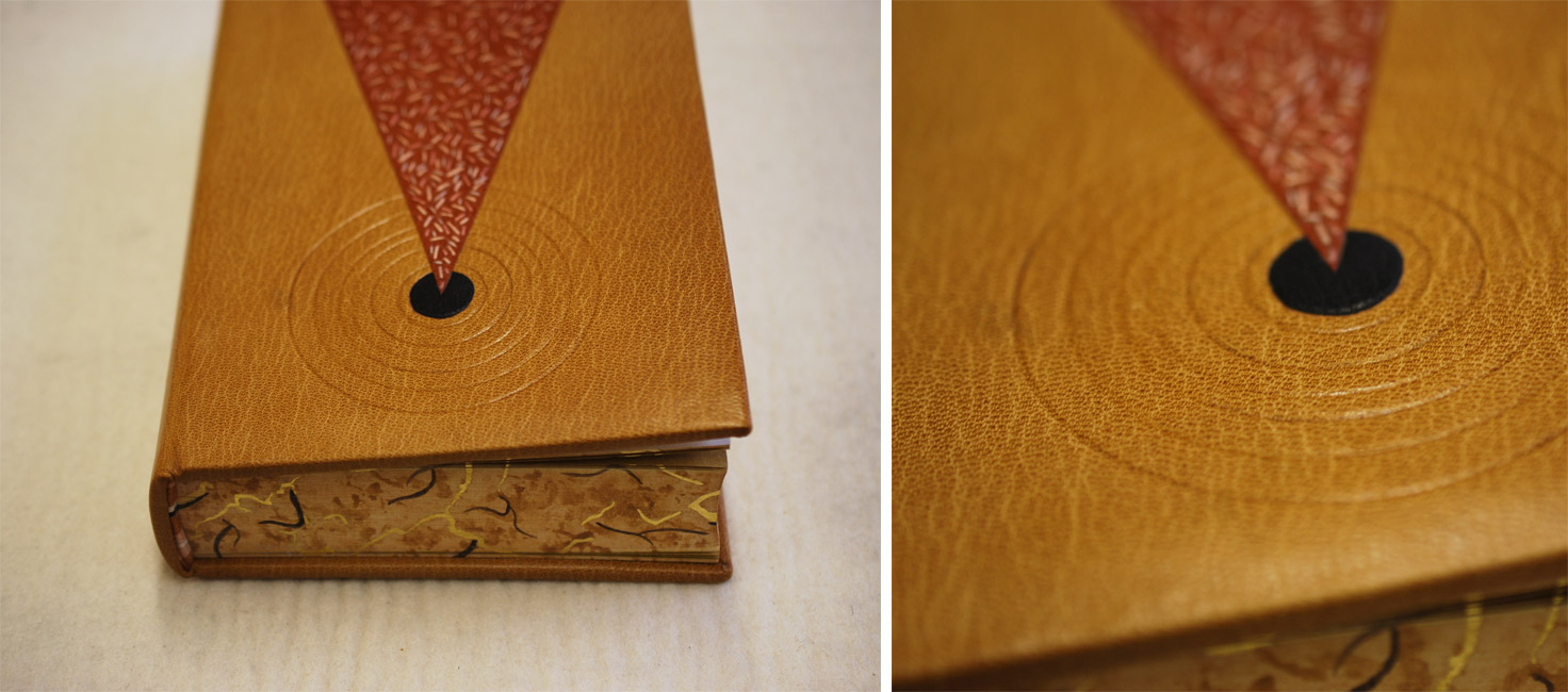
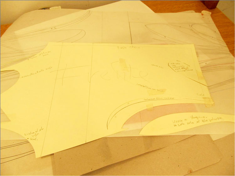
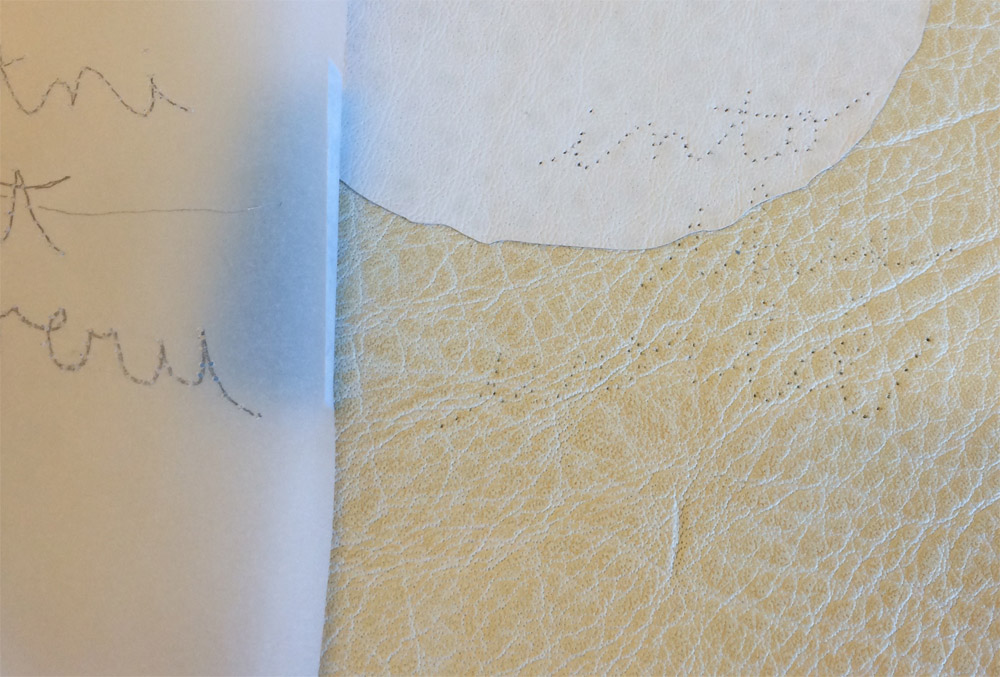
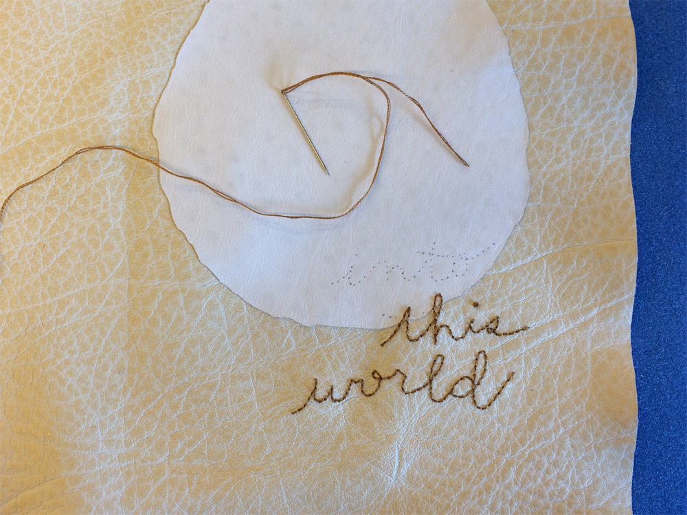
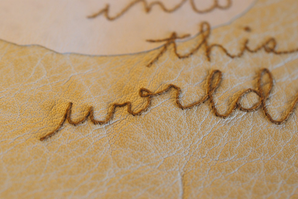
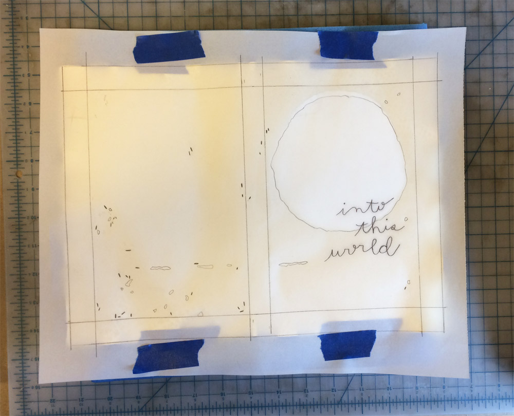
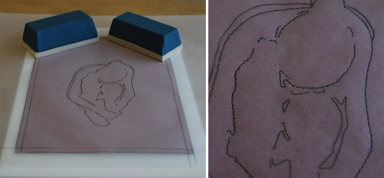
    The script used for the title mimics the author’s own handwriting taken from her signature on the title page. The title was drawn onto tracing paper and taped in place, overlapping the white buffalo back-pared onlay. I tend to pre-punch the holes for embroidery, especially when I am trying to achieve something exact. For the pre-punching, I put a thin embroidery needle in my pin vise and placed the leather onto a piece foam. Then I used the tracing paper to guide my pin vise.

    IntoThisWorld-ErinFletcherIntoThisWorld2-ErinFletcher

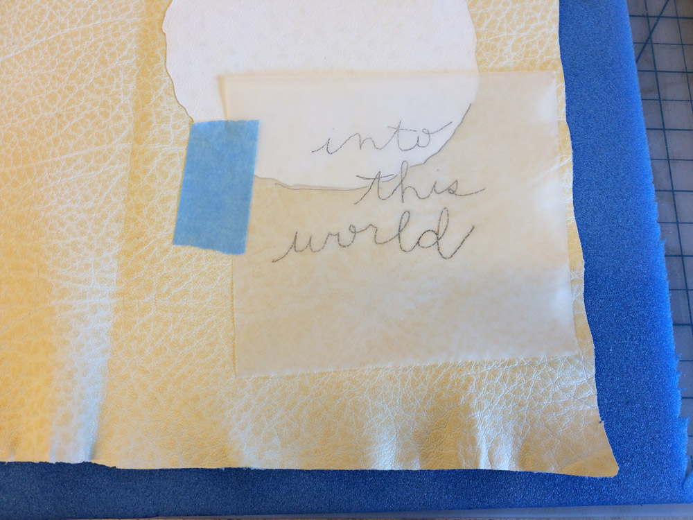
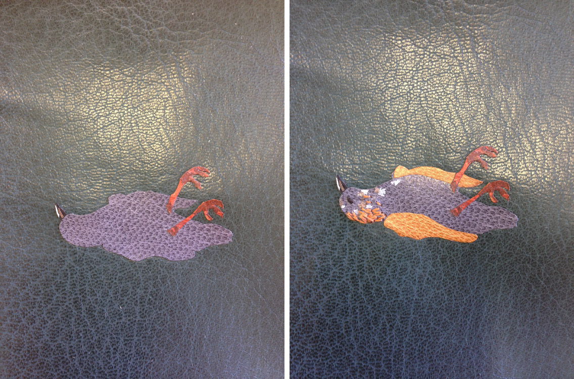
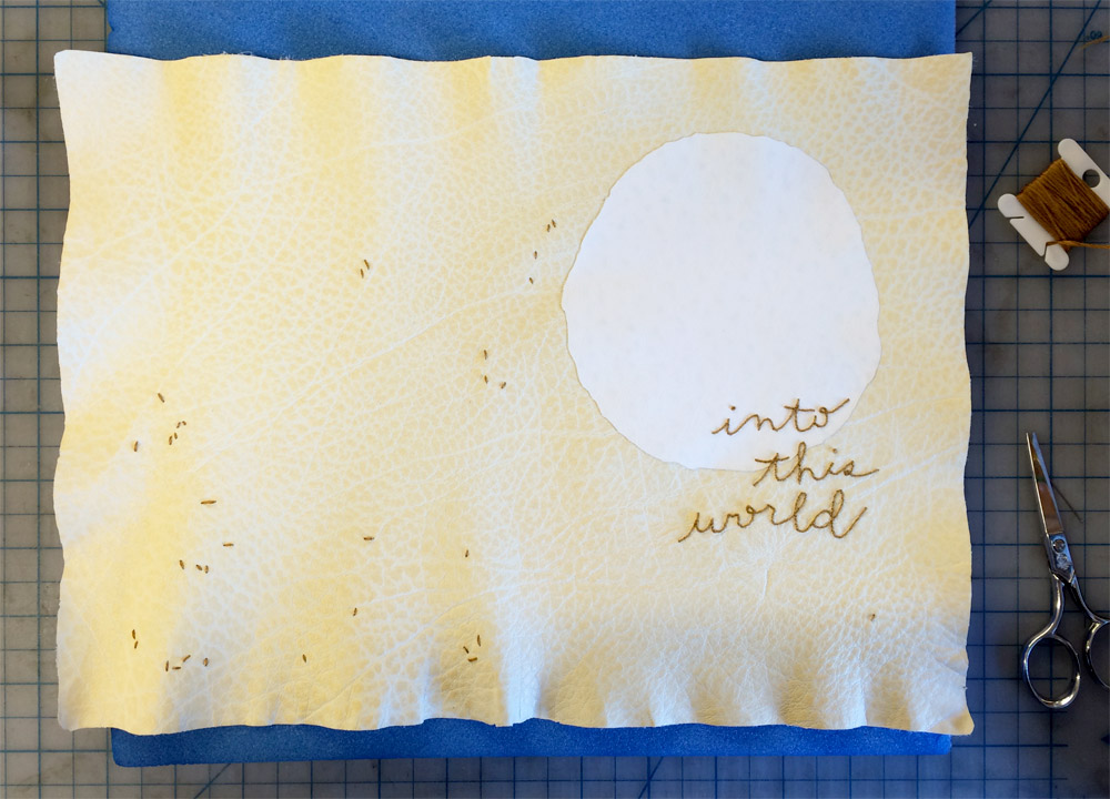
    The embroidery for the title happened in two steps: back-stitch to spell-out the letters with french knots for the i’s dots and then I wrapped the stitches to create a raised, more defined line.

    IntoThisWorld3-ErinFletcher IntoThisWorld5-ErinFletcher

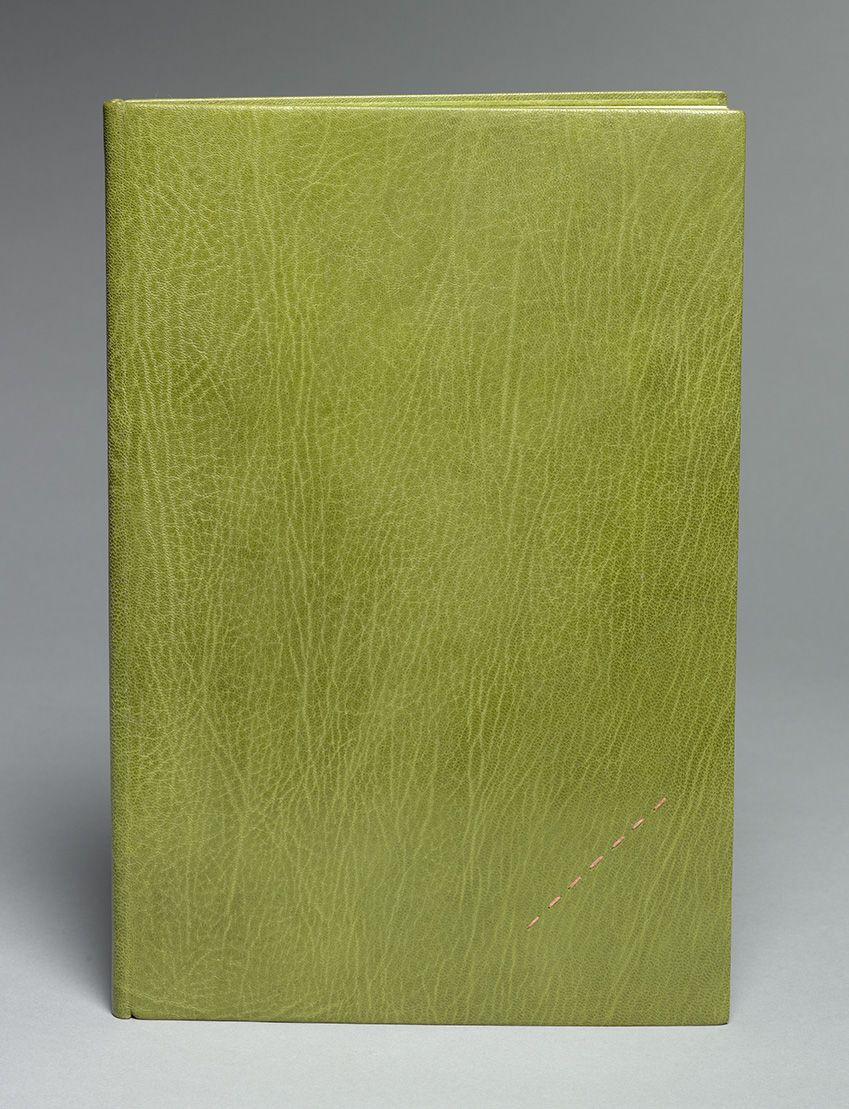
    After the title was completed, several seed stitches were scattered around the binding with the majority of them appearing on the back cover. I used the same technique to pre-punch the holes for the seed stitches, this time using the full-scale template. The title and seed stitches were sewn with 2-ply cotton thread in an ochre yellow.

    IntoThisWorld6-ErinFletcherIntoThisWorld7-ErinFletcher

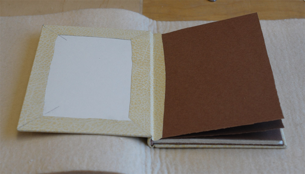
    The second embroidered element in the binding are the edge-to-edge paper doublures. The prep for paper doublures is very similar to the set-up for leather doublures; for paper I allowed a wider turn-in as I trimmed out, this would ensure a smoother surface under the paper. Below you can see the turn-ins post covering and with the leather hinge in place.

    IntoThisWorld10-ErinFletcher

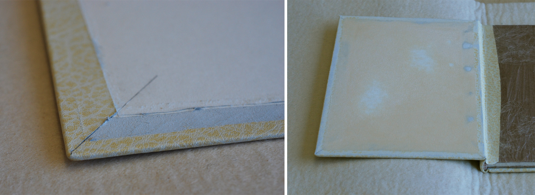
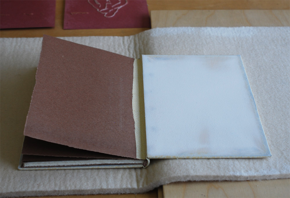
    After scoring a frame around the board and spine edge, I began to trim off the excess leather at a slight bevel. In order to create a successful doublure, several layers are added to the board (one at a time) and sanded to make the board as smooth as possible. The first layer (shown on the right in the image below) was a piece of 10pt. card, first sanded along all four edges and attached with a PVA/methylcellulose mix. After allowing that layer to dry under weight for an entire day, I sanded the edges smooth (which is the state visible in the image below).

    IntoThisWorld11-ErinFletcher

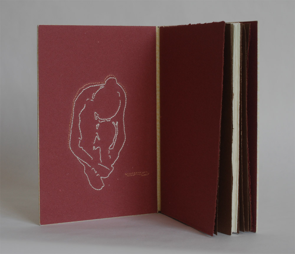
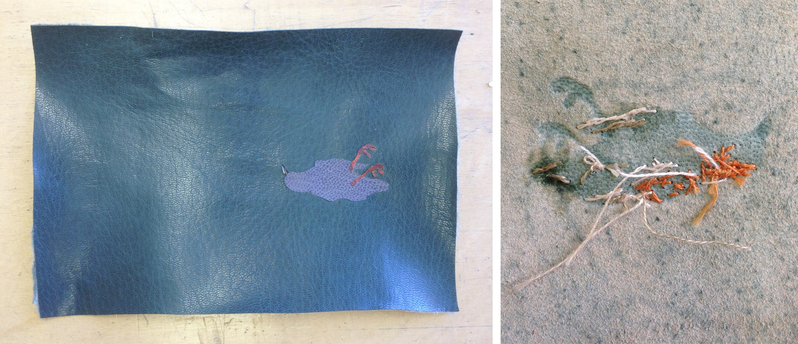
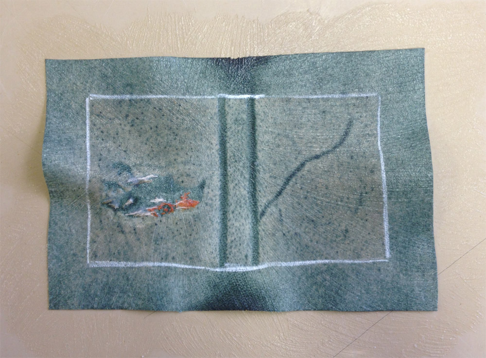
    In between these stages, I began working on the embroidered paper doublures. Referencing the same print used to inspired the covers, I traced an outline of the figure from the image. I felt that her pose embodied the sentiments of the text perfectly. Using the tracing paper once again as my guide for punching the holes, I placed the paper onto a piece of foam and poked through the tracing paper into the doublure paper.
    IntoThisWorld12-ErinFletcherIntoThisWorld13-ErinFletcher

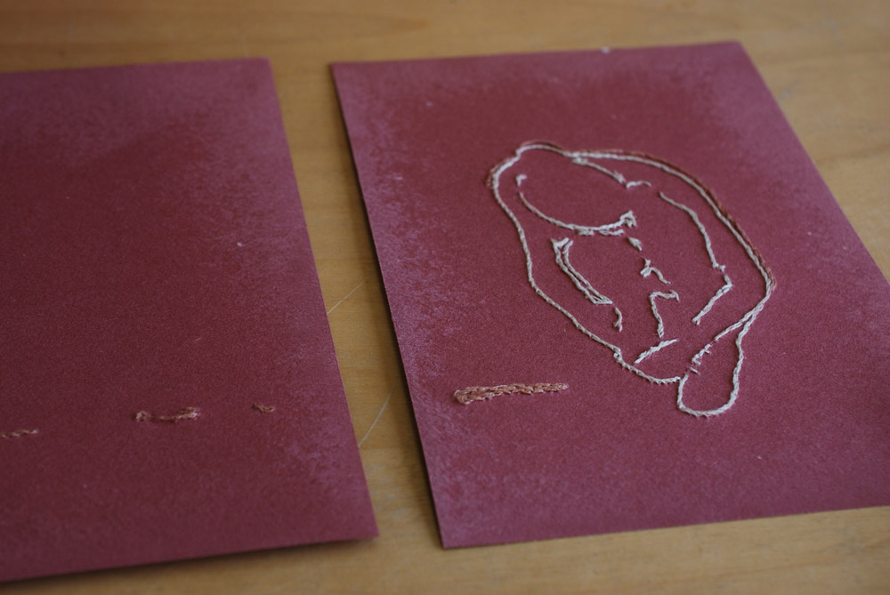
    Once the paper pieces were fully embroidered, I carefully sanded the backside of the paper to create a smoother feel along the edges once glued down to the board. Below you can see the board in it’s final stage. After sanding down the 10pt. card, I attached a medium weight smooth paper. This piece was slightly oversized on three edges and sanded down on the spine side. After allowing it to dry under weight, I sanded it down smooth. The embroidered paper doublures were attached with MIX and put under weight for a day in order to dry thoroughly and to prevent the board from cupping inward.

    IntoThisWorld14-ErinFletcher

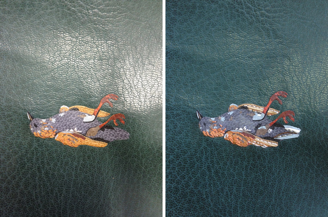
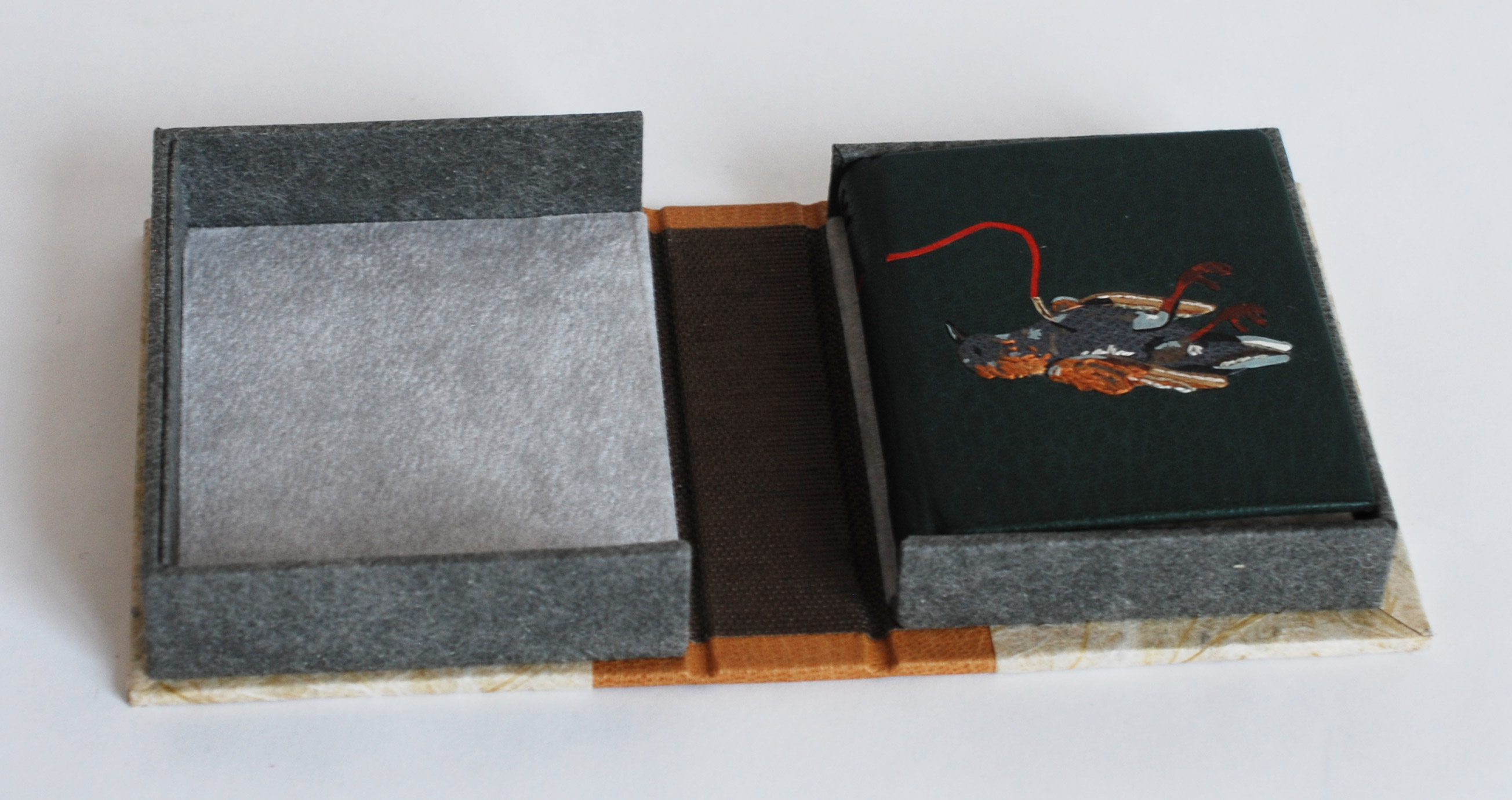
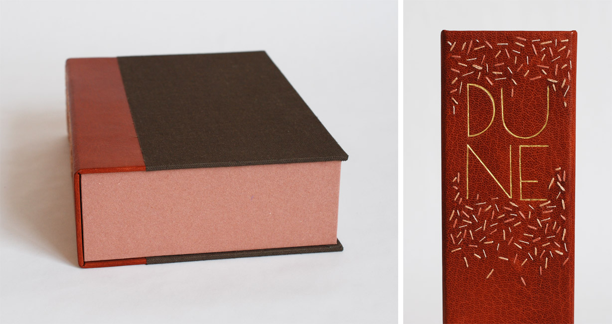
    And here are the final results. I am so pleased with the outcome of the embroidered paper doublures, it will most certainly be a technique I use again on a future binding. To see more images of the binding and it’s embroidered quarter leather clamshell box, click here.

    IntoThisWorld9-ErinFletcher


  2. My Hand // The Nightingale and the Rose

    February 16, 2016 by Erin Fletcher

    Nightingale1-ErinFletcher

    This binding was featured very briefly on the blog last year in my review of the North Bennet Street School’s 2015 Student and Alumni Show. After the show, I sent it off to England for the Society of Bookbinder’s International Competition. Just last week, I was finally reunited with this macabre little binding. Its presence on my bench reminded me that this binding needed a proper post documenting the steps involved in its creation.

    NightingaleAndTheRose1-ErinFletcher

    This edition of Oscar Wilde’s The Nightingale and the Rose was printed by Rebecca Press in 1985 and includes wood engravings by Alan James Robinson of Cheloniidae Press. My design for both the nightingale and the rose are drawn straight from Robinson’s engravings. The text block was sewn on two flattened cords and rounded and backed in a job backer. Which was a bit excessive for such a tiny binding, but offered me a bit a humor. In lieu of a backing hammer, I used the flat, rounded side of my bone folder to achieve the rounded shape of the spine.

    NightingaleAndTheRose2-ErinFletcher

    Once the forwarding on the book was complete, I could focus on the design. I photocopied the image of the nightingale and rose from the text; enlarging them to the desired size. These photocopies became my guide for drawing out each shape of the bird and flower. Beginning with the bird, the first onlays attached to the base leather were a silhouette of the body, the beak and feet. In order to get some depth and texture to the bird’s feet, before cutting out the two shapes I laid feathered onlays of maroon goatskin over thinned out terracotta goatskin.

    NightingaleAndTheRose3-ErinFletcher

    Although I would normally use PVA to place my onlays onto the leather, I chose to use paste because I was worried about staining the tiny pieces of leather when applying the PVA. After the the onlays went down, I pressed the skin between acrylic boards. Then I back-pared the leather. In the image below you can see the shape of the onlays on the reverse side of the leather (the change in color appears because more flesh is being pared from the areas with onlays, this creates a smooth transition from onlay to base leather on the surface.)

    NightingaleAndTheRose6-ErinFletcher

    After paring the leather, I was free to begin with the embroidery. When I embarked on this task, I had very loose plans and approached it in a very free form way. I would build up the image with embroidery and then switch to adding feathered onlays, then more embroidery until I felt satisfied with the look of the bird. You can see this progression below (please forgive the poor photography and variation in color).

    NightingaleAndTheRose7-ErinFletcherNightingaleAndTheRose8-ErinFletcher

    With the design of the bird fully assembled and embroidered, I prepped for covering. After pasting out the leather, I laid down any stray tails from the embroidery beside a stitch to hide its appearance from the front. Then I progressed with the covering, formed the endcaps, wrapped the turn-ins around the cover boards and pleated the corners. After setting the boards, I put the book to rest between a small scrap of felt in my small wooden press.

    NightingaleAndTheRose9-ErinFletcher NightingaleAndTheRose10-ErinFletcher

    Once the book had dried, I carefully opened each cover and began the steps to prep the inside for the leather doublures. The back doublure was embellished with a multi-onlay and embroidered rose. The steps involved in creating the rose mimic those used to create the bird. The tricky part here happened while back-paring. It was impossible to pare to the desire thickness for doublures without slicing through the rose onlay. So the rose is not a true back-pared onlay, it actually sits on the surface of the leather. I was worried this extra thickness might impact the neighboring flyleaf or the way the book closed, but neither became an issue.

    Nightingale2-ErinFletcher

    The Nightingale and the Rose is a tale about a nightingale who chooses to give her life so that a young man may find love. By piercing her breast into the thorn of a rose, her blood stains a white rose red. This part of the story is illustrated with a tiny wood veneer inlaid “thorn”. The red goatskin Ascona onlay runs from the top of the thorn across the spine (at the “I” in Wilde) and to the rose on the back doublure.

    NightingaleAndTheRose12-ErinFletcher

    The book is housed in a miniature quarter leather clamshell box. I used the same tan goatskin on the spine of the box which was used on the doublures. The rest of the case is covered in a paper I made using cotton and leek skins, also used for the flyleaves in the binding. The author name is stamped in matte grey foil on the spine and the title is stamped on a Mohawk label that sits in a recessed well. The trays are covered in granite colored Cave Paper.

    NightingaleAndTheRose13-ErinFletcherNightingaleAndTheRose14-ErinFletcher

    The trays are lined with a light grey Silsuede fabric. I prefer using a faux suede to line boxes for embroidered books and veneer bindings, I think it offers a bit more cushion and less chance of wear on the binding.

    I’m really proud of this little binding. My embroidered work is definitely evolving and I like the direction it took with The Nightingale and the Rose. I have a few fine bindings lined up to complete this year and I look forward to sharing their designs and techniques with you.


  3. Bonus // Bookbinder of the Month: Kathy Abbott

    December 31, 2015 by Erin Fletcher

    WingedChariot-KathyAbbott

    I am ending my interview with Kathy Abbott with a bonus post. The binding above is Winged Chariot by Walter de la Mare. Kathy completed this binding in 2012 by covering the book in full burgundy goatskin. The tooled designs are done in Caplain leaf and the head edge is gilt in the same.

    When laying out a tooled design, especially one that is to be symmetrical across the book (like the design on Winged Chariot), what is your approach? Have you always employed the same method for transferring your design or has your technique changed over time?
    I have been fortunate to have been taught gold tooling in both the traditional manner, whilst I was at college and then latterly, in the contemporary manner by Tracey Rowledge. Both Tracey and my traditional gold finishing tutors have used the same method of marking out a diaper pattern (a diagonally marked grid), which can be a useful way of creating symmetry across both boards.

    This design of this book wasn’t done using a diaper pattern. It contains one long poem, about time and to express this, I had a very fine 5mm short pallet made to create the imagery, and wanted the tooled design to be fairly random. I made a paper template the same size as one of the boards, drew out the design with a fine ink-pen. I photocopied the drawing, cut out some of the areas of the design and re-positioned them until I was happy with it. I then traced the design and reversed it. I always pin my designs up on the wall and live with them for a while before I begin tooling.

    When I was ready, I photocopied the design onto thin handmade paper, attached it to the binding, tooled through the template, removed the template and blind-tooled again direct, applied the glaire and then tooled each impression with 3 layers of Caplain gold leaf (which was picked up on the tool itself).


  4. Bookbinder of the Month: Kathy Abbott

    December 27, 2015 by Erin Fletcher

    LovesLaboursLost-KathyAbbott

    This 2006 binding from Kathy Abbott is Shakespeare’s Love’s Labour’s Lost with illustrations by Berkeley Sutcliffe. The binding is covered in full pink goatskin and includes multi-colored goatskin onlays. The top edge is colored pink to match the leather.

    One of the reasons that I wanted to do this interview with you is that you create such striking and simplistic designs, which really push forward the beauty of the leather. What is your selection process for choosing the perfect leather?
    I adore the graininess of Nigerian goatskin: every skin tells a different story through its grain. Depending on which angle you cut your piece of covering leather, you can express a landscape, a sea, a wind, trees; all sorts. I don’t often use the spine of the skin on the spine of my books: I find it much more interesting to move my template window around the skin until I find something more arresting about the grain. I also love all the faults on skins: dyeing faults, holes, scars etc.

    When I have read my text, I set off to find the perfect skin to express as much of the story as possible. I have often looked through a hundred or more skins at the tannery until I find the ‘right’ one: the poor guys at Harmatan have been so patient with me over the years! Often, I have found it difficult to embellish the skin I have chosen, as the grain is saying everything I want to say about the text. I do all I can to celebrate the beauty in every skin I use.

    Sadly, we can no longer get Nigerian goatskins because of the political situation there. So obtaining anything grainy now is a challenge as the grain of Indian goatskins is quite flat in comparison. Luckily I have a large stock of Nigerian skins, so I will be ok for a while, but I won’t be able to be so choosy in the future.

    NewYorkRevisited-KathyAbbott

    This is a binding of Kenneth Auchincloss’s New York Revisited that includes wood engravings by Gaylord Shanilec. The book was published by The Grolier Club of New York in 2002. Kathy covered the binding in full black goatskin and detailed the covered with handmade paper onlays. Click on the image to get a full sense of the graininess of the leather.


  5. Bookbinder of the Month: Kathy Abbott

    December 20, 2015 by Erin Fletcher

    BenitoCerano-KathyAbbott

    The 1926 Nonesuch Press edition of Herman Melville’s Benito Cereno with illustrations by E. McKnight Kauffer was bound by Kathy Abbott in 2013. The book was bound in full grey goatskin with recessed paper inlays. The head edge was gilt in Caplain leaf to appear distressed.

    I would love to talk about your aesthetic. Your designs are compelling because of their simplicity, where does your inspiration come from? Are you drawing from the book itself or outside influence?
    I am a passionate reader, so the inspiration comes from reading and re-reading the text until I get a ‘sense’ of the book. A colour usually is the first thing that comes to my mind and then I write down the key themes of the text, which stay with me after I have finished reading: that’s my starting point. I then search for the skin of leather that best expresses the essence of the text or that will emphasise my idea for the design.

    My ideas usually get distilled down to their absolute essence: I want to lure the reader in to my books, to entice them to discover what the book is about.

    For Benito Cereno I wanted to express the extreme savagery of the text. The story is set on a shipwrecked boat that has been mutinised by its slaves, who have slain most of the crew with cutlasses. I chose the skin because the grain looked windswept and stormy and I also wanted to continue the feeling of a windy storm within the endpapers and in the scratches to the Caplain-gilded head of the book.

    BenitoCerano3-KathyAbbott

    After practicing the slash marks many times, I found that the only way to make them look savage and frenetic, was to actually slash the book very fast with a scalpel, once the book was covered. This was hugely stressful, as I only had one chance to get it right: once the first one was done, I had to hold my breath and repeat it three more times!

    AStitchInTime2010

    In addition to Kathy’s binding of Benito Cereno, I also wanted her to speak about her design for A Stitch in Time or Pride Prevents a Fall. This binding was created in 2010 and is also a Nonesuch Press edition published in 1927.
    A Stitch in Time is quite a silly poem about a 1930’s girl about town, who finds herself a slightly dangerous situation when she is duped into having lunch alone with a man who has sexual intentions towards her. She gets herself out of a potential sexual assault because she can’t bear the thought of her assailant seeing a tear in her green petticoat, which she had hastily sewn up with pink thread before leaving her house.

    I tried to make the pink leather onlays on this binding look like they were sewn through the green leather.


  6. Bookbinder of the Month: Kathy Abbott

    December 6, 2015 by Erin Fletcher

    AsYouLikeIt-KathyAbbott

    Jumping back to 2008 with this binding of William Shakespeare’s As You Like It. Kathy Abbott bound this 1903 Roycroft Shop edition in full scarlet goatskin. The cascading hearts are black goatskin onlays. The head edge is gilt using moon gold.

    I’ve noticed that you never title your bindings. What are your reasons for this choice? Are you ever criticized for this decision by collectors or other binders?
    I wouldn’t say criticized but it is often commented on! I like the reader to be curious about what’s inside the book, without actually ‘telling them’ what it’s about. For me, a book’s design must flow freely across the front board, the spine and the back board without interruption. I feel that a title would break the flow in my work. This is purely personal: I have seen many binders use titling beautifully as an essential element of their design but this is just not for me, at least for now that is! All of my bindings are housed in bespoke drop-back boxes and the title of the book is always on the box, so it’s not a problem.

    The free-flowing design for this book is a nod towards the love letters that Orlando leaves for Rosalind in the trees of the forest.


  7. Bookbinder of the Month: Tini Miura

    October 25, 2015 by Erin Fletcher

    Alice-TiniMiura

    Alice’s Adventures in Wonderland is one of those titles that has been bound so many different ways and by so many different binders. In 1983, Tini Miura, added her binding to this list with her brightly colored, kaleidoscopic design for an equally mind-bending story. This particular edition was published by the Pennyroyal Press in 1982.

    Bound in red morocco with several onlays that run the spectrum of color between white and black with tooling in gold and green foil. The doublures are a dark red sheepskin and the edges have been in gilt in the rough.

    I love your interpretation of this book, the design emotes feelings of chaos and helplessness. In many of your designs you incorporate floral elements. What does the flower mean within your designs, specifically for this binding and in general?
    It is a fairytale-like story and the things Alice encounters, like rabbit, teapot, etc. Therefore I chose fantasy flowers to make the whole interpretation happen in a “wonderland”.

    Flowers are a wonder of nature that bring joy – like  beautiful words. They do something to your soul, you feel alive and joyful (colors and music does that to me as well).

    When I do a book and see the design in my head, the design becomes this image which I physically execute. After reading the story, if it is not worldwide known literature, I often understand the design after I read the book. I know that is weird. But I feel it is a present and I don’t ever change or complain – just go with it.

    Another reoccurring design element are the built up areas of tiny tooled shapes, which usually flow across the binding. What can you say about the use of this in your work?
    The small dots or squares are my “Pixie” dust, magic or wonderment in the words or stories.


  8. My Hand // Dune

    May 1, 2015 by Erin Fletcher

    It’s been a while since I wrote about my binding of the science fiction classic Dune. After sharing my technique for the edge decoration, hand-sewn headbands and the process of covering, I’m finally ready to unveil the finished binding.

    Dune11a-ErinFletcher

    So now I’ll go over the steps that led to the finished look. After covering and letting the book rest, I began working on the remainder of the design for the front cover, which included a series of concentric circles. All seven circles would be tooled using gold leaf, but only the inner circle would also include a leather onlay. In the image below (on the left) is my initial sketch of the front cover design. It includes a list specifying the size gouge for each circle. The image on the right is the final outline drawn on tracing paper, which includes fewer circles due to spacing issues. This also became the template I would use to transfer the design to the book (hence the wrinkles and cut out squares).

    Dune13-ErinFletcher

    In the image below you can see the tooling template attach to the underside of the front board. At this point, I’ve flipped it off the book to check the placement of the first circle.

    Dune8-ErinFletcher

    Happy with the first circle, I continued working my way through the remaining 6 circles. Each circle was initially placed onto the leather with a plastic circle template and thin bone folder. I then used the appropriately sized gouge to make the first impression, with the tool being cold. Below is an image of all the different gouges used on the binding.

    Dune12-ErinFletcherDune9-ErinFletcher

    In the midst of winter and in an incredibly dry studio, I began to add the gold to the circles. After a few failed attempts and some adjustments I made to the atmosphere, the gold started to stick. In between the tooling process on the front cover, I moved to the spine where I tooled in the title and author’s last name.

    Inspired by the lettering seen on French fine bindings from the 1920s and 30s, I used a combination of gouges and line palettes to design my own alphabet. In the image below, I’ve finished the initial blind layer and am about to begin the gold tooling.

    Dune10-ErinFletcher

    The title and author’s name are divided by a blind tooled onlay of buffalo skin in a lovely light pink, which also appears on the back cover. This design is again a play on the French fine bindings from the 1920s and 30s.

    With the outside complete, I moved to the inside of the book. The fly leaves are a soft suede in dark brown which matches the onlay on the front cover. The matching DUNEblures (a silly nicknamed coined by my witty studio mate Colin Urbina) are tooled in a design that mirrors itself on the back cover. The angle of the lines match that of the triangle on the front cover. The spacing between the lines is consistent with the spacing between the concentric circles.

    Dune14-ErinFletcher

    The book is housed in a quarter leather clamshell box using the same terracotta goatskin as for the triangle back-pared onlay. The leather has been embroidered in the same fashion and tooled with the title. The rest of the case is covered in brown Canapetta cloth. The trays are covered with handmade paper I bought from Katie MacGregor and lined with the same suede as the fly leaves.

    Dune16-ErinFletcher Dune15-ErinFletcher

    In mid-April, I received the exciting news that my binding of Dune will join the Guild of Book Workers Traveling Exhibit: Vessel! This will be the second time I’ve participated in a GBW show and what’s more exciting is that this exhibit will be hosted by the North Bennet Street School. So halfway through the tour, I’ll get the chance to revisit my binding.

    The exhibit will open later this year in California and I’ll be writing a post to remind those nearby.


  9. Bookbinder of the Month: Tracey Rowledge

    March 22, 2015 by Erin Fletcher

    TheEssenceOfBeeing-TraceyRowledge

    The prior posts on Tracey Rowledge’s work have focused on her designs mostly inspired by abstract markings. However, there are a few pieces in her portfolio that stand out for their sheer difference in design. The above binding of The Essence of Beeing by Michael Lenehan with illustrations by Alice Brown-Wagner is bound in black goatskin with a gold tooled design.

    The second binding featured in this post is a copy of William Shakespeare’s Hamlet, which was bound by Jen Lindsay in a red native-dyed goatskin with rough-edge gilding. Tracey completed the binding by gold tooling the title in 2012.

    Even though letterforms can be viewed as markings in their own right, I wanted to find out why Tracey veered toward a typographic design for these particular bindings.

    I love your use of typography as the single design element on these two bindings. The texture you create by overlapping a word or building up a letter with several impressions of a single tool is really genius. What draws you to use typography over the abstract markings you often employ in your designs?
    With The Essence of Beeing I was interested in combining my handwriting, the nature of the crosshatched images in the book and the wonderful title, to create an image that was the title – to see how far a fine binding could be simplified in appearance – to see if at first glance it could look like an art book. I don’t know if this makes sense, but to try to explain it another way – I really enjoy the look and feel of a fine binding, but I sometimes wonder if they look to others overly laboured. I was exploring in this work, whether I could remove this element.

    Hamlet-TraceyRowledge

    Hamlet was bound by Jen Lindsay in 2002 and it came to me in 2012 to be lettered. Although there was a ten year gap in between the time Jen completed the binding and I gold tooled the lettering, it was very much a collaborative process. We felt it was really important that the lettering worked with the incredible grain of the native red goatskin Jen had bound the book in. The Hamlet lettering is gold tooled using Jen’s handwriting, it being uppercase and superimposed, creates an image that also evokes something about Hamlet itself.


  10. Bookbinder of the Month: Sol Rébora

    November 30, 2014 by Erin Fletcher

    CantoGeneral-SolRebora

    This binding of Pablo Neruda’s Canto General is the most recent binding Sol Rébora has completed and the most important book she has worked with to date. This first edition copy was printed in a limited 500 copies. This particular copy is number 52 and is signed by Pablo Neruda, Diego Rivera and David A. Siqueiros with additional signatures by Cesar Chavez, Carlos Fuentes and Baldemar Velasquez (American labor union activist).

    CantoGeneral3-SolRebora

    The text is printed in black and red with original color printed endpapers illustrated by Diego Rivera (left/front endpaper) and David A. Siqueiros (right/back endpaper). (Click image to enlarge)

    CantoGeneral2-SolRebora

    Why the book is so important to Sol:
    This epic book consists of 15 sections and over 300 separate poems tracing the history of Spanish America. Canto General is considered by many to be the most important work of political poetry of the 20th century in Latin America.

    About this work, I may say this book was sent to me at a perfect time.

    I had been working with the inlay technique used on this binding for the last two years. I had the feeling that I had worked with it enough as to feel free to create any design I wanted, without any fear of the inlay process, but also because I decided to trust my capacity to find solutions to any problem.

    The other important point is: I had spent 15 days in Mexico in February, for bookbinding reasons, sharing time with wonderful people who taught me a lot about their history. Two months later I went to Guatemala, to the Francisco Marroquín University to teach bookbinding. There I had been in contact with their culture, almost completely with the history of Mesoamerica.

    My feeling coming back to Argentina was that I had to make a book, may be an art book, to convey all of my experiences and my feelings on these wonderful trips.

    Two months later, I got this binding commission from Heritage Book Shop and I could believe in such a great opportunity. Pablo Neruda, Canto General, first edition. [As Sol mentions again] The book considered by many to be the most important work of political poetry of the 20th century in Latin America.

    – – – – – – – – – – –

    The book is bound in full leather in the French-style of fine binding. The design is created using thirteen different colors creating the several levels of relief and low relief. The thirteen colors come from goatskin and buffalo leather supplied through Argentina, Mexico, England and France. The title is tooled in green on the spine. The doublures are French goatskin with a design of inlayed circles.

    CantoGeneral7-SolRebora CantoGeneral6-SolRebora CantoGeneral5-SolReboraCantoGeneral4-SolRebora

    The front and back flyleaves are made from Argentinean suede. The book is housed in a matching custom clamshell box covered in orange goatskin leather with the title tooled in turquoise.

    CantoGeneral8-SolRebora

    The design for Canto General is quite beautiful and energetic. The complexity of the design is displayed in the various recessed and raised layers. When you approach a design of this complexity, how detailed and thorough are your steps leading to the final bindings? Are you creating multiple drawings and models of the design?
    To make a design for any binging, I prepare sheets of paper, many are the size of the full cover. I make a fold to place the spine and to have clear sense of where the hinge falls. I start the drawing by composing the three planes (top, back and spine) separately and together simultaneously.

    CantoGeneral9-SolRebora

    After several drawings, I put a selection of them on the studio wall. After mediating over the selection, I choose a final design. Then I scan the design and I start to make color tests in Photoshop.

    CantoGeneral10-SolRebora

    So then I start to work over the book. To place each of these inlay pieces I need a map. This map is the replica of the design, on a translucent (60 gr.) paper. It will help me locate each piece and put it in its rightful place.

    I always use the same map, I do not combine it with another, with this method I can be quite sure the pieces will find the right place. The first pieces of leather on the covers needs to be compensated with paper to make it all level, so I get a flat surface again and start to place the next pieces.

    CantoGeneral11-SolRebora

    The same applies to the spine, every element is thinner, as thin as paper, and that will be strengthened by the following layers of leather. The mosaics are superimposed as well as I keep working. To cut each piece of leather I use a mold-made on heavy paper, (240 gr. in this case). Out of that mold each piece of leather is like a puzzle. Once the entire top is covered, I make the head cup and fold over the turn-ins.


  • My name is Erin Fletcher, owner and bookbinder of Herringbone Bindery in Boston. Flash of the Hand is a space where I share my process and inspirations.
    The StudioNewsletterInstagramEmail me
  • Archives