RSS Feed

‘bookbinding’ Category

  1. Book Artist of the Month: Roni Gross

    May 19, 2014 by Erin Fletcher

    AnniversaryCommission-RoniGross

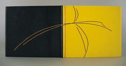
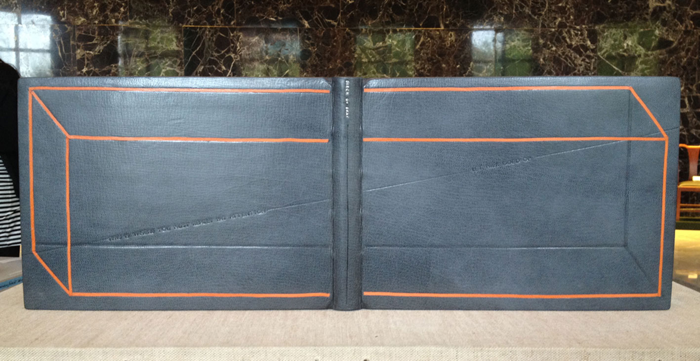
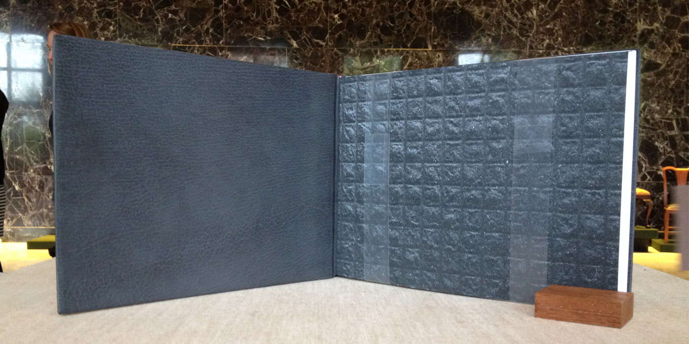
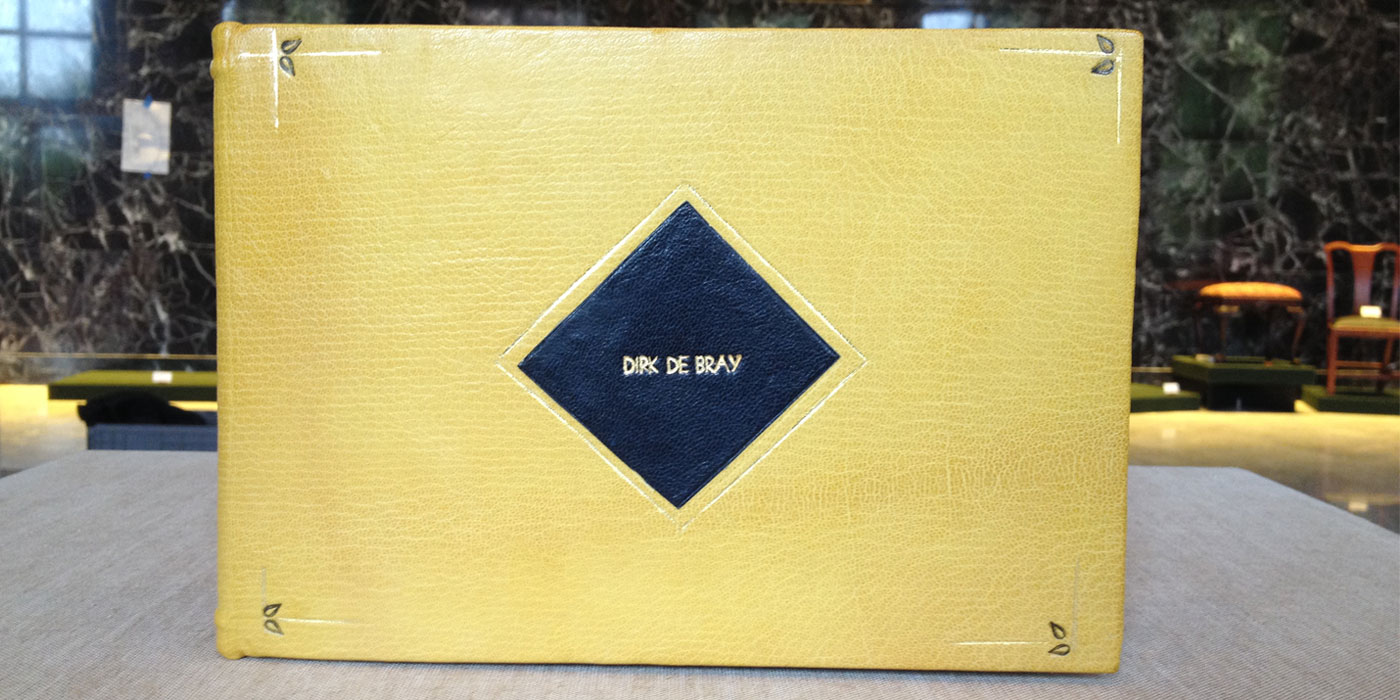
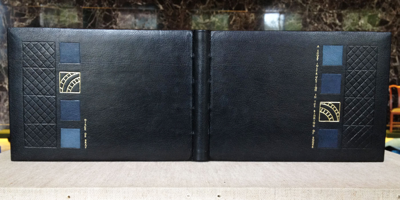
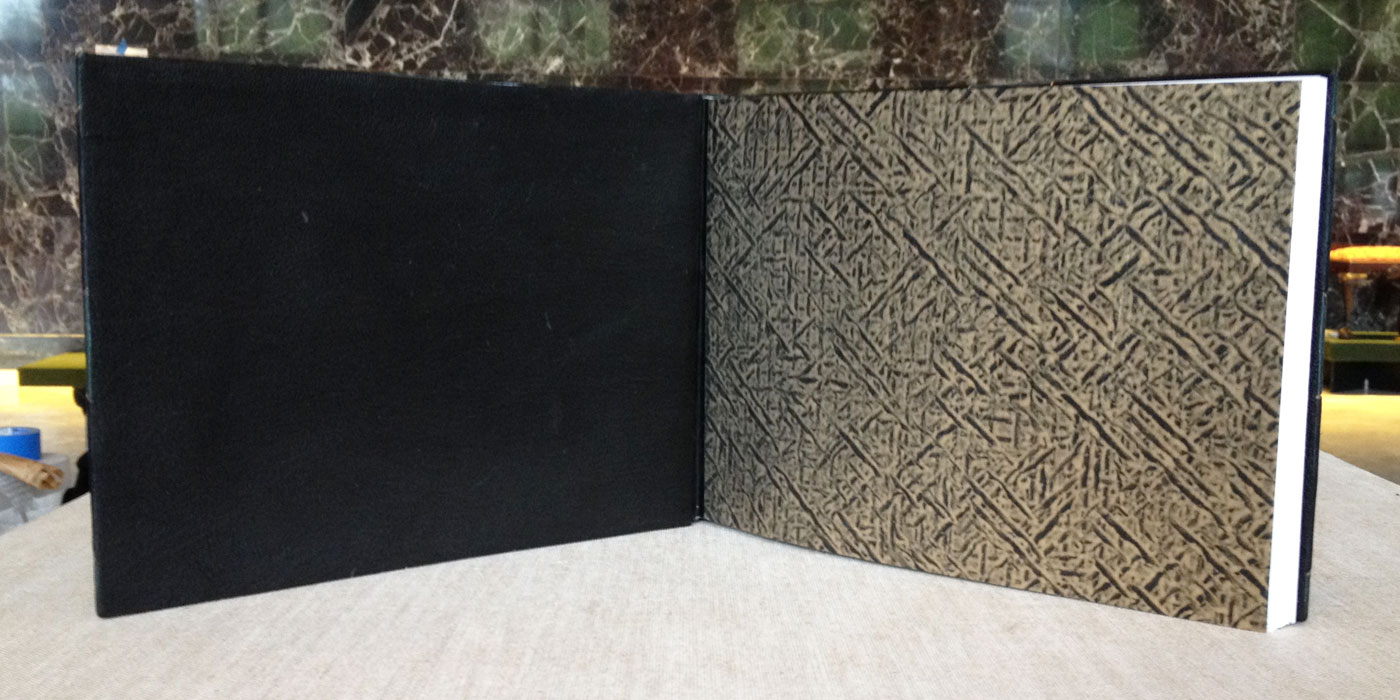
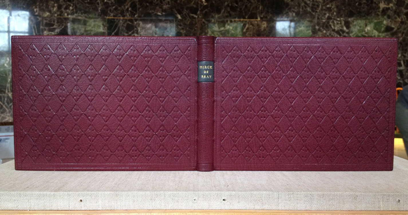
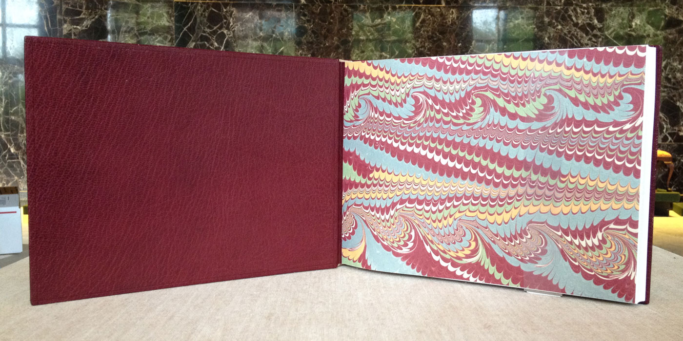
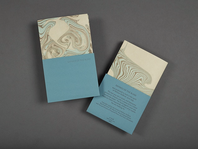
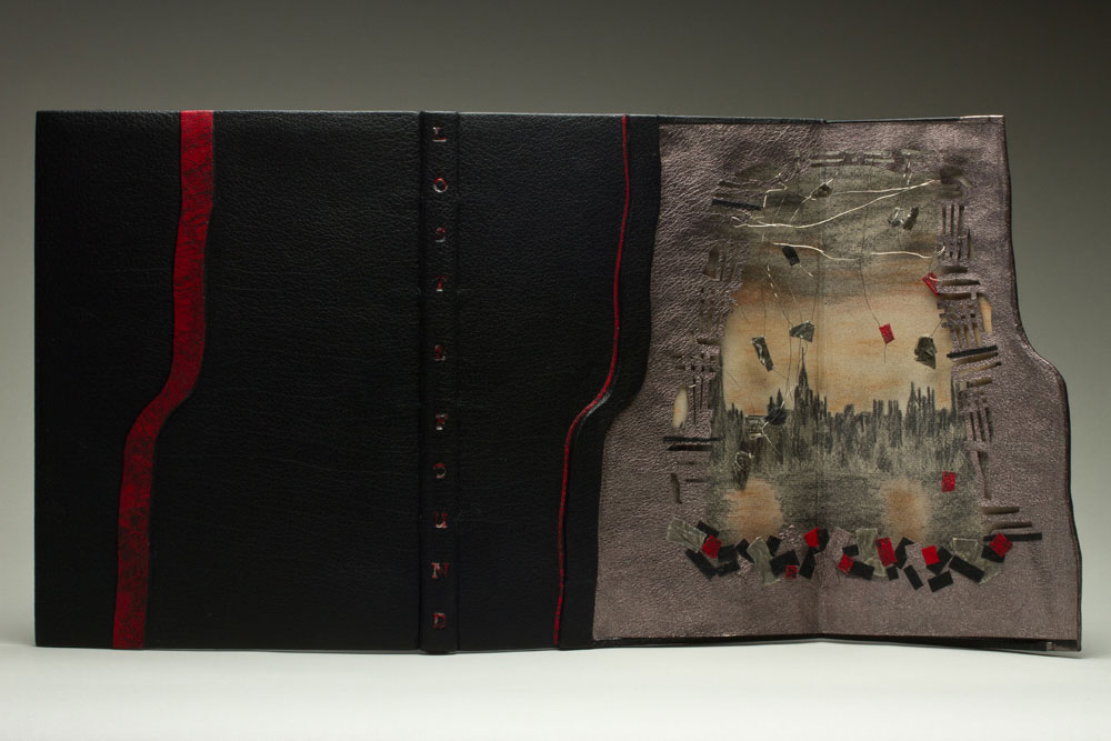
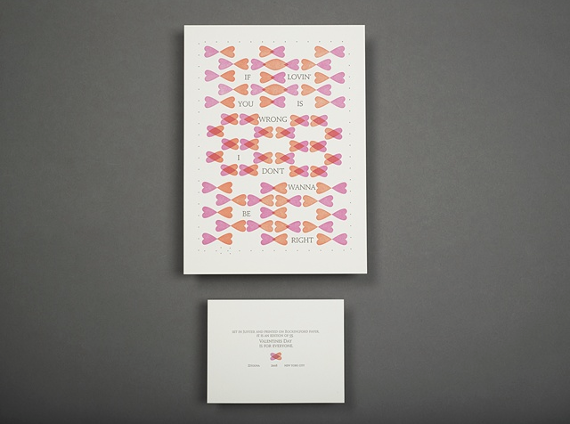
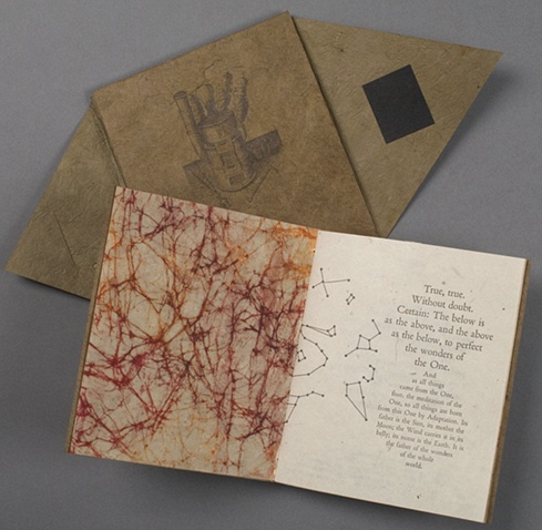
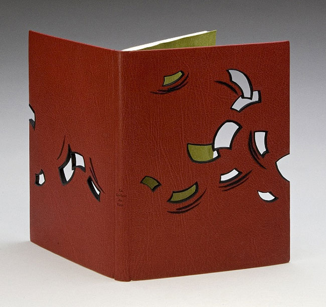
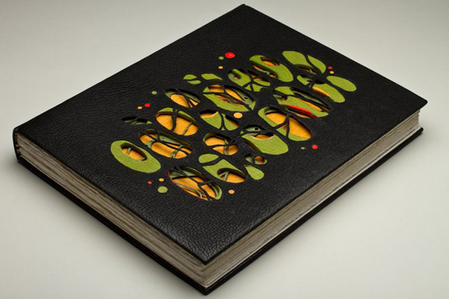
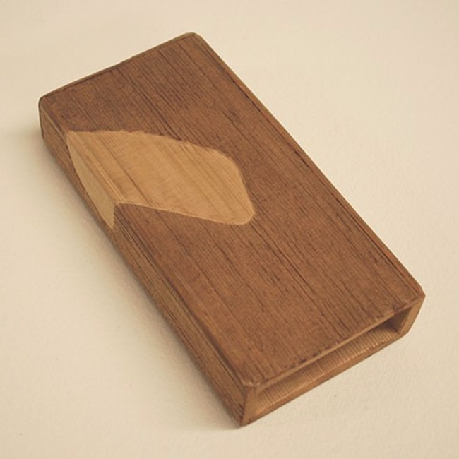
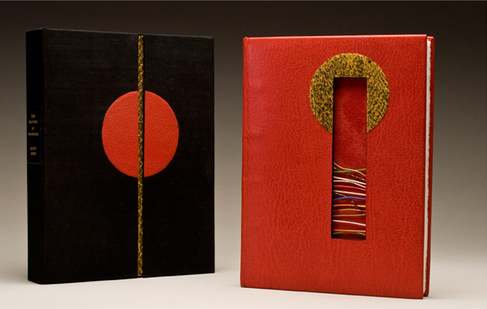
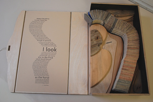
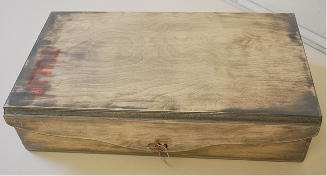
    Roni Gross crafted this celebratory gift for a couple’s 50th anniversary. The piece is housed in a birch plywood box distressed with milk paint and includes the stenciled word ‘TULIP’ in red. The text printed on the inside of the lid is a poem by Frank O’Hara called Having a Coke with You. 

    AnniversaryCommission2-RoniGross

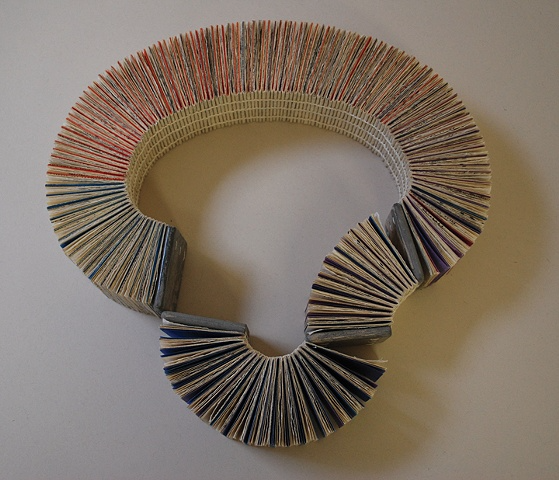
    This is such a beautiful commissioned piece for a couple’s 50th anniversary. Can you talk about the relationship between the elements: poem, wooden typographic map and the book necklace?
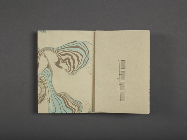
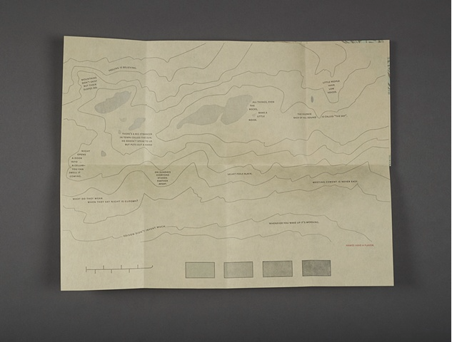
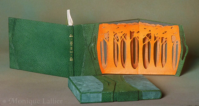
    The couple are collectors of art glass, and are more visual than literary. The wife enjoys collecting wacky jewelry and so I thought that a book necklace would make sense for them. I am motivated by language however, and I told the daughter that I needed some text to start working from. The poem, by Frank O’Hara, is a avery New York poem, and we thought that a sculptural topographical map of a place in Riverdale would be an interesting reference for people that have lived their whole lives in NYC. The waterway provides the trough for the necklace to reside.

    AnniversaryCommission3-RoniGross

    – – – – – – – – – – –

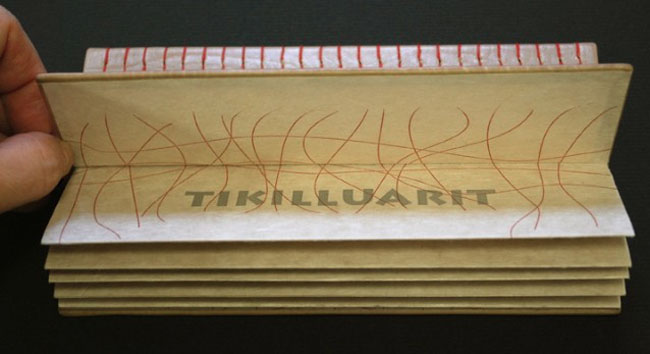
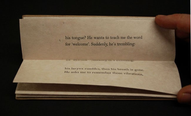
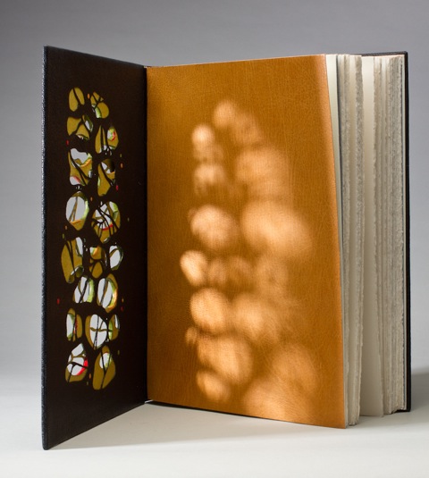
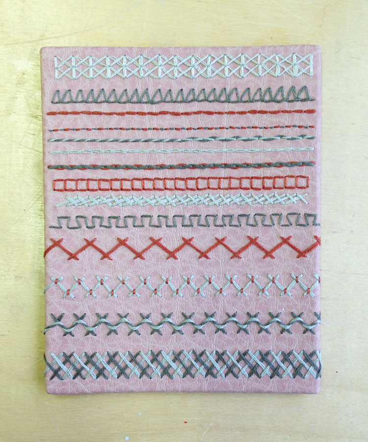
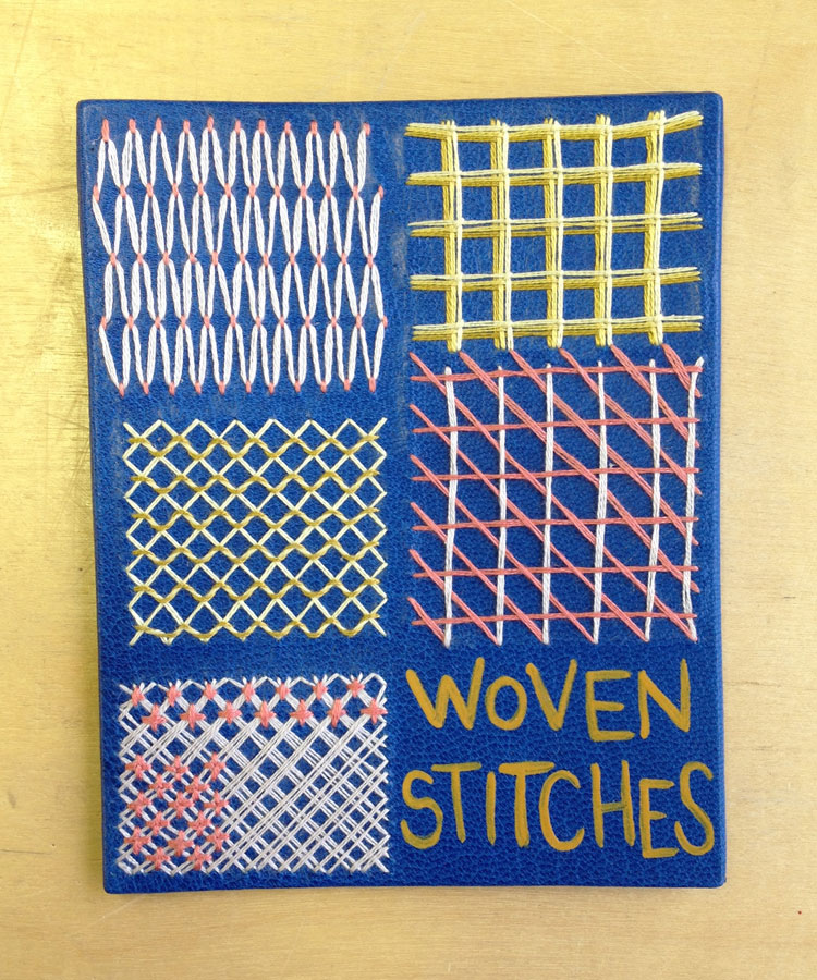
    The text which makes up the poem by Frank O’Hara (see the poem in it’s entirety below) was printed, cut and sewn as a coptic structure along with monoprints. The wooden covers of the coptic book necklace have also been treated with milk paint.

    Having a Coke with You by Frank O’Hara

    is even more fun than going to San Sebastian, Irún, Hendaye, Biarritz, Bayonne
    or being sick to my stomach on the Travesera de Gracia in Barcelona
    partly because in your orange shirt you look like a better happier St. Sebastian
    partly because of my love for you, partly because of your love for yoghurt
    partly because of the fluorescent orange tulips around the birches
    partly because of the secrecy our smiles take on before people and statuary
    it is hard to believe when I’m with you that there can be anything as still
    as solemn as unpleasantly definitive as statuary when right in front of it
    in the warm New York 4 o’clock light we are drifting back and forth
    between each other like a tree breathing through its spectacles

    and the portrait show seems to have no faces in it at all, just paint
    you suddenly wonder why in the world anyone ever did them

    I look
    at you and I would rather look at you than all the portraits in the world
    except possibly for the Polish Rider occasionally and anyway it’s in the Frick
    which thank heavens you haven’t gone to yet so we can go together the first time
    and the fact that you move so beautifully more or less takes care of Futurism
    just as at home I never think of the Nude Descending a Staircase or
    at a rehearsal a single drawing of Leonardo or Michelangelo that used to wow me
    and what good does all the research of the Impressionists do them
    when they never got the right person to stand near the tree when the sun sank
    or for that matter Marino Marini when he didn’t pick the rider as carefully
    as the horse

    it seems they were all cheated of some marvelous experience
    which is not going to go wasted on me which is why I am telling you about it


  2. Bookbinder of the Month: Monique Lallier

    May 18, 2014 by Erin Fletcher

    ThePhoenix-MoniqueLallier

    In Flight ran from 2003 – 2005 as the triennial traveling exhibit organized by the Guild of Book Workers. For the exhibit, Monique Lallier bound The Phoenix. The most obviously astonishing design element executed by Monique on this binding is the use of two separate leathers with a seamless connection down the center of the spine. Bound in yellow and black goatskin over laced-in boards, the dual color scheme continues in the hand sewn headbands and the stylized phoenix design creating with contrasting onlay leather lines.

    The line quality of the phoenix is reminiscent of lines from a fashion sketch. Do you think your background in fashion plays any part in your overall design choices?
    I love this binding. I think it illustrates the story perfectly. Everything that we do in life, every experience stays with us and you are influenced because it is deep in you and when you are searching and “struggling” with a design you go within you, like in a well to retrieve what you need, whether you realize it or not.

    As I entered my undergraduate studies, I was determined to go into Fashion Design. However, I was pulled in another direction, but I find that I’m still drawn to the latest couture designs. Do you seek out fashion as an artistic inspiration?
    I don’t look too much at fashion anymore, I look more at design and craft magazines, or visit galleries and museums everywhere I go. Although I noticed that laser cutting is big in fashion now.


  3. North Bennet Street School // Student & Alumni Exhibit 2014

    May 13, 2014 by Erin Fletcher

    Every year the North Bennet Street School hosts an exhibit to celebrate the work of current students and alumni across several of its departments, which include Bookbinding, Violin Making, Jewelry, Cabinet and Furniture Making, and Preservation Carpentry. The exhibit opened on May 10th and runs through the end of the month. The opening reception will take place on the evening of Tuesday, May 13th for the Annual Evening of Craft when supporters of the school and exhibitors come together to discuss and explore the handcrafted items.

    As an exhibitor this year, I had the opportunity to help set up the show, which allowed me to document and chat with each of the graduating students about their fine bindings. The photographs in this post were taken during the set-up, so please excuse the occasional body in the background or roll of blue tape.

    Dirck de Bray: A Short Instruction in the Binding of Books was chosen as this year’s set book for the graduating bookbinding class. The earliest known Dutch bookbinding manual is a tiny illustrated manuscript from 1658, in which, Dirck de Bray described the making of a full leather binding and a parchment laced-case binding as the most common techniques of the 17th century. The manuscript is illustrated with 16 instructive drawings in pen and watercolor. This 17th century bookbinding manual originally appeared for the public in a 1977 edition, which has been re-edited in the 2012 edition that the students bound. This second edition includes each original page from the 1658 manuscript along with an in-depth look at the life of Dirck de Bray and the time period he lived in, as well as, the way books would normally look, the master’s test for bookbinders and other early manuals.

    The 2012 edition was printed in an unusual oblong format to include the historical Dutch paired with a contemporary Dutch and English translation next to the original page from the 17th century manuscript. I asked each of the graduating students to share with me their concept for their design.

    DirckDeBray5-AlcamyHenriksen

    Alcamy Henriksen
    As I mentioned above, the set book was written in both Dutch and English. Alcamy ran with this theme by including a phrase from the text: “This is where you must really pay attention” is blind tooled on the back cover, while “Let hier goed op” is the Dutch translation blind tooled on the front cover. These two phrases are enclosed within a box created through the use of orange onlays.

    Dirck de Bray was a talented artist across several mediums, but principally known for his paintings and worked on the murals of “Orange Hall” (Oranjezaal) in Huis ten Bosch, a royal palace in The Hague. The orange cube spanning across the covers represents the space of the artist’s creavity and its challenging limitations.

    DirckDeBray4-AlcamyHenriksenDirckDeBray2-AlcamyHenriksen

    Alcamy’s binding is bound in gray Harmatan goatskin with matching leather doublures. She used handmade papers from Hook Pottery Paper as the made flyleaf. The head edge is decorated with graphite with a single line of orange running the length of the edge. Alcamy’s design is really striking and made great use of long horizontal shape of the binding.

    – – – – – – – – – – –

    DirckDeBray1-ChristineAmeduri

    Christine Ameduri
    Inspired by 17th century Dutch tile designs, Christine reinterprets the design as a broken frame of simple corner ornaments. The intersecting gilt lines at each corner are paired with two small smoke-tooled droplets. The center tile is a black onlay tooled with de Bray’s name and framed within gilt lines. Bound in yellow Harmatan goatskin with matching leather hinges. Inset on the inside of the boards is a panel of handmade marbled paper made by Christine herself.

    DirckDeBray2-ChristineAmeduri

    – – – – – – – – – – –

    DirckDeBray1-GabrielleCooksey

    Gabrielle Cooksey
    In the classic drawing style that I’ve seen emerge on Gabrielle’s work during her two years at NBSS, she has created an elegant and simple design binding. The motif on the front cover is reflected on the back cover and was created from a series of line palettes and gouges through gold foil. The motif was inspired by Gothic door frames. The edge decoration mimics the shape of the design on the covers.

    Bound in dark blue Pergamena goatskin with matching leather hinges. A panel of black leather fills the inside of the boards. The made flyleaf is a handmade marbled paper.

    DirckDeBray2-GabrielleCooksey

    – – – – – – – – – – –

    DirckDeBray1-LeslieTo

    Leslie To
    The diaper-style design and onlays of various blue leathers are extracted from the illustrations in the manuscript. de Bray mentions that in art you must look past the surfaces of your surroundings to find the details. Leslie captures the background details of the archways, windows and blue tile flooring through both gilt and blind tooling. The head edge is decorated with green pigment, which is also pulled from the manuscript illustrations. 

    DirckDeBray3-LeslieTo DirckDeBray2-LeslieTo

    Bound in black goatskin with navy blue doublures. Leslie hand marbled the paper used on the made flyleaf. Pulling from the architectural elements within the illustrations, Leslie has created a complimentary structural design on her binding.

    – – – – – – – – – – –

    DirckDeBray1-ElizabethCurran

    Elizabeth Curran
    Elizabeth also found inspiration in the original manuscript illustrations, but put her focus on the illustrations of stacked books to create a design of an abstracted library. The stacked books on her binding are created through a series of gilt line palettes and gouges, with a few being surface gilt. Separating the stacked books are a series of vertical stripes of colored onlays, some being tooled onlays. A nice detail that Elizabeth included, was wrapping the colored onlays onto the board edges.

    The design is quite striking and each cover can stand alone or be displayed fully open as the image above displays.

    DirckDeBray3-ElizabethCurran DirckDeBray2-ElizabethCurran

    Bound in grey Harmatan goatskin with biscuit-colored goatskin doublures paired with a handmade marbled made flyleaf. The headbands are hand sewn around a flat rectangular core made from laminated goatskin and vellum.

    – – – – – – – – – – –

    DirckDeBray1-MariannaBrotherton

    Marianna Brotherton
    Marianna took her inspiration from designs on mid-17th century bindings, a period that is contemporary to the original manuscript. The frame is created with a black onlay and tooled using an ascona tool over gold foil. The center inlay panel of vellum is framed with a black onlay mimicking the style of the outer border. Marianna wanted to incorporate vellum in her design as a homage to the original vellum binding of the manuscript. The title, along with de Bray’s name, has been hand-tooled with gold foil onto the vellum.

    Bound in green Pergamena goatskin and vellum with black goatskin doublures paired next to a stunning Claire Maziarcyk paste paper made flyleaf.

    DirckDeBray3-MariannaBrotherton DirckDeBray2-MariannaBrotherton

    – – – – – – – – – – –

    DirckDeBray1-JeffAltepeter

    And last, but certainly not least is the binding created by NBSS instructor and alum, Jeff Altepeter. Bound in crimson goatskin with matching doublures. The boards are blind tooled in a lozenge pattern using a single hand-carved finishing tool which mimics the classic ‘cusped edge stamp’. de Bray’s name is hand tooled on a leather label pasted on the spine. Marbled ‘Dutch curl’ endpapers in the typical 18th century palette are used for the made flyleaf.

    DirckDeBray2-JeffAltepeter


  4. Book Artist of the Month: Roni Gross

    May 12, 2014 by Erin Fletcher

    SayingsOfTheBlind3-RoniGross

    Sayings of the Blind is an artist book by Roni Gross that includes the poem of the same name (see below) from the prolific William Stafford. The book unfolds to reveal a hand-drawn and letterpress printed topographical map, which interprets the world of the blind.

    Bound in 2010 in an edition of 50, Sayings of the Blind is part of the Stafford Collection, a curated collection organized by the 23 Sandy Gallery. The Stafford Collection includes any work that incorporate the poetry of William Stafford and/or Kim Stafford. 

    SAYINGS OF THE BLIND — William Stafford
    Feeling is believing.
    Mountains don’t exist. But their slopes do.
    Little people have low voices.
    All things, even the rocks, make a little noise.
    The silence back of all sound is called “the sky.”
    There’s a big stranger in town called the sun.
    He doesn’t speak to us but puts out a hand.
    Night opens a door into a cellar–
    you can smell it coming.
    On Sundays everyone stands farther apart.
    Velvet feels black.
    Meeting cement is never easy.
    What do they mean when they say night is gloomy?
    Edison didn’t invent much.
    Names have a flavor.

    SayingsOfTheBlind-RoniGrossSayingsOfTheBlind2-RoniGross

    The poem by William Stafford is plotted across the topographical map in such an ingenious way. What is the correlation between the map graphic and the text from the poem?
    After many mockups, most more complicated than the final book, I realized that the topographical map is referring to the landscape of the blind. It is a different landscape than seeing people are aware of, and by placing the text within it, we are taking you into that world.

    SayingsOfTheBlind4-RoniGross

    The texture of Suminagashi wonderfully reflects the shapes of a topographic map, was this your intention?
    I did realize that the Suminagashi was a nice parallel to the lines of the map without revealing too much from the beginning. I commissioned the paper from Yukari Hayashida, who teaches a class in Suminagashi at CBA (The Center for Book Arts).


  5. Bookbinder of the Month: Monique Lallier

    May 11, 2014 by Erin Fletcher

    LostAndFound-MoniqueLallier

    This beautiful fine binding has a secret. It’s a secret (technique) that only Monique Lallier and a few of her students know about. The front cover has a panel that swings open along the fore-edge to reveal an elaborate, hidden design. This technique is unique to Monique’s portfolio.

    Lost and Found is a work about illustrator Rachel Rackett and was recently bound by Monique for InsideOUT, an international exhibition organized by the Designer Bookbinders that celebrates the craftsmanship of contemporary binders and private press printers. I can not wait until this exhibit arrives at the Houghton Library in September, you can bet on a future post about the show.

    LostAndFound2-MoniqueLallier

    Another signature design element seen throughout your portfolio is the front panel, which opens to reveal a hidden design. What is the history of this design technique, where did you learn about it?
    In 1985 I designed L’Ecorce et le Vent with a front panel opening on a “forest” of layers of trees, the first layer being goat skin and the two other layers being Japanese paper. This was my first attempt and it was a great success at the 1986 exhibition L’Association des Relieurs du Quebec. This book is now in the collection of the Morgan Library in New York. I really don’t know where I had this idea of the hidden design. In my first attempt it was to show a forest and I wanted the three dimensional aspect of looking at a forest, so it had to be free and moving, not static like an onlay.

    LEcorceEtLeVent-MoniqueLallier

    For The Knell of Cock Robin I wanted to express the feeling of a bird (on the agate) flying into the forest.

    TheKnellOfCockRobin-MoniqueLallier

    For Lost and Found, the story is about Rachel Rackett, an illustrator of books. When she died they found a box filled with drawings that had never been used, so they produced the book to show her work and many illustrations were about the blitz of London during the war, so I thought that the hidden design of destruction was perfect for the story.

    I don’t know anybody else, other than my students, that used this technique in the same way. I have seen front panels that cover the entire surface of the front or back covers, it creates a very different design.

    – – – – – – – – – – –

    Just one more panel binding to end the post. The following binding was completed in 2012, for the ARA-Canada exhibit Les escaliers de Québec. The portfolio binding is covered in black morocco goat with highlights of red morocco. The text block is an accordion attached to the lower board only and has a graphite colored head edge. The hidden décor panel opens to a colorful scene created by Masahiro Chatami with a photograph of Québec City tipped behind the staircases. The marbled paper endleaves are by Claude Delpierre.

    LesEscaliersdeQuebec-MoniqueLallier


  6. Book Artist of the Month: Roni Gross

    May 5, 2014 by Erin Fletcher

    ZitounaPress-RoniGross

    I See You Everywhere – 2003

    Roni Gross has successfully continued her project Zitouna over the course of 25 years. Twice a year, she creates a limited edition book or broadside which expands on the cultural ideas which emanate from Valentines Day and Halloween. The projects have explored a wide variety of themes from folklore and superstition to wordplay and mythology. 

    As a project that began in 1989, what was your initial inspiration for this ongoing work?
    The Zitouna pieces started as limited edition book-like objects made in honor of Valentines Day and Halloween each year. I chose those holidays because they are secular and thus inclusive. It began by an investigation of the origins of the traditions cross culturally, and then deepened over time to consider the seasons in which they occur – times of death and rebirth. 

    How do you find inspiration as you continue year by year?
    I have found this a very fruitful project that has led me to investigate alchemy, concepts about skeletal understanding throughout the ages, mythology and superstitions, to name a few topics. The deadline is a motivator and I have not yet felt that I am reaching the end of the possible topics for exploration.

    ZitounaPress4-RoniGross

    If Luvin’ You Is Wrong – 2008

    ZitounaPress5-RoniGross

    Alchemy – 2008

    ZitounaPress2-RoniGross

    A Very Valentine – 2010

    ZitounaPress3-RoniGross

    Lover’s Knot – 2009


  7. Bookbinder of the Month: Monique Lallier

    May 4, 2014 by Erin Fletcher

    LaColouerduVent-MoniqueLallier

    La Couleur du Vent was bound in 2013 by Monique Lallier for the ARA-Canada exhibition that I may have mentioned just once or twice (even thrice) in the past. I brought up the window element in Monique’s work during the interview on the first of the month with her binding The Drawings of Caravaggio. When I saw Monique’s binding of Interpreter of Maladies at an exhibition in Chicago, I was awed and intrigued by its construction. With this binding Monique began experimenting with laser cutting technology to create detailed and intricate work. 

    IntrepreterOfMaladies1-MoniqueLallierI want to further the discussion from last week on the progression of the window element in your designs. Except this time I would like to focus on technique. The covers of La Colouer du Vent and Interpreter of Maladies were laser cut to achieve the intricacies of the design. Do you approach the structure differently on a fine binding when including laser cut elements?
    When I choose to use laser cutting I have to do a “case” binding as I have to finish the inside doublures before the laser cutting and the cover has to be flat on the table of the laser cutter. I still consider it a fine binding. 

    Did you have to alter anything about the process from your first attempt to the most recent one?
    I think I figured it out right on the first time and it worked well, so I repeated the same technique.

    – – – – – – – – – – –

    In addition, during the interview, I included a sneak peek of one of Monique’s recent bindings of Les Sonnets by Shakespeare. The complexity of the design is literally jaw-dropping. Two layers of board have been cut and sandwiched between the covering leather and leather doublures, which have also been laser cut.

    LesSonnets-MoniqueLallier LesSonnets2-MoniqueLallier LesSonnets3-MoniqueLallier


  8. May // Book Artist of the Month: Roni Gross

    May 2, 2014 by Erin Fletcher

    Tikilluarit3-RoniGross

    Tikilluarit was created for the An Inventory of Al-Mutanabbi Street exhibition, which began in 2012, exhibiting nationally and internationally until 2015. The exhibition showcases a collection of artist books and broadsides that are a response to the explosion of a car bomb in Al-Mutanabbi Street, the historic center of bookselling and arts culture in Baghdad, back in March 2007. The exhibit came to Cambridge and was exhibited in three parts. Unfortunately, the session I attended did not included this particular work (I wrote a post about it).

    Tikilluarit is the collaborative work of three artists. But Roni Gross is the star of this post; her concept transformed a written piece into a conceptual binding. The sonnet, which makes up the text of the book, was recast from a Greenlandic series by Nancy Campbell titled “The Hunter Teaches Me To Speak” (originally published in Modern Poetry in Translation). The word ‘tikilluarit’ means ‘welcome’ in Kalaallisut, the native language in Greenland. The sonnet is as follows:

    The hunter teaches me to speak
    I place my fingers round his neck and feel
    his gorge rise – or is he swallowing
    his tongue? He wants to teach me the word
    for ‘welcome’. Suddenly, he’s trembling:
    his larynx rumbles, then his breath is gone.
    He asks me to remember those vibrations,
    and, anxious as a nurse who takes a pulse,
    touches my throat to judge its contortions.
    Will I ever learn these soft uvulars?
    I’m so eager, I forget that the stress
    always falls on the second syllable.
    My echo of his welcome is grotesque.
    He laughs, an exorcism of guillemets,
    dark flocks of sound I’ll never net, or say.

    Tikilluarit1-RoniGrossTikilluarit2-RoniGross

    The modified accordion binding was executed by Biruta Auna using calfskin while Roni designed and letterpress printed the text on Mitsumata paper.

    Tikilluarit is bound in such a way that offers little access to the interior parts of the book. How does the text and binding correlate to one another?
    The poem speaks about a person trying to mimic the sound of a word spoken by another person by placing a hand around the throat of the speaker. The spine side of the book was made to be as visually important as the text block, which serves in effect, as the throat of the book. The text moves up and into the spine as if going down the throat. The exposed sewing is similar to the anatomy of the vocal cords.

    Tikilluarit4-RoniGross

    The fourth collaborator is Peter Schell who crafted the unique sound sculpture that is paired with the deluxe edition of the book. In addition the deluxe edition includes a waxed linen wrap to house both the book and sound sculpture.

    Paired with the book is a wooden sound sculpture that can be activated by shaking it. What does the element of sound bring to the experience of this piece?
    The speaker in the poem says of the difficulty in learning to the language…”dark sounds that I will never net or say”. The wooden sculpture has an abstract wing pattern on the outside, which refers to an arctic bird which make a tinkling sound as its wings beat across the water. A sound that the human voice would not be able to replicate. It is another way of amplifying the words so that you can experience the poem in a physical way.

    – – – – – – – – – – – – – –

    I went into this interview not knowing very much about Roni, her history, her work or her artistic outlook. Through the interview, I hope you come to realize what I have: that Roni has a great appreciation for her artistic community and brings together unique artists in collaboration to expand on the concept of the book by conjuring up the senses. Enjoy the interview after the jump and sign up to receive email notifications so you don’t miss a post throughout the month of May which will feature more of Roni’s work.

    read more >


  9. May // Bookbinder of the Month: Monique Lallier

    May 1, 2014 by Erin Fletcher

    DrawingsOfCaravaggio-MoniqueLallier

    This stunning binding was created by Monique Lallier almost ten years ago. Yet the design appears so fresh and relevant to the experimentations happening with contemporary design bindings. When you land on Monique’s website, this is the binding you are greeted with and it will, no doubt, cause you to click through every single page of the gallery. The Drawings of Caravaggio by Ally Jones was bound in full scarlet leather in the French technique. The boards have been cut to reveal the red suede fly leaves through a collection of wires that have been embedded into the thickness of the board. Straddled around the top edge of the cut-out is an onlay of snakeskin. 

    The book is housed in a box covered in black silk with matching red and snakeskin onlays.

    If I remember correctly you told me that this is one of the first bindings you completed and that it is still your favorite. I love this binding as well for many reasons: the use of bright colors, contrasting textures from the goatskin, suede flyleaves and snakeskin onlay and the inclusion of a window cut-out of the cover. This window element is peppered throughout your portfolio. What does this element bring to your designs and why do you keep coming back to it?
    This binding was done in 2005. I had done the “window element” before to give space for an agate in 1985, so I suppose it evolved to an opening that was not totally filled-in like The Fables of Aesop where I have wires imbedded in the thickness of the front board and you see, through the opening to the lion stamped on the leather fly leave, or this Caravaggio, also with wires imbedded in the thickness of the boards. It was done in an advanced class for AAB (American Academy of Bookbinding) and I wanted to show the students how to line the thickness of the boards with black leather in this case.

    I suppose I keep coming back to it because I like the effect of “seeing through”, like in Les Sonnets (shown below) where the boards, the covering leather and the leather doublures are all cut out. In this case, it was to illustrate how Les Sonnets have an impression on you. (More images on this binding later!)

    LesSonnets4-MoniqueLallier

    Monique’s work is awe-inspiring. Not only do I find her bindings to be so, but also her involvement in the bookbinding community.  Our community and the craft of bookbinding thrives when talented and dedicated people like Monique become teachers. Between my first and second year at North Bennet Street School, I jumped at the opportunity to take a week-long private workshop with Monique at her home in North Carolina, where I absorbed everything she had to offer (no doubt an infinitesimal amount to the vast knowledge she holds).

    I’m really honored that Monique agreed to be interviewed for my blog, which she has complimented me about several times. So without furthering gushing, please enjoy the interview after the jump. Stay updated with posts by signing up for an email subscription. Since Monique has an ample collection of work, each week I’ll be showcasing multiple bindings including a few newly bound and unseen works!

    read more >


  10. My Hand // Leather Embroidery Samplers – Part Two

    April 30, 2014 by Erin Fletcher

    ChainStitches-ErinFletcher

    All six of my leather embroidered samplers are now complete and I’m so thrilled to share them with you. If you missed part one, you can check it out here

    The sampler above is on buffalo skin and showcases a variety of chain stitches. This sampler is by far the most successful of the bunch and is already coming in handy as I am in the early stages of designing a fine binding. Below is the couching sampler on goatskin. I wasn’t quite sure if the couching stitches would translate well through leather, but some of the variations are quite interesting and remind me a lot of classical tooling patterns.

    During the covering process I nip the sampler in a press using foam sandwiched between two press boards to make sure the leather is fully adhered to the board. This part of the process really flattened the couching stitches. 

    Couching-ErinFletcher

    The running stitch sampler is on goat and was my first and least successful attempt. (At least in my eyes, I can see a lot of errors.) Since this was my first sampler of the bunch, I began with piercing the holes with my needle as I was sewing. Working like this in the air made it really difficult to keep straight, even stitches. To resolve this issue, I began pre-piercing the holes with my pin vise with the leather flat on my work surface. 

    RunningStitches-ErinFletcher

    The scarlet goatskin sampler is adorned with a mixture of stitches, including a line of sequins at the bottom. I have mixed feelings about the stitches on this sampler because the majority of the stitches were difficult to execute through leather. Such as the coral stitch (line 3) and rope stitch (line 4).

    MixedStitches-ErinFletcher

    The following sampler is showcasing another mixture of stitches such as the herringbone stitch (with variations) and the back stitch (with variations). This sampler is also on buffalo and is probably my second favorite of the bunch with a lot of successful and useful stitches to be used on future fine bindings. 

    MixedStitches2-ErinFletcher

    Finally, I played around with woven stitches to create a larger plane of embroidery on the leather. I’m really pleased with a few of these stitches. My main hurdle is figuring out a way to hide the threads on the back, which became very visible through the blue goatskin. 

    WovenStitches-ErinFletcher


  • My name is Erin Fletcher, owner and bookbinder of Herringbone Bindery in Boston. Flash of the Hand is a space where I share my process and inspirations.
    The StudioNewsletterInstagramEmail me
  • Archives