RSS Feed

Posts Tagged ‘coleen curry’

  1. Catching up with Coleen Curry // No. 5

    January 28, 2018 by Erin Fletcher

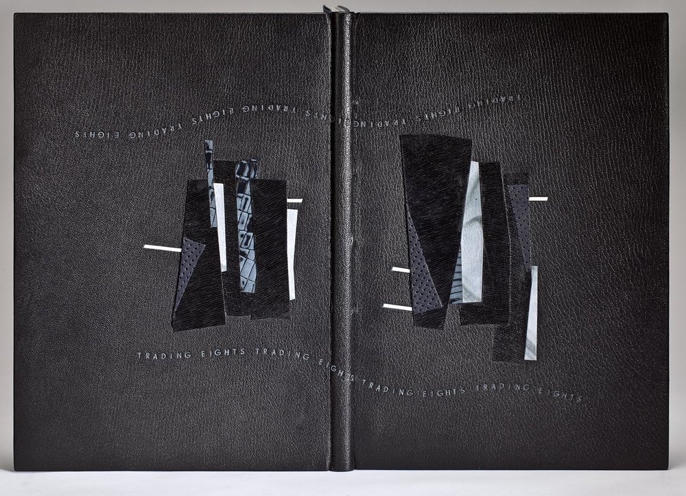
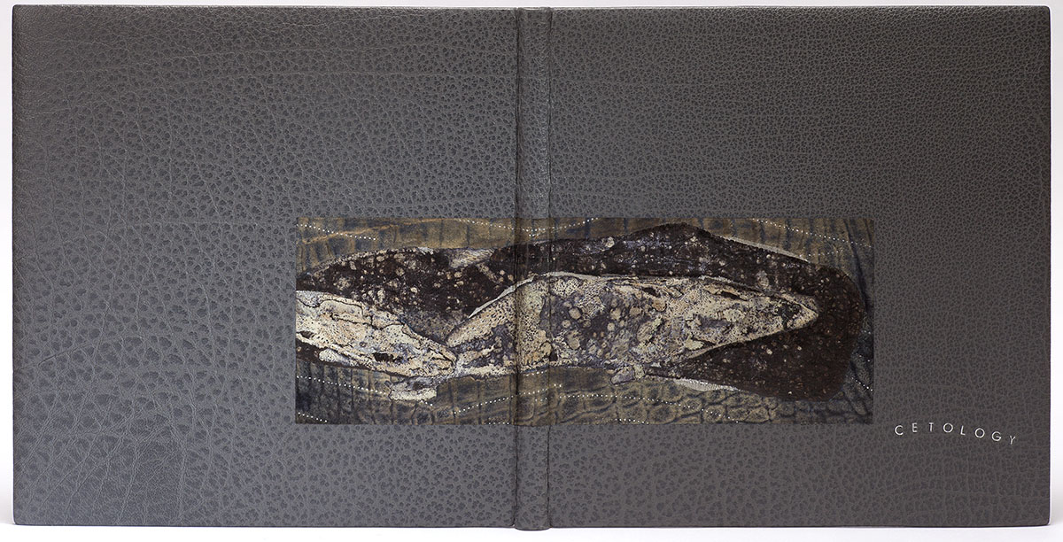
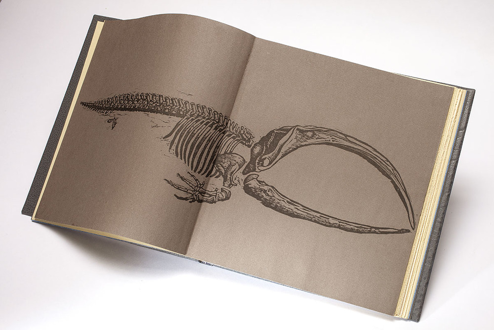
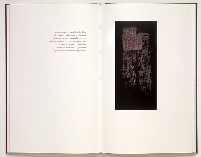
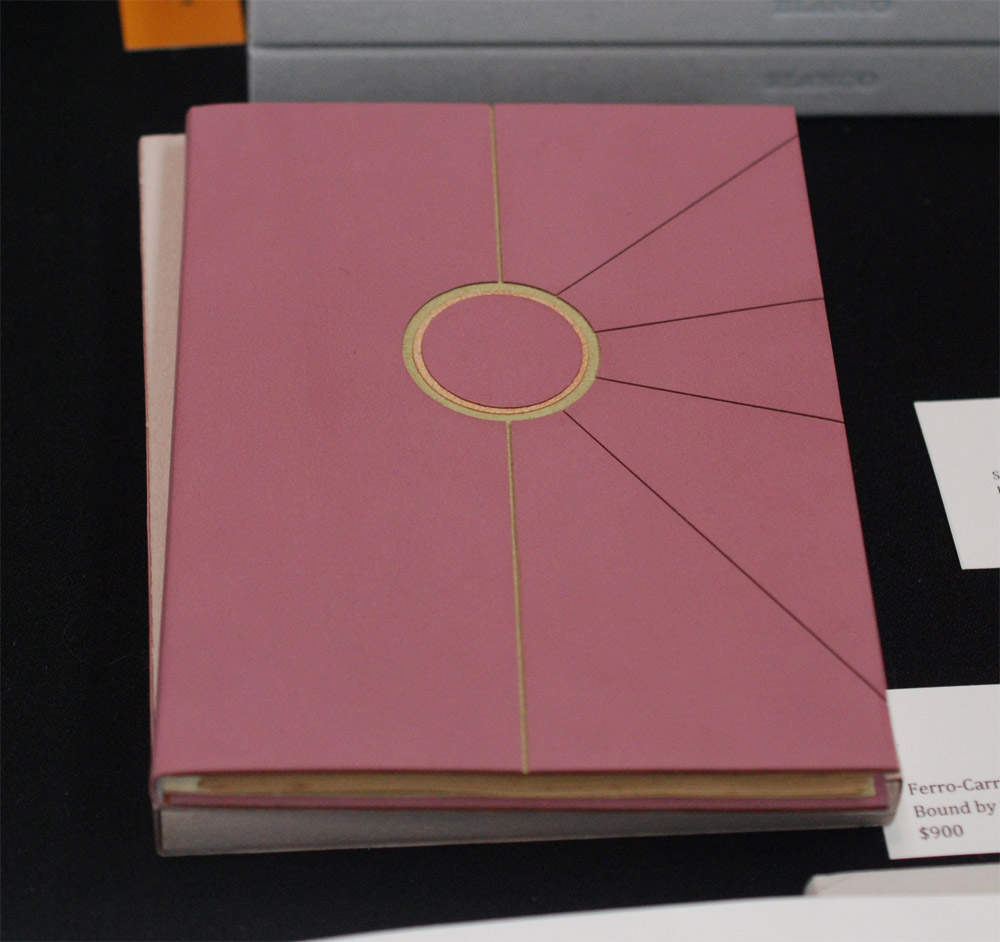
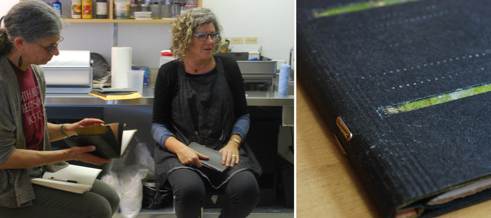
    In my final post with Coleen Curry, I want to feature her binding of Trading Eights, The Faces of Jazz. Celebrating the culture of Jazz, this Nawakum Press publication includes wood engraved portraits of eight iconic jazz figures. These engravings by James G. Todd Jr. are paired with an essay by Jazz historian Ted Gioia and a poem by Dana Gioia.

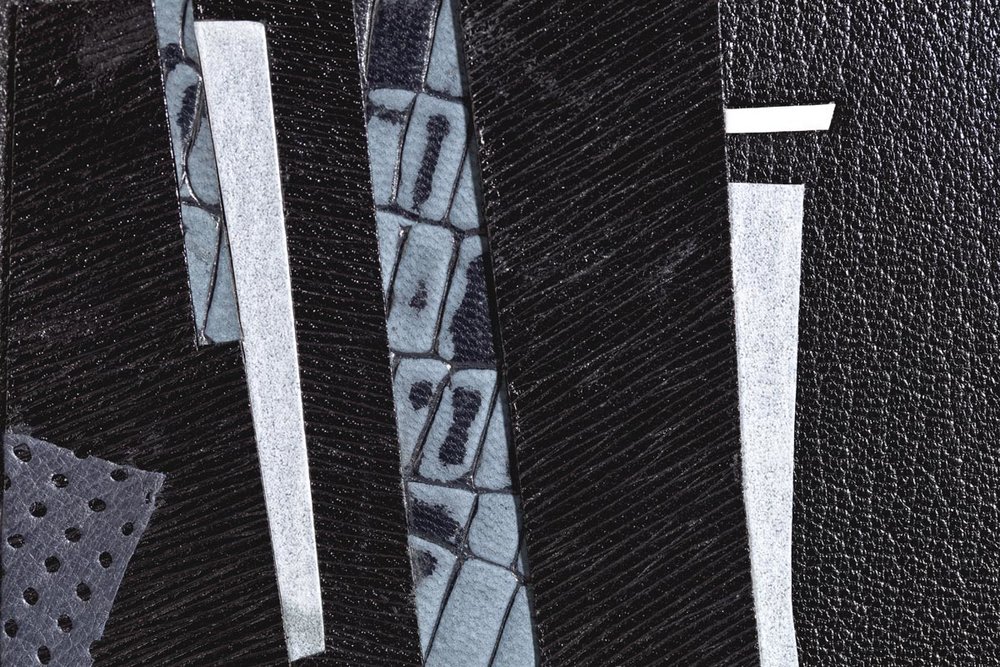
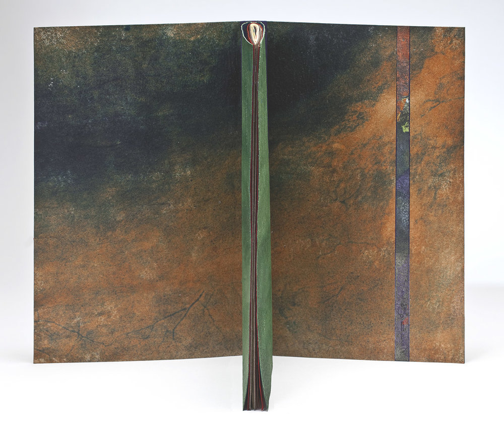
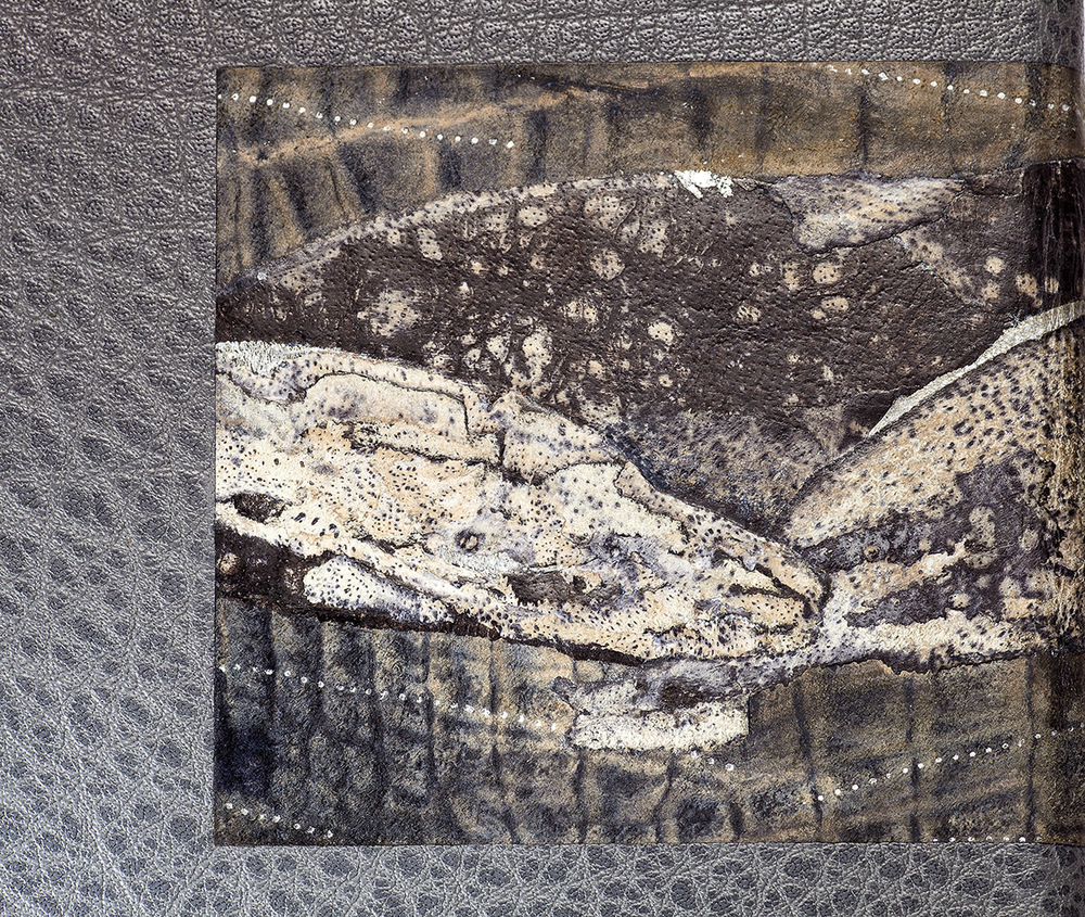
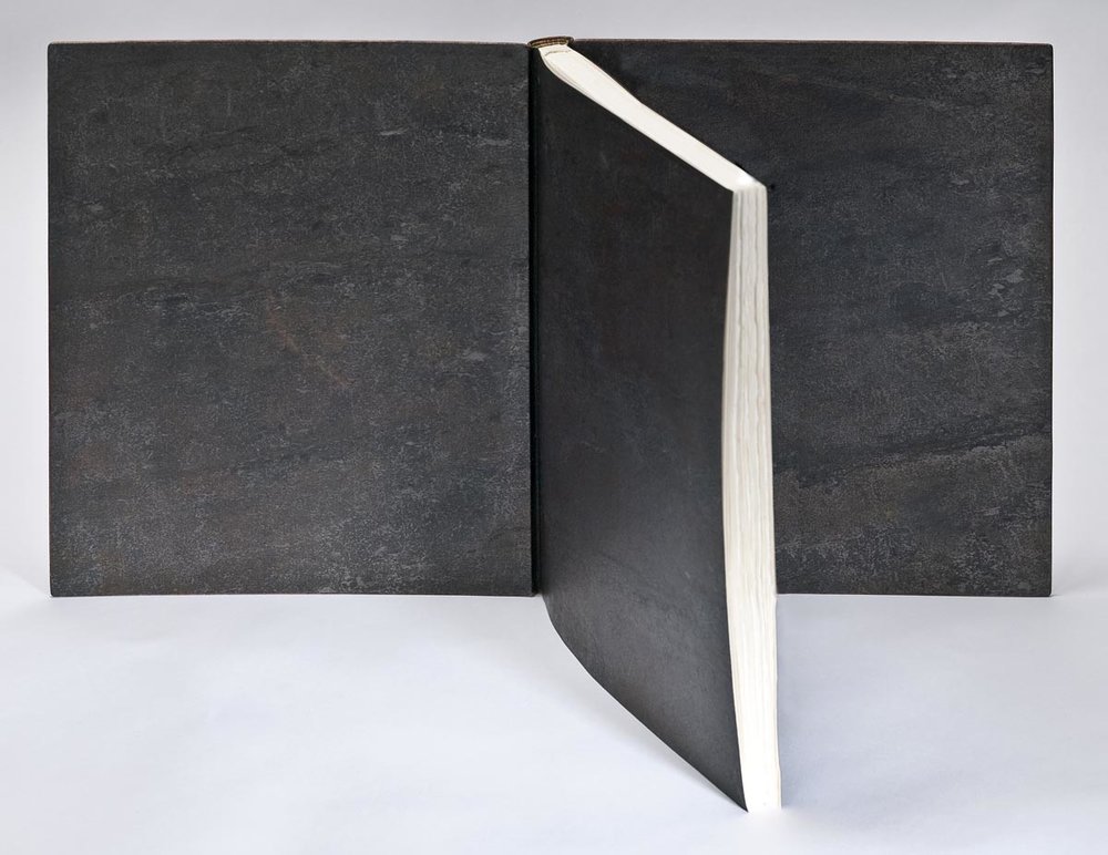
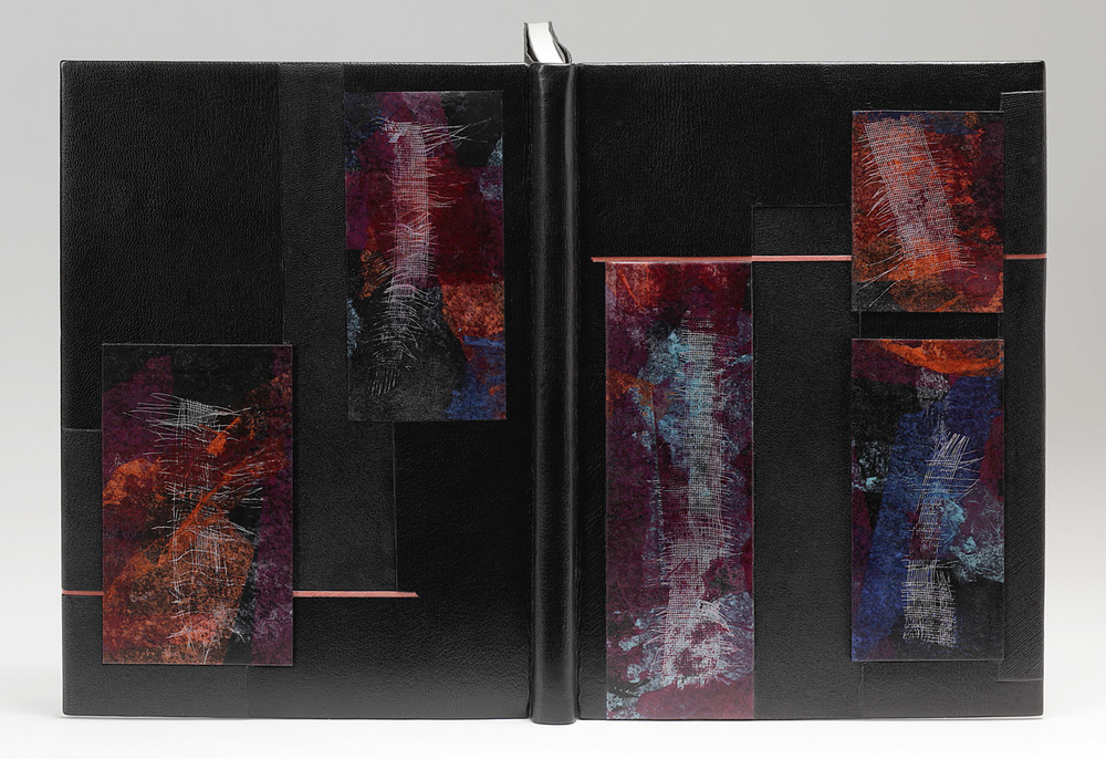
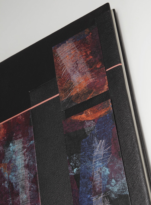
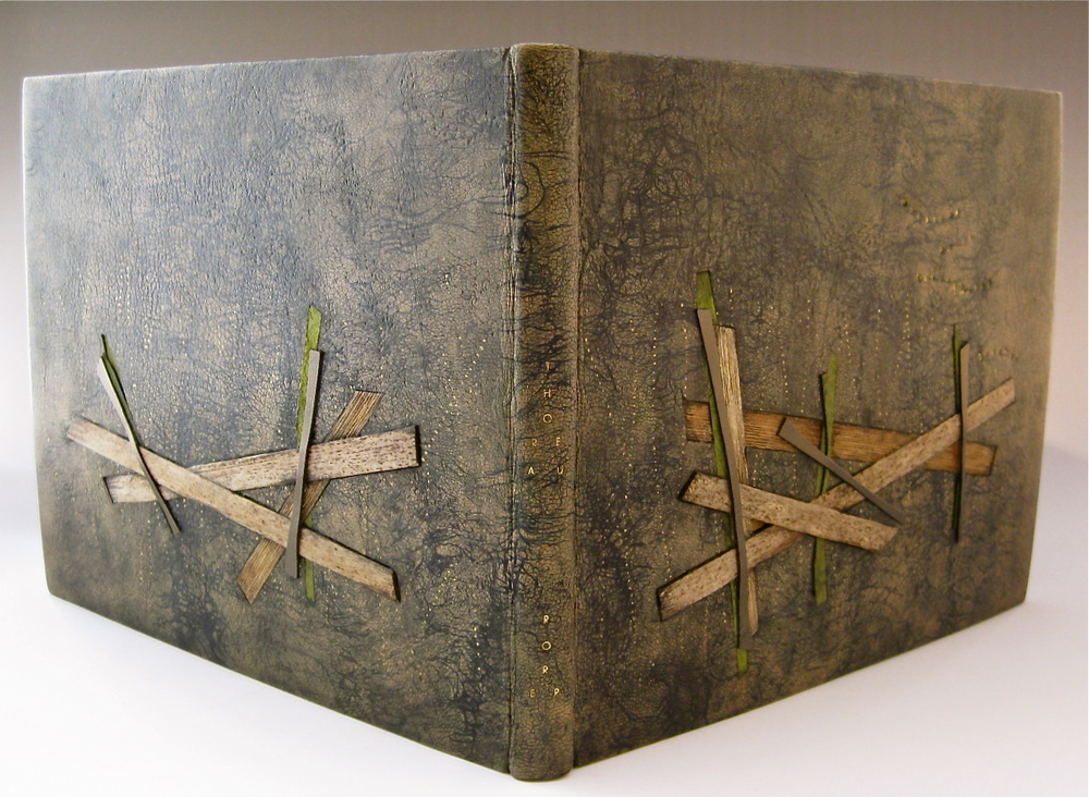
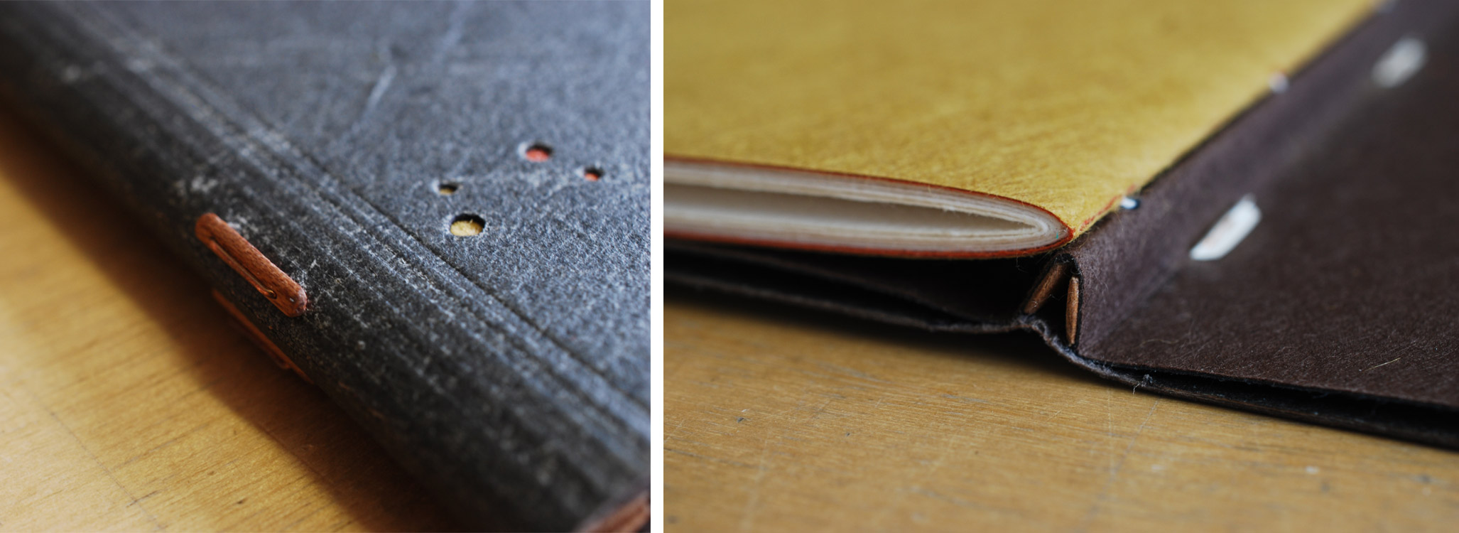
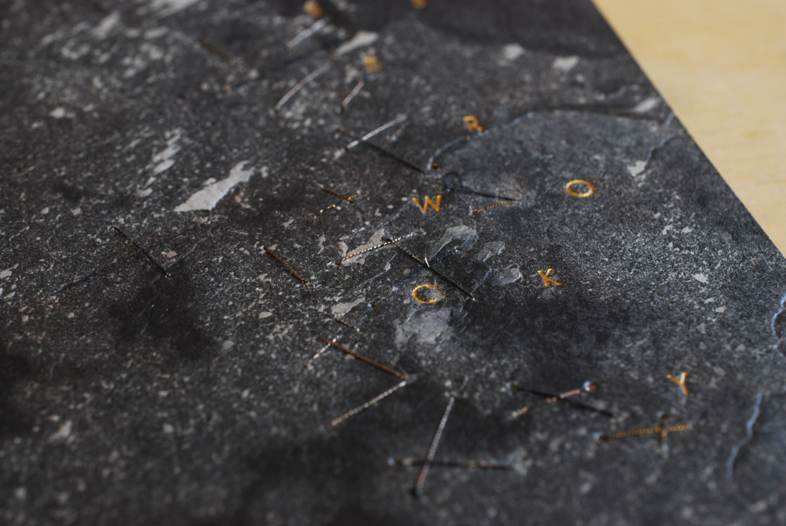
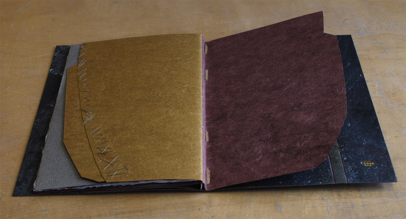
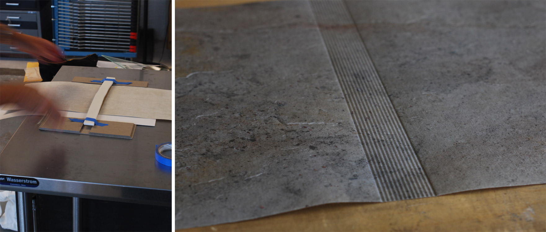
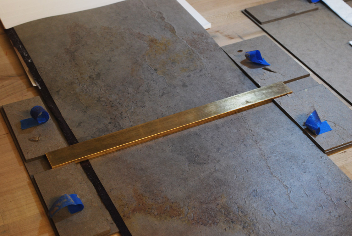
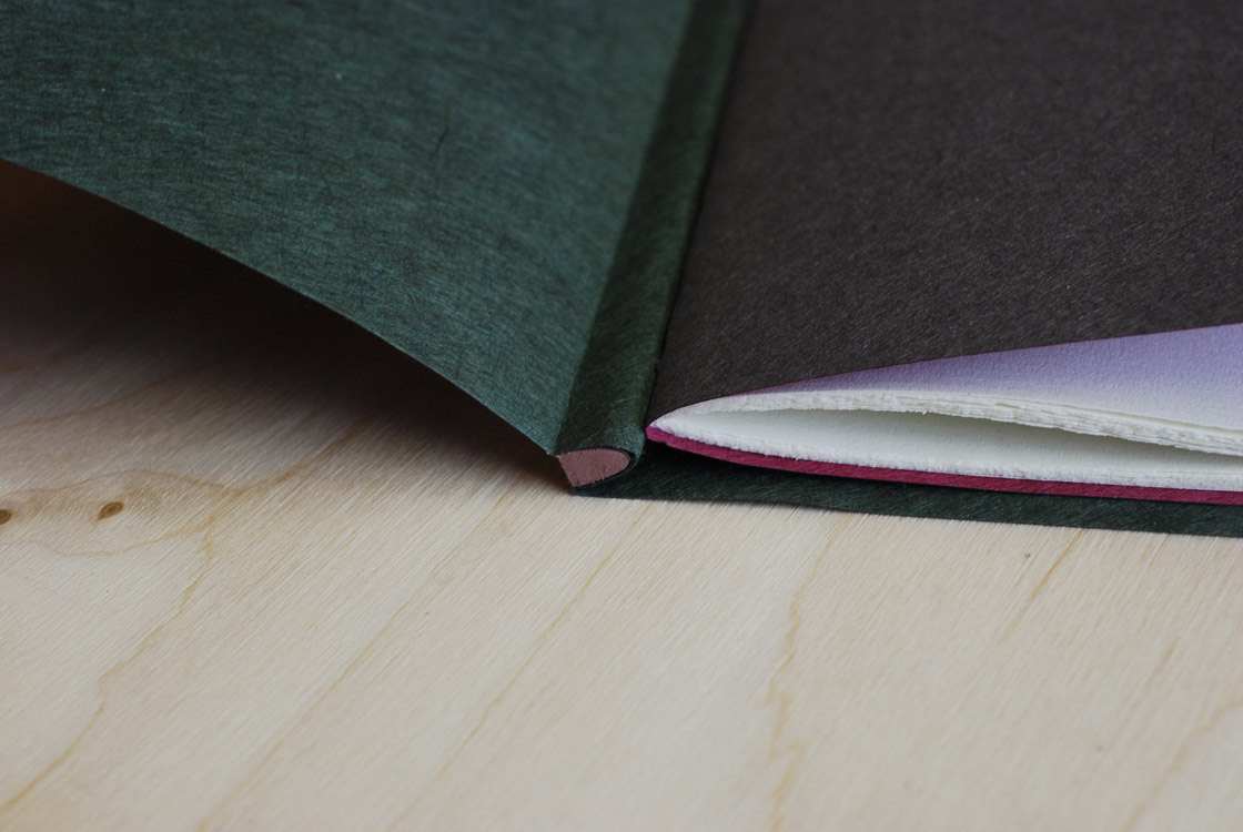
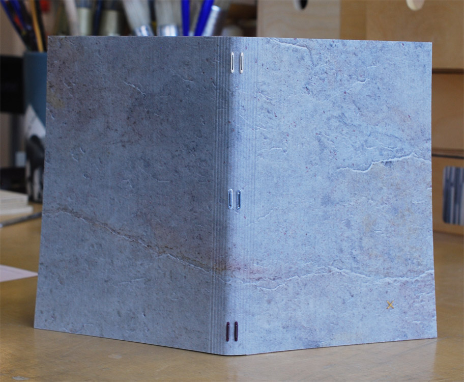
    In 2017, Coleen crafted this book as a traditional French laced-in binding covered in black goatskin. The design includes inlays of black straight grain goat, embossed and top-pared navy blue calf and perforated dark blue sheepskin plus onlays of white box calf and the same silver-grey translucent paper used for the interleaving in the book.

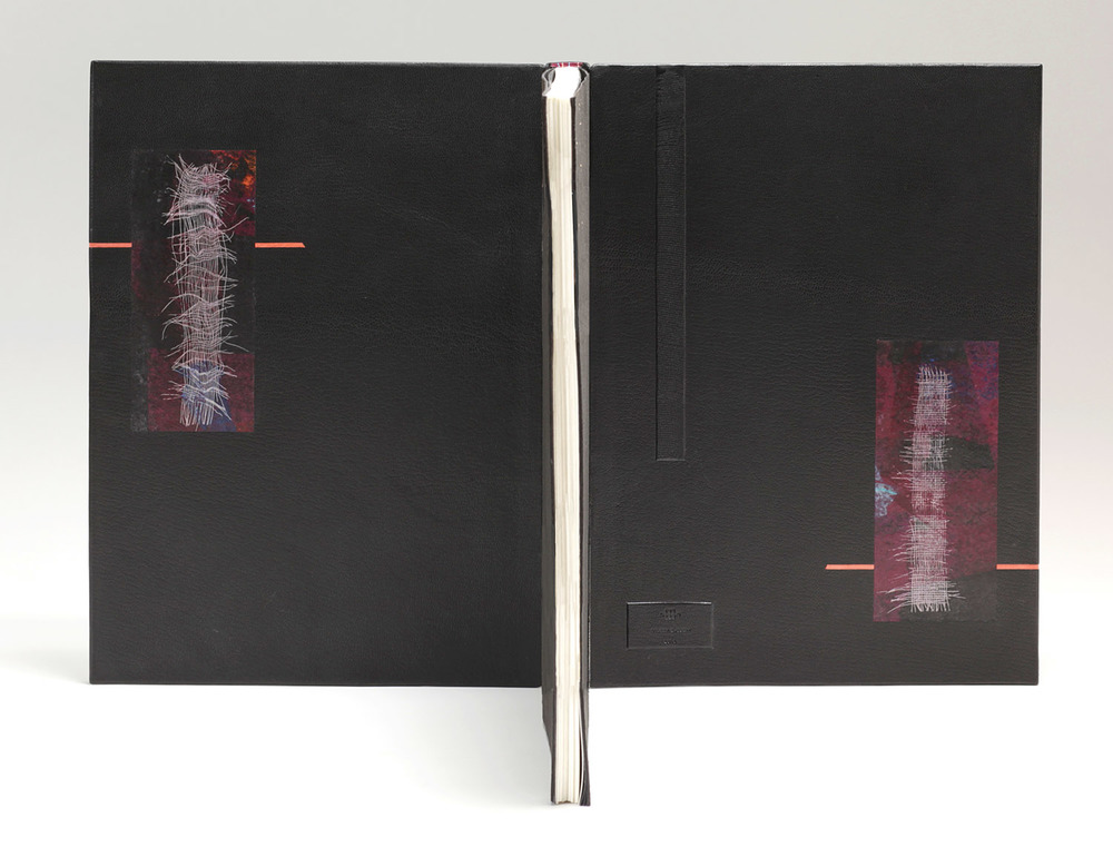
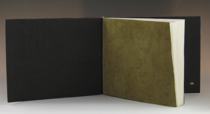
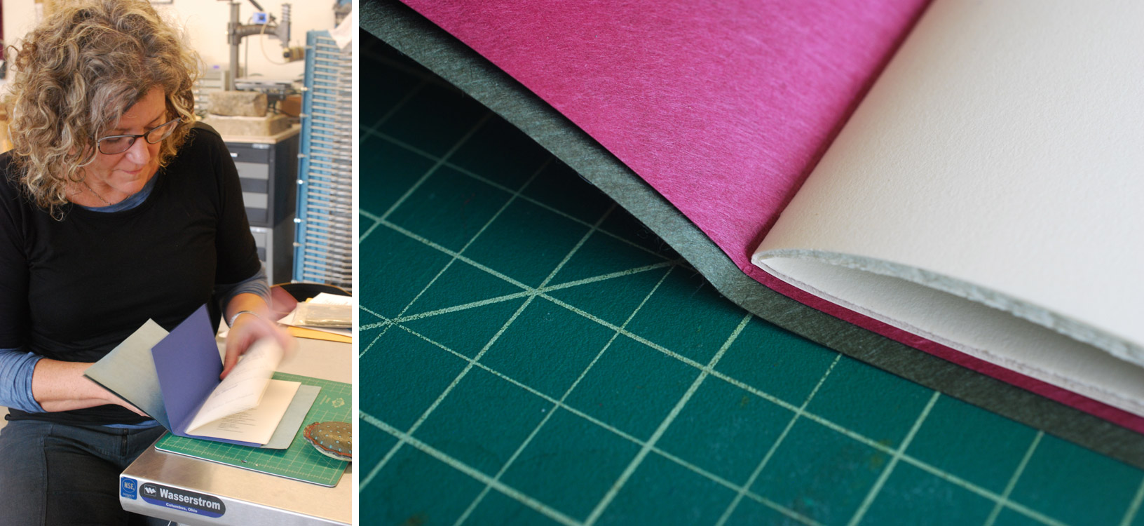
    The interior side of the board is covered in edge-to-edge doublures in the same black goatskin used on the covers. The endpapers were designed by Lisa Van Pelt and originally used on the publishers’ binding edition. Coleen’s binding was included in the 2017 Designer Bookbinders International Exhibition traveling throughout the UK and landing in Boston.

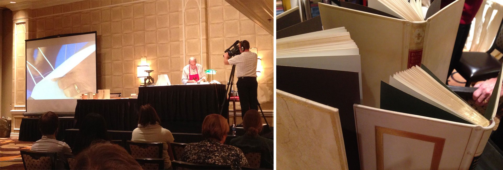
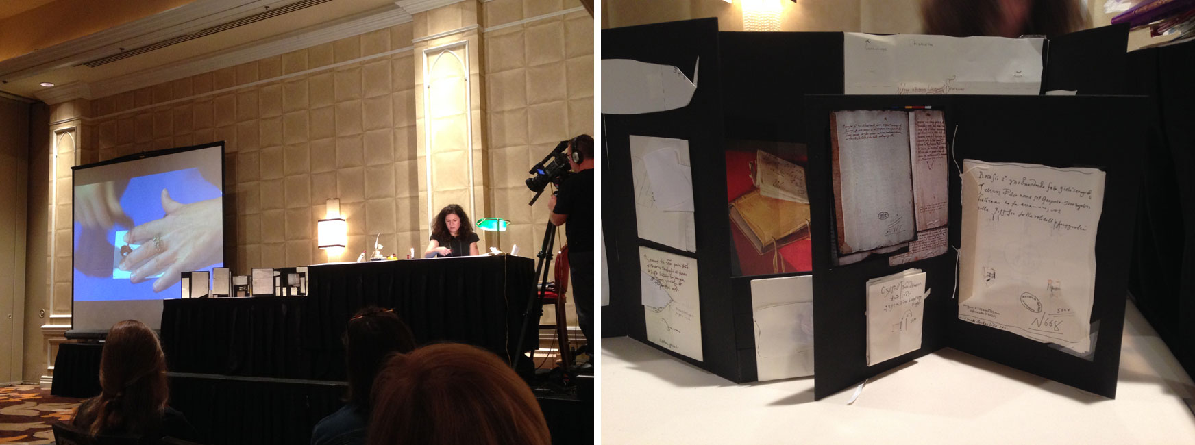
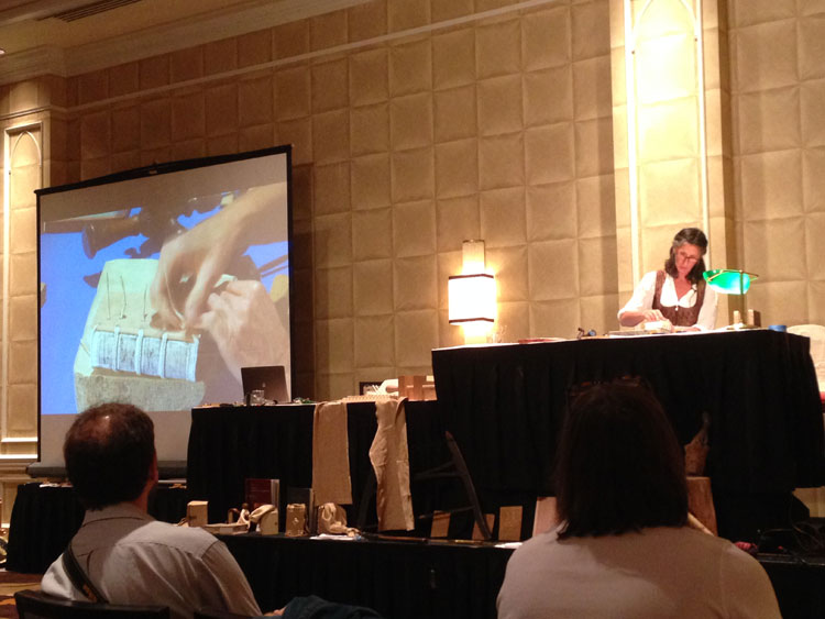
    Recently you’ve been binding for the Santa Rosa-based Nawakum Press, who recently suffered a great loss of their inventory and facility during the 2017 October fires in Sonoma County. How did your relationship begin with Nawakum Press and how things have changed since the devastating fires?
    In 2014, I had the good fortune to attend the Manhattan Fine Press Book Fair in New York.  Whilst browsing the tables laden with beautiful books, I spotted Richard Wagener of Mixolydian Editions presenting LOOM at Nawakum’s table and was blown away by his prints.  I introduced myself to Richard, and he in turn, introduced me to David Pascoe of Nawakum Press.  David mentioned his admiration of my binding on Toni Morrison’s A Mercy that he had seen in an exhibition and we got to talking about making books in the North Bay (area north of SF).  As we were all North Bay residents, I invited both Richard and David to visit my bindery when we returned home.  They visited in August and shortly afterward, David asked if I would be interested in collaborating on a new project he was working on for CODEX 2015.  I crafted a design binding on Nawakum’s featured release Encheiresin Naturae – an incredibly large text with abstract prints by Barry Moser and an ‘heroic crown of sonnets’ by Paul Muldoon.  This was the beginning of our collaboration.

    The Santa Rosa fires were devastating for David and his family– they lost everything including Nawakum’s entire inventory and archive. They escaped in the middle of the night with minutes to spare.  David has since relocated to the Tacoma area for a year and is already working on 2 books, one of which is about the fires. We still collaborate and I am in constant awe of the artists he brings together to make incredible fine press limited editions.

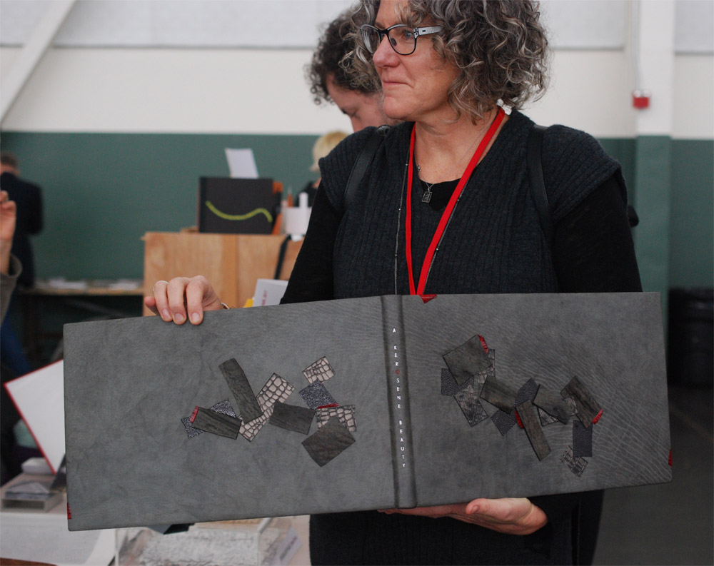
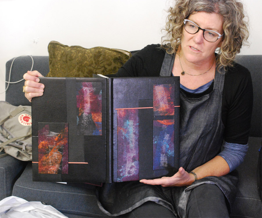
    The mood of Trading Eights is so different from your other bindings. The black on black offers a subtle contrast with spontaneous blips of subdued blue and unusual texture. The framing of these inlays with a repeating title across a wave-like path really contains the design in a way that is different from your other work. So are we seeing a new style emerge from you or is it just that the subject matter of Trading Eights demanded a more sleek design.
    Trading Eights was a delight to work on and listening to the Autumn Jazz station on Pandora got me into the groove of Chet Baker, The Monk and Charlie Parker amongst others.  I wanted to create an intimate feeling in a smoky jazz club and chose a narrow color palette of blues, greys and then black and white.

    I don’t think that you are seeing a different style emerge, rather the subject matter and the book design steered the style for this binding.  The book is clean, with hues of grey and blue.  The black and white underscores the importance of the smoky jazz club.  Jazz performance is personal, intimate: “You can follow the changes in the riffs on their faces … Look into their faces. Peer into their eyes, their souls.” Jim Todd clearly feels the same way about the faces of the great live jazz performers.  The particularly lovely translucent interleaves, with beautifully evocative smoke images, introduces the reader to each large engraving as though peering through the smokey haze in a jazz club.

    I wanted a subtle lyrical feeling in an intimate atmosphere similar to what it would be like sitting in a club listening to musicians trade eights.  The title is repeated across the bottom with 8 notes (each word being a note) and then repeated (traded) across the top, which encloses the design on the boards to create the intimacy.  Jazz is organized yet allows the musician to riff into their own exploration and the design is my attempt to do that.  The shapes on the front and back boards are clean, woven and tight, yet I wanted to explore boundaries with depth and color and texture.


  2. Catching up with Coleen Curry // No. 4

    January 21, 2018 by Erin Fletcher

    This limp suede staple binding by Coleen Curry was bound in 2017. Published by The Perishable Press, Pulsars is authored by Harry Lewis and includes a silkscreen print by Sam Gilliam. Coleen left the text in its original brown paper wrapper along with the prospectus, but added red and blue Moriki endpapers and embossed green goat suede flyleaves. The text is affixed to a red wood stub piece, which allows the print to open completely flat. The book is attached to the cover with 18 carat gold wire staples secured by handmade wood and parchment tackets.

    When I look at your work as a whole there is a clear appreciation for the materials used. Even when a material is manipulated or distressed it is done so with care. Your use of suede on Pulsars reminds me of leather’s hidden beauty. The suede remnants of a split skin can reveal an interesting array of splotches, veins and other blemishes where the dye did not penetrate. I wonder if you feel the same attraction to suede and if that irregularity influenced your reason for using suede on Pulsars?
    The Perishable Press prospectus calls this book a “tactile event” and I wanted my binding to be just that, a tactile event. Sam Gilliam’s vibrant multi-media silkscreen centerfold captures the energy of a pulsar with a vivid green machine stitching across it. I chose a gorgeous purple suede split with a myriad of colors as my covering material as the colors compliment that energy and reflects on some of Lewis’ references to astrophysics. I used a variety of techniques to manipulate the cover including bright paper collage, embossing, tooling and acrylic paint. I chose Italian silk thread in blue and red to machine stitch across the lower right corner of the cover.

    I am attracted to asymmetry and imperfection as a point of beauty. Irregularity – I love it – it creates curiosity, intrigue, and begs the question ‘What is that?’  or ‘How did you do that”. Many of the materials I choose have ‘imperfections’ and these, in my opinion, are what breathe life into my bindings, that intrigue.  When the leather is split, often many variations appear that ware previously hidden. Tick bites, scars, veins, dye variation, texture variation all appear and are always a secret surprise.  Additionally, when various coatings are applied, completely different colors may appear, darken, enrich or even change altogether. The goat suede split was really purple, however when I applied layers of paper and then a PVA wash, the purple darkened and an amazing orange appeared along with some purple dots.

  3. Catching up with Coleen Curry // No. 3

    January 14, 2018 by Erin Fletcher

    Cetology is a finely printed text from The Red Angel Press that includes excerpts from Herman Melville’s Moby Dick. The book was designed and illustrated by Ronald Keller.

    Coleen Curry bound this copy in 2016. The text is sewn ‘Montage sur onglets’ and bound in dark grey buffalo skin. The decorative inlay is a collage of top and back-pared leather mounted on an alligator belly split. The collage has been tooled with the binder’s brass roulette through silver foil. The interior is covered with buffalo edge-to-edge doublures and flyleaves made from hand-dyed Okawara paper.

    With the decorative onlay piece on Cetology, you’ve really managed to unite the textures from the prints with the skin of an actual whale. To create such a textural piece, you worked with alligator skin (not a typical leather found on bookbindings), how did you manipulate it and what challenges did you encounter working with this leather?
    For Cetology, my design inspiration was threefold: 1) Melville’s text and Keller’s art regarding the remarkable size range of cetaceans from a 1.5 meter porpoise to the majestic 30 meter blue whale, 2) my own fascination with how some whales carry up to 1000 pounds of whale barnacles on their bodies and, serendipitously, 3) my bindery overlooks the Pacific Ocean in Northern California where my design process was inspired by a dozen sightings of a mother Humpback and her calf, breaching off the coast during in the late fall of 2015 while I was in the midst of creating this binding.

    I strove to create textured barnacles, the salty fresh scent of a turbulent ocean, and the awesome graceful motion of cetaceans swimming in light shimmering waves.

    The decorative piece is actually an inlay, flush with the cover leather that I made off the book. The inlay consists of a collage made from a variety of leathers and then mounted onto an alligator leather split that was pre-tooled in silver foil. Once that piece was created, I then chose the shape of the inlay and cut into the binding to place it. The collage was my attempt to create that motion and texture by suggesting an abstracted pod of cetaceans varying in size and class.

    I have been experimenting with collaging various leathers and enjoy this technique immensely. I am able to create texture, dimension, and curiosity, while the look is elegant without being clunky. It is similar to Lacunose in that both techniques require building up of layers of leather; however in lacunose, the surface is removed by sanding; for my collages, I make the surface prior to adhering it to the panel. To construct these pieces, it takes time to choose leathers that work together, taking care to pare them very thin and experimenting with adhesives. I press the pieces multiple times and often back pare between layers. I tool and emboss during the process and often add acrylic paint as well to achieve the effect I desire.

    For Cetology, I encountered a few difficulties with the inlay panel as the gray water buffalo leather binding has laced on boards and a flat back. I had to pare the leathers thin as the piece had to be flat enough to extend across both boards and both joints. While the boards were prepared with extra layers of material to allow me to recess the panel deeper within them, the joints are merely the thickness of the leather at the joint. Therefore, my panel was thinner at the joints to allow for easy opening, without breaking the visual across the panel at the joints. All that required forethought. To inset the inlay, I cut into the covering leather – cutting across the joint is a precarious procedure as you I don’t want to cut through the leather hinge! I also experimented with adhesives on the materials used because there are multiple pressing of the collage, leakage of PVA onto suede for example can alter how it looks. I want to know before-hand what to use to achieve the result I strive to create.

    The title, CETOLOGY, is tooled in silver gilt on front board to the right of the inlay panel, the letters in all caps in a barely perceptible arabesque (think gentle wave swell). Its placement took time for me to figure out as the panel across the cover looked like a panel across a cover. I noticed the buffalo leather grain was distinctly flowing towards the lower right board, exactly where one’s hands would open the book. It was a perfect location to title and invite the reader into the book.


    Also bound in 2016, is Coleen’s binding of Outside. A Nawakum Press edition that includes six short stories by Barry Lopez accompanied by “mediation” engravings from Barry Moser. The stories are taken from Lopez’s Notes trilogy, written over a span of almost twenty years. The engravings reflect Lopez’s insight into relationships between humans and animals, creativity and beauty, life and death as he describes both exterior and interior landscapes.

    This same tension is found in Coleen’s binding covered in hand-dyed and embossed kangaroo leather with inlays of copper and inlays and onlays of snake and calfskin. The title is blind tooled at the lower right hand corner of the front cover and almost blends into the background. The interior is lined with stone veneer edge-to-edge doublures and matching fly leaves.

    This binding was included in the American Academy of Bookbinding’s 2017 Open/Set International Competition and was received ‘Highly Commendable for Onlays and Inlays’.

    I had a chance to handle this binding while setting up for the Open/Set Exhibit and it was a real treat. Once again the cover leather is elevated through hand-dying. The irregular patterning of the dye compliments the texture of the crinkled copper and snakeskin inlays so well. Did you alter the snakeskin or is that its natural coloring?
    Lopez’s prose is rich in metaphors and vivid imagery offering a total physical, spiritual, and visual experience which served as inspiration for my design and material choices. His writing captivated me.

    Featuring the natural world, the short stories flow together as a series, reminiscent of native American story-telling connected to spirituality. This led me to create six shapes woven together, each a story by itself, yet connected through a common spirit. Lopez’s prose has ethereal dimensions of reality providing me the opportunity to abstractly incorporate them into the design with specific materials.

    This is one of my favorite bindings– it feels so soft and familiar like a precious leather journal. I chose kangaroo leather to bind the book, and hand-dyed it several times. The smoothness of the kangaroo leather offers a sensual feeling while holding the binding. I applied many types of manipulation and dying techniques such as craquele, embossing and tooling, to create a map documenting a surreal journey through both the physical and spiritual worlds. Visually it is worn, textured, rich, with unidentifiable tracks and lots of movement. The kangaroo is such a gorgeous material. It lacks grain, similar to calf, and therefore is a blank canvas for me to create the texture and colors that I want.

    The shapes are all inlaid individually and consist of a coral and green snake skin, bronze salmon skin, distressed copper, and painted calf splits. I purchased the snake skin in France from an Atelier that supplies exotic leather to luxury fashion houses such as Prada, Gucci, and Hermes. It is a python skin that was hand painted by in-house artists. I did add touch ups of coral and green acrylics in the pockets underneath the scales on the skin, as these pop open across the spine as the book opens and closes. On some bindings, I glue these bits down to keep the look tight and flat, but for this binding I wanted the movement to remain. The snake skin represents “a storm pattern rug woven out of the mind of a Navajo Woman”.

    I chose copper to represent mother earth. It is associated with the goddess Venus in alchemy, owing to its lustrous beauty, its ancient use in producing mirrors, and its association with Cyprus, which was sacred to the goddess. The patina was applied after I crinkled the copper to give it depth. The treated suede ruffles secured under the copper edges softens the metal and offers a somewhat feminine feel.

    The edge-to-edge doublures and fly leaves are thin slate stone veneer, an amazing material from Italy used in architectural applications. It is actual stone that has been laser cut to .3 mm and backed with a polyester and fiberglass backing, then vaporized with a sealant on the surface. I’ve used it for many bindings and it is similar to working with cloth yet it has an immense amount of texture and natural variation.

    One can’t tell from the photographs, but the binding has many minute sparkles that reflect the light. I used micaceous iron oxide many ways to emulate “Dust feels like graphite”; lightly washed over the blind tooled title area to emphasize the spiritual world; painted over the stone doublures “Black rocks glistening in the moonlight” in contrast to the bare stone flyleaves “Dreams of boulders”.

    There are many instances where you are placing an inlay or onlay across the spine of the book. What sort of technical challenges have you experienced from this placement and what solutions have you found? I imagine certain materials would inhibit the movement of the board, how does this limitation effect you during the design stage?
    I usually design and then try to figure out how to make it work, often experimenting with materials and methods. If I am to make an inlay on the spine, I will make a tight-back binding so as to not take the risk of cutting through the hollow. There are technical challenges taking a design over the joints across the spine. The joints are delicate and vulnerable with much thinner leather than on the boards to allow for easy opening of the book. Any material that is placed across the spine, inlay or onlay, also needs to be thin at the joint crease thus limiting the kind of materials that can be used. Many exotic leathers have too much texture variation to allow for easy opening; metals and stone will fail in the crease over time; Thick leather won’t work as the joint needs to be very thin. I have also found that inlays across the spine work best when flush with the covering leather. I have brought designs across the spine by building up the boards or spine prior to covering and sanding the pieces to zero at the crease. This is a different look. Alternatively, onlays can cross the spine, and I have seen two ways, one is to cut the onlay at the joint, similar to tooling where the line breaks at the joint. I have also made bindings where the piece lifts off at the spine, attached into the boards. Don Glaister uses this technique in on many of his bindings.

    SaveSaveSaveSave

    SaveSave


  4. Catching up with Coleen Curry // No. 2

    January 7, 2018 by Erin Fletcher

    LOOM was published by Nawakum Press in collaboration with printmaker Richard Wagener and poet Alan Loney. After Richard began to explore the structure of a loom and the process of weaving, he approached Alan with three finished engravings. Alan was asked to respond in the form of a poem that would equally explore the beauty between connection and disconnection found in both woven work and life.

    Coleen Curry bound this copy of LOOM in 2015 in a black goatskin with inlaid pieces of manipulated leather. The interior is covered in distressed edge-to-edge leather doublures that include two additional inlaid panels of the same manipulated leather.

    The main decorative element on this binding captures the essence of Richard Wagener’s prints beautifully. Can you discuss your technique for creating these amazing distressed leather onlays?
    It was love at first sight when I laid my eyes on LOOM at the 2014 Fine Press Fair in NYC. Richard’s pristine end block maple prints are stunning and Alan Loney’s poem gently flows. I purchased a set in sheets and sat on the project for some time awaiting that design inspiration.

    Later that year, while experimenting with suede splits, I rather unsuccessfully attempted to emboss mull into the split – it stuck and I couldn’t remove it. My ahha moment, it was beautiful! This was perfect for LOOM!

    I made the colorful panels on one large piece of red by layering vivid colored papers, pressing and sanding. I then took sections of mull and carefully removed strands both vertically and horizontally until I had the shapes I desired. These were then pressed into the suede and additional layers of paper added. More sanding and pressing until I had the desired effect.

    To create the design, I cut and arranged the pieces to flow across the book, taking care to ensure the mull pieces flowed harmoniously. I embossed large sections of distorted mull into dampened black leather for a few background onlays and inlays to add texture and continuity. All the panel pieces with the exception of one, are inlaid at various levels: recessed, even, and raised. I inlaid two even panels on the edge to edge leather doublures as well. The pink leather incisions were added to weave the components together.

    The layouts of your designs have a rather organic flow to them, yet LOOM feels more hard-lined and controlled. Was your decision swayed by the nature of the materials or the subject matter of the book?
    I hadn’t thought about the book content being so controlled. The poem is very much about weaving, earth, spirituality, and movement. The typesetting although controlled and consistent, has breaks mid line for a pause and those breaks add to a weave or flow. Richard’s prints begin with a very simple weave and build into ever more complex weaves. Nawakum Press made a 15 minute video on the making of the edition that I find inspiring.

    My binding of LOOM is one of my favorite bindings and it was a hard one to let go. That said, I have another 2 sets in sheets, one of which I am working on these days.


  5. Catching up with Coleen Curry // No. 1

    January 1, 2018 by Erin Fletcher

    The first time I interviewed Coleen Curry was back in 2013. I am continuously inspired by Coleen’s work. She skillfully brings layers of color and texture to her work in new and interesting ways. So let’s start off the year feeling inspired to challenge and improve upon our own work with this updated interview with Coleen. We are starting off with Coleen’s binding of Of Woodland Pools, Spring-holes & Ditches.

    Of Woodland Pools, Spring-holes & Ditches was design and printed by Michael Russem of Kat Ran Press and includes 28 engravings by Abigail Rorer of Lone Oak Press. The prints are accompanied by selected entries from Henry David Thoreau’s journals from the months of March, April and May. These passages elegantly describe the early springtime landscape in New England. The woodland pools, spring-holes and ditches were all terms Thoreau used to describe the breeding grounds of wildlife as the fauna awoke from the winter season.

    Coleen’s binding is covered in a hand-dyed goatskin with edge-to-edge leather doublures. The design includes inlays of cat-tails and green calfskin with additional onlays of bronzy calfskin. The author and printer’s last name were hand-tooled in golf leaf. The leather doublures are distressed and paired with a leather split flyleaf. Coleen bound this copy for the Designer Bookbinders InsideOUT Exhibition in 2014.

    When I saw this binding for the first time, I felt that you had created a style that was uniquely yours. The most striking element of this binding is the hand-dyed leather. The dark veins flow across the book like water making the pieces of inlaid cat-tails and leather almost appear to float on the surface. Can you talk about the dying process for the leather and why you choose to have the accented pieces both sunken on the board and jutting outward?
    I would walk my dogs in a coastal woodland area by my home that has ponds and pools as described by Thoreau. With my tall wellingtons protecting me from the water, I would spend a few hours at various times of the day and peer down into the pools observing the multiple layers of life and plants teeming within. This murky layering was the inspiration for my design. I am deeply attracted to texture and color, and during my design process, I spend a lot of time choosing materials and found objects, mixing and matching, in an attempt to try to visually create the emotions I experience while reading a text and enjoying the art. I find stuff, constantly experiment, and keep everything. I want my designs to introduce the text by appealing to all 5 senses. This binding captured that essence and perhaps that is why you feel it is my own style.

    Working with undyed ‘fair’ goatskin, I applied several paste resists using liquid acrylics, a technique called ‘Craquele’. Thick layers of wheat paste are applied directly to the leather, allowed to dry, and then ‘cracked’ intentionally. The acrylic is then applied and is absorbed in the paste cracks; the paste is then removed. Several resists in various colors were applied to achieve depth and layers I desired. Hewits’ aniline dyes were applied to create the ruddy brown color, along with various embossing and debossing with inks.

    The leather became my water, and now I needed to create movement. First, I gold tooled dotted lines to create the glints of light that appear when sunlight hits water at certain angles. I used a special roulette, that I designed and Pascal Alivon crafted, of uneven dots that roll out crooked. Next, I added a few bright green inlays and onlays for the color of new plant life in the spring. I collected cat-tails from the ponds and dried them. After many experimentations with finishes to seal and protect the cat-tail, I settled on layers of black bison wax – a fine wood finishing wax that has an aroma of wood. To create the feeling of floating layers of intertwined cat-tail leaves, I created two inlay pieces off the book and these needed to be a variety of thicknesses to accommodate effective layering. At this point I had what Suzanne Moore and Don Glaister call ‘the eleventh hour blues’, this is when I experience the ‘my design sucks, it needs something else, it is ruined…”. And yes, this happens with almost every binding I create. At this point, I sift through all my materials and usually find that ‘one thing’ to add. For Pools it was some bronzy calf. I placed thin strips over the cat-tail leaves and inlaid only the tips so the mid portion has air.

    I’m also curious about the treatment of Thoreau and Rorer, their names appear in a sort of V-shape on the spine. It’s quite an unusual layout, does this reference the text in some way?
    The title is quite long ‘Of Woodland Pools, Spring-holes and Ditches’ – I toyed with a variety of shortened versions and settled on ‘Woodland Pools Spring-holes Ditches’ tooled in gold each on its own line meandering line on the front upper right in tiny type.

    I decided to highlight both the prominent author and artist on the spine. I enjoy incorporating letters as part of the design to add interest and intrigue. The ‘O’ in each name lines up with the cat-tails on both front and back covers and the gold letters add that glint on water and adds some continuity between the front and back covers.


  6. My Trip to Codex

    February 26, 2017 by Erin Fletcher

    At the beginning of February, I flew to San Francisco to attend the Codex Book Fair for the first time. The Codex Foundation was formed in 2005 by fine press printer, Peter Rutledge Koch and paper conservator, Susan Filter. Since 2007, the Codex Book Fair and Symposium has run biennially, growing from 120 exhibitors in its first year to 220 in 2017. The venue has also been upgraded to the Craneway Pavilion (once known as the Ford Assembly Plant) to accommodate this ever growing event. The Symposium runs in conjunction with the fair and features keynote speakers within the field of artist books.

    The fair itself runs for four days, unfortunately I only had a chance to be there for the final two days. Needless to say, there was so much to see and so many people to chat with that I was unable to make it all the way through. If you are planning to attend in the future, give yourself four full days. You’re going to need it.

    This year, Codex hosted exhibitors from 26 different countries, who were there to showcase their artist books and fine press editions. In addition, various institutions that offer courses and programs in bookbinding and book arts were displaying work from current students and alumni. A handful of vendors could be spotted amongst the tables selling beautiful handmade papers and tools, plus leather and other binding materials.

    I had a really great time and would recommend making the trip if you are at all interested in bookbinding, book arts and printmaking. It will certainly open your eyes up to the vast levels of skill and creativity amongst our field. Below are some of the highlights from my visit to Codex.

    One of the first things to catch my eye were three bindings by Jonathan Tremblay. His work is so flawless and it was great to get the chance to handle these bindings and chat with Jonathan about his work. The best part of the raised inlay shown on the binding above, is that Jonathan hand-painted the exposed suede edges in a grain-like pattern so that it would blend in seamlessly. A truly amazing detail. Jonathan’s work was on display at A. Piroir Studio-Gallery, a fine press based out of Montréal.

    This lovely cloth book bound around brown thorns and embroidered with erotic images was constructed by Lois Morrison. Her work Leah, interprets an excerpt from the Old Testament. Lois’ illustrations are so expressive, her initial sketch in light blue pencil is still visible under the stitches (a detail that I just loved).

    Coleen Curry discussed a recent binding she completed for Nawakum Press. Her work is so textural and this piece was no exception. Combining a Pergamena grey goatskin with onlays of shark and sanded alligator skin. Really beautiful work.

    The book on the left is by Rhiannon Alpers and is such a creative and lovely way of utilizing the structure of the Secret Belgian binding. She was a delight to chat with and see her work in person. The work on the right is by the phenomenal printer and book artist Karen Kunc. Karen is from my home state of Nebraska, where she runs Constellation Studios. It was great to catch some insight on how this art form is being received in the midwest, particularly in an area that lacks exposure to book arts.

    Vellicate by Karen Hardy includes human hair and this amazing translucent clamshell box. She went through the book arts and printmaking MFA Program at The University of the Arts in Philadelphia and is currently living in Asheville, North Carolina.

    A small selection from Vamp & Tramp Booksellers.

    This binding by Sol Rébora was one of many delightful finds at her table. It was so wonderful to meet Sol in person since interviewing her for the blog back in 2014. The delicate precision of her work is inspiring and Sol was kind enough to speak about the many details of her work.

    Towards the end of the final day, I made a quick stop at Tomorrow’s Past to say hello to Tracey Rowledge and Kathy Abbott. Above are two fine examples from their table. The two bindings on the right are stone veneer staple bindings bound by Sün Evrard.

    Well that’s just a small sample of the things I saw during my trip to Codex. As I mentioned before, it’s definitely worth making the trip. You’ll leave feeling inspired and emboldened to make work, plus you might walk away with an armful of goodies.


  7. Best of 2016

    December 31, 2016 by Erin Fletcher

    At the end of the year, I like to reflect on Herringbone Bindery’s accomplishments and challenges. To name a few successes that I’m particularly proud of include getting my work into two prominent private collections, creating work for 21st Editions and traveling overseas to study with two talented binders. With all of the work coming into the studio this year, plus the time spent outside of the studio teaching and learning, the blog has been engaged with less than desired. But I am very excited about the new year: bringing new energy, interviews, posts on book and much more!

    Here are a list of my favorite posts from 2016:

    1. May // Book Artist of the Month: Amy Borezo
    I had the pleasure of visiting Amy at her studio in Orange, Massachusetts earlier in the year, which led to a rather interesting interview about her work in artist books. This opened up a discussion about painting, printing and working as an edition binder. Her work is perfectly crafted and full of inspiration.
    2. Swell Things No. 29 // Jason Fletcher
    Jason was the first of several guest bloggers to add their own twist to the Swell Things column, sharing links on mummified animals and stunning animated shorts.
    3. My Hand // Into This World

    4. My Hand // The Nightingale and the Rose
    5. North Bennet Street School // Student & Alumni Exhibit 2016 – The Set Book
    Every year I interview the graduating students in North Bennet Street School’s bookbinding department about their design binding that goes on display during the annual Student and Alumni Exhibit.
    6. Workshop // Manipulating Stone Veneer with Coleen Curry


  8. Manipulating Stone Veneer with Coleen Curry

    April 22, 2016 by Erin Fletcher

    Over the first weekend in April, Third Year Studio hosted a workshop organized by the New England Chapter of the Guild of Book Workers. Third Year Studio is located in Boston and is run by Colin Urbina, who just so happens to be my friend and studio mate (Herringbone Bindery is run out of Third Year Studio). This was the first workshop we hosted and Colin was so gracious to opened his space to members of NEGBW and to our guest instructor Coleen Curry.

    Coleen traveled to a unseasonably warm, then snowy Boston to teach 10 local New England binders, book artists and conservators Staple Binding in Stone Veneer. Coleen learned this innovative structure from Sün Evrard, who developed this binding as a conservation solution under the Tomorrow’s Past ideology. We began the first day of the workshop by handing around models of the Stone Veneer binding while introducing ourselves and learning about the structure and its history. The stone veneer comes from a place in Italy where it is cut to a veneer-thickness by use of lasers. This process puts an adhesive coating on the surface, while the back is coated with a cotton-fiberglass layer. The veneer comes in two varieties: slate or quartzite. Yet within these two categories you can find a range of textures, patterns and tones.

    StoneVeneerWksp-ErinFletcher

    left: Dorothy Africa and Coleen Curry | right: detail of  Toad Poems

    The decoration on the slate stone veneer binding of Toad Poems above was achieved by placing a gilt piece of paper behind a cut-out in the covers. The windows are aligned with the staples, an example of how to incorporate the layout of the staples with the overall design.

    StoneVeneerWksp2-ErinFletcher

    The details of the binding above are of the blank model that Coleen made during the workshop with Sün, where she learned this structure. The covers were decorated using a Japanese screw punch. The circular cut-outs were backed with various colored Japanese tissues, offering a small pop of color against the grey slate. The image on the left shows part of the interior construction.

    Another example binding that Coleen shared with us, is this binding of Jabberwocky by Lewis Carroll. It was a great example of how well the stone tools and how it can handle embroidered decorations.

    StoneVeneerWksp4-ErinFletcher

    I especially loved the playfulness of the patched endpapers and use of embroidery to mend the edges.

    StoneVeneerWksp3-ErinFletcher

    After looking through Coleen’s examples, it was time for us to make our own model. After choosing our unique piece of stone (I chose a lovely light colored slate with splashes of yellows, pinks and purples), we were instructed to stamp a series of parallel lines into the center (or spine) of the stone. We did this by strapping our stone and a heated brass rule into a contraption and keeping it under the weight inside our large press. Afterward, we laminated a second layer of Japanese tissue to the backside of the stone. While that was put to bed, we laminated together pieces of colored Japanese tissue that would ultimately become our endpapers.

    StoneVeneerWksp5-ErinFletcher

    While our stone continued to dry, we trimmed down our endpapers to either match our text block or extend slightly behind the edges. The image below shows Coleen demoing the pamphlet stitch that we would use on the text block. The image on the right shows how I trimmed my endpapers. In the end I didn’t like how much of a square I gave the outer (green) endpaper. With the additional square from the stone, the overall square became to large for the size of the text block.

    StoneVeneerWksp6-ErinFletcher

    At the end of day one, Coleen shared with us two fine bindings on loan from a local collector. It was an unexpected and delightful treat to handle and speak with Coleen about her bindings and decorative techniques.

    StoneVeneerWksp7-ErinFletcher

    On day two of the workshop, we were all reunited with our backed stone veneer. We went through the unnerving task of stamping our veneer with the brass rule three more times to redefine the lines and make sure we had an even amount on the outside and odd number on the inside. It was very important to register the brass rule correctly each time, so that our lines stayed crisp and parallel to one another. I snapped a photograph at the very end when I was ready to take the brass rule and stone out of our jig.

    StoneVeneerWksp8-ErinFletcher

    We also advanced on the text block by attaching the wooden spine stub piece. This stub could be made from a number of materials, but we choose from a selection of basswood pieces that were cut down and laminated to match the height of the outer endpaper and thickness of the text block. The wooden piece was also shaped to match the roundness of the folded signature. I painted the ends of my spine piece to offer a bit of decoration to the head and tail. After trimming, shaping and painting, the spine piece was affixed to the outer endpaper and the fore edge was finally trimmed to the final width.

    StoneVeneerWksp9-ErinFletcher

    At this point, we were ready to attach our text block to the stone veneer. The first steps were to create a punching jig to guide our awls to punch holes in the folds of the outer endpaper and in the stone cover. The stone was easy to pierce, once you felt it was in the right place, I simply used an awl to poke through the stone. We laced our text block temporarily into the stone covers in order to fold the fore edge and trim off any excess.

    StoneVeneerWksp10-ErinFletcher

    Before laminating the folded stone onto itself, you have the opportunity to add any decorative elements such as cut-outs, sewing, tooling, etc. Due to time constraints (I had to remake a painted wooden stay that I dropped on the floor), I chose to add some simple embroidered stitches just to see how well I could sew through the stone. This was mostly done on the inside of the front cover.

    StoneVeneerWksp11-ErinFletcher

    With a pile of stays (wooden, metal and vellum) and metal staples in hand, I was ready to securely attach the text block to the stone veneer covers. In the image on the right below, Coleen is demonstrating how to use plastic tubing to make it easier to insert the staples and stays.

    StoneVeneerWksp12-ErinFletcher

    For my binding, I chose to use both metal connectors and wooden stays. I painted one set of wooden stays to match the dark purple laminated to the backside of my stone. The staple is inserted through the stay and the vellum catches the legs of the staples on the inside of the endpaper. We stuck an orange stick into a piece of cork, this strange looking tool (seen above) aided in folding over the legs of staples. And viola! The binding is complete. At this point I could still add tooling, but I loved the look of my stone, that I chose to leave it untouched.

    StoneVeneerWksp13-ErinFletcher

    We had a great workshop with Coleen, she brought so much experience and knowledge to the workshop. Her patience and persistence ensured that everyone walked away satisfied and with a finished binding.

    StoneVeneerWksp14-ErinFletcher


  9. Guild of Book Workers – Standards of Excellence Seminar // Las Vegas 2014

    October 28, 2014 by Erin Fletcher

    The 2014 Guild of Book Workers Standards of Excellence Seminar was located in Las Vegas at the Excalibur Hotel. My initial experience of the city was enchanting. As my first trip to Las Vegas, the lights and sights were captivating and surreal. The city is constantly bustling with excitement and anticipation. However, these abstractions of Vegas began to weigh on my experience.

    Despite the circumstances, I thoroughly enjoyed myself at the Seminar and within this post I will present an overview of the events. Each Standards of Excellence Seminar includes a tour. The conservation lab at the University of Nevada, Las Vegas invited the attendees to view their facilities and see an overview of their collection, means of repair and exhibits.

    The official start of the Seminar occurred later that day with an opening reception at the University outside the Barrick Museum. We gathered outside in the warm weather to some treats and libations. The museum was open to us as well and featured a selection of contemporary 2-d and 3-d art juxtaposed with an exhibit of baskets from the Southern Paiute and Shoshone of southern Nevada. The reception is a great way to see who is attending and offers an opportunity to rekindle connections. There are a variety of people whom I connect with every year at Standards, which is one reason I love to attend the Seminar.

    Standards1-ErinFletcher

    The first full day of the Seminar included two of the four presentations and ended with a Mix and Mingle event. In addition to those happenings, is the the vendor room. Each year the vendor room is filled with colorful leathers, handmade papers, bindery tools and more. There are many vendors who are staples of the vendor room and many who are new to the crowd. I’m always pleased to chat with the vendors, it’s so wonderful to have a personal relationship with the people who supply our materials. But on to main event: the very first presentation was by Emily Martin.

    Standards2-ErinFletcher

    Emily’s artist book, The Tragedy of Romeo and Juliet, was a Distinguished Winner for the Designer Bookbinders 2013 International Bookbinding Competition and became the subject of her presentation on Carousel Books. This style of binding was first used in the 1930s becoming more popular after WWII. There are two main types of carousel books: 1) floor and wall and 2) window (or starbook). Emily’s presentation was so well executed as she demonstrated how she created a hybrid of the two types for her Shakespeare book. Her instruction was easy to follow as she demonstrated her creative process and the steps for constructing an elaborate carousel book. One other element that I enjoyed from Emily’s presentation was her use of trace monotype as a means of creating illustration.

    The second presentation was on Parchment Over Boards from Peter Geraty. This is a structure that I have learned directly from Peter, while I was a student at North Bennet Street School. So Peter’s presentation was a wonderful refresher to a structure that I am currently working on in my studio. Due to the short-time frame of the presentations, many of the steps had to be rush through, but Peter did a wonderful job of completing the major parts of the binding. It was particularly nice to see how to shape the headcap, which can be quite difficult when working in parchment.

    Standards3-ErinFletcher

    The first full day of the Seminar ended with a Mix and Mingle event, which is an informal way to show off your more recent work to the fellow attendees. A few tables were filled with a variety of book related projects from miniature bindings and finely printed artist books to handmade tools and fine bindings. It’s always delightful to handle books and have the opportunity to speak with the craftsperson about their work. This Mix and Mingle event is quite a new addition to Standards, only happening once before at last year’s Seminar, but I hope it will continue. It’s a wonderful way to engage in creative conversation with fellow bookbinders and conservators.

    Standards4-ErinFletcher Standards5-ErinFletcher

    At the start of the second day of the Seminar was a presentation on Historical Letterlocking by Jana D’ambrogio. I really enjoyed Jana’s presentation because her enthusiasm for the subject of letterlocking was quite infectious. She presented on several letterlocking variations, detailing the folds and locking techniques used in order to secure a letter of importance. And there were quite a lot of variations from using the same material to create the lock, penetrating through all folded layers, pleating, triangular lock, the penguin lock and using wax seals. Every locked letter that Jana demonstrated was based on an actual letter, that had been deeply researched and investigated by Jana herself. She has traveled all over the world viewing various letters to decipher their letterlocking structures. All this research is just the start of a new database of information and a new lexicon on the habits of security during the 15th – 16th century.

    Jana wrapped the audience into her presentation as we were tasked to unlock our own letter. She also demonstrated a quick and easy way to lock a letter into a triangular shape, which can be sent through the mail even today.

    Standards6-ErinFletcher

    To wrap up the day was the final presentation on the Traditional Medieval Girdle Book given by Renate Mesmer. In Germany the girdle book is called Das Beutelbuch and was a symbol of faith or status within society of the 15th century. The texts were either religious or legal. Around 800 girdle books can be found in art, yet only 23 physical examples are known worldwide (most in Germany and only 14 in their original cover). The structure of the book is similar to most 15th century wooden board bindings, there are so many variations to the sewing pattern, sewing support, endpapers and spine linings. Renate demonstrated the construction of the binding before moving on the creation of the girdle and Turk’s head knot.

    Renate also engaged the audience’s participation by attempting to teach us the Turk’s head knot using a bouncy ball and a long, thin piece of leather. It was quite difficult to say the least.

    Throughout Renate’s presentation, the audience was enchanted by spurts of medieval knowledge from Jim Croft, who joined the stage to discuss wood and brass hinges.

    Standards7-ErinFletcher

    The final event of the Seminar is the banquet, this year attendees were invited to dress in medieval garb (which is why Renate is dressed so appropriately during her presentation). And thanks to my classmate, Caitlyn Thompson, many of the NBSS students and alum donned hand-crocheted crowns. During dessert, the Guild’s President Mark Andersson, presented the Laura Young Award to Julia Miller and the Lifetime Achievement award to Sam Ellenport. The former is presented to someone who has served the Guild in an outstanding manner. The latter award was presented to Sam Ellenport for the countless ways he has influenced the field of bookbinding. Many people have been affected by his influence, for example, Sam was instrumental in created the bookbinding program at North Bennet Street School.

    Following the food and awards, is the real excitement of the night: the auction. Scholarship winners parade around the room with the items up for auction and excitement ensues amongst the crowd. I was delighted to participate this year for the first time and walked away with two beautiful pieces of suede that were so gorgeously decorated and altered by Coleen Curry. And thanks to Colin Urbina, I also got a dogtooth burnisher.

    Standards8-ErinFletcher

    My night ended with several goodbyes, some lovely music from Jim Croft and an excellent show and tell from Don Glaister.

    Although, I was eager to leave Vegas, I had a wonderful time at the Seminar. Looking forward to seeing all my book friends and colleagues next year in Nashville.


  10. Bookbinder of the Month: Lang Ingalls

    March 16, 2014 by Erin Fletcher

    FantasyAndNonsense-LangIngalls

    The exhibition showcasing design bindings of the Tryst Press edition of Fantasy & Nonsense has been mentioned a few times on the blog. I first discussed the exhibition with my own submission, then again when I featured the work of Coleen Curry and Mary Uthuppuru. The book itself is a compilation of works by the American poet James Whitcomb Riley paired with beautiful wood engravings by Berrot H. Hubrecht. Each of the exhibitors really captured the whimsy of the poems and illustrations, transforming each binding into a unique object.

    Lang Ingalls‘ binding of Fantasy & Nonsense is no different in this respect. Her simple yet elegant design extracts the illustrations and complies them to form an intriguing landscape across the open binding. Lang created the binding in 2012 for the exhibition which was hosted by the Rocky Mountain Chapter of the Guild of Book Workers and displayed at the J. Willard Marriott Library at the University of Utah. Bound in the French technique in full light blue goatskin. The linear design was painted with acrylic inside a pulled leather line. Other design elements include colored head edge, custom paste paper endsheets and hand tooled title in blind on the spine.

    I love the color palette on this binding. Even though I had the opportunity to view this binding in person, I was stumped by how you created such a fine line of color in the leather. Can you talk about the technique you employed in this binding?
    This is one of the techniques I learned form Hélène Jolis — it is called an incision line. You actually cut the two sides of the line with a scalpel, remove the leather and paint with acrylics (yes, you need a paintbrush with only three bristles!) inside the line. I advise an optivisor for the work…


  • My name is Erin Fletcher, owner and bookbinder of Herringbone Bindery in Boston. Flash of the Hand is a space where I share my process and inspirations.
    The StudioNewsletterInstagramEmail me
  • Archives