RSS Feed

Posts Tagged ‘lang ingalls’

  1. Exquisite Corpse Collaboration

    July 10, 2016 by Erin Fletcher

    ExquisiteCorpse
    As Program Chair for the New England Chapter of the Guild of Book Workers, I had the pleasure of organizing a project brought to me by one of our members. Jonathan Romain, a recent graduate of the North Bennet Street School Bookbinding Program, brought forth the idea of a collaborative project between the students at NBSS and the NEGBW. I loved this idea and so with the help of instructor Jeffrey Altepeter, we put this plan in motion.

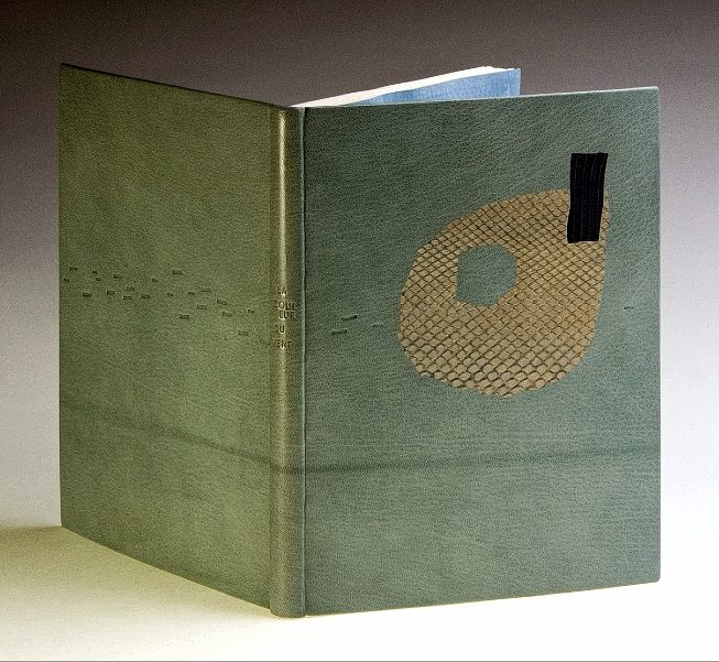
    An Exquisite Corpse is a method of illustration invented by Surrealists in the early 1910s, where each collaborator adds to a composition in sequence usually without seeing the prior portion. Upon reveal this rule to hide the previous sequences offers up an abstract and amusing portrait. Each student created a plaquette covered in neutral leather (we used Harmatan Terracotta and Brown goatskin) and also completed the “head” portion of the figure. The plaquette’s were about 18in x 6in; allowing each participant to cover a 6in square portion of the board.

    The project spanned over 3 months as each participant received and worked on their portion over the course of a month. At the end of May, the finished pieces were on display as part of NBSS’s Student & Alumni Show, an annual exhibit that showcases work from current students and alumni from the various programs.

    I had the pleasure of receiving the finished pieces and bringing them back to the students. We gathered around one another as each student revealed the unique and strange characters that developed over the course of the project. Each piece is displayed below with a brief description from each collaborator remarking on their concept and use of materials.

    Jeffrey Altepeter – Samuel Feinstein – Lang Ingalls

    JeffSamuelLang-Corpse
    Jeffrey Altepeter
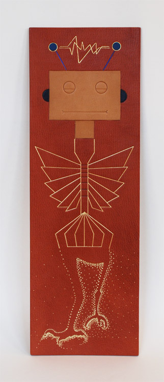
    The robot head was inspired by my son’s fascination with mechanical and technological design and construction. It is made up of traditional leather decoration techniques—leather onlays, tooled with gold leaf, foil and carbon.


    Samuel Feinstein
    Chicago, IL

    Gold and blind tooling.


    Lang Ingalls
    Crested Butte, CO

    I opted for humor in my approach to the Exquisite Corpse. The design concept was to depict bird legs: the initial tests were for tooling in the positive; it became clear that the negative space would be more interesting. I used four sizes of “dots” in gold foil to produce the background behind the legs. Repetition and rhythm became the focal point.

    Emily Patchin – Barbara Adams Hebard – Athena Moore

    EmilyBarbaraAthena-Corpse Emily Patchin
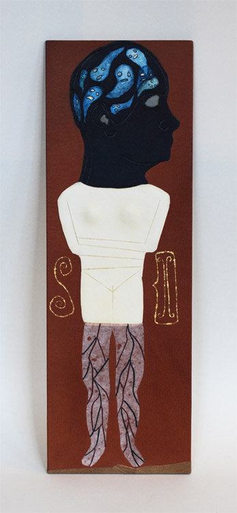
    This head was created as an onlay piece. The main portion was cut out of navy blue goat skin, pared thin. The sections for the eye, ear, and ghosts were all cut out, and their edges beveled on the flesh-side. Light blue leather for the eye and ear were glued to the back before pasting to the base leather. The ghosts were cut out from parchment; their faces backed with thinly pared gold leather, and painted with watercolor before being glued in place. The outline of the original drawing was then blind tooled over the leather. The intention behind the design was to look at intense personal struggles (depression, intrusive thoughts, insomnia) through a lens of whimsy and humor.

    Barbara Adams Hebard
    Melrose, MA

    Melrose, MAWhite alum-tawed goatskin onlay with blind tooled details, inspired by the shape of an Early Cycladic marble female torso (2800-2300 BC, Keros-Syros Culture). Flanking the torso are shapes commonly found incised on Early Cycladic pottery, a spiral and a two-headed ax, executed in surface gilding.


    Athena Moore
    Somerville, MA

    My materials were leather and hand-cast paper (made by the artist). The concept was a bit literal, since I had the last portion and was finishing the body with the legs, but I was inspired by a particular set of medical prints from Yale’s collection.

    Jonathan Romain – Erin Fletcher – James Reid-Cunningham

    JonathanErinJamesJonathan Romain
    a shapeless face, 18 karat gold, palladium, and ascona onlay


    Erin Fletcher
    Boston, MA

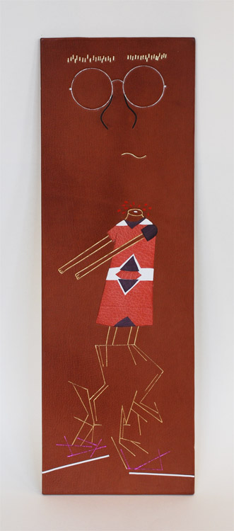
    I wanted to created something really playful with my portion of the plaquette. When I saw no indication of where to begin, I chose to create a headless girl with comically long arms. The girl’s dress is a series of blind tooled onlays in pink and purple goatskin and white buffalo. Her skin is gold tooled. And the blood spurting from her headless stump is painted with red acrylic.


    James Reid-Cunningham
    Cambridge, MA

    The design is largely non-representational, with a vague suggestion of legs. Otherwise, there is no concept. Tooled in gold and metallic foil, with inset lines of white box calf.

    Mary Grace Whalen – Eric Alstrom – Penelope Hall
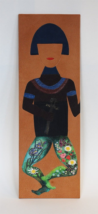
    MaryGraceEricPenelope-CorpseMary Grace Whalen
    Blue Pageboy, a leather tool-edged onlay made of goatskin is inspired by the Russian pioneer of geometric abstraction, Kazimir Malevich’s costume design and his Yellow Man painting. Blue Pageboy gives off a theatrical and mysterious vibe. Who is s/he? Only the body will tell!


    Eric Alstrom
    Okemos, MI

    After many ideas, I kept coming back to the idea of ancient Egypt and their exquisite corpses.  My design is based on various historic paintings, but did not copy any single on in particular. The design is made from various colors of goat painted with acrylics and blind tooled


    Penelope Hall
    Kingfield, ME

    Inlay consisting of glazed earthenware, scraps of Thai papers, and wheat paste. Colored with watercolor. Additional adhesives used are E-6000, and Jade 403 PVA. Finish coat on the inlay is SC 6000 acrylic polymer and wax emulsion.

    Nicole Campana – Jan Baker – Colin Urbina
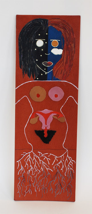
    NicoleJanColin-Corpse

    Nicole Campana
    This design was inspired by nothing more than a common theme in much of my art: day and night. I’m drawn to the color palette each time presents and the way in which our perceptions of those colors change as the light does. The techniques utilized are predominantly onlays and gold tooling, however a variation of the lacunose technique and an Ascona tool were used for the hair.


    Jan Baker
    Providence, RI

    what i lost this year:
    – my ovaries
    – my fallopian tubes
    – my uterus
    – all of my hair
    – and my brother


    Colin Urbina
    Boston, MA

    When I’m sketching, I often come back to the roots of a plant. For this project I decided to attempt the same type of free flowing, loose, many-from-one nature of these sketches with traditional gouges. Using five or six tools I built up the legs of this plaquette, and then added acrylic paint into them that gets darker as the roots go lower. The dirt is represented by grain manipulation with sandpaper, changing the surface of the leather and giving it a different look and feel.

    Peggy Boston – John Nove – Shannon Kerner
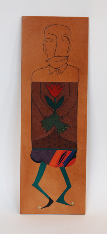
    PeggyJohnShannon-Corpse

    Peggy Boston
    My inspiration for this project came from a group of mustachioed, high-collared, quirky members of the Viennese Secessionist art movement. This movement was part of the golden age of illustration and graphic design in Vienna and Germany from 1897 to 1918. Their main influences were derived from William Morris and the English Arts and Crafts movement which sought to bridge the applied and fine arts. The Secessionists favored hand-made object opposing machine techniques. Hand tooling and acrylic paint.


    John Nove
    South Deerfield, MA

    The initial description of the project attributed the Exquisite Corpse to the Surrealists. My concept was of a Magritte-ian gentleman – fine suit, hands crossed in the standard coffin pose holding the usual flower  — but then with an amphibian’s green gnarly ‘hands’. Carbon tooling and goatskin onlays.


    Shannon Kerner
    Easthampton MA

    The vivid colors on the chubby tum were used to inspire whimsy, as well as the funny shape of the legs, which took inspiration from the cartoon Invader Zim, a silly plot animation focusing on an alien sent to Earth and meant to blend in. Stars: gold and palladium mixed together is a challenging medium to tool as they are different weights, but the outcome is very rewarding and attractive. Leather onlays, gold and palladium tooling.

    Todd Davis – Jason Patrician – Jacqueline Scott
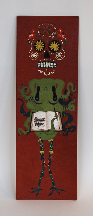
    ToddJasonJackie

    Todd Davis
    The design of this head is inspired by the sugar skulls used as part of the Mexican celebration of Dia de los Muertos (day of the dead). On that day, these skulls, made of sugar, are part of an altar made to honor and celebrate dead ancestors, particularly children. Blind tooled outline filled with raised, ascona, and back-pared onlays. It is finished with blind and lemon gold tooling, and surface gilded teeth.


    Jason Patrician
    New London, CT

    I wanted to stay true to the surrealist exercise of the exquisite corpse by combining the distorted human figure and nature. For my design I chose the octopus, the master of disguise, which doubles as the female torso. Leather onlays (Harmatan and Pergamena), vellum inlay (Pergamena) with walnut ink wash and Prismacolor marker detail, blind tooling throughout.


    Jacqueline Scott
    Somerville, MA

    Materials: goatskin leather, gold leaf
    Concept: I wanted my plaquette section to be whimsical and colorful and wanted to utilize the feathered onlay technique. Something about chicken legs appealed to me, so I ran with that, though I think they ended up looking more like reptile legs with funny leg warmers.

  2. Bonus // Bookbinder of the Month: Lang Ingalls

    March 31, 2014 by Erin Fletcher

    KingOfTheAlps-LangIngalls

    Just one more bonus binding from Lang Ingalls to end out the month. King of the Alps by Reginald Farrer with illustrations by Abigail Rorer was bound by Lang in 2013. The Lone Oak Press edition is signed by the illustrator.

    Bound in the French technique in full white alum-tawed goat. The geometric design on the covers is an interpretation of one of the illustrations. Lang continues to use the incision technique in which a thin line of leather is removed and painted with acrylics in grey and blue tones. The same palette continues on the inside with blue leather edge-to-edge doublures and grey suede flyleaves. The title, author, illustrator and date of edition are on decorative onlays on the spine.


  3. Bookbinder of the Month: Lang Ingalls

    March 30, 2014 by Erin Fletcher

    Ici-LangIngalls

    On exhibit from June 20th to September 14th of this year is Lang Ingalls‘ binding of Ici by Roger Munier. The exhibit is sponsored by ARA France in partnership with the city of NÎmes and its renowned Carré d’Art Library for the XIth FIRA International Forum & Exhibition.

    This edition is copy 13 of 47 and is signed by the author. Bound in the reliure à cru structure in black sanded calf with sewn red thread elements. The binding is complete with squared suede headbands, suede doublures and suede flyleaves. The title, author and date are hand tooled on both covers.

    This binding stands out in your portfolio due to the absence of color in the design, however the treatment of the leather is exceptional. It reminds me of how a photocopied image begins to degrade and become fuzzy with each subsequent copy. Was this effect created through a dyeing or printing process?
    This binding was made in Paris with Ana Ruiz-Larrea last fall. The structure is called reliure a cru, a soft-cover leather binding. The text is about how all things go round, all things in life. I decided on a circular element and taped #18 thread to the back of black calf. I sanded and — viola! — the calf was distressed and the circle came through. There is a hint of red in the text, the initial letter at the start of the copy, and I borrowed from that when I made small sewings of red thread through parts of the circle. The French teach that 2/3 of your design is on the recto and 1/3 is on the verso, thus the placings of these tiny thread elements, while considering the title, author and year.


  4. Bookbinder of the Month: Lang Ingalls

    March 23, 2014 by Erin Fletcher

    Chanson-LangIngalls2

    Chansons is a text written by the Belgian poet and playwright Maurice Maeterlink. This particular 1995 edition is in French and includes engravings by Ginette Litt; the copy is signed by Litt and bibliophile G.A. Dassonville. Lang Ingalls bound this copy in 2013 and it will be exhibited from April 4 to June 30 of this year in a show titled ‘Belgian Writers, a Binding Homage’ sponsored by Bibliotheca Wittockiana and ARA Belgica.

    The binding is bound in the French technique in pink goatskin. Lang describes the cover design inspiration and techniques below in response to my question. However, not shown are the hand-sewn silk headbands and black suede pastedowns and flyleaves.

    Once again, you’ve created such a beautiful binding. I would just love for you to discuss your concept behind the design and how you translated that into the materials used on the binding.
    This binding is recent, and one that took a long time to develop, and one that is amongst my favorites I’ve made. The shapes on both the recto and verso are taken from the etchings of Ginette Litt, one for each song (six). The shapes were removed and sanded, then re-adhered to the covers. The incision lines were painted black. The small connecting lines are thin twine that has been wound with silk thread in a near-pink hue, then adhered in a tooled line. The title is blind tooled then painted in the same black as the incisions.


  5. Bookbinder of the Month: Lang Ingalls

    March 16, 2014 by Erin Fletcher

    FantasyAndNonsense-LangIngalls

    The exhibition showcasing design bindings of the Tryst Press edition of Fantasy & Nonsense has been mentioned a few times on the blog. I first discussed the exhibition with my own submission, then again when I featured the work of Coleen Curry and Mary Uthuppuru. The book itself is a compilation of works by the American poet James Whitcomb Riley paired with beautiful wood engravings by Berrot H. Hubrecht. Each of the exhibitors really captured the whimsy of the poems and illustrations, transforming each binding into a unique object.

    Lang Ingalls‘ binding of Fantasy & Nonsense is no different in this respect. Her simple yet elegant design extracts the illustrations and complies them to form an intriguing landscape across the open binding. Lang created the binding in 2012 for the exhibition which was hosted by the Rocky Mountain Chapter of the Guild of Book Workers and displayed at the J. Willard Marriott Library at the University of Utah. Bound in the French technique in full light blue goatskin. The linear design was painted with acrylic inside a pulled leather line. Other design elements include colored head edge, custom paste paper endsheets and hand tooled title in blind on the spine.

    I love the color palette on this binding. Even though I had the opportunity to view this binding in person, I was stumped by how you created such a fine line of color in the leather. Can you talk about the technique you employed in this binding?
    This is one of the techniques I learned form Hélène Jolis — it is called an incision line. You actually cut the two sides of the line with a scalpel, remove the leather and paint with acrylics (yes, you need a paintbrush with only three bristles!) inside the line. I advise an optivisor for the work…


  6. Bookbinder of the Month: Lang Ingalls

    March 9, 2014 by Erin Fletcher

    GoTellItOnTheMountain2-LangIngalls

    In 2011, Lang Ingalls won the Best Binding Award from the Chicago Public Library’s One Book Many Interpretations exhibition for her binding of Go Tell It on the Mountain by James Baldwin. It was during the reception for this exhibition that I met Lang. I was drawn to her binding because of the stark contrast between the rich purple leather and bright white onlays.

    Bound in the French technique and covered in purple goatskin. Spanning across the covers and spine are white eel onlays.  Other design details along with the title are hand tooled blind.

    This is the binding that led to our being introduced during an exhibit in Chicago. I am so attracted to the brilliant contrast between the vivid purple leather and the bright white eel skin onlays. I have little experience using exotic leathers, how does eel skin compare to traditional bookbinding leathers?
    This eel skin is really really thin, perfect for onlays, and not difficult to execute. I had fun deciding which way the spine parts would go to complement the design.


  7. March // Bookbinder of the Month: Lang Ingalls

    March 1, 2014 by Erin Fletcher

    LaCouleurDuVent-Lang Ingalls

    At this point I think it’s safe to say that I have found the recent ARA-Canada exhibition La Couleur du Vent to be filled with many beautiful and inspiring bindings. This particular binding was created by Lang Ingalls and is the fourth binding from the exhibition to be featured on the blog (the other three: Sonya Sheats, Coleen Curry and Karen Hanmer).

    So in case you missed those three posts I highly recommend you check them out after reading this one, but first let me summarize the exhibit. This international design binding exhibition was put together by ARA-Canada in partnership with École Estienne in Paris. The exhibition started in 2013 in Paris before traveling to Quebec then Montreal (which ended on February 28th). The show will continue to travel during this year, showing in Trois-Rivières from March to April. La Couleur du Vent is a collection of poems by Gilles Vigneault, illustrated and designed by Nastassja Imiolek under the artistic direction of Cécile Côté.

    Let’s get back to Lang’s binding. The set text is bound in the French technique using sea foam blue goatskin. On the front cover are inlays of python and lizard. A series of irregular shapes are tooled blind and span across the full length of the binding with the title also tooled blind on the spine. What I love most about this binding (besides the superb color choices) is the bold inclusion of the spine. Lang so wonderfully highlights the material and uses the natural elements of the leather to create an even more compelling design.

    This binding is stunning. The design you’ve created really celebrates the natural qualities of the materials. Can you talk about your concept behind the design?
    I bought the python and lizard used for the inlays in Paris years ago, but really love the texture and color of them — I tend to make monochromatic color choices in my books, this one is an example of that.

    – – – – – – – – – – –

    I chose to interview Lang for a few different reasons. Her work has been and continues to display thoughtful experimentation and courage with her materials. Her designs continue to engage and perplex me. She’s also just a wonderful person to be around. Lang is part of a handful of people I look forward to seeing once a year at the Guild of Book Workers Standard of Excellence Conference. Lastly, Lang’s educational experiences have greatly differed from my own. Since graduating from North Bennet Street School and having the opportunity to study with various guest instructors I’ve come to value the importance of creating what Lang describes as a ‘tool box’: gathering techniques on structures and decoration from binders with various talents and backgrounds.

    After the jump is my interview with Lang, it discusses heavily her varied educational experiences. Every Sunday this month I will feature some more of Lang’s bindings, so don’t forget to email subscribe and receive reminders when posts go live. You won’t want to miss out!

    read more >


  • My name is Erin Fletcher, owner and bookbinder of Herringbone Bindery in Boston. Flash of the Hand is a space where I share my process and inspirations.
    The StudioNewsletterInstagramEmail me
  • Archives