RSS Feed

Posts Tagged ‘mark cockram’

  1. Studying in London with Mark and Tracey

    January 8, 2017 by Erin Fletcher

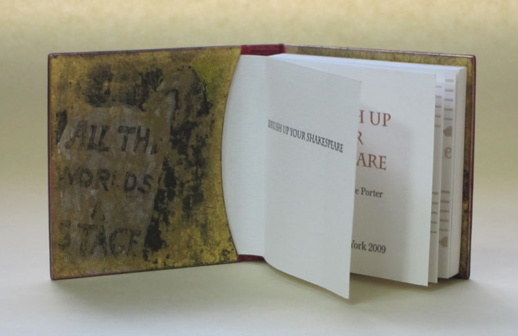
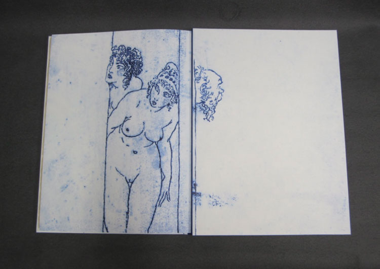
    At the beginning of November, I spent two and a half weeks living under the gloomy, grey skies of London. But having lived in Boston for the past six years, I felt quite at home with the overcast days and long train rides. After getting settled in my flat just outside of Tufnell Park, I spent my first day wandering around the Victoria and Albert Museum. An exhibit on Medieval English embroidery occupied most of my time during the visit. The exhibit surveyed religious garments and coverings dating from the 13th – 15th centuries. The quality of the stitchwort was breathtakingly beautiful and in such immaculate condition for their age.

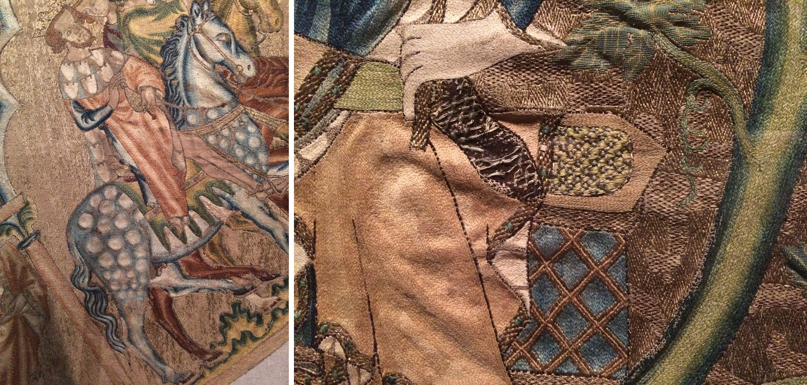
    right: Panel depicting the Tree of Jesse (1310-20)

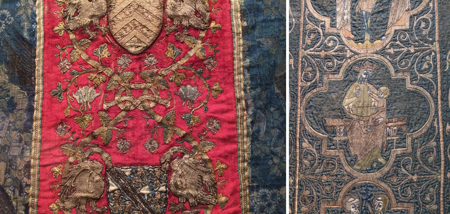
    right: The Clare Chasuble (1272-94)

    After my jaunt at the V&A (plus a quick bite at the cafe), I wandered around Soho, popping into a few shops before ending up at Mother Mash for dinner (so delicious and highly recommended). But let me get to the real reason why you are reading this post.

    DAY ONE
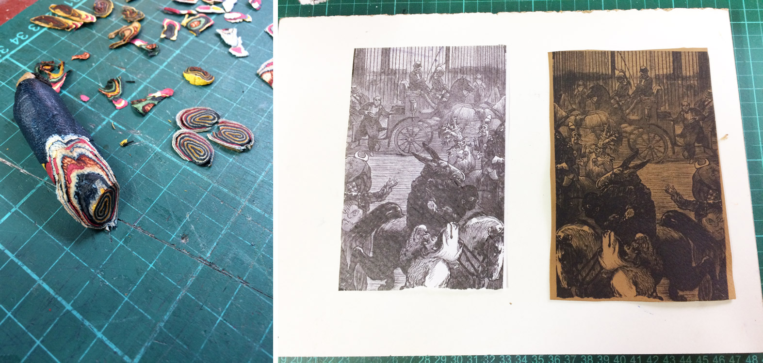
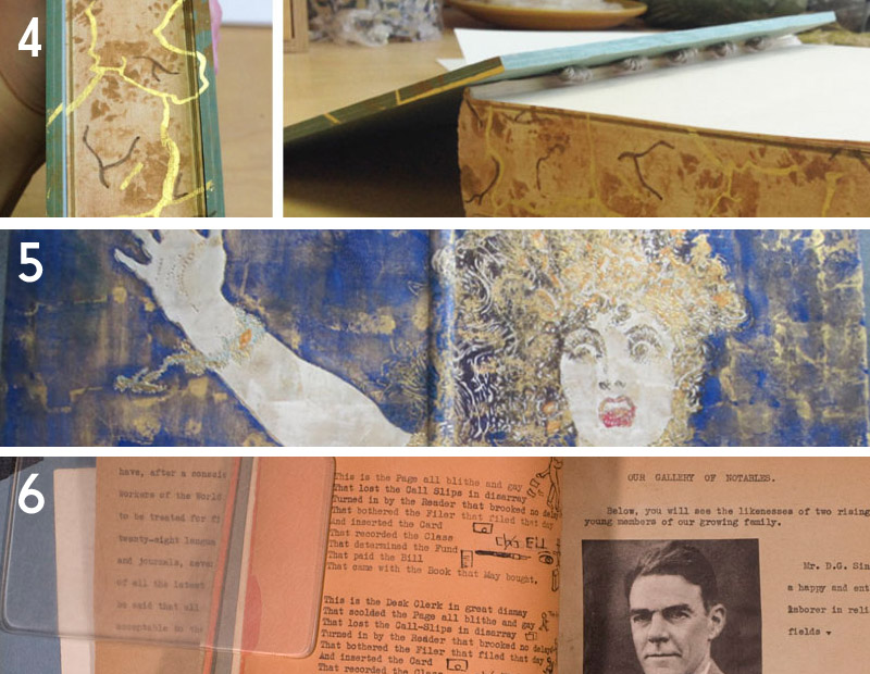
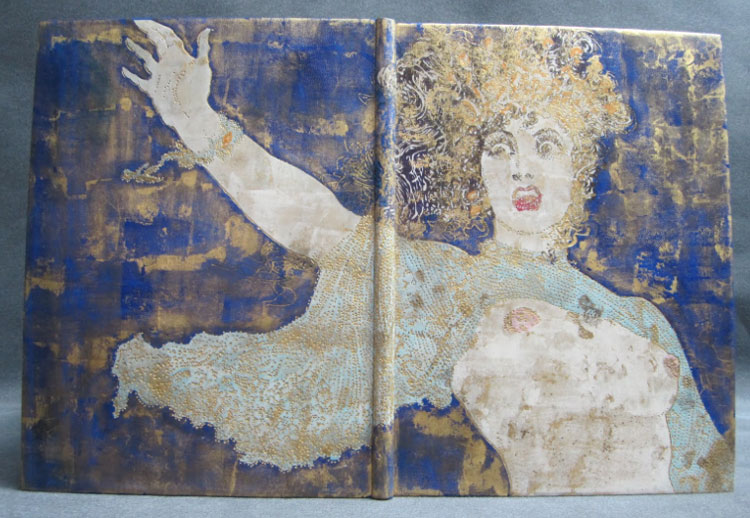
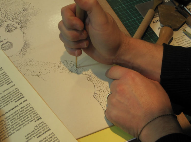
    The next day I traveled from my flat in Tufnell Park to Barnes for the first of nine days with Mark Cockram. I arrived promptly at 10:00 in the morning, not a minute too early or too late (as were the rules). On the first day, we focused on paring with a Schärffix (which I did standing up, a bit unusual for me) and using a French paring knife. All of the pared leather was used to create “swiss rolls”, which is a term used by Mark to describe this technique but has also been described by Philip Smith as “maril”. Mark also shared reverse cellulose printing with me, which is the process of transferring a printed image onto leather.

    DAY TWO
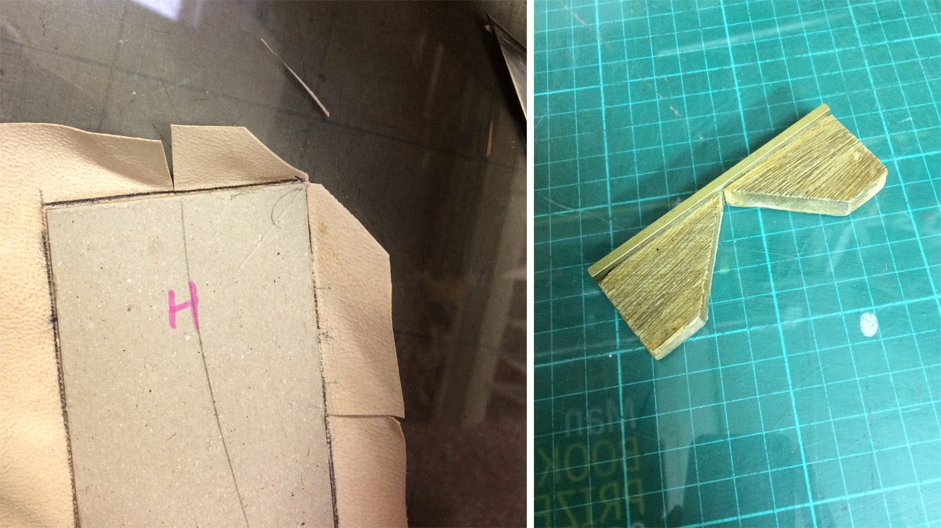
    On the second day, I continued to play with my creations from the previous day. I took the shavings from the swiss rolls and created an assemblage. I took my printed leather and pared it down in preparation for board attachment using Mark’s method of edge paring. The day’s final demonstration centered on laying down leather corners using a nifty tool called a tensai. The tensai is shown in the image below on the right and is used to mark the leather before trimming. Its name translates from the Japanese word for genius. And I certainly felt quite like one with this technique for finishing off corners.

    DAY THREE
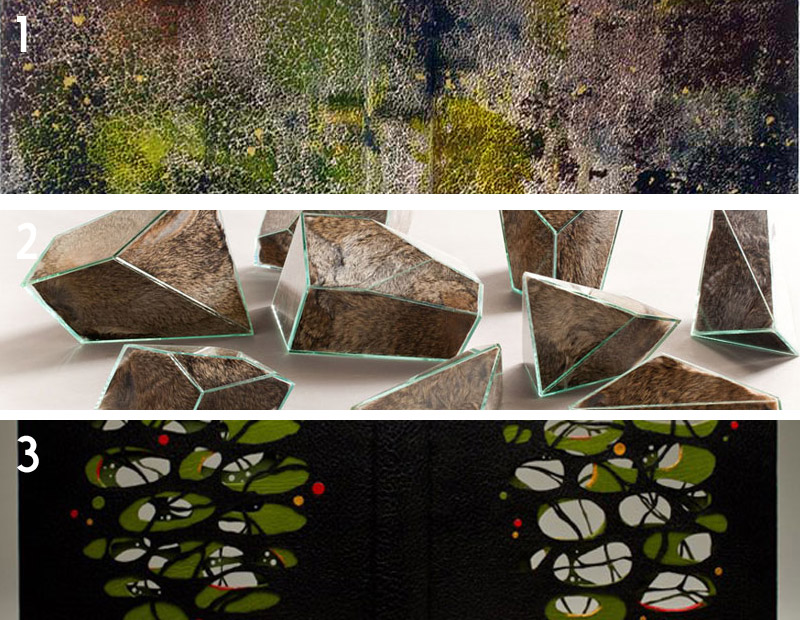
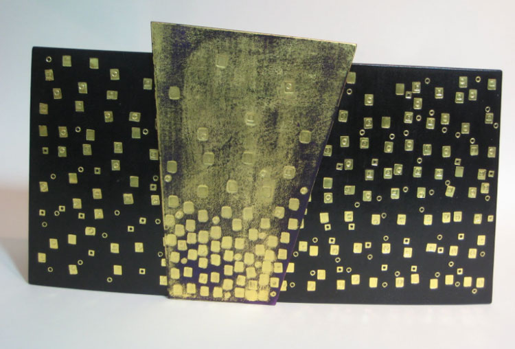
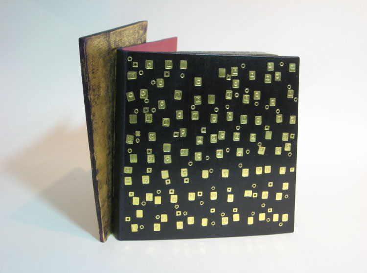
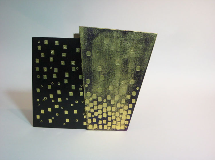
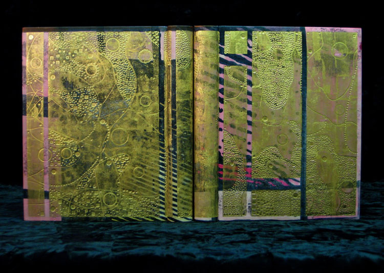
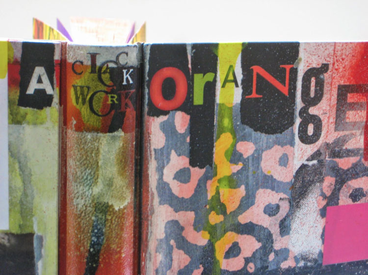
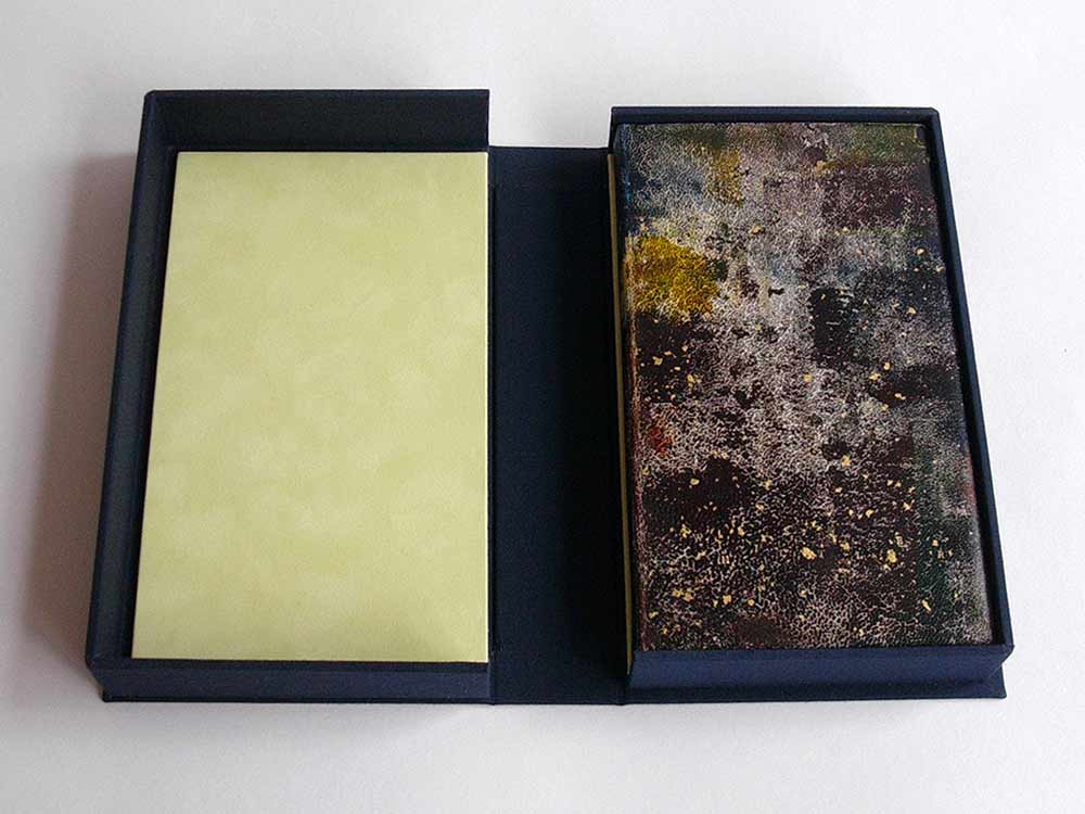
    Today was the beginning of leather dying, starting with the craquelle technique (see more in Day Four). While waiting for the thick layer of paste to dry before the dye could be applied, I began working on a technique that was unnamed at the beginning of the demonstration but was eventually dubbed “dicated surface” (this name was randomly chosen from the dictionary by Mark, but is in fact the second half of a hyphenated word). This technique is implemented by creating multiple layers of leather. These layers are then manipulated in a variety of ways to alter the aesthetic and texture of the surface. After feeling satisfied with its look, I distorted the plaquette further by cutting it down into square tiles.

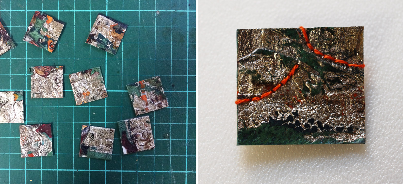
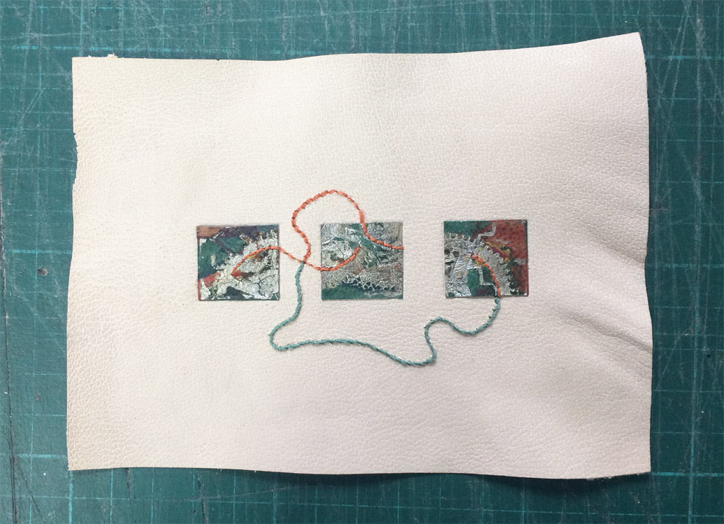
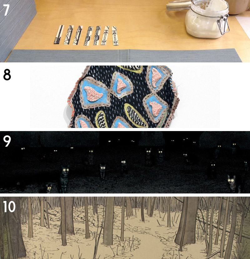
    By Mark’s encouragement, I continued to play with the aesthetic of the tiles by using embroidery floss to enhance the texture more. I took three of the embroidered tiles and pasted them to a piece of fair goatskin. After back-paring by hand, I continued to tinker with the design by adding additional embroidery around the tiles. I continued to work on this piece throughout my time at Mark’s studio (below is the piece in progress, I have yet to finish it).

    DAY FOUR & FIVE & SIX
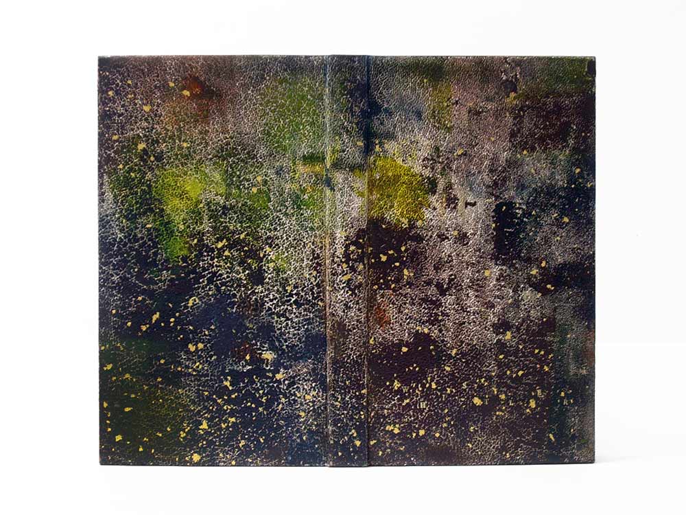
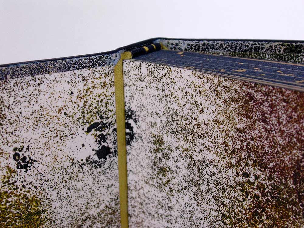
    Over the next few days, the focus was primarily on dye techniques with free time to collage multiple techniques onto one plaquette. I was able to finish my craquelle sample piece, which dried on Mark’s lovely tea towel patterned with steins.

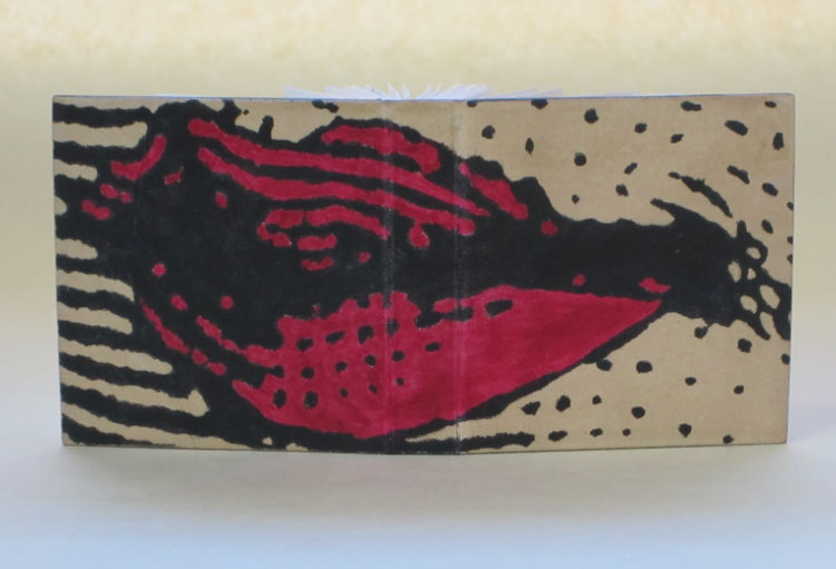
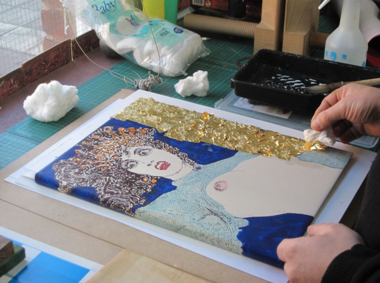
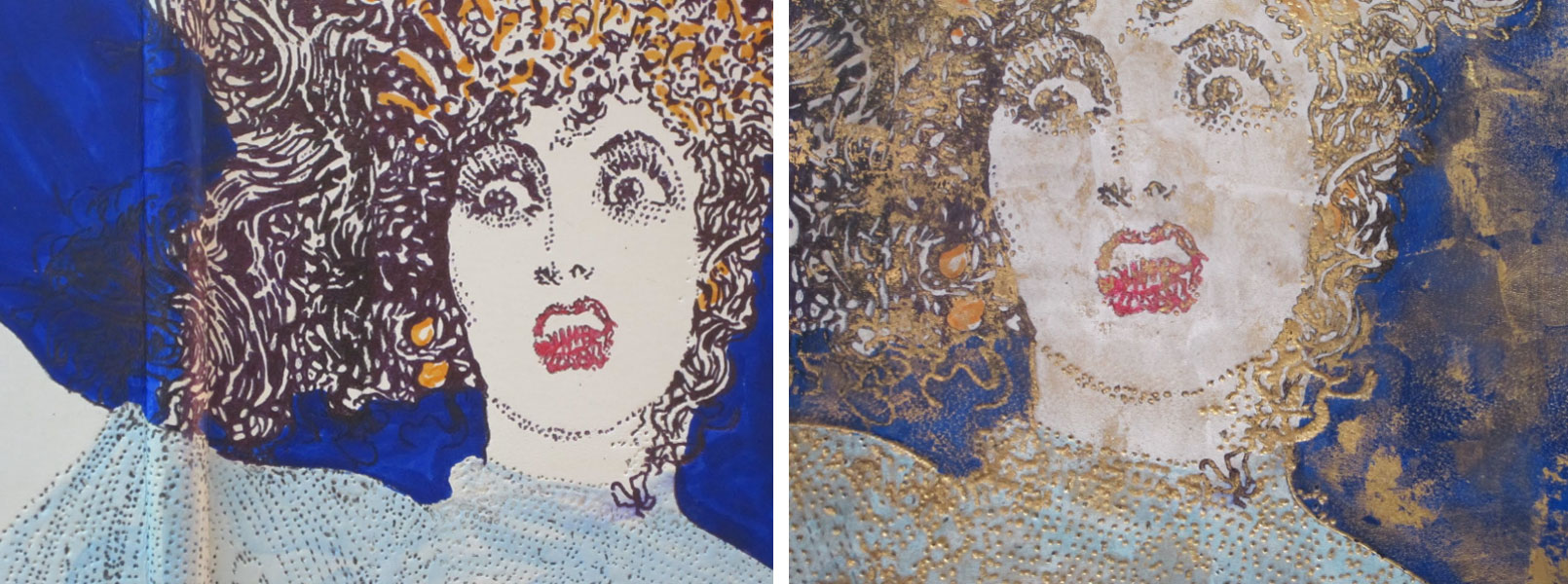
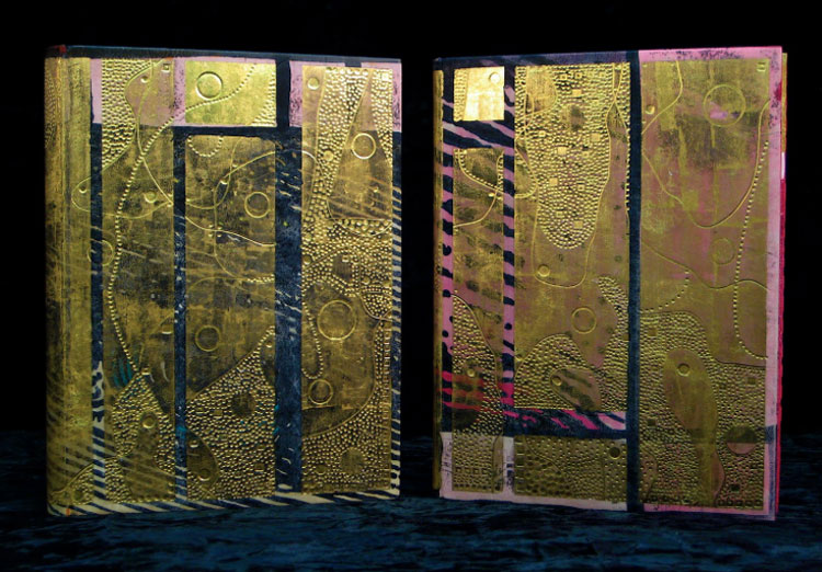
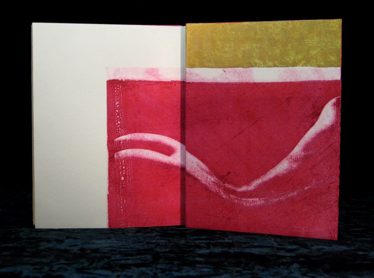
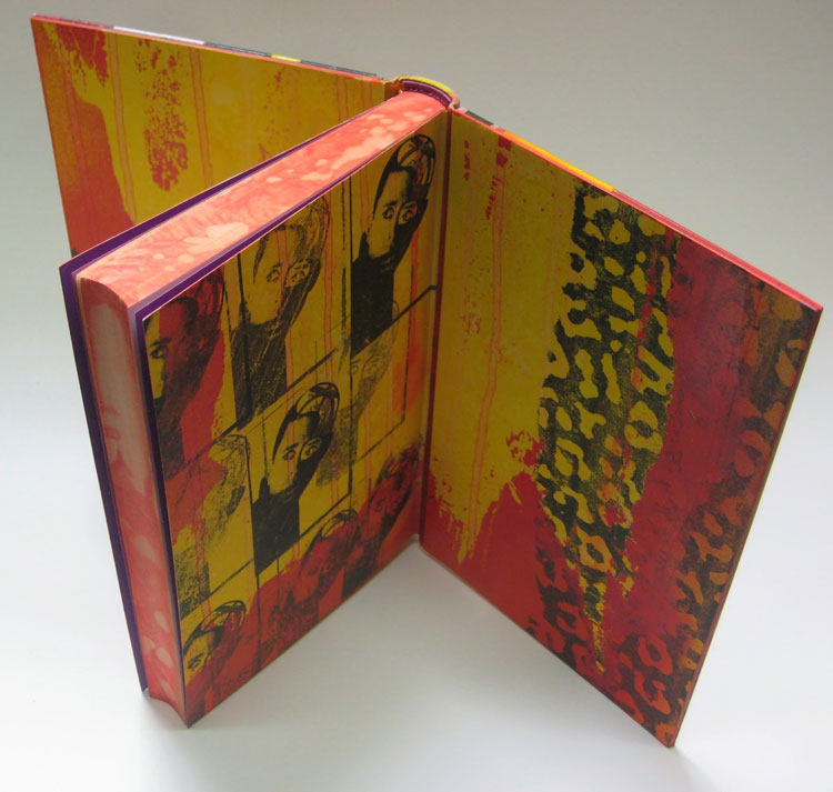
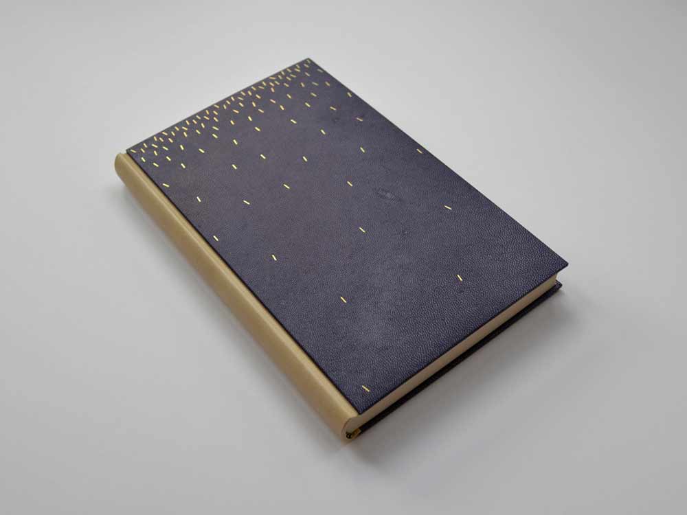
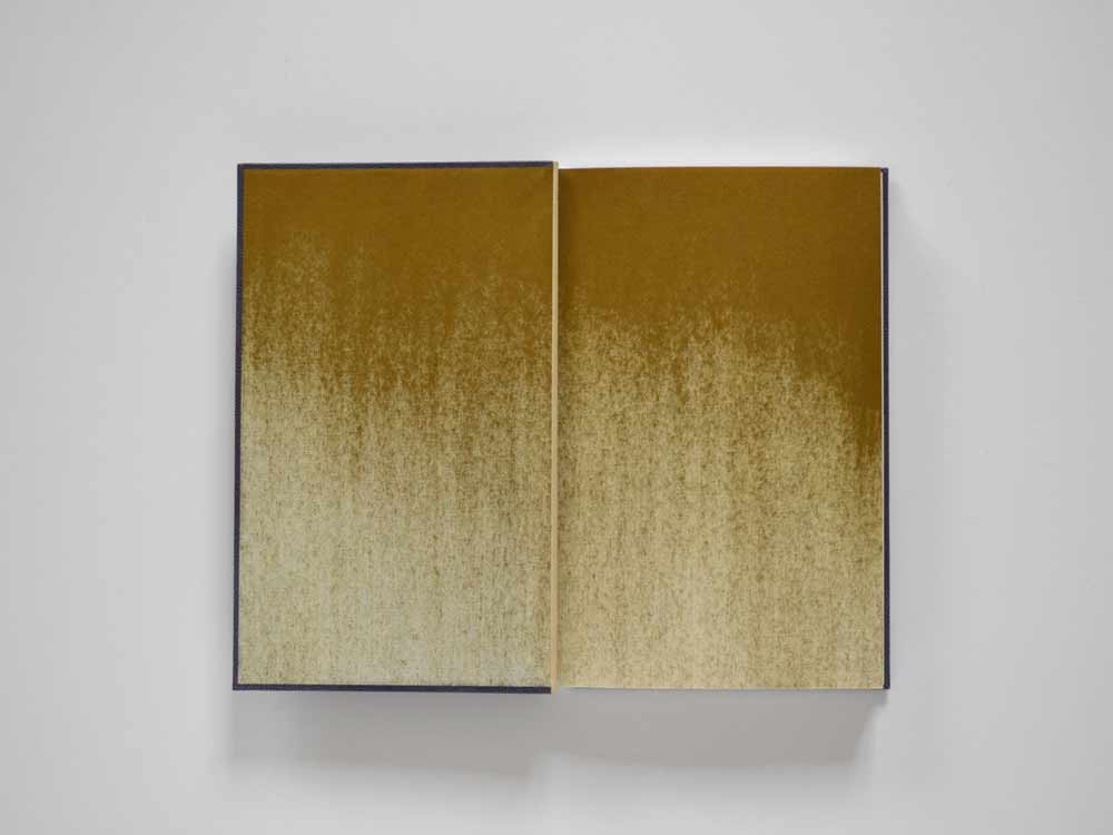
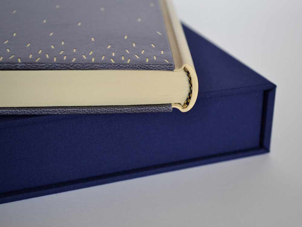
    The next sample piece I created was unevenly dabbed with orange leather dye before being pressed with a leaf. The impression created by the leaf was then highlighted with gold leaf and palladium at the midrib (main vein). In the area around the leaf, Mark had me test out Sunago, the Japanese term used to describe sprinkling with leaf.

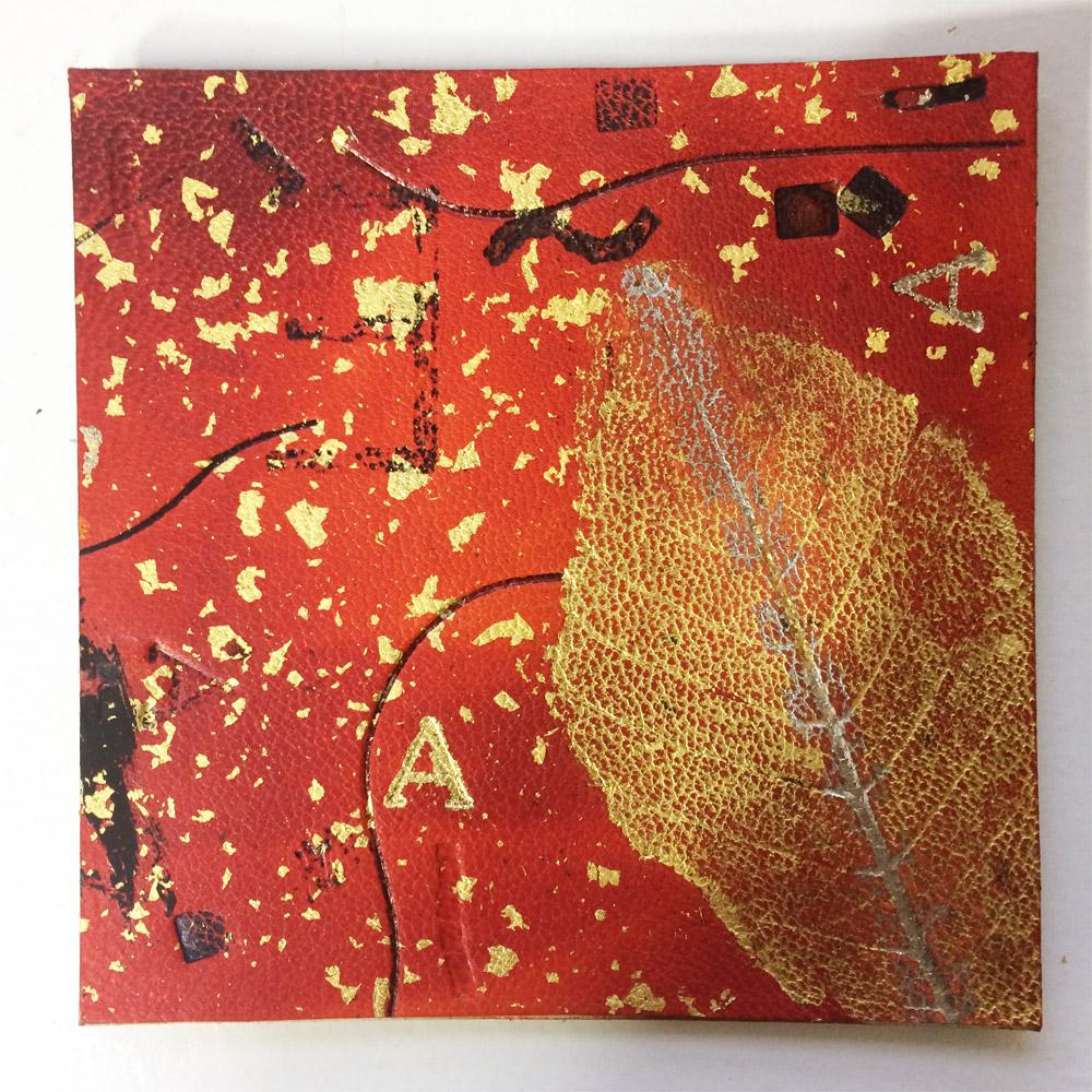
    I continued to manipulate the plaquette by employing different types of black line work using carbon paper, acrylic paint, ink and foils. The tool also changed depending on the look I wanted; I used a variety of pens, small brushes, PVA, brass finishing tools and a heat spatula.

    DAY SEVEN
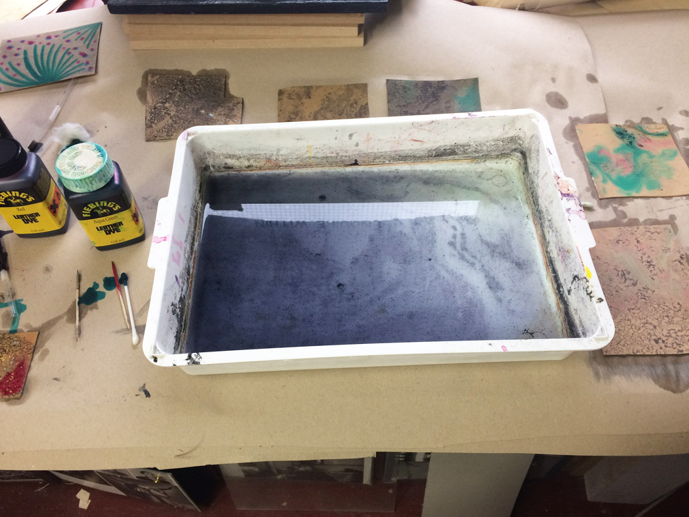
    Even more dye techniques were demonstrated to me on day seven, at this stage the dye was mostly painted on with cotton swabs, toothpicks and brushes. But the most interesting type of dye application was flottage (simply put: marbling). I played around with different colors and ways of dropping the dye into the bath.

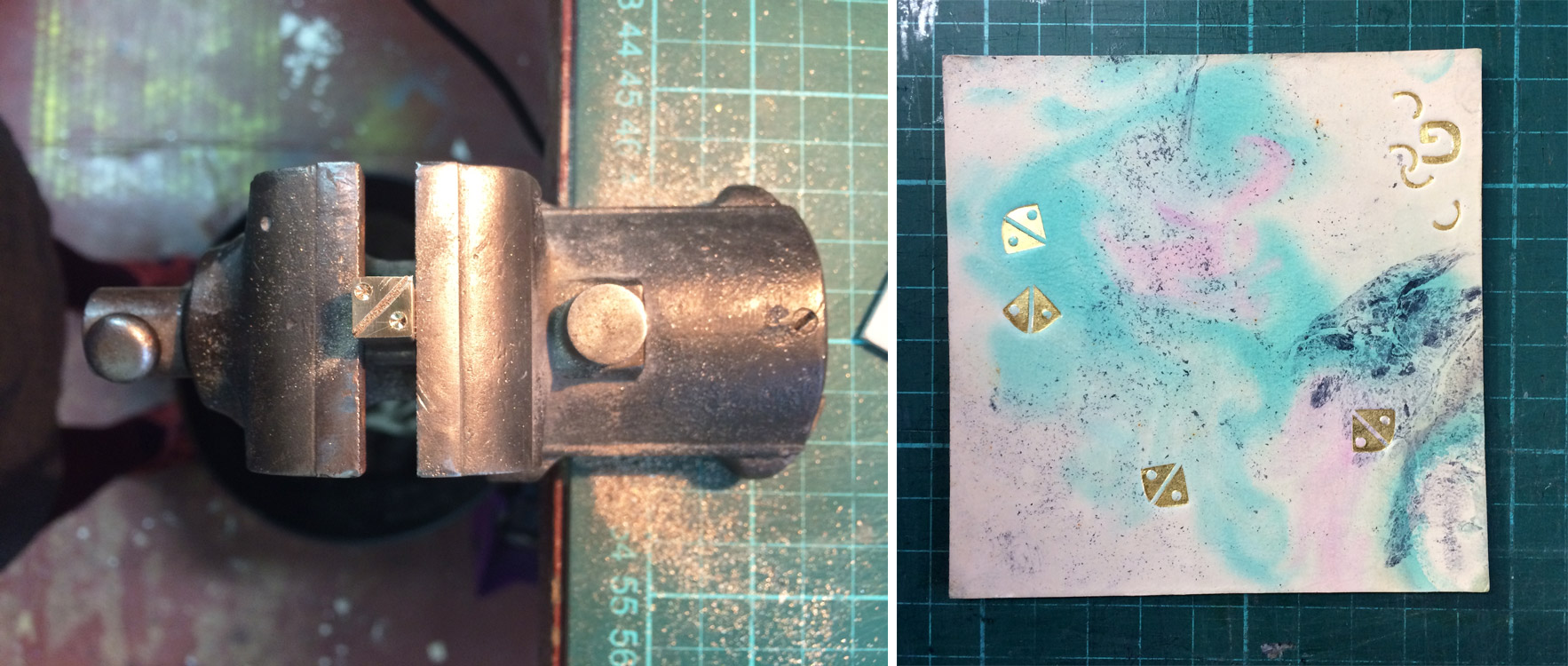
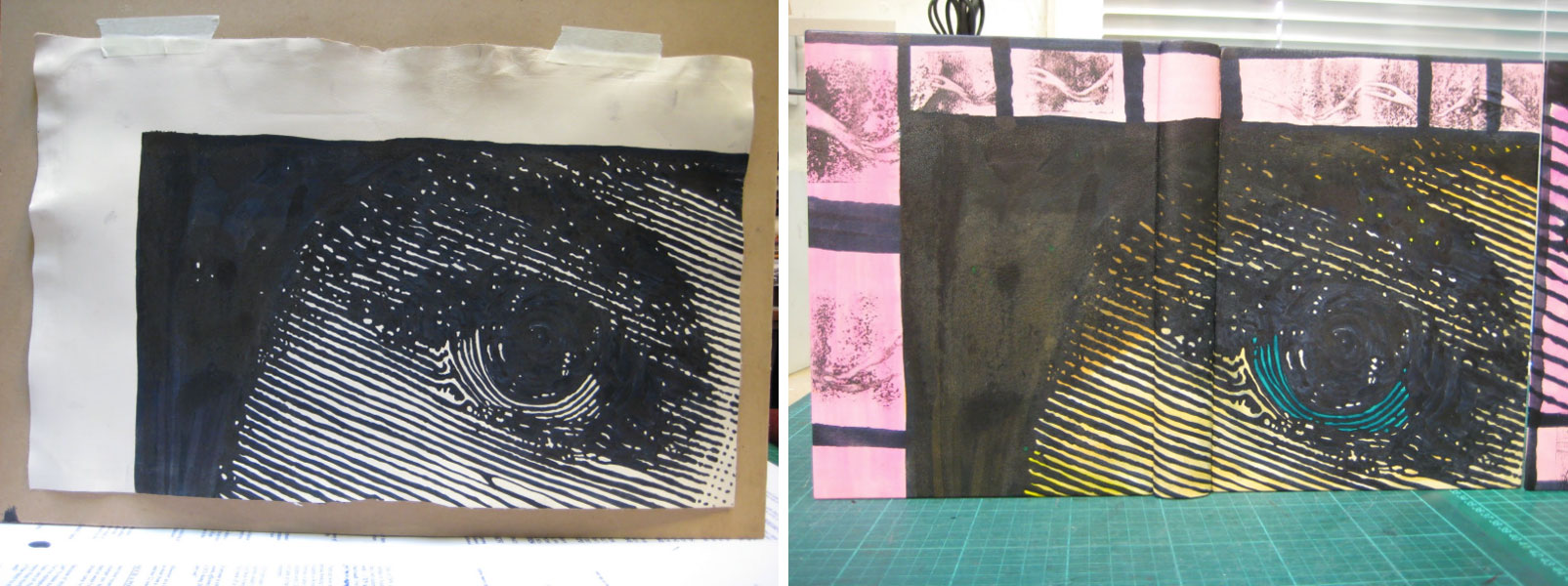
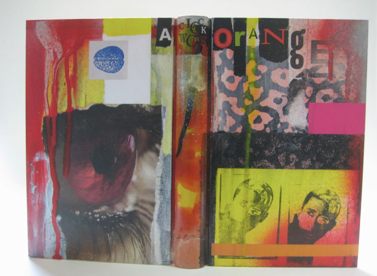
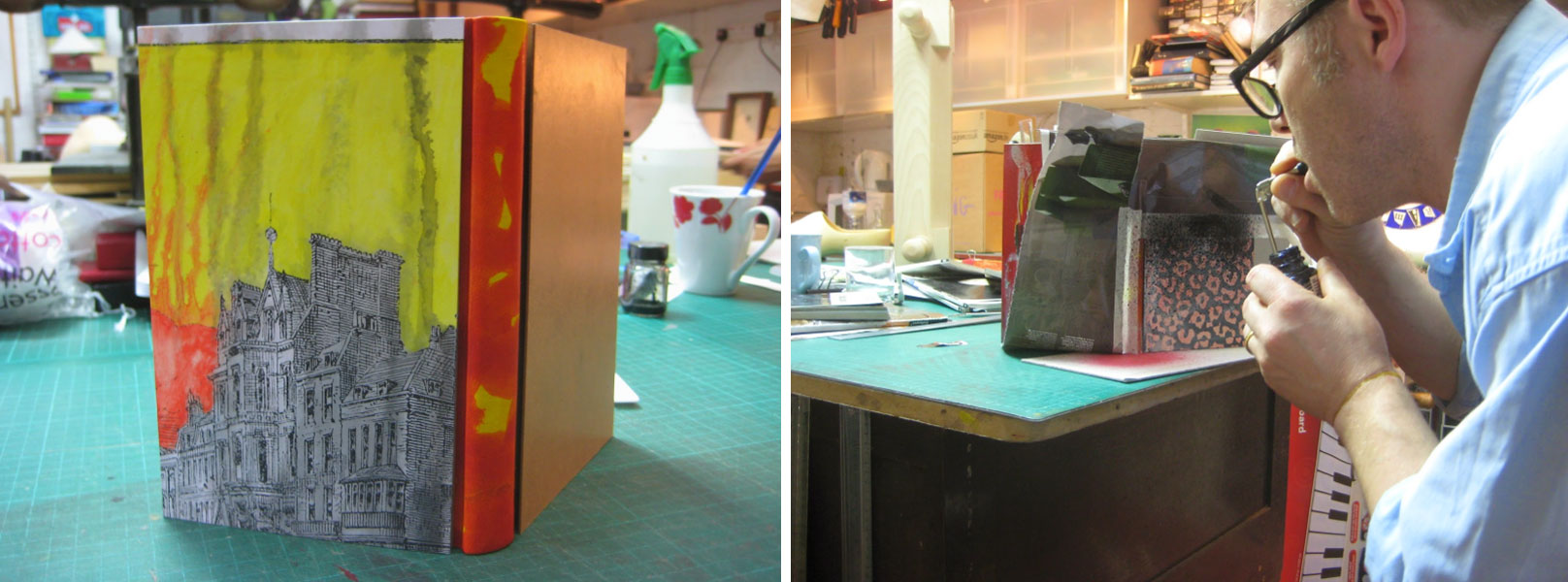
    Below is my personal favorite. One the final days I tooled some of my dyed pieces with brass tools that I made using quick tooling making techniques. You can see the tool in progress in the image below on the left. Mark also had me make a capital letter G, which was quite difficult. If you don’t believe me, then try it yourself.

    DAY EIGHT & NINE:
    The last two days were focused on tooling the various plaquettes I had. I played around with different applications of size and the order of when I made the impressions.

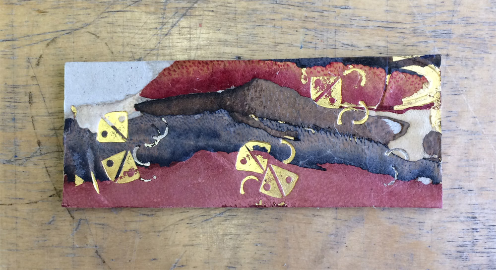
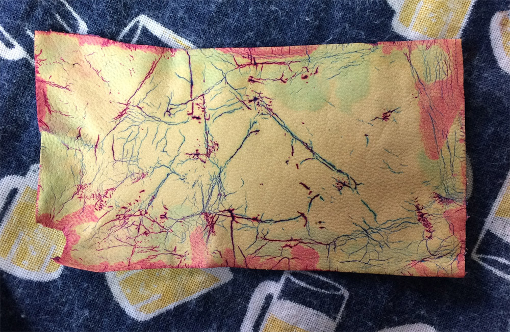
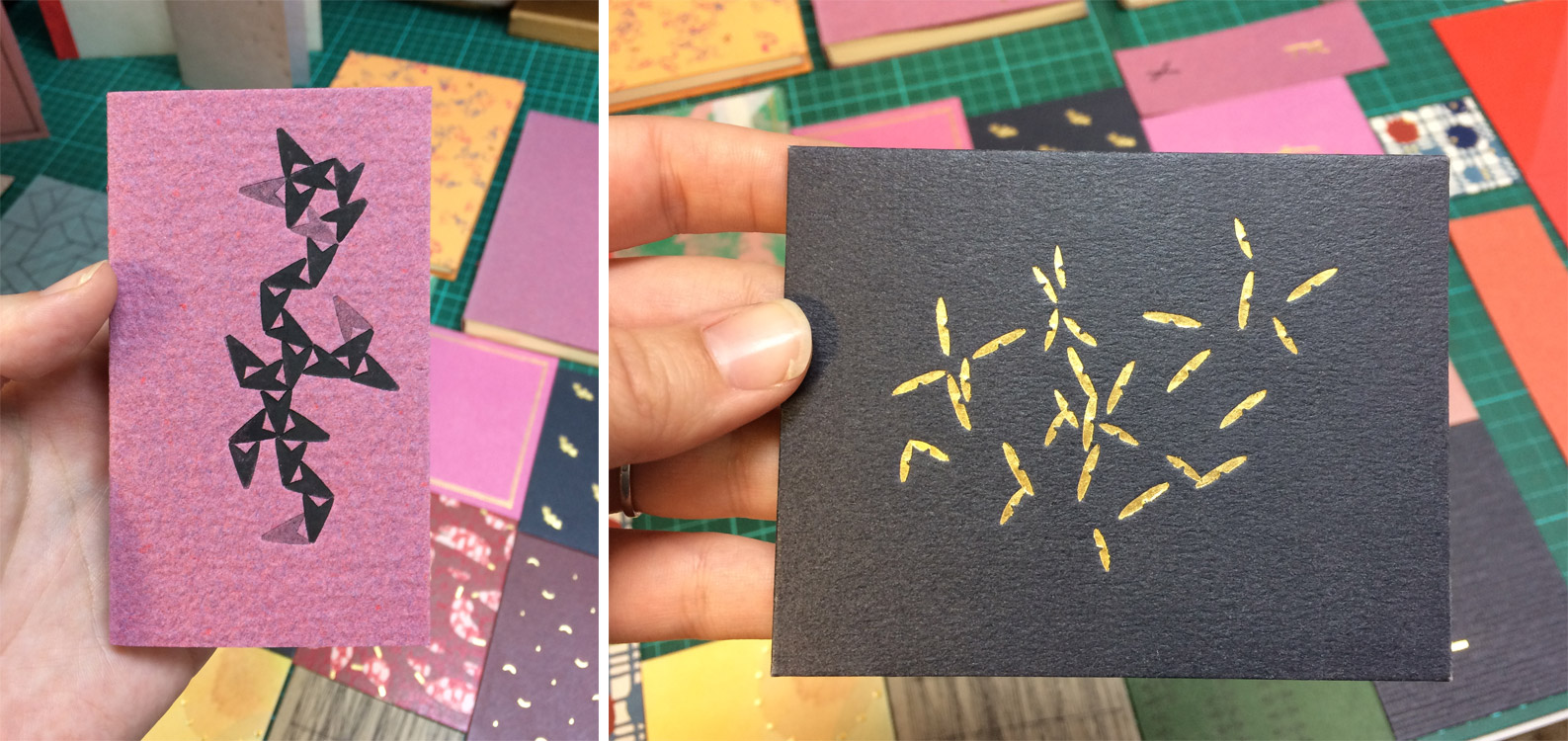
    The final technique we reviewed was Sunago on paper. I continued to play with dyeing and the sunago technique on the piece of leather that I printed on the very first day. Here’s where that experimentation went:

    After a few days off, I got on a bus that took me across London to Tracey Rowledge‘s studio just west of Regent’s Park. I spent two days with Tracey, learning her technique for tooling. A unique style she learned from Ivor Robinson. I chose to learn how to employ this technique on paper rather than leather. Below are some of my favorite examples from the collection of pieces Tracey laid out for me to view.

    DAY ONE
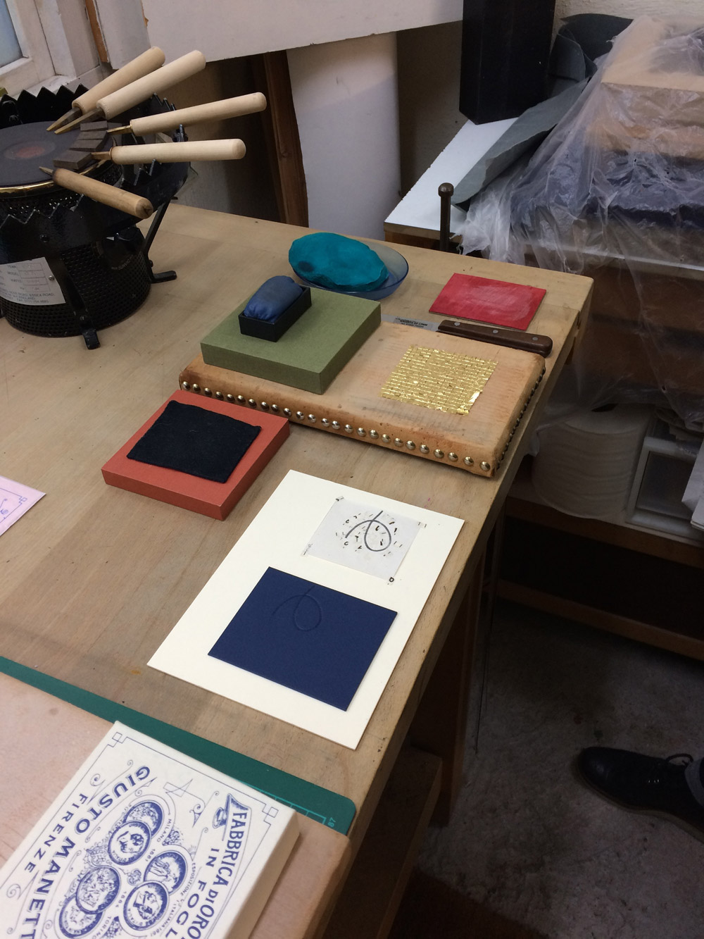
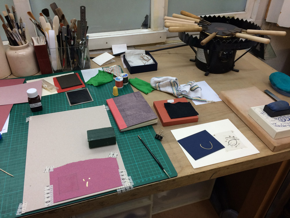
    Working with a simple swirl design, Tracey walked me through her process. We discussed laying out a design, choosing the right tools to build up the design (which may require making custom tools) then transferring the design to the plaquette. We blind tooled the design through a lightweight handmade paper before painting the impressions with glaire. Tracey pushed me to focus on my posture, making sure I approached the plaquette with accurate precision to place the tool in the right impression.

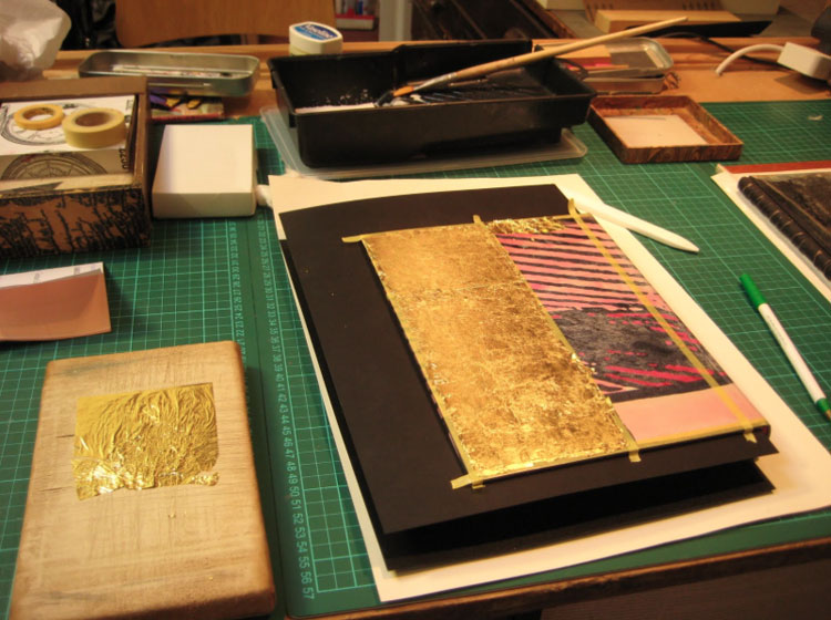
    Below is an image of how the bench was set up to streamline the tooling process (at this point the plaquette has been blind tooled and painted with glaire and my leaf of gold has been cut into very small square pieces). I continued to work on this design the entire day, taking snack and water breaks from time to time.

    DAY TWO
    On my final day, I continued to perfect my posture and technique under Tracey’s guidance. In addition to the initial plaquette, I also brought a variety of handmade papers from home that I began to play around with by testing direct tooling (seeing how the glaire would alter the appearance of the paper) versus blinding first. We also got into carbon tooling (direct versus blinding first).

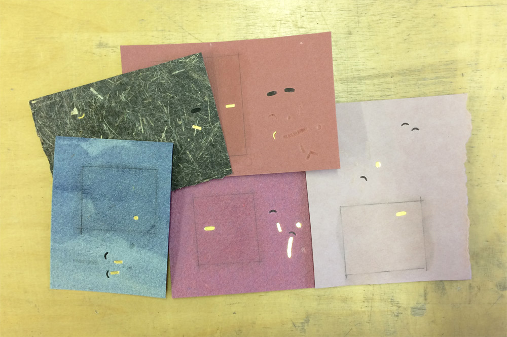
    Here are the selection of papers I brought from home (and one that Tracey gave me). From left to right in the top row: Wheatstraw (black) from Hook Pottery Paper and paper from Katie MacGregor. From left to right in the bottom row: Indigo Day Cave Paper, Zaansch Bord (redbrown) from De Schoolmeester and Bugra.

    My time in London was unforgettable, Mark and Tracey are incredible tutors. There was such a stark contrast to their styles of instruction, but each were able to push and challenge me in a way that enhanced my understanding of these techniques (some familiar and some new). I am so grateful to Mark’s pushback every time I asked a question, he has instilled within me the drive to experiment more and not to play it safe with my designs. But I am also grateful to Tracey’s controlled and thoughtful way of working, she taught me how to feel the motion of tooling within my entire body and to work in a meditative way. I left feeling beholden to Mark and Tracey, I hope for the opportunity to study with them again in the future.


  2. Best of 2014

    December 31, 2014 by Erin Fletcher

    As the year 2014 comes to a close, I want to send out another thank you to the nine bookbinders and book artists who took time away from their busy schedules to participate in my interviews. Another thank you goes to those who read and subscribe to my blog and I especially appreciate the kind comments I’ve received either in person or via email.

    Now to reflect on my year: Herringbone Bindery was busy yet again this year. I had the opportunity to work on some really great projects, amongst them were commissions from the Old State House in Boston, artist Laura Davidson and the Veatchs booksellers. An unusual amount of traveling this year took me to Rare Book School for the first time, up to Maine for a mini-conference and across the country to Vegas for the Guild of Book Workers conference.

    Things to expect in the New Year:
    – an updated website with all the projects I completed in 2014 (including some beautiful design bindings)
    – a Herringbone Bindery newsletter
    – more posts on my own projects (expect to see more on Dune as I will be covering right after the holidays)
    – another round of interviews

    As we ring in the new year, I just wanted to share my favorites posts from 2014.

    bestof2014a

    1. February // Bookbinder of the Month: Haein Song
    Haein Song was recommend to me by Hannah Brown and I was so thankful for her suggestion. Haein’s work is so clean and skillfully crafted. Her headcaps are so impeccable that I gape in awe.
    2. Artist: Marcela Cárdenas
    3. May // Bookbinder of the Month: Monique Lallier
    I greatly admire the work of Monique Lallier and was just ecstatic that she agreed to be interviewed for the blog. She has become such an influence in our field and openly shares her support and wisdom.

    bestof2014b

    4. My Hand: A Desert Inspired Edge for Dune
    5. August // Bookbinder of the Month: Mark Cockram
    The interview with Mark Cockram captures the boisterous and enthusiastic charms of both his personality and love of the craft. Each post examines the intensity of his designs and complexity of his techniques.
    6. Conservation Conversations Column
    Beginning this year, I invited six of my colleagues working in conservation to post about a field that encapsulates their professional lives. Topics range from using the appropriate adhesive and what to consider when building a conservation lab to various conservation considerations and philosophies.

    bestof2014c

    7. My Hand: Boxes for Laura Davidson
    My first project with Laura Davidson after interviewing her on my blog.
    8. Artist: Lydia Hardwick
    9. Photographer: Andrea Galvani
    10. January // Book Artist of the Month: Mary Uthuppuru
    I’m so charmed both Mary Uthuppuru and her work. She really engages the craft by exploring and experimenting with bookbinding and printmaking techniques. Mary is quite inspiring.

    bestof2014d

    11. November // Bookbinder of the Month: Sol Rébora
    It was a pleasure to interview Sol Rébora. Her insights to bookbinding in Argentina were refreshing, as are her imaginative and unique design bindings.
    12. February // Book Artist of the Month: Diane Jacobs
    Diane Jacobs employs important topics like feminism, body issues and societal issues against women in book arts and other art forms. I am very engaged and compelled by these issues and enjoyed dissecting her work in the interview.
    13. My Hand: Leather Embroidery Samplers
    14. Artist: Jennifer Davis

    Happy New Year!


  3. Bookbinder of the Month: Mark Cockram

    August 24, 2014 by Erin Fletcher

    DieNibelungen-MarkCockram
    Die Nibelungen arrived in Mark Cockram‘s studio bound together with staples. After removing the pesky binding material, Mark transformed this book into an intriguing sculptural object.

    What’s the inspiration behind this sculpted binding? The additional panel almost appears to swing between each cover, although I believe it is attached to the lower cover.
    This is a charming book with fantastic illustrations. One aspect of the illustrations are the backgrounds, often of buildings. The outlines of the buildings create a framework for the rest of the illustration. I wanted to explore this with the binding. You are correct to say that the panel is attached to the back board. The concept is simple, but like a lot of simple things it works well. The edge of the binding is extended beyond the normal square. When the book is partially open the panel gives us an angular perspective, again a reflection of the illustrative style.

    The leather is hand dyed with traditional gold tooling, I tend to make my own simple tools and adapt them as I work. I set out to produce a simple, controlled, rather elegant book with angles and forms. As with all my work, I had fun making Die Nibelungen.

    DieNibelungen2-MarkCockram DieNibelungen3-MarkCockram


  4. Bookbinder of the Month: Mark Cockram

    August 17, 2014 by Erin Fletcher

    BrushUpYourShakespeare-MarkCockram

    Brush Up Your Shakespeare is a limited edition accordion from the Piccolo Press in New York. The text is a combination of music and words to the song Brush Up Your Shakespeare from the musical Kiss Me Kate (which is inspired by The Taming of the Shrew) and includes charming illustrations by Seymour Chwast.

    Mark Cockram bound a chemise in full leather fair goat with a stylized image of a pair of pouty lips. The dye was applied carefully with a brush. The doublures double as a pocket which hold the first and last pages of the text. The doublures are hand-printed using soft plate off-set and colored with a layer of worked cold gold.

    BrushUpYourShakespeare4-MarkCockram BrushUpYourShakespeare3-MarkCockramBrushUpYourShakespeare5-MarkCockram

    You mention that you weigh down the lid of the clamshell box for your miniature books. How do you go about doing this?
    For Brush Up Your Shakespeare I made a two tray drop back box. The box is the last thing to be made and the first thing to be seen. It protects, it informs and I like to think of the opening of the box like the parting of theatre curtains. The box sets the scene, it can hint at the contents, tantalising us, making us want to see inside. The opening and closing, the fit of the book can tell us, from the very outset the skill of the maker.

    I have made a number of miniature books and bindings. One of the common issues is the opening and closing of the box. The way the air is expelled as the lid closes and the slight tug of the vacuum on opening. This is not only down to the accuracy of the box, but also the weight of the materials involved, the bigger the box the heavier the overall weight of the materials. The smaller the box the more difficult it is to keep the lid closed, it has a habit of just popping open that fraction of a mil. One way to counter this is to use magnets. I do not like to use magnets for the simple reason that magnets attract metal particles (it is in the nature of magnets to do this). These metal particles can, in turn begin to rust leading to all manner of issues.

    I prefer to use lead to gently weight the upper lid. After varnishing in a metal lacquer I place the small piece of lead in a recess created in the upper tray (this is done in the construction) the recess is covered on one side by the outer case of the box and the inner lining of the upper tray. Simple and very effective.

    BrushUpYourShakespeare2-MarkCockram


  5. Bookbinder of the Month: Mark Cockram

    August 10, 2014 by Erin Fletcher

    Lysistrata-MarkCockram

    Bound in 2010, this is just one binding of Lysistrata that Mark Cockram has bound. Grabbing illustrations from the text for both the cover design, doublures and endpapers; Mark transforms them into a visual experience rarely seen on a book. The cover mimics that of a fresco painting.

    The book was bound in fair goat which was hand-dyed and the design was initially blind tooled onto the leather. Mark handcrafted 7 new tools for the book, which were modified throughout the tooling process. He discusses his technique more in depth below.

    This binding is by far my most favorite from your portfolio. There are so many artistic details I find to be rather captivating. I wanted to ask you about your technique for distressing the gold leaf?
    My glib answer would be to say that shouting at gold leaf usually distresses it, though I feel that is not the answer you were looking for.

    Though gold leaf and other metals are used in bookbinding, gold leaf and the like tend to be used in a static manner. By static manner I refer to the traditional way in which it is applied to books. Please forgive me if I do not elaborate on finishing/tooling with gold leaf, there are many books, workshops and bits and bobs on the Internet for those who wish to find out more. There is so much more to the application of gold leaf than traditional gold tooling or finishing, one only has to look outside of bookbinding to realise that.There is great skill in finishing, indeed, the training for a finisher is usually longer than for a forwarder, with the finisher being paid more. What has always made me smile is the way the layman is always amazed with the gold tooling, but fails to see the book. If it were not for the forwarder there would be nothing for the finisher to do except, perhaps, wall panels and the like. This brings to mind one lecture and one question in particular. I was asked by a very earnest student what I thought of fine binding? I asked her to tell me what a ‘fine binding’ was.  Her reply was the usual ” Well, it is full leather with gold tooling …….. of course.” After a considered pause I told her that I had seen many full leather bindings with lashings of gold tooling and that in no way would I call them fine. Any book beautifully made, balance of materials, fit for purpose, harmony of craft and art is a fine binding in my eyes. I cannot remember her response, but I do remember her looking over to a small group of people, arms folded, scowls and mumbling between themselves, whom I can only assume were her teachers. I only hope that the student began to ask questions and open not only her eyes, but ears also.I suppose that like many people, bookbinders and collectors like things to be classified to make them easy to understand. Just as a point, if one were to ask what is fine art? Would the answer be oil paint on canvas? I, of course, doubt that to be any answer that any serious artist or those appreciating the arts would give. So why is it that so many contemporary bookbinders and collectors, curators and so on appear to have the pre-impressionist salon approach to what fine binding is? To carry this forward we could argue that though both the salon artists (the establishment) and the Impressionists (non establishment) used the same materials, it was the application of the materials and the way the artists saw their work that was different. One challenged the preconceptions of what is and painted what they felt and saw, the other hid behind technique and history (I realise this is a somewhat simplified view, but I hope you get my drift). I always have half an eye on technique and history, but I will not let them get in the way or limit what I want to produce. Please do not assume that I consider myself to be in any way akin to the Impressionists, I only use them to make a point.

    With the 2010 Lysistrata I wanted to echo the illustrations in the text block. One method commonly used is to copy an illustration, have a block made and use that to do the tooling with. Another method is to transfer the image to thin paper, blind tool through that and then tool in the usual way. However, I feel that the line is static, it has no life. I know that by putting the tool down at an angle the reflected light creates an impression of movement, but there is still that feeling of it being contrived. I suppose I am of the ilk that think if you want something to look like a splash of paint then splash with paint, there is no need to spend hours, days in trying to get gold tooling to look like a spontaneous splash of paint. Are we meant to admire the technique ? That it looks so much like a spontaneous (even though it is not) splash of paint or do we admire the spontaneity of the person who is able to splash the binding with paint? The paint being an intrinsic element of the book as opposed to an applied decoration. Is this a case of seeing the technique and not seeing the book? Perhaps people find it easier to admire technique as that is quantifiable and can be tweaked, whereas the spontaneous is less quantifiable and in no way can be tweaked. The spontaneous it is less safe and one has to live with the result, in other words it is alive.

    Lysistrata6-MarkCockram Lysistrata5-MarkCockram
    Lysistrata4-MarkCockram

    I do not think that I have to say that in some of my work I am spontaneous with the 2010 Lysistrata captureing some of that working style. The leather was hand dyed off and on the book. The black line and cold gold work is loose, it is the sketch like quality of the line that creates the tension and that all so elusive movement. The gold is adhered (please do not ask me what adhesive I use, a boy has to have a secret or you could come to a workshop) to the binding after the black line work with the tooling done with a number of warmish hand tools. The gold is further worked with 000 grade, oil free, wire wool. I wanted the finished work to resemble a wall painting or fresco, I think I am somewhere near the mark. The work was a commission and I kept the client informed of progress, he would pop into the studio and watch me work. He delighted in the non formulaic approach, so far from the rest of his collection. I prefer to work with collectors that give me and the book space to breath, to expand and explore what is or maybe possible and not to rely on what has been.

    Lysistrata2-MarkCockram

  6. Bookbinder of the Month: Mark Cockram

    August 3, 2014 by Erin Fletcher

    TheLivesofGallantLadies-MarkCockram

    In 2009, Mark Cockram bound a two volume set of The Lives of Gallant Ladies. Bound in full leather with hand dyed elements, layers of gold leaf and tooled shapes creating brilliant texture and depth. Just like many of Mark’s bindings, you can read about the progression of the design on his blog here.

    Below on the left shows the leather freshly pared with the first layer of dye carefully brushed on depicting a portion of a woman’s face. Later, after covering the binding more color is added to the skin.

    TheLivesOfGallantLadies_progress-MarkCockram

    After each square of gold leaf was carefully applied, the tooling was done in a free-style way offering for a more expressive design. Finally the gold was lightly rubbed away using a fine wire wool brush revealing the layer of dyed imagery.

    TheLivesOfGallantLadies_progress3-MarkCockram

    The base layer of this binding is revealed through the series of in-progress photographs included on your blog. Much of the design of the base layer is hidden under the blocks of gold. Why do you lean towards heavy applications of gold on your bindings? How does the use of gold project your artistic concepts?
    I enjoyed The Lives of Gallant Ladies. It is always nice to work on multiple volumes, more area to express and create a narrative. The images are built up with dyes then layered over with gold and cold tooled. I feel that working this way allows for great freedom in the mark making process. The gold is then re-worked to create layers that draw us into the binding.

    Though the gold may look heavy in the images online, the reality is that they are very light. When viewed at certain angles the images become more or less defined, rather like looking through a silk drape. Gold like other metals we use in bookbinding is traditionally used with hot tools, glaire and so on. I wanted something that was less stiff and moved. Using gold in this way enabled me to create a soft, final layer to the finished work. I tend to look outside of bookbinding to see what other artists do with similar materials, adopting and adapting to suit my requirements.

    TheLivesofGallantLadies2-MarkCockram TheLivesofGallantLadies3-MarkCockram


  7. August // Bookbinder of the Month: Mark Cockram

    August 1, 2014 by Erin Fletcher

    AClockworkOrange-MarkCockram

    This binding of A Clockwork Orange by Anthony Burgess was recently completed by the imitable Mark Cockram. The design is free of constraints, running wild and pushing the boundaries of the typical composition found on bindings past or present.

    Below are just two of the many photographs that Mark has shared on his blog documenting the progression of the binding. You can find more posts here. Seeing the transformation of the covers offers an even greater appreciation for the binding, exploring the work and dedication that was put into it.

    AClockworkOrangeprogress-MarkCockram

    A Clockwork Orange is special to Mark and deserved the right style of binding and design to speak of its story appropriately. The book is a second edition with a tipped in plate signed by the author.

    Your bindings have begun to develop into more textural surfaces with complex layers of color and graphics. What made you feel ready as an artist and bookbinder to bind a copy of this iconic title?
    I think I have always been interested in mixed media, even at art college my tutors would run out of things to say about my work. I suppose that with all the combinations of materials that have been and are being used to make books and how artists use materials, there is nothing new about what I do. I went to college in an age before the computer and for me cut and paste is just that… cut and paste.

    One aspect of bookbinding is to learn the skills that we need to make a book. This can be a life long journey. Some get so wound up in the technique and the craft of making that they forget the art of making and how design and art are as important as craft. I feel there has to be a balance in all things. Worse are the binders who say they work in the contemporary. Binding each book that finds itself on their bench with the same technique and material manipulation year in year out. The only apparent difference being the colour and the title.

    I realise that binders like to sell their work and it is so tempting to go for the easy option, after years of training and developing their ‘signature binding style’ and then the work begins to sell, it is at that time that forward movement ends. The collectors become comfortable with the styles of these binders. I have heard collectors say, at more than one private view “I have to have a so and so binding, I do not have one of his/hers yet”. It would appear that they are not collecting books, but binders work… Most binders working in this field tend to work with private press books from the 1890’s + (Golden Cockerel and the like) or modern private presses. I know that some text blocks are beautifully printed, but most titles and themes just seem to be dated. So who is to blame? The binders for doing the same thing year in year out? Or the collector, buying the same thing year in, year out? Or is it something else? Like a combination of the two.

    I prefer to move forward, to work with each book separately. To use an existing technique or to find something different depends on what the book needs. I do revisit past styles or working techniques if suitable … not as a matter of course. Over the last year or so I have been working with more mixed media. I suppose it looks like I go through phases with my work, but I tend to collect a few books that I feel a particular way of working would lend itself to and go for it.

    A Clockwork Orange is one of about 3 or 4 books that have a very graphic, layered, multi media feel and look to them. What else could I do with Clockwork? A full leather binding, generic traditional gold tooling with a nice label to the spine, 5 raised bands, marbled paper endpapers? Hardly contemporary and hardly in keeping with the text I think. It has been said that I am a brave binder, to take risks, to do what is not expected. I could take the safe path, bind in a fashion I know would sell, with the least amount of thought. But in reality I could not call myself a designer bookbinder let alone a contemporary bookbinder if I were to do that and most important I would not be either honest with my work and the book.

    AClockworkOrange3-MarkCockram AClockworkOrange2-MarkCockram

    – – – – – – – – – – –

    While a student at North Bennet Street School, I had the opportunity to travel with my fellow classmates to London. On this trip we spent an afternoon at Studio 5, Mark’s bindery space. His energy was infectious as he bounced around the room demonstrating various techniques and answering all of our eagerly asked questions. I regrettably did not take the time to get to know Mark further that day, so I was very happy that he agreed to be interviewed on my blog. I am in constant awe of the work he churns out, both in their execution and design.

    I’m so delighted to present the following interview with Mark Cockram. His bindings transform the traditional view of bookbinding and push the form into a new level of design. His work and dedication to the craft is aspirational and Mark has thoughtfully answered each of my questions with so much passion and truthfulness (with a bit of wit mixed in). Throughout the month of August, I’ll be presenting a binding of Mark’s each Sunday.

    Enjoy the interview after the jump.

    read more >


  8. Bookbinder of the Month: Haein Song

    February 2, 2014 by Erin Fletcher

    Whistler-HaeinSong

    The design on this full leather binding from Haein Song really transforms the material to mimic a textured painted canvas. Haein bound this copy of Whistler by Haldane Macfall in 2009. Sprinkled on top of the hand colored natural goatskin are flecks of gold leaf. The title is also tooled in gold on the front cover. If you click on the image above, you can see the title on the front cover toward the tail. I spotted the “H” first. Happy hunting. 

    The endpaper and matching panel doublures are monoprinted and sit opposite a leather joint. The edges are decorated with blue and brown acrylic pigment and sprinkled with gold leaf. 

    Whistler2-HaeinSongWhistler3-HaeinSong

    There seems to be quite an influence from Mark Cockram in the design of this binding. I can tell you were a student of his. The decoration on the leather has such a painterly quality to it, can you talk about your technique for achieving this affect?
    Do you think so? That is quite interesting as I haven’t thought in that way. Mark’s teaching involved structures, materials, tools and many tips from his experience except aesthetics. He thought, I believe, everyone has different aesthetics. But I suppose what you see influences how you express.

    Few Whistler’s paintings were on display at Tate Britain when I started this book. I remember walking around feeling his paintings titled Nocturne. I wanted to convey that feeling to the cover. Back then I was trying simple but different dyeing and printing technique. How it was achieved was simply rolling few different chosen (or mixed) relief inks onto the glass surface then lay the leather on top and rub it. Endpapers were made in similar way. There is a little bit of trial and error until you get the desirable outcomes. Also depending on the amount of inks and pressure you can achieve a very different look. Whistler was very much interested in Japanese prints. To finish I used a technique called Sunago (Japanese technique in woodblock printmaking, which involves sprinkled or scattered gold leaf) to reflect that.


  9. February // Bookbinder of the Month: Haein Song

    February 1, 2014 by Erin Fletcher

    MythOfSisyphus-HaeinSong

    This beautiful binding of The Myth of Sisyphus and Other Essays by Albert Camus was crafted in 2013 by Haein Song. Bound as a Bradel binding, the spine is covered in a natural goatskin with dark blue vellum covers. The sprinkled dashes on the covers are hand tooled in gold. The spectacular endpapers are hand printed. 

    MythOfSisyphus2-HaeinSongMythOfSisyphus3-HaeinSong

    This binding is absolutely stunning and so flawlessly executed. The covers are a beautiful dark blue vellum. Did you find the material difficult to work with in either the structural or tooling aspect of the binding process? I have a single experience with vellum over boards, but I know that bookbinders approach the board construction differently. May I ask if you prepped the boards for the covers in any particular way for the vellum?
    I heard few notorious rumours about vellum but I don’t think I found it difficult at the time I was working on it. Partly because it was a relatively small bradel binding and there wasn’t headcaps or joints. The spine of the book is covered in natural goatskin. 

    What I found afterwards was that the front and back vellum boards sometimes change their shapes depending on the humidity or temperature of the surrounding. But surprisingly it comes back to the original shape after some time. I was told that it needed a little bit of time to climatise.

    Later I was also told that lining vellum with a very thin paper (archival bible paper or Japanese paper) would reduce this changeable characteristic. 

    Tooling wasn’t particularly hard after practising enough on sample boards but I don’t think I have an ample amount of experience to compare differences in tooling on leather or vellum.

    – – – – – – – – – – –

    I have not yet had the pleasure of meeting Haein or been presented the opportunity of viewing her work in person. However, I’ve had her website bookmarked for a while now, checking back from time to time to ogle her work. As I began preparing a list of people to interview this year Haein’s name popped up as a suggestion from Hannah Brown, whom I interviewed at this time last year. So with Hannah’s endorsement and my growing fondness, I present the following interview with Haein Song. The interview ends with Haein’s elegantly worded philosophy on bookbinding. 

    Come back every Sunday during the month of February for more posts on Haein’s work. You don’t want to miss it, Haein shares some of the creative techniques behind her expressive and artistic bindings. 

    read more >


  • My name is Erin Fletcher, owner and bookbinder of Herringbone Bindery in Boston. Flash of the Hand is a space where I share my process and inspirations.
    The StudioNewsletterInstagramEmail me
  • Archives