RSS Feed

Posts Tagged ‘mary uthuppuru’

  1. Guild of Book Workers – Standards of Excellence Seminar // Cleveland 2015

    October 25, 2015 by Erin Fletcher

    I woke up very, very early on a Thursday morning to catch a flight out of Boston to Cleveland in order to attend the evening festivities planned for the first day of the Guild of Book Workers Standards of Excellence Seminar. I was delighted to be on the same flight with Deborah Howe, Collections Conservator at the Baker-Berry Library at Dartmouth College. The weekend-long event filled with book-related discussions had officially begun.

    We arrived in Cleveland to a brisk, yet sunny morning. My wonderful friends and colleagues, Henry Hebért and Jeanne Goodman, picked us up at the airport and we were off to the hotel located just a short walk from Lake Erie (and the Rock and Roll Hall of Fame).

    The first day of Standards began with book-related tours across the city. At the last moment, I was able to snag a spot on the tour of the Cleveland Museum of Art. Our docent, a fellow GBW member, gave us a brief tour through the Western Art galleries, stopping from time to time to show off books from their spectacular collection. It was a real treat to see some fine examples of Western-style bindings and manuscripts.

    StandardsCleveland1-ErinFletcher

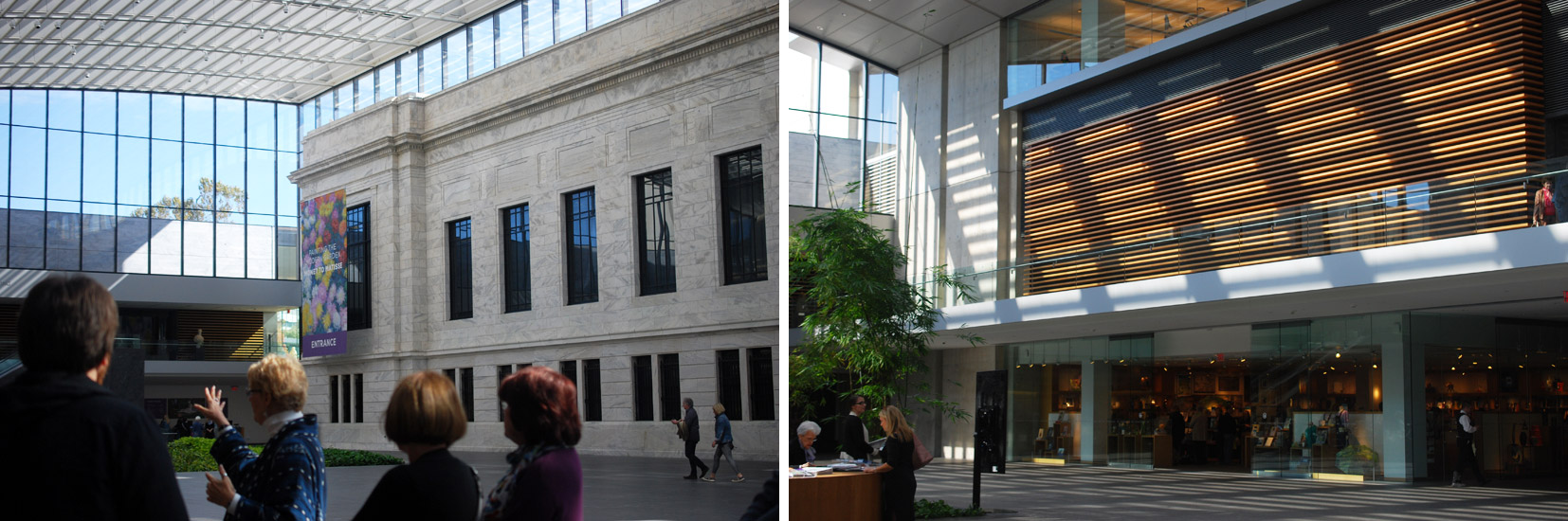
    In 2002, the Museum underwent renovations that included this beautiful 39,000 square foot enclosed glass atrium that connects the original building with the newer wing and is where we met our tour guide. (click to enlarge images)

    StandardsCleveland2-ErinFletcher

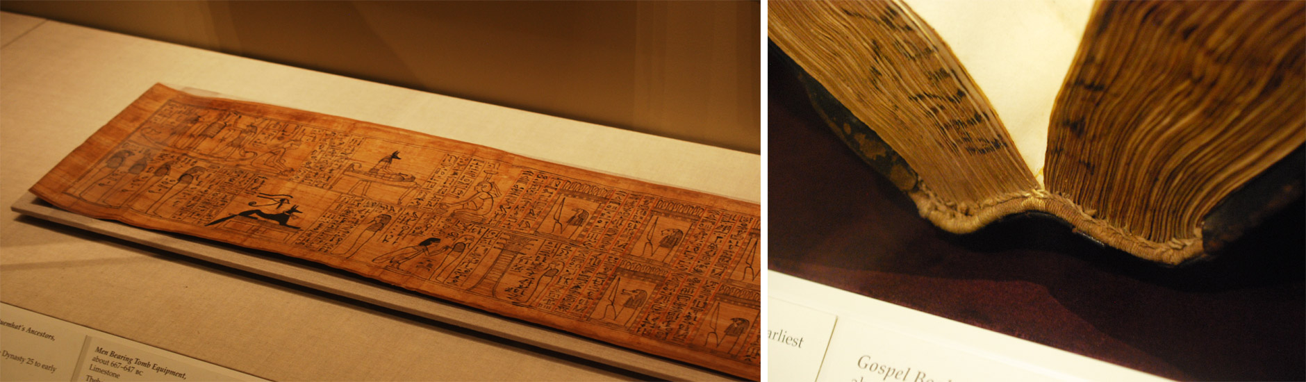
    We appropriately began our tour of early bindings with an Egyptian Book of the Dead of Hori scroll on papyrus dating roughly around 1969 – 945 BC. We swiftly made our way to the 11th century as our docent pointed out this beautiful Byzantine binding with the primary headbands still intact.

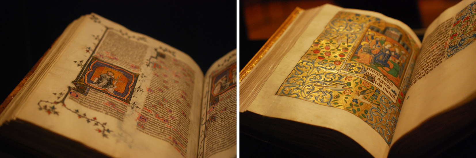
    We then saw a small collection of illuminated manuscripts with pigments that had been wonderfully preserved and appeared as bright as if they were created yesterday.

    StandardsCleveland4-ErinFletcher

    As a great lover of Flemish art, Queen Isabella treasured her library of devotional books; on display at the museum is a Book of Hours crafted for her by the most talented manuscript painters active in Ghent and Bruges during early 1500s. This circle of artists were renowned for their border decoration that often featured realistically painted flowers, scrolling acanthus leaves, birds and butterflies.

    StandardsCleveland3-ErinFletcher

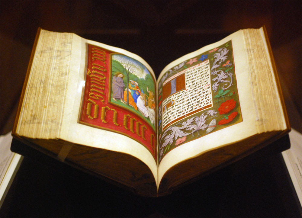
    The Gotha Missal dating from about 1370 – 72 is shown in the image above (left) opens to a lovely miniature painting with vines running along the margins. Since the interest for most displayed book is in the content, binders get to see very little of the actual binding. Fortunately, the CMA has digitized and photographed a large portion of their collection. The leather binding over wooden boards is quite a beautiful example of a decorative medieval binding. The tooling could have been completed with a decorative roll and covers the entire surface of the covers.

    Next in the tour was a highly decorated leather case with cut-work and hand painted details in blue once used to cover a Qu’ran dated to sometime in the 15th century. We also saw a leaf from a Jain manuscript from India dating to sometime in the 15th – 16th century. But the final piece we saw was by far my favorite.

    StandardsCleveland5-ErinFletcher

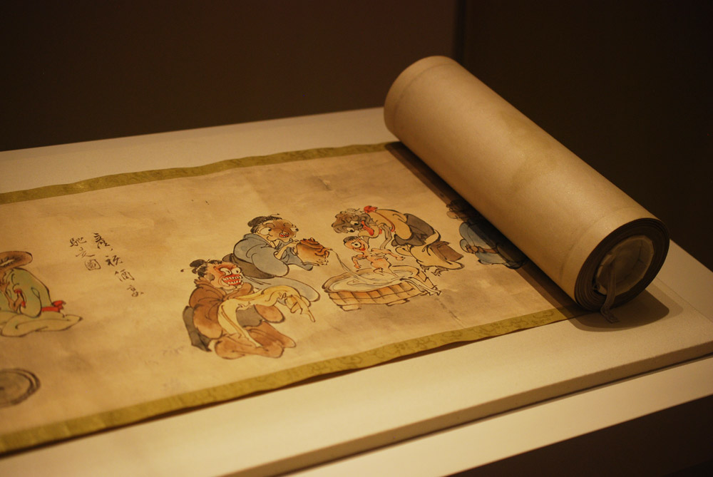
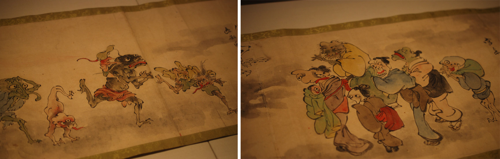
    An Illustrated Marriage of Apparitions (Bakemono konrei emaki) is a humorous hand scroll created in the mid-1800s. The story is mainly told through imagery with cartouches scattered amongst the illustrations as a way to describe the scene (much like a comic book). The scroll is displayed open to the part of the story with the birth of the first child between two apparitions or bakemono. A procession of 100 whimsical and supernatural monsters follow the couple through their matchmaking, engagement, marriage and finally to childbirth.

    StandardsCleveland6-ErinFletcher

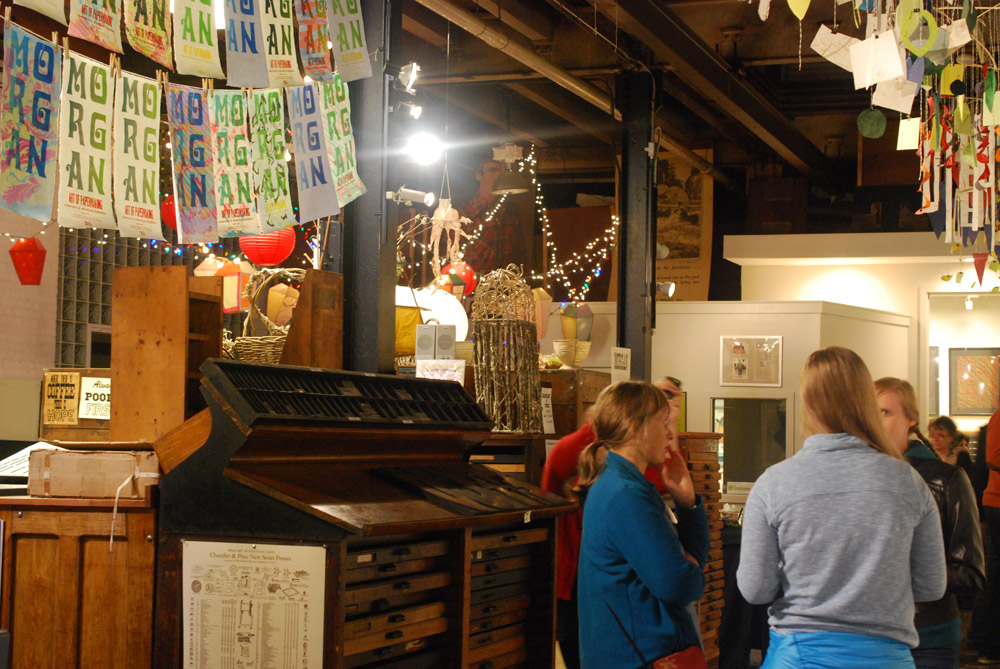
    The evening reception occurred at the Morgan Art of Papermaking Conservatory and Education Foundation. This was my first time at the Morgan and I was blown away by the size of the space. It was covered with a multitude of various creations. From what I could gather, the space was divided into different areas, a small shop right near the entrance, an area for printing, the center of the room was used as an exhibitions space, and the back half was for paper making and other workshops. I did miss out on the tour of the garden just outside the building in the back, but I heard it was absolutely gorgeous.

    StandardsCleveland7-ErinFletcher

    Buoyancy was the exhibit on view at the Morgan, which explores themes of water and swimming and includes the work of Aimee Lee and Kristen Martincic. I really enjoyed Kristen’s realistic paper recreations of objects used in the water. Aimee created a large and impressive assortment of intricately woven sculptural ducks from hanji dyed with natural pigments.

    StandardsCleveland8-ErinFletcher

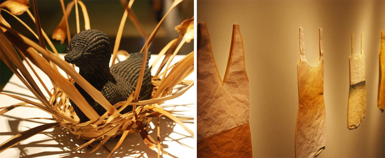
    left: Aimee Lee | right: Kristen Martincic

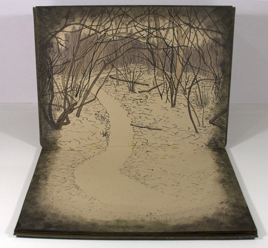
    Being that we were on the turf of the Midwest Chapter, members were invited to bring books for a pop-up exhibit. To our delight, this was also on display during the opening reception.

    StandardsCleveland9-ErinFletcher

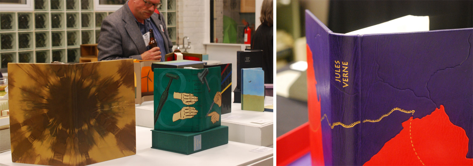
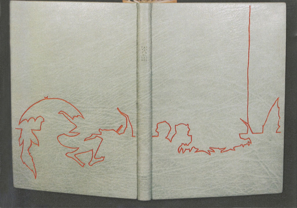
    The books on display in the image above from left to right are: Cris Clair Takacs: Remembering Jan Bohuslav Sobota, Karen Hanmer: Bookbinding with Numerous Engravings and Diagrams and Richard BakerLe Tour du Monde en Quatre-Vingts Jours (Around the World in Eighty Days).

    StandardsCleveland10-ErinFletcher

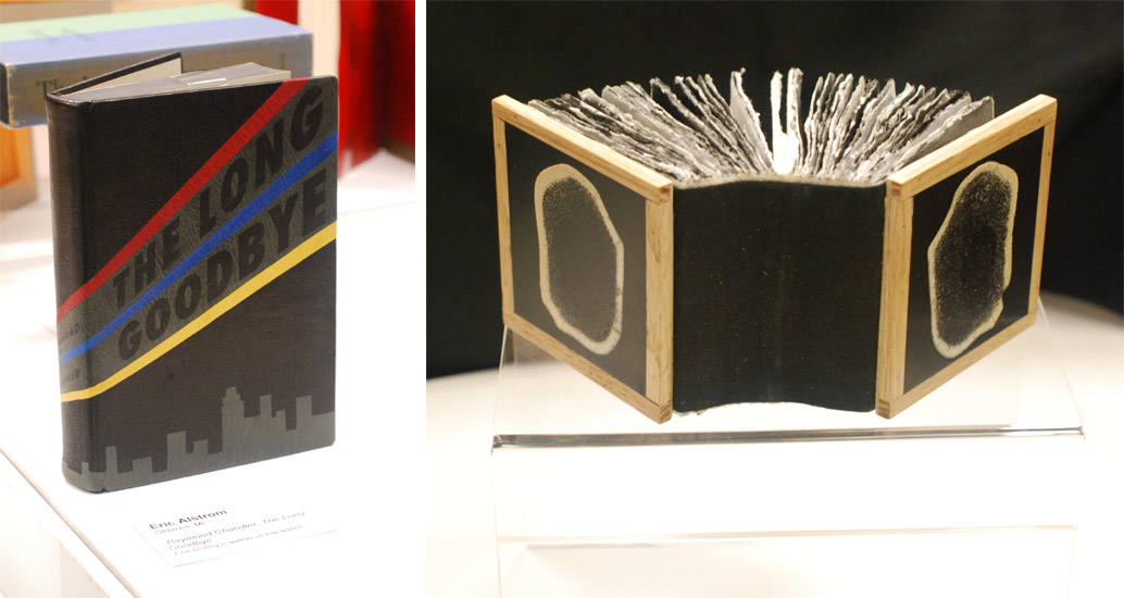
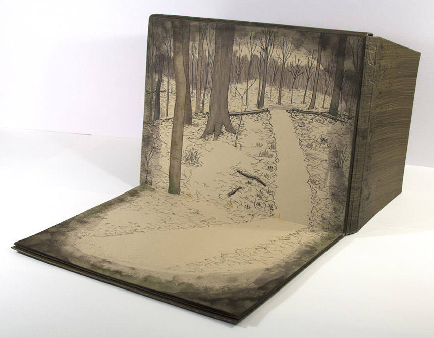
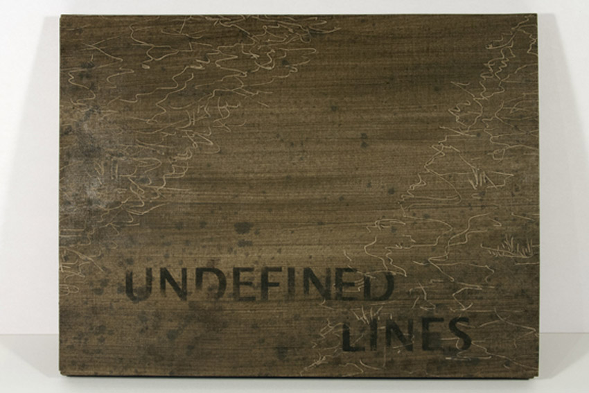
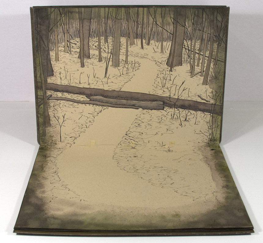
    Working down the exhibit table is Eric Alstrom’s The Long Goodbye (seen on the left) and Charles Wisseman‘s World Bones. 

    StandardsCleveland11-ErinFletcher

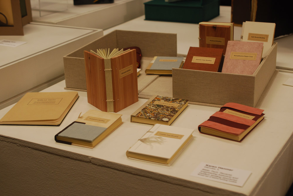
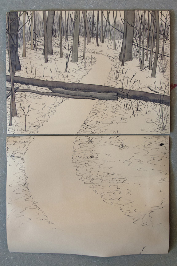
    Next up Biblio Tech: Reverse engineering historical and modern binding structures from Karen Hanmer.

    StandardsCleveland12-ErinFletcher

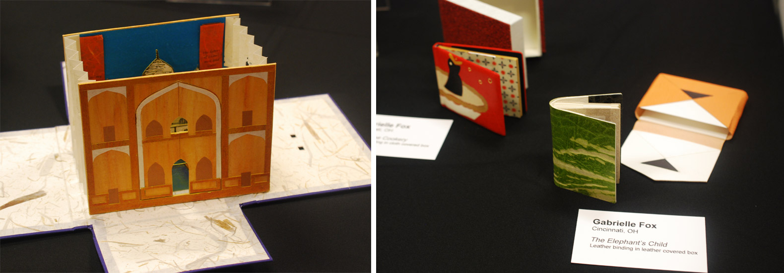
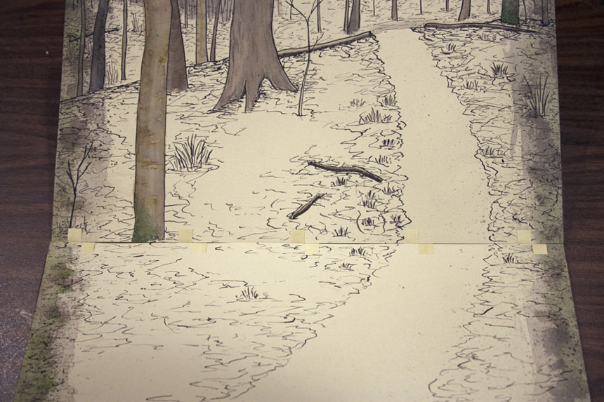
    On the left is Tunnel of Love from Mary Uthuppuru with miniatures from Gabrielle Fox on the right.
    StandardsCleveland13-ErinFletcher

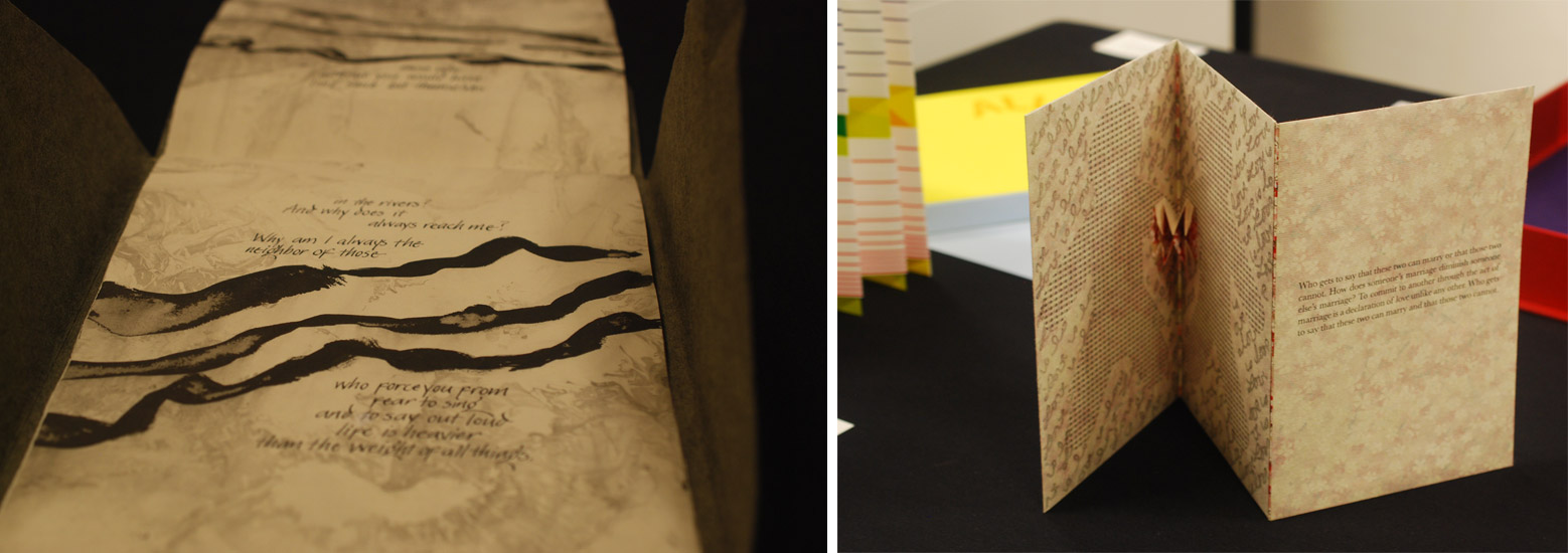
    Wrapping up my tour of the exhibit table is Joanna Kluba‘s Rainer Maria Rilke: Poems on the left and Emily Martin‘s Who Gets to Say on the right.

    That concludes day one of the Standards Seminar. Stay tuned for part two of the post soon.


  2. Best of 2014

    December 31, 2014 by Erin Fletcher

    As the year 2014 comes to a close, I want to send out another thank you to the nine bookbinders and book artists who took time away from their busy schedules to participate in my interviews. Another thank you goes to those who read and subscribe to my blog and I especially appreciate the kind comments I’ve received either in person or via email.

    Now to reflect on my year: Herringbone Bindery was busy yet again this year. I had the opportunity to work on some really great projects, amongst them were commissions from the Old State House in Boston, artist Laura Davidson and the Veatchs booksellers. An unusual amount of traveling this year took me to Rare Book School for the first time, up to Maine for a mini-conference and across the country to Vegas for the Guild of Book Workers conference.

    Things to expect in the New Year:
    – an updated website with all the projects I completed in 2014 (including some beautiful design bindings)
    – a Herringbone Bindery newsletter
    – more posts on my own projects (expect to see more on Dune as I will be covering right after the holidays)
    – another round of interviews

    As we ring in the new year, I just wanted to share my favorites posts from 2014.

    bestof2014a

    1. February // Bookbinder of the Month: Haein Song
    Haein Song was recommend to me by Hannah Brown and I was so thankful for her suggestion. Haein’s work is so clean and skillfully crafted. Her headcaps are so impeccable that I gape in awe.
    2. Artist: Marcela Cárdenas
    3. May // Bookbinder of the Month: Monique Lallier
    I greatly admire the work of Monique Lallier and was just ecstatic that she agreed to be interviewed for the blog. She has become such an influence in our field and openly shares her support and wisdom.

    bestof2014b

    4. My Hand: A Desert Inspired Edge for Dune
    5. August // Bookbinder of the Month: Mark Cockram
    The interview with Mark Cockram captures the boisterous and enthusiastic charms of both his personality and love of the craft. Each post examines the intensity of his designs and complexity of his techniques.
    6. Conservation Conversations Column
    Beginning this year, I invited six of my colleagues working in conservation to post about a field that encapsulates their professional lives. Topics range from using the appropriate adhesive and what to consider when building a conservation lab to various conservation considerations and philosophies.

    bestof2014c

    7. My Hand: Boxes for Laura Davidson
    My first project with Laura Davidson after interviewing her on my blog.
    8. Artist: Lydia Hardwick
    9. Photographer: Andrea Galvani
    10. January // Book Artist of the Month: Mary Uthuppuru
    I’m so charmed both Mary Uthuppuru and her work. She really engages the craft by exploring and experimenting with bookbinding and printmaking techniques. Mary is quite inspiring.

    bestof2014d

    11. November // Bookbinder of the Month: Sol Rébora
    It was a pleasure to interview Sol Rébora. Her insights to bookbinding in Argentina were refreshing, as are her imaginative and unique design bindings.
    12. February // Book Artist of the Month: Diane Jacobs
    Diane Jacobs employs important topics like feminism, body issues and societal issues against women in book arts and other art forms. I am very engaged and compelled by these issues and enjoyed dissecting her work in the interview.
    13. My Hand: Leather Embroidery Samplers
    14. Artist: Jennifer Davis

    Happy New Year!


  3. Bookbinder of the Month: Lang Ingalls

    March 16, 2014 by Erin Fletcher

    FantasyAndNonsense-LangIngalls

    The exhibition showcasing design bindings of the Tryst Press edition of Fantasy & Nonsense has been mentioned a few times on the blog. I first discussed the exhibition with my own submission, then again when I featured the work of Coleen Curry and Mary Uthuppuru. The book itself is a compilation of works by the American poet James Whitcomb Riley paired with beautiful wood engravings by Berrot H. Hubrecht. Each of the exhibitors really captured the whimsy of the poems and illustrations, transforming each binding into a unique object.

    Lang Ingalls‘ binding of Fantasy & Nonsense is no different in this respect. Her simple yet elegant design extracts the illustrations and complies them to form an intriguing landscape across the open binding. Lang created the binding in 2012 for the exhibition which was hosted by the Rocky Mountain Chapter of the Guild of Book Workers and displayed at the J. Willard Marriott Library at the University of Utah. Bound in the French technique in full light blue goatskin. The linear design was painted with acrylic inside a pulled leather line. Other design elements include colored head edge, custom paste paper endsheets and hand tooled title in blind on the spine.

    I love the color palette on this binding. Even though I had the opportunity to view this binding in person, I was stumped by how you created such a fine line of color in the leather. Can you talk about the technique you employed in this binding?
    This is one of the techniques I learned form Hélène Jolis — it is called an incision line. You actually cut the two sides of the line with a scalpel, remove the leather and paint with acrylics (yes, you need a paintbrush with only three bristles!) inside the line. I advise an optivisor for the work…


  4. Book Artist of the Month: Mary Uthuppuru

    January 27, 2014 by Erin Fletcher

    UndefinedLines4-MaryUthuppuru

    In 2012, Mary Uthuppuru created Undefined Lines. This unique artist book is designed with a cover that converts into an easel, making the image heavy content read as a guided tour along a trail commonly traveled by Mary. Using ink and watercolors to layout each scene on Rives BFK, the pages have a very soft, nostalgic feeling.

    UndefinedLines2-MaryUthuppuruUndefinedLines3-MaryUthuppuruUndefinedLines-MaryUthuppuru

    Undefined Lines is a really unique structure. The binding acts as an easel to direct the point of view of the imagery. Where did your inspiration come from for this structure?
    I chose to depict a hike I take every morning in a forest near my house. It is there that I sort out the agenda for the day, contemplate what might be on my mind or just clear my head. Being a little reserved with letting imagery be the message in my books, I decided that this book would be centered on large ink drawings with watercolors.

    This structure was a complete response to the content. In an unusual way, unusual to me, I created the pages of the book before considering how it would come together in the binding. As I finished the image panels, it occurred to me that I did two things: I created single sheets that then needed to be bound, and the image format begged for each page to be upright when viewed.

    UndefinedLines-inprocess-MaryUthuppuru

    So I leaved through all of the books about artist books I could find, hoping something would trigger an idea for my unique situation. First, I stumbled upon one of Claire Van Vliet’s bindings and I remembered the quilted books for which I first came to know her. The Lilly Library has a copy of her book Woven and Interlocking Book Structures from the Janus so I paid a visit and found a binding style that worked for my pages. The woven paper allowed me to bind the single sheets in an elegant and mostly hidden way. Another inspiration for the binding came from Susan Skarsgard, from whom I took a class at the Paper and Book Intensive in 2011. She showed us a non-adhesive structure that allowed the spine piece to slide into the cover to allow for the pages to open completely flat, something I found out I needed once I decided on the cover format.

    UndefinedLines-inprocess2-MaryUthuppuru

    Woven binding detail.

    Next, was to find a way to get the pages upright. I wanted the viewer to have the experience that they were walking through the forest with me. With the images as large as they are, I thought this would be possible especially if I could get the pages to turn towards the viewer. As each page is turned down, the viewer would find themselves in a new scene. I looked for inspiration in objects that are propped up for use that already exist like iPad cases and art easels. I made a few mock ups, but none of those things would work without making the book look clunky. Remembering that the box itself could act as the “easel”, I found the simplest ways possible to prop up the book. Having the box act as the cover in the form of a multi-flap portfolio was a good solution not only can all of the flaps be folded back for my purposes, but it also had a good-for-travel sort of feel. Once all the flaps are closed, it is self-contained.

    UndefinedLines5-MaryUthuppuru

    Last week you discussed your use of painted tissue for the cover of Fantasy & Nonsense. For Undefined Lines, Interpreter of Maladies and other works you’ve used paste cloth. Can you talk about your process for creating paste cloth?
    I first learned about paste cloth at my first Standards in 2008 in Toronto. Martha Cole demonstrated her beautiful technique of creating and using paste cloth for books as well as textile pieces. She even provided everyone with her recipes. I don’t use her recipe but I make a very simple recipe for mine which is just paste cooked as though you are using it for repair work, strained and thinned to the desired consistency, then divide the paste to be mixed with Golden acrylic paints. For the cloth, I use undyed natural cotton or linen…usually cotton since it has a consistent texture and tight weave that provides a nice smooth surface for combing if desired. All of my paste work with paste cloth is done on Mylar taped to a hard surface for drying.

    PasteCloth-MaryUthuppuru

    The cloth is sprayed with water and spread flat on the Mylar. At this stage, I make sure the fabric is laying evenly and the threads are not warped or distorted. The cloth is then pasted out with clear paste until the whole piece is evenly coated. Using your hands or a long ruler, turn the pasted cloth over onto the same piece of Mylar and smooth out gently with your hands getting rid of any air bubbles. At this point, you have to start making design decisions. If you plan on combing or drawing through the paste, then you need to decide if you will allow the color of the cloth to come through, by applying a layer of clear paste first, or if you want to build different colors on top of one another, in which case you just start your painting. If you are merely painting a design with the paste/paint mixture, you are ready to begin. Paste cloth lends itself to building rich designs by layering different colors or patterns on top of one another which is really fun to play with depending on the book’s subject matter.

    – – – – – – – – – – –

    Thanks Mary for a wonderful interview. It was great of you to share some of your techniques and creative processes.

    – – – – – – – – – – –

    UPDATE: Check out this wonderful review on Undefined Lines over at the Abecedarian Gallery Blog. The post includes a great slideshow of each page of the book!


  5. Book Artist of the Month: Mary Uthuppuru

    January 20, 2014 by Erin Fletcher

    FantasyAndNonsense-MaryUthuppuruIn 2012, the Rocky Mountain Chapter of the Guild of Book Workers held an juried exhibit of design bindings based on a book of James Whitcomb Riley poetry called Fantasy & Nonsense. The text block was beautifully letterpress printed by Tryst Press and includes wonderful and whimsical wood engravings by Berrot Hubrecht. 

    Mary Uthuppuru’s binding of Fantasy & Nonsense is covered in a thin hand-painted tissue, which allows the scattered LED lights embedded in the covers to shine through. These lights glow at alternating intervals and represent the goblin’s “green glass eyes” as described in the poem Nine Little Goblins. The book is housed in a cloth covered clamshell box, which contains a compartment holding three spare batteries. Watch the video below to see the LED lights in action.

    The exhibition was held in conjunction with the 2012 Standards of Excellence conference in Salt Lake City, Utah. At the time the books were on display at the University of Utah’s J. Willard Marriott Library, where Mary’s binding was awarded second place. 

    There are so many creative elements in this binding and so many design questions I have for you. Can you talk about your process for creating the painterly look of the cover?
    While I usually use paste cloth (Mary will discuss her paste cloth technique in next week’s post) when I want total control over cover design for my bindings, this book had unusual needs. Paste cloth, while thin, would not allow me the translucency that I needed for the LED lights. Not only did I need the cover material to allow light through, but I needed it to look like the surrounding material when the light was off. For this reason, I turned to Japanese tissue mounted to cotton. The tissue could be painted exactly how I wanted, and in the areas where the LEDs would be placed, I could thin it even more. This way, when everything was painted, it would blend in, but when the lights were on, it would have the effect I wanted.

    The steps for getting from plans to the final book are as follows: create the cover design on a piece of paper to scale, plan the circuitry and light placement, bind the book, add circuitry, work on the cover material. (You’ll find some in-progress images below: layout of design and circuitry, layout of circuitry on front cover boards and detail of wiring.)

    FantasyAndNonsense_process1-MaryUthuppuruFantasyAndNonsense_process2-MaryUthuppuru FantasyAndNonsense_process3-MaryUthuppuru

    The general design for the cover was painted on the tissue, predominately the midnight blue background and the trees. Next, the dry painted tissue was mounted to the cloth with PVA/Klucel G mixture. Once dry, the material was lined up with the paper design and holes were punched where the eyes in the design were to be. I then toned a thinner tissue to match the surrounding areas and put that in place. Finally, the painted design was completed and attached to the book being careful to line up the eyes over the LEDs.

    FantasyAndNonsense_process5-MaryUthuppuru

    Back of covering material and back cover of binding.FantasyAndNonsense_process6-MaryUthuppuruCovering material and front cover of binding.

    Your use of soft circuitry is very exciting and I’m looking forward to seeing how your work progresses with this technique. When did you first experiment with combining this technology with your bookbinding work? What challenges have you experienced? 
    I first started using the soft circuitry when Leah Buechley came from MIT to Indiana University to give a lecture and workshop about the promotion of these materials. I lucked out because my friend was helping put the workshop together and was able to get me a seat. During the workshop, we each created our own soft circuit using conductive thread, a battery and an LED light. The workshop was given in hopes of putting this technology in the hands of people, specifically educators, who make things and have the potential to distribute these skills to kids, especially girls. During the lecture, Leah explained these goals further and showed some amazing applications of the circuitry.

    After this exposure to the potential uses, I was really interested to try the technology in books too, but I wanted to wait until it actually fit the project at hand. It is easy to be excited about a technique or tool and use it just because you are excited about it. It is especially the case with lights and circuitry. It is my feeling that once you add lights to something, that you are trying to draw attention or add extra glitz. I wanted to be careful to reserve this eye catching element for a purpose, not just an adornment. It was this project that was perfect for the lights.

    The challenge comes when you try to figure out how to hide all the electronic components that, while small, are tricky to keep from distracting from the overall design. I wanted to avoid sacrificing my aesthetic to allow the new components, so it can be tricky. With Fantasy & Nonsense, the biggest challenge was hiding the LEDs under the book cloth and trying to figure out how to wrap the conductive threads around the spine.

    CircuitryBox-MaryUthuppuru

    It also required some additional education on my part since the lights are timed with a microcontroller that had to be programmed. I applied these similar techniques to a box I made and donated to the Guild of Book Workers Standards of Excellence auction. The box has a moon (which is also a button) that when pressed, lights up three lanterns. It was built so that when the lid is lifted, there is a panel that folds out and reveals the circuitry. Also included were supplies for a small project and a tutorial for how to put something like that together. (All of this is available for download on my website.)

    CircuitryBox3-MaryUthuppuru


  6. Book Artist of the Month: Mary Uthuppuru

    January 13, 2014 by Erin Fletcher

    InterpreterOfMaladies5-MaryUthuppuru

    Mary Uthuppuru received ‘Best Binding’ for her work based on Interpreter of Maladies. This award was given at the opening reception for the second edition of One Book, Many Interpretations exhibition at the Chicago Public Library in 2011. A total of ten titles were chosen by the CPL, a handful of bindings were created for each title and the award for ‘Best Binding’ was awarded to one binding for each title. 

    Housed in a beautifully shaped slipcase are nine individual books. Each book is bound in the Bradel binding style with handmade paste cloth. Details explained below are hand stenciled. Titles are stamped in gold. 

    This piece is so complex; you divided Interpreter of Maladies into nine books, which can be arranged two different ways to create either a map of India or the United States. I’ve never read these short stories by Jhumpa Lahiri, what inspiration did you find within the text to execute the binding in this manner? 
    This was my first competition binding and it was a perfect book for me because I have an intimate look into the content of Lahiri’s subject matter. Interpreter of Maladies is a compilation of nine stories featuring Indian people both in India and the United States as they deal with cross cultural issues and in some cases, the westernization of India. While the stories are about a specific culture, Lahiri writes them in such a way that they speak to a more universal experience.

    My husband is the son of an Indian father and a Japanese mother who moved to the United States for college in the 1960s. They moved here at a time when communication and travel is nothing like it is today. Letters were written and silences between phone calls were very long if at all possible. My first memories of visiting them were the numerous maps throughout the house. After a while it became clear that when you move to a new country with your family on the other side of the world, especially at the time that they did, there is comfort in looking at a map and seeing the two places a little closer together. It is this element that helped me tie the content of Interpreter with what became familiar to me.

    Since the stories take place in India and the United States I wanted both maps to be a part of the design. However, I didn’t want to overload the books with too many design features. Having the maps only appear one at a time as simple line drawings inset in the cover was the perfect solution. Additionally, I wanted the ability to create an intense color similar to marigolds, a flower present in various aspects of Indian culture, so I created paste cloth for my cover material. This also allowed me to easily stencil guides for arranging the maps into both configurations without which would make it nearly impossible for the viewer to figure out their order.

    InterpreterOfMaladies-process2-MaryUthuppuru

    Stencils used to create guides to help in arranging maps.

    This shuffling of book covers and rearranging them to create the two countries helped reinforced the difficulty of the themes in the book: life is a challenge, and when you move to a new place or what once was familiar changes, you have to make adjustments…and it can be difficult.

    – – – – – – – – – – –

    Below are images of the map blueprints and how the covers can be arranged to create both the United States and India. 

    InterpreterOfMaladies-process4-MaryUthuppuruInterpreterOfMaladies2-MaryUthuppuruInterpreterOfMaladies6-MaryUthuppuru


  7. Book Artist of the Month: Mary Uthuppuru

    January 6, 2014 by Erin Fletcher

    DestinyOfChoice1-MaryUthuppuru

    Can books save the world? Can artist books raise consciousness, create awareness or change thinking? These were the questions that EcoEditions aimed to answer through a collection of artist books that could raise awareness on the state of our environment. For her submission, Mary Uthuppuru, created Destiny of Choice in a small unique edition of three. Each book is bound in the Ethopian style with a tab closure on the fore edge. The title is hand stenciled on three unique covers sourced from boxes that were headed to the recycling bin.

    DestinyOfChoice4-MaryUthuppuru

    The text block is made from trash entirely sourced from Mary’s house. Which is also the major influence for creating this book. Most of us assume our trash is going straight to a landfill, but we lose sight of the fact that it may not. Mary’s concern with reducing the amount of waste that comes out of her household is an attitude that more people need to obtain.

    The books were sewn with dental floss (which Mary notes was unused for hygienic purposes). The illustrations and text have been inkjet printed onto packaging material. Other bits of trash including plastic bags and plastic netting were scattered throughout the text block.

    DestinyOfChoice3-MaryUthuppuruDestinyOfChoice2-MaryUthuppuru

    This artist book is brilliant; once again you successfully bring together humor and interactive elements. Destiny of Choice was part of EcoEditions, an exhibition at 23Sandy Gallery. Did you create this artist book specifically for the exhibition?
    This book was created for the EcoEditions exhibit. It was also a part of the hoped for quarterly project with Kristin of Space Paste Press. As mentioned earlier, we hoped to create more advanced projects than the one book per month endeavor. At the time, we were both thinking of environmental themes so it sounded like a really good goal, create a book that can also be submitted to an exhibit.

    I was really happy with the way the book turned out. Since I was already thinking of the theme, it was great timing. The theme asks artists to illicit change through the content of their artwork.  When trying to get people to change or realize that what they might be doing is harmful, I don’t think it is best to begin by ordering them around. I don’t listen this way, so I wanted to avoid a book full of preaching. The Choose Your Own Adventure format seemed really appropriate to me because the arrangement is playful, inviting the reader in. As a kid, I used to read choose your own adventure books all the time and I always approached them with a sense of reserve. I was choosing what would happen to the characters in the story, which hit home for me. So I wanted that same feeling to translate through this book.

    A favored story-telling method of mine is to anthropomorphize sometimes unexpected objects. In this case, a plastic bag is the main character of the story and while the reader decides what happens, the bag is doing the action. The reader chooses between recycling and throwing it away then how the bag gets from the garbage can or recycling bin at home to its final destination. Many people have heard about the gyres (islands of garbage) in the middle of the ocean. We all know about landfills. It is a very contemporary concern all over the world, and one that I have on my mind daily.


  8. January // Book Artist of the Month: Mary Uthuppuru

    January 2, 2014 by Erin Fletcher

    AndThenThereWere8_3-MaryUthuppuru

    In preparation for their 2013 Annual Open House and Silent Auction, the Morgan Conservatory presented participants with two sheets of paper made at the Morgan and asked them to create a piece of art to be auctioned off during the event. Mary Uthuppuru was given one sheet of charcoal grey and the other of bright white.

    Mary found inspiration from the recent drop Pluto experienced from its rank as a planet and the heated discussions that followed. As the sole character in this artist book, Mary personifies the now dwarf planet in the form of a letter, where Pluto freely express himself after hearing this news of rejection. You can read more about Mary’s process in her blog post, Poor Pluto

    And Then There Were Eight is bound as an accordion with a removable spine piece, when fully opened the viewer can experience the vast and expanding qualities of outer space. The covers are most appropriately wrapped in beautiful handmade Moon Paper from Hook Pottery Paper. The paper appears to be a 3-dimensional print of the moon, but it is actually smooth (like paper). The interior pages were given an airbrush look by using a mouth atomizer and drawing inks.

    AndThenThereWere8-MaryUthuppuruAndThenThereWere8_4-MaryUthuppuruAndThenThereWere8_2-MaryUthuppuruI really enjoyed reading about your thought process behind this book. Not only did you find inspiration in a literary influence, but also in your own sense of humor. The application of pigment really captures the atmosphere and depth of space. Can you talk about the challenges and benefits to using a mouth atomizer?
    The mouth atomizer was a really fun thing to use. I actually had it for over ten years before I discovered its use during this project. It looks a lot like a compass, but without the pencil. One end goes into whatever liquid you are using (in the case of the Pluto book it was India ink and Winsor & Newton drawing ink) and then you blow on the other tube.

    The benefit in its use is also its challenge. So long as you have the lung capacity, this tool is very simple. Blow in the horizontal tube, and the ink is sprayed from the vertical tube. The difficulty is in style. If you are trying to get consistent coverage, then you have to be consistent with the pressure behind your breath. But it is easy to get used to with a practice piece of paper. Also, beware your work space. Cover anything surrounding the piece you are working on with newsprint or other waste unless you want a speckled work space.

    ThereWere8_Atomizer-MaryUthuppuru

    There is more than one way to use it too. In this book, for example, I cut stencils from transparency sheets to create the planetary bodies. This allowed for a clean, shaded shape that is much faster and reads truer than a traditional stippling stenciled technique. It is also easy to clean by running it under water then drying.

    ThereWere8_Stenciling-MaryUthuppuru

    I first met Mary in Chicago for the One Book, Many Interpretations exhibit at the Chicago Public Library, where both Mary and I had work in the show. I’ll be featuring her binding of Interpreter of Maladies from that show later this month. From the beginning, I noted Mary’s impeccable skill and her exceptional eye for detail, but I can’t forget to mention her infectious personality. Her humor mixed with kindness and generosity makes her a delightful person to engage with and learn from.

    Like myself, Mary, is just beginning her career in the field of bookbinding. Her ambition and creativity are inspiring, as is the interview (after the jump). Mary discusses her love for bookbinding and how she caught “the book bug”. Later in the interview, Mary talks about setting up her own home studio and how being self-employed has its ups and downs. But it’s quite clear to see that Mary tackles her obstacles with smarts and humor. 

    Come back each Monday during the month of January for more on Mary Uthuppuru and her work, which will bounce between bookbinding and book arts.

    read more >


  • My name is Erin Fletcher, owner and bookbinder of Herringbone Bindery in Boston. Flash of the Hand is a space where I share my process and inspirations.
    The StudioNewsletterInstagramEmail me
  • Archives