RSS Feed
  1. Giveaway on Instagram + Workshop Seconds

    February 22, 2022 by Erin Fletcher

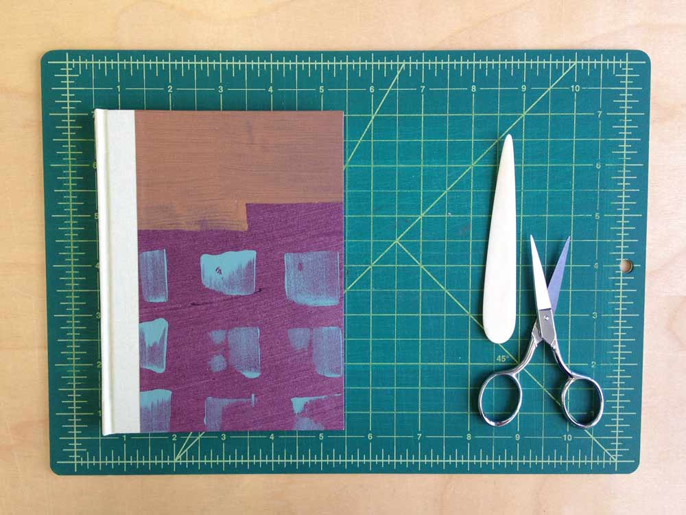
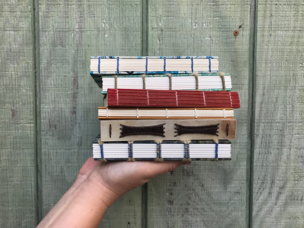
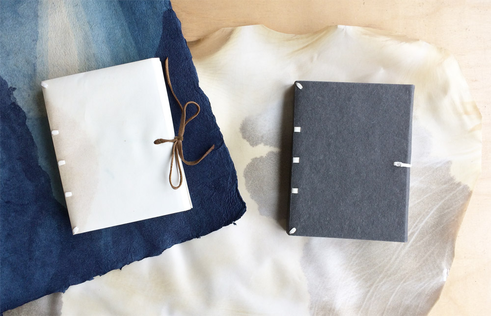
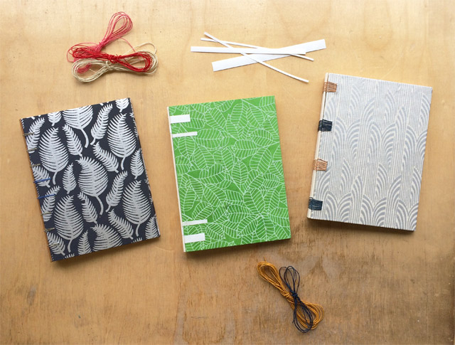
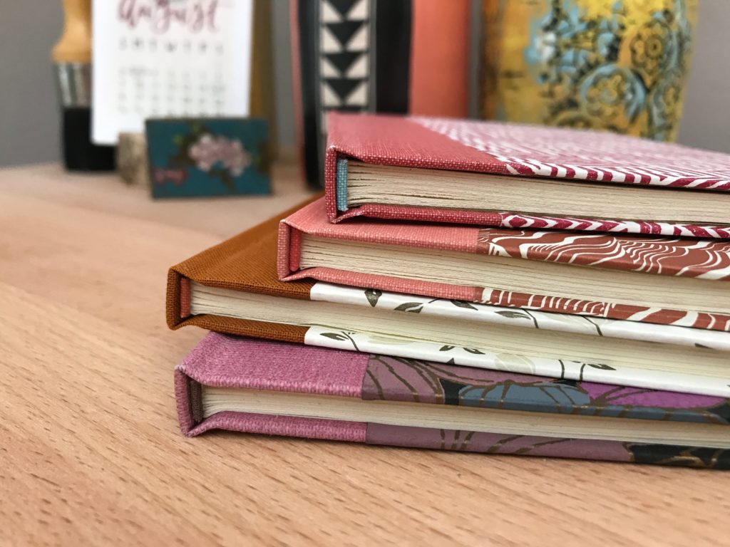
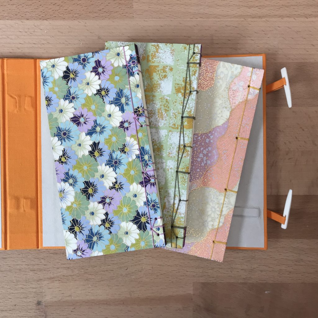
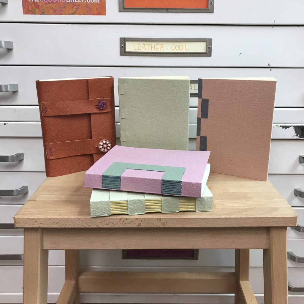
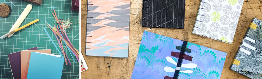
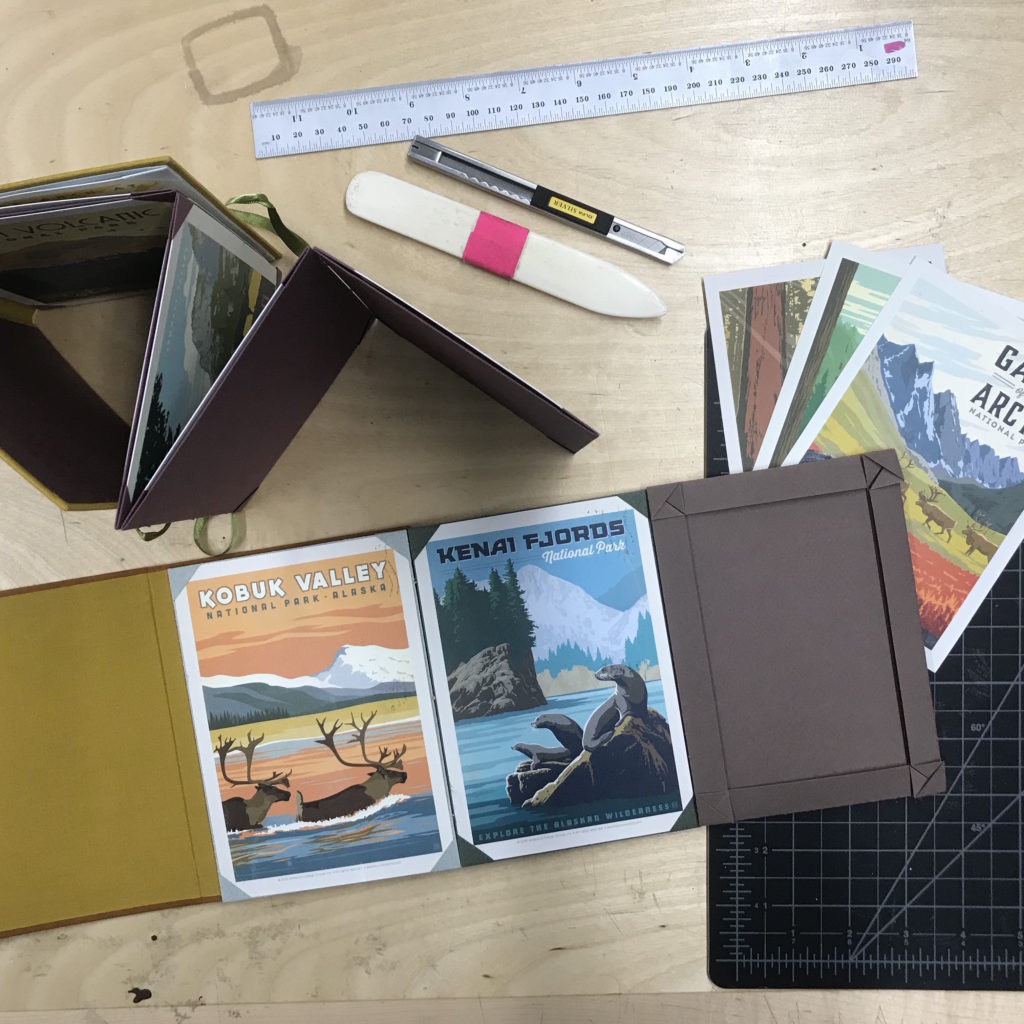
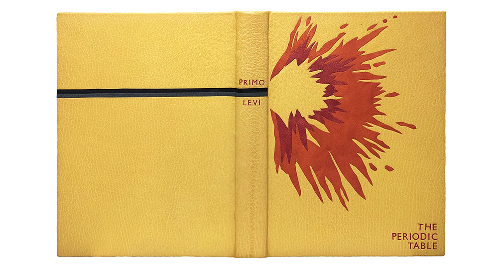
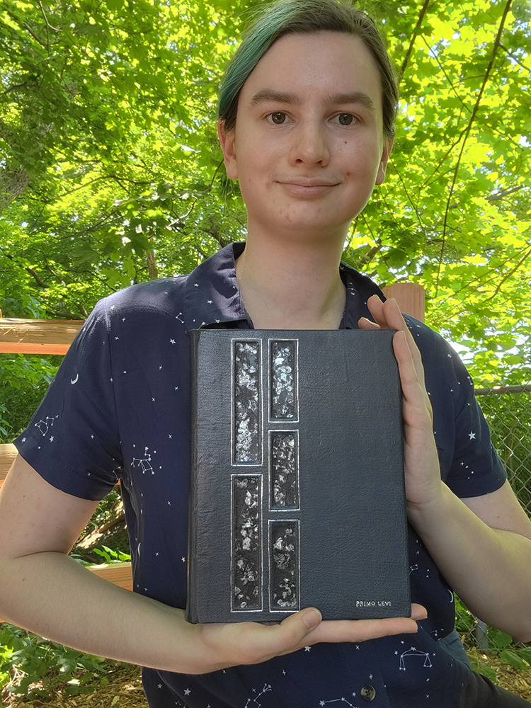
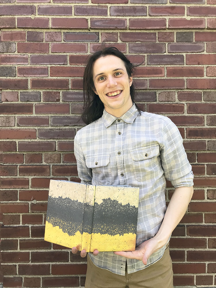
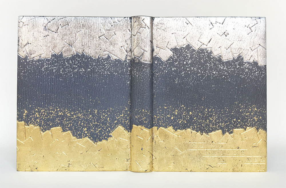
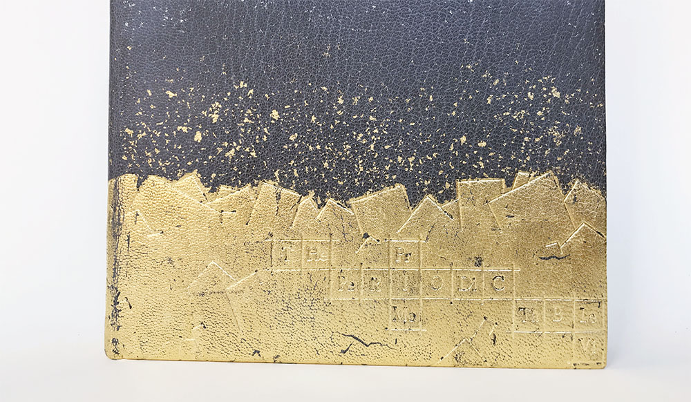
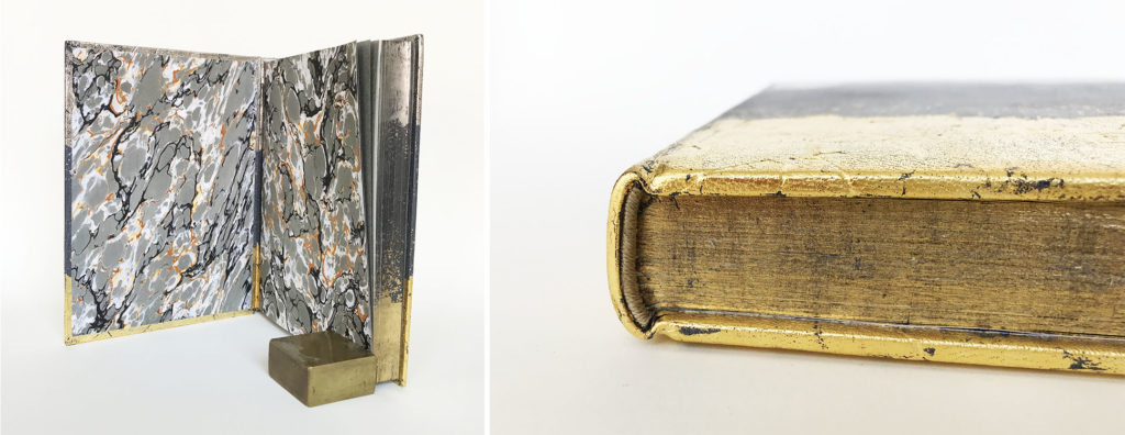
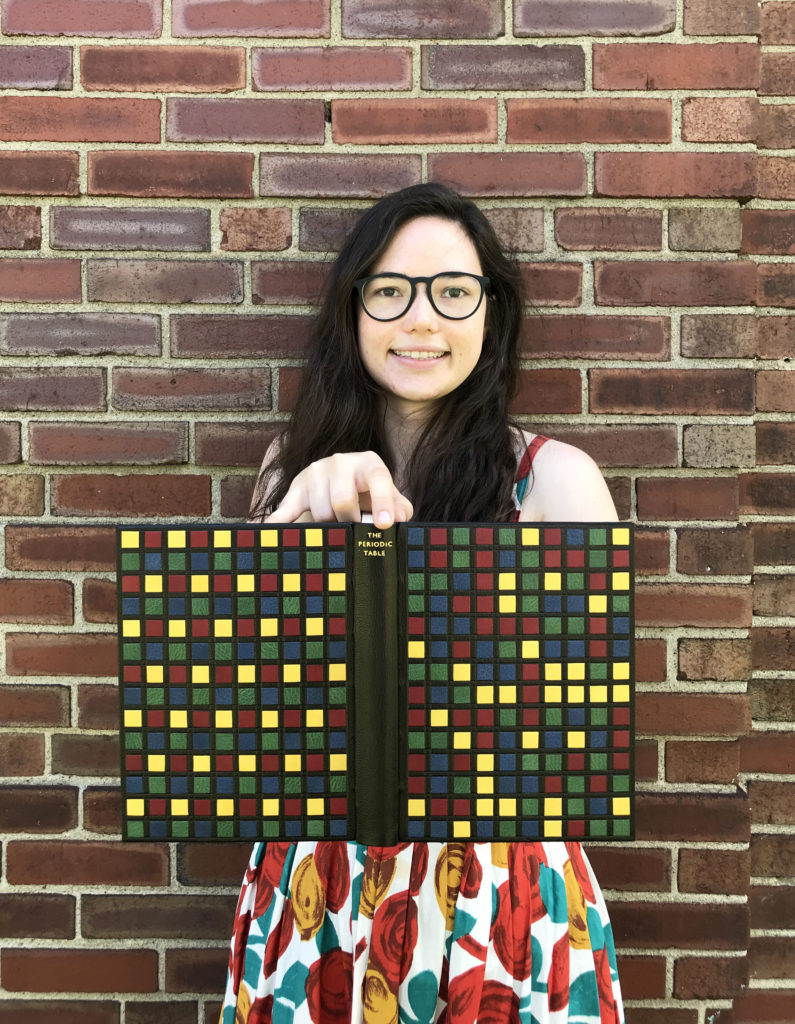
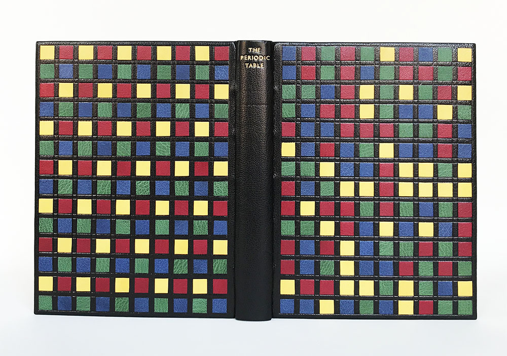
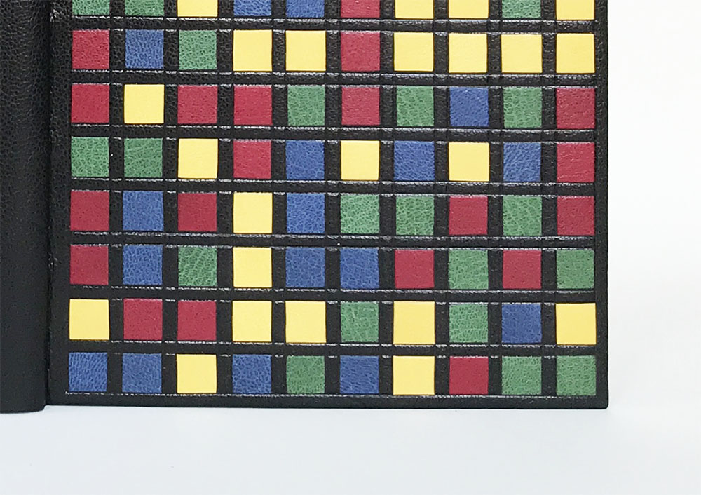
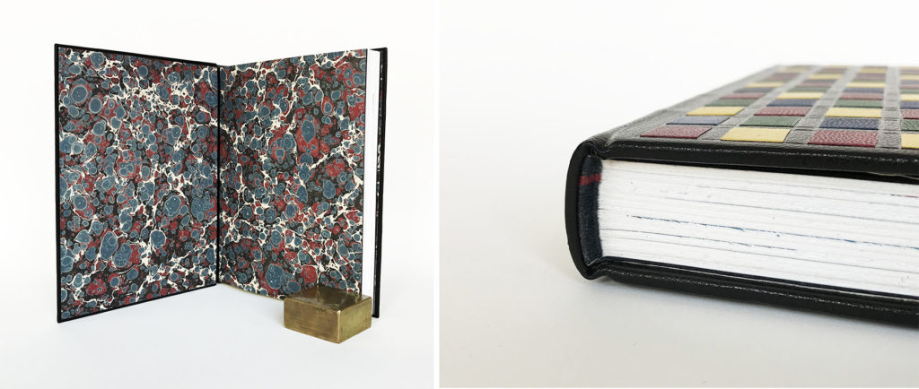
    Giveaway and Announcement! Over the past year and a half I’ve been teaching workshops online from my home studio. I’ve accumulated lots of models from teaching students from all over the world. I’m excited to announce these models are now for sale. All of the proceeds will go toward organizations dedicated to building up individuals and strengthening communities through art and craft.

    TO ENTER:
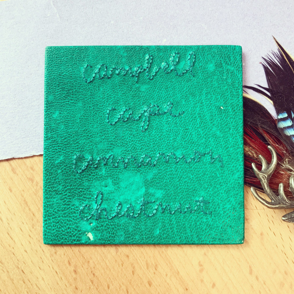
    Click over to Instagram and find the image above^
    1. Like this post
    2. Tag a friend in the comments and tell me what you love about books and/or boxes! (multiple comments count as multiple entries)

    Contest open to Instagram users only and ends February 24, 2022 at 11:59pm (est). Open to US residents only.

    THE PRIZE:
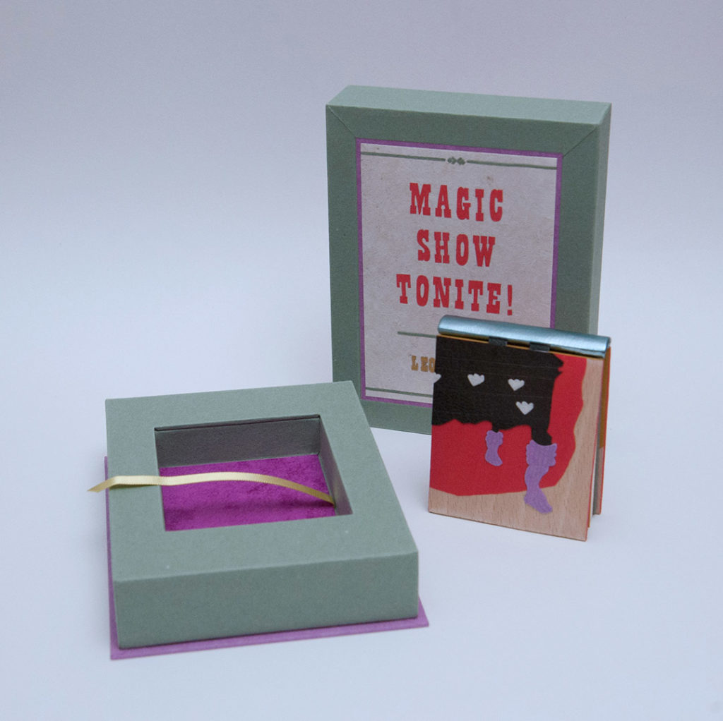
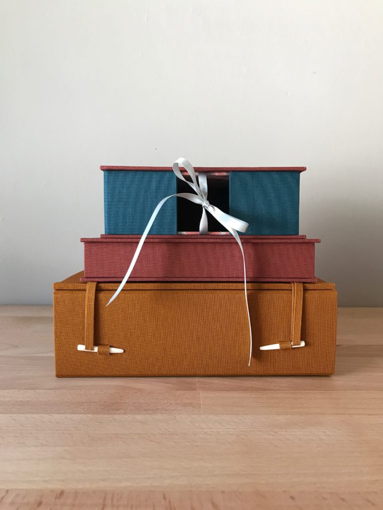
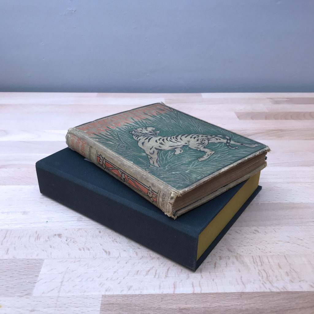
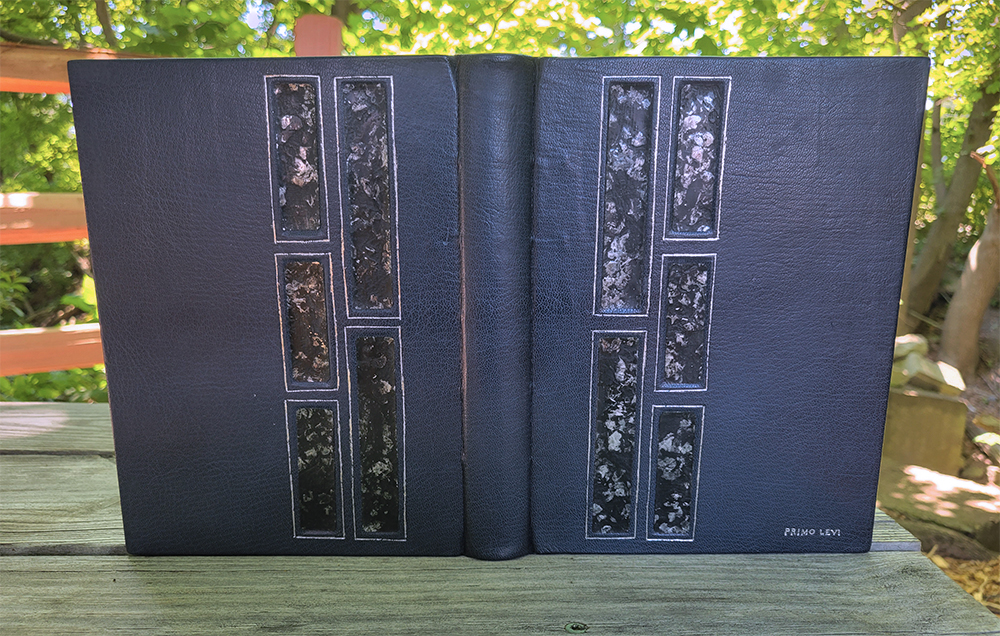
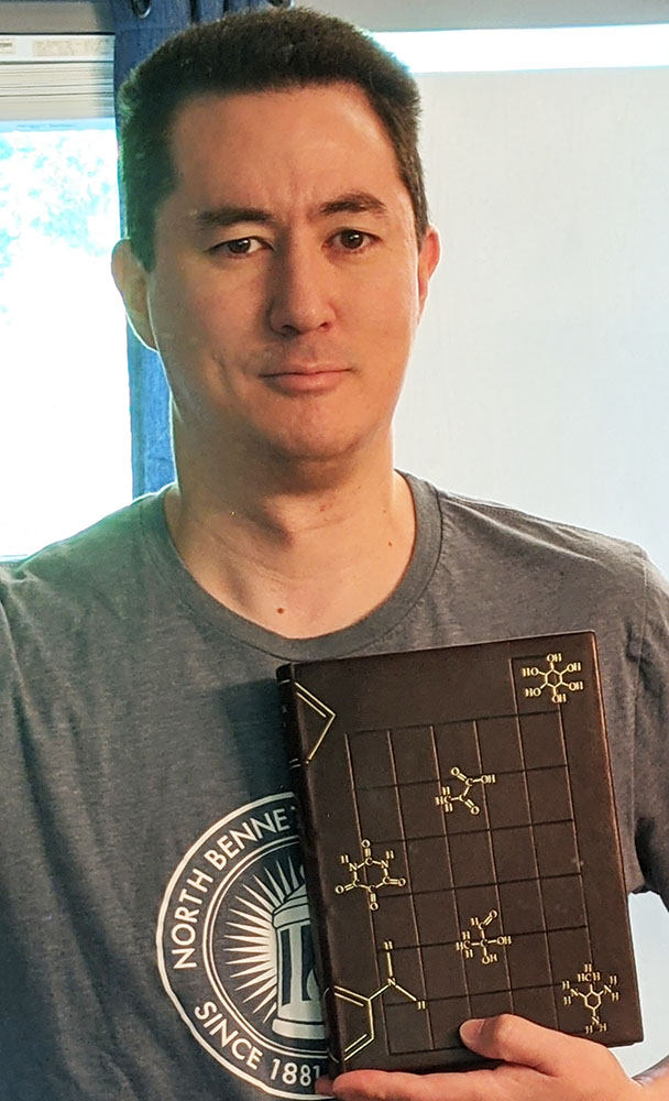
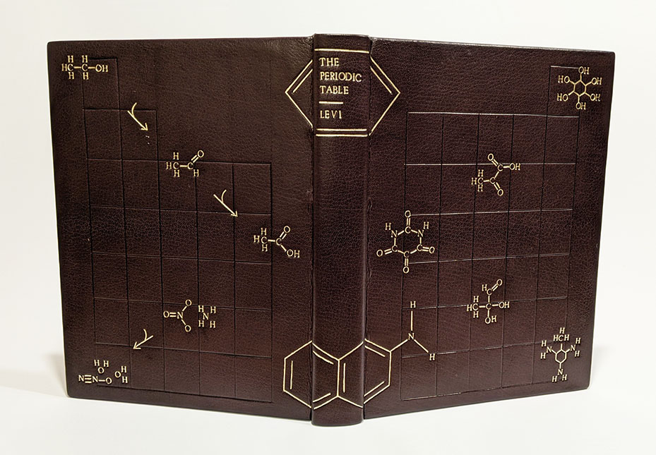
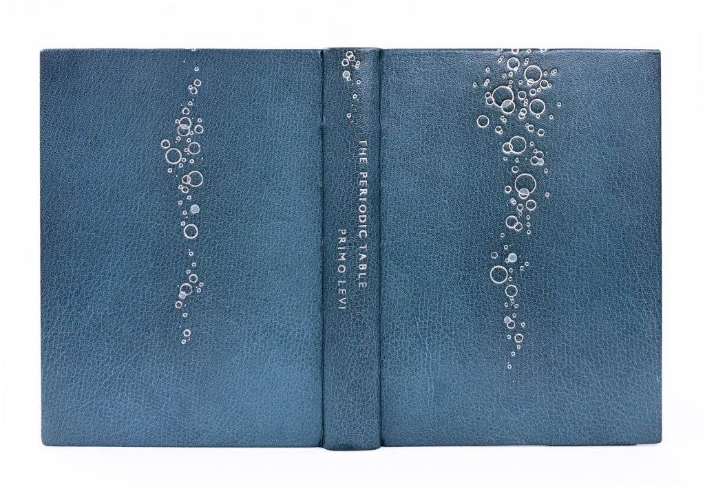
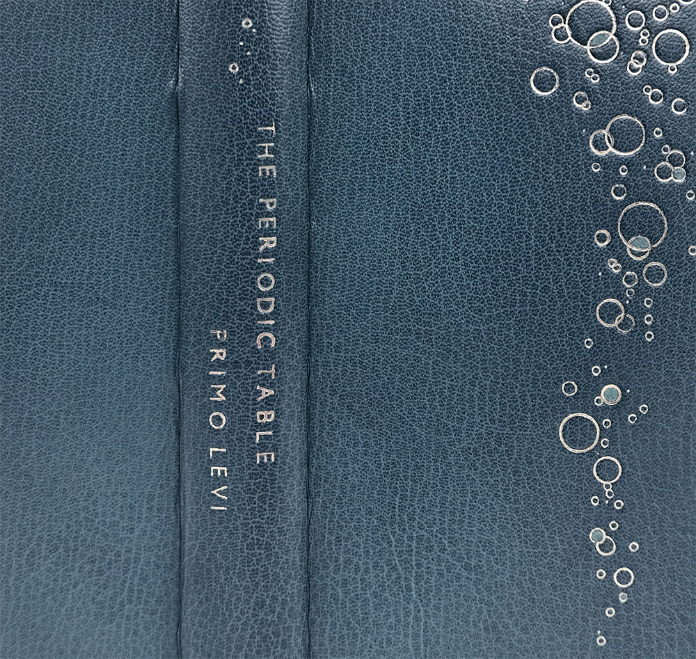
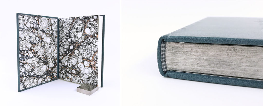
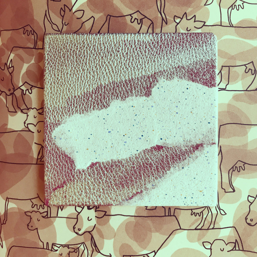
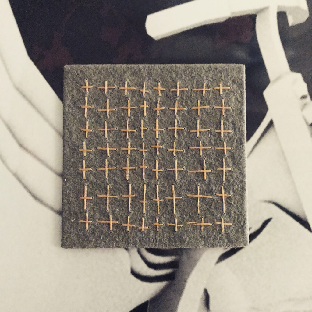
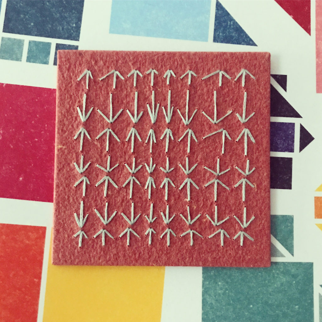
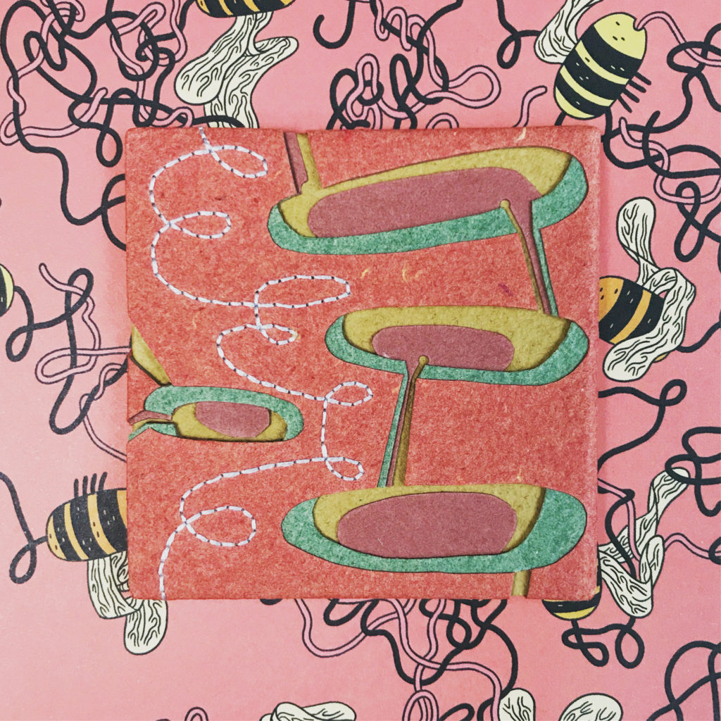
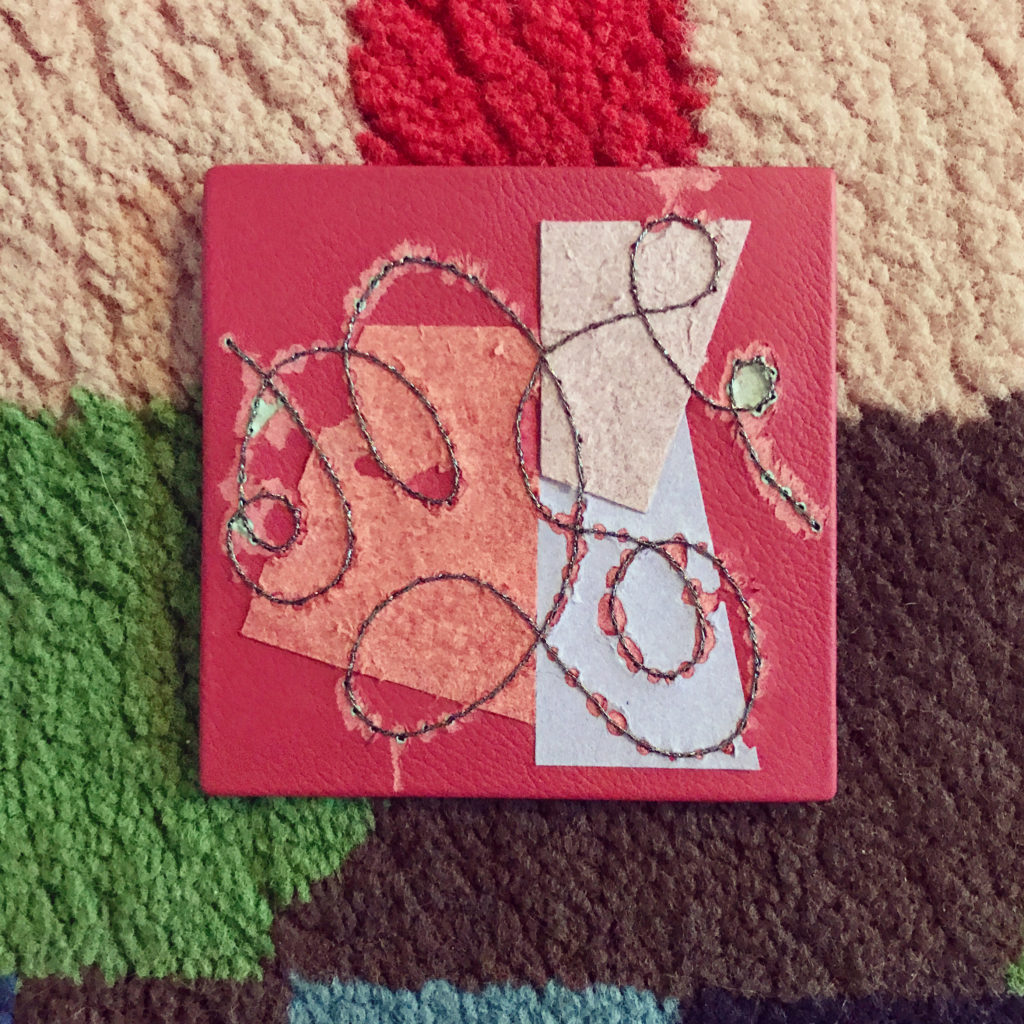
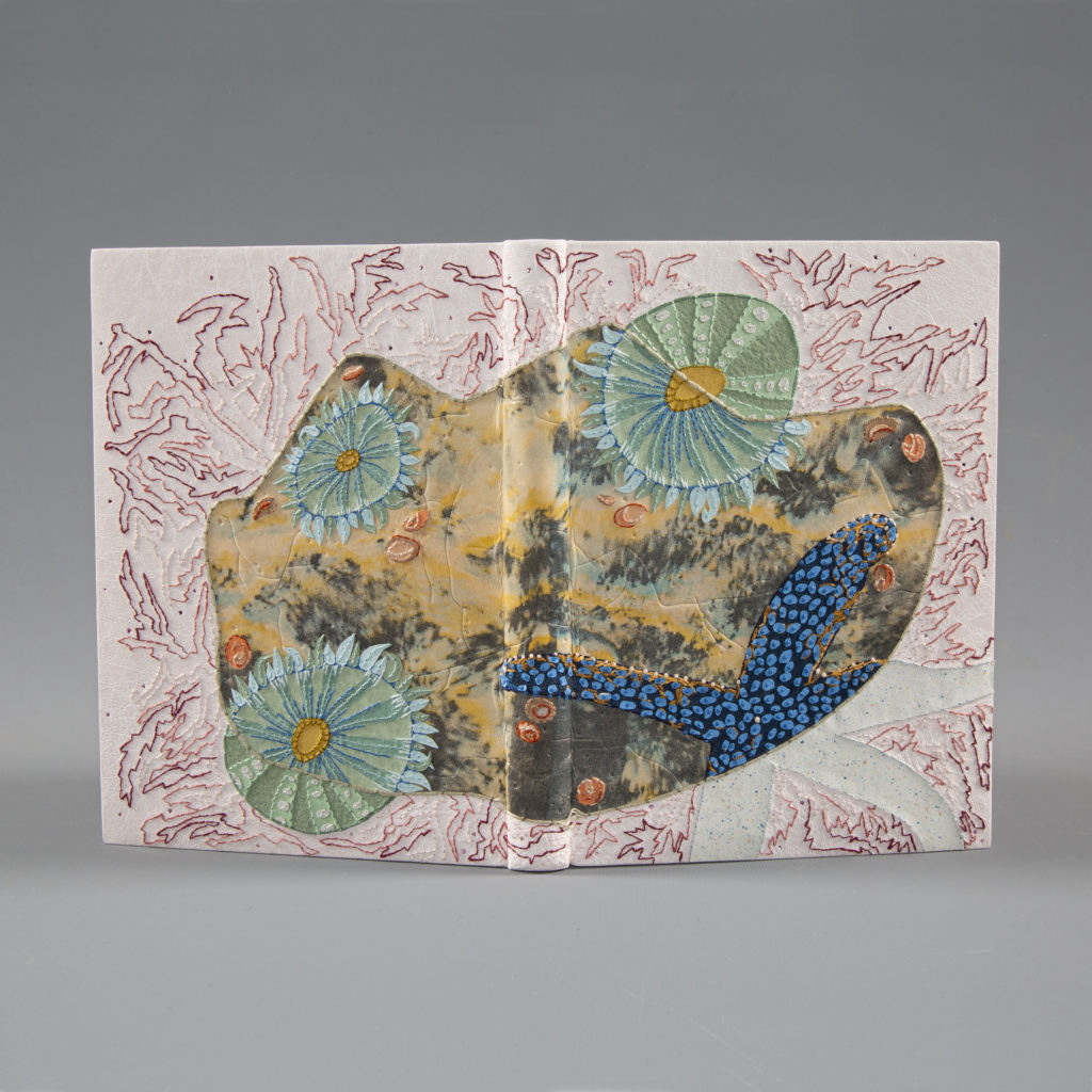
    A complete set of boxes made during my Box Series Workshop (includes 1 French tray, 1 clamshell and 1 Japanese box case). All boxes were made during demonstrations, so there may be marks and flaws for the purpose of teaching.

    WORKSHOP SECONDS:
    You can also get a workshop second directly by making a donation to one of the organizations below. For more information, click here.
    – Artists for Humanity
    – Bemis Center for Contemporary Arts
    – The Black School
    – Crafting the Future
    – North Bennet Street School
    – Penland School of Craft

    I’ll be donating funds once a month and posting receipts on Instagram. Many thanks in helping me support these incredible organizations and for keeping my studio organized.


  2. Upcoming Workshops // March & April

    February 15, 2022 by Erin Fletcher

    MARCH
    Flatback Case Binding
    2 Sessions // March 26 & 27 (Saturday and Sunday)
    10:00am – 1:00pm (EST)
    Sign-up by March 15 to receive your material kit!
    ONLY 4 SPOTS LEFT!!

    The Flatback Case Binding is one of the most common and recognizable structures today. In this workshop, students will learn foundational binding skills to assemble two different styles of covering known as quarter cloth and half cloth. The Flatback Case Binding is easy to construct and is perfect for small publications, artist books, journals and more.


    APRIL
    Choose Your Own Adventure: Non-Adhesive Bindings
    1 – 4 Sessions // April 5 – 14 (Tues and Thursday evenings)
    6:00 – 9:00pm (EST)
    Sign-up by March 24 to receive you material kit!

    This workshop is designed to cover a range of non-adhesive structures, just a small handful of the multitude of ways to sew a book. Non-adhesive bindings are great for any skill level, but beginner binders will learn fundamental sewing skills and work with a range of materials. Build this workshop for your skill level and your budget. Sign up for any number of workshops: 1, 3 or all 4! Receive $20 if you sign up for all 4.

    Choose Your Own Adventure:
    Session 1 – Coptic
    Session 2 – Link & Long Stitch
    Session 3 – Historical Long Stitch
    Session 4 – Single & Double Raised Cords

    Limp Vellum Binding
    2 Days // April 9 & 10 (Saturday and Sunday)
    8:30am – 4:30pm
    In-Person Workshop @ North Bennet Street School in Boston

    With the advent of printing in the 15th century books were printed in larger quantities creating a higher demand for bookbinders. Limp binding structures came about as a way for binders to quickly construct an elegant and durable binding for this new demand. This beautiful style of binding is suitable for conservation or new bindings. Students will learn the proper sewing pattern for this structure, create hand-sewn endbands and how to properly fold the cover before lacing in the text block.

    Telescoping Box
    3 Sessions // April 21 – 28 (Tues and Thursday evenings)
    6:00 – 8:00pm (EST)
    Sign-up by April 8 to receive you material kit!
    ONLY 3 SPOTS LEFT!!

    In contrast to the clamshell box, this style of enclosure has a completely separate lid that slides off the base. In this workshop, students will construct an inner tray set within a frame for the object to rest. A ribbon will be added for easy retrieval of the object. Students will be able to customize the inner tray to fit an object from their own library.


  3. Upcoming Workshops // Winter/Spring 2022

    December 28, 2021 by Erin Fletcher

    FEBRUARY
    Secret Belgian Binding
    2 Days // February 12 & 13 (Saturday – Sunday)
    8:30am – 4:30pm
    In-Person Workshop @ North Bennet Street School in Boston

    The Secret Belgian binding, also known as Criss Cross binding, was developed by Anne Goy in the mid-1980s and is influenced by traditional Japanese binding styles. The binding is simple and easy to construct; it opens flat and is perfect for thinner text blocks. Students will construct 3 variations of this structure, including a style which uses Tyvek as the binding agent.

    Box Series
    4 Sessions // February 15 – 24 (Tuesday and Thursday evenings)
    6:00 – 8:30pm (EST)
    Sign-up by February 3 to receive your material kit!

    Boxes come in all shapes and sizes. In this workshop, we’ll look at just three examples: French-Tray with Drop Spine, Clamshell and Japanese Box Case. Students will learn how to assemble these three styles of boxes while also discussing the ways to measure for custom box-making. This workshop will give you the foundational skills to build and modify your own boxes. It will also explore different ways of creating closures for boxes.

    MARCH
    Fundamentals of Bookbinding I
    5 Days // March 14 – 18 (Monday – Friday)
    8:30am – 4:30pm
    In-Person Workshop @ North Bennet Street School in Boston

    Students will learn the foundations of bookbinding by combining hands-on exercises and discussion. The class starts by exploring non-adhesive structures: soft cover pamphlet, Coptic, historical longstitch and link stitch. The class ends with a look at case bindings, with the creation of two hardcover flatback bindings. Students also learn different structural elements, sewing variations, covering and cutting techniques using various materials, tools and equipment. Throughout the course discussions will cover terminology, paper grain and folding, selecting proper materials and tools, and adhesives and their properties.

    Flatback Case Binding
    2 Sessions // March 26 & 27 (Saturday and Sunday)
    10:00am – 1:00pm (EST)
    Sign-up by March 15 to receive your material kit!

    The Flatback Case Binding is one of the most common and recognizable structures today. In this workshop, students will learn foundational binding skills to assemble two different styles of covering known as quarter cloth and half cloth. The Flatback Case Binding is easy to construct and is perfect for small publications, artist books, journals and more.

    APRIL
    Choose Your Own Adventure: Non-Adhesive Bindings
    1 – 4 Sessions // April 5 – 14 (Tues and Thursday evenings)
    6:00 – 9:00pm (EST)
    Sign-up by March 24 to receive you material kit!

    This workshop is designed to cover a range of non-adhesive structures, just a small handful of the multitude of ways to sew a book. Non-adhesive bindings are great for any skill level, but beginner binders will learn fundamental sewing skills and work with a range of materials. Build this workshop for your skill level and your budget. Sign up for any number of workshops: 1, 3 or all 4! Receive $20 if you sign up for all 4.

    Choose Your Own Adventure:
    Session 1 – Coptic
    Session 2 – Link & Long Stitch
    Session 3 – Historical Long Stitch
    Session 4 – Single & Double Raised Cords

    Limp Vellum Binding
    2 Days // April 9 & 10 (Saturday and Sunday)
    8:30am – 4:30pm
    In-Person Workshop @ North Bennet Street School in Boston

    With the advent of printing in the 15th century books were printed in larger quantities creating a higher demand for bookbinders. Limp binding structures came about as a way for binders to quickly construct an elegant and durable binding for this new demand. This beautiful style of binding is suitable for conservation or new bindings. Students will learn the proper sewing pattern for this structure, create hand-sewn endbands and how to properly fold the cover before lacing in the text block.

    Telescoping Box
    3 Sessions // April 21 – 28 (Tues and Thursday evenings)
    6:00 – 8:00pm (EST)
    Sign-up by April 8 to receive you material kit!

    In contrast to the clamshell box, this style of enclosure has a completely separate lid that slides off the base. In this workshop, students will construct an inner tray set within a frame for the object to rest. A ribbon will be added for easy retrieval of the object. Students will be able to customize the inner tray to fit an object from their own library.


  4. Just a Few Workshops Left in 2021!

    September 14, 2021 by Erin Fletcher

    There are just a few workshops left in 2021 to sign-up for!

    OCTOBER
    Trio of Japanese Bindings in a Wraparound Case
    3 Sessions // October 3 – 17 (Sunday mornings)
    10:00am – 12:00pm (EST)
    Sign-up by September 20 to receive you material kit! – 3 SPOTS LEFT!!

    In this workshop, students will construct a common Japanese binding model, traditionally referred to as yotsume toji or 4-hole binding. With this pattern as the foundation, students will also learn the hemp-leaf and tortoise-shell pattern. We will build the models in a traditional manner, while incorporating western tools and equipment. To finish, we will construct a wraparound case held together with bone clasps to house all three models.

    NOVEMBER
    Choose Your Own Adventure: Cross Structure
    1 – 5 Sessions // November 30 – December 14 (Tues and Thursday evenings)
    6:00 – 9:00pm (EST)
    Sign-up by November 18 to receive you material kit!

    The Cross Structure binding is a non-adhesive binding that offers much freedom to the text block. This 20th century design is greatly inspired by the Long Stitch bindings of the medieval era and can be constructed in a range of styles. The structure is uniquely constructed by interlocking the front and back cover at the spine. It is suitable in conservation or new bindings, such as journals or decorative bindings. For this workshop, you can sign up for any number of sessions.

    Choose Your Own Adventure:
    Session 1 – Basic
    Session 2 – Protective
    Session 3 – Hidden
    Session 4 – MarcoPolo
    Session 5 – Solo

    Sign up for all 5 and receive a $25 discount.


  5. Upcoming Workshops // August – December

    August 10, 2021 by Erin Fletcher

    AUGUST
    Focus on Clamshell
    4 Sessions // August 31 – September 9 (Tues and Thurs evenings)
    6:00 – 8:30pm (EST)
    Sign-up by August 18 to receive you material kit! – ONLY 2 SPOTS LEFT

    A clamshell box is a common and elegant way to house and protect a binding. In this workshop students will learn how to measure and cut down materials to make two custom clamshell boxes to house books from their own library. The first box will be covered in full cloth, while the second box will have a leather spine with suede lining the inside. Each box will be finished with a printed label.


    SEPTEMBER
    Embroidered Leather Binding
    6 Sessions // September 28 – November 2 (Tuesday evenings)
    6:00 – 8:00pm (EST)
    Sign-up by September 15 to receive you material kit!

    In this workshop, students will work from start to finish on their own embroidered leather binding over the course of several sessions. Students will be asked to prep their own text block and leather for a full leather case binding, however a kit of materials is available for purchase. Students will be introduced to a few hand-embroidery stitches and the best techniques for sewing into leather, cloth, and paper. We will also discuss ways to transfer the design onto the material, how to incorporate onlays and how to prepare the finished embroidered piece for covering.


    OCTOBER
    Trio of Japanese Bindings in a Wraparound Case
    3 Sessions // October 3 – 17 (Sunday mornings)
    10:00am – 12:00pm (EST)
    Sign-up by September 20 to receive you material kit!

    In this workshop, students will construct a common Japanese binding model, traditionally referred to as yotsume toji or 4-hole binding. With this pattern as the foundation, students will also learn the hemp-leaf and tortoise-shell pattern. We will build the models in a traditional manner, while incorporating western tools and equipment. To finish, we will construct a wraparound case held together with bone clasps to house all three models.


    NOVEMBER
    Secret Belgian + Single Signature
    November 8 – 12 (Monday – Friday)
    Maine Media Workshops + College
    Rockport, ME – In-person

    During this week-long workshop students will explore variations within two different styles of binding: Secret Belgian and Single Signature.

    Choose Your Own Adventure: Cross Structure
    1 – 5 Sessions // November 30 – December 14 (Tues and Thursday evenings)
    6:00 – 9:00pm (EST)
    Sign-up by November 18 to receive you material kit!

    The Cross Structure binding is a non-adhesive binding that offers much freedom to the text block. This 20th century design is greatly inspired by the Long Stitch bindings of the medieval era and can be constructed in a range of styles. The structure is uniquely constructed by interlocking the front and back cover at the spine. It is suitable in conservation or new bindings, such as journals or decorative bindings. For this workshop, you can sign up for any number of sessions.

    Choose Your Own Adventure:
    Session 1 – Basic
    Session 2 – Protective
    Session 3 – Hidden
    Session 4 – MarcoPolo
    Session 5 – Solo

    Sign up for all 5 and receive a $25 discount.


  6. Upcoming Workshops // August – December

    July 13, 2021 by Erin Fletcher

    AUGUST
    2-Day: Shrigley
    3 Sessions // August 23 & 27 (Monday & Friday)
    Aug. 23: 10:00am – 1:00pm & 3:00 – 6:00pm
    Aug. 27: 3:00 – 4:00pm
    Maine Media Workshops + College – Online

    The Shrigley is an innovative way to house loose ephemera, postcards, photographs, prints and more. The pages are folded into frames, allowing you to easily add or remove pieces from the book. In this workshop, students will learn the folding techniques to create the frames with various corner styles. Once the pages are assembled and sewn, students will finish their project by making a hardcover case with a ribbon tie.

    Focus on Clamshell
    4 Sessions // August 31 – September 9 (Tues and Thurs evenings)
    6:00 – 8:30pm (EST)
    Sign-up by August 18 to receive you material kit!

    A clamshell box is a common and elegant way to house and protect a binding. In this workshop students will learn how to measure and cut down materials to make two custom clamshell boxes to house books from their own library. The first box will be covered in full cloth, while the second box will have a leather spine with suede lining the inside. Each box will be finished with a printed label.


    SEPTEMBER
    Embroidered Leather Binding
    6 Sessions // September 28 – November 2 (Tuesday evenings)
    6:00 – 8:00pm (EST)
    Sign-up by September 15 to receive you material kit!

    In this workshop, students will work from start to finish on their own embroidered leather binding over the course of several sessions. Students will be asked to prep their own text block and leather for a full leather case binding, however a kit of materials is available for purchase. Students will be introduced to a few hand-embroidery stitches and the best techniques for sewing into leather, cloth, and paper. We will also discuss ways to transfer the design onto the material, how to incorporate onlays and how to prepare the finished embroidered piece for covering.


    OCTOBER
    Trio of Japanese Bindings in a Wraparound Case
    3 Sessions // October 3 – 17 (Sunday mornings)
    10:00am – 12:00pm (EST)
    Sign-up by September 20 to receive you material kit!

    In this workshop, students will construct a common Japanese binding model, traditionally referred to as yotsume toji or 4-hole binding. With this pattern as the foundation, students will also learn the hemp-leaf and tortoise-shell pattern. We will build the models in a traditional manner, while incorporating western tools and equipment. To finish, we will construct a wraparound case held together with bone clasps to house all three models.


    NOVEMBER
    Secret Belgian + Single Signature
    November 8 – 12 (Monday – Friday)
    Maine Media Workshops + College
    Rockport, ME – In-person

    During this week-long workshop students will explore variations within two different styles of binding: Secret Belgian and Single Signature.

    Choose Your Own Adventure: Cross Structure
    1 – 5 Sessions // November 30 – December 14 (Tues and Thursday evenings)
    6:00 – 9:00pm (EST)
    Sign-up by November 18 to receive you material kit!

    The Cross Structure binding is a non-adhesive binding that offers much freedom to the text block. This 20th century design is greatly inspired by the Long Stitch bindings of the medieval era and can be constructed in a range of styles. The structure is uniquely constructed by interlocking the front and back cover at the spine. It is suitable in conservation or new bindings, such as journals or decorative bindings. For this workshop, you can sign up for any number of sessions.

    Choose Your Own Adventure:
    Session 1 – Basic
    Session 2 – Protective
    Session 3 – Hidden
    Session 4 – MarcoPolo
    Session 5 – Solo

    Sign up for all 5 and receive a $25 discount.


  7. North Bennet Street School // The Set Book Interviews – Class of 2020 & 2021

    June 30, 2021 by Erin Fletcher

    Every year I look forward to presenting the set book interviews from the graduating class at North Bennet Street School’s Bookbinding Department. However, like many events and plans for 2020, this too had to be put on hold for a later date. Over the past month and a half, I’ve had the opportunity to meet both virtually and in-person with the recent graduates. In the past, I typically got to speak with them about their work and discuss the progress of the binding in real time. Since I didn’t get the same experience this past year, I was thoroughly wowed and surprised by all of the work the graduates were able to produce over a period of uncertainty.

    The set book for this group of graduates was Primo Levi’s The Periodic Table. This memoir of 21 short stories reflects on the author’s experiences as a Jewish-Italian chemist before, during and after being held captive at the Auschwitz concentration camp. With his background as a chemist, the stories are interwoven with connections to an element from the periodic table which is first introduced with the title of the chapter. As the contemplated their designs, this thread connected with some of the binders, while others chose to focus on a single portion of the book.

    During the interviews, I spoke with each of the binders about their design process and how they chose to execute their vision. After missing the chance to engage with them on a weekly basis, it was wonderful to sit down and see their personalities shine through their work and the way they spoke about the process. I wish them all the best of luck in their various endeavors post graduation.

    Shelley Esplin – BB ’20

    One thing that I know about Shelley is that she has a love for the outdoors and is a spirited adventurer. So it was no surprise to me that she latched onto the way Levi intertwined themes of nature into his short stories. Engaged with this theme of connectivity between human and nature both on the micro and macro level, Shelley began to develop her design. She walked me through her design process and shared with me a range of ideas before settling on this typographic-style map. I find that the design is directly representing a landscape, but also gives me vibes of a fingerprint.

    The monotone palette of Shelley’s binding intentionally highlights both the chemical process and earth tones. What is not evident in the images here, is the incredible texture she was able to add to the leather. As Shelley explained the process for creating her design it reminded me why I love conducting these interviews. I find that these students have a certain level of fearlessness that drives an ambition to create something completely new.

    After dyeing a piece of fair goatskin with bright yellow Roda dye, Shelley took a special debossing plate to create this imaginative typographic map. The plate was layered with pieces of sandpaper in 5 different grits with the coarsest grit creating the deepest part of the map. Each piece was laser cut and etched with a corresponding number by Sarah Pike from FreeFall Laser. Sarah was using a Illustrator file created by Shelley to map out the pieces. Once reassembled onto an acrylic board, the damp leather protected by a layer of saran-wrap was pressed in a standing press for about an hour.

    Some of the definition in the leather was lost after the binding was covered. However after doing several tests beforehand, Shelley discovered the benefit of back paring the low points to maintain some of that definition after covering. The edges were further accentuated with a bit dye brushed around the perimeter. The title and author snake around curves in the design and are tooled in Gill Sans in blind. The edge-to-edge terracotta goatskin doublures are embroidered in a gradation of yellow to brown in a design that mirrors the front cover. The doublures are opposite a suede fly leaf in apricot. The endbands play with the same palette as the embroidery on the doublures and sit over an Armenian boule edge. Shelley used her thumbprint to create texture on the edge decoration, which relates nicely to the cover design.

    Shelley’s familiarity with laser cutting ultimately led her down this route and I love to see how binders creatively incorporate other disciplines and experiences into their work. I found so much inspiration in Shelley’s technique for creating her binding and I hope she continues blending her design background with bookbinding. I am particularly excited to see how binders engage with new technologies like laser cutting to bring something fresh to design bindings.

    You can follow Shelley on Instagram @bs_collective.

    Lindsay Gibbons – BB ’20

    Lindsay was compelled by the progression of the story as told through inert, stable elements slowly building to the more explosive elements from the periodic table. Before landing on this concept for her design, Lindsay expressed her initial lack of interest in the text, which is a potential hurdle that we discussed during the interview. Sometime it can be difficult to draw inspiration, but Lindsay knew she wanted to create something that felt organic and contemporary. Finding inspiration from an illustration in the book, she chose a warm palette of yellow, orange and red.

    When the binding is fully opened you can clearly see Lindsay’s concept illustrated from left to right. Starting at the back cover the fuse is a pair of back-pared onlays in hand-dyed grey and black goatskin. The fuse wraps around the spine and ends right at the front cover so that it is only visible when the binding is open. The fuse also runs through the author’s name which is tooled in matte red foil. The explosion is represented with hand-dyed orange and red goatskin back-pared onlays.

    Lindsay chose to hand-dye the leather for the onlays in order to control the hue of each element, in addition to creating a mottled effect for the red and orange. This texture gives the onlays that organic feel Lindsay was hoping to capture. The title is tooled in the lower right hand corner in the same matte red foil.

    The edges of the text block are decorated with buckthorn which offers a pale yellow hue and perfectly matches the yellow variegated thread used to create the hand sewn endbands. The paste down and flyleaf bring the vibrant palette to the inside with orange Colorplan paper.

    Much of Lindsay’s design was familiar to me, since we had the chance to discuss her design before the students were disrupted by the pandemic. Some aspects of the design were removed or rearranged during that span of time, but it was amazing to see her small sketch realized into this impressive and colorful binding. Towards the end of our conversation, we spoke a lot about fine bindings and creating work of this nature for exhibits and clients. I can’t to see what Lindsay decides to bind next.

    Follow Lindsay on Instagram @lcgarts to find out what she’ll be doing next.

    Samantha Griglack – BB ’20

    After listening through the audiobook in between a busy schedule of school and work, Sam decided that her design would create a feeling for the story as a whole. Working with a limited color palette, Sam uses navy blue and silver to highlight Levi’s Jewish faith. Meanwhile the mica pulls double duty within the design, speaking to the predominant themes of nature and chemistry presented in the short stories.

    The medium blue goatskin is adorned with panels of “eggshell” mica that span each cover in a symmetrical pattern. Using the eggshell technique, Sam replaced the traditional material with sheets of mica. Working on a large sheet of paper, Sam layered on a wash of black gesso over the cracked mica before sanding. This process was continued until the right effect was achieved. The panels were sealed with wax and then cut to size before being inlaid into the covers.

    Palladium is tooled as a single border around each panel and used for the author’s name in the lower right hand corner of the front cover. The palladium offers the same shimmer as the mica and is a perfect pairing to the inlays.

    The head edge is sprinkled with palladium leaf over a graphite ground. This marries perfectly with the mica panels. The endbands are sewn in a matching blue floss with metallic fibers. The marbled paste down and flyleaves come from Pamela Smith. The over-marbled paper has a texture that mimics both the mica panels and the sprinkled edge.

    While creating a fine binding may not have been Sam’s cup of tea, her use of mica in place of eggshell is quite innovative and like nothing I’ve seen before. The organic quality of the mica panels offer a blend of light and dark, a duality threaded throughout the book. While talking with Sam, she declared a real interest in marbling which she realized during a workshop with Chena River Marblers. I can’t wait to see where she takes this excitement for marbling.

    After graduation, Sam plans to build up her bindery business that sells ready-made journals, marbled earrings and other items. Follow her on Instagram @caviidaemara and check out her website: Wildwood Bindery.

    Mitch Gundrum – BB ’21

    Mitch latched onto the overarching theme of duality within The Periodic Table. Levi weaves a thread of contrast throughout with presentations of chemistry and alchemy (or the idea of turning something worthless into something precious). Running with this idea, Mitch created a spectacular binding, illuminated by gold and palladium.

    The book is covered in a gray goatskin and blind tooled with a cubic design reminiscent of minerals and crystal formations. The title was also blind tooled into the lower right hand corner before any other design elements were added. Small flecks of gold and palladium were sprinkled on their respective halves before Mitch added a layer of surface gilding. The blind tooling created a crisp edge for the leaf and offered a greater depth to the design. All areas were tooled again, which allowed the leaf to settle in and create a more defined texture to the cover.

    The division of the design continues onto the edge of the text block with gilt and sprinkled layers of leaf over a ground of graphite. The cracked effect from the gilding creates a lovely organic texture to the work. The endbands blend into their corresponding edge by being sewn with gold and silver grey threads.

    Upon opening the binding to explore the paste down, I was pleasantly surprised by the detail added to the leather hinge. Here too, Mitch has continued the design from the cover by adding layers of leaf through sprinkling and surface gilding. It’s a unique touch and not an area of the binding that is greatly utilized. The marbled paste papers perfectly match the aesthetic of the binding with threads of gold and silver running through areas of grey, black and white.


    I was so excited when Mitch pulled out his binding to show me. His ambition to really play with techniques matched my own experience as a student with my set book of The Songlines. He really worked outside his comfort zone and took advantage of his time at North Bennet to explore a range of techniques on his binding.

    You can follow Mitch on Instagram @a.swing.and.a.mitch and catch more of his work at Boundless. Following graduation Mitch left for D.C. to start a 3-year Conservation Technician position at the National Archives where he will be working on treatments of Civil War Era pension files slated for digitization.

    Jane Knoll – BB ’21

    After playing with many iterations of more illustrative designs that put the focus on a single chapter from the book, Jane took a step back and decided to consider the book as a whole. The act of writing a memoir pushes one to create order among the scattered tales of their life. A good memoir threads together individual tales in order to create a greater story. This process is what inspired Jane’s design. Although the process of executing the design is quite formulaic, the covers express two very different concepts.

    The binding is covered in a black goatskin with an overlapping grid pattern tooled in blind. The overlapping lines create an incredible texture giving this binding an even greater appeal. Each tooled onlay was meticulously cut from strips of crimson, yellow, blue and green goatskin. Row by row, the back cover is neatly arranged with alternating squares of yellow and crimson followed by squares of blue and green.

    The front cover is more chaotic in the placement of the colored squares. In the process of writing a memoir the author can package their life stories in a neater and more organized fashion. Yet life is rarely carried out this way and Jane wanted to express this in her design. So Jane used a number randomizer to create the layout for the design and stayed true to the pattern until she ran out of the crimson goatskin. However, the remaining portion without crimson pieces was also randomized in order to maintain that theme of chaos. The title is gilt with gold leaf in Gill Sans and spans across the spine near the head edge.

    With such a bright exterior the remaining areas are left more subdued with no edge decoration and a simple endband of black with a band of red around a rectangular core. The paste downs and flyleaves are marbled papers from Dodin’s Marbling and were selected by Jane to highlight the palette on the cover.

    It was great to see Jane’s process for experimenting with different designs and materials. Many of her designs were explored through Photoshop, which is how she prefers to work since ideas can be manipulated quickly. The binding is superb, but I would expect nothing less from Jane. Her passion for bookbinding is apparent every time I visited North Bennet, as she always had some new treasure or discovery to share.

    You can follow Jane on Instagram @mrkgnaopress and see more of her work on Mrkgnao Press. This fall, Jane will be sticking around Boston as the next Von Clemm Fellow at the Boston Athenaeum.

    Mike Miura – BB ’20

    My interview with Mike was not in person as he moved back to Colorado at the start of lock down last year. He finished the remaining months of his second year remotely, but I do recall a few conversations we had regarding his design prior to this disruption. So it was a delight to finally see his binding come through my inbox. Reading through the text, Mike felt a strong desire to create a design that would play with the elements highlighted in each chapter set over that familiar layout that makes up the periodic table.


    A second idea began to emerge, as Mike also jotted down the various molecules that were incorporated throughout several different chapters in the book. Upon reflection, the combination of the two designs became more than the sum of their parts. It’s no wonder with Mike’s background in science and biology for more than 12 years, that he would gravitate towards structuring his design in this way.

    The binding is covered in blackberry goatskin with the periodic table blind tooled across both covers. The gold tooling shines bright against the dark purple leather and forms molecular structures that span across the binding in a triangular pattern as a means to break out of the confinements of the grid. While most of these structures are pulled from the book, Mike incorporated a few extras, such as TNT and ammonium nitrate. A nod to the explosive quality of chemistry and some elements within the periodic table.

    When a book has themes on chemistry, I can think of no better paper to use than marbled paper. Many of the designs are explosive with color and have an organic quality to them. So it’s no surprise that almost all of the binders chose to use it in their bindings. To counter the dark exterior of the blackberry, Mike picked a marbled paper from Claire Guillot that includes hints of dark purple between the bright shades of gold, pink and white. The use of a dark leather and bright marbled paper felt like the perfect way to showcase the darker themes in the book, while also highlighting the brightness that courses throughout. The head edge is decorated with graphite with a leather wrapped endbands in blackberry goatskin.

    The calculated choices for these materials create a balance and give an overall feeling for the work inside. The design on the cover creates a spin on the layout of the periodic table and the inclusion of more explosive formulas plays to Mike’s humor. There is nothing to hide behind with his design and his execution of the blind and gold tooling is very clean and precise.

    You can follow Mike on Instagram @mike.miura and check out more of his work at Catspaw Books. Mike plans to create his own bindery where he can continue to crafts fine bindings in addition to other binding work based on commission.

    Lisa Muccigrosso – BB ’20

    The class of 2020 had a 6-month break due to COVID between the start and finish of this project. This pause gave Lisa the opportunity to rethink and rework her design. Taking inspiration from the chapter on Zinc, Lisa wanted her design to express the catalyst that can cause behavioral changes in both people and cultures by illustrating a chemical reaction. At the time Lisa was enrolled in the course Chemistry for Conservators where she was able to witness the chemical transformation of zinc to copper.

    Before the final transformation to copper, the bar of zinc will run through a gradient of blue, which led Lisa to bind her book in a teal goatskin. A color she was more than happy to use. The design has a subtle interactive element: the head edge is decorated with palladium over a ground of graphite to represent the bar of zinc. So for the design to read correctly, the binding must be flipped onto its head, so that the bubbles are emerging from the head edge of the boards (or the bar of zinc). It’s a lovely and unexpected detail.

    The bubbles begin at the edge of the board before flowing onto the covers and are tooled in palladium with a set of tiny dots and circle tools. It is not unheard of that a binder may react to their design as they are working and sway from their original intent. Using a tooling stencil, Lisa made slight changes here and there by adding or omitting bubbles. An organic process that also led to scraping away the grain of the leather to reveal the lighter suede underneath. This subtle change in color gives the design movement and texture.

    The paste down and flyleaves were hand marbled by Lisa during a workshop with Chena River Marblers and are reminiscent of a chemical reaction on a macro scale. The paper includes veins of teal and copper running through areas of black and white. The endbands are sewn in alternating bands of light grey and dark grey.

    A simple design does not mean the execution was simple. In working with a pared down design, Lisa was able to put her focus on making sure each bubble was tooled to perfection and that the leather was pared evenly smooth. With no where to hide, the work has to be flawless and I think she was able to achieve that in her binding.

    You can find more of Lisa’s work on her website. She is the current Von Clemm Fellow at the Boston Athenaeum and will continue in that position through the end of the year.

    – – –

    Thanks to the 2020 & 2021 graduating class and Jeff Altepeter, Head of Bookbinding Department. It was such a joy to get to know you all a little bit more through your work. I wish you all the best of luck in your pursuits post-graduation and how you build on your education and interests.

    If you want more interviews from past classes check out the list here.


  8. 100 Day Project // Panels 91 – 100

    June 8, 2021 by Erin Fletcher

    Here are the final ten panels in my 100 Day project. This was an incredibly challenging, yet rewarding project to embark on. It simultaneously invigorated and exhausted me creatively. But I will have these little experiments in my toolbox as I move forward with my work and that is invaluable to me. Thanks for coming along on this journey with me!

    Panel No. 91 // Cut it, Crease it, Paste it, Sew it

    I found inspiration from paper and embroidery artist Liz Sofield for this panel, which is covered in a lilac handmade paper from Katie MacGregor with circles cut from lavender handmade paper. The circles are folded along the edges to create a square in the center. Five holes are punched along the diagonal inside the square and purple cotton floss is laced through in an overlapping twist pattern.

    Photographed against a letterpress dice print from Striped Light Press.

    Panel No. 92 // Googly E

    For Panel No. 56, I created a googly-eyed portrait of my husband so I thought I’d do the same for myself. The contour embroidery is done with dark orchid cotton floss over a piece of marbled paper. The entire piece sits on sunburst yellow cowhide leather.

    Photographed against my orange couch.

    Panel No. 93 // Circuit

    After taking an online workshop with Sol Rebora through the San Francisco Center for the Book on her Paper Onlay technique, I was quite inspired to make a panel with this new decorating technique. The panel is covered with four layers of paper which include pink and light blue St. Armand paper, hedgehog purple paper from Hook Pottery Paper and muted mauve handmade paper from Katie MacGregor. The shapes are mostly cut by hand with my Olfa knife, but some areas are punched out with a Japanese screw punch.

    Photographed on a page from the Colour Out of Space by H.P. Lovecraft, an artist book created by Amy Borezo.

    Panel No. 94 // Tokyo Platform

    I love photographing the surfaces below my feet, particularly tiled floors, manhole coverings and subway platforms. This is a paper collage of a subway platform in Tokyo using a range papers including: green/gray abaca paper, teal Cave Paper, black Hahnemuhle Ingres, pebble grey Lokta paper, white Arches, yellow Moriki and fire red Canson. Keeping small scraps around allowed me to use such a range of papers on this panel. So it worth it to save those cut-offs.

    Photographed on a sheet of pastel Chiyogami paper.

    Panel No. 95 // Italian Ice

    This panel is covered in a piece of raspberry goatskin that have been sprayed with Krylon Looking Glass that is typically used on a smooth surface like glass or acrylic to create a mirror-like finish. However, on the leather it offered a textured and uneven metallic finish. Pieces of speckled light blue Zerkall paper were ripped to create a feathery, scarf tear and adhered to the sprayed surface of the leather.

    Photographed on a page from Brazen: Rebel Ladies Who Rocked the World by Pénélope Bagieu

    Panel No. 96 // Positive Vibes

    This is another panel inspired by the technique I first implemented on Panel No. 57. The pattern was laid out first inside of an irregular grid and then punched into the paper. For this panel, I choose to use a repeating “+” for the pattern. Stitching with pale pumpkin cotton floss through granite Cave Paper.

    Photographed on an animation still of a flying tricycle designed by Jason Fletcher.

    Panel No. 97 // No Direction

    Using the same punching template as the panel above, I created a different pattern with the same sets of holes. This time the panel is covered with tomato red St. Armand paper with arrows stitched in light blue green cotton floss.

    Photographed on a tangram map of the United States.

    Panel No. 98 // OMG, No Way

    I had so much fun creating Panel No. 93, that I wanted to play around with looser and more organic shapes. Plus I wanted to incorporate embroidery into the panel because that’s what I do. This panel is also covered with 4 different papers that include: handmade paper from Katie MacGregor in ochre yellow and mauve with blue and tomato red St. Armand colored paper. Again I used only my Olfa knife and a Japanese screw punch to create the cut-outs. A loopy line is stitched with silver grey cotton floss.

    Photographed on a page from Ant Colony by Michael DeForge.

    Panel No. 99 // Weirdo Shrine No. 2

    This panel is playing on the same concept as Panel No. 37. The difference here is the inclusion of leather as the base rather than paper. The panel was covered with strawberry cowhide and paper onlays and then the holes for the embroidery were punched from the backside which creates these “volcanoes” of material to emerge on the surface. This burst of material was then pared off with a scalpel. Depending on the pressure or movements from the scalpel larger areas of the base materials were also removed. Finally, the holes were embroidered in a whipped back stitch with gunmetal metallic thread.

    Photographed on my living room rug.

    Panel No. 100 // Farewell

    For the final panel in the series, I was really struggling to come up with a new idea or technique. But I finally rested on something that I hadn’t experimented with yet. For this panel, I punched through the board prior to covering and embroidered the word “farewell”. Then I covered the panel with a piece of natural handmade paper from Katie MacGregor and pressed it with a piece of foam to pick up the shape of the lettering. It was mildly successful, but sets up plenty of experimenting for the future.

    Photographed on my collection of red and pink coloring utensils.


  9. Wild/LIFE Exhibit at American Bookbinders Museum

    June 4, 2021 by Erin Fletcher

    My binding of At Low Water by Rebecca Chamlee is now on view at the American Bookbinders Museum in San Francisco as part of the Guild of Book Workers Traveling Exhibit Wild/LIFE. The work in on view from June 2 – August 7, 2021.

    The beach provides a microcosm that has the power to capture and reel you in for a closer look. For the design on Rebecca Chamlee’s book, I wanted to play on the transformation that occurs when removing specimens from the beach. There is a certain brilliance and beauty displayed beneath the water, yet once removed these same specimens dry out and become something entirely new.

    The binding is bound in pale pink buffalo skin with back-pared onlays in printed calfskin, navy blue buffalo skin and various handmade papers. Laser-cut paper sequins tacked on with embroidery floss embellish the starfish. Additional details for the anemones and coral are hand embroidered with various colors of cotton floss. The printed onlay is outlined in a couched line of sage green cotton floss and blind tooled to create texture. Metallic pink dots are tooled around the coral.

    If you are in the San Francisco area, I hope you get the chance to see this incredible exhibit of bindings, artist books and broadsides.


  10. 100 Day Project // Panels 82 – 90

    June 1, 2021 by Erin Fletcher

    These are the next nine panels in my 100 Day project.

    Panel No. 82 // Jason’s Spirit

    This panel became more of a showcase for this pink lizard skin that I picked up during a trip to Tokyo. The lizard is backed with a piece of electric blue handmade paper and is onlaid onto a peach colored handmade paper. I always joke that my husband once had a past life as a lizard, so that became the inspiration for the title of this panel.

    Photographed on the paste down of Dogs & Water by Anders Nilsen.

    Panel No. 83 // See See

    My husband has recently been creating animated loops for performing artists and thought this imagery could be interesting on a panel. He supplied me with an imagine and I printed it onto a piece of fair calfskin. The image is actually printed twice, rotated 180 degrees between each printing. After covering the panel I roughly tooled various shapes into the leather with metallic pink and purple, matte lilac and holographic foils.

    Photographed in the mouth of Sweet Duck figurine. Made while listening to M83.

    Panel No. 84 // Square Weave

    Tessellation origami is really fascinating to me and something that I’ve seen other binder’s explore in their work. I sought out the easiest pattern that I could find and landed on the square weave. Although the front is highly textured, the backside remains rather flat, making it easy to then paste onto board. This panel is made with a folded mint Moriki paper that was cut about two and a half times larger than the panel board.

    Photographed on a wooden cactus. Made while listening to Madonna.

    Panel No. 85 // Where the Sidewalk Ends

    The surface of the lavender Pergamena goatskin for this panel was sanded over the highly textured surface of the cement steps that lead to my front door. Small areas were completely worn through the leather, leaving small irregular holes. This technique leaves the leather feeling very soft with a subtle texture.

    Photographed on the steps in front of my house. Made while listening to Madonna.

    Panel No. 86 // Buttered Popcorn

    Before covering I glued down a piece of 4-ply hemp cord to the board in a wavy pattern. The panel was then covered with a decorated piece of yellow chartreuse Moriki paper and pressed with a piece of foam so that the paper would mold around the hemp cord. The Moriki paper was initially decorated with painted shapes using misty blue Acryla gouache and outlined with manganese violet colored pencil. Lines of scarlet colored pencil are drawn across the paper.

    Photographed on a Dusen Dusen bath towel. Made while listening to Madonna.

    Panel No. 87 // You Got Something in Your Teeth

    This panel is made from a piece of sturdy woven brown paper that was painted with ash green, coral red and opera pink Acryla gouache. I then couched on a piece of dark salmon cord with long stitches of light beige brown cotton floss. I typically create very small, tight couching stitches, but with this panel I wanted to explore using them in a more visible way.

    Photographed on a paste paper pig from Hook Pottery Paper. Made while listening to Mika.

    Panel No. 88 // Jaxson

    This panel is inspired by a drawing from my amazingly talented 7-year old nephew Jaxson. The original drawing is of this little red boat bravely sailing through a ferocious sea. For the base of the panel I used a piece of Indigo day Cave Paper cut to perfectly capture the shape of the waves beneath the boat. The waves are stitched and outlined with purple, dark violet, lilac and dark blue cotton floss. The red boat is cut from a piece of red Lokta paper and outlined with pewter grey cotton floss.

    Photographed against a transparency of the moon.

    Panel No. 89 // Salty Cosmos

    The paper on this panel was decorated with a diluted blue sumi ink sprinkled with table salt. Once the ink dries the salt crystals are left behind and create a rough, rocky texture to the surface of the orchid handmade paper. A swirl is embroidered along the left hand side with magenta cotton floss.

    Photographed in a ceramic bowl made by Helen Levi.

    Panel No. 90 // Teals

    I wanted to continue to play with the texture created in Panel No. 85, specifically how embroidery would look over the sanded leather. This piece of teal Pergamena goatskin was also sanded over the cement steps in front of my house. Then I embroidered four different species of Teal (ducks) into the leather with dark teal cotton floss.

    Photographed on my studio bench with a strip of handmade paper and a vintage stag feather brooch.


  • My name is Erin Fletcher, owner and bookbinder of Herringbone Bindery in Boston. Flash of the Hand is a space where I share my process and inspirations.
    The StudioNewsletterInstagramEmail me
  • Archives