RSS Feed

Posts Tagged ‘laura davidson’

  1. Best of 2014

    December 31, 2014 by Erin Fletcher

    As the year 2014 comes to a close, I want to send out another thank you to the nine bookbinders and book artists who took time away from their busy schedules to participate in my interviews. Another thank you goes to those who read and subscribe to my blog and I especially appreciate the kind comments I’ve received either in person or via email.

    Now to reflect on my year: Herringbone Bindery was busy yet again this year. I had the opportunity to work on some really great projects, amongst them were commissions from the Old State House in Boston, artist Laura Davidson and the Veatchs booksellers. An unusual amount of traveling this year took me to Rare Book School for the first time, up to Maine for a mini-conference and across the country to Vegas for the Guild of Book Workers conference.

    Things to expect in the New Year:
    – an updated website with all the projects I completed in 2014 (including some beautiful design bindings)
    – a Herringbone Bindery newsletter
    – more posts on my own projects (expect to see more on Dune as I will be covering right after the holidays)
    – another round of interviews

    As we ring in the new year, I just wanted to share my favorites posts from 2014.

    bestof2014a

    1. February // Bookbinder of the Month: Haein Song
    Haein Song was recommend to me by Hannah Brown and I was so thankful for her suggestion. Haein’s work is so clean and skillfully crafted. Her headcaps are so impeccable that I gape in awe.
    2. Artist: Marcela Cárdenas
    3. May // Bookbinder of the Month: Monique Lallier
    I greatly admire the work of Monique Lallier and was just ecstatic that she agreed to be interviewed for the blog. She has become such an influence in our field and openly shares her support and wisdom.

    bestof2014b

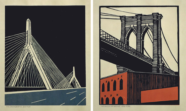
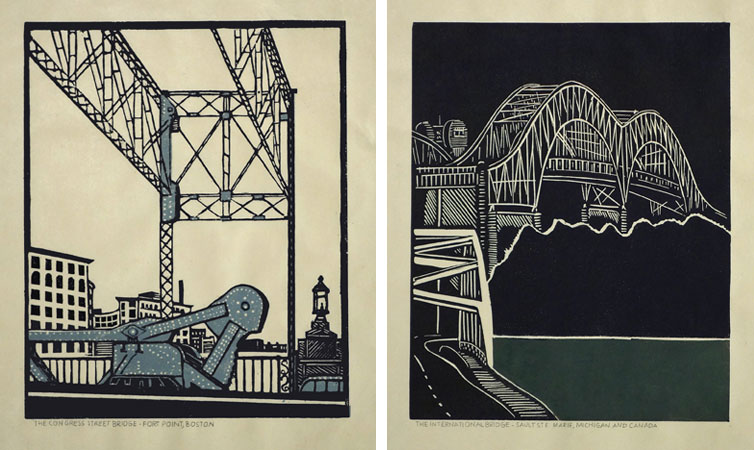
    4. My Hand: A Desert Inspired Edge for Dune
    5. August // Bookbinder of the Month: Mark Cockram
    The interview with Mark Cockram captures the boisterous and enthusiastic charms of both his personality and love of the craft. Each post examines the intensity of his designs and complexity of his techniques.
    6. Conservation Conversations Column
    Beginning this year, I invited six of my colleagues working in conservation to post about a field that encapsulates their professional lives. Topics range from using the appropriate adhesive and what to consider when building a conservation lab to various conservation considerations and philosophies.

    bestof2014c

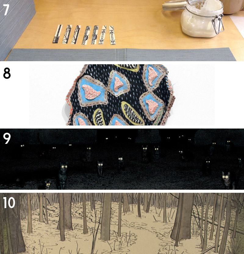
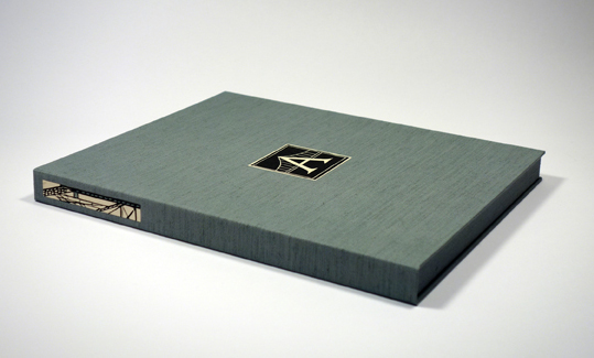
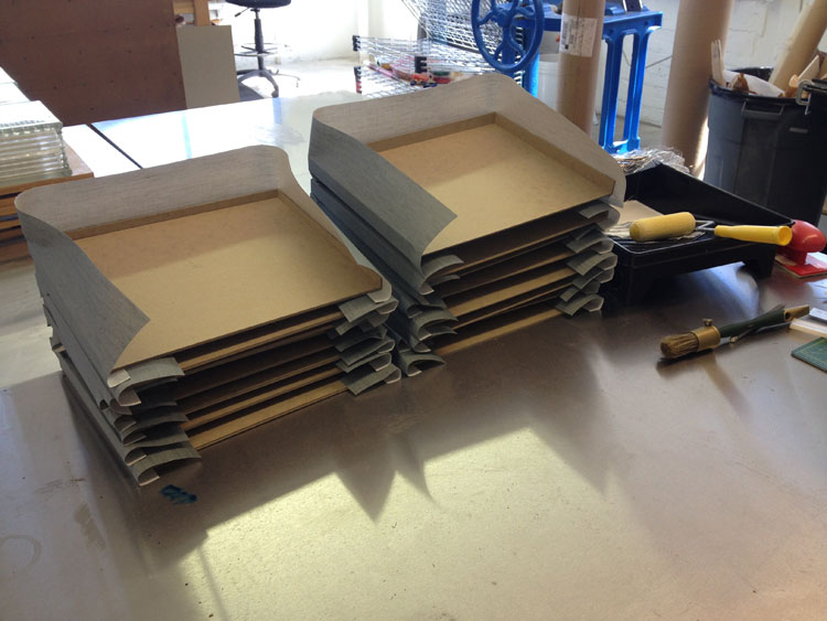
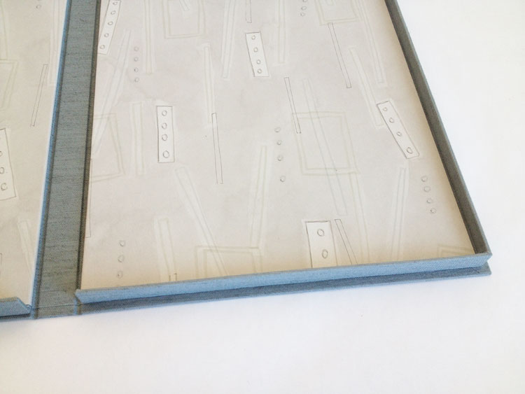
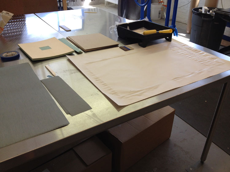
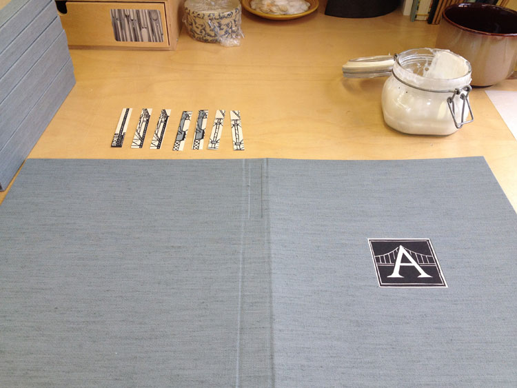
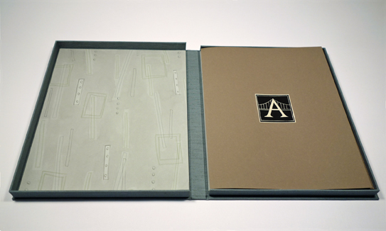
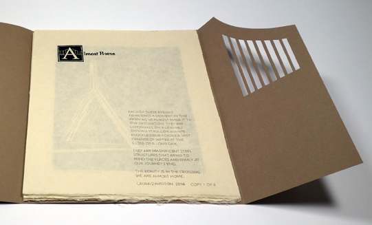
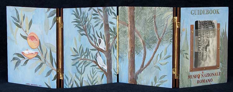
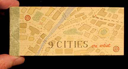
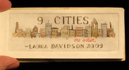
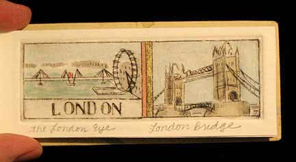
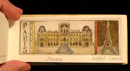
    7. My Hand: Boxes for Laura Davidson
    My first project with Laura Davidson after interviewing her on my blog.
    8. Artist: Lydia Hardwick
    9. Photographer: Andrea Galvani
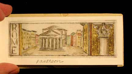
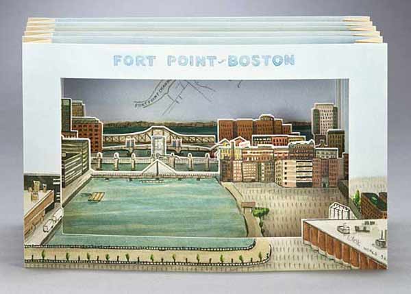
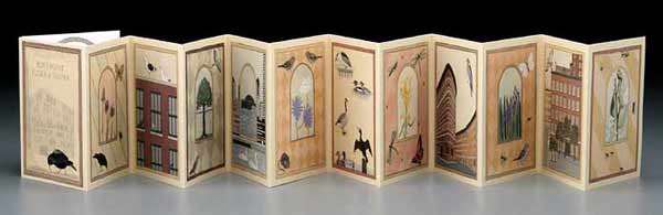
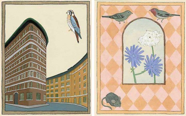
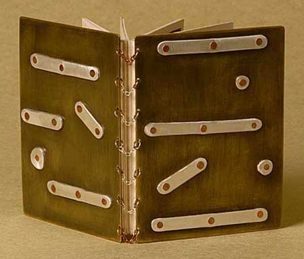
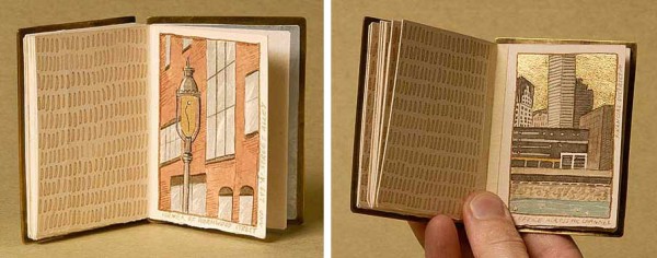
    10. January // Book Artist of the Month: Mary Uthuppuru
    I’m so charmed both Mary Uthuppuru and her work. She really engages the craft by exploring and experimenting with bookbinding and printmaking techniques. Mary is quite inspiring.

    bestof2014d

    11. November // Bookbinder of the Month: Sol Rébora
    It was a pleasure to interview Sol Rébora. Her insights to bookbinding in Argentina were refreshing, as are her imaginative and unique design bindings.
    12. February // Book Artist of the Month: Diane Jacobs
    Diane Jacobs employs important topics like feminism, body issues and societal issues against women in book arts and other art forms. I am very engaged and compelled by these issues and enjoyed dissecting her work in the interview.
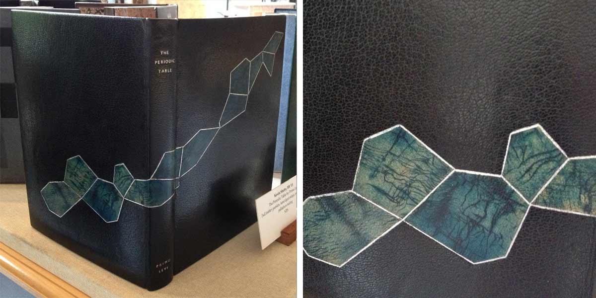
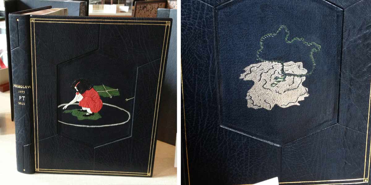
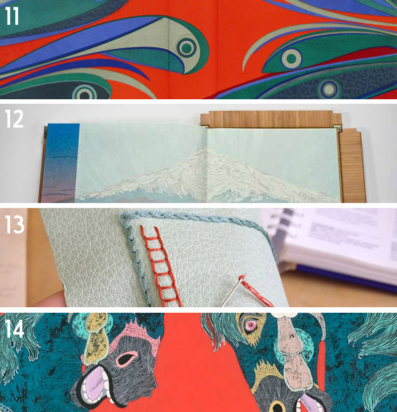
    13. My Hand: Leather Embroidery Samplers
    14. Artist: Jennifer Davis

    Happy New Year!


  2. My Hand // Boxes for Laura Davidson

    September 19, 2014 by Erin Fletcher

    LauraDavidsonBoxes6-ErinFletcher

    Photo courtesy of Laura Davidson

    A while back, I had the chance to interview the artist Laura Davidson as a part of my Book Artist of the Month series. Since then, Laura and I have stayed in contact with each other, which has given me the opportunity to view some of her works in their various stages. Most recently Laura completed a set of prints illustrating various bridges across the country. These six bridges were chosen due to their close proximity to the many spaces Laura views as home. The act of crossing these bridges, Laura is filled with the anticipation of almost being home, therefore, the set of prints are aptly titled Almost Home.

    AlmostHome2-LauraDavidson

    Photo courtesy of Laura Davidson

    AlmostHome3-LauraDavidson

    Photo courtesy of Laura Davidson

    Laura presented me with the opportunity to build an edition of boxes to house the prints from her Almost Home series. I was quite elated. I’ve really enjoyed Laura’s work and was excited to be working with her. Laura knew she wanted a clamshell box, something sleek and clean. I’m came by her studio and we discussed material options and how the prints would fit in the box.

    After everything was settled and the materials were ordered, I began working on the small edition of 8 clamshell boxes. Clamshell boxes are pretty straight forward, but with Laura’s boxes I would be adding a few custom elements. First, the base of the interior tray would include some padding. The prints themselves had no discernible thickness, but Laura wanted the box to be at least ½” thick.  So the outward appearance of the box was the right height for Laura and the interior height of the tray was right for the prints.

    Once the binders board was cut and the trays were assembled, it was time to cover them. Laura chose silver Canapetta cloth for its durability and textural qualities. The color also complimented the prints and the industrial feel of bridges. To streamline the process I used a small paint roller and paint tray filled with PVA.

    LauraDavidsonBoxes7-ErinFletcherLauraDavidsonBoxes2-ErinFletcher

    The second custom element came as the material used on the lining of the trays. Laura provided me with 8 sheets of hand-drawn decorative paper. Using a combination of ink and markers, Laura’s custom lining paper pulled imagery from the prints and grabbed colors from the boxes and brown wrapper. Below is an image of one of the finished boxes showcasing the lining.

    LauraDavidsonBoxes9-ErinFletcher

    Finally, it was time to make the cases, which were also covered in silver Canapetta cloth. Before covering, however, I had to create a label well on the front cover board and the spine piece. Each of these wells would be filled with a printed label that Laura had provided me. I also used a paint roller to streamline the process of making the cases.

    LauraDavidsonBoxes3-ErinFletcherLauraDavidsonBoxes4-ErinFletcher

    The hand-printed label on the front cover is an ‘A’ both acting as the support beams of the bridge and the first letter to the title of the series. The label on the spine came from extra prints from the series. Laura artistically cut down the print to isolate some compelling and inciting imagery.

    It was quite a joy to create these boxes and to work for an artist as talented as Laura!

    LauraDavidsonBoxes5-ErinFletcher

    Photo courtesy of Laura Davidson

    LauraDavidsonBoxes8-ErinFletcher

    Photo courtesy of Laura Davidson


  3. Vote for Laura Davidson!

    May 31, 2014 by Erin Fletcher

    OldNorthernAveBridge-LauraDavidson

    Mayor Martin J. Walsh and the Boston Art Commission invited Boston artists to submit artwork that captures contemporary life in the city to be presented as gifts to visiting diplomats and distinguished guests. Five semi-finalists were chosen from a wide range of applicants and the winner will be determined through an online voting process. 

    Check out the website and vote for your top three favorites. Consider voting for Laura Davidson! Her work is greatly inspired by the city of Boston, a place she’s called home for several decades. She has been featured on my blog in the interview series back in 2013, which you can check out here

    Thanks for participating!


  4. North Bennet Street School // Student & Alumni Exhibit 2013

    May 30, 2013 by Erin Fletcher

    At the annual Student & Alumni Exhibit for North Bennet Street School, the 2013 graduating Bookbinding class* showcased their design bindings for the set book The Periodic Table by Primo Levi. The text is largely a memoir of the years before and after Levi was transported to Auschwitz. Through a set of chapters titled after elements on the periodic table, Levi recounts his Jewish community in Italy and his life as a student and young chemist; exposing how life’s pleasures can resist and endure in the face of tyranny.

    studentalumni-kevinsheby

    Kevin Sheby bound his edition in black goatskin with hand-dyed goatskin onlays, tooled with palladium. The title and author are also hand tooled in palladium. Edges decorated with graphite and irregularly gilt with palladium. Kevin finished off the inside covers with black goatskin doublures and sunken ebonized veneer panels.

    studentalumni-jeannegoodman

    Jeanne Goodman covered her binding in full navy blue goatskin with sunken hexagon panels on either cover displaying two illustrations from the text. Each illustration is created through the use of several decorative techniques including feathered onlays, tooling in blind and gold and surface gilding in palladium. A tooled double border in gold runs along the outer edges of the covers. All three edges are gilt in gold and the interior is finished with handmade graphite paste papers.

    studentalumni-katrinakiapos

    Bound in full black goatskin, Katrina Kiapos, accented her design binding with a minimalist, geometric design. Three onlays in shades of black and grey mirror each other from the front and back covers. Katrina hand tooled the title and author in palladium. Edges decorated with graphite and sprinkled with palladium. The interior is covered with black goatskin doublures and leather flyleaves.

    studentalumni-betsyroper

    Betsy Roper bound her design binding in full hand-dyed goatskin. The skin was dyed to have a mottled look, creating texture and movement. Various hexagons are placed on the front and back cover, both protruding from and sinking into the boards. Title hand tooled in blind. Edges decorated in a soft brown tone. A marbled paper accents the island paste down and flyleaf.

    studentalumni-averybazemore

    Avery Bazemore created a design to reflect the chapters of the book, emphasizing the section about gold with a surface gilt square onlay on the front cover. The book is bound in full grey goatskin with additional onlays in black goatskin. Title and author were hand tooled in carbon. Head edge decorated before sewing in graphite; Avery again emphasizes the chapter in gold by gilding that particular section of the text. The single line continues onto the headband and headcap. The interior is finished off with leather doublures.

    studentalumni-laurenschott

    Covered in full dark green goatskin, Lauren Schott created a design binding reminiscent of the Art Deco era. Hand tooled gilt lines run the height of the front cover, wrapping around the spine, board edges and back cover leaving the outline of a hexagon. The title and author were also hand tooled in gold. Edges decorated with graphite and sprinkled with gold leaf.

    In addition to student work, a small handful of alumni work was also on display.

    libraryofbabel-colinurbina

    Library of Babel bound by Colin Urbina in full brown goatskin and hand tooled in a repeating hexagon pattern. A single hexagon is gilt on the front cover. Edges decorated with alternating shades of brown and chartreuse green.

    libraryofbabel2-colinurbinawhitman-samfeinstein

    A full leather rounded spine clamshell box from Samuel Feinstein. The front cover has a built-in window to house a printed portrait of Walt Whitman in addition to a gold tooled border along the frame.

    shakespeare-celinelombardi

    The Complete Works of Shakespeare bound by Celine Lombardi in full red goatskin. Titling and cover design hand tooled in gold. Each title on the spine is linked to a tab on the foredge of the text block through a corresponding gilt line.

    alumnicase-erinfletcher

    There are four great pieces on display in this case. On either corner are two of my bindings: Fantastic Mr. Fox and James and the Giant Peach. Last year, Marie Oedel paired up with book artist Laura Davidson (whom I interviewed on my blog in April) to make custom boxes for her book Every Nib. Lastly, is Celine Lombardi’s Murmurations, a small edition printed and bound during her year long fellowship at The Center for Book Arts in New York.

    * Nancy Baker’s set book was taken from the exhibit before I could photograph it for this blog post.


  5. Bonus // Book Artist of the Month: Laura Davidson

    April 29, 2013 by Erin Fletcher

    luckygirl-lauradavidson

    One of my favorite books from Laura Davidson is Lucky Girl. This unique accordion book bound with handmade hinges is inspired by Laura’s daughter, who can spot a four-leaf clover anywhere. Clovers from Michela’s collection have been delicately sandwiched between glass in each wooden page, which is also collaged with the typed text “lucky girl”.

    Since 2010, the vibrant green clovers have dried out and aged to a yellow-brown. During my visit, Laura brought out a book from her library. Tucked inside was a surprising collection of four-leaf clovers, each marked with the location where they were plucked.

    luckygirl2-lauradavidson


  6. Book Artist of the Month: Laura Davidson

    April 29, 2013 by Erin Fletcher

    ebonypencil-lauradavidson

    In 2012, Laura Davidson spent some time drawing her drawing tools. Ebony Pencils is a set of six silverpoint portraits cataloging the remaining pencils from Laura’s youth. These pencils were given to her by her father, who worked as a detailer at Studebaker’s and then the Ford Motor Company. This unique book is housed in a walnut box crafted by Laura’s father. 

    During my visit to her studio, Laura directed me towards her magnetic wall where additional drawings hung. Since Ebony Pencils, Laura has expanded to include more tools for her collection, capturing the detail of each tool. I hope these drawings will soon manifest into another delicately crafted book. 

    ebonypencil2-lauradavidson


  7. Book Artist of the Month: Laura Davidson

    April 22, 2013 by Erin Fletcher

    everynib-lauradavidson

    Not only does Laura Davidson find inspiration in her travels and her neighborhood, but also in the tools scattered throughout her studio. Every Nib is catalog of nibs and pens used in Laura’s work; housed in a clamshell box that opens to reveal a book and seven handmade pen nibs sculpted from painted paper. Every Nib was created in an edition of 18, signed and numbered, in 2012.

    everynib2-lauradavidson

    The book is bound as an accordion, delicately held together with wire and linen. Five pages of the book are block printed with unique images of five different pen nibs with descriptions written in ink. At the bottom of each page is a hand drawn pen in silverpoint. The sixth page includes an artist’s statement from Laura written in a Sheaffer’s fountain pen. A portrait of the 1940s pen is drawn in silverpoint. In the small compartment, each nib replica appears fragile, but are quite sturdy and highly detailed. Laura showed me some of the real nibs, tucked away neatly in little tins or the original Italian packaging. 

    The grey clamshell box was crafted by Marie Oedel. The box includes labels and tray linings hand drawn with pen and ink wash. The box and all its contents are protected inside a fold-over portfolio with an original linocut of a pen nib on the spine. 

    everynib3-lauradavidson


  8. Book Artist of the Month: Laura Davidson

    April 15, 2013 by Erin Fletcher

    guidebook1-lauradavidson

    Guidebook – Museum Nazionale Romano was completed by Laura Davidson in 2011 after an inspirational visit to the museum in Rome. The four wooden pages of this accordion book are connected with handmade brass hinges. The painting on the cover and exterior sides of the book are based on a frescoed room housed in the museum. A transparent vellum holder on the front cover displays a two-sided replica of the museum ticket, which was drawn using ink and wash.

    guidebook1a-lauradavidson

    The interior pages of the book are paper mosaics based upon pieces in the museum’s collection. These paper mosaics are found throughout Laura’s work and are quite beautiful (even more so in person). Each mosaic is created by adding tiny pieces of paper to a line drawing. Each piece is then painted individually by hand. Laura works with a wide color palette as she paints her mosaics, slightly altering the pigment from piece to piece. Some images are also embellished with 22 c. gold leaf.

    guidebook2-lauradavidson

    After visits to the museum in Siena Pinacoteca, Laura becomes inspired to create another guidebook.

    In Laura’s words:
    These books are about specific places that have inspired me – the Siena Pinacoteca is a place I have a very emotional attachment to. There is one floor there that I know the works so well, I can find sketches from many different visits. I can see color influences in my work from there and the deep desire to use gold leaf. 

    Guidebook – Siena Pinacoteca was also made in 2011 as a four page accordion book bound using handmade brass hinges. I had the opportunity to handle this book during my visit to Laura’s studio. The movement of the pages were very fluid, which allowed me to navigate easily through the book as both an accordion and codex. The paintings on the exterior side of the wooden pages are based on two works by Ambrogio Lorenzetti. This guidebook also includes a transparent vellum holder set in between two carved columns. The holder displays a two-sided museum ticket, which Laura recreated using ink and wash. I love this detail, the hand-drawn tickets act as souvenirs and create a connection between the artist and the viewer. 

    guidebook2a-lauradavidson

    The interior pages are ink and wash drawings depicting details of paintings within the museum’s collection. The images are embellished with 22 c. gold leaf.


  9. Book Artist of the Month: Laura Davidson

    April 8, 2013 by Erin Fletcher

    9citiescover-lauradavidson

    In 2009, Laura Davidson took inspiration from the cities that she visited and created 9 Cities, One Artist in a small edition of 7. Each hand colored dry point print depicts a monument from each respective city and includes a handwritten caption naming the buildings. The beautiful, muted color palette is a lovely contrast against the vibrant 22 c. gold details. There are 10 prints in total.

    The book is on a smaller, more intimate scale measuring 2″ high by 4½” long. 

    A few words from Laura regarding her work:
    I love to travel and have been so inspired by it. I think it is good to get out of the studio and look at what is out there and what can inspire.

    9cities-lauradavidson 9citieslondon-lauradavidson 9citiesparis-lauradavidson 9citiesrome-lauradavidson


  10. April // Book Artist of the Month: Laura Davidson

    April 2, 2013 by Erin Fletcher

    fortpointtunnelbook-lauradavidson

    Fort Point-Boston is part of an ongoing series of tunnel books from artist Laura Davidson completed in 2011. The point of view shows the harbor walk from the Gillette building to the Boston Harbor, passing by bridges and buildings along the Fort Point Channel. Each copy is numbered and signed. Laura’s tunnel books are available through her website or at the Made in Fort Point store.

    I’ve been working in the Fort Point neighborhood of Boston for almost a year now and I’ve already seen changes in the landscape around me. Laura has been in Fort Point for 30 years. After realizing that we are practically neighbors, Laura so graciously invited me to visit her studio. Laura pulled piece after piece out of her display cabinet, allowing me to handle each one. We discussed details of her work from the handmade hinges to the paper mosaics to the various nibs Laura uses to create her drawings. After surveying Laura’s work one can clearly see how her environment both in and out of the studio acts as inspiration. Laura has created several works showcasing her point of view of a neighborhood to which she calls home.

    fortpointflorafauna-lauradavidsonflorafaunadetail-lauradavidson

    Fort Point Flora and Fauna is an offset printed accordion book from 2003. One side showcases full color drawings of the various animal and plant-life in the Fort Point area that Laura has observed. The reverse side is sepia toned text giving explanation to the images. I first saw this lovely little book at the FPAC Gallery and it opened my eyes to the idea of nature thriving in the urban environment of Fort Point. Now as I walk around the neighborhood I find myself being greeted by signs of life. Most recently a wild turkey, but I image that was quite unusual.

    fortpointilluminated-lauradavidsonilluminateddetail-lauradavidson

    In 2006, Laura created Fort Point Illuminated, a miniature book filled with images of her neighborhood. Each image is painted with ink and wash and illuminated with gold leaf. The covers are sterling silver with copper and brass elements and is bound with a sterling silver necklace chain. This book is in the Collection of the Boston Athenaeum.

    It was a real treat to meet Laura and get a glimpse of her studio life. An organized and inspirational workshop is conducive to creating successful pieces of art. On one side of Laura’s studio is a completely magnetized wall, where Laura displays old tintype portraits, pieces of ephemera, fragments of her current work and photographs of her family. A magnetized wall is quite appealing and something I may implement in my studio. 

    I want to thank Laura again for inviting me into her studio and sharing stories of her work and life with me.

    Read the interview after the jump and come back each Monday in the month of April for more of Laura’s work.

    read more >


  • My name is Erin Fletcher, owner and bookbinder of Herringbone Bindery in Boston. Flash of the Hand is a space where I share my process and inspirations.
    The StudioNewsletterInstagramEmail me
  • Archives