RSS Feed
  1. Book Artist of the Month: Diane Jacobs

    February 24, 2014 by Erin Fletcher

    Cloudland1-DianeJacobs

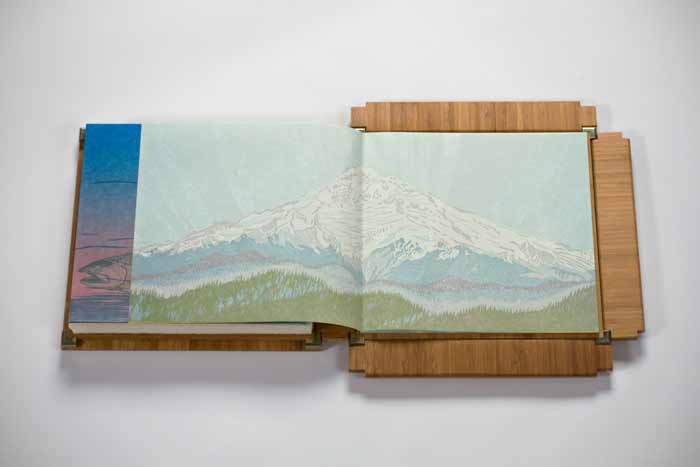
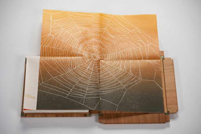
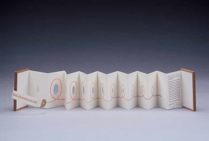
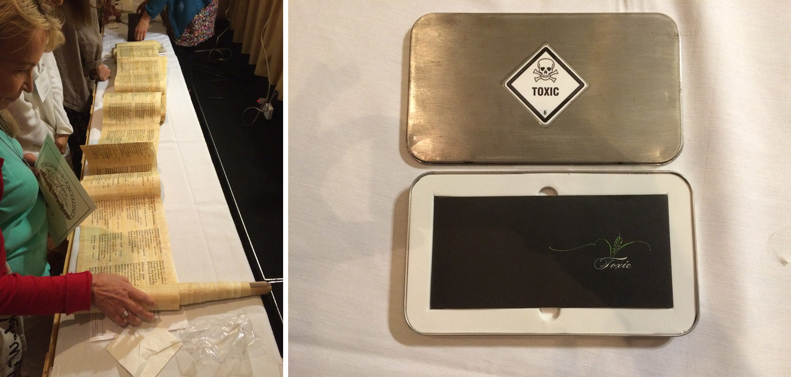
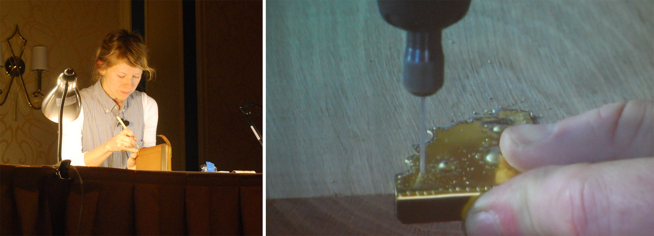
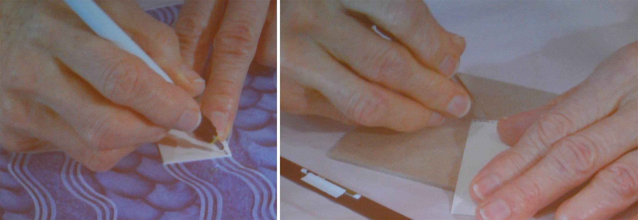
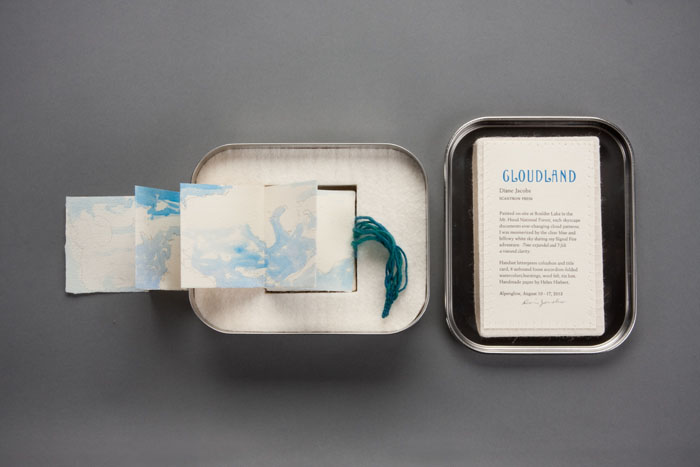
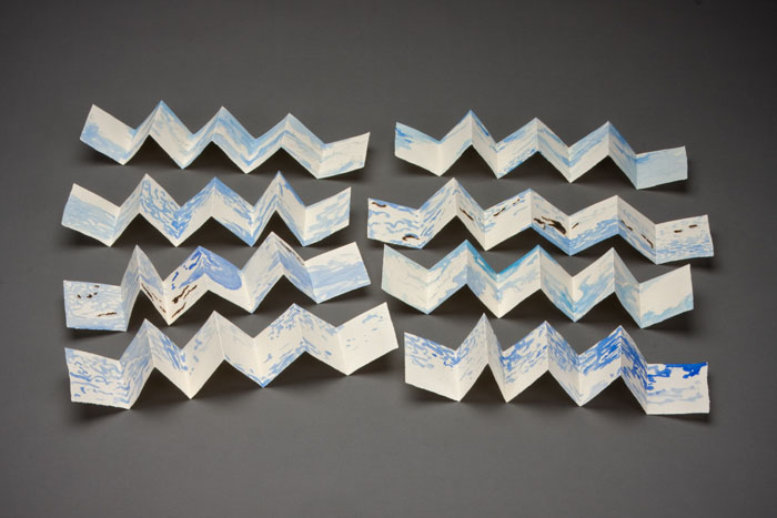
    Housed inside this tin box is the miniature artist book Cloudland. Painted on site in the Mt. Hood National Forest, Diane Jacobs captures the altering cloud patterns viewed across the sky with the use of watercolor and slight burning of the paper. The eight accordions inside the tin fold out to 18″ long by 2.5″ tall.

    Cloudland2-DianeJacobs Cloudland3-DianeJacobs

    I was particularly drawn to this artist book due to my fondness for clouds and the gorgeous typeface you used for the title page. The cloud formations were painted on site at Boulder Lake in the Mt. Hood National Park, was this outing planned or were you unexpectedly struck by inspiration?
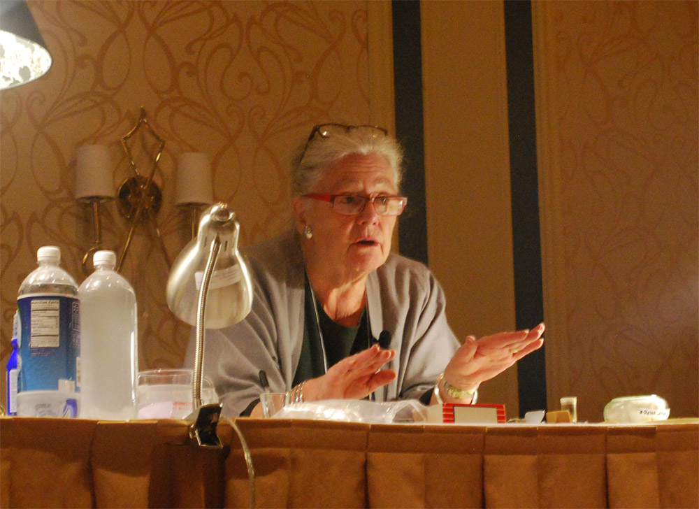
    I painted all the accordion folios on site. I had an idea to do a book about clouds before going on the Alpenglow backpacking trip with Signal Fire. The first part of the trip was backpacking then we could retrieve art supplies for the remaing 3 days where we were stationed at Boulder Lake. While planning for the trip I folded up some paper trimmings to take with me. For CLOUDLAND I used handmade cotton paper scraps from Helen Hiebert.


  2. Book Artist of the Month: Diane Jacobs

    February 17, 2014 by Erin Fletcher

    Nourish1-DianeJacobs

    Housed in an elegantly crafted bamboo box are a series of prints under the title Nourish. This unique artist book was created by book artist Diane Jacobs in 2012. The book explores both the natural and man-made systems in which we as humans depend on in our daily lives. As you advance through the book, these complex systems are displayed within a delicate balance of beauty and harshness. 

    Nourish5-DianeJacobs Nourish2-DianeJacobs Nourish3-DianeJacobs Nourish4-DianeJacobs

    This is such a beautiful artist book and is quite complex with the range of materials. The illustrations are so delicately printed; I especially love the ghost image on the reverse. The structure is so flawless, can you talk about the choices you made for how the prints would be housed and read?
    My goals were to investigate color, play with the transparency of gorgeous Gampi paper, wow the viewer with complex reduction prints, and engage with the viewer to ask questions and think more deeply about the interconnectedness of all living things and the state of the environment. At first I thought the book would be bound but soon realized it needed to be free and every folio needed to be opened twice (or four times in the case of the starling murmuration). I wanted the box to collapse and this took a lot of ingenuity by Mark Burdon. The clincher was relinquishing the idea of purchasing a prefab hinge. Once we realized we had to design it, it came more quickly.

    Watch the video below to see how the book unfolds.


  3. Book Artist of the Month: Diane Jacobs

    February 10, 2014 by Erin Fletcher

    WovenUndergarments-DianeJacobs

    Over a three year period, Diane Jacobs, compiled a list of slang and derogatory words used to exploit women. Sources for this list came from friends, family, strangers and several slang dictionaries. The words were set individually out of type and letterpress printed. These printed strips were then used to weave women’s undergarments and hats offering references to women’s craft, the body and our misogynist culture. 

    WovenUndergarments2-DianeJacobs

    This work has been exhibited at the Gallery Paule Anglim in San Francisco and the Hoffman Gallery at Oregon College of Art & Craft.

    WovenUndergarments3-DianeJacobs WovenUndergarments4-DianeJacobs

    I think it’s important to distinguish that a word can be ingested as either derogatory or empowering based on the context of the situation. I think your Woven Paper Undergarment series is teetering towards empowerment; allowing the woman to be in control and wear these words with confidence and pride. Can you talk about your overall concept behind this work?
    I am really glad you feel that way. I started this body of work after an experience I had in a Bart station in San Francisco right after being at a Gorilla Girls event. A man asked me for a quarter and I gave it to him. He said “thanks honey” and I said “ don’t call me honey” and he flew out of control calling me every name in the book. After that I picked up a dictionary on slang and derogatory words. I painstakingly hand-set many many words for this body of work. The words lost their negative power and I reclaimed them.


  4. Book Artist of the Month: Diane Jacobs

    February 3, 2014 by Erin Fletcher

    TheBlackHole-DianeJacobs

    The Black Hole is an intimate miniature accordion that explores the personal issues one may feel about body hair and so of, course it includes a surprise hairball at the end. The accordion can be read on either side and is letterpress printed with wooden covers and a parchment strap. This artist book was created in an edition of 45 by Diane Jacobs back in 2003. 

    TheBlackHole2-DianeJacobs

    In your work, you demonstrate the versatility of hair as a medium by forming hairballs, felted shapes and using full locks of hair to loose strands. Do you enjoy manipulating hair one way more than another?
    I love to roll my own hair into balls. It is very easy because of it being curly and relatively fine. But I discovered that I can pretty much roll anyone’s hair into a ball. I like comparing different hair color and texture in the ball form. I like the association of a hairball being something else when put in a different context such as the hairballs in the gum ball machine. I also enjoy weaving hair in the combs to spell out words.

    HairChart-DianeJacobs Tails-DianeJacobs Combs-DianeJacobs

    I noticed you only use hair with natural color. Do you avoid artificially colored hair for a reason?
    I am sure some of the hair I use is dyed. Personally I have always liked the natural  color of someone’s hair. I have used a bit of blue hair but that has been the only really artificially colored hair I have in my massive collection.


  5. February // Book Artist of the Month: Diane Jacobs

    February 2, 2014 by Erin Fletcher

    HairTalk3-DianeJacobs

    Hair Talk is a three volume artist book set that was created by Diane Jacobs over the course of three years from 2009 to 2011. The structure is inspired from a binding by Roberta Lavadour, except in this case, Diane binds the series in human hair. The content within each book are the collected replies to a set of questions, where an individual wrote about their feelings regarding their own hair. 

    The books are letterpress printed and bound with covers made from Cave Paper. 

    HairTalk2-DianeJacobs

    When binding this book with human hair, did you find the material to be tricky to work with or did you treat the hair first (like a bookbinder would wax their thread)?
    I learned this binding from Roberta Lavadour. It is a twine binding technique that she invented. Instead of twine I used human hair and transparent thread that resembles hair. Each folio is a set of four questions, so in order for that particular person’s responses to stay together I needed to sew each folio individually into the spine. With Roberta’s book, she would sew a thick signature with each twine line. I did not treat the hair with anything. It was a little tricky, but do able.

    The way a person chooses to wear and style their hair can suggest a lot about them, whether these connotations be positive or negative. What did you hope to extract from this survey and what did you find to be surprising?
    I was surprised that more people did not want to trade their hair in for different hair. The majority of people wanted to keep their hair. My questions were not about style (that would have been interesting) they were:            
    Question 1: Describe your hair (color, texture, body, length…)
    Question 2: What don’t you like about your hair?
    Question 3: What do you like about your hair?
    Question 4: Would you trade your hair in for different hair? If so, what would it be?

    HairTalk4-DianeJacobs HairTalk5-DianeJacobsHairTalk-DianeJacobs

    Diane’s work is intriguing and thought provoking. She is driven by the language that inhabits issues surrounding women, racism, equality and other social issues. Her work spans over several mediums from artist books and sculptures to prints and two-dimensional pieces. This month long interview will cover some of Diane’s artist books plus a few additional pieces I found to be relevant to my set of questions. 

    See the interview after the jump and come back each Monday during the month of February for more posts on the work of Diane Jacobs. She discusses her materials and inspirations sources such as feminism and nature. 

    Continue Reading


  6. Marc Jacobs :: Resort 2013

    October 2, 2012 by Erin Fletcher

    Marc Jacobs is by far my favorite designer, surprising me season after season. Using Cindy Sherman’s Clown Series as a platform, the 2013 Resort collection incorporates oversized costume-like garments decorated by either oversized or shrunken patterns in a vivid range of colors: polka dots paired with plaids, folk florals, carnations, butterflies and lace. 


  7. List of Interviews // Bookbinders & Book Artists

    January 30, 2023 by Erin Fletcher


    Bookbinders:
    Kathy Abbott
    Hannah Brown // update
    Eduardo Giménez Burgos
    Mark Cockram
    Coleen Curry // update
    Benjamin Elbel
    Annette Friedrich // update
    Karen Hanmer
    Derek Hood
    Lang Ingalls
    Monique Lallier
    Tini Miura
    Lori Sauer // update
    Sol Rébora
    Tracey Rowledge
    Sonya Sheats
    Haein Song
    Book Artists:
    Jody Alexander
    Amy Borezo
    Sarah Bryant
    Susan Collard
    Laura Davidson
    Dianna Frid
    Roni Gross
    Diane Jacobs
    Ellen Knudson
    Sarah McDermott
    Michelle Ray
    Natalie Stopka
    Mary Uthuppuru


  8. Guild of Book Workers – Standards of Excellence Seminar // Charleston 2016

    October 24, 2016 by Erin Fletcher

    After an adventuresome time in Durham, North Carolina, where I consumed delicious local brews, lost at shuffle board, ate so many southern dishes, visited Duke’s conservation lab, toured a lemur center and discovered that I’m still allergic to mosquito bites, Henry and I embarked on our drive to Charleston, South Carolina.

    Upon our arrival we were greeted by Tropical Storm Julia, but luckily the next few days proved to be quite lovely with very little rain. After checking in, I began to rummage through my conference packet and found my name tag, which was beautifully done by local calligrapher Elizabeth Porcher Jones.

    charlestonstandards15

    Day One:
    The conference began with a tour to the Charleston Library Society, an absolutely charming space that also served as the venue for the opening reception later that evening. Our tour began with Anna Smith, Special Collections Librarian, who gave us an overview the Society’s establishment and shared a few treasures from their collection. We were then led to the first floor by Kerri Harding, Director of Bindery and Conservation Studio, where she showed off their delightfully quaint bindery space. Having just relocated to Charleston, Kerri shared with us the range of her upcoming projects: a presentation leather binding, rehousing and holiday ornaments showcasing the Society’s newest titles.

    charlestonstandards1a charlestonstandards2

    Day Two:
    The first presentation of the conference was Drawn to the Writing given by calligrapher Cheryl Jacobsen. As a freelance artist living in Iowa City, Cheryl’s work ranges from design and lettering to illustrations and art. She began her presentation with her personal history on how her interest in art and lettering developed before going into a slideshow of her work. Cheryl is also an adjunct assistant professor at the University of Iowa, teaching courses at the Center for the Book. Over the course of the presentation, Cheryl created a certificate to commemorate the conference using a variety of letter forms. She spoke about line formation (this included pressure and hand position), nib use, ink/pigment preferences and tricks of the trade.

    charlestonstandards3

    At the end of presentation, the audience was rewarded with a copy of the certificate Cheryl produced during the presentation (she even offered to add your name to the certificate). We were also allowed to handle some of her artist books.

    charlestonstandards4

    For the afternoon presentation, the topic switched to bookbinding in Exploration of history and techniques for Pennsylvania German Liturgical Bookbinding before 1850. The presentation was divided into two parts: Chela Metzger, Head of Library Conservation at UCLA, demonstrated the construction of the binding and Erin Hammeke, Senior Conservator at Duke University, demonstrated the techniques used to create the bosses and clasps traditionally seen on this style of binding.

    charlestonstandards5

    Chela quickly went through the construction of the binding. The book used in the demonstration was sewn in an abbreviated pattern (usually 2-on) using thicker supports (usually two supports as one), the shoulders are quite narrow and the edges were (historically) ploughed. The wooden boards (oak or beech; usually quarter-sawn) are heavily shaped along the spine and fore edge on both sides of the board. The fore edge is also notched in preparation for the clasps. The spine is lined with linen strips that extend beyond the shoulder. Unlike most wooden board structures, the boards are not laced-in. The sewing supports are frayed and adhered to the first and last leaf, then the linen is adhered to sandwich the frayed cords. The text block edge is colored after the boards are attached, then the hand-sewn or hand-woven endbands are stuck-on.

    One of my favorite parts of the presentation was the brief demo given by Chela on the technique behind the woven endbanding material. Using a make-shift back-strap loom (popsicle crafts!), she wove a traditional white and blue endband strip. A variety of endbands have been spotted on these bindings. The image below (on the right) shows just two varieties with the hand woven style on the bottom.

    charlestonstandards6charlestonstandards7

    Chela’s portion of the presentation continued with the covering of the book and tying up the spine (this step ensures that the leather adheres to either side of the supports). The last step presented by Chela is one of the defining characteristics of this binding: the leather spine straps. Appearing on the spine at the head and tail (and sometimes the middle) many examples are seen adorned with brass studs or domes.

    charlestonstandards9 charlestonstandards8

    Using a 24-gauge brass sheet, Erin demonstrated the process for creating the corner pieces for the binding. Beginning with a flat piece of brass, Erin roughly traced out the design with a sharpie. Then she cut down the brass close to her design with metal snips; shaping it even further with needle files and emory paper. Supporting the brass with a lead block, Erin began to decorate the brass corner piece by striking the back with steel punches. This did not create a hole, rather pushed the brass into a shape that would be raised on the front side. In the image above (on the right), Erin uses a drill to create holes where the nails will be inserted when attaching the furniture to the book. After attaching this corner piece to the book, Erin began to bend the extended brass around the edge of the board with her fingers and finished its shape by striking the brass with a planishing hammer.

    Day two ended with a social gathering at a local pub for a Mentor-Mentee Happy Hour, those new to their field were encouraged to speak with the more accomplished participants. Afterward, I broke off with some friends for a very quick bite to eat before going on a Ghost and Dungeons tour through Charleston.

    Day Three:
    One the third and final day of the conference, two more presentations were given. The morning presentation was given by Betsy Palmer Eldridge on Paper Conservation Treatment Revisited. In 1989, Betsy gave a presentation at the Standards conference in Portland, this year she presented a revised version of that lecture.

    charlestonstandards10

    Betsy was introduced to book arts during her time at Wellesley College in 1957 and further advanced her training in Germany and France. In 1973, she moved to Toronto, where she established and maintained her private conservation studio. Betsy has been an active member of the Guild since 1960 and the Canadian Bookbinders and Book Artists Guild since 1983. Betsy gave an overview of a variety of conservation techniques and tricks she has picked up along the way. Many of the presentation materials she referred to were used in her original presentation 27 years ago, it was quite interesting to see how the materials had changed or retained their vibrancy over the years.

    The final presentation was on Herrnhuter Paste Paper given by Deborah Evetts. At the start of her presentation the audience received a brief history lesson paired with images of these papers collected from several sources. During the last third of the 18th century, a group of Moravian sisters living in a religious community at Herrnhut in Saxony created what came to be a very recognizable style of paste paper. The sisters traditionally used olive, bright or grayish blue, mustard yellows and reds in their papers. Deborah has seen several examples and has recreated tools to mimic the patterns seen on these historical papers. Herrnhuter Papers were used as both cover papers and endpapers on many common types of books such as ledgers and almanacs, but examples have also been found on works of literature, non-fiction and other genres.

    charlestonstandards11

    After the slideshow, Deborah moved onto discussing tools and paste preparation. She began with a quick demonstration on making your own tools such as combs, rolls and mylar templates. The first image below shows Deborah marking out a small piece of plastic and then cutting out the teeth using a sharp scalpel blade. Combs can be made from binder’s board, plastic container lids or vertical blinds. The second image below shows three different styles of paper that utilize the same decorative roll and the handmade rolls that Deborah has made. The designs were carved out of linoleum and attached to craft rollers.

    charlestonstandards13charlestonstandards12

    Over the course of the presentation, Deborah created several styles of the historical patterns seen on Herrnhuter Papers. She demystified so many patterns. One in particular that I was excited to see was the two-finger swirl. The crowd gave Deborah a round of applause after each paper blossomed before our eyes. Deborah was so delightful and high-spirited in her presentation and it was a great way to end this year’s series of presentations.

    charlestonstandards14

    At the end of the evening, we all gathered in the Colonial Ballroom at the Francis Marion Hotel for the banquet and live auction. Also during this time, two members of the Guild are rewarded with the Laura Young Award and the GBW Lifetime Achievement Award. Catherine Burkhard was awarded the former for her dedication and long-time service to the Guild. The latter was awarded to Peter Verheyen, celebrating his achievements in the fields of conservation, bookbinding, book arts and creating a thriving online community. As the night came to a close, I allowed my nose to be traced, said my goodbyes and wished everyone  safe travel back home. Looking forward to next year’s conference in Tacoma, Washington!


  9. Trip to the 2015 New York Antiquarian Book Fair

    April 21, 2015 by Erin Fletcher

    On April 10th, I took the train down to New York City for the annual Antiquarian Book Fair and shadow show put on by the Fine Press Book Association. I spent the weekend ogling over a delightful selection of fine bindings, artist books and finely pressed editions amongst a sea of rare objects and books. I wanted to highlight a few of the gems that I saw, which there were many.

    BookFair1-ErinFletcher

    My first stop was at the shadow show, where I am afraid I was less of spectator (I only captured two images from this event). My first stop was at the Two Ponds Press table where I had a wonderful conversation with co-found Liv Rockefeller and browsed through some Gehanna Press editions and Gray Parrot bindings.

    Next, I stopped at the table of book artist Sue Higgins Leopard of Leopard Studio Editions, whose work is pictured above. We discussed the concepts behind a few of her pieces on display. After browsing through the selection of large-scale artist books on the Booklyn table, I made a point to chat with David Esslemont on his current projects. My next notable stops were with two highly accomplished and exquisite printers: Russell Maret and Gaylord Schanilec of Midnight Paper Sales. Gaylord was quite gracious with his time and walked me through this latest and most elaborate printed accomplishment, Lac Das Pleurs. It was such a pleasure to examine each print through his eyes as he pointed out subtle details, such as how each scale of one particular fish were drawn individually to capture the unique qualities of nature.

    Before leaving, I stopped by Abby Schoolman’s booth and met bookbinder Christine Giard, whose work was on display. It was such a treat to speak with her not only about her binding training, but discuss the techniques employed in her work. My goal is to get her interviewed on the blog sometime this year (Christine gladly accepted!).

    BookFair2-ErinFletcher

    From the Lux Mentis booth: left: Russell Maret’s Interstices & Intersections | right: a book from Nancy Loeber

    I spent one and a half days exploring the Antiquarian Book Fair, which was held at the Park Avenue Armory. As a former storage space for weaponry and tanks, the room was massive and has been transformed for several types of events and art installations. My first stop was at the Lux Mentis booth run by Ian Kahn. He always has delightfully strange and unique items on display, such as the work of Diane Jacobs and some fellow colleagues of mine Colin Urbina and Gabby Cooksey.

    As I wondered through the aisles, I stumbled upon one embroidered binding after another. If you are regular to the blog, you know my fascination with historical embroidered bindings and creating my own. So it was pure enjoyment to see such a pristine collection of historical embroidered bindings from England and France.

    BookFair3-ErinFletcherBookFair4-ErinFletcher

    The three embroidered bindings shown above range from 17th to 18th century and were found at the  Librairie Camille Sourget booth, a dealer from France. Click on the image to see the detail of the embroidery work.

    BookFair5-ErinFletcher

    Over at the Musinsky Rare Books booth were three really beautiful examples of embroidered French pocket Almanacs. I choose to include my two favorites. The example on the left has a great example of couched ribbon creating a bold border. The example on the right is bound in a luscious pink silk with painted appliqué pieces that build up the central design and dots. These pieces were in such wonderful condition, I don’t think they were carried around too often.

    BookFair6-ErinFletcher

    At the very end of the fair, my eye caught this shelf of embroidered bindings. Unfortunately, in my haste I neglected to note anything about the bindings or the dealer who was exhibiting them.

    In addition to embroidered bindings, I like to search out design bindings and binders whose name or work I recognize. One binder that popped up again and again was Brother Edgard Claes. The two books in the image below seem like they were made on two different planets, yet the bindings are actually very similar. The book on the left was spotted at the Sophie Schneideman Rare Books booth and is an example of one of Claes’ Dorfner bindings. The covers are wood veneer with delicate marquetry and hand painted elements.

    BookFair7-ErinFletcher

    The book on the right was found in the Bromer Booksellers booth. It was one of three bindings by Claes they had on display. This binding of erotica is an example of Claes’ polycarbonate bindings. The color palette is inspired by the original cover which has been included in the text block.

    BookFair8-ErinFletcher

    One binder commonly found at Antiquarian Fairs is Pierre Legrain. The binding above was found at the booth of Dr. A. Flühmann of Switzerland. I took a photograph of this particular binding because it reads so differently from his other highly geometrical designs. The emphasis on typography really grabbed me.

    I truly had a wonderful experience at the book fairs in New York City. I ran into familiar faces and met many wonderful artist, publishers and dealers. I’ll finish off this post with a charming engraved tunnel book discovered at one of the booths.

    BookFair9-ErinFletcher


  10. Best of 2014

    December 31, 2014 by Erin Fletcher

    As the year 2014 comes to a close, I want to send out another thank you to the nine bookbinders and book artists who took time away from their busy schedules to participate in my interviews. Another thank you goes to those who read and subscribe to my blog and I especially appreciate the kind comments I’ve received either in person or via email.

    Now to reflect on my year: Herringbone Bindery was busy yet again this year. I had the opportunity to work on some really great projects, amongst them were commissions from the Old State House in Boston, artist Laura Davidson and the Veatchs booksellers. An unusual amount of traveling this year took me to Rare Book School for the first time, up to Maine for a mini-conference and across the country to Vegas for the Guild of Book Workers conference.

    Things to expect in the New Year:
    – an updated website with all the projects I completed in 2014 (including some beautiful design bindings)
    – a Herringbone Bindery newsletter
    – more posts on my own projects (expect to see more on Dune as I will be covering right after the holidays)
    – another round of interviews

    As we ring in the new year, I just wanted to share my favorites posts from 2014.

    bestof2014a

    1. February // Bookbinder of the Month: Haein Song
    Haein Song was recommend to me by Hannah Brown and I was so thankful for her suggestion. Haein’s work is so clean and skillfully crafted. Her headcaps are so impeccable that I gape in awe.
    2. Artist: Marcela Cárdenas
    3. May // Bookbinder of the Month: Monique Lallier
    I greatly admire the work of Monique Lallier and was just ecstatic that she agreed to be interviewed for the blog. She has become such an influence in our field and openly shares her support and wisdom.

    bestof2014b

    4. My Hand: A Desert Inspired Edge for Dune
    5. August // Bookbinder of the Month: Mark Cockram
    The interview with Mark Cockram captures the boisterous and enthusiastic charms of both his personality and love of the craft. Each post examines the intensity of his designs and complexity of his techniques.
    6. Conservation Conversations Column
    Beginning this year, I invited six of my colleagues working in conservation to post about a field that encapsulates their professional lives. Topics range from using the appropriate adhesive and what to consider when building a conservation lab to various conservation considerations and philosophies.

    bestof2014c

    7. My Hand: Boxes for Laura Davidson
    My first project with Laura Davidson after interviewing her on my blog.
    8. Artist: Lydia Hardwick
    9. Photographer: Andrea Galvani
    10. January // Book Artist of the Month: Mary Uthuppuru
    I’m so charmed both Mary Uthuppuru and her work. She really engages the craft by exploring and experimenting with bookbinding and printmaking techniques. Mary is quite inspiring.

    bestof2014d

    11. November // Bookbinder of the Month: Sol Rébora
    It was a pleasure to interview Sol Rébora. Her insights to bookbinding in Argentina were refreshing, as are her imaginative and unique design bindings.
    12. February // Book Artist of the Month: Diane Jacobs
    Diane Jacobs employs important topics like feminism, body issues and societal issues against women in book arts and other art forms. I am very engaged and compelled by these issues and enjoyed dissecting her work in the interview.
    13. My Hand: Leather Embroidery Samplers
    14. Artist: Jennifer Davis

    Happy New Year!


  • My name is Erin Fletcher, owner and bookbinder of Herringbone Bindery in Boston. Flash of the Hand is a space where I share my process and inspirations.
    The StudioNewsletterInstagramEmail me
  • Archives