RSS Feed
  1. My Hand // Dune

    May 1, 2015 by Erin Fletcher

    It’s been a while since I wrote about my binding of the science fiction classic Dune. After sharing my technique for the edge decoration, hand-sewn headbands and the process of covering, I’m finally ready to unveil the finished binding.

    Dune11a-ErinFletcher

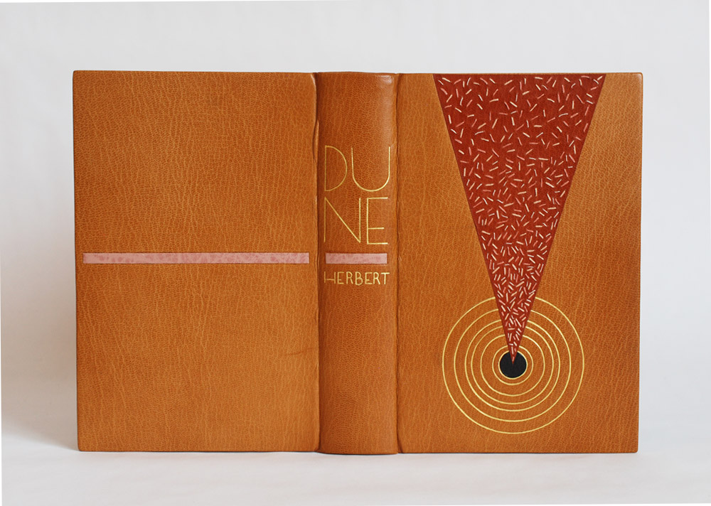
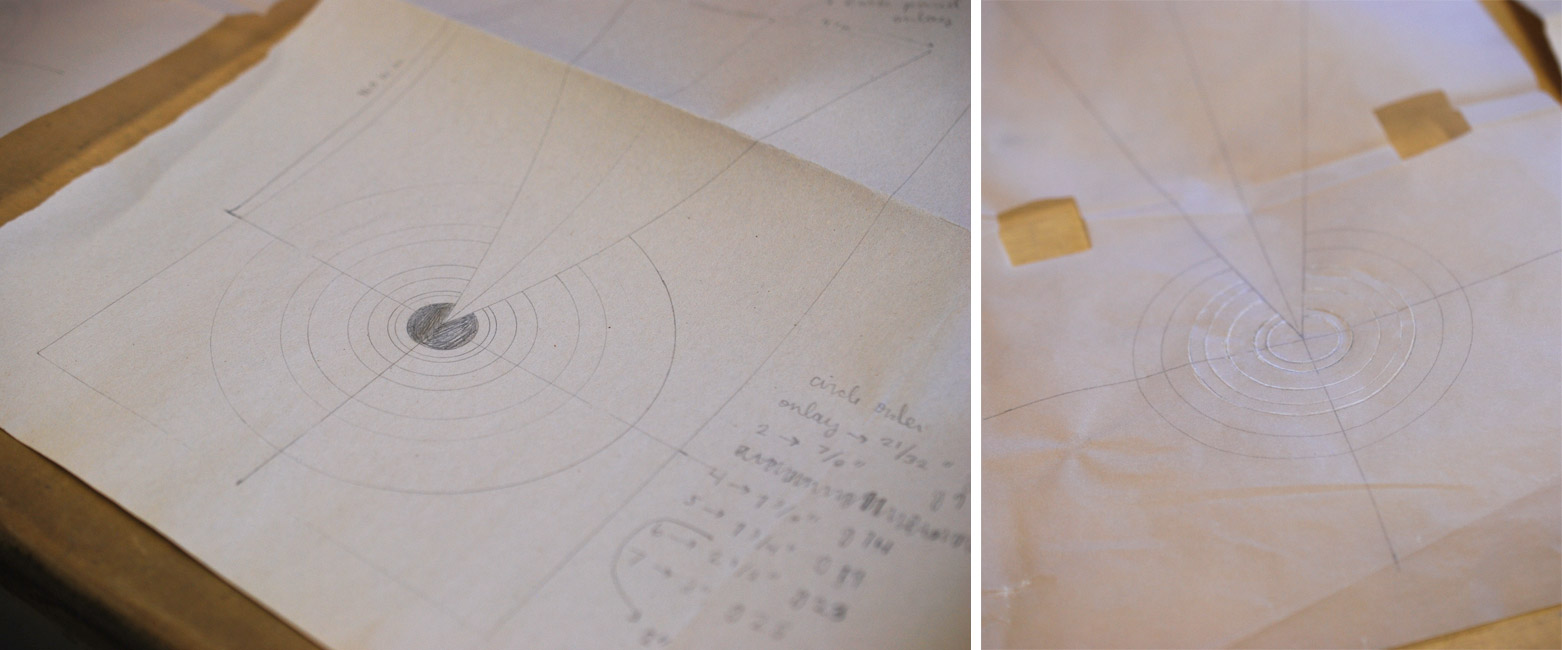
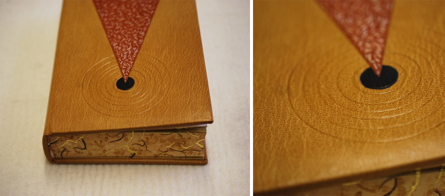
    So now I’ll go over the steps that led to the finished look. After covering and letting the book rest, I began working on the remainder of the design for the front cover, which included a series of concentric circles. All seven circles would be tooled using gold leaf, but only the inner circle would also include a leather onlay. In the image below (on the left) is my initial sketch of the front cover design. It includes a list specifying the size gouge for each circle. The image on the right is the final outline drawn on tracing paper, which includes fewer circles due to spacing issues. This also became the template I would use to transfer the design to the book (hence the wrinkles and cut out squares).

    Dune13-ErinFletcher

    In the image below you can see the tooling template attach to the underside of the front board. At this point, I’ve flipped it off the book to check the placement of the first circle.

    Dune8-ErinFletcher

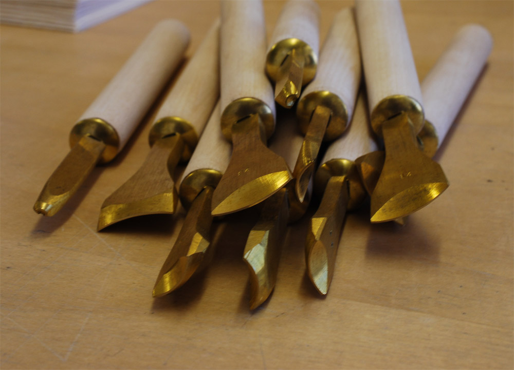
    Happy with the first circle, I continued working my way through the remaining 6 circles. Each circle was initially placed onto the leather with a plastic circle template and thin bone folder. I then used the appropriately sized gouge to make the first impression, with the tool being cold. Below is an image of all the different gouges used on the binding.

    Dune12-ErinFletcherDune9-ErinFletcher

    In the midst of winter and in an incredibly dry studio, I began to add the gold to the circles. After a few failed attempts and some adjustments I made to the atmosphere, the gold started to stick. In between the tooling process on the front cover, I moved to the spine where I tooled in the title and author’s last name.

    Inspired by the lettering seen on French fine bindings from the 1920s and 30s, I used a combination of gouges and line palettes to design my own alphabet. In the image below, I’ve finished the initial blind layer and am about to begin the gold tooling.

    Dune10-ErinFletcher

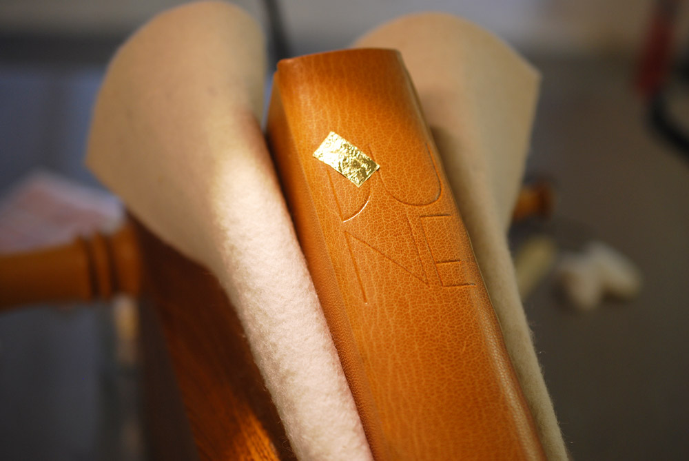
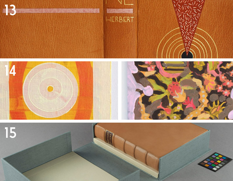
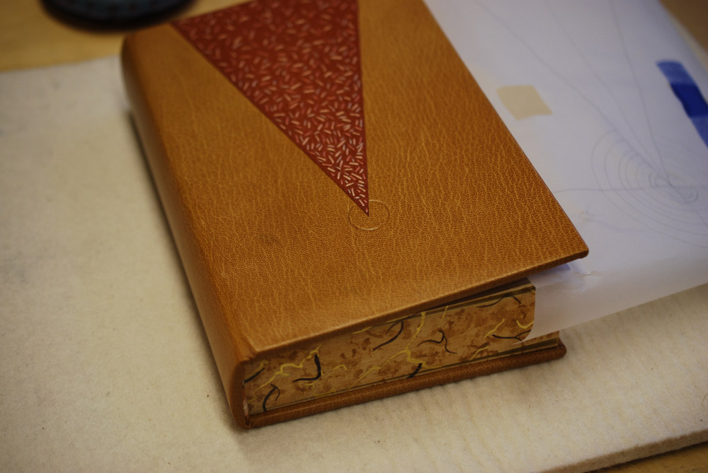
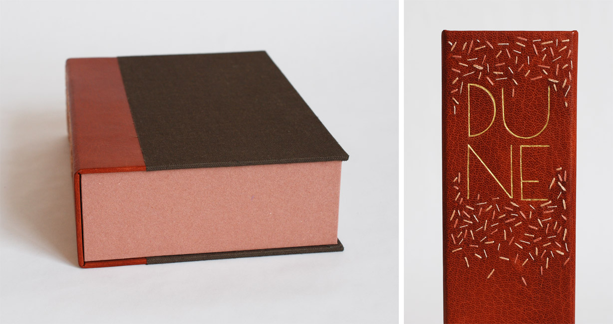
    The title and author’s name are divided by a blind tooled onlay of buffalo skin in a lovely light pink, which also appears on the back cover. This design is again a play on the French fine bindings from the 1920s and 30s.

    With the outside complete, I moved to the inside of the book. The fly leaves are a soft suede in dark brown which matches the onlay on the front cover. The matching DUNEblures (a silly nicknamed coined by my witty studio mate Colin Urbina) are tooled in a design that mirrors itself on the back cover. The angle of the lines match that of the triangle on the front cover. The spacing between the lines is consistent with the spacing between the concentric circles.

    Dune14-ErinFletcher

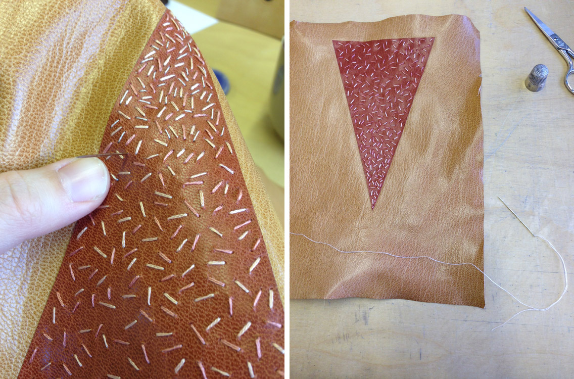
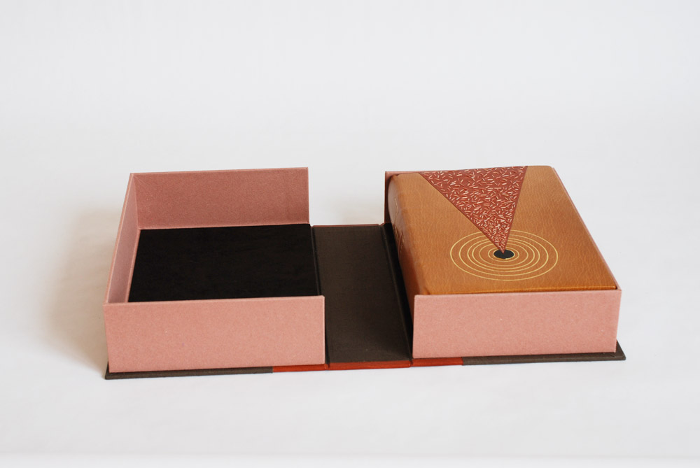
    The book is housed in a quarter leather clamshell box using the same terracotta goatskin as for the triangle back-pared onlay. The leather has been embroidered in the same fashion and tooled with the title. The rest of the case is covered in brown Canapetta cloth. The trays are covered with handmade paper I bought from Katie MacGregor and lined with the same suede as the fly leaves.

    Dune16-ErinFletcher Dune15-ErinFletcher

    In mid-April, I received the exciting news that my binding of Dune will join the Guild of Book Workers Traveling Exhibit: Vessel! This will be the second time I’ve participated in a GBW show and what’s more exciting is that this exhibit will be hosted by the North Bennet Street School. So halfway through the tour, I’ll get the chance to revisit my binding.

    The exhibit will open later this year in California and I’ll be writing a post to remind those nearby.


  2. My Hand // Covering Dune

    February 10, 2015 by Erin Fletcher

    CoveringDune1-ErinFletcher

    As I have mentioned on a prior post, my inspiration for the binding of Dune came from several sources: my husband (super fan) plus Lynch and Jodorowsky’s cinematic interpretations. Once I put pencil to paper, I drew from the geometric shapes and simple forms of the French Art Deco design bindings of the 1920s/30s.

    After creating a plaquette of the final design, I outlined the steps of execution for the covering and design work. The isosceles triangle onlay was to be embroidered, which meant it needed to be attached before any paring. The triangle onlay was pared to be incredibly thin from a terracotta Harmatan goatskin then glued down to the base tan Harmatan goatskin using PVA. It’s crucial to use PVA, since the steps for covering requires moisture which could lift the onlay if paste were used.

    In the image above, I’ve laid down a paper template (this paper template is the exact dimensions of the book, it includes the turn-ins and width of the joint). It also has the markings showing me where to glue the terra-cotta triangle onlay. Once the triangle was in place, I sandwich the leather between two acrylic boards and put it in the press to dry.

    CoveringDune2-ErinFletcher

    At this point, the leather is ready to be pared. The paring went through several stages. I began by paring the whole piece of leather using a Schärf-fix, this process turned the triangle onlay into a back-pared onlay. Next I pared the edges down in preparation to use a spokeshave to cushion pare the rest.

    CoveringDune5-ErinFletcher

    Once the skin was perfectly pared, I got straight to the embroidery of the triangle onlay. I used three different shades of pink in varying thread thickness to sew lines in a random manner (being more densely applied near the point of the triangle).

    CoveringDune6-ErinFletcher

    With the embroidery complete and the leather pared, I continued with the final steps of the plan: covering the book. I’m going to keep you in suspense to see the full design once the binding is complete! Stay tuned!


  3. My Hand // Hand Sewn Headbands on Dune

    November 11, 2014 by Erin Fletcher

    DuneHeadband-ErinFletcher

    After reacquainting myself (with the help of Jane Greenfield and Jenny Hille’s Headbands: How to Work Them) on the techniques for sewing a French double core headband, I embarked on creating the headbands for Dune. The headbands are made up of four different colored threads wrapped around two leather cords of different sizes. A third row of thread is created around a core of thread referred to as the bead. You can see this in the image above, the colored thread is wrapped around the white thread that is dangling in front of the headband. The beading step also locks the tension, keeping everything nice and orderly as you move further along the cord.

    Three of the colored threads will be used as embroidered elements on the design of the binding. The dark brown thread was incorporated to extend the dark brown pigment from the edge decoration onto the headband itself. (Click on the image to enlarge).

    DuneHeadband2-ErinFletcher

    With the headbands completed, I will be moving forward with the spine linings and board shaping. I foresee a bit of sanding in my future.


  4. My Hand // A Desert Inspired Edge for Dune

    November 6, 2014 by Erin Fletcher

    I am currently working on a first edition copy of Dune by Frank Herbert for two reasons: 1) I plan to submit it to a bookbinding competition with the hopes that it will travel around the country and 2) there is a towering stack of books from the Dune series on my husband’s bookcase and he deserves a finely bound copy of his favorite (he exhaustively quotes from) book.

    At the beginning of the design phase, I consulted with my husband for inspiration and to make sure I was capturing the spirit of this iconic science fiction novel with precision (I may have subconsciously derived some inspiration from both Lynch’s visual masterpiece and Jodorowsky’s sadly unfinished film). After finalizing my design, I began working on the binding. First step was to remove it from its trade binding and mend the signatures. After the book was re-sewn, then rounded and backed, I ploughed the edges in preparation for the edge decoration.

    DuneEdgeDecoration-ErinFletcher

    At this point in the process, I’ve already completed the decoration on the fore edge and will go through the steps to decorate the tail edge in this post. As always, I decorate the edges in the following order: fore edge, tail edge, head edge. The book is placed between two wooden finishing boards that are angled at the top in order to apply more pressure to the book’s edge.

    Before I can apply any decoration, I need to scrap and sand the edge until it has a smooth feeling and an almost sheen-like finish. I scrap the edge first with a curved scraper, then I sand the edge beginning with a course grit sandpaper and work the edge with a finer and finer grit to get that nice luster finish.

    DuneEdgeDecoration2-ErinFletcher

    The sanding phase can be an arduous task in the decoration process, but quite necessary to a successful edge. I usually sand the edge smooth, then apply my base layer of pigment, allow it to dry, then sand the edge smooth again. After the second phase of sanding, I’m ready to apply the final base layer of pigment. For the edge on Dune, I wanted to achieve the look of a cracked, dry desert ground by combining gouache and gold leaf.

    The mixture of gouache also included water and paste. I paint the mixture onto the edge, then use a sponge to thin down the color. I allow the first layer to dry a bit before applying more pigment with a sponge which offers a mottled and textured effect to the edge.

    As this layer is drying, I draw out the imagery to represent the cracks of the dry ground on some Frisket film. The cracks are going to be gilt onto the edge, the Frisket film is used to mask out the areas I don’t want to be gilt. Frisket is a great material to work with because it has a low tack and will not disturb the gouache layer underneath.

    DuneEdgeDecoration3-ErinFletcher

    In the image above you can see the mottled gouache layer through the clear Frisket film (which is also hanging over the edge of the spine). The exposed areas will be covered by gold leaf.

    in the next step, I apply a PVA wash as the size (adhesive) for the gold leaf. At first the PVA wash absorbs quickly into the edge, but eventually the PVA wash will sit on top the edge. At this point, the gold leaf can be laid down. The PVA wash acts almost like a vacuum as it sucks the gold leaf to the edge.

    Before the PVA wash is completely dry underneath, the leaf needs to be set; this can be done by carefully applying downward pressure with a piece of flannel wrapped around the squishy part of my thumb. A second layer of gold leaf is laid down using the same steps, this creates a more vibrant and fuller look to the gilding.

    DuneEdgeDecoration4-ErinFletcher

    Once the PVA wash is completely dry, I burnish the edge and remove the Frisket film. This initial burnishing of the edge is done through a protective layer of silicone release paper. After some time, when I know the edge is dry and the decoration is secure, I burnish the edge once more (this time the agate burnisher is in direct contact with the edge).

    For the final step of the decoration process, I add some accents of dark brown gouache (this mixture also included water and paste). The darker pigment is added simply with a brush in the desired areas. When I am satisfied with the decoration and the last bit of gouache is dry, I burnish the edge on last time.

    After removing the book from the press, I whack the edge against the edge of the table. This cracks open the text block, separating the pages. This step can be a bit nerve-racking, at this point any poorly attached layer can crack or flack off. Luckily my edges came out beautifully!

    DuneEdgeDecoration5-ErinFletcher

    Now on to the headbands, but not before I cap up (wrap up with a thin paper) the text block. After spending three days creating such a complex decorative edge, I want to make sure it stays safe from any scrapes or scuffs.


  5. My Hand // Designing Books

    May 3, 2020 by Erin Fletcher

    Writing about my own work has become an important part of my practice. It gives me an opportunity to reflect on my designs and techniques in addition to sharing my work with others. I hope these posts will inspire and inform others about the creative world of bookbinding.

    Design Bindings:
    2019:

    2001: A Space Odyssey by Arthur C. Clarke // one / two
    Happy Abstract by William Blake
    La Prose du Transsibérien by Blaise Cendrars with pochoir by Sonia Delaunay-Terk [Re-creation by Kitty Maryatt]

    2017:
    Feed Sacks: The Colourful History of Frugal Fabric by Linzee Kull McCray
    Invisible Cities by Italo Calvino

    2016:
    The Nightingale and the Rose by Oscar Wilde

    2015:
    Dune by Frank Herbert // edge decoration / headbands / covering

    2014:
    Goose Eggs & Other Fowl Expressions

    2013:
    Field Book of Western Wild Flowers by Margaret Armstrong // one / two / three

    2012:
    Charlie and the Chocolate Factory by Roald Dahl
    Fantastic Mr. Fox by Roald Dahl
    Fantasy & Nonsense by James Whitcomb Riley
    Flatland: A Romance of Many Dimensions by Edwin A. Abbott
    James and the Giant Peach by Roald Dahl
    Little Birds by Anaïs Nin
    The BFG by Roald Dahl
    The Enormous Crocodile by Roald Dahl
    The Songlines by Bruce Chatwin
    The Twits by Roald Dahl

    Client Work:
    2018:
    The New House by David Mamet

    2016:
    Into This World by Natalie Goldberg

    2015:
    Ye Sette of Odd Volumes

    2014:
    – clamshell boxes: Almost Home by Laura Davidson
    – multi-section slipcase: Charles Dickens Christmas Set
    Residence in Bermuda

    2013:
    – clamshell boxes: Bullet Boxes
    Massachusetts Law Review Journals
    Three Nyatitis and Talek by Evan Ziporyn and Christine Southworth // one / two
    Weggefährten

    2012:
    Talking to Myself journal
    – clamshell box: William Shakespeare Miniature Set


  6. Swell Things No. 44 // Henry Hébert

    June 30, 2017 by Erin Fletcher

    Back for another guest post is my good friend and fellow classmate, Henry Hébert. His picks this year include some fellow bookbinders (and one of their cats), a secluded bookbinding haven and some old comforts.

    1. Zdzisław Beksiński, Untitled, oil on fibreboard: Beksiński’s dystopian surrealism is gorgeous and haunting. My favorite paintings are like this one, combining religious iconography with almost alien textures. You can see a virtual gallery of his work here.
    2. Lahey Hemostatic Foreceps: Adam Larsson, Conservator at Uppsala University Library, clued me in to using long surgical tools for quickly lacing sewing supports through paper case bindings.
    3. Darwin: I picked this print up at Horse + Hero in Asheville, NC. This line from some of Charles Darwin’s 1861 correspondence pretty much sums up how I feel most mornings.
    4. Dark Souls: I think this video game from 2011 is still one of the best games ever made. Fun to play, excellent design, and weird, weird story telling.
    5. Bradel the Cat: Noted bookbinder and artist Karen Hanmer is the caretaker of this wonderful Abyssinian cat.

    6. Trump stress ball: News getting you down? Take your frustration out by squeezing a tiny version of our president’s dumb head.
    7. Rocks: I recently saw some of these decorated, parchment-wrapped rocks made by Shanna Leino. They were just such curious, fun little objects – I had to put them on this list.
    8.  Oxbow: I just attended my first Paper & Book Intensive, held at the Ox-bow School of Art in Saugutuck, MI. It was a pretty magical opportunity to disconnect from the outside world and focus on bookbinding.
    9. Jodorowsky’s DuneThis documentary about Alejandro Jodorowsky’s failed attempt to make a film based on Frank Herbert’s Dune is wonderful. Some of my favorite artists were all set to collaborate on the project, and many award-winning projects were produced from the wreckage.
    10. Mini-dividers: Brien Beidler makes some really nice brass tools. I just happened to have a pair of tiny plastic hands on me when he showed me these mini brass dividers. I still laugh every time I look at this mini-hand-modeling photo.


  7. Best of 2015

    December 31, 2015 by Erin Fletcher

    Wow, this has been a busy, busy year and I can’t believe that 2015 is coming to end. I want to extend my gratitude to the people who have helped contribute to the blog this year:

    Interviews:
    – Kathy Abbott
    – Ben Elbel
    – Tini Miura
    – Tracey Rowledge
    – Natalie Stopka
    Conservation Conversations Contributors:
    – Marianna Brotherton
    – Henry Hébert
    – Becky Koch
    – Athena Moore
    – Jacqueline Scott

    I also want to thank everyone who reads the blog, subscribes to the blog and newsletter and to those who’ve left comments. It has really warmed my heart to see the growth of interest and recognition that the blog has receive over the course of the year.

    At this time I like to reflect on my year. Herringbone Bindery saw a nice shift in workflow this year. As I removed conservation and repair services, I saw more edition work come my way. A few of these projects will be finishing up early in the new year and I plan to write up a post about them. I had another successful year teaching at North Bennet Street School with roughly 85% of my offered workshops running. I also began my second year as a Middle School Book Arts instructor. It’s been so delightful to see the creativity flow from the kids, stay tuned for a new feature on the blog.

    What to expect in the New Year:
    – an updated website: My husband and webmaster has been working on a beautiful new and easy to navigate website. We hope to have it up and running before the end of March.
    – I’ll be working on a fair amount of design bindings in 2016 and will be posting about them along the way
    – another round of interviews

    As I do every year, here is my list of favorite posts from 2015.

    bestof2015a

    1. December // Bookbinder of the Month: Kathy Abbott
    I am really delighted by this interview with Kathy Abbott. She is very methodical about her approach to design binding from selecting the perfect goatskin to applying her decorative techniques. Kathy’s discipline is inspiring and so are her simplistic designs.
    2. Artist: Rachel Foullon
    3. Client Work // Ye Sette of Odd Volumes

    bestof2015b

    4. Makin’ Care of Business Interview
    In July, I was interviewed by Rachel Binx at Makin’ Care of Business. It was a great way to reflect on my successes and how I’ve overcome challenges throughout the years I’ve been in business. I was honored to be apart of this collection of interviews with other talented craftsman and artisans working successfully as entrepreneurs.
    5. Artist: Nicholas Schutzenhofer
    6. North Bennet Street School // Student and Alumni Exhibit 2015 – Part One & Part Two
    I love writing this post every year. It’s a joy to speak with the students about their design bindings; detailing their concepts and techniques, what worked and what didn’t. This year’s exhibit also included a lovely selection of bindings from alumni, which you can read about in Part Two.

    bestof2015c

    7. Conservation Conversations // Making an Old Book Whole Again by Jacqueline Scott
    Jacqueline Scott had a slew of internships this past summer, which offered great material for the Conservation Conversations column on the blog. I particularly enjoyed this treatment of a binding in the collection at the Newberry Library in Chicago.
    8. March // Bookbinder of the Month: Tracey Rowledge
    I am so awed by the art work and bindings from Tracey Rowledge. Her responses to my interview questions were so thoughtful and inspiring. There is no mistake that she is a talented craftsperson with an impeccable ability to meld her artistic capabilities into her bindings.
    9. Artist: Tomma Abts

    bestof2015d

    10. Seventh Triennial Helen Warren DeGolyer Exhibition and Bookbinding Competition 2015
    As a first time participant in the DeGolyer Exhibit and Competition, I found the experience to be quite rewarding (despite the fact that I didn’t actually win anything). It forced me to execute an idea for a design binding in a new and more extensive way. This post goes into detail about my own proposal and the proposal from winner, Priscilla Spitler.
    11. Artist: David Quinn
    12. July // Bookbinder of the Month: Ben Elbel
    An innovator in the field, Ben Elbel has continuously churned out variations on structures and has developed several new styles of binding. I am always looking forward to his next project; to read about the challenges posed by the binding and the elegant solutions he comes up with.

    bestof2015e

    13. My Hand // Dune
    This year I finished my design binding for Dune, that was then accepted into the Guild of Book Workers Traveling Exhibit: Vessel. I am very pleased with the outcome of this binding, particularly with the edge decoration and the successfully gilt concentric circles. No easy task.
    14. Artist: Lily Stockman
    15. Conservation Conversations // The Continuum by Henry Hébert
    Henry Hébert has been writing for the Conservation Conversations post for 2 years now and has continuously delivered interesting and sometime hilarious content. The outcome of Henry’s treatment shared in this post is stunning. The new binding is well executed and is treated with respect to the binding’s historical content.

    Happy New Year!


  8. Swell Things No. 25

    July 31, 2015 by Erin Fletcher

    stno25a

    1. The city of Melbourne has assigned email addresses to trees, which allow citizens to report any issues. Instead, the city has been receiving letters addressed directly to the trees from passing admirers. Check them out here.
    2. The British Library recently published Medieval Monsters, a delightful picture book from medieval historian Damien Kempf and art historian Maria L. Gilbert. The book explores the fantastic, grotesque and exuberant world of monsters found in illuminated manuscripts throughout the Middle Ages. Check out a this delightful post from the two authors on the Ten Things to Know About Medieval Monsters.
    3. If you can, make your way to the National Building Museum in Washington DC sometime before September 7th to visit The Beach. Design duo Snarkitecture recently installed a massive wading pool out of 1 million translucent polystyrene balls, basically the largest ball pit ever. At the edge of the wading pool is a carpeted space with deck chairs and beach umbrellas. What a unique and relaxing way to enjoy the summer.
    4. The University of Wisconsin – Milwaukee has a great tumblr showcasing treasures from their Special Collections. My favorite column is Book/Not Book which includes animated gifs of artist books from their collection, giving a real sense of the content and how the book functions.
    5. The work of French artist, Amandine Urruty, is truly strange. Her eerie drawings are highly detailed scenes and portraits of nostalgic icons, like Jabba the Hut, Cookie Monster, Cabbage Patch dolls and many more. Each piece will keep your focus as your pane through the scene looking for the recognizable characters.

    stno25b

    6. As part of the Sculpture By the Sea Festival in Denmark, Gjøde & Povlsgaard Arkitekter installed a breathtaking circular bridge off the Danish Coast.
    7. Gretchen Röehrs has been playing with her food in the most haute couture way. Her Instagram is full of creative fashion drawings where the garments are constructed with actual food. Oysters and leafy greens make for gorgeous silhouettes and offering intriguing textures.
    8. Iranian artist Shirin Abedinirad created a dual installation of mirrors placed outside in Italy and Iran. Seen above is Heaven on Earth, in which mirrors were installed on the steps at Fabrica, a communication research center in Treviso, Italy. The installation offers a striking juxtaposition between the hard concrete and brilliant blue sky. The second installation, Evocation, includes round mirrors placed on the desert dunes of Iran.
    9. The Thomas J. Watson Library at the Met in New York recently acquired a group of Czech Publishers’ bindings which demonstrate the rise of importance of the Czech language and the skill of artists and designers working at the time. The designs range from the early 1900s to about 1930. Quite a striking and little seen collection of Publishers’ bindings, read more about it here.
    10. Singapore-based photographer Gabriel Kang has a beautiful Instagram of found triangles. Gabriel crops his images in order to create a triangle with a right angle at the bottom of the frame. Truly beautiful pieces.


  9. Best of 2014

    December 31, 2014 by Erin Fletcher

    As the year 2014 comes to a close, I want to send out another thank you to the nine bookbinders and book artists who took time away from their busy schedules to participate in my interviews. Another thank you goes to those who read and subscribe to my blog and I especially appreciate the kind comments I’ve received either in person or via email.

    Now to reflect on my year: Herringbone Bindery was busy yet again this year. I had the opportunity to work on some really great projects, amongst them were commissions from the Old State House in Boston, artist Laura Davidson and the Veatchs booksellers. An unusual amount of traveling this year took me to Rare Book School for the first time, up to Maine for a mini-conference and across the country to Vegas for the Guild of Book Workers conference.

    Things to expect in the New Year:
    – an updated website with all the projects I completed in 2014 (including some beautiful design bindings)
    – a Herringbone Bindery newsletter
    – more posts on my own projects (expect to see more on Dune as I will be covering right after the holidays)
    – another round of interviews

    As we ring in the new year, I just wanted to share my favorites posts from 2014.

    bestof2014a

    1. February // Bookbinder of the Month: Haein Song
    Haein Song was recommend to me by Hannah Brown and I was so thankful for her suggestion. Haein’s work is so clean and skillfully crafted. Her headcaps are so impeccable that I gape in awe.
    2. Artist: Marcela Cárdenas
    3. May // Bookbinder of the Month: Monique Lallier
    I greatly admire the work of Monique Lallier and was just ecstatic that she agreed to be interviewed for the blog. She has become such an influence in our field and openly shares her support and wisdom.

    bestof2014b

    4. My Hand: A Desert Inspired Edge for Dune
    5. August // Bookbinder of the Month: Mark Cockram
    The interview with Mark Cockram captures the boisterous and enthusiastic charms of both his personality and love of the craft. Each post examines the intensity of his designs and complexity of his techniques.
    6. Conservation Conversations Column
    Beginning this year, I invited six of my colleagues working in conservation to post about a field that encapsulates their professional lives. Topics range from using the appropriate adhesive and what to consider when building a conservation lab to various conservation considerations and philosophies.

    bestof2014c

    7. My Hand: Boxes for Laura Davidson
    My first project with Laura Davidson after interviewing her on my blog.
    8. Artist: Lydia Hardwick
    9. Photographer: Andrea Galvani
    10. January // Book Artist of the Month: Mary Uthuppuru
    I’m so charmed both Mary Uthuppuru and her work. She really engages the craft by exploring and experimenting with bookbinding and printmaking techniques. Mary is quite inspiring.

    bestof2014d

    11. November // Bookbinder of the Month: Sol Rébora
    It was a pleasure to interview Sol Rébora. Her insights to bookbinding in Argentina were refreshing, as are her imaginative and unique design bindings.
    12. February // Book Artist of the Month: Diane Jacobs
    Diane Jacobs employs important topics like feminism, body issues and societal issues against women in book arts and other art forms. I am very engaged and compelled by these issues and enjoyed dissecting her work in the interview.
    13. My Hand: Leather Embroidery Samplers
    14. Artist: Jennifer Davis

    Happy New Year!


  • My name is Erin Fletcher, owner and bookbinder of Herringbone Bindery in Boston. Flash of the Hand is a space where I share my process and inspirations.
    The StudioNewsletterInstagramEmail me
  • Archives